Identifying Trends of a Graph

Learning outcome

  • Recognize the trend of a graph

Data from the real world typically does not follow a perfect line or precise pattern. However, depending on the data, it does often follow a trend. Trends can be observed overall or for a specific segment of the graph. When looking a graph to determine its trend, there are usually four options to describe what you are seeing.

Graph Trends

  • One variable increases as the other increases
  • One variable decreases as the other increases
  • There is no change in one variable as the other increases or decreases
  • The data is so scattered and random that no trend can be determined from the graph

Let’s take a look at some graph depicting real data and see what we can determine about their trends.

Example

The graph below shows the closing value in ($) of the Dow Jones index in relation to the year. What is the overal trend of this data?
A graph of the DOW Jones Industrial Average from 1900 to 2000. The horizontal axis is measured in years, and the vertical axis measures the average in power ten increments, from 10 to 1000 to 10,000. In 1900, the average measures at around 80. Then, by 1920, the average has increased to about 100. From 1920 to 1930, the average rises to 400, however, it suddenly falls around the year 1930, and by 1940 the average is about 150. From 1940 to 1960, the average reaches approximately 600, then 800 by 1980. By the year 2000, The average has risen to about 10,000.

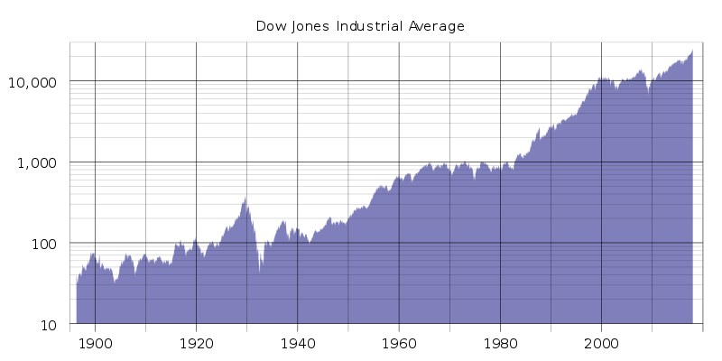
Though the points don’t create a perfect line, if you hold your pencil over the data points, you can see that a diagonal line going up to the right is formed. If we pick pick a point from each end we can analyze the values. In [latex]1920[/latex] the Dow Jones was at about [latex]$100[/latex]. In [latex]2000[/latex] the Dow Jones was at about [latex]$10,000[/latex]. So as the years increased by [latex]80[/latex], the value of the index increased by [latex]$9,900[/latex].

We can say that the data on this graph fits the trend — “one variable increases as the other increases”.

As time passes, or the years increase, the value of the Dow Jones also increases.

TrY IT

Now let’s look at a graph that show the global temperature differences collected over the 100+ years. How would you describe the trend of this graph?
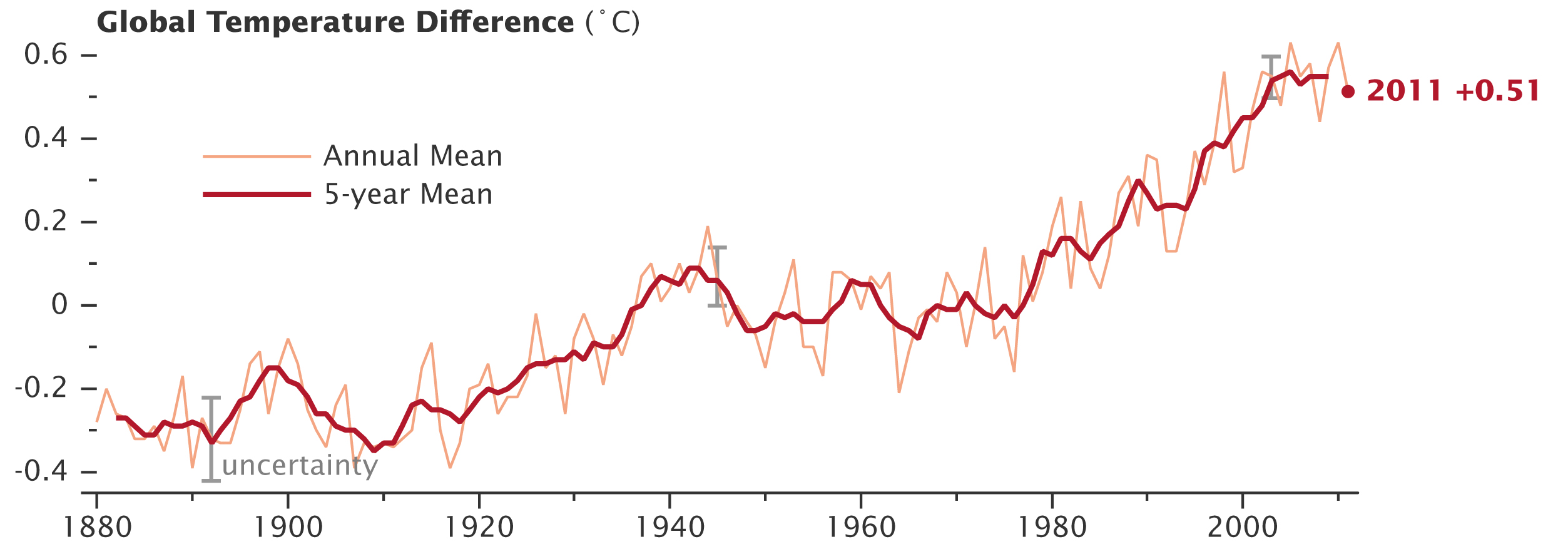
A graph of the global temperature difference from 1880 to 2000. The x-axis is labeled in years, and the y-axis in degrees Celcius. The graph illustrates both the annual mean and 5-year mean of the temperature. The 5-year mean starts a few years after 1880 at about negative 0.3 degrees celsius. A spike begins shortly after 1890, and by 1900 the 5-year mean is slightly above negative 0.2 degrees celsius. Come 1920, we see the 5-year mean slightly below negative 0.2 degrees celsius. After 20 more years, the 5-year mean only slightly measures above 0. And the same can be said for 1960. By 1980, the 5-year mean is closer to 0.1, and by 2000 the 5-year mean has skyrocketed past 0.4. As of 2011, the annual mean was 5.1.

ExAMPLE

The following graph shows the fertility rate in various regions in a hundred year range.A graph of the trends in global fertility rates by region from 1950 to 2050. The x-axis is incremented by 5 year spans within the 100 year range, and the y-axis is labeled the total fertility rate (TFR), which spans from 0 to 8. A key indicates the different trend lines on the graph. Trend lines for the world data, as well as data for Africa, Asia, Latin America/Carribean, and More Developed Regions are included in the graph. In the first 5 years from 1950 to 1955, the world sat at a fertility rate of 5. Meanwhile, Asia and the Latin American/Carribean countries were near 6. Africa was almost as high as 7, and more developed regions was slightly below 3. Come 1970 to 1975, Africa was about the same, but Asia had dropped below 5, Latin America/Carribean was about 5, the world was hovering above 4, and more developed regions had even dropped closer to 2. By 2000 to 2005, Africa was down to 5 and more developed regions were down to 1.5 while the rest of the trend lines sat just below 3. Once to 2030 to 2035, Africa is down to 3, and the rest of the trends hover around 2. And come 2040 to 2045, Africa dropped closer to 2 while the others stayed about the same.
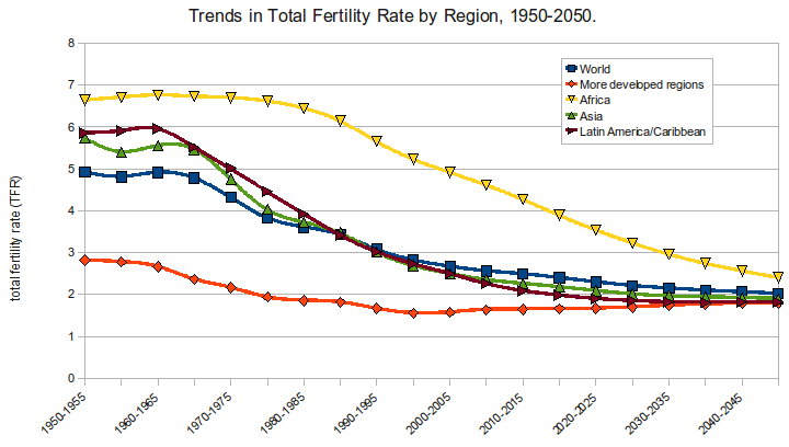
Looking at this graph we can observe overall trends, individual regions, or segments of time.

  1. What would you say is the overall trend of this data (Worldwide)?
  2. What is the trend in more developed regions (red line w/ diamond points)?

TRY IT

The graph below show the marriage rates in Great Britain over the past [latex]80[/latex] years.

A graph of the marriage rates in Great Britain from 1930 to 2010. The graph illustrates both male and female trends. The date range of World War 1, from 1939 to 1945, is labeled on the graph, as is the year of the Asylum and Immigration act, which is 2004. Starting in 1930, the male marriage rate was about 55, and the female was slightly above 40. By 1940, the male rate had risen to 80, and the female rate was above 60. A peak occured around this time. The next 3 or 4 years during the war saw a steady decline in marriage rates down to 55 and 40, until rates rose again in the last year of the war past 70 and 50. After another 5 years, the male rate was a little below 70 and the female was a little above 50. By 1960, those numbers hadn't changed much. However, by 1970 the male rate was about 75, and the female rate was around 60. By 1980, rates declined to 60 and below 50, respectively. Another 10 years and they'd be down to 40 and about 35. Come 2000, the rates were below 30. In 2004 when the Asylum and Immigration Act was passed, the trend of declining rates did not seem to change. And they continued to drop further into the 2000s, with a male rate slightly above 20 and a female rate around 20 in 2010.

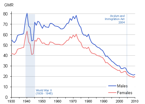
Looking at this graph answer the following questions.

  1. What is the trend of this data for males between [latex]1940[/latex] and [latex]1975[/latex]?
  2. What is the trend of this data for females between [latex]1980[/latex] and [latex]2010[/latex]?

Example

Look at the data points scattered all over the graph below. It’s possible that if a statistician analyzed the numbers, there is a slight trend. However, based on our knowledge and the data provided, we cannot tell how median household income is related to overrepresentation.
A graph plotting median household income against overrepresentation. The scatterplot illustrates a sporadic collection of points in the plane. Some lie along the x-axis, while others extend to the bounds of the axes, both vertical and horizontal.
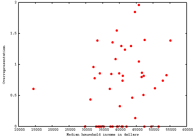
We would say that we cannot determine the trend of this data based on the graph.

Contribute!

Did you have an idea for improving this content? We’d love your input.

Improve this pageLearn More