Learning Goals
- Identify Quantitative Variables in a Data Set
- Identify graphical displays appropriate for visualizing quantitative data distributions.
- Use a data analysis tool to create a histogram of quantitative data.
- Read and interpret a histogram.
- Explain how the bin width affects a histogram.
- Use a data analysis tool to create a dotplot of quantitative data.
- Read and interpret a dotplot.
- Determine if a population and sample are appropriate to draw conclusions about a larger population.
In the next activity, you will need to identify quantitative variables, make plots of the distributions of quantitative variables, distinguish between a population and a sample, and explain limitations of analyses based on sample data. In this section, you’ll prepare for the activity by exploring the types of displays used to visualize quantitative variables.
Quantitative Variables
You learned to distinguish the difference between categorical and quantitative variables in Module 1, Data Collection and Organization, and you learned to identify and display distributions of categorical variables in the previous two sections, Displaying Categorical Data and Applications of Bar Graphs. Before we turn our attention to a thorough study of quantitative variables, take a moment to refresh your knowledge in the recall boxes below.
Recall
What is the distinguishing feature of a quantitative variable? That, how can we tell a quantitative variable apart from a categorical variable?
Core Skill:
We will explore quantitative displays later in this section. In the meantime, can you recall which graphs and charts are appropriate for displaying the distribution of a categorical variable?
Core skill:
Example
Which are the quantitative variables in the list below?
Salary, eye color, zip code, number of children in household, height, income level
In short, quantitative variables have numerical meaning. They are numbers that come with labels attached; [latex]30[/latex] years, [latex]82[/latex] points, [latex]15,000[/latex] dollars, [latex]3[/latex] speeding tickets are all examples of quantitative data observations. We can sum them up, take their average, and identify the minimum and maximum values.
Now it’s your turn to practice what you know using a real data set. Read the example and description of the data set and its variables below, then answer the questions that follow.
Variables in a data set
Let’s say we are interested in the ages of film actors who have won the highest professional accolades. Do they tend to be younger or older when they win a big award? We can use a data set containing the ages of performers (a quantitative variable) at the time of receiving an award. While we won’t be able to draw conclusions about why the award recipients might tend to be younger or older, we can use a visual display to see if an interesting tendency emerges.
To investigate, we’ll ask the question, How old are the winners of the Best Actress and Best Actor awards at the Academy Awards (more commonly known as “the Oscars”)?
To answer this question, we will use data on “Best Actress/Actor” for the [latex]184[/latex] winners from 1929 to 2018.[1] The table below shows the first five observations.
| Best Actress/Actor Winners from 1929 to 2018 |
|||||||||
| oscar_no | oscar_yr | award | name | movie | age | birth_pl | birth_mo | birth_d | birth_y |
| 1 | 1929 | Best actress | Janet Gaynor | 7th Heaven | 22 | Pennsylvania | 10 | 6 | 1906 |
| 2 | 1930 | Best actress | Mary Pickford | Coquette | 37 | Canada | 4 | 8 | 1892 |
| 3 | 1931 | Best actress | Norma Shearer | The Divorcee | 28 | Canada | 8 | 10 | 1902 |
| 4 | 1932 | Best actress | Marie Dressler | Min and Bill | 63 | Canada | 11 | 9 | 1868 |
| 5 | 1933 | Best actress | Helen Hayes | The Sin of Madelon Claudet | 32 | Washington DC | 10 | 10 | 1900 |
The following is the data dictionary for the variables in the table:
- oscar_no: Oscar ceremony number
- oscar_yr: Year of the Oscar ceremony
- award: Best Actress or Best Actor
- name: Name of award recipient
- movie: Name of movie
- age: Age of award recipient
- birth_pl: Birth place of award recipient
- birth_mo: Birth month of award recipient
- birth_d: Birth day of award recipient
- birth_y: Birth year of award recipient
quantitative versus categorical variables
[Insert a short video ( < 30 seconds) introducing the features of quantitative variables vs categorical in a data table or data dictionary (this extends the understanding obtained in 1C of identifying them from a list of words. The confusing variables in the data dictionary above include oscar_yr and birth_mo, which will appear to be numerical to students.]
question 1
Quantitative Displays
Earlier, you learned which kinds of graphs make good visualizations for categorical data. Just as certain graphs are useful for displaying data across categories (pie chart, bar graph, side-by-side and stacked bar graphs), others are especially well suited to quantitative data distributions. Categorical displays won’t work for quantitative data and vice-versa.
Graphs and Charts
In the future, you may need to choose a display based on the type of data distribution you have, so it is important to know which display works for the type of data you have. Remind yourself in the example below of which graphs and charts you have used to display categorical variables then answer the following question about quantitative displays.
Example
Some graphs and charts can be used to display distributions of categorical variables. Others work for displaying quantitative variables. Which of the graphs and charts below did you use in previous sections to display categorical variables?
- Pie chart
- Bar chart
- Dotplot
- Histogram
Now answer Question 2, about quantitative displays.
question 2
We know that pie charts and bar charts (and side-by-side and stacked bar charts) are used to display categorical distributions. Histograms and dotplots are appropriate for displaying quantitative data.
- Dotplots display how many individual observations there are of each value observed. Each observation in the data set appears as its own dot on the graph. A large number of observations could overwhelm the display so dotplots work well when the data set is small.
- Histograms are good choices for displaying data sets that have a large number of observations since they group observations into equal-size “bins.” The bins can include any interval of values desired, so a histogram will not be overwhelmed by a large number of observations in a data set.
Histograms
We’ve seen that a histogram is a graphical display used to visualize the distribution of a quantitative variable, and we know that it is a good choice to use when there are a large number of observations in the data set, which is why histograms are commonly used for quantitative distributions. Let’s take a closer look at how a histogram is created before using the tool to create one ourselves.
creating a histogram
[Perspective Video – a 3-instructors video demonstrating how to create a histogram for a variable from an copy-and-pasted data set, covering the features of a histogram, especially including binwidth and endpoints. Be sure to point out that after students can also select “dotplot” in the tool to change the type of graph. Include a statement or two comparing and contrasting the two graphs. Boxplots have not been studied yet, so there is no need to compare them as well.]
We can use the “Best Actress/Actor” data table as a resource to learn more about the features of a histogram. Below, see a histogram of the variable age from the data set.
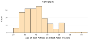
Similar to a bar graph, the height of each bar shows the number of observations within each “bin” (these would be the categories in the bar graph). A bin is a range of values that the quantitative variable can take. For example, the first bin on the histogram above is [20,25). The height of this bar shows there are six actors or actresses with ages that fall in this bin.
A bin can be defined by its end points, the smallest and largest values of the quantitative variable represented in the bin. For the first bin [20,25), the end points are [latex]20[/latex] and [latex]25[/latex]. The notation [20,25) means this bin includes observations with ages that are at least [latex]20[/latex] and less than [latex]25[/latex].
Questions 3 and 4 below will help further understand the bins of a histogram.
question 3
question 4
Creating histograms with technology
Go to the Describing and Exploring Quantitative Variables tool at https://istats.shinyapps.io/EDA_quantitative/ and create a histogram for the distribution of age of the [latex]184[/latex] Best Actress/Actor winners, following the steps below:
Step 1) Select the Single Group tab
Step 2) Locate the dropdown under Enter Data and select Your Own.
Step 3) For Do you have: select Individual Observations.
Step 4) In the Name of Variable box, type “Age“.
Step 5) Download the Oscars_Age spreadsheet and copy and paste the age data.
Step 6) Locate Choose Type of Plot and choose Histogram. Unselect any other types.
Step 7) Select Binwidth For Histogram to 5.
question 5
Interpreting histograms
reading and interpreting histograms
[Worked Example — a 3-instructors worked example of reading and interpreting histograms with different binwidths — showing which binwidth seems “better” for answering certain questions about the distribution. )
Use the histogram you created to answer the following questions. (Hint: Hover over the histogram to get the exact height of each bar.)
question 6
question 7
question 8
question 9
Bin Width
Using a different bin width for the histogram can change the features of the distribution we are able to see from the graphical display.
question 10
question 11
question 12
Dotplots
In a previous activity, you created a dotplot, a graphical display for quantitative data where each dot represents an single observation in a data set. Dotplots are useful for visualizing distributions when the data set is small.
There aren’t as many features to understand about a dotplot as there are with histograms. We’ll begin our exploration by creating one with the tool, which we will read and interpret.
Creating dotplots
We’ll use a dotplot to visualize the same distribution of age of Best Actress/Actor winners.
With the same tool open that you used to create the histogram (or by following Steps 1 – 4 above), check the “Dotplot” box. Use dotsize = 1 and bin width = 1.
question 13
Interpreting dotplots
At this point, students will be presented with two datasets. They will be able to choose which one they would like to use to answer example questions before creating dotplots using the data analysis tool.
Reading a dotplot is much the same as reading a histogram. The horizontal axis contains the range of all possible values of the variable and the vertical axis marks the number of each of those values observed. The difference is that a dotplot shows distinct counts of each value or binned value, one dot per observation. The example below demonstrates how to read and interpret a dotplot.
Example
Let’s say that a marketing firm is interested in the age in years of the typical automobile driven by college students. Survey responses from 130 college students were collected and are displayed in the dot plot below.
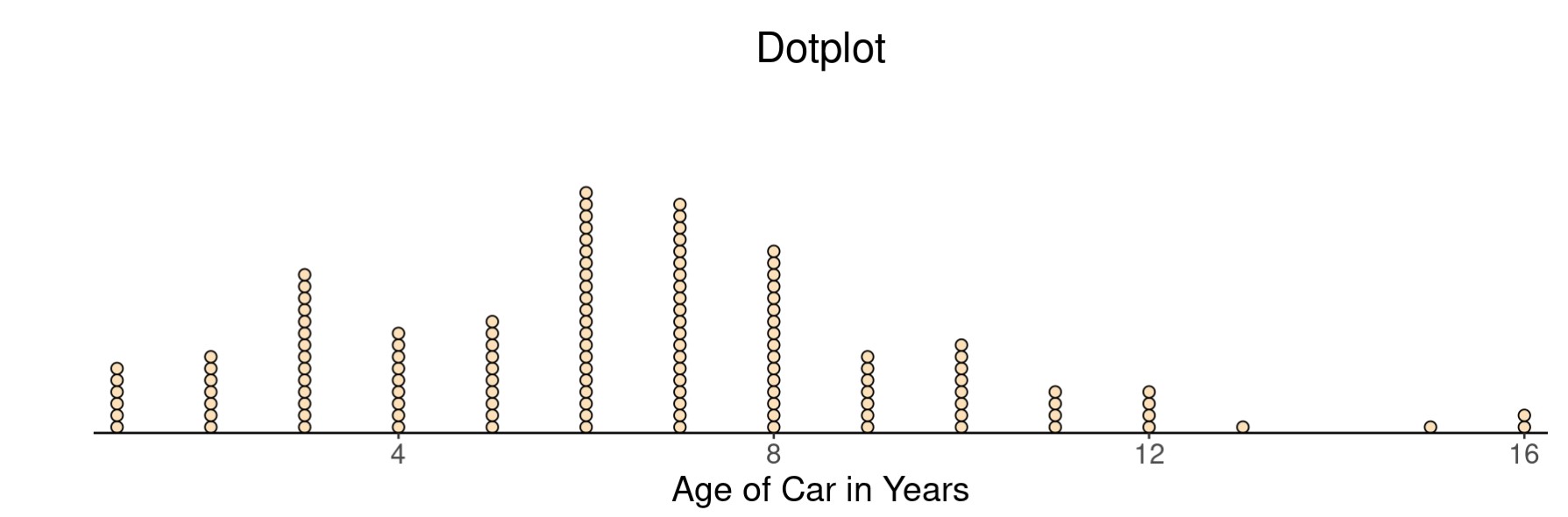
- What does each dot on the graph represent?
- How many students reported driving a car more than 12 years old?
- How many students reported driving a car that was 10 years old?
- Did more students report driving a car under 2 years old or one 6 years old?
question 14
Looking Ahead: Drawing Conclusions about Larger Populations
You saw a brief introduction to statistical inference earlier in the course, the process of making inferences about a population based on data collected on a sample from that population. We’ll study it in greater detail later, but it will be helpful to consider the idea of a representative sample from time to time along the way. You learned in section 2A that a sampling method is considered biased if it has a tendency to produce samples that are not representative of the population. When that happens, we cannot generalize our results to the population and can only make statements about the sample itself.
Recall
Core skill:
The question below will help you to develop your understanding of when you can use the results of an analysis to make statements about some larger population of which your sample is a subset.
To answer this question, consider that the data set we’ve explored in this section, Best Actress/Actor” for the [latex]184[/latex] winners from 1929 to 2018, includes observations on people who won this award over an [latex]89[/latex] year span. The people about whom data was collected are also members of the set of all Oscar winners in the timespan, which is itself a subset of all Hollywood film actors.
question 15
In the next activity, we’ll continue this theme by talking about the runtime of well-loved movies. Get ready by thinking about those movies you could watch over and over. Look up the “runtime” (length of the movie in minutes) of your favorite movies to compare with others in the next activity.
- Navigate to https://www.imdb.com/.
- Type your favorite movie in the search bar. Select the title.
- Convert the runtime into minutes and record that value.
For example, if your favorite movie is Happy Gilmore, the runtime is listed as one hour, [latex]32[/latex] minutes. Therefore, the runtime that you will record is [latex]92[/latex] minutes.
question 16
Summary
In this section, you’ve had a chance to practice the tasks that will be essential to forming deeper connections in the next activity. This is a good time to sum it all up before moving on.
- In Questions 1, 2, and 3, you identified quantitative variables and the plots used to visualize their distributions.
- In Questions 4, 5, 6, and 14, you used technology to make a plot of the distribution of a quantitative variable.
- In Questions 7 – 10, you used a histogram to describe a distribution.
- In Questions 11, 12, and 13 you explored how bin width affects a histogram.
- In Question 15, you used a dotplot to describe a distribution.
- In Question 16, you identified the population and the sample.
- In Question 16, you considered limitations on the scope of analysis based on the sample data.
This section gave you an opportunity to see that dotplots and histograms are good ways to visualize quantitative data. You also received some practice manipulating the bin width of a histogram to see how it affected the information displayed. Finally, you were needed to differentiate between the population and the sample to discuss possible limitations on the scope of an analysis of sample data. If you feel comfortable with these ideas, please move on to the next activity in Forming Connections.
- Oscar winners, 1929 to 2018. (n.d.). OpenIntro. Retrieved from https://www.openintro.org/data/index.php?data=oscars ↵
