Illustrating Frequency with Histograms
Below we are given a histogram for the variable Hours of Sleep Per Night (Weekend). Recall that a histogram displays the distribution of a quantitative variable but, unlike the dotplot in which each observation is stacked above each value appearing, a histogram gathers groups of observations up into its bars.
recall
You may wish to refresh your understanding of how data is represented in a histogram.
Core skill:
Use the following histogram to address Questions 4-7.
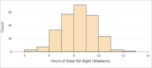
As you did with for the dotplot above, first orient yourself to the information conveyed in the histogram by answering Question 4. Then, compare and contrast the histogram to the dotplot in Question 5. Finally, read and interpret the histogram to answer Questions 6 and 7.
question 4
Now that you are familiar with the information presented in the histogram, look back at the dotplot and consider general differences and similarities in the two types of displays.
question 5
Histograms are more commonly encountered than dotplots as a visualization of quantitative data since they can more concisely display large data sets. Dotplots are more appropriate for smaller sets of data in which the observations (the dots) are not overwhelmingly numerous.
Now use the histogram to answer questions about the variable Hours of Sleep Per Night (Weekend).
question 6
question 7
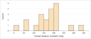
Let’s examine the distribution of a variable from another data set.
The histogram below displays the frequency of sodium content per serving for [latex]20[/latex] different varieties of cereals.[1]
question 8
question 9
- Agresti, A., Franklin, C. A., & Klingenberg, B. (2021). Statistics: The art and science of learning from data, 5th edition. Pearson. https://www.pearson.com/us/higher-education/program/Agresti-My-Lab-Statistics-with-Pearson-e-Text-Access-Card-for-Statistics-The-Art-and-Science-of-Learning-from-Data-18-Weeks-5th-Edition/PGM2788191.html ↵
