Calculating the Mean and Median of a Data Set: Learn It 5

Histograms

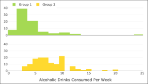
The following image uses histograms to compare the distribution of the variable “Alcoholic Drinks Per Week” for two groups of college students in this study. Based on these histograms, determine whether you believe the following statements are true or false.

Two histograms. The horizontal axis is labeled "Alcoholic Drinks Consumed Per Week." At the top, a legend shows that green indicates Group 1 and yellow indicates Group 2. The first graph is green. For 1-2, the count is approximately 8. For 3-4, the count is approximately 39. For 5-6, the count is approximately 20. For 7-8, the count is approximately 4. For 9-10, the count is approximately 3. For 11-12, the count is approximately 4. For 13-14, the count is approximately 2. For 24-25, the count is approximately 1. The next graph is yellow. For 3, the count is approximately 7. For 4, the count is approximately 10. For 5, the count is approximately 18. For 6-7, the count is approximately 20. For 8, the count is approximately 11. For 9, the count is approximately 10. For 10, the count is approximately 22. For 12, the count is approximately 7. For 13, the count is approximately 3. For 14, the count is approximately 1. For 15, the count is approximately 3. For 18, the count is approximately 1. For 20, the count is approximately 2.

question 8

question 9

question 10

question 11