Calculating the Mean and Median of a Data Set: Apply It 3

Making Comparisons Using Histograms

The following histograms illustrate the distributions of the Poor Sleep Quality Score variable based on whether the participants identified as owls, larks, or neither.
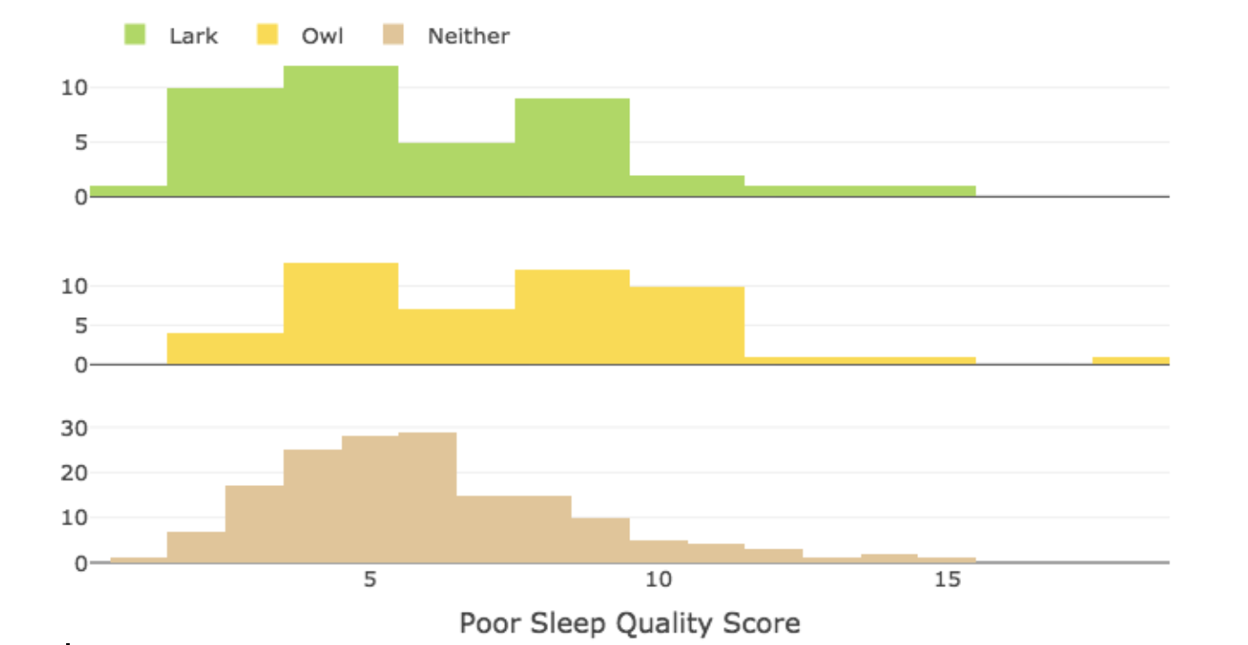
Three histograms, labeled "Poor Sleep Quality Score" on the horizontal axis. At the top, there is a legend showing that green indicates lark, yellow indicates owl, and brown indicates neither. The first chart is green. For 0-1, the count is 1. For 2, the count is 10. For 3, the count is 10. For 4, the count is 12. For 5, the count is 12. For 6, the count is 5. For 7, the count is 5. For 8, the count is 8. For 9, the count is 8. For 10, the count is 4. For 11, the count is 4. For 12, the count is 2. For 13, the count is 2. For 14, the count is 2. For 15, the count is 2. The next plot is yellow. For 2, the count is 4. For 3, the count is 4, For 4, the count is 14. For 5, the count is 14. For 6, the count is 7. For 7, the count is 7. For 8, the count is 13. For 9, the count is 13. For 10, the count is 10. For 11, the count is 10. For 12, the count is 2. For 13, the count is 2. For 14, the count is 2. For 15, the count is 2. For 18, the count is 2. The next chart is brown. For 1, the count is 1. For 2, the count is 7. For 3, the count is 17. For 4, the count is 25. For 5, the count is 28. For 6, the count is 29. For 7, the count is 14. For 8, the count is 14. For 9, the count is 10. For 10, the count is 5. For 11, the count is 4. For 12, the count is 3. For 13, the count is 1. For 14, the count is 2. For 15, the count is 1.

question 6

[Feedback for Question 6 –” that was a tricky analysis since the centers of all three groups were similar. We see that Larks and Neither reported a greater percentage of low scores and Owls appear to have reported a few extreme high scores”] 

The following histograms illustrate the distributions of the Alcoholic Drinks per Week variable based on whether the participants identified as owls, larks, or neither.
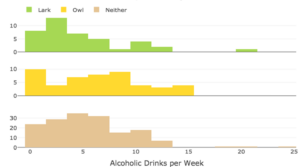
Three histograms, labeled "Alcoholic Drinks per Week" on the horizontal axis. At the top, there is a legend showing that green indicates lark, yellow indicates owl, and brown indicates neither. The first chart is green. For 0-1, the count is approximately 8. For 2-3, the count is approximately 13. For 4-5, the count is approximately 7. For 6-7, the count is approximately 5. For 8-9, the count is approximately 1. For 10-11, the count is approximately 4. For 12-13, the count is approximately 2. For 20-21, the count is approximately 1. The next plot is yellow. For 0-1, the count is approximately 10. For 2-3, the count is approximately 4. For 4-5, the count is approximately 7. For 6-7, the count is approximately 8. For 8-9, the count is approximately 9. For 10-11, the count is approximately 4. For 12-13, the count is approximately 3. For 14-15, the count is approximately 4. The next chart is brown. For 0-1, the count is approximately 23. For 2-3, the count is approximately 29. For 4-5, the count is approximately 33. For 6-7, the count is approximately 30. For 8-9, the count is approximately 14. For 10-11, the count is approximately 19. For 12-13, the count is approximately 8.

question 7

[Feedback for Question 7 –” that was a tricky analysis since the centers of all three groups were similar. We see that all three histograms show students reported consuming 0 – 15 drinks per week with a few outliers in the larks and owls groups. The means appear quite similar but the median for the lark group may be less than the others.”]