Comparing Multiple Distributions
Since we’ll be using data from the Tax Policy Center to analyze the claims made in the two quotes above, let’s first investigate a statement the Center made about the average tax cut experienced from the law.
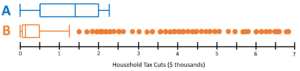
According to the independent Tax Policy Center, the average income tax cut as a result of the law was $[latex]1,260[/latex].[1] However, as we’ve seen before, averages can be misleading and uninformative.
Two boxplots are provided below, each displaying a hypothetical distribution of [latex]5,000[/latex] tax cuts that would result in a mean tax cut of $[latex]1,260[/latex].
question 2
Hint
question 3
Hint
Now, let’s compare these distributions.
question 4
Hint
question 5
Hint
question 6
Hint
- Tax Policy Center. (2018, February 16). T18-0025 - The Tax Cuts and Jobs Act (TCJA): All provisions and individual income tax provisions; distribution of federal tax change by expanded cash income percentile, 2018. htpps://www.taxpolicycenter.org/model-estimates/individual-income-tax-provisions-tax-cuts-and-jobs-act-tcja-february-2019/t18-0025 ↵
