Stacked Bar Charts
Stacked bar charts also display values for different categories but rather than showing a different bar for each category, they display sub-categories as segments within each bar. Sometimes the bars represent counts, while others, such as the one we see in the image below, display percentages. Each segment represents a percentage of the whole so it’s easy to see relative differences within a bar. But as segment percentages grow smaller, it becomes difficult to estimate them. Let’s take a look at the graph below to gain a better understanding of how to read stacked bar charts.
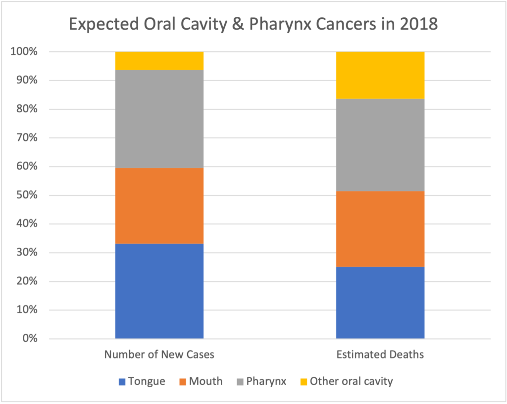
The graph above shows the expected number of new cases of oral cavity and pharynx cancer for 2018 and the expected number of deaths from oral cavity and pharynx cancer for 2018, separated by the specific location of the cancer. [1] The bar on the left shows the number of new cases of a cancer by location in the body as a percent of all new oral cavity and pharynx cancers that year. The bar on the right shows the number of deaths by location of cancer as a percent of total deaths from these cancers. The percentages represented by the segments within each bar will total to [latex]100[/latex]%. For example, we can see that in the bar on the left, the yellow segment covers about [latex]7[/latex]% of the bar from [latex]93[/latex]% to [latex]100[/latex]%. This means that locations other than tongue, mouth, or pharynx accounted for about [latex]7[/latex]% of new cancers. In the bar on the right, we see that deaths from cancers in other locations accounted for about [latex]17[/latex]% of new cancers (the yellow segment covers from about [latex]83[/latex]% to [latex]100[/latex]%).
interactive Example
What percent of estimated deaths from these cancer were located in the tongue? In the mouth? In the pharynx? Estimate them by looking at the range of percentages covered by each segment. Check your answers, then complete the question below the graph.
Now it’s your turn to practice reading the stacked bar chart by answering the following questions. The graph is linked again here for convenience.
question 5
question 6
question 7
question 8
question 9
- American Cancer Society. (2018). Table 1. Estimated number of new cancer cases and deaths by sex, US, 2018. https://www.cancer.org/content/dam/cancer-org/research/cancer-facts-and-statistics/annual-cancer-facts-and-figures/2018/estimated-number-of-new-cancer-cases-and-deaths-by-sex-us-2018.pdf. ↵
