Learning Goals
- Describe the shape of the distribution of a quantitative variable.
- Describe the center of the distribution of a quantitative variable.
- Describe the spread of the distribution of a quantitative variable.
- Identify any outliers in the distribution of a quantitative variable.
- Identify a graphical display given its description.
In the previous section and activity, you learned how to use graphs (histograms and dotplots) to visualize the distribution of a quantitative variable. By displaying the data in a graph, you were able to answer questions about the distribution, and you began to develop strategies for choosing the most helpful graph to use for a given situation.
In the upcoming activity, you’ll need to use a histogram to describe the distribution of a quantitative variable and answer questions about it. Let’s prepare for that now by learning about the four features used to describe a quantitative distribution: shape, center, spread, and the presence of outliers.
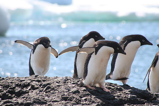
Let’s study penguins!
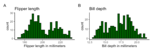
The data for this example includes the species and size measurements of [latex]342[/latex] penguins found foraging near Palmer Station, Antarctica.[1] The following table contains [latex]10[/latex] observations.
| Species and Size of Penguins |
|||||||
| species | island | bill_length_mm | bill_depth_mm | flipper_length_mm | body_mass_g | sex | year |
| Adelie | Torgersen | [latex]39.1[/latex] | [latex]18.7[/latex] | [latex]181[/latex] | [latex]3,750[/latex] | male | 2007 |
| Adelie | Torgersen | [latex]39.5[/latex] | [latex]17.4[/latex] | [latex]186[/latex] | [latex]3,800[/latex] | female | 2007 |
| Adelie | Torgersen | [latex]40.3[/latex] | [latex]18[/latex] | [latex]195[/latex] | [latex]3,250[/latex] | female | 2007 |
| Adelie | Torgersen | N/A | N/A | N/A | N/A | N/A | 2007 |
| Adelie | Torgersen | [latex]36.7[/latex] | [latex]19.3[/latex] | [latex]193[/latex] | [latex]3,450[/latex] | female | 2007 |
| Adelie | Torgersen | [latex]39.3[/latex] | [latex]20.6[/latex] | [latex]190[/latex] | [latex]3,650[/latex] | male | 2007 |
| Adelie | Torgersen | [latex]38.9[/latex] | [latex]17.8[/latex] | [latex]181[/latex] | [latex]3,625[/latex] | female | 2007 |
| Adelie | Torgersen | [latex]39.2[/latex] | [latex]19.6[/latex] | [latex]195[/latex] | [latex]4,675[/latex] | male | 2007 |
| Adelie | Torgersen | [latex]34.1[/latex] | [latex]18.1[/latex] | [latex]193[/latex] | [latex]3,475[/latex] | N/A | 2007 |
| Adelie | Torgersen | [latex]42[/latex] | [latex]20.2[/latex] | [latex]190[/latex] | [latex]4,250[/latex] | N/A | 2007 |
The following is the data dictionary for the variables in the table:
- species: A factor denoting penguin species (Adélie, Chinstrap, or Gentoo)
- island: A factor denoting the island in Palmer Archipelago, Antarctica (Biscoe, Dream, or Torgersen)
- bill_length_mm: A number denoting bill length (millimeters)
- bill_depth_mm: A number denoting bill depth (millimeters)
- flipper_length_mm: An integer denoting flipper length (millimeters)
- body_mass_g: An integer denoting body mass (grams)
- sex: A factor denoting penguin sex (female or male)
- year: An integer denoting the study year (2007, 2008, or 2009)
Go to the Describing and Exploring Quantitative Variables tool at https://dcmathpathways.shinyapps.io/EDA_quantitative/.
Select the data set Penguins – Body Mass and make a Histogram of the variable body_mass_g, the total body weight in grams. Select Binwidth for Histogram: 500.
question 1
question 2
In the following activity, you will use the histogram to describe features of the distribution of a quantitative variable. The features used to describe the distribution of a quantitative variable are the shape, center, spread, and presence of outliers. You will learn to summarize all of these features in a single description, but for now let’s discuss them one by one.
determining shape, center, spread, and the presence outliers
[Perspective video – a 3-instructor video describing how to determine shape, center (just a visual estimation — we don’t talk about mean/median yet!), spread (just the range for now!), and the presence of outliers (just the appearance for now – we don’t use statistical methods yet!) — emphasize skew, modality, and center. Emphasize what the term “distribution” of a quantitative variable means. It would be very cool to have an animation in which the numbers from a data table lift from the table en masse and sprinkle down onto a histogram, all falling into place in the distribution.]
Shape
Let’s begin with the shape. The description of shape includes two parts: (1) overall pattern (left skewed, right skewed, symmetric) and (2) the number of peaks (unimodal, bimodal, multimodal).
Skew
Let’s take a look at the first component. The overall pattern can be described as one of the following:
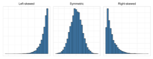
- Symmetric: The left and right sides of the distribution (closely) mirror each other. If you drew a vertical line down the center of the distribution and folded the distribution in half, the left and right sides would closely match one another.
- Left skewed: The distribution has a longer tail to the left.
- Right skewed: The distribution has a longer tail to the right.
Modality
In addition to the overall pattern, the description of shape also includes the number of peaks. This is also known as the modality. The modality can be described as one of the following:
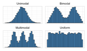
- Unimodal: There is one prominent peak.
- Bimodal: There are two prominent peaks.
- Multimodal: There are three or more prominent peaks.
- Uniform: There are no prominent peaks.
Example
What two elements make up a description of the shape of a distribution?
question 3
Center
The next feature is the center. The center describes the location of the middle of the distribution. The center is a number that describes a typical value. For example, one way to think about the center is that it could be the point in the distribution where about half of the observations are below it and half are above it. For now, we will use the histogram to get an approximate value of the center. (In a later lesson, you will learn statistics used to describe the center more precisely.)
Example
What is one way to think about the center as the location of the middle of a distribution?
a) The center is always the value that splits the data in half.
b) The center is always the value indicated by the tallest bar in the graph.
c) The center is always the middle number between the highest and lowest values on the horizontal axis.
question 4
Spread
Next, let’s approximate the spread. The spread is a measure of how much the values in a data set tend to differ from one another. One way we can find the spread is by finding the minimum and maximum values in the data and calculating the difference between them. This difference is called the range.
Example
How can we find the range of a distribution?
a) By finding the minimum and maximum values on the graph’s horizontal axis and calculating the difference between them.
b) By finding the minimum and maximum values on the graph’s vertical axis and calculating the difference between them.
c) By finding the minimum and maximum values in the data and calculating the difference between them.
question 5
Outliers
The last feature in the description is the presence of outliers. Outliers are observations in the data that are unusual and outside the general pattern of the rest of the observations in the distribution. When working with a univariate (“one variable”) distribution for a quantitative variable, an outlier is an observation that has an unusually high or unusually low value. It is good practice to make note of outliers, as these observations can sometimes influence the statistical results (e.g., the value of the range).
Example
Why is it a good practice to make note of outliers?
a) These observations can sometimes influence the location of the middle of the data.
b) These observations can sometimes influence the value of the range.
c) These observations can sometimes influence the modality of the graph.
question 6
Identifying Graphical Displays
When visually assessing graphical displays of the distribution of a quantitative variable, we want to feel comfortable summarizing the graph with a description that includes all four characteristics: shape, center, spread, and the presence of outliers. It can be challenging to identify these features when the graph doesn’t indicate a clear tendency, but with time and practice, you’ll find that the accuracy of your predictions will improve. Question 7 below will help you get started.
describing the characteristics of a graph
[Worked Example — a 3-instructors worked example of describing the four characteristics of a graph with less than super-clear features. ]
question 7
Summary
In this lesson, you dove deeply into using a histogram to describe the distribution of quantitative variables and to answer questions about a distribution. You examined whether the shape of a distribution was symmetrical or skewed left or right, and you identified a distribution’s modality. You practiced estimating the center and spread using a histogram, and you noted the presence of possible outliers that could affect the range or shape of the distribution. Let’s summarize the skills you saw in each question.
- In question 1, you used technology to make a histogram of a quantitative variable.
- In question 2, you used a histogram to answer questions about the distribution of a quantitative variable.
- In question 3, you described the shape of a distribution.
- In question 4 , you described the center of a distribution.
- In question 5, you described the spread of a distribution.
- In question 6, you identified outliers in a distribution.
- In question 7, you matched the description of a distribution to the graphical display.
Hopefully, you are beginning to feel more confident at describing the characteristics of a distribution of a quantitative variable such as a histogram. If so, it’s time to move on to the next activity in Forming Connections, where you’ll put your new skills to work analyzing and describing distributions of quantitative variables.
- Horst, A., Hill, A., & Gorman, K. (n.d.). palmerpenguins. Github. https://allisonhorst.github.io/palmerpenguins/ ↵
