Comparing Groups with Dotplots
Now let’s make comparisons of a single variable across two groups using first dotplots, then histograms.
interactive example
When making comparisons of a single variable across two groups, we are often looking for clues that let us know which group is larger or in which group more data appears to the left or right of a particular value of the variable.
- Based on what you know about dotplots and histograms, which graph would be more helpful for determining which group is larger?
- Which graph would be more helpful for determining in which group the bulk of the data lies more to one side of a particular value of the variable?
Show Answer
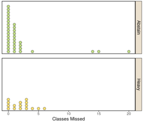
The following dotplots compare the numbers of classes missed between two groups of students: those who abstain from drinking alcohol (“Abstain”) and those who consume large amounts of alcohol each week (“Heavy”). Note that “Moderate” and “Light” drinkers are excluded here.
question 10
Hint
question 11
Hint
question 12
Hint
