Learning Goals
In this support activity you’ll become familiar with the following:
In the next section of the course material and in the following activity, you will need to compare the distributions of a single variable between groups. In this corequisite support activity, we will practice describing the distributions when presented with a histogram.
Describing Histograms
In the the section Applications of Histograms: What to Know you defined the shape, center, spread, and the presence of outliers in the distribution of a quantitative variable. You learned about the skewness and modality of a distribution and saw how to use the range as a possible representation of spread. Then, in the activity, Applications of Histograms: Forming Connections, you used these statistical terms in summary to thoroughly describe the distribution of a quantitative variable. In the upcoming section and activity, you’ll need to display a comfortable understanding of this statistical language so we’ll spend some time analyzing some histograms and possible descriptions in this support activity.
In Questions 1–3 below, you will be presented with a histogram and a description of the distribution of the variable to analyze. The recall box below contains the descriptions of each of the four characteristics of a thorough description.
Recall
Recall, from Forming Connection in Applications of Histograms: 3D, that a complete description of the distribution of a quantitative variable will include a discussion of shape, center, spread, and the presence of outliers. Refresh your understanding of the definitions of these characteristics if needed.
Core skill:
Describing a Distribution
Use the guidelines presented in Applications of Histograms: Forming Connections: shape, center, spread, and the presence of outliers to assist you with each histogram in the questions below.
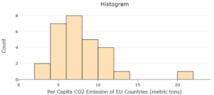
question 1
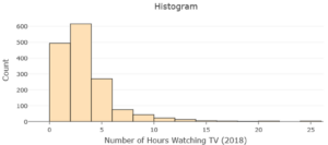
question 2
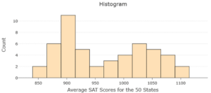
question 3
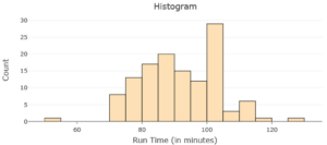
question 4
Hopefully, you have started to become more comfortable using the language of statistics to describe the distribution of a quantitative variable. It’s time to move on to the next section.
