Learning Goals
- Look at a histogram and summarize the important measures of center
- Take the measures of center to explain the behavior of the variables in a data set
Another way to describe data numerically is to find and use the measures of center and measures of spread.
Variability
Measure of how spread out, or dispersed, the data set is.
Standard deviation, variance, and range are all calculated measures of variability.
Comparing Variability
We can visually assess variability using graphical displays such as histograms and dot plots. When looking at a histogram or dot plot, consider whether the data appears to be more spread out from the center (greater variability), or more clustered toward the center (less variability). These visual clues help us recognize distributions that have more or less variability than others.
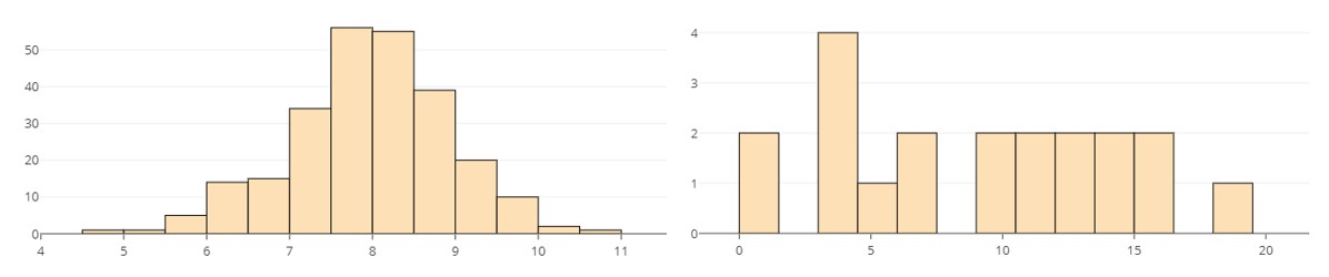
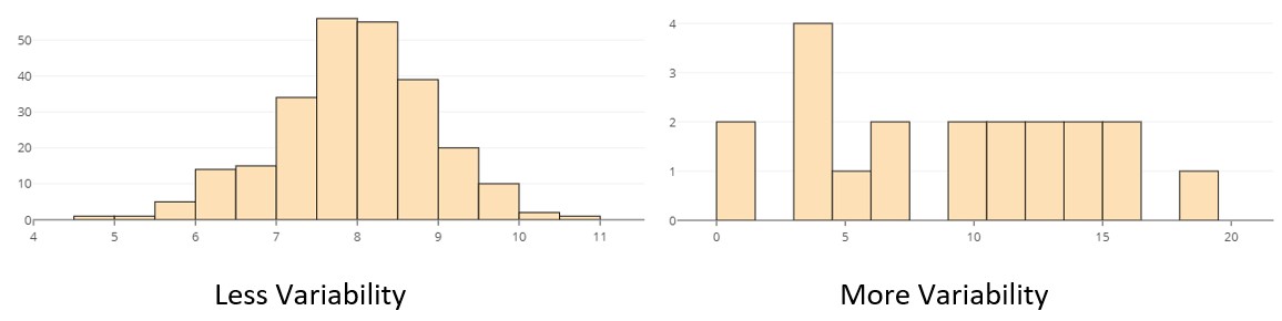
example
Histograms displaying the distribution of two quantitative variables with different amounts of variability are shown below. Which do you think has less variability than the other? Explain your reasoning. For example, what visual clue could help you decide if your answer were correct?
It can often be easier to visualize variability using a dot plot than using a histogram, because the individual data points (or observations) are visible in the dot plot.
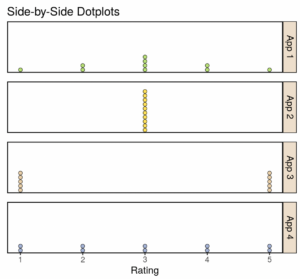
Try It 1
Ten customers rated four different smartphone apps. The customer ratings for the four different apps are shown in the following dot plots. The average rating for each app is equal to 3. Even though the mean, [latex]\bar{x}[/latex], is the same for each app, the dot plots for each app look very different.