Bar graphs
Bar graphs are visual displays of data in which the frequency of each category listed across the horizontal axis is indicated by the height of its corresponding rectangular bar (or the length if the graph is displayed horizontally). Bar graphs can be displayed vertically, as the ones you’ll see here, or horizontally. See the interactive example below for a demonstration of how to read a bar graph.
Interactive example
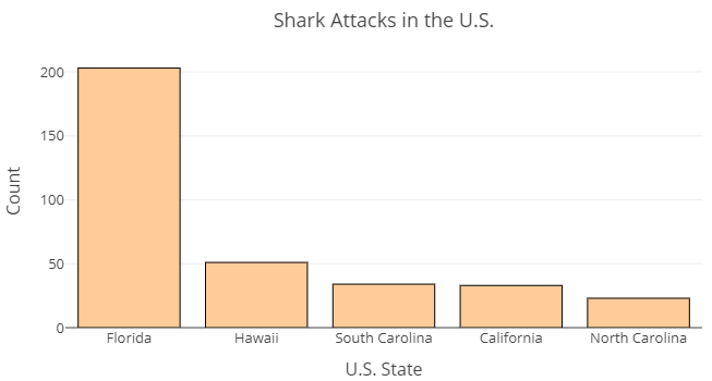
The graph you see here is a portion of a larger graph that you’ll see following this demonstration. The full graph will display data about internationally occurring shark attacks. This portion shows just the attacks in the United States. The states are listed, one by one across the horizontal axis. Each bar rises to a number along the vertical axis representing the number of shark attacks recorded in that state.
Use this chart (rather than the frequency table you saw earlier) to answer the following questions.
- According to the bar graph, about how many shark attacks occurred in Florida?
- What two states appear to have recorded about the same number of attacks?
- About how many attacks does the bar graph indicate occurred in Hawaii?
- About how many attacks occurred in North Carolina?
Now it’s your turn to try reading a bar graph. The image below is a bar graph (also known as a bar chart) of [latex]689[/latex] shark attacks across the globe.[1] Note that each country or state is listed along the horizontal axis. The height of each bar provides a visual representation of the number (count) of shark attacks that occurred in each country. We cannot read the exact frequency of each bar from a bar graph. Rather, the display helps us to visualize the frequencies relative to one another.
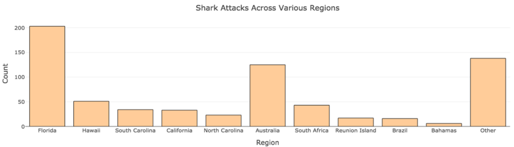
Use the chart to answer the questions below.
question 5
question 6
question 7
Pie Charts
Pie charts display data in a round graph, split into “pie pieces,” each representing a relative frequency. A key is provided to identify the categories associated with each relative frequency. Pie charts are useful for visually comparing relative frequencies.
Interactive example
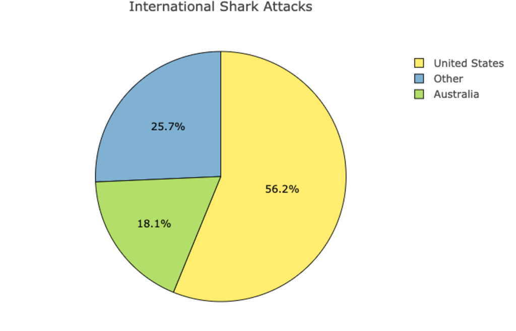
Let’s say we were interested in comparing the percentage of shark attacks occurring in the United States and Australia versus the rest of the globe. We could create pie chart like the one below. This chart takes [latex]689[/latex] international shark attacks and divides them into three categories: attacks occurring in the United States, in Australia, and all other locations.
Use this pie chart to answer the following questions.
- What percent of attacks happened in Australia?
- Approximately how many of the total 689 attacks happened in Australia?
If needed, see the recall box below to refresh how to determine what number a certain percent represents in a given total.
recall
When working with percentages, it is often helpful to convert them to counts.
Core skill:
Now it’s your turn. Here is the pie chart from the interactive example above showing the relative frequencies of all [latex]689[/latex] international shark attacks that occurred in the U.S., Australia, and all other locations.
Use the pie chart above to answer the following two questions.
question 8
question 9
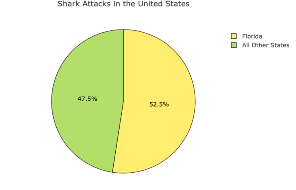
Let’s try one more. The following is a pie chart of [latex]387[/latex] shark attacks in the United States. Use the information from the table to determine how many shark attacks in each of the two categories shown.
question 10
question 11
You’ve seen how to read information presented in frequency tables, bar charts, and pie charts and you’ve learned to calculate relative frequencies. You’ve also seen how to interpret the information displayed, and that sometimes it is helpful to convert numbers between ratios, proportions, and percentages in doing so. If you feel comfortable with these skills, then it’s time to move on to the next section.
- Sharks (csv). (n.d.). The Art & Science of Learning from Data. Retrieved from https://img1.wsimg.com/blobby/go/bbca5dba-4947-4587-b40a-db346c01b1b3/downloads/sharks.csv?ver=1622756678385 ↵
