Bar Graphs
One of the most commonly used graphs for visualizing the distribution of a categorical variable is a bar graph. In a bar graph, categories are represented by bars that are separated from each other. The bars can be vertical or horizontal, and the height (or length) of each bar represents the measure of the data in each category. Bars can represent frequencies, relative frequencies (proportion), or percentages.
Interpreting bar graphs
At this point, students will be presented with two datasets. They will be able to choose which one they would like to use to answer example questions before creating bar graphs using the data analysis tool.
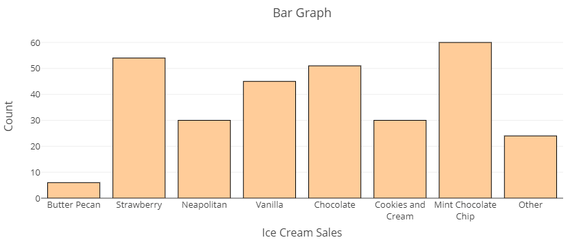
The bar graph below displays the number of cones each of a small ice cream shop sold on the 4th of July. Note that the counts (numbers of cones) are listed on the vertical axis while each flavor sold is listed along the horizontal axis. Examine the graph, then answer the questions in the Example that follows.
Example
Use the Ice Cream Flavors bar graph above to answer these questions.
a) Which flavor sold the fewest number of cones?
b) About how many cones of Neapolitan ice cream were sold?
Now that you have had a chance to become familiar with this categorical visualization, follow the directions below to use technology to create a bar graph for a real dataset.
Creating bar graphs from data
Recall the frequency table you created earlier in this section using the Describing and Exploring Categorical Data tool. When you used the technology tool to create the frequency table, a bar graph was also created on that page. Let’s go back to the tool to explore the bar graph. If you still have the tool open for this dataset, just follow steps 4 and 5 below to view the bar graph.
Go to the data analysis tool Describing and Exploring Categorical Data at https://dcmathpathways.shinyapps.io/EDA_categorical/
Step 1) Select the One Categorical Variable tab.
Step 2) Locate the dropdown under Enter Data and select From Textbook.
Step 3) Locate the dropdown under Dataset and select Young Adults: Enjoy Music.
See the bar graph under the frequency table on the tool page. You can change the appearance of the graph using the Options selections. You can show counts or percentages on the vertical axis or in the bars, change the bars from vertical to horizontal, customize order, and even change the color of the bars in the Modify/Include section. Let’s explore how to change the bars from vertical to horizontal and then change the horizontal axis from Count to Percent (%).
Step 4) Click the Horizontal Bars box to change the perspective of the graph from counts as bar-heights to bar-lengths. Note how the Count range switches from the vertical axis to the horizontal axis.
Step 5) Click the Show Percent box to change the heights (or lengths of horizontal bars) from counts to percentages. Note how the Count range switches to Percent (%).
Take a moment to explore switching these options back and forth to see how the graph changes then answer Question 5 below.
question 5
Pie Charts
Another common graph used for displaying the distribution of categorical data is a pie chart. In a pie chart, categories are represented by wedges in a circle and are proportional in size to the percentage of individuals/items in each category. There are several ways to present pie chart data visually. A pie chart may include all the information needed to read it within each wedge or they may provided some image in the chart and some in a key off to the side.
Interpreting pie charts
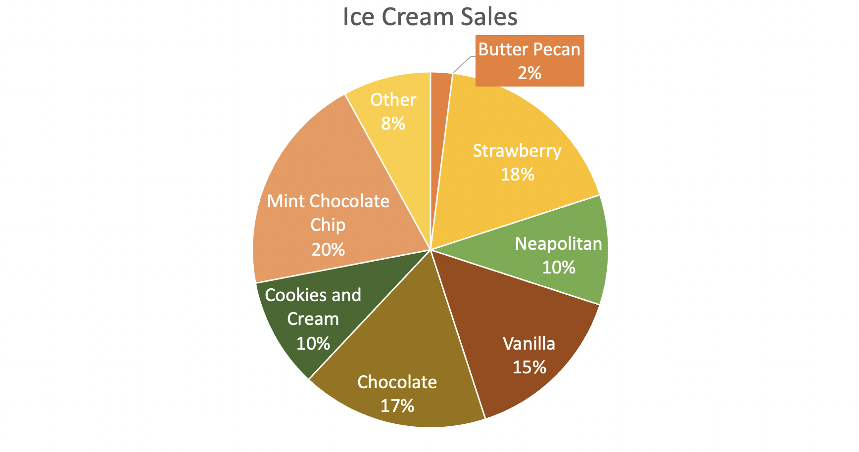
Pie charts are useful for showing percentages (parts of a whole) at some particular instance in time. For example, the following chart displays flavors of ice cream sold at an ice cream shop as a percentage of all ice cream sales on July 4th. This chart contains the same information as the bar chart does above, but shows percentages rather than counts.
Example
Use the chart above to answer the following questions.
a) What flavor made up the largest percentage of ice cream sales?
b) What percent of sales was attributed to strawberry ice cream?
Creating pie charts from data
When you used the Describing and Exploring Categorical Data data tool to create the frequency table and bar graph, you also had the option to create a pie chart. Let’s do that now. If you still have the tool open, skip to Step 4 below.
Go to the data analysis tool Describing and Exploring Categorical Data at https://dcmathpathways.shinyapps.io/EDA_categorical/
Step 1) Select the One Categorical Variable tab.
Step 2) Locate the dropdown under Enter Data and select From Textbook.
Step 3) Locate the dropdown under Dataset and select Young Adults: Enjoy Music.
Step 4) Under the Additional Plots section, select Pie Chart. Scroll down to see the pie chart on the page under the bar graph.
question 6
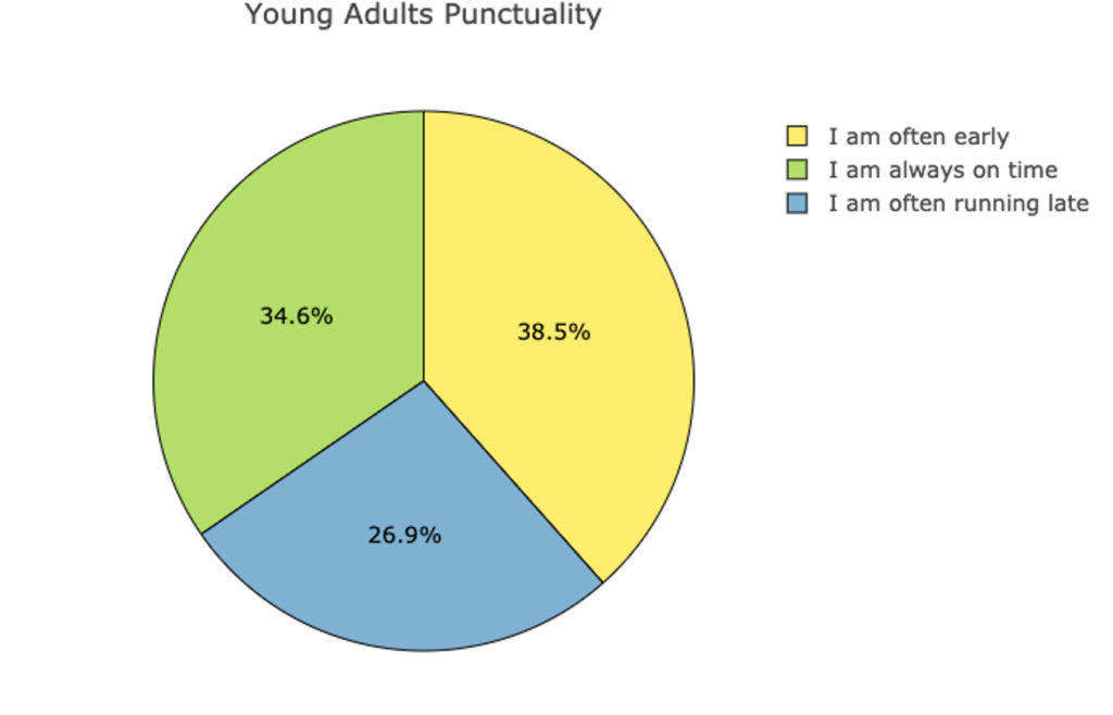
It’s difficult to visualize a summary of the Enjoy music categories since just one or two of them dominate the chart. Let’s leave the tool now and explore another one of the variables from the dataset: Punctuality. The following pie chart displays the distribution of the categorical variable Punctuality. Use this pie chart to answer Questions 7 and 8 below.