Learning Goals
After completing this section, you should feel comfortable performing these skills.
- Define the terms: first quartile, third quartile, interquartile range, and five-number summary.
- Identify the features of a boxplot
- Calculate interquartile range for a data set.
- Calculate the range of observations characterized as upper outliers or lower outliers.
- Interpret the features of a boxplot.
- Use a boxplot of a data set to identify whether the shape of its distribution is left-skewed, symmetric, or right-skewed.
Click on a skill above to jump to its location in this section.
Boxplots are helpful for visualizing the distribution of a quantitative variable. A boxplot clearly shows the median of the data and provides a summary at a glance of the bulk of the data and the presence of outliers. In the next activity, you will need to be able to identity and interpret the features of a boxplot, identify outliers in a data set, and relate a boxplot of a quantitative variable to its distribution. In this section, you’ll learn to identify the key pieces of information needed to accomplish these tasks.
Boxplots
In order to interpret boxplots, you will need to identify the minimum, maximum, and median of a quantitative variable. You’ve done this in previous activities. See the Recall box below if you need a refresher. A boxplot captures only the median of the data set, not the mean, as a measure of center.
recall
Core skill:
You will also need to know the following definitions:
- the first quartile of a quantitative variable (sometimes denoted Q1) is the value below which one quarter of the data lies, and the first quartile is also equal to the [latex]25[/latex]th percentile;
- the third quartile of a quantitative variable (sometimes denoted Q3) is the value below which three quarters of the data lay, and the third quartile is also equal to the [latex]75[/latex]th percentile; and
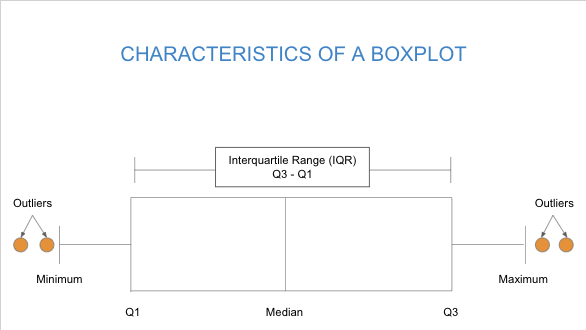
- the interquartile range (sometimes denoted IQR) of a quantitative variable is the quantity Q3–Q1.
The collection of the minimum, first quartile, median, third quartile, and maximum form the five-number summary of the variable.
first and third quartiles
[Perspective video — a 3 instructor video showing how to understand Q1 and Q3 as percentiles and/or quarters of data. See below for the idea:]
- the location of the Q1/25th percentile and Q3/75th percentile on a number line along with other percentile locations such as 10th and 98th along with three ways to think about it:
- 1) “if a student scores in the 10th percentile of a test like the SAT, they have scored higher than only 10% of all the test takers but if they score in the 98th percentile, then their score is higher than 98% of all the test takers.” and
- 2) “percentiles divide data into two parts — the lower part (she scored higher than 98% of the test takers) and the higher part (2% of the test takers scored higher than she did)” and 3) “the 25th percentile (first quartile) splits the data into the lower 25% and the 75% above that; the 50th percentile (2nd quartile) splits the data in half (marked by the median); the 75th percentile (3rd quartile)splits the data into the lower 75% and the 25% of the data above that.”
- 3) Subtracting the value of Q1 from the value of Q3 gives the IQR (the distance between the 25th percentile and the 75th percentile)
- (critics may point out that students will have seen all of this before, which is true but doesn’t acknowledge that students also need a brief refresher at this point.)
Features of a Boxplot
The features of a boxplot include the five-number summary (minimimum, Q1, median, Q3, and maximum) together with the interquartile range (IQR) and any outliers. See the interactive example below for a demonstration of how to find and interpret the five-number summary, calculate the IQR, and discuss the presence of outliers.
interactive example
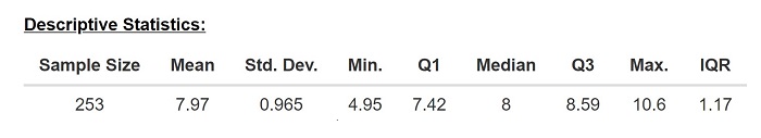
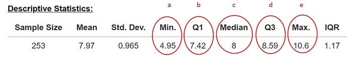
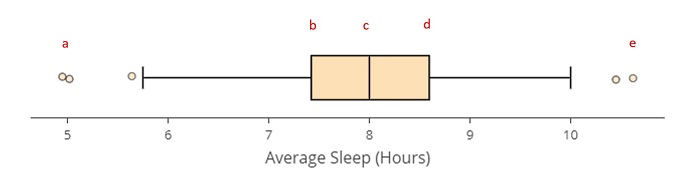
You may recognize the descriptive statistics below as a description of the Sleep Study you explored in Calculating the Mean and Median of a Data Set: What to Know.
You can use the quantitative data analysis tool at https://dcmathpathways.shinyapps.io/EDA_quantitative/ to display the descriptive statistics and boxplot by choosing the data set Sleep Study: Average Sleep and Type of Plot: Boxplot in the tool. But these are also reproduced for you below.
Recall that this data set contains the average number of hours of sleep per night for each of the 253 students in the sleep study.
Sleep Study: Average Sleep
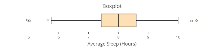
Note that the boxplot produced here is presented along a horizontal axis, from left to right. It is also common to see boxplots displayed along a vertical axis, from bottom to top, least to greatest. In fact, the graph you’ll use to answer the questions later in the text will be displayed vertically.
Use the descriptive statistics and boxplot given here to answer the following for the Sleep Study: Average Sleep data set.
-
-
- Locate the Minimum, First Quartile (Q1), Median, Third Quartile (Q3), and Maximum data values using in the list of Descriptive Statistics presented above and identify them on the graph.
- The plot indicates that about half the students reported getting fewer than _______ hours of sleep per night and half got more than that.
- About a quarter of the students got no more than _______ hours of sleep per night.
- About three-quarters of the students report sleeping up to _____ hours per night.
- About __________ of the students reported sleeping more than 8.59 hours per night.
- What is the interquartile range of this data set?
- The range of numbers considered upper and lower outliers can be found by calculating [latex]1.5\times\text{IQR}[/latex] then locating the values that far below Q1 and above Q3.
-
- Upper outliers are the observations greater than [latex]\text{Q3}+1.5\times\left(\text{IQR}\right)[/latex]
- Lower outliers are the observations less than [latex]\text{Q1}-1.5\times\left(\text{IQR}\right)[/latex].
Use these formulas to identify the outliers in the data set. That is _______ hours of sleep per night or more would be considered an upper outlier, and ________ hours of sleep per night or less would be considered a lower outlier.
-
Show Answer
-
Now it’s your turn to practice calculating and interpreting the features of a boxplot using a real data set.
Five-Number Summary
As we explore the features of boxplots, we will work with part of a data set that reports information about whether drivers involved in a fatal crash were impaired by alcohol.[1] The data set contains [latex]51[/latex] entries corresponding to all [latex]50[/latex] states, as well as Washington, DC.
The following table gives the five-number summary for the percentage of drivers involved in fatal collisions who were alcohol-impaired in all [latex]50[/latex] states and Washington, DC.
| Minimum | First Quartile | Median | Third Quartile | Maximum |
| [latex]16[/latex] | [latex]28[/latex] | [latex]30[/latex] | [latex]33[/latex] | [latex]44[/latex] |
One of the ways to visualize the data using the five-number summary is by creating a boxplot. For questions 1 – 4, refer to the following boxplot, which depicts data about the percentage of drivers involved in fatal collisions who were alcohol-impaired in all [latex]50[/latex] states and Washington, DC. The boxplot is superimposed with the letters A – G labeling different features of the plot.
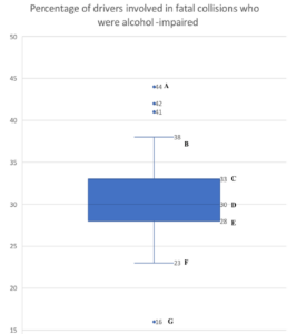
question 1
For questions 2-4, complete each sentence using information from the boxplot above.
question 2
question 3
question 4
Interquartile Range and Outliers
Now, let’s define the idea of an outlier more precisely. Previously, we’ve seen that an outlier is a value that is unusual, given the other values in a data set. But what does “unusual” mean? To be more precise, for data with only one variable, let’s define the define the following:
- upper outlier as an observation that is greater than Q3 + [latex]1.5[/latex] × (IQR); and
- lower outlier as an observation that is less than Q1 – [latex]1.5[/latex] × (IQR).
Use these definitions with the boxplot above question 1 to complete the sentences in questions 5 and 6.
identifying features of a boxplot
[Worked example – a 3-instructor video showing a worked example similar to Questions 5 – 7]
question 5
question 6
Again, referring to the boxplot above Question 1, we saw previously how some of the boxplot’s features relate to the five-number summary, but when outliers are present, the boxplot is modified as shown below.
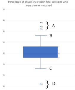
question 7
The following table lists each state in the data set, along with the corresponding percentages of drivers involved in fatal crashes who were impaired by alcohol, in order from lowest percentage to highest percentage. Use this table and the definition of outlier to answer questions 8 -9.
| Drivers Involved in Fatal Crashes by State | |||
| State | Percentage of Drivers Involved in Fatal Crashes and Impaired by Alcohol | State | Percentage of Drivers Involved in Fatal Crashes and Impaired by Alcohol |
| Utah | [latex]16[/latex] | Maine | [latex]30[/latex] |
| Kentucky | [latex]23[/latex] | New Hampshire | [latex]30[/latex] |
| Kansas | [latex]24[/latex] | Vermont | [latex]30[/latex] |
| Alaska | [latex]25[/latex] | Mississippi | [latex]31[/latex] |
| Georgia | [latex]25[/latex] | North Carolina | [latex]31[/latex] |
| Iowa | [latex]25[/latex] | Pennsylvania | [latex]31[/latex] |
| Arkansas | [latex]26[/latex] | Maryland | [latex]32[/latex] |
| Oregon | [latex]26[/latex] | Nevada | [latex]32[/latex] |
| District of Columbia | [latex]27[/latex] | Wyoming | [latex]32[/latex] |
| New Mexico | [latex]27[/latex] | Louisiana | [latex]33[/latex] |
| Virginia | [latex]27[/latex] | South Dakota | [latex]33[/latex] |
| Arizona | [latex]28[/latex] | Washington | [latex]33[/latex] |
| California | [latex]28[/latex] | Wisconsin | [latex]33[/latex] |
| Colorado | [latex]28[/latex] | Illinois | [latex]34[/latex] |
| Michigan | [latex]28[/latex] | Missouri | [latex]34[/latex] |
| New Jersey | [latex]28[/latex] | Ohio | [latex]34[/latex] |
| West Virginia | [latex]28[/latex] | Massachusetts | [latex]35[/latex] |
| Florida | [latex]29[/latex] | Nebraska | [latex]35[/latex] |
| Idaho | [latex]29[/latex] | Connecticut | [latex]36[/latex] |
| Indiana | [latex]29[/latex] | Rhode Island | [latex]38[/latex] |
| Minnesota | [latex]29[/latex] | Texas | [latex]38[/latex] |
| New York | [latex]29[/latex] | Hawaii | [latex]41[/latex] |
| Oklahoma | [latex]29[/latex] | South Carolina | [latex]41[/latex] |
| Tennessee | [latex]29[/latex] | North Dakota | [latex]42[/latex] |
| Alabama | [latex]30[/latex] | Montana | [latex]44[/latex] |
| Delaware | [latex]30[/latex] | ||
question 8
question 9
question 10
Now, let’s calculate the mean using technology and compare it to the median.
Go to the Describing and Exploring Quantitative Variables tool at https://dcmathpathways.shinyapps.io/EDA_quantitative/.
Step 1) Select the Single Group tab.
Step 2) Locate the dropdown under Enter Data and select From Textbook.
Step 3) Locate the drop-down menu under Data Set and select Bad Drivers (alcohol).
Step 4) Use the tool to compute the mean percentage of drivers involved in fatal collisions who were alcohol-impaired.
question 11
Outliers and Shape
Were you surprised by the actual difference in the mean and median in the data set Bad Drivers (alcohol)? Or did the tool only confirm your suspicion that the data set was roughly symmetrical? Boxplots, like histograms and dotplots, can also tell us about the shape of a distribution.
Interactive example
Recall the effect that skew has on the relationship between the mean and median in a data set. A right-skewed data set will pull the mean to the right of the median while a left-skewed data set will pull the mean to the left. We can use visual clues to observe the skew in a boxplot in the same way that we can in a histogram or a dotplot.
The descriptive statistics and graphs below describe the data set Oscars: Age, which you explored in Visualizing Quantitative Data: What to Know. Let’s use these to understand how to see the shape of a data set from a boxplot.

- Do you notice any skew in the histogram of this data set?
- Can you point out the corresponding outliers in the boxplot of the data?
- What is the relationship between the mean and median of the data? Is the mean less than, greater than, or roughly similar to the median?
- What can you conclude about the shape of the data?
- What visual clue in the boxplot led to your conclusion?
Now you try identifying the shape of the data sets represented by the boxplots in Question 12 below.
question 12
Summary
In this section, you’ve learned about boxplots: how to calculate the five-number summary, how to read these numbers from a boxplot, and how to identify outliers in a data set using the interquartile range. Let’s summarize where these skills showed up in the material.
- In Questions 1 and 7, you identified the features of a boxplot.
- In Questions 2 – 4, you interpreted the features of a boxplot.
- In Questions 5, 6, 8, and 9, you identified outliers in a data set.
- In Questions 10 – 12, you related the boxplot of a quantitative variable to its distribution.
Being able to calculate and identify features of a boxplot and relate the boxplot and distribution of a quantitative variable are necessary statistical skills and will be used in the next activity. If you feel comfortable with these skills, please move on!
- Chalabi, M. (2014, October 24). Dear Mona, which state has the worst driver? FiveThirtyEight. https://fivethirtyeight.com/features/which-state-has-the-worst-drivers/ ↵
