Learning Objectives
- Describe the distribution of quantitative data using a histogram.
We now use histograms to compare the distributions of a quantitative variable for two groups of individuals. Previously, we did a similar comparison using dotplots. As before, our descriptions focus on the overall pattern (shape, center, and spread) as well as deviations from the pattern (outliers). We also use percentages to describe and compare different intervals of variable values, since histograms make it easy to do so.
Example
Smoking and Birth Weight
Does smoking during pregnancy have an impact on birth weight? To investigate this question, doctors collected data on 189 new mothers who gave birth at a hospital in Massachusetts during the 1980s.
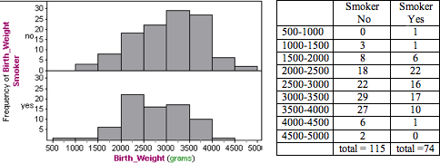
Here we use histograms to compare the distribution of birth weights for mothers who smoked during pregnancy with mothers who did not smoke. The table shows the numbers of mothers with babies in each interval of birth weights. (Left endpoints are included in the bin, so a 1,000-gram baby is in the interval 1,000–1,500 grams.)
Note: For easy and more accurate visual comparisons, both histograms have the same horizontal scale and bin width. Also, the scale on the vertical axis is the same. So we can directly compare the heights of the bars to compare the number of mothers with babies in each interval of birth weights.
Following are some observations about the shape, center, and spread:
Nonsmokers: The distribution of birth weights for the nonsmokers appears skewed slightly to the left. We estimate that birth weights for this group fall between approximately 1,000 and 5,000 grams for an overall range of approximately 4,000 grams. For nonsmokers, nearly half of the babies have a birth weight between 3,000 and 4,000 grams (29 + 27 = 56, 56/115 = 48.7%) with fewer babies in the lower weight ranges.
Smokers: The distribution of birth weights for the smokers appears slightly skewed to the right. We estimate the birth weights for this group fall between approximately 500 and 4,500 grams for an overall range of approximately 4,000 grams. For smokers, nearly half of the babies have a birth weight between 2,000 and 3,000 grams (16 + 22 = 38, 38 / 74 = 51%) with fewer babies in heavier weight ranges.
Comment: As we have seen, the choice of bin width can affect the shape of a histogram. We also cannot make precise statements about center and spread because our sense of “typical” range is also affected by the choice of bin width.
Another strategy for comparing distributions is to use a benchmark. Here are some examples:
- Doctors define low birth weight as a birth weight below 2,500 grams. Calculate and compare the percentage of smokers and nonsmokers with low-birth-weight babies by this definition.Nonsmokers: Of babies born to mothers who did not smoke, 3 + 8 + 18 = 29 weighed less than 2,500 grams, so 25.2% (29 of 115) of the babies born to nonsmokers fit the definition of low birth weight.Smokers: Of babies born to mothers who smoked, 1 + 1 + 6 + 22 = 30 weighed less than 2,500 grams, so 40.5% (30 of 74) of the babies born to smokers fit the definition of low birth weight.
- A condition called macrosomia (also known as big baby syndrome) is defined as a birth weight of 4,000 grams or more. Calculate and compare the percentage of smokers and nonsmokers with babies that fit the definition of macrosomia.Nonsmokers: Of babies born to mothers who did not smoke, 6 + 2 = 8 weighed 4,000 grams or more, so 7.0% (8 of 115) of the babies born to nonsmokers fit the definition of macrosomia.Smokers: Of babies born to mothers who smoked, only 1 weighed 4,000 grams or more, so 1.4% (1 of 74) of the babies born to smokers fit the definition of macrosomia.
Now we synthesize these observations into a paragraph.
Tip: Be sure to emphasize the comparison of the groups. Develop a thesis statement if appropriate.
In this observational study, we compared mothers who smoked during pregnancy to mothers who did not smoke during pregnancy. The variable is the birth weights of their babies. Both groups had a lot of variability in birth weights, with identical overall range estimates of 4,000 grams.
There was also a lot of overlap in the distributions. Nonsmokers had babies that weighed between approximately 1,000 and 5,000 grams. Smokers had babies that weighed between approximately 500 and 4500 grams.
However, we also observe some important differences in the typical ranges of birth weights for the two groups. For nonsmokers, nearly half of the babies have a birth weight between 3,000 and 4,000 grams (56 out of 115, 48.7%) with fewer babies in the lower weight ranges. For smokers, nearly half of the babies have a birth weight between 2,000 and 3,000 grams (40 of 74, 54%) with fewer babies in heavier weight ranges.
If we use the medical definition of low birth weight (under 2,500 grams), we see that smokers in this study have a much higher incidence of low birth weights: 25.2% (29 of 115) of the babies born to nonsmokers fit the definition of low birth weight, compared to 40.5% (30 of 74) of the babies born to smokers. In this study, smoking is associated with lower birth weights, though the variability in the data suggests that other variables also contribute to birth weight.
Learn By Doing
Let’s Summarize
In “Distributions for Quantitative Data,” we focused on describing the distribution of a quantitative variable.
- In a graph that summarizes the distribution of a quantitative variable, we can see
- the possible values of the variable.
- the number of individuals with each variable value or interval of values.
- To analyze the distribution of a quantitative variable, we described the overall pattern of the data (shape, center, spread), and any deviations from the pattern (outliers).
- We described the shape of a distribution as left-skewed, right-skewed, symmetric with a central peak (bell-shaped), or uniform. Not all distributions have a simple shape that fits into one of these categories.
- The center of a distribution is a typical value that represents the group. We discuss ways to identify the center of a distribution in “Measures of Center.”
- The spread of a distribution is a description of how the data varies. One measurement of spread is the overall range of the data (largest value – smallest value). We also looked at a typical range of values. We discuss ways to identify a typical range in “Quantifying Variability Relative to the Median” and “Quantifying Variability Relative to the Mean.”
- Outliers are data points that fall outside the overall pattern of the distribution.
- We used two types of graphs to analyze the distribution of a quantitative variable:
- Dotplots
- Histograms
- Following are some observations about dotplots:
- Individual variable values are visible, particularly when the data set is small.
- Descriptions of shape, center, and spread are not affected by how the dotplot is constructed.
- We can accurately calculate the overall range (largest value – smallest value).
- Following are some observations about histograms:
- Individual variable values are not visible.
- Grouping individuals into bins of equal-sized intervals is particularly useful when analyzing large data sets.
- We can easily use percentages, also called relative frequencies, to describe the distribution.
- Descriptions of shape, center, and spread are affected by how the bins are defined.
- How do we decide when to use a dotplot and when to use a histogram? There are no rules here. Each type of graph can highlight different aspects of the data.
Candela Citations
- Concepts in Statistics. Provided by: Open Learning Initiative. Located at: http://oli.cmu.edu. License: CC BY: Attribution