Histograms
Recall that a histogram visualizes the distribution of a quantitative variable by displaying rectangular bars representing the frequencies (height of the bar) for intervals of data values called bins (width of the bar). Variability can be judged from a histogram by examining the distance of the bars from the statistical center (mean or median) of the graph. If the variability is high, equally sized or taller bars will appear away from the center of the graph. It the variability is low, the data will appear clustered around the center.
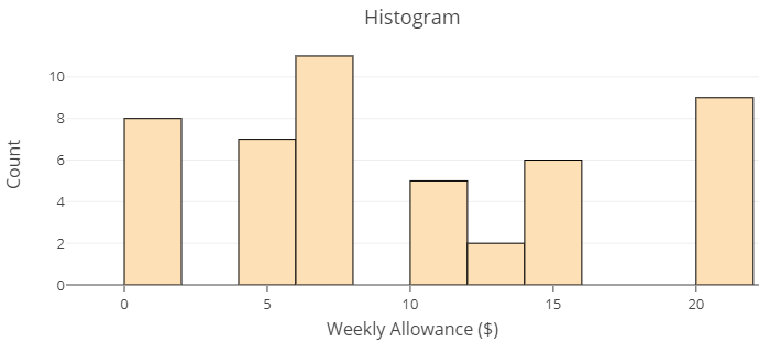
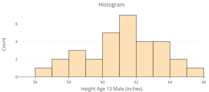
The images below show distributions of two different data sets using histograms. The first histogram displays the distribution of responses given by parents of thirteen year old children to the question, “how much allowance do you give weekly?” The second is a distribution of the heights in inches of [latex]31[/latex] thirteen year old boys attending the same middle-school. Use these histograms to answer Question 1 below.
question 1
Dotplots
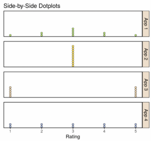
A dotplot indicates the variability of the data or the extent to which each observation differs from other observations. It can be easier to visualize variability using a dotplot than using a histogram because of the individual observations visible in the dotplot. Use the side-by-side dotplots in the image below to answer Questions 2 and 3.
Ten customers rated four different smartphone apps. The customer ratings for the four different apps are shown in the following dotplots. The mean for each app is equal to 3. Even though the mean, [latex]\bar{x}[/latex], is the same for each app, the dotplots for each app look very different.
question 2
question 3
Continue to the next page to see how you can use technology to obtain descriptive statistics.