Learning Goals
After completing this section, you should feel comfortable performing these skills.
- Read and interpret a two-way table.
- Make comparisons of different groups using side-by-side bar graphs.
- Make comparisons of different groups using stacked bar graphs.
- Identify the differences between side-by-side and stacked bar graphs.
Click on a skill above to jump to its location in this section.
In the upcoming activity, you will need a basic understanding of how contingency tables, stacked bar charts, and side-by-side bar charts are used to describe and analyze data on a single categorical variable for multiple populations or groups. To develop this understanding, let’s begin by recalling how we use a more familiar graphical display (a pie chart) to represent a categorical variable for a single population by analyzing percentages of votes cast for presidential candidates.
Visualizing a Categorical Variable for One Population
recall
Which types of displays are appropriate for a categorical variable?
Core skill:
Example
Recall the techniques you used in What to Know About Displaying Categorical Data: 3A to read and interpret the following chart, which describes how people in America voted in the 2016 presidential election.[1] Take a moment to familiarize yourself with the chart, then answer Questions 1 – 3 below.
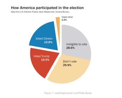
a) According to the chart above, what percentage of people living in the United States did not participate in the 2016 presidential election?
b) We can see from the chart that more people did not participate than those who did. A large percentage of those were deemed “ineligible to vote.”
Use the Internet to find out what it means to be “ineligible to vote” in a U.S. presidential election. Select all groups from the list below that can be deemed “ineligible” within the United States.
- American adults living in Puerto Rico
- American adults living in Guam
- American adults who at one time were convicted of felony crimes
- Americans under the age of 18
- American adults who are deemed mentally incapacitated
- Non-citizens and Dreamers (people living in the United States under DACA)
- All of the above
c) The variable of interest shown in the chart could be defined as “Voter Choice,” with five possible values:
Clinton, Trump, Other, Ineligible to vote, and Chose not to vote.
What is the best description of the population(s) of interest? There is only one correct answer.
-
- Three populations of interest: Republicans, Democrats, and Other
- Fifty populations of interest: One for every state that makes up our electoral college
- One population of interest: All people living in the United States
We’ve seen that a pie chart is a good visual representation of a categorical variable (Voter Choice) from a single population or group (people living in the United States). But what can we do if we want to compare a categorical variable across multiple groups?
Let’s use the variable from the data above, but instead of grouping all Americans together as a single population of interest, we’ll focus on just the voters in a presidential election.
Displaying a Categorical Variable Across Multiple Populations or Groups
In this example, we’ll explore how to display and interpret changes in a categorical variable of interest (Voter Choice) when comparing multiple populations or groups of interest (Black, White, Latinx, Asian, and Other). We will then convert tables of data called contingency tables (or two-way tables) into stacked bar charts and side-by-side bar charts and make comparisons.
The 2016 presidential race was very different from the one in 2020. In 2016, fewer people turned out to vote,[2] more people were deemed ineligible ([latex]6[/latex] million felons in 2016[3] compared to [latex]5.1[/latex] million felons in 2020),[4] and the election results were much closer. In 2016, Hillary Clinton won the popular vote, and fewer than [latex]80,000[/latex] votes out of [latex]137[/latex] million votes cast determined the outcome of Donald Trump being selected as our president.[5]
Looking to our future, one question might be “If we increase legitimate voter participation, will one party benefit?” We can better answer this question if we study the voting patterns of different groups within the United States.
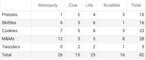
Contingency Tables (Two-Way Tables)
CNN used an exit poll to estimate the presidential 2020 voting patterns by race.[6] The following is a table of the results, where the rows describe the different groups of people of interest (White, Black, Latinx, Asian, and Other) and the columns represent the vote choices (Biden, Trump, or Other).
reading a contingency table
[Worked Example Video — a 3-instructors video illustrating the how to read a contingency table (how to see a single categorical variable measured on different sub-groups of a larger population — and how the data in the table is distributed into stacked and side-by-side bar charts]
| Presidential 2020 Voting Patterns by Race | |||
| Biden | Trump | Other | |
| White | [latex]41[/latex] | [latex]58[/latex] | [latex]1[/latex] |
| Black | [latex]87[/latex] | [latex]12[/latex] | [latex]1[/latex] |
| Latinx | [latex]65[/latex] | [latex]32[/latex] | [latex]3[/latex] |
| Asian | [latex]61[/latex] | [latex]34[/latex] | [latex]5[/latex] |
| Other | [latex]55[/latex] | [latex]41[/latex] | [latex]4[/latex] |
Among Asians, for example, [latex]61[/latex]% voted for Biden, [latex]34[/latex]% voted for Trump, and the remaining [latex]5[/latex]% voted for someone else.
question 1
Because this table displays the results of two categorical variables simultaneously, it is called a two-way table. It is also called a contingency table. The advantage of a contingency table is you can see each precise percentage of responses (or count of responses). A disadvantage is that the table does not present a strong visual comparison between the groups. Distributing the data from a contingency table into a stacked bar chart or side-by-side bar chart can help us visually compare the groups.
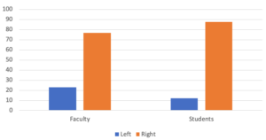
Side-by-side Bar Graphs
Side-by-side bar graphs present data for two categorical variables from more than one group by creating two bars on the chart for each group — one bar for each variable. See the interactive example below for a demonstration.
Example
Say a sample of the members of four student organizations at your college were asked whether they preferred chocolate ice cream or vanilla. Here is a contingency table containing a summary of their responses.
| Student Organization | Chocolate | Vanilla |
| A | 23 | 12 |
| B | 13 | 15 |
| C | 9 | 21 |
| D | 17 | 14 |
The side-by-side bar chart below contains the same data as the two-way table above. Each of the four groups are represented along the horizontal axis with two vertical bars indicating the frequency of their responses, one for chocolate preference and one for vanilla. The key to the right of the chart identifies which bar is which by color.
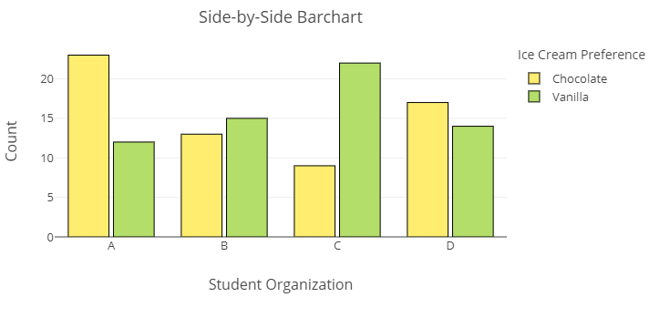
- Which organization shows a clear preference for chocolate?
- Which organization shows a clear preference for vanilla?
- Which display, the table or the chart, is easier for understanding precise counts for each variable? Which gives a strong visual comparison between the groups?
See the video below for a perspective on reading a side-by-side bar graph.
Reading a side-by-side Bar Graph
[We can insert another short video demonstration of how to read this graph.]–> this video would be great from 1:38-2:10
Now let’s turn back to the table of voting patterns we looked at above and compare it to a side-by-side graph containing the same information.
For Questions 2–5, refer to the standard side-by-side bar chart below, which contains the exact same information about 2020 voting patterns as the two-way table above.
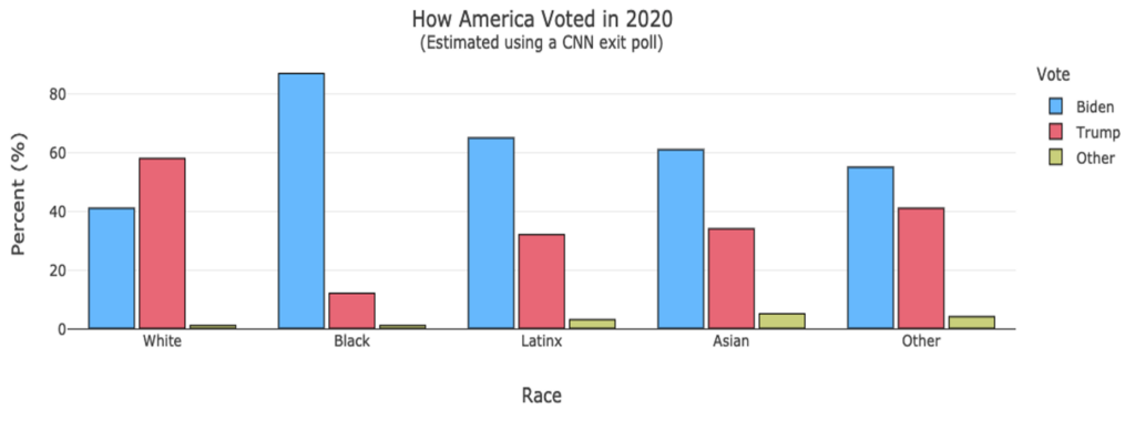 The groups of interest are listed on the horizontal axis (Whites, Blacks, Latinx, Asian, and Other) and the percentages associated with each voter choice are on the vertical axis. Note: within each group, the heights of the three bars sum to total [latex]100[/latex], representing [latex]100[/latex]% of all responses within that group. Also, since this side-by-side bar chart chose to represent percentages within groups (as opposed to the numbers of actual ballots cast within groups), you cannot make conclusions about counts of votes; rather, you can make conclusions about relative proportions or percentages within each group.
question 2
question 3
question 4
question 5
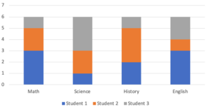
Stacked Bar Graphs
At this point, students will be presented with two datasets. They will be able to choose which one they would like to use to answer example questions.
Stacked bar graphs display the same type of data as a contingency table (two-way table) and a side-by-side bar graph. This type of chart offers a different perspective of a visual comparison between the groups. See the interactive example below for a demonstration.
Example
Recall the contingency table containing a summary of responses collected from members of four student organizations
Say a sample of the members of four student organizations at your college were asked whether they preferred chocolate ice cream or vanilla. Here is a contingency table containing a summary of their responses.
| Student Organization | Chocolate | Vanilla |
| A | 23 | 12 |
| B | 13 | 15 |
| C | 9 | 21 |
| D | 17 | 14 |
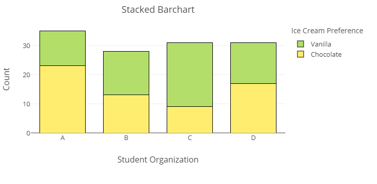
- True or false: the stacked bar chart shows that more students in organization C preferred chocolate than students in organization A.
- Which organization does the graph indicate has the greatest preference for chocolate ice cream?
Reading a stacked Bar Graph
[We can insert another short video demonstration of how to read this chart.]–> this video is pretty cool from 0:18-2:14
For Questions 6 and 7, consider the following standard stacked bar chart showing the exact same information as the previous table and side-by-side bar chart.
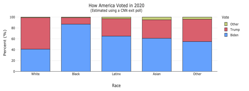
In this stacked bar chart, each bar represents the responses of one group. The height of each color within that bar represents a percentage of a particular response, and the combination of all colors represents the total ([latex]100[/latex]%) of all responses within that group. Like the side-by-side bar chart where percentage is plotted along the vertical axis, you cannot make conclusions or comparisons regarding the absolute counts of responses within or between groups.
Note: A single stacked bar chart is very similar to a pie chart, but it uses rectangular regions rather than pie slices to represent each category.
question 6
question 7
When to use Side-by-Side vs. Stacked Bar Graphs
Note the difference between a side-by-side bar graph and a stacked bar graph displaying the same information. Each is useful to display a categorical variable across multiple groups. They only differ depending upon the perspective of the information you wish to present. A side-by-side bar graph is similar to a bar graph. If you felt a bar graph would best display your data, but you don’t want to use separate bar graphs (one for each group), then use a side-by-side bar graph to combine the two-way data into a single graph. If you felt a pie chart would best display your data, but didn’t want to use separate pie charts for each group, you could use a stacked bar graph to combine all three groups into one graph.
Example
A sample of members from four student organizations where asked whether they prefer chocolate or vanilla ice cream.
Their responses are shown below in both a side-by-side barchart and a stacked barchart.
- Which type of graph is more like a set of pie charts?
- Which type of graph allows you to represent a collection of bar graphs all in the same display?
stacked versus side-by-side bar chart
[Perspective video — a 3-instructor video showing how to think which kind of display to use for which situation (advantages and disadvantages): stacked vs side-by-side bar chart.]
question 8
question 9
Summary
In this section, you’ve seen representations of voter patterns by race in the 2020 presidential election. In the following Forming Connections activity, we’ll explore the possibility of making predictions about how future election outcomes by asking a research question about racial composition in the United States. Let’s summarize all the skills and tasks you’ve applied so far before you dive into the next activity.
- In Questions 1 – 3, you read and interpreted information from a pie chart.
- in Question 4, you read and interpreted information from a two-way (contingency) table.
- In Questions 5 – 8, you read and interpreted a side-by-side bar chart.
- In Questions 9 – 10, you read and interpreted a stacked bar chart.
- In Questions 11 – 12, you explained the differences between side-by-side charts and stacked bar charts.
Pie charts are good tools for visualizing a single categorical variable for multiple populations or groups. When we want to display and interpret changes in a categorical variable of interest while comparing multiple populations or groups, we can organize the data into a contingency table (two-way table), which we can then convert into side-by-side bar charts or stacked bar charts. These kinds of charts provide a stronger visual comparison between the groups than the two-way table does.
If you feel comfortable with these ideas, it’s time to move on to Forming Connections in the next activity!
- Bump, P. (2016, November 16). A lot of nonvoters are mad at the election results. If only there were something they could have done. The Washington Post. https://www.washingtonpost.com/news/the-fix/wp/2016/11/16/a-lot-of-non-voters-are-mad-at-the-election-results-if-only-there-was-something-they-could-have-done/ ↵
- Schaul, K., Rabinowitz, K., & Mellnik, T. (2020, December 28). 2020 turnout is the highest in over a century. The Washington Post. https://www.washingtonpost.com/graphics/2020/elections/voter-turnout/ ↵
- Uggen, C., Larson, R., & Shannon, S. (2016, October 16). 6 million lost voters: State-level estimates of felony disenfranchisement, 2016. The Sentencing Project. https://www.sentencingproject.org/publications/6-million-lost-voters-state-level-estimates-felony-disenfranchisement-2016/ ↵
- Maxouris, C. (2020, October 15). More than 5 million people with felony convictions can’t vote in this year’s election, advocacy group finds. CNN. https://www.cnn.com/2020/10/15/us/felony-convictions-voting-sentencing-project-study/index.html ↵
- Why voting matters: Supreme Court edition. (2018, June 28). Axios. Retrieved from https://www.axios.com/hillary-clinton-2016-election-votes-supreme-court-liberal-justice-1b4bc4fc-9fad-44b4-ab54-9ef86aa9c1f1.html ↵
- Exit polls. (2020). CNN Politics. Retrieved from https://www.cnn.com/election/2020/exit-polls/president/national-results ↵