What you’ll need to know
In this support activity you’ll become familiar with the following:
- Read and interpret a data table and data dictionary.
- Create a histogram from a data set using technology.
- Use a histogram to answer questions about a variable.
You will also have an opportunity to refresh the following skills:
In the section, Applications of Histograms: What to Know, and in the following activity, you will need to be able to use technology to visualize the distribution of quantitative variables and use the visualization to answer questions about the distribution.
Analyzing Course Evaluations
In this corequisite support activity, you will use the evals data set,[1] which includes information collected from student evaluations for a sample of [latex]463[/latex] courses taught by [latex]94[/latex] professors at The University of Texas at Austin. Each row is a different course, and the columns have information about the professor and summary information from the course.
The objective of this analysis is to explore the distribution of age of the professor for the [latex]463[/latex] courses. To do so, you’ll use technology to make a histogram to visualize the distribution of professor ages.
Data Tables
A data table contains raw data, collected observation by observation. The columns of the table list the variables for each observation. Each row contains data collected from one observational unit. See the demonstration in the interactive example below to understand how to read the table.
interactive example
A few observations of the Teaching Evaluations data table have been extracted and are shown here along with the data dictionary. The data displayed in each row was collected from a different course taught at the university.
| Teaching Evaluations |
||||
| score | rank | cls_profs | cls_students | age |
| [latex]4.7[/latex] | tenure track | single | [latex]43[/latex] | [latex]36[/latex] |
| [latex]4.6[/latex] | tenured | multiple | [latex]20[/latex] | [latex]59[/latex] |
| [latex]3.9[/latex] | tenured | single | [latex]195[/latex] | [latex]51[/latex] |
- score: Average professor evaluation score
- rank: Rank of professor (teaching, tenure track, tenured)
- cls_profs: Number of professors teaching sections in course in sample (single, multiple)
- cls_students: Number of students in the class
- age: Age of professor in years
- What was the rank of the professor teaching the course section that had an average professor evaluation score of [latex]4.6[/latex]?
- What was the average professor evaluation score taught by a [latex]36[/latex] year old tenure track professor?
- How many students were in the course section with the score of [latex]3.9[/latex]?
- How many professors taught the course section with [latex]43[/latex] students in the class?
The first [latex]10[/latex] observations of the selected variables within the “Teaching Evaluations” data set are displayed in the following table. Use it to answer Questions 1 and 2 below.
| Teaching Evaluations |
||||
| score | rank | cls_profs | cls_students | age |
| [latex]4.7[/latex] | tenure track | single | [latex]43[/latex] | [latex]36[/latex] |
| [latex]4.1[/latex] | tenure track | single | [latex]125[/latex] | [latex]36[/latex] |
| [latex]3.9[/latex] | tenure track | single | [latex]125[/latex] | [latex]36[/latex] |
| [latex]4.8[/latex] | tenure track | single | [latex]123[/latex] | [latex]36[/latex] |
| [latex]4.6[/latex] | tenured | multiple | [latex]20[/latex] | [latex]59[/latex] |
| [latex]4.3[/latex] | tenured | multiple | [latex]40[/latex] | [latex]59[/latex] |
| [latex]2.8[/latex] | tenured | multiple | [latex]44[/latex] | [latex]59[/latex] |
| [latex]4.1[/latex] | tenured | single | [latex]55[/latex] | [latex]51[/latex] |
| [latex]3.4[/latex] | tenured | single | [latex]195[/latex] | [latex]51[/latex] |
| [latex]4.5[/latex] | tenured | single | [latex]46[/latex] | [latex]40[/latex] |
The following is a data dictionary of the selected variables:
- score: Average professor evaluation score
- rank: Rank of professor (teaching, tenure track, tenured)
- cls_profs: Number of professors teaching sections in course in sample (single, multiple)
- cls_students: Number of students in the class
- age: Age of professor in years
question 1
question 2
Histograms
Go to the Describing and Exploring Quantitative Variables tool at https://dcmathpathways.shinyapps.io/EDA_quantitative/ and select the data set Teaching Evaluations – Age” to make a histogram of the distribution of professor ages. Select Binwidth to 5.
question 3
Answering Questions
Use the histogram to answer the following questions. You may wish to refresh the mathematical skill needed for Question 4 in the recall box before beginning. Also see the Student Resources: Fractions, Decimals, Percentages and Ratios and Fractions.
Recall
For question 4 below, recall from 1E and 2D Corequisite Activities how to write a proportion.
Core Skill:
interactive example
In Questions 4 – 7, you’ll use the histogram you created for the variable age to answer questions about the data. Let’s answer a few practice questions to warm up.
Here is an image of the histogram you created. You can hover over the bars of the graph in the tool to get information about count and endpoints for the bins. Use the histogram in your tool to answer the following questions.
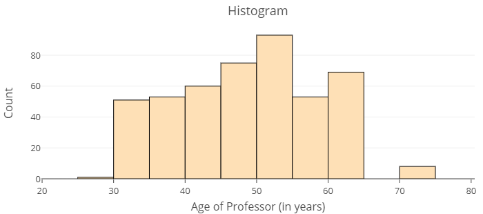
- About what proportion of courses are taught by a professor older than 60? Remember to hover over the bars of the graph in the tool to get the counts. The sample size is given in Descriptive Statistics.
- What does the graph suggest for the median age, and what does the median imply for the data?
- Which would be more likely: that a course is taught by a professor close to 32 years old or 62 years old?
Now it’s your turn to try answering questions about the data using a histogram.
question 4
question 5
question 6
question 7
Now that you’ve gained some valuable practice creating and interpreting a histogram, it’s time to move on to the next section and activity.
- Professor evaluations and beauty. (n.d.). OpenIntro. Retrieved from https://www.openintro.org/data/index.php?data=evals ↵