objectives for this activity
During this activity, you will:
Click on a skill above to jump to its location in this activity.
video placement
[Intro: The data set used in this activity comes from the independent Tax Policy Center, a non-partisan group. We’ll look at the Tax Policy Center’s distributional tables of tax cuts by income levels, which were constructed in February 2018, in order to apply public policy analysis to a tax reform bill signed into law in 2017. Specifically, we’ll use this situation to explore how boxplots can be used to compare distributions across several populations and draw inferences about them. As you read the two quotes at the start of the activity, consider the differences in them and ways in which you might investigate the accuracy of their claims.]
Good Tax Policy?

Read these two quotes about the U.S. 2017 Tax Reform bill:[1]
“We’re doing everything we can to reduce the tax burden on you and your family. By eliminating tax breaks and loopholes, we will ensure that the benefits are focused on the middle class, the working men and women, not the highest income earners. Our framework includes our explicit commitment that tax reform will protect low-income and middle-income households, not the wealthy and well connected.” – President Donald Trump in 2017, prior to the bill’s enactment[2]
“You remember just a few years ago when Trump and my Republican colleagues voted for almost $[latex]2[/latex] trillion in tax breaks for the wealthiest people in this country and the largest corporations.” – Bernie Sanders in 2021, after the bill was enacted[3]
question 1
In this activity, you’ll see how to use a boxplot to provide a visual summary of a quantitative variable, and how boxplots can be used to compare the distributions of multiple populations. Since we’ll be using data from the Tax Policy Center to analyze the claims made in the two quotes above, let’s first investigate a statement the Center made about the average tax cut experienced from the law.
According to the independent Tax Policy Center, the average income tax cut as a result of the law was $[latex]1,260[/latex].[4] However, as we’ve seen before, averages can be misleading and uninformative. Two boxplots are provided below, each displaying a hypothetical distribution of [latex]5,000[/latex] tax cuts that would result in a mean tax cut of $[latex]1,260[/latex].
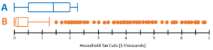
Comparing Multiple Distributions
question 2
question 3
Now, let’s compare these distributions.
question 4
question 5
question 6
question 7
question 8
Drawing inferences from boxplots
Now let’s look at the data from the 2017 Tax Reform bill.
The data from the Tax Policy Center in the table below separates income groups into quintiles. Quintiles divide data sets into five parts, from the lowest [latex]20[/latex]% of values up to the highest [latex]20[/latex]% of values.
The Tax Policy Center released the following data about the actual tax cuts households experienced because of the 2017 Tax Reform bill.[5]
| Household Tax Cuts | |
| Income Group | Mean Tax Cut |
| Lowest Quintile | $[latex]40[/latex] |
| Second Quintile | $[latex]320[/latex] |
| Middle Quintile | $[latex]780[/latex] |
| Fourth Quintile | $[latex]1,480[/latex] |
| Top Quintile | $[latex]5,790[/latex] |
| Top 1 Percent | $[latex]32,650[/latex] |
| Top 0.1 Percent | $[latex]89,060[/latex] |
question 9
question 10
question 11
question 12
video placement
Wrap up: “There are many perspectives to take and questions to answer when trying to sort out as complicated a situation as this one. We are only presented a small amount of information in this activity so we limited ourselves to questions we could answer using the data we had. It is of interest, though, to compare these tax cuts given in dollar amounts to their equivalencies in terms of percent of peoples’ incomes. [voice over the table given in the hidden text below]. The Tax Policy Center also provides this information. The top income groups received both the largest cuts in dollar amounts but also the largest percent growth in after-tax income as a result of the bill (the top 0.1 percent don’t follow this trend, however). But hopefully you’ve been able to understand from this activity how boxplots provide a quick glance, a summary, of the data to make comparisons based on median, skew, outliers, and percentiles. Let’s take a look at a few general five-number summaries to make sure you feel good about what you’ve learned here.” — Provide a few five-number summaries and ask students to sketch boxplots of them. Then show the answers for comparison. — “You’ve seen that boxplots provide visual summaries of quantitative variables that can be used to compare the distributions of multiple populations. Hopefully, you feel that you are now comfortable using boxplots to compare and draw inferences.”
- Data and lesson context adapted from Skew the Script, www.skewthescript.org ↵
- Administration of Donald J. Trump. (2017, September 27). Remarks in Indianapolis, Indiana. Govinfo.gov. https://www.govinfo.gov/content/pkg/DCPD-201700693/html/DCPD-201700693.htm ↵
- Cooper, A. (Interviewer). (2021, January 29.). CNN. ↵
- Tax Policy Center. (2018, February 16). T18-0025 - The Tax Cuts and Jobs Act (TCJA): All provisions and individual income tax provisions; distribution of federal tax change by expanded cash income percentile, 2018. htpps://www.taxpolicycenter.org/model-estimates/individual-income-tax-provisions-tax-cuts-and-jobs-act-tcja-february-2019/t18-0025 ↵
- Tax Policy Center. (2018, February 16). T18-0025 - The Tax Cuts and Jobs Act (TCJA): All provisions and individual income tax provisions; distribution of federal tax change by expanded cash income percentile, 2018. https://www.taxpolicycenter.org/model-estimates/individual-income-tax-provisions-tax-cuts-and-jobs-act-tcja-february-2018/t18-0025 ↵