What you’ll need to know
In this support activity you’ll become familiar with the following:
- Compare a single variable across groups using dotplots.
- Compare a single variable across groups using histograms.
You will also have an opportunity to refresh the following skills:
In the next section of the course material you will refresh your knowledge of mean and median by calculating them for a small data set. In the following activity, you’ll use technology to calculate them for larger data sets in order to read, interpret, and make comparisons of centers between histograms. In this support activity, you’ll review reading and interpreting graphs that display the distribution of quantitative data, dotplots and histograms.
Graphical Displays Illustrating Frequency
Let’s begin by re-visiting data from a sleep study [1] of college students that we saw in Forming Connections in Displaying Categorical Data: 3A. We’ll explore and compare the distributions of a few of the numerical variables from the study, including alcoholic drinks consumed per week, hours of sleep per night on the weekends, and classes missed in a semester.
Dotplots
Below we are given a dotplot for the variable Alcoholic Drinks Per Week. Recall that a dotplot is used to display the frequency and distribution of a quantitative variable. Use this dotplot to answer Questions 1-3.
Recall
You may wish to refresh your understanding of how data is represented in a dotplot.
Core skill:
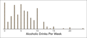
In order to use a graphical display to answer questions about the data set, it helps to first ask yourself a question or two to become familiar with the visualization. We’d like to know what information this dotplot conveys about the participating students in the study. Then we can use it to answer questions about the data. Question 1 will help orient you to the information presented in the dotplot. Questions 2 and 3 ask specifically about the data.
question 1
Now that you are familiar with the information presented in the display, you can use it to answer questions about the data.
question 2
question 3
Next, we’ll see how a histogram presents information about the distribution of a quantitative variable.
Histograms
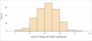
Below we are given a histogram for the variable Hours of Sleep Per Night (Weekend). Recall that a histogram displays the distribution of a quantitative variable but, unlike the dotplot in which each observation is stacked above each value appearing, a histogram gathers groups of observations up into its bars.
recall
You may wish to refresh your understanding of how data is represented in a histogram.
Core skill:
Use the following histogram to address Questions 4-7.
As you did with for the dotplot above, first orient yourself to the information conveyed in the histogram by answering Question 4. Then, compare and contrast the histogram to the dotplot in Question 5. Finally, read and interpret the histogram to answer Questions 6 and 7.
question 4
Now that you are familiar with the information presented in the histogram, look back at the dotplot and consider general differences and similarities in the two types of displays.
question 5
Histograms are more commonly encountered than dotplots as a visualization of quantitative data since they can more concisely display large data sets. Dotplots are more appropriate for smaller sets of data in which the observations (the dots) are not overwhelmingly numerous.
Now use the histogram to answer questions about the variable Hours of Sleep Per Night (Weekend).
question 6
question 7
Let’s examine the distribution of a variable from another data set.
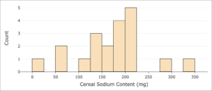
The histogram below displays the frequency of sodium content per serving for [latex]20[/latex] different varieties of cereals.[2]
question 8
question 9
Comparing Variables Across Groups
Now let’s make comparisons of a single variable across two groups using first dotplots, then histograms.
interactive example
When making comparisons of a single variable across two groups, we are often looking for clues that let us know which group is larger or in which group more data appears to the left or right of a particular value of the variable.
- Based on what you know about dotplots and histograms, which graph would be more helpful for determining which group is larger?
- Which graph would be more helpful for determining in which group the bulk of the data lies more to one side of a particular value of the variable?
Comparing with Dotplots
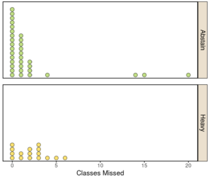
The following dotplots compare the numbers of classes missed between two groups of students: those who abstain from drinking alcohol (“Abstain”) and those who consume large amounts of alcohol each week (“Heavy”). Note that “Moderate” and “Light” drinkers are excluded here.
question 10
question 11
question 12
Comparing with Histograms
The following graph compares the distribution of per capita CO2 emissions between two groups: countries in Central and South America and countries in Europe.
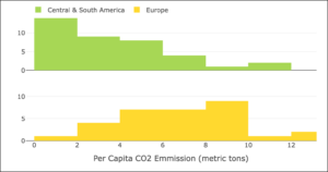
question 13
question 14
If you feel comfortable reading, interpreting, and comparing histograms, please move on to the next section and activity.
- Onyper, S. V., Thacher, P. V., Gilbert, J. W., & Gradess, S. G. (2012). Class start times, sleep, and academic performance in college: A path analysis. Chronobiology International, 29(3), 318-335. ↵
- Agresti, A., Franklin, C. A., & Klingenberg, B. (2021). Statistics: The art and science of learning from data, 5th edition. Pearson. https://www.pearson.com/us/higher-education/program/Agresti-My-Lab-Statistics-with-Pearson-e-Text-Access-Card-for-Statistics-The-Art-and-Science-of-Learning-from-Data-18-Weeks-5th-Edition/PGM2788191.html ↵