Learning Goals
After completing this section, you should feel comfortable performing these skills.
- Compare the variability of multiple data sets visually using histograms.
- Compare the variability of multiple data sets visually using dotplots.
- Use a data analysis tool to identify the standard deviation of a data set.
- Calculate the variance of a data set given standard deviation
- Use a data analysis tool to calculate variability by identifying the range of a data set.
Click on a skill above to jump to its location in this section.
In the next activity, you will be exploring data and using the measures of center and measures of spread to describe the data. This section will introduce you to variability, which is a measure of how dispersed (spread out) the data are. You’ll learn to recognize variability in histograms and dotplots by using visual clues. You’ll also learn how to calculate measures of variability including standard deviation, variance, and range.
Comparing Variability
The variability of a data set is often referred to as the spread of a data set. We can visually assess variability using graphical displays such as histograms and dotplots. When answering Questions 1 – 3 below to estimate variability of data visually using histograms and dotplots , consider whether the data appears to be more spread out from the center (greater variability) or more clustered toward the center (less variability). See the interactive video below for a demonstration of clues to look for in the graphical display.
interactive example
Whether presented with distributions of quantitative variables in histograms or in dotplots, similar visual clues can help you to recognize distributions that have more or less variability than others.
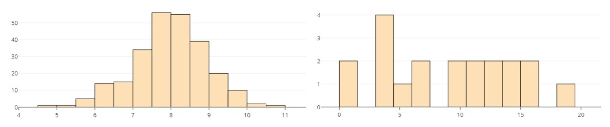
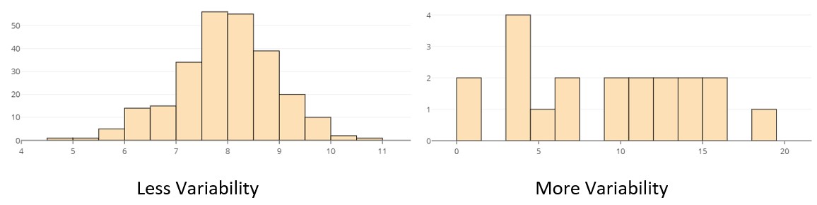
Histograms displaying the distribution of two quantitative variables with different amounts of variability are shown below. Which do you think has less variability than the other? Explain your reasoning. For example, what visual clue could help you decide if your answer were correct?
On the next page, you will see more about histograms and dotplots.