What you’ll need to know
In this support activity you’ll become familiar with the following:
- Identify the minimum and maximum values of a data set.
- Calculate and interpret the median.
- Calculate the first quartile (Q1).
- Calculate the third quartile (Q3).
- List the five-number-summary for a quantitative variable.
- Calculate the interquartile range (IQR) for a quantitative variable.
- Determine whether or not a value is an outlier.
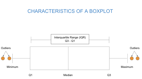
The upcoming section of material and following activity will introduce a new graph for displaying quantitative data called a boxplot. The image below shows a boxplot labeled with the five-number-summary and interquartile range.
We’ll explore boxplots in detail soon. The focus of this support activity is to help you become familiar with the characteristics of a boxplot: minimum and maximum values, median, first quartile, third quartile, and interquartile range.
A boxplot is a graphical visualization of a quantitative variable that shows median, spread, skew, and outliers by illustrating a set of numbers called the five-number summary. In the next section of the course material, you will need to be able to relate the features of a boxplot to the data set it comes from. In the following activity, you will need to be able to interpret and compare boxplots. Begin to familiarize yourself with boxplots in this corequisite support activity during which you’ll build up an understanding of the parts of the five-number summary and how to determine whether a data value is “unusual enough” to qualify as an outlier.
To introduce this new quantitative graph, we’ll use a data set that contains the gross domestic product per capita for the [latex]10[/latex] most populous countries.
GDP of the World’s Most Populous Countries

The following table lists data for the [latex]10[/latex] most populous countries in 2018, and it includes each country’s population rank (we can see that China had the largest population in 2018, India had the second largest population, and so on) and each country’s gross domestic product (GDP) per capita. [1] A country’s GDP is the total monetary value of everything produced in that country over the year. The GDP per capita is a country’s GDP divided by its population.
| Country | Population Rank | GDP per Capita |
| China | 1 | $[latex]9,771[/latex] |
| India | 2 | $[latex]2,016[/latex] |
| United States | 3 | $[latex]62,641[/latex] |
| Indonesia | 4 | $[latex]3,894[/latex] |
| Pakistan | 5 | $[latex]1,473[/latex] |
| Brazil | 6 | $[latex]8,921[/latex] |
| Nigeria | 7 | $[latex]2,028[/latex] |
| Bangladesh | 8 | $[latex]1,698[/latex] |
| Russia | 9 | $[latex]11,289[/latex] |
| Japan | 10 | $[latex]39,287[/latex] |
Before we begin, take a look at the values in the table. Are all the values relatively close or do you see any that seem unusual compared to the others? Use your observations to answer Question 1.
question 1
Did you identify one or two observations in Question 1 as being unusual? It can be difficult sometimes to decide if a particular value really is an outlier. Keep this thought in mind as you work through this activity. We’ll come back to this question again at the end.
Minimum and Maximum
To calculate the minimum and maximum values in a dataset, find the least and the greatest. If the dataset is lengthy, use technology to do the work. Otherwise, just order the values from least to greatest. You’ll need this ordering soon to locate the median as well.
question 2
question 3
Median
question 4
question 5
First Quartile (Q1)
To find the first and third quartiles, first determine the list of values that lie both above and below the median. Then, take the medians of those lists.
Interactive example
First and Third Quartiles The first quartile and third quartile, also known as Q1 and Q2, can be thought of as the median of the lower half of the data (Q1) and the median of the upper half of the data (Q2).
Let’s say you are given the following set of data values: [latex]2, 4, 5, 7, 8, 10, 11, 13, 14, 19, 20[/latex]. The median of the set is [latex]10[/latex] since [latex]10[/latex] is the middlemost number in the set. Use this information to answer the following questions.
[latex]2\quad 4\quad 5\quad 7\quad 8\quad[/latex] [latex]\mathbf{10}\quad[/latex] [latex]11\quad 13\quad 14\quad 19\quad 20[/latex]
- What numbers in the dataset lie below the median? What is the median of those values? This value will be the first quartile, Q1
Show Answer
- What numbers in the dataset lie above the median? What is the median of those values? This value will be the third quartile, Q3.
Show Answer
Now you try it with the GDP data.
question 6
question 7
We call this value the first quartile, and we sometimes denote it as Q1. It is the median of the values that lie below the median for the whole data set. It is also equal to the [latex]25[/latex]th percentile.
Third Quartile (Q3)
question 8
question 9
We call this value the third quartile, and we sometimes denote it as Q3. It is the median of the values that lie above the median for the whole data set. It is also equal to the [latex]75[/latex]th percentile.
Five-Number Summary
Before you list the five-number summary for the GDP dataset, think about the word quartile. We know what the first and third quartiles are? Consider for your answer to Question 10 values might represent the second and fourth quartiles? Hint: Would we need to split the data in another way to find quintiles, for example?
question 10
Now you are ready to record the Five-number summary for this dataset to answer Question 11.
question 11
Interquartile Range (IQR)
interactive example
Interquartile Range The interquartile range (sometimes denoted as IQR) is the quantity Q3 – Q1.
Recall the list of values we saw in the interactive example above with a median of [latex]10[/latex], Q1 of [latex]5[/latex], and Q3 of [latex]14[/latex].
[latex]2\quad 4\quad \mathbf{5}\quad 7\quad 8\quad[/latex] [latex]\mathbf{10}\quad[/latex] [latex]11\quad 13\quad \mathbf{14}\quad 19\quad 20[/latex]
- Calculate the IQR by finding the difference Q3 – Q1.
- About how much of the data are located within the IQR?
Now it’s your turn to calculate the IQR of the GDP dataset.
question 12
question 13
Outliers
Some outliers seem quite simple to spot (such as the GDP per capita of the United States), but others are harder to identify (such as Japan’s GDP per capita). If you were to make up a rule for testing whether a value is “unusual enough” to be called an outlier, what would it be? Use your rule on the value of Japan’s GDP per capita to decide whether or not it is an outlier. What did you decide?
question 14
In the next section, you’ll learn about an accepted method of determining whether a data value “qualifies” to be an outlier in a skewed distribution like this one. It’s called the IQR method and states that if a data value is located more than [latex]1.5[/latex] times the IQR to the left of Q1 or to the right of Q3, then that value is “unusual enough” to be called an outlier. It’s important to note that, while this method can be used to identify unusual observations in skewed distributions like this one, other methods, which you’ll learn about in an upcoming section, are well suited for symmetrical distributions. In certain applications, it may be desirable to distinguish between “mild outliers” (using [latex]1.5[/latex] times IQR) and “extreme outliers” (using [latex]3[/latex] times IQR). We can really set the threshold for “unusual” values as far away as we’d like, depending on the application. But [latex]1.5[/latex] times IQR is commonly used, so we’ll use it here and in the upcoming section.
Let’s apply the method to Japan’s GDP per capita in the interactive example below.
interactive Example
Recall that Japan’s GDP per capita from the data set is $[latex]39,287[/latex]. We would like to know how unusual this value really is in comparison to the rest of the data values. We’ll use the IQR method to make the determination.
Under this method, a data value is considered an outlier if it lies [latex]1.5[/latex] [latex]\times[/latex] (IQR) above Q3 or below Q1. Since [latex]39,287[/latex] is greater than the median, we’ll test it to see if it exceeds Q3 + [latex]1.5[/latex] [latex]\times[/latex] (IQR) (If it were a very small number, we’d test to see if it were lower than Q1 – [latex]1.5[/latex] [latex]\times[/latex] (IQR).).
Recall, for this data set: Q3 = [latex]11,289[/latex] and IQR = [latex]9,273[/latex].
Step 1) Calculate [latex]1.5[/latex] [latex]\times[/latex] (IQR).
Step 2) Calculate Q3 + [latex]1.5[/latex] [latex]\times[/latex] (IQR)
Step 3) Compare Japan’s GDP per capita. If it exceeds Q3 + [latex]1.5[/latex] [latex]\times[/latex] (IQR), then it is an outlier.
What did you discover? Is Japan’s GDP per capita an outlier in the data set?
In this support activity, you’ve seen how to calculate the five-number summary and interquartile range (IQR) by hand for a data set, and you’ve learned about a method to mathematically determine if an observation is an outlier. These make up the features of a box-plot. It’s time to move on to the next section where you’ll use these skills as you explore boxplots for visualizing the distribution of a quantitative variable.
- Bevins, V. (2020). The Jakarta method: Washington’s anticommunist crusade and the mass murder program that shaped our world. PublicAffairs. ↵