objectives for this activity
During this activity, you will:
- Identify misleading claims made using means
- Given characteristics of a distribution including skew and outliers, identify under which conditions it is appropriate to use the mean as a measure of center.
Click on a skill above to jump to its location in this activity.
Is It Worth It?
Consider this scenario. A college basketball player is skilled enough to make an NBA roster and is thinking about dropping out of college this year.

question 1
In this activity, you’ll use a distribution of professional basketball salaries to see that medians are resistant to influence from skew and outliers, while means are not. Importantly, means, in certain circumstances, can be misleading.
recall
Before beginning this activity, take a moment to recall the meanings of the terms left-skewed, right-skewed, symmetric, and outlier. You’ll need to be able to use those terms to describe features of a data set.
Core skill:
video placement
[Intro: Starting from a sentence or two discussing Question 1, remind students that they have recently been working to calculate and interpret the mean and median of a data set. That is, the median is the value that splits the data in half, with half the observations above the mean and half below, regardless of the presence of skew or outliers. The median is fixed. But the mean is not; it gets pulled to the left or right of the mean under the presence of skew or outliers. The mean is sensitive to extreme values. So when we see that the mean is higher than the median, we say that it has been “pulled to the right,” and we understand the quantitative variable is skewed right. Likewise, if the mean is smaller, we’ll say it’s been “pulled to the left,” and we understand the quantitative variable is skewed left. If the mean and median are similar, though, we understand that the distribution is symmetric. In this activity, we’ll use a distribution of professional basketball salaries to explore how skew arises in a quantitative variable and why we must be careful to consider all the characteristics of a quantitative variable’s distribution before deciding if the mean or median would be more responsible to use as a measure of a “typical” value. ]
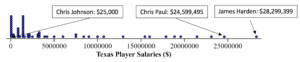
Below is a dotplot of NBA salaries[1] for Texas players in the 2017–2018 season:
question 2
question 3
Misleading Claims
In fact, the median salary among Texas NBA players was $[latex]1,577,320[/latex]. The mean salary was $[latex]5,262,279[/latex]. Use this information to complete Questions 4-6.
question 4
question 5
question 6
video placement
[Guidance: “Consider your answers to Questions 3 – 6. [voice over images of the dotplot with the vertical lines drawn] What did you consider to be a “typical” salary? What characteristic of this variable’s distribution caused the mean to be different from the median?”]
Now consider the following scenario. An NBA recruiter for the Houston Rockets approaches a promising college basketball player and says, “the typical salary among Texas NBA players is $[latex]5,262,279[/latex].”
question 7
video placement
[insert a sub-summary here. “How did you your answer the question, “is the recruiter’s statement misleading?” Did you consider the mean to be a “typical” salary among these NBA players? What could the recruiter have said instead? That it is likely a player would make $5.3 million by joining the team? That is is possible for some highly skilled and talented players? Or would it have been less misleading for the recruiter to have emphasized the median salary of $1.58 million? If you were in the prospective player’s position, would you have asked to see the distribution to make your own assessment? Which value would you have used, mean or median, if you were in the recruiter’s position?”]
You’ve seen that the mean, under certain conditions, can be a misleading indicator of a “typical” observation value, such as the salary of a professional basketball player. Now try to apply this understanding to some other types of data collections.
Appropriate Measures of Center
Three situations are given below in which data is collected on a quantitative variable. For each, visualize what the distribution might look like and make predictions about the shape of the distribution (skewed or symmetric?), the relationship between the mean and median (will they be similar or will the mean be smaller or greater than the median?), and whether or not it would be appropriate to use the mean to represent a “typical” observation. Use what you learned about resistance in the previous section, What to Know About Interpreting the Mean and Median of a Data Set: 4C, to guide you.
Situation 1: Data are collected on incomes in New York City.
question 8
question 9
question 10
Situation 2: Data are collected on GPAs at a local college.
question 11
question 12
question 13
Situation 3: Data are collected on peoples’ body temperatures.
question 14
question 15
question 16
video placement
[Wrap-up: Provide a transition from these particular examples to larger situations in which a quantitative variable would tend to be skewed or symmetric: if the data would tend toward a bunched-up group of values but contain some extreme values, what would the shape of the distribution look like? If data were distributed on the graph “as though it had fallen through a funnel onto a plane” what would it look like? Then show and discuss the simulation at https://dcmathpathways.shinyapps.io/MeanvsMedian/ .Finally, show some distributions and ask viewers to predict the relationship between mean and median. ]
- NBA player salary data set (2017-2018). (2018) Kaggle. Retrieved from https://www.kaggle.com/koki25ando/salary ↵