Monitoring Your Readiness
To effectively plan and use your time wisely, it helps to think about what you know and do not know. For each of the following, rate how confident you are that you can successfully do that skill. Use the following descriptions to rate yourself:
5—I am extremely confident I can do this task.
4—I am somewhat confident I can do this task.
3—I am not sure how confident I am.
2—I am not very confident I can do this task.
1—I am definitely not confident I can do this task.
Skills Needed for Visualizing Quantitative Data: Forming Connections
| Skill or Concept: I can . . . | Questions to check your understanding | Rating from 1 to 5 |
| Identify quantitative variables and the plots used to visualize their distributions. | 1, 2 | |
| Use technology to make a plot of the distribution of a quantitative variable. | throughout text, 10-13 | |
| Use a histogram to describe a distribution. | 6-9 | |
| Identify how bin width affects a histogram. | 10-12 | |
| Use a dotplot to describe a distribution. | 14 | |
| Identify the population and sample and explain limitations on the scope of the analysis based on sample data. | 15 |
Now use the ratings to get ready for your next in-class activity. If your rating is a 3 or below, you should get help with the material before moving forward. Remember, your instructor is going to assume that you are confident with the material and will not take class time to answer questions about it.
Ways to get help:
- See your instructor before class for help.
- Ask your instructor for on-campus resources.
- Set up a study group with classmates so you can help each other.
- Work with a tutor.
Essential Concepts
- Quantitative variables have distinguishing features placing individuals into one of several groups based on a numerical value such as height, cost, exam scores, and temperature. The data from these variables can be displayed in multiple ways.
- Quantitative variables have data observations that can be added, averaged, and have a minimum and maximum value identified.
- Some features of a distribution are more apparent in some graphical displays than others. This also explains why some questions can be better answered in some graphical displays than others.
- A sample is representative of a population if its characteristics tend to match the characteristics of the population. If this is not the case, a generalization of the population cannot be made from the sample.
Study Tips: Evidence-based strategies for learning
- Test your understanding of quantitative variables by creating flashcards from the examples given in the text and assignments. (Retrieval practice)
- Explain to a friend, real or imaginary, which kinds of graphs and charts can be used to display distributions of quantitative variables. Point out how the different displays are similar and which display is better to use for different types of distributions. (Verbalizing)
- Make an acronym or a symbol of the characteristics of a histogram: binwidth, end-points (left end included, right end not), height (given in counts or percentages). (Mnemonics & Symbols)
- Example. Combine a mnemonic with a symbol. W[lr),H:c,p could remind you how to read:
- W[lr): Width of the bars (a range with the left endpoint included and right excluded, using the )
- H:c,p Height of the bars (which can be given in counts or percentages).
- Example. Create a symbol that represents the features of a histogram bar. The symbol below illustrates that binwidth is a range of values including the left endpoint but not the right and that height can be given in counts or percentages.
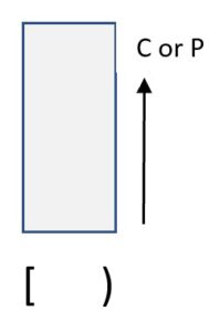
- Example. Combine a mnemonic with a symbol. W[lr),H:c,p could remind you how to read:
- Reflect on the ways you used a histogram or dotplot to answer questions about a quantitative variable. (Reflect)
- What do I know well about this?
- What part is still challenging to me?
- What strategy did I learn was particularly useful?
- How could I know my answer is reasonable or accurate?
Foundational Knowledge
Glossary
- bin
- a range of values that the quantitative variable can take.
- binwidth
- a numerical value that is calculated by the difference in the values of the end points of a bin in a histogram.
- dotplot
- a graphical display of the distribution of a quantitative variable showing the variable’s possible values and the frequency of each value.
- endpoints
- the smallest and largest values of the quantitative variable represented in the bin of a histogram.
- generalize
- when the sample is representative of the population, this transfers our analysis of the sample to the population.
- histogram
- a graphical display that groups observations into bins rather than having a single dot for each observation.
- population
- the entire collection of individuals or objects that you want to learn about.
- representative
- when the characteristics of a sample tend to match the characteristics of the population.
- sample
- a part of the population that is selected for study.
My Skills Checklist:
- I can visualize the distribution of a quantitative variable in multiple ways.
- I can identify the features of a distribution that are more apparent in some graphical displays than in others.
- I can identify the questions that can be better answered in some graphical displays than others.
- I can identify and create appropriate graphical displays to visualize the distribution of quantitative variables.
- I can compare and contrast features present in each graphical display.
- I can identify the most useful graphical display(s) to answer a given research question.

Topic Complete – now test your understanding in the Self-Check.
Candela Citations
- Roller hockey ball overlaid with a green check. Authored by: Parutakupiu. Provided by: Wikimedia Commons. Located at: https://commons.wikimedia.org/wiki/File:Rollerhockeyball_check.svg. License: Public Domain: No Known Copyright