Learning Outcomes
- Create a histogram that represents a data set
Visualizing Numbers
Quantitative, or numerical, data can also be summarized into frequency tables.
Example
The exam scores from 75 students were sorted from lowest to highest.
32, 32, 33, 34, 38, 40, 41, 43, 44, 44, 45, 46, 47, 48, 48, 53, 53, 53, 54, 55, 55, 58, 59, 59, 59, 60, 60, 60, 64, 64, 64, 64, 65, 65, 65, 67, 67, 67, 67, 67, 68, 68, 68, 69, 69, 71, 72, 72, 72, 74, 74, 75, 75, 75, 77, 77, 78, 78, 79, 79, 80, 80, 80, 81, 83, 83, 84, 85, 86, 86, 90, 90, 91, 94, 97
A frequency table can be created by grouping the scores in the following intervals: 30 – 39, 40 – 49, 50 – 59, 60 – 69, 70 – 79, 80 – 89, 90 – 99.
Frequency Table of Exam Scores
| Intervals of Scores | Frequency (or Count of Students Earning Scores in this Interval) |
| 30 – 39 | 5 |
| 40 – 49 | 10 |
| 50 – 59 | 10 |
| 60 – 69 | 20 |
| 70 – 79 | 15 |
| 80 – 89 | 10 |
| 90 – 99 | 5 |
A graph can be created from the frequency table. This type of graph is called a histogram.

DIFFERENCE BETWEEN BAR GRAPHS AND HISTOGRAMS

Histograms are different from bar graphs. The horizontal axis in a bar graph has categories. The horizontal axis in a histogram is a continuous number line. In addition, the bars in a bar graph do not touch, but the bars (also called classes) in histogram do touch.
HISTOGRAM
A histogram is a graph where the horizontal axis is a continuous number line. Data are grouped into equally spaced intervals. The intervals are called classes. Rectangles are drawn to represent the classes. The height of the rectangle can either be the frequency (or count of the number of data points in each class) or it can be the relative frequency (the frequency divided by the total count).
Unfortunately, not a lot of common software packages can correctly graph a histogram. About the best you can do in Excel or Word is a bar graph with no gap between the bars and spacing added to simulate a numerical horizontal axis.
If we have a large number of widely varying data values, creating a frequency table that lists every possible value as a category would lead to an exceptionally long frequency table, and probably would not reveal any patterns. For this reason, it is common with quantitative data to group data into class intervals.
Class Intervals
Class intervals are groupings of the data. In general, we define class intervals so that
- each interval is equal in size. For example, if the first class contains values from 120-129, the second class should include values from 130-139.
- we have somewhere between 5 and 20 classes, typically, depending upon the number of data we’re working with.
example
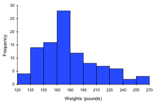
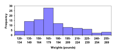
Suppose that we have collected weights from 100 male subjects as part of a nutrition study. For our weight data, we have values ranging from a low of 121 pounds to a high of 263 pounds, giving a total span of 263-121 = 142. We could create 7 intervals with a width of around 20, 14 intervals with a width of around 10, or somewhere in between. Oftentimes we have to experiment with a few possibilities to find something that represents the data well. Let us try using an interval width of 15. We could start at 121, or at 120 since it is a nice round number.
| Interval | Frequency |
| 120 – 134 | 4 |
| 135 – 149 | 14 |
| 150 – 164 | 16 |
| 165 – 179 | 28 |
| 180 – 194 | 12 |
| 195 – 209 | 8 |
| 210 – 224 | 7 |
| 225 – 239 | 6 |
| 240 – 254 | 2 |
| 255 – 269 | 3 |
A histogram of this data would look like:
In many software packages, you can create a graph similar to a histogram by putting the class intervals as the labels on a bar chart.
The following video walks through this example in more detail.
Try It
Try It
The total cost of textbooks for the term was collected from 36 students. Create a histogram for this data.
$140 $160 $160 $165 $180 $220 $235 $240 $250 $260 $280 $285
$285 $285 $290 $300 $300 $305 $310 $310 $315 $315 $320 $320
$330 $340 $345 $350 $355 $360 $360 $380 $395 $420 $460 $460
When collecting data to compare two groups, it is desirable to create a graph that compares quantities.
Example
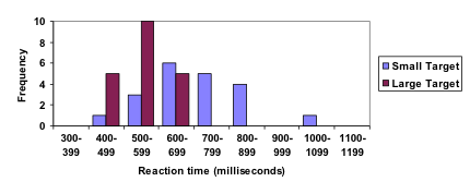
The data below came from a task in which the goal is to move a computer mouse to a target on the screen as fast as possible. On 20 of the trials, the target was a small rectangle; on the other 20, the target was a large rectangle. Time to reach the target was recorded on each trial.
| Interval (milliseconds) | Frequency small target | Frequency large target |
| 300-399 | 0 | 0 |
| 400-499 | 1 | 5 |
| 500-599 | 3 | 10 |
| 600-699 | 6 | 5 |
| 700-799 | 5 | 0 |
| 800-899 | 4 | 0 |
| 900-999 | 0 | 0 |
| 1000-1099 | 1 | 0 |
| 1100-1199 | 0 | 0 |
One option to represent this data would be a comparative histogram or bar chart, in which bars for the small target group and large target group are placed next to each other.
This is the end of the section. Close this tab and proceed to the corresponding assignment.
Candela Citations
- Revision and Adaptation. Provided by: Lumen Learning. License: CC BY: Attribution
- Presenting Quantitative Data Graphically. Authored by: David Lippman. Located at: http://www.opentextbookstore.com/mathinsociety/. Project: Math in Society. License: CC BY-SA: Attribution-ShareAlike
- numbers-education-kindergarten. Authored by: karanja. Located at: https://pixabay.com/en/numbers-education-kindergarten-738068/. License: CC0: No Rights Reserved
- Creating a histogram. Authored by: OCLPhase2's channel. Located at: https://youtu.be/180FgZ_cTrE. License: CC BY: Attribution
- Defining class intervals for a frequency table or histogram. Authored by: OCLPhase2's channel. Located at: https://youtu.be/JhshitTtdP0. License: CC BY: Attribution
- When not use a pie chart. Authored by: OCLPhase2's channel. Located at: https://youtu.be/FQ8zmZ56-XA. License: CC BY: Attribution
- Frequency polygons. Authored by: OCLPhase2's channel. Located at: https://youtu.be/rxByzA9MFFY. License: CC BY: Attribution
