
Joan’s uncle Devon is a semiprofessional blogger who writes about media (he would really like to be a paid film critic, but no one has offered yet). Recently, Devon posted a short blog piece complaining about the number of ads on TV these days compared to when he was younger. He was not very scientific about it, and a couple of his readers disputed a claim he made and tried to start an argument.
Devon asks Joan, who is taking an algebra class at night, to help him gather and cite some data to support his claim that there are “way more” TV ads now than when he was a kid. Together, they get online and do a little research and find a website that reports some interesting data on the number of minutes of TV commercials per hour since 2009. The data is shown below.
| Years Since 2009 | Minutes |
|---|---|
| [latex]0[/latex] | [latex]8.5[/latex] |
| [latex]1[/latex] | [latex]9.25[/latex] |
| [latex]2[/latex] | [latex]10[/latex] |
| [latex]3[/latex] | [latex]10.75[/latex] |
| [latex]4[/latex] | [latex]11.5[/latex] |
| [latex]5[/latex] | [latex]12.25[/latex] |
| [latex]6[/latex] | [latex]13[/latex] |
The data show that, yes, there are more commercials now than in [latex]2009[/latex]. Joan decides the table is not very exciting because of the success she had with her manager when she reported her increase in sales using a graph. Also, Devon doubts that his readers will actually read a table. He agrees that a graph is the perfect thing to post on his blog to convince his skeptical readers!
They get to work.
First, they figure out what information they need to draw a graph of the line that represents the change in the number of minutes of commercials in one hour of TV since [latex]2009[/latex]?
Joan remembers that the coordinate plane gives graphs structure and meaning. A straight line on a page will not tell Devon’s readers much. Joan draws the axes and labels the horizontal one “Years Since [latex]2009[/latex],” because that is the first data point they have. Then Devon labels the vertical axis from [latex]1[/latex] to [latex]18[/latex], because the minute data ranges from [latex]8.5[/latex] to [latex]13[/latex] minutes.
They plot the ordered pairs from the table of values on the coordinate plane as shown below.
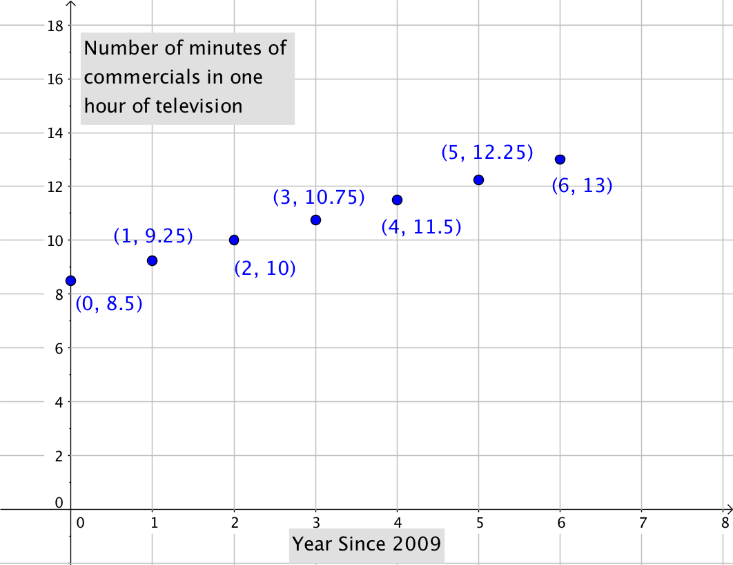
The points give them a guide for drawing the line which is shown below.

Devon is excited to post the graph on his blog to show people how much more time they are being exposed to commercials in one hour of watching TV.