Licensing Information
This text was adapted by Saylor Academy under a Creative Commons Attribution-NonCommercial-ShareAlike 3.0 License without attribution as requested by the work’s original creator or licensor.
Saylor Academy would like to thank Andy Schmitz for his work in maintaining and improving the HTML versions of these textbooks. This textbook is adapted from his HTML version, and his project can be found here.
How to cite this work:
- Publisher: Saylor Academy
- Year Published: 2012
Preface
Book Design Problem
We set out to design an introductory course governed by four themes:
- Give students a good idea of what a career in MIS looks like by doing MIS.
- Enhance the professionalism of deliverables by teaching design and usability concepts.
- Promote creativity by assigning projects that demand it.
- Teach students about cloud computing by having them do cloud computing.
Students in an introductory Management Information Systems (MIS) course often ask what a career in MIS looks like. Lacking a clear vision, they make their own assumptions. Often they assume the career involves programming with little human interaction. That MIS is a technical field could not be further from the truth. MIS job descriptions typically require candidates to be able to collaborate, communicate, analyze needs and gather requirements. They also list the need for excellent written and communication skills. In other words, MIS workers are constantly interacting with other people both inside and outside the organization. They are coming up with creative solutions to business problems.
This course is designed to help students get a feel for what a career in MIS would be like. Our students report that they learn more about information systems from their internships than from their IS courses. Consequently, we designed a course that looks very much like an internship—an introduction to the field followed by a substantial project.
Chapter 1 begins by introducing the information systems landscape. Here we discuss all the usual suspects: the information systems triangle, the systems development life cycle, transaction systems (ERP, SCM, CRM), collaboration systems, and business intelligence systems. Other aspects of the landscape such as usability, outsourcing, database concepts and so forth are introduced throughout chapter in Chapter 2 where they fit in naturally with the flow of the project.
Chapter 2 is the substantial project which runs over a number of chapters. Over the course of the semester, students plan, build, and develop a proposal for an iPhone application. They develop a very realistic mockup. They also build a website to help market and support the app. Students are engaged because the project is fun and feels real. However, they are simultaneously learning business concepts and MIS skills. Prior to the existence of this course, we were only able to give such an interesting project at the senior level. Now, even as freshmen, students have a real experience of MIS in operation.
A by product of creating an engaging course is increased enrollment in the MIS major. Even students who have never heard of MIS become excited about the major and either switch majors or add it as a double major or minor.
Many other books have students study tools and then do a case. By contrast, most of this book is a case. Much like the real world, we introduce tools when needed, and only to the extent needed, to get at each part of the case.
Constraints
The design team embraced a number of constraints in creating the book. We acknowledged that this is a support course in terms of skills development for the other business disciplines—accounting, finance, management, and marketing. Students should walk away with skills that they can take into the other disciplines. The course requires mastery of a number of software skills—primarily from the Microsoft Office suite. These include skills in PowerPoint, Word, and Excel. We assumed no prior background knowledge on the part of the students. Our experience is that students entering college have exposure to software skills, but not a mastery of applying those skills to solve business problems.
A number of skills are also learned about cloud computing. These include Web site design and development (Google Sites, Google Gadgets, Google Docs), Color Management (Adobe Kuler Color), iPhone App mockups (MockApp), and online polls (PollEverywhere).
The book was designed for both in class and online delivery and for small and large section sizes. The non-traditional student population is a growing sector and many of those students choose to learn online.
Finally, the book needed to appeal to the business side of information systems. We accentuate the creative aspects of the field rather than casting MIS as an overly technical, nerdy, machine-oriented discipline.
Values, attitude, approach
We began with the assumption that MIS is an exciting discipline. Nonetheless we recognized the difficulty of conveying that excitement—especially in a skills book. However, difficult does not mean impossible—and we believe we have created an elegant solution. We hold that learning can be both challenging and fun. Research clearly shows that students want to be challenged in meaningful ways. Finally, we assumed that students recognize and want to emulate good graphic and information design. This is an image-conscious generation with a keen eye for what looks cool. Why not build a book that capitalizes on the eye for graphic design that students already bring to the table?
Book Design Influences
While our background is in MIS, we believe that one of the strengths of the book is its ability to look outside the field for inspiration. We were influenced by a number of writers in the development of the book.
Edward Tufte (The Visual Display of Quantitative Information) is perhaps the world’s leading expert on the design and display of quantitative information. Tufte begins by insisting we focus first on the quality, relevance, and integrity of the content. He has an especially sensitive eye for the ethical dimension—telling the truth in an information display. Good content is followed by the creation of a good design to communicate that content.
Robin Williams (The Non-Designers Design Book) gives simple but effective design rules that can be applied to document design, presentation design, website design, even spreadsheet design. Following these rules students are able to create professional displays of information.
Students will use PowerPoint both in college and the workplace. Why not learn to use it effectively? Two writers were especially helpful in this regard. Both are pioneers in the effective construction of PowerPoint presentations. Garr Reynolds (Presentation Zen) promotes a heavy use of images in PowerPoint. Nancy Duarte (Slide:ology), provides a comprehensive list of design guidelines.
Organizing framework for the Book
Our organizing framework for the book revolves around the importance of design. We want students to be creative, design like professionals, and take pride in their work. We challenge students to produce deliverables that are professional in both content and style.
Problems must be thoroughly analyzed before a proper solution is designed. Information is a core asset, not only in information systems, but to most organizations. It is safe to say that most students will regularly be creating information displays as part of their jobs following graduation. Why not get a competitive advantage by learning how to create them in a professional and effective fashion? We include sections on graphic design—a subject that students find to be very interesting and marketable.
The importance of design lead us to adopt the Systems Development Life Cycle for the assignments. In this way, students are asked to be intentional about their design choices, relating them back to the requirements that they uncovered earlier in the project.
Book Guiding Principles
We developed a number of guiding principles in the creation of the book. We began with creative, right brain problems. The business curriculum is so heavily focused on analysis that there is little room for creative expression. We have students design and draw with the software to remedy this problem. For example, students design an iPhone App in PowerPoint and simulate its operation with hyperlinks.
We want to support and model critical thinking. There are many definitions of critical thinking and we do not claim to have the most comprehensive one. However, we believe that the explanatory framework offered by Richard Paul is especially powerful. Paul encourages faculty to communicate concepts in four forms—definitions, rephrasing, written examples and illustrations. The hope is that one or more of the forms will stick and mutually reinforce each other in the student’s mind. Students frequently comment that they see the value in what they are learning and are able to apply it not only in their other classes, but also in real life.
Finally, we think that the book should support multiple learning styles. We use Neil Fleming’s taxonomy of learning styles: Visual, Auditory, Read/write, and Kinesthetic (VARK). Different students learn differently; this book contains something for everyone.
Architecture of the Book
We align the architecture of the book with our guiding principles. For example, all the book’s concepts and software skills are presented in a critical thinking format. Each concept is defined, rephrased “in other words,” bolstered by an example, and then illustrated. For software skills we repeat the same pattern in a different format. We construct a captioned screen shot. The caption contains the first three forms—definition, rephrasing, and written example. The screenshot contains the illustration. A great deal of work went into the digital manipulation of the screenshots to support our pedagogy. The actions are expressed with a near wordless lexicon. Symbols in the lexicon have an Anime or Comic Book feel in order to create a counterpoint and stand out from the screen shot. And frankly the Anime feel is just fun. To accommodate online learners the skills are also modeled through video lectures.
Problems in the book progress from challenging students to imitate best practice to creative application of the concepts. So many times we have seen assignments where students are asked to do either too little and thus the students get little value or the students are challenged but not given the proper ramp up. Our leveled approach is a good meeting in the middle—challenge with support.
Since we set the bar so high for the professional quality of deliverables, we had to provide a way for students to meet that standard. What we developed is a progressively challenging pedagogy. By accomplishing the Level 1 and 2 hurdles, students prepare themselves for a comprehensive Level 3 project.
Introduction: Each chapter begins with an introduction to outline the chapter. The introduction also sells the practical value of the chapter to the student’s future career. Selling the chapter achieves buy in and creates motivation to succeed. Establishing the practical value of the chapter also lets students know that we care about their future.
Following the introduction, we present the theory behind the chapter. The theory is carefully introduced to scaffold on prior knowledge while extending that knowledge much further. We cover best practice in industry and illustrate it using good and bad examples.
L1, L2, L3 Creative Application: The Level 1 and Level 2 assignments incorporate analysis and requirements stages. The Level 3 assignments focus on design. Students must analyze the problem, gather requirements, design a solution, and develop the solution. Students are encouraged to exercise creativity both in their deliverable and in their written support for the deliverable.
Diagrams: We show abbreviated techniques to accomplish each of the tasks required in the assignment. Furthermore, the techniques are shown in no particular order. Students need to discover what they need to accomplish and then look up the techniques that will help to get them there. Over the years, we have learned that students can learn a technique very quickly, but this is not what they truly need to understand. They need to know when to apply the technique, and this pedagogy focuses on developing that intuition.
Sometimes, we show before and after examples of the required deliverable. Students are challenged to transform the before into the after using the techniques. We expressly avoid the step by step exercises found in many other texts. Our experience is that students will focus on keystrokes rather than concepts when presented with step by step instructions.
Our model is closer to just in time learning found in many MBA programs. It is also a model for life-long learning, rather than learning specific software tools.
Conclusion
We have learned a lot over five years developing this book, and continue to learn every day as we move forward. We would like to thank our students who have helped guide us with their feedback. We will continue to make improvements to a project that will never be entirely finished. However, this much we know—enrollment has dramatically increased in our department (400%).
Chapter 1 Information Systems in Your Life: Types of Systems and Careers
1.1 What Are Information Systems?
LEARNING OBJECTIVES
- Understand the parts of an information system
- Identify companies that practice user centered design
- Identify typical careers for information systems graduates
It’s More Than Just Computers
Information systems are the combination of people, information technology, and business processes to accomplish a business objective.
Every information system (IS) has people, processes, and information technology. In fact, many IS professionals add most of their value working with people and processes. They manage the programmers but typically avoid programming themselves. We can represent an information system as a triangle with people, processes, and information technology (computers) on the three vertices. The three parts of an information system are often referred to as the information systems triangle.
Consider the popular trend of letting the TV audience vote on some talent shows such as Dancing with the Stars. The voting is managed by a sophisticated information system. The voters are the people involved with the system. Voters can cast the votes by phone, by text, or by online poll—three different information technologies. A central server at ABC records and tallies the votes. The business processes include the phone, texting, and online procedures—how and when to cast votes, and rules limiting the number of votes from each household.
In November 2010, ABC had to defend the legitimacy of its business processes when detractors claimed that Bristol Palin, daughter of political candidate, Sarah Palin, received an inflated vote tally from Tea Party supporters. Some of these supporters bragged on blogs about how they had circumvented the ABC business processes to record multiple votes for Bristol. ABC claims that it has systems in place to spot and discount suspicious voting activity. They have publicly revealed some, but not all, of these fraud detection systems. At this point we don’t know for sure if fraudulent votes got through. For more on this story see for example: http://insidetv.ew.com/2010/11/19/dwts-bristol-palin-tea-party-voting-conspiracy/.
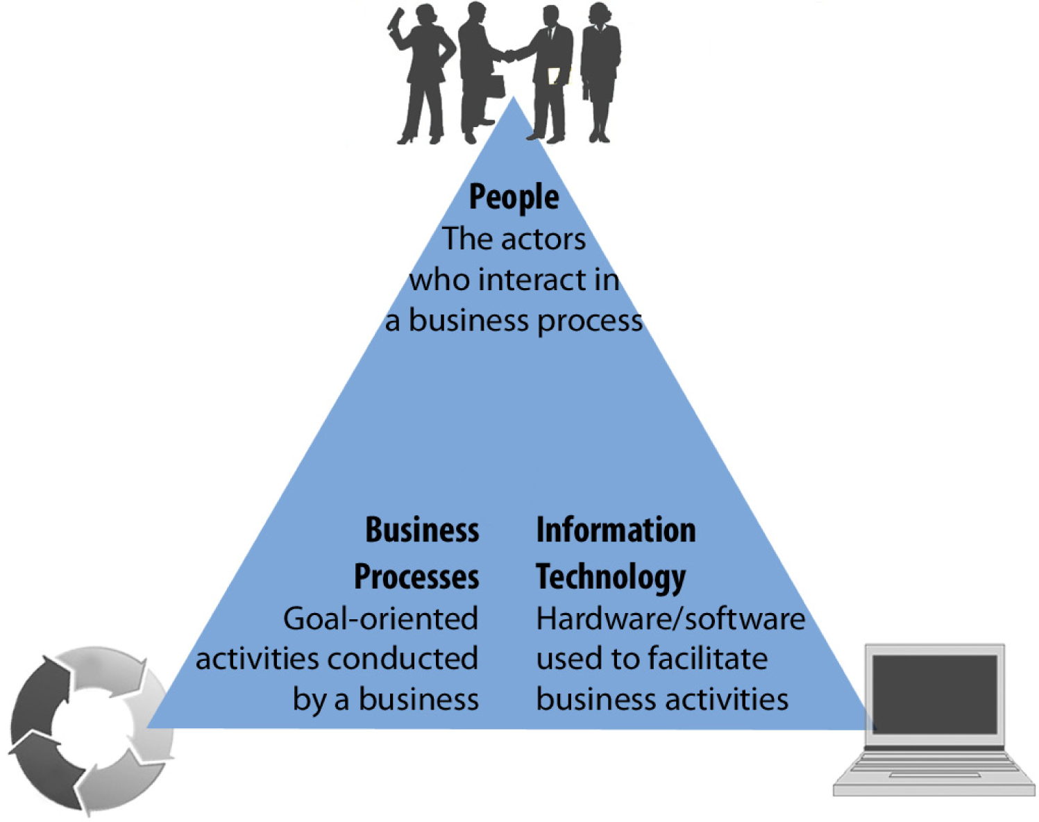
The three parts of the information systems triangle must interact in concert to realize business objectives. The job of the IS professional is to ensure that a balance is maintained and enhanced for the good of all the actors and the business as a whole.
Good and Bad Information Systems
Information systems professionals work with others to design and customize the systems that you interact with everyday. When you register at a hospital, the information goes into an information system designed to support administrative reporting and insurance processing. When you buy from Amazon.com, the information goes into an information system designed to support customer relationship management.
Every information system is designed to make someone’s life easier. Unfortunately, that someone is not always the consumer. When was the last time that you had a good registration experience at a hospital? That system probably was not designed with you in mind—but rather designed to support backend reporting for the hospital administration and by proxy for the government and insurance companies. So the administrators are happy, but not the customers. From the hospital’s point of view there is no business need to make the registration experience extraordinarily pleasant. They are betting that you will not choose your hospital based on how difficult it was to register.
Amazon.com, by contrast, delivers an extraordinary experience to its customers so that they will stay loyal. Amazon practices user centered design—designing to meet the needs of the user. However, the clever folks at Amazon also have tremendous backend reporting. So it is possible to design systems that please customers and administrators simultaneously—but it takes a bit more effort.
What would hospital systems look like if they were designed to Amazon standards? Imagine 1-click appointments, 1-click payments, shielding the client from the insurance companies. How about an integrated patient record of all past procedures?
The world will continue to gravitate toward Amazon style systems. In the end it is good business to make everyone happy—employees, customers, and administrators. It is also the right thing to do. Think back to the hospital. In a competitive market, maybe you would choose the better customer experience. A hospital worker might choose to work for the hospital with the more user friendly patient information system. No one likes to be yelled at by unhappy customers.
It doesn’t take much to improve the user experience (UX) of a system. You have to design a user interface (UI) anyway—why not make it a good one? In the words of Hall of Fame basketball coach John Wooden, “If you don’t have time to do it right, when will you have time to do it again?”
Consider the tremendous success of Apple Computer. One of the main advantages that Apple has over its rivals is that it carefully analyzes how people best interact with technology, develops requirements based on that analysis and then designs elegant computers, the iPhone, iPad, iTunes, and so forth based on those requirements.
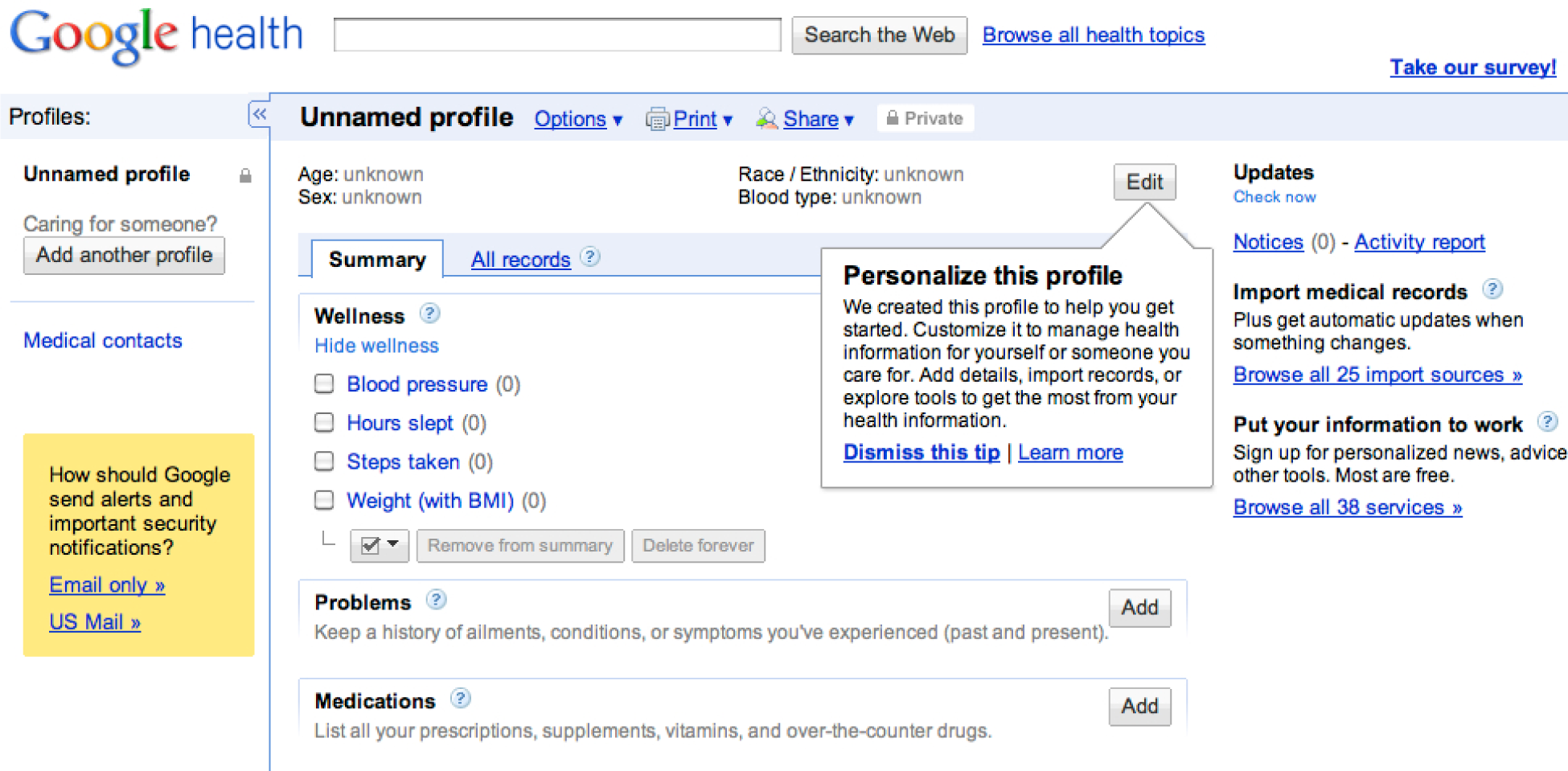
Google Health, pictured here, has created a user centered patient record—and for free! It will be interesting to see if hospitals adopt it.
Most Professions Use Information Systems
Marketing, accounting, finance, manufacturing – there are many different professional goals and types of work in the business world. There are also many different industries where this work can be performed – manufacturing, retail, banking, healthcare. No matter what your career goal is or what industry interests you, your success and the success of the business rely on your ability to recognize opportunities where information systems can be used to improve performance. In most lines of work, you will need to store information in and retrieve information from databases. You will have to create persuasive and professional reports and presentations to convince others that your ideas make sense. Using Microsoft Excel and other tools, you will analyze data to find patterns and trends to aid decision-making. You will manage your relationships with contacts and clients using customer relationship management systems. The business’s success will depend on you leading efforts that use technology to support the introduction of new products, efficiently manage supply chains, and effectively manage complex financial activities. Retailers rely on past purchase data to develop sales forecasts and predict purchase behavior. Most businesses utilize collaboration technologies to bring together employees from all over the world to solve problems. Your ability to recognize opportunities to use information technology to create business value is central to both your success and that of your firm.
What Does an IS Career Look Like?
A career in information systems is full of action, problem-solving, and teamwork. It is the goal of information systems professionals to bridge the knowledge gap between business users and technologists, and thus IS professionals must be fluent in both worlds. Work in the field of information systems is exciting, fun, and fast-paced. There is always a new team to work with and new technology to learn about, and projects move quickly leaving openings for new endeavors. In a recent report published in The Wall Street Journal, information systems professionals were tied for the highest percentage of college graduates that were satisfied with their career path. See http://finance.yahoo.com/college-education/article/111000/psych-majors-not-happy-with-options?mod=edu-continuing_education.
When preparing to become an IS professional, students focus on learning about the types of systems that exist, what they offer to businesses, best practices for implementation, and the advantages and disadvantages of each. Students also focus on how to work with business users and discover what their system needs are and how they can best be served by information systems. Information systems professionals focus on solving problems in businesses through the use of information systems.
When students start their careers, they frequently work on teams that connect businesspersons with the appropriate system solution for their situation. Usually the organizations they work for adopt a set of best practices to create consistency across project teams. Through the use of these best practices, IS professionals determine what options are available, consider the pros and cons of each, design a customized solution to match the specific business, and develop a plan on how to best implement the information system, including rollout phases and training.
As mentioned, IS professionals typically work in teams. This is because the projects are usually very large and have many interworking pieces. As a result, IS professionals specialize in a particular type of work and contribute their expertise in this area. Specializations include system analysts, software developers, database administrators, and project managers.
Information systems as a career is attractive to many individuals because of the traits above. However, it is also engaging because it is a career in which you get to work on making people’s lives easier. IS professionals focus on developing systems that businesspersons will use to create efficiency and increase their performance. IS professionals design systems that help businesspersons make better decisions (decision support systems) and lead organizations (executive dashboards). Systems are also created to keep track of materials (supply chain management systems) and customers (customer relationship management systems). And given the important role of information in modern organizations, IS professionals record, monitor, and analyze data to learn how the business can improve (business intelligence systems). IS professionals work to design these systems to be more usable, more efficient, and more informative. This book will discuss these topics and allow you to experience many of them. It walks you through what it is like to be an IS professional, rather than telling you about it.
KEY TAKEAWAYS
- The information systems triangle includes people, processes, and information technology. It is a good reminder that MIS is about much more than just technology.
- Well designed information systems keep the user in mind at each step of the process.
- Information systems are used by every functional area of business—marketing, management, finance, and accounting. For this reason it is good to have a strong background in information systems.
- Careers in information systems tend to be dynamic, team based, and focused on problem solving.
- Few information systems careers involve programming. However, IS professionals must be able to communicate with programmers.
QUESTIONS AND EXERCISES
- Search for news stories on the Bristol Palin vote controversy. What systems did ABC put in place to catch voter fraud?
- Pick a user centered web site other than Amazon.com and explain why you think it is well designed.
- Find job descriptions for two information systems jobs. Do the job descriptions emphasize soft skills or technical skills or both?
1.2 Designing Information Systems
LEARNING OBJECTIVES
- Compare and contrast usability, graphic design and analytical design.
- Outline the steps by which an information system should be designed.
Many Meanings of Design
The key to successful information systems is good design. But what makes a good design? A number of disciplines weigh in on this topic. We will look at design from a number of different perspectives. Whenever possible we will contrast good and bad designs.
Different people use the word design in different contexts. When IS professionals speak of design, they are referring to business processes. Problems must be analyzed and requirements documented before solutions are designed, developed, and implemented. After all if the design does not satisfy the business need, then what’s the point? However, satisfying the business need is really a baseline standard. The vilified hospital system described earlier meets the business need of registering patients. And yet its design is in other ways lacking. Similarly, fast food meets the need for feeding one’s hunger. However, we want to be metaphorically better than fast food in our designs.
Usability describes how easy the system is to navigate. The easier the system is to navigate, the less time a user will need to spend learning to use the system. A more usable system also leaves less room for error. Usability theory provides rules of thumb (heuristics) that document best practice conventions for designing a user interface. Amazon.com has one of the most usable online systems because they follow established conventions. Following conventions tremendously increases the potential acceptance of your website or app.
Graphic design refers to the visual appeal and organization of the user interface. There is obviously some overlap here with usability. Usable systems typically adhere to at least some graphic design rules. However, a usable system could be bland and uninteresting. Employing graphic design principles helps ensure that the system will have visual appeal. Designs also need to fit with the overall brand of the client. Existing colors, fonts, and logos are all a part of the brand for which the system is being created.
Analytical Design describes how to best represent information—especially quantitative information—to communicate clearly and truthfully. Every information systems project has quantitative dimensions associated with project management. These include estimating costs, time schedules, and so forth.
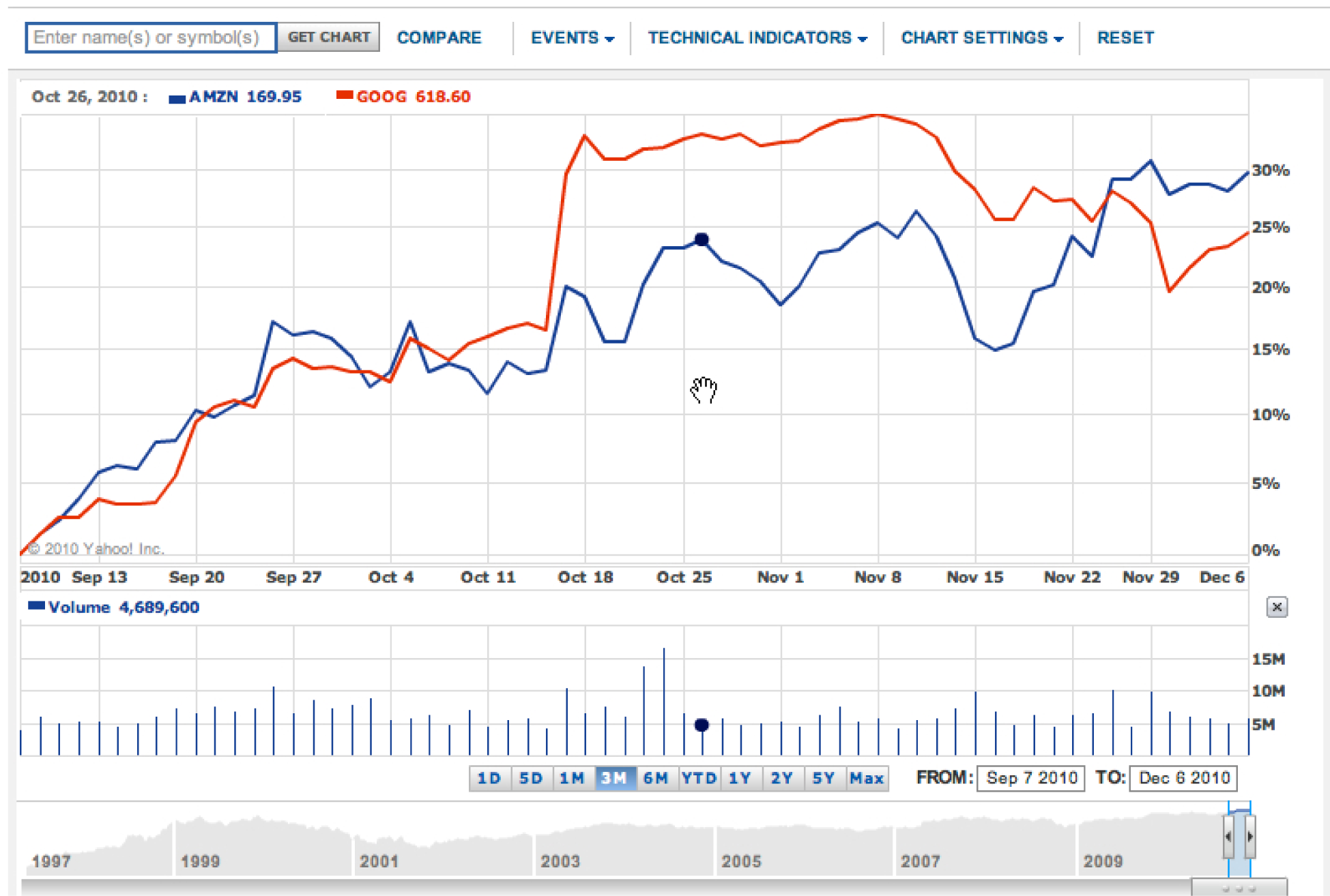
The convergence of usability, graphic design, and analytical design on Yahoo Finance. This graph shows the three month stock price for Amazon vs. Google. From a usability standpoint it could not be easier to request the graph. Type the company name and it suggests the stock ticker symbol. Also, as you move your cursor (the hand), the black dot on the line moves as well, and the numbers on the top left update to display values for the date you are passing over—very slick! The graphic design is excellent—muting the underlying grid so that the data stands out by contrast. The analytical design is also first rate. Hundreds of data points are effortlessly represented. We see the trading volume on each day. At the bottom, the stock price is placed in context over a multi year period. In sum, we have a tremendous amount of information beautifully represented without clutter. Think about this the next time you see an impoverished PowerPoint graph with four bars representing four data points.
Systems Development Life Cycle (SDLC)
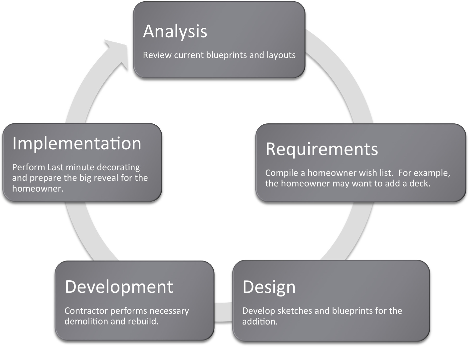
Information systems are designed using the systems development life cycle (SDLC). The SDLC is to a large extent common sense spelled out in stages. First, analyze the current situation. Then specify the requirements that a solution should embody. The next stage is to design a solution (no programming yet). Then the system is developed (programmed) and tested. Finally, the system goes live for the end users as it is implemented in the business setting. To review, the five phases are:
- Analysis
- Requirements (vision of future state)
- Design
- Development
- Implementation
In this course we will cover all five stages. However we will focus most heavily on the first three stages for two reasons. First, because that is where IS professionals tend to spend most of their time and second because it is much easier to make changes to a system when in the planning stages, than after code has already been generated.
It is good to frequently interact with the end user and show them screen mockups and a systems architecture diagram of what the final system will look like. The systems architecture is a hierarchy diagram of the flow of the website or app—what the relationship between the pages of the system will be. It is sometimes called a site map. Ideally the systems architecture is done on paper with sticky notes that can be moved around at will by multiple users. A final systems architecture can be represented as a hierarchy chart in PowerPoint.
Once the systems architecture is complete, wireframes or mockups of the individual pages may be constructed. Mockups are non-functioning pages generated in a drawing program such as PhotoShop, Omnigraffle (Mac), or even PowerPoint. PowerPoint turns out to be a fairly respectable mockup tool—especially when working off of some predefined templates.

The SDLC in action. By analogy think of home improvement shows on TV. such as Curb Appeal. They typically follow a similar life cycle when improving a home. The current state of the home is analyzed in consultation with the resident. During this stage the residents reveal their requirements for a solution. For example, they might want a way to interact more with the neighbors. Next the designer produces a plan to meet those requirements. For example, a French door in the living room leading to a front deck from which to interact with the neighbors. Actually blowing a hole through the wall and installing a deck is the development stage. If the design is good and workmanship good, the owner is normally delighted with the solution. At least they seem to be on TV. The illustration below helps to tease out some of the equivalencies.
KEY TAKEAWAYS
- The systems development life cycle (SDLC) is an approach for designing and developing MIS solutions. It proceeds in stages: analysis, requirements (vision of future state), design, development, and implementation.
- Information systems professionals often make the equivalent of a sketch of the design of the final system. When the sketches are crude they are called wireframes; when they are more refined they are called mockups. However, sometimes the terms are used interchangeably.
QUESTIONS AND EXERCISES
- Watch a home improvement show such as Curb Appeal and identify all five stages of the SDLC in the show. About how much time does the show devote to each stage?
- Read and summarize an article on interface design from humanfactors.com.
1.3 The Big Picture
LEARNING OBJECTIVE
- Compare and contrast Enterprise, Collaboration and Collaboration systems
Business Information Systems
Most information systems can be grouped into three broad classifications—enterprise systems (ES), knowledge management/collaboration systems, and business intelligence (BI) systems. These collectively comprise the information systems architecture for an enterprise.
Enterprise systems are used to manage the day to day business processes. Supply chain management (SCM) controls inbound and outbound logistics. Customer relationship management (CRM) manages communications and marketing initiatives directed at customers. However, the grandaddy of them all are enterprise resource planning (ERP) systems that control business transactions from accounts payable/receivable to product movement on the factory floor.
If this seems dense now, don’t worry about it. Books have been written about all these pieces. What is important for you to see is that ideally all the systems are smoothly coordinated so that management makes information driven decisions.
All of these enterprise systems communicate and share information as needed. They also store each of their activities in databases. At regular intervals these databases are copied into a centrally located data warehouse. The copying process is called extract, transform and load (ETL). Data is extracted from the multiple databases, transformed to a common format, and then loaded into the data warehouse.
The data warehouse then becomes a gold mine of data about the business. The beauty of the data warehouse is that it can be queried offline without interrupting operations of the business. However, the data warehouse is only as useful as the systems that query it for information. These are called business intelligence (BI) systems. One of the most well known types of BI systems is for advanced reporting or data mining. BI systems look to spot trends in the data and then convey that information to the appropriate management level. For example, BI systems discovered years ago that diapers and beer were often purchased in the same supermarket visit. Clever marketing sleuths concluded that dad sent out to buy diapers was also picking up a 6 pack on his way out of the store. This creates opportunities for product placement—locating the beer closer to the diapers.
Knowledge management and collaboration systems are ways that members of the organization capture and institutionalize organizational knowledge. The most familiar types of systems are internal websites for the company as well as blogs and wikis. However, leading organizations will also require that reports be filed in a systematic way to allow for easy retrieval in case the organization encounters a similar business problem in the future.

The big picture of information systems architecture. We will touch all these systems—albeit at a surface level. We will create a store that handles customer relationship management (CRM). Blackboard and similar systems are examples of collaboration systems. Finally, we will analyze our sales data as a form of business intelligence.
KEY TAKEAWAYS
- Most business information systems can be classified as enterprise systems, collaboration systems, or business intelligence systems.
- Ideally all these systems smoothly exchange data to help managers make information driven decisions.
QUESTIONS AND EXERCISES
- In Good to Great, Jim Collins quotes former Kroger CEO, Lyle Everingham, on how Kroger management made the decision to pursue the Superstore concept, “Basically, we did extensive research, and the data came back loud and clear: The super—combination stores were the way of the future.” Which of the information architecture systems could produce such data? Explain.
Chapter 2 Information Systems to Enhance Business: Business Process Redesign
Information Systems to Enhance Business: Business Process Redesign
“If you don’t know where you’re going, you might not get there.”
Yogi Berra
2.1 What Is a Business Process?
LEARNING OBJECTIVES
- Identify a business process
- Describe the difference between an As-Is and To-Be business process
- Ask questions to elicit business process information from the client
Introduction
Every information system is designed to improve business in some way. However, before making an improvement, it is critical to understand the current business process. In this chapter we will develop a technique to diagram business processes. We will first diagram the current business process—the so-called As-Is process. After studying the process, we will be in a position to propose and diagram a future process—the so-called To-Be process. If we have done our job well, the To-Be process will improve upon the As-Is process, making it more efficient, effective, user friendly, and so forth. In other words, every process improvement should move the business closer to achieving its goals.
Where Are We in the Life Cycle?
Many information systems projects are conceived of in a life cycle that progresses in stages from analysis to implementation. The diagram below shows the stages that we touch in the current chapter:
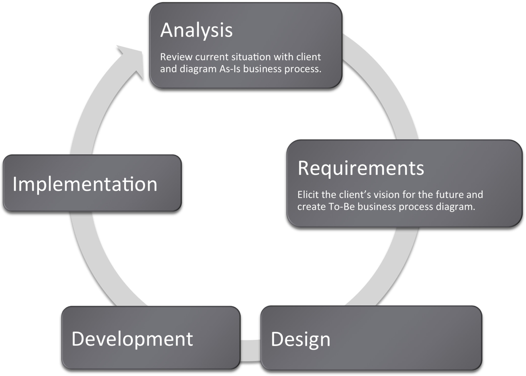
Goal Directed Activities.
Implicit in each current and future state are one or more business processes. A business process is a set of goal directed activities. In other words, a process describes the actions To-Be taken to accomplish a task. For example, applying to a university, filing taxes, and evaluating employees are all processes. The steps in applying to a university might include filling out an online form, submitting a credit card payment, requesting test scores be sent, and requesting that high school transcripts be sent.
Note that all of the processes mentioned above took place even before the advent of computers. Try to imagine how. Information systems simply transform the processes with the goal of making the process more efficient, convenient, effective, reliable, and so forth.
First, we represent the current (usually deficient) state As-Is process. Seeing the As-Is process diagrammed exposes obvious areas for improvement in the process. For example, many years ago students registered for classes in person. The As-Is process in that era might have shown a student waiting in line outside a large auditorium. When his turn comes up, the student enters the auditorium. There are tables representing each department staffed with faculty from that department. For each course that the student wishes to take, he must find the corresponding department table and add his name to the list for that class. Buying concert tickets followed a similar process before services like Ticket Master went online. People used to camp out for days in advance outside the Ticket Master office.
Sometimes information technology may improve processes, other times no technology is required. Sometimes the solution is as simple as providing information for individuals completing a business process at the appropriate time, or simply rearranging the steps in the business process, in which case, no new information technology is needed.
The redesigned and improved business process is called the To-Be process. This process takes into consideration the deficiencies identified in the As-Is process and the goals of the business. The area of work that focuses on improving business processes is called business process redesign. Individuals performing this work focus on understanding the As-Is process and how to improve it in the To-Be process.
Business Process Examples:
-
Shopping at a grocery store
-
The deli
- Taking numbers
- Rules about which products can be sliced on which machines
- Rules about wrapping product after slicing
-
The fish counter
- Taking numbers
- Rules about how to prepare the fish—head and tail off and so forth.
-
Checkout
- Scanning and weighing procedures
- Gathering customer data
- Printing customized coupons
- Optimal bagging
- Taking payment
-
-
Shopping at an online retailer
-
Product display
- Best selling
- By price
- By rating
- Cross selling—“You might also like…”
- Shopping cart and checkout processes
-
-
Inventory management
- Determining the inventory need
- Reordering with supplier
- Tracking and receiving shipments
- Stocking shelves
Note that most business processes subsume other business processes. One of the toughest challenges is knowing what process to focus on and with what degree of granularity to zoom in on the process. Never lose site of the problem you are trying to solve—and use that as your filter.
The Initial Client Meeting
Obviously, you can not diagram a business process without understanding the business. This will require meetings with the client. It is best to walk into those meetings with a willingness to listen rather than pretending that you know the client’s business. Ask open ended questions and take lots of notes.
Those that design systems are called business analysts or consultants. Analysts begin their work with an initial client meeting. The quality of the questions asked at that meeting may well determine the success or failure of the project. Using the following four open ended questions can help in this consulting situation (Starr, 2010):
- Current state: What does the client see as the current state of the situation/project?
- Future state: What is the vision of the client for the end point of the situation/project?
- Barriers: What barriers does the client envision will hinder reaching the vision?
- Enablers: What is the client already doing to reach the vision? What does the client think will help?
Note that these questions capture the aspirations of the client as well as perceived barriers and enablers to reach that vision. The assumption here is that the client knows her business pretty well, and the goal of the initial meeting is to capture her knowledge and vision without jumping to a solution.
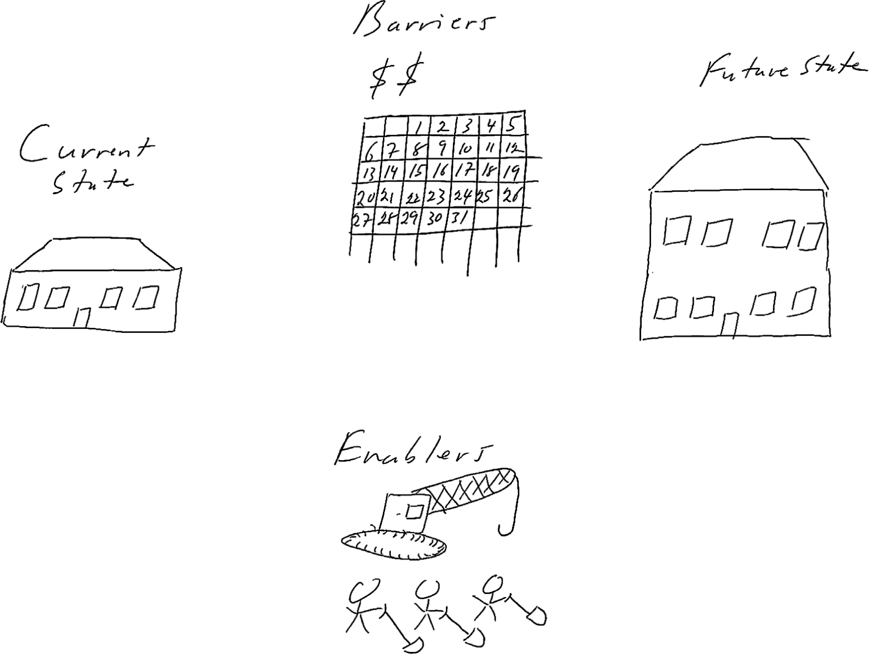
The initial client meeting for a home renovation project adding a second story to a home. Note the barriers, time and money, and the enablers, the crane and manpower. Business problems require a similar type of analysis. Never assume that you know these items. Give the client the opportunity to explain. It will save you a great deal of time in the final analysis.
KEY TAKEAWAYS
- A business process is a set of goal directed activities
- The As-Is process captures the analysis of the current state of the business
- The To-Be process captures the client’s requirements for the future state of the business. Ultimately the To-Be process will be the measuring rod against which you will evaluate the completed system.
QUESTIONS AND EXERCISES
- Identify three business processes involved in the purchase of a car.
- Describe how the process of going on a date changed with the introduction of online dating services such as Match.com. What do you see as the pros and cons?
2.2 Diagramming a Business Process
LEARNING OBJECTIVES
- Create deliverables for the first two phases of the systems development life cycle
- Create As-Is and To-Be process diagrams for the redesign of a business process
- Given an advertisement, research and represent the business process redesign
- Manipulate images and text to create a best practice diagram in PowerPoint
- Choose and successfully employ PowerPoint techniques to solve a complex task
Actors and Actions
Improving a business process requires first understanding the process. Diagramming the steps in the process contributes greatly to that understanding. Business process diagrams typically consist of actions linked by arrows. However, it is also important to be clear about who is performing each action. For this reason we create a swim lane for each actor in the process. The actors pass a metaphorical baton among themselves at different stages of the process.
An easy way to diagram a business process is to first identify all of the actors and place each in a swim lane. The process begins at the top of the page and continues down the page following the arrows. Arrows represent communication among the actors, while diamonds represent decision points. While actors are normally people, a computer standing in for the role of a person can also be an actor.
At times we can simplify the business process diagram by eliminating all but the essential elements. This makes the diagram less cluttered and easier to read. On the facing page we have a process diagram reduced to just three elements — swim lanes, actions, and arrows.
For the level of analysis needed in this course, the simplified diagram is more than sufficient. However, it is good to know the full lexicon, especially the decision point diamond shown on the next page.
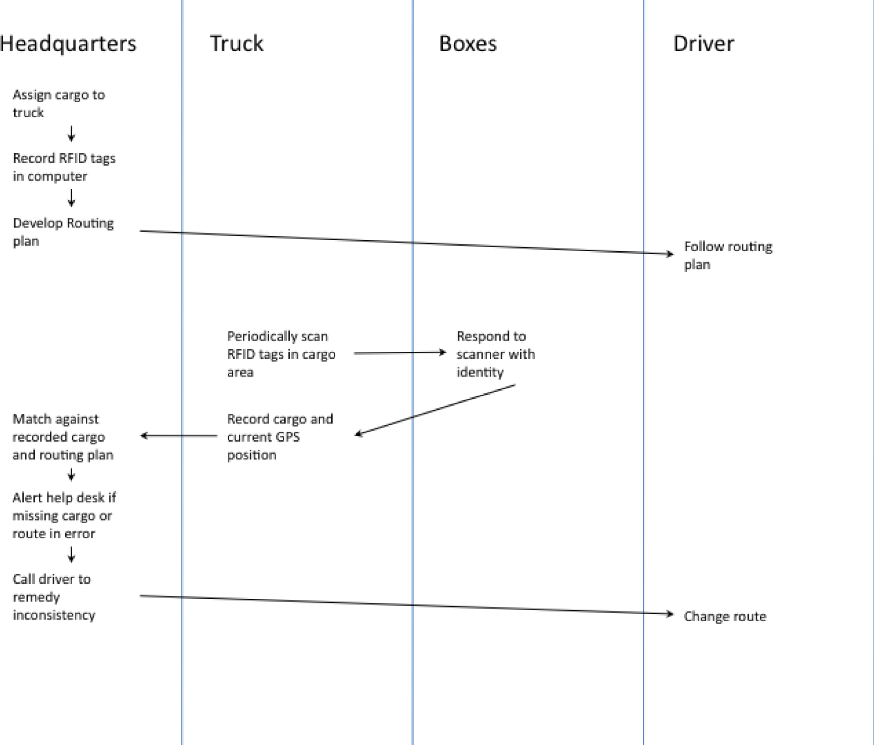
To-Be business process for IBM’s package routing solution. In this solution Radio Frequency Identification (RFID) tags in the boxes communicate with their surroundings to report their geographic position back to the help desk. If a truck has taken the wrong turn, the boxes will notify the help desk. A help desk employee will in turn communicate by phone with the truck driver to reroute the truck.
It’s More Complicated Than That
What we showed on the prior page is actually a simplified form of a business process diagram. For the purpose of this course, the simplified form works just fine. However for the sake of completeness, we show a more advanced diagram more in the spirit of Universal Modeling Language (UML). It is not that the UML style diagram is better—just that you should be prepared to see it. The following table lists some of the symbols that you might encounter in a process flow diagram.
Table 2.1
|
Action state |
 |
An action taken in the flow |
|
Start state |
 |
A beginning of a flow; only one start state can be used |
|
End state |
 |
An end of a flow; any number of end states are allowed |
|
Transition |
 |
Indicates the control passing from one object to another |
|
Decision point |
 |
Showing possible options and paths to follow |
|
Fork |
 |
The beginning of parallel processes |
|
Join |
 |
The integration of parallel processes |
|
Swim lane |
 |
Represents ownership or assignment of a group of actions |
|
Artifact |
 |
An object involved in the system, such as a server or database |
KEY TAKEAWAYS
- A business process can be diagrammed by showing actors in swim lanes taking actions. Communication or message passing among the actors is represented by arrows.
QUESTIONS AND EXERCISES
- Diagram the As-Is and To-Be processes before and after online dating.
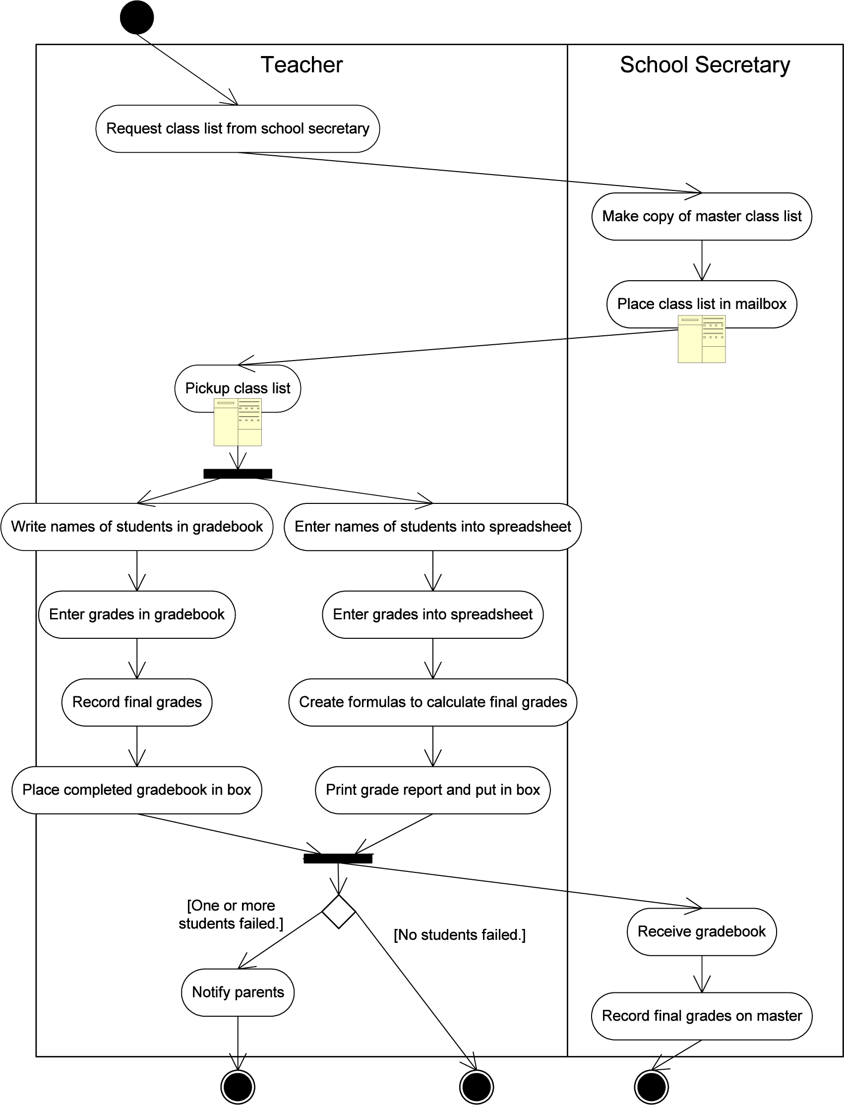
Universal Modeling Language (UML) style As-Is process flow for recording grades.
Techniques
The following techniques, found in the PowerPoint section of the software reference, may be useful in completing the assignments for this chapter.: Layout-Change • Align • Shape-Insert • Text Box-Insert
L1 ASSIGNMENT: DIAGRAM BUSINESS PROCESSES
Create As-Is and To-Be diagrams of a business process, given a video commercial. Many commercials on TV are really advertisements for improved business processes. IBM has been particularly active in this arena. IBM’s focus on business process improvement makes sense given that IBM is one of the largest consulting organizations in the world. In this exercise, you will view a commercial on YouTube and then create the As-Is and To-Be business process diagrams that the commercial implicitly represents.
Setup
Start up PowerPoint.
Content and Style
- Use the drawing tools in PowerPoint to create swim lanes and diagram the As-Is and To-Be business processes on separate slides.
- Make sure you title each slide to identify which is which.
- Align and space the content consistently. A sharp looking diagrams conveys professionalism.
- Include a copyright symbol and your name in the bottom left corner.
- When you are finished, submit the PowerPoint file according to your professor’s instructions. Your professor may want hard copy or an electronic submission to the course management system.
Deliverable
Electronic submission: Save your file as a PowerPoint presentation. Submit it electronically.
Paper submission: Create a printout by printing the slides directly out of PowerPoint.
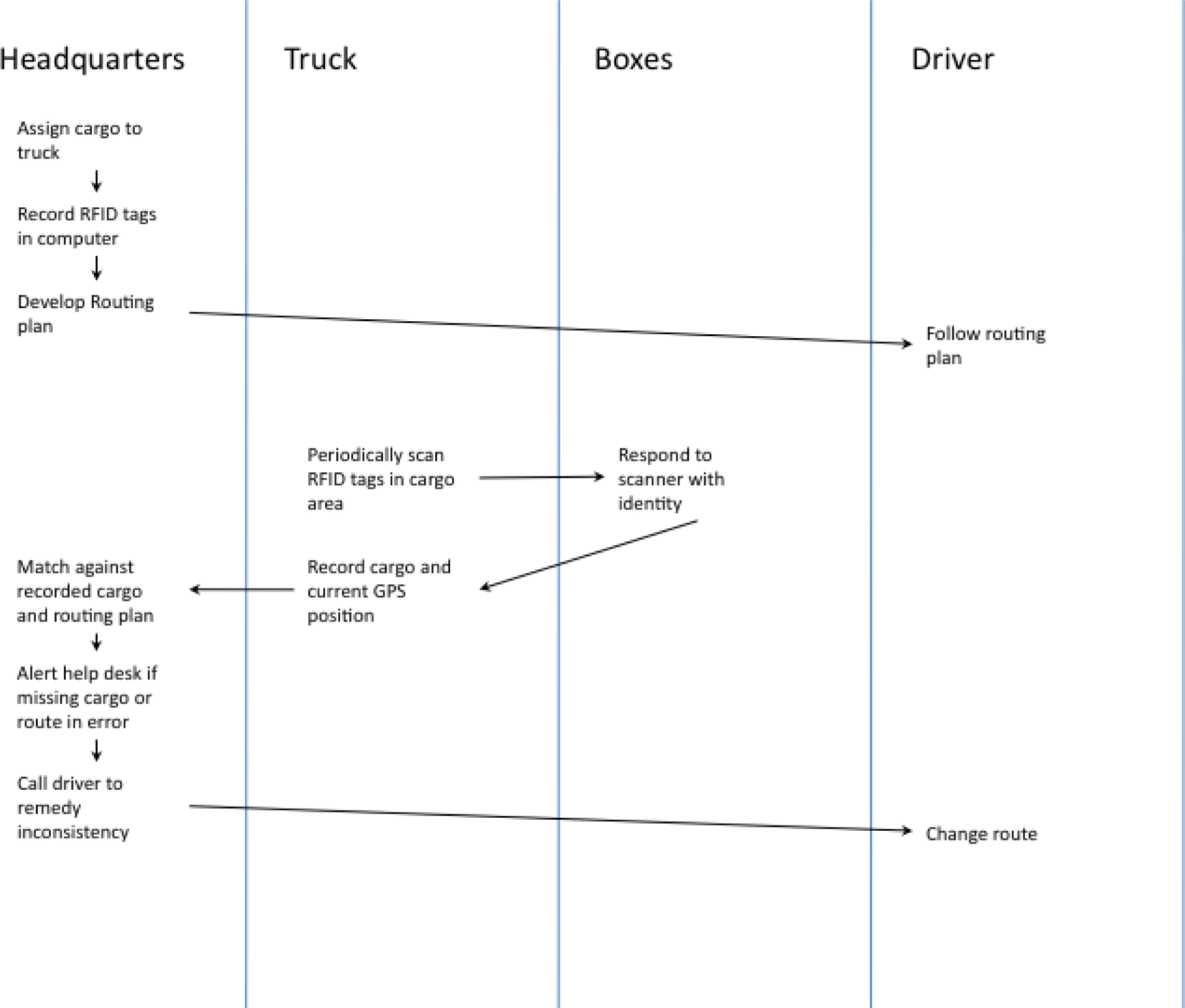
Sample To-Be deliverable for the IBM RFID trucking commercial.
Chapter 3 Professionalism in Deliverables: Principles of Graphic Design
“We are all inherently visual communicators. Consider kindergarten: crayons, finger paints, and clay propelled our expression, not word processors or spreadsheets…”
“Unfortunately, somewhere, at some time, someone probably told you that you weren’t very good at drawing. And, after looking around and comparing yourself to other kids in the classroom, you probably consented, threw in the towel, and decided that piano lessons or football might prove a better bet for primary education glory.”
“Now, as an adult, you may not try anymore—at least in the visual realm. This is ironic considering that your employers and colleagues assess you by how well you communicate—a skill that is reflected in annual reviews, pay increases, promotions, and even your popularity. Effective communication is a job requirement now, whether you’re trying to beat competitors, communicate vision, demonstrate thought leadership, raise capital, or otherwise change the world. And like it or not, your profession likely requires you to communicate using a visual tool, regardless of your proficiency or training in this medium. Business schools in particular drill their students in management, accounting, and technology, but few offer anything approaching Design 101—the one thing that combines creative thinking, analytics, data assimilation, and the inherent ability to express oneself visually.”Duarte, Nancy, Slide:ology: the Art and Science of Creating Great Presentations, O’Reilly Media, Inc. 2008, p2.
Nancy Duarte
3.1 C.R.A.P. Principles of Graphic Design
LEARNING OBJECTIVES
- Compare and contrast artwork using graphic design principles—contrast, repetition, alignment, proximity (C.R.A.P.)
- Compare and contrast artwork using ad design principles (picture, headline, text, logo)
- Compare and contrast artwork using type design principles (font, size, weight, color, form, direction)
- Distinguish between layouts that conflict versus layouts that go well together
- Categorize fonts based on visual inspection
- Manipulate images and text to re-create a best practice advertisement in PowerPoint
- Choose and successfully employ PowerPoint techniques to solve a complex task
Introduction
How much graphic design do you need in business? Considering the heavy emphasis that is currently placed on “the look” of deliverables, the answer might be a lot. We don’t pretend that you will become a master of graphic design after just one chapter. However, there are some survivor principles of graphic design laid out by Robin Williams. Those principles are contrast, repetition, alignment, and proximity (C.R.A.P.).
You will learn to see the world in a new way. For years, you have looked at magazine layouts, ads, banners, flyers, etc. Some have caught your eye and some have not. Unless you have been trained in graphic design, it would most likely be hard for you to vocalize what it is about a layout that appeals to you.
The principles of graphic design, ad design, and type design will be repeated throughout the text when designing the following deliverables:
- Ads
- Websites
- Resumes
- Term papers
- PowerPoint presentations
- Spreadsheets
- Graphs
Everything that you design in this course will have a professional feel to it. Our goal is to make your work indistinguishable from the work that appears in publications such as the New York Times and the Wall Street Journal. Realizing that goal will also help make you a valuable contributor in the workforce. Others will value your work as professional, polished and communicative. You will also be able to give guidance to others on how to improve the look of their deliverables.
Robin Williams Robin Williams is the author of the Non-Designer’s Design Book. This is an essential reference used even in graphic design programs.
Where Are We in the Life Cycle?
Many information systems projects are conceived of in a life cycle that progresses in stages from analysis to implementation. The diagram below shows the stages that we touch in the current chapter:
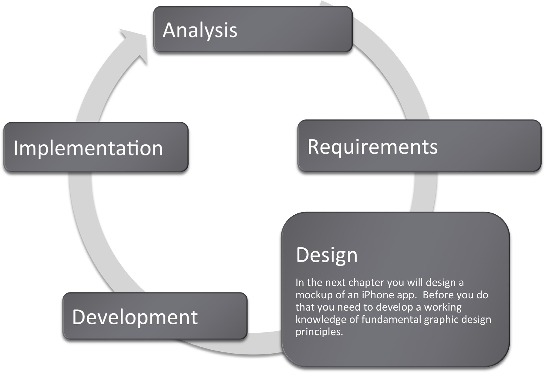
Contrast
Contrast focuses our attention and should be used to highlight the most important points that the audience should take away. Designers should use colors, bold type, and size to distinguish parts of text or an image and create contrast. Contrast is used in all aspects of life. For example, jewelers usually display their diamond pieces on a background of black velvet to let the jewels stand out. The page you are reading uses headings to create contrast with the text.
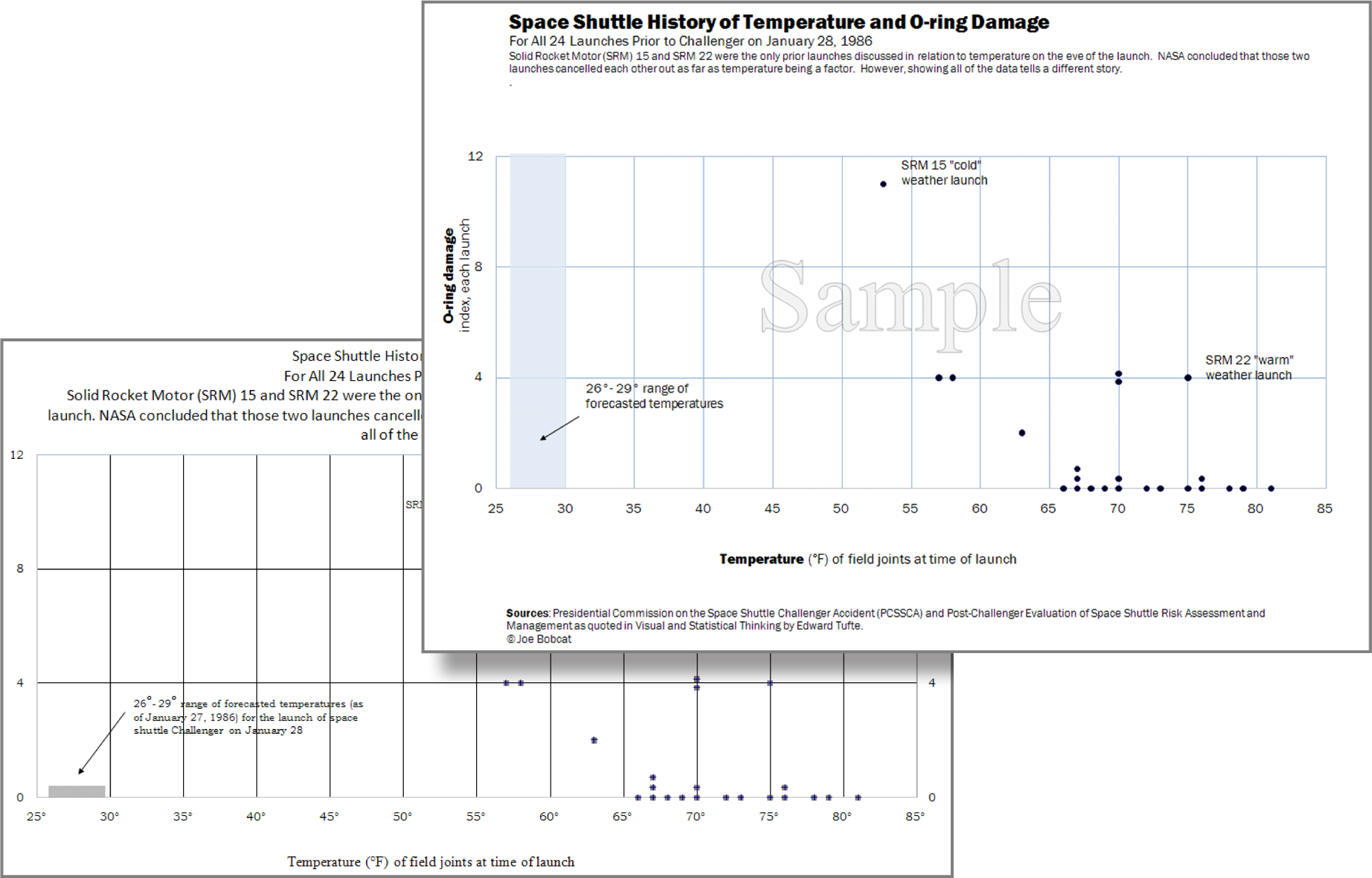
Formatting, including the use of a blue shape, creates contrast, drawing attention to important data points in the Excel graph.

Formatting headings for the title and subtitles creates contrast..
Contrast Through Visual Weight
Another way to create contrast is by using visual weight. You create a focal point and then lead the reader’s eye around the page. The main focal point is the picture. The next “heaviest” item on the page is the headline, followed by the date, followed by the logo, followed by the body text. The reader’s eye is led from one item to the next based on these “weights.” The greatest mistake that most students make in flyer design is to make all the text the same size as though it needed to be readable from 20 feet away. As long as the picture and headline capture interest, a reader will move in closer to read the rest of the flyer. Also, if every item is the same size then nothing stands out and it looks unprofessional. Variation of font sizes and weights is critical to focus attention.
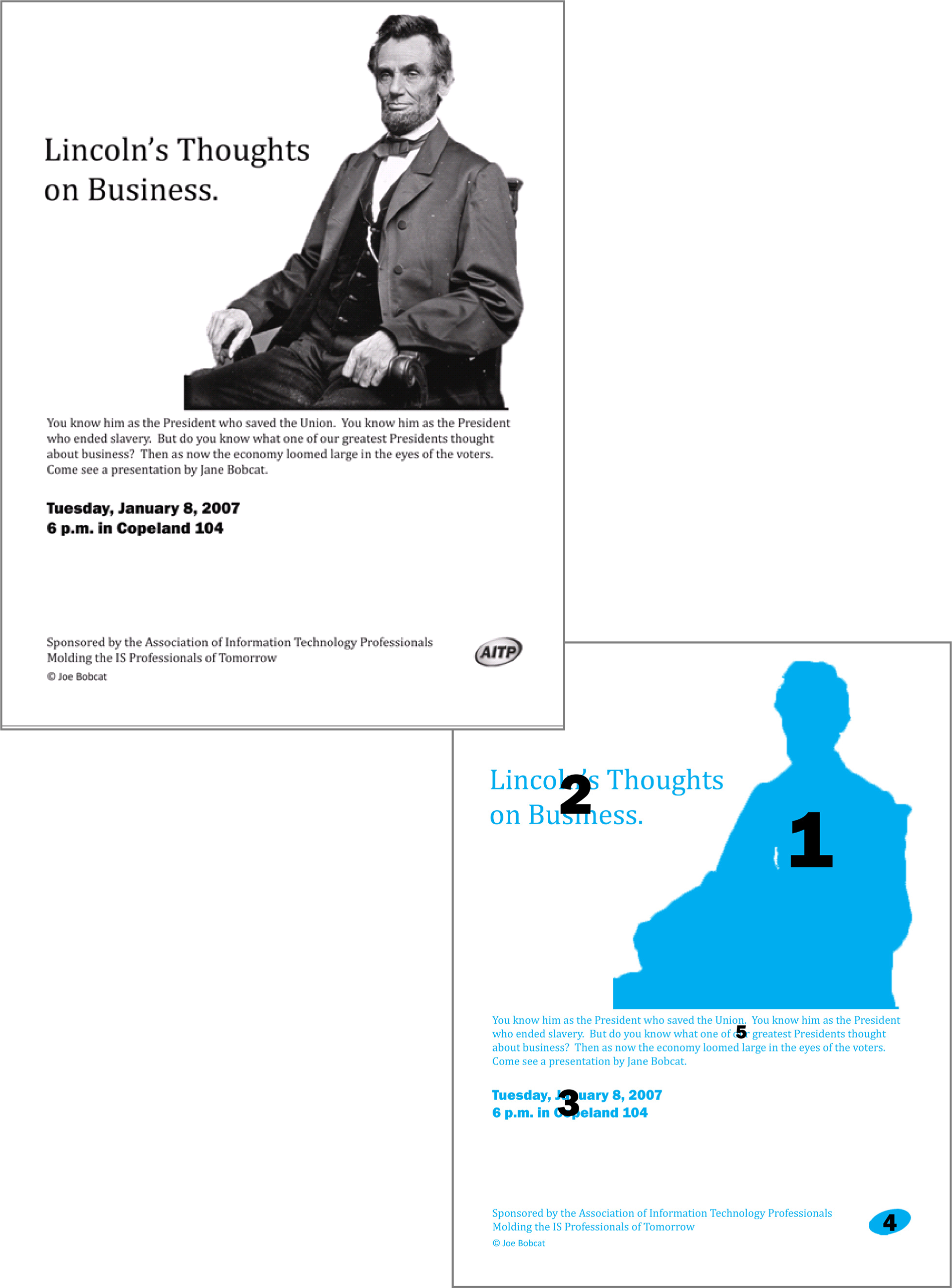
Visual weight in action. Note how your eye travels around this flyer in the numbered sequence depicted.
Contrast with Fonts: Type Design
When working with type, aim for a contrasting layout. Contrasting layouts create visual interest and energy. For example, when you wear clothes of contrasting colors, such as red on navy blue, the outfit can be quite eye catching. Our examples will follow the conventions Robin Williams sets out in her book.Williams’ book, The Non-Designers Design Book discusses design principles for the novice designer.
The opposite of contrast is affinity. Layouts demonstrating affinity show subtle variations in color or brightness. The overall effect is pleasing, though not particularly remarkable. For example, a person wearing a dark suit with a dark tie would be wearing an outfit that shows affinity.
In type design, a layout showing affinity is best for formal documents, such as wedding and graduation invitations. For most other documents, use a contrasting style to make your documents really pop. However, tailor the contrast to suit the audience and the occasion for the document. For example, a business plan prepared for a bank should have less contrast than the layout of this text book. When in doubt, be conservative.
The one type of layout that you must avoid is a conflicting layout. In a conflicting layout the type is very similar but different. For example, never use two different serif fonts on the same page. Think of wearing an outfit that has two different shades of red that are very similar but different. The combination looks like a mistake—as though part of the outfit had faded in the wash. In the same manner two serif fonts side by side will look like a mistake. Fonts should be identical or very different.
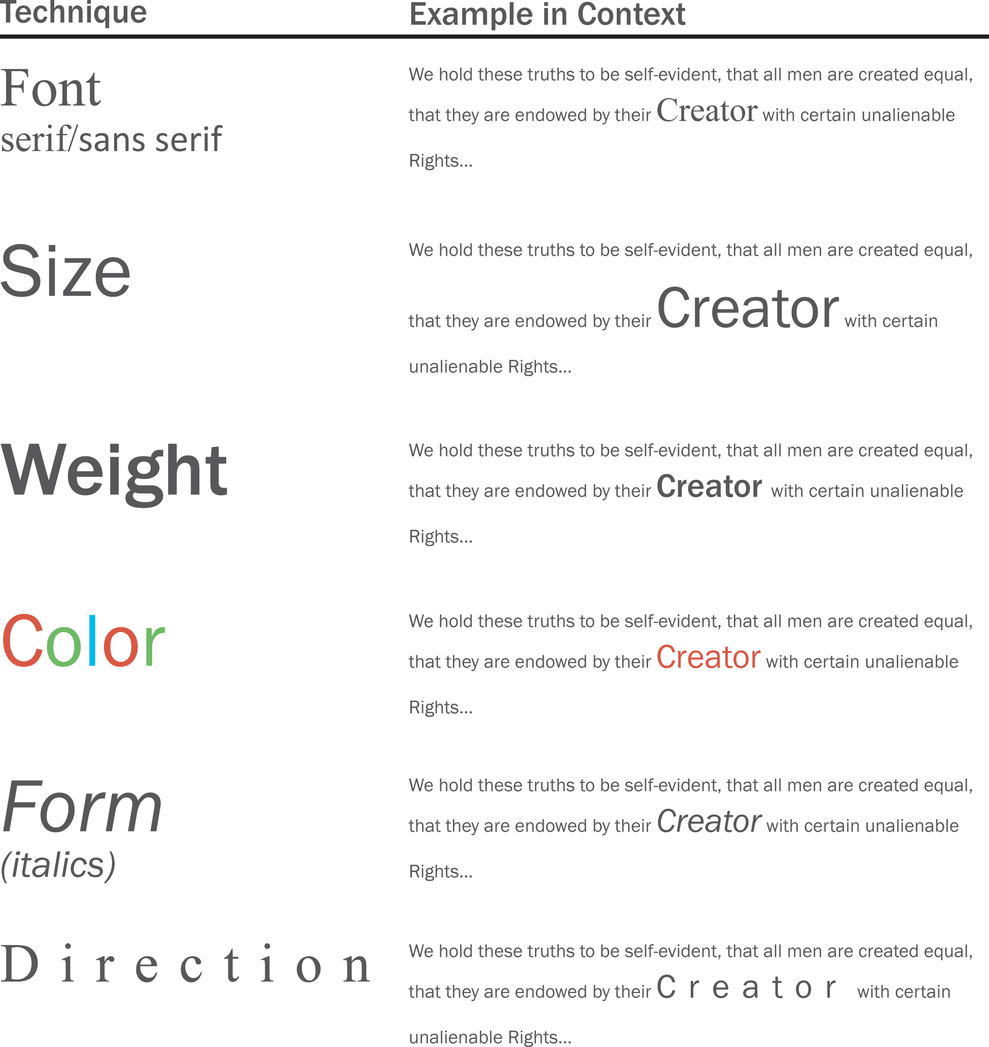
The text on the next page is taken from The United States Declaration of Independence and demonstrates some type contrasting techniques. By increasing the font size and changing the text color, you can highlight certain words or information that you want to stand out. The goal is to make “Creator” stand out as the most important word in the sentence. You can also boldface to dramatize the weight of the text or italicize to accent the text. Direction refers to adding space between letters to make text stand out. Structure, using serif or sans serif fonts, can also differentiate text and will be discussed in the next section.
Contrast with Fonts: Serif/Sans Serif
The two main categories of font are serif and sans serif. Serifs are the ornamental strokes at the end of the letters, which all serif fonts have. Sans serif means without serifs, therefore sans serif fonts do not have these decorative additions.
Serif and sans serif fonts can be used together to create contrast within text. Typically sans serif fonts are used for headings while serif fonts are used for body text.
Note that you should avoid combining two fonts that are from the same category. For example, two serif fonts that look similar, such as Georgia and Garamond, should not be used together.
Serif fonts are best used in text heavy books because the serifs quickly guide the reader’s eye from letter to letter. Sans serif fonts are the best choice for online text because serifs can blur in the pixels on a screen. The resolution of most computer screens is not sufficient to precisely draw the serifs in a body of text. The result tends to look blurry. Therefore, most websites use a sans serif font. An exception is sometimes made for the page title, which because of its greater font size, can show serifs much more clearly. To allow for serifs online, Microsoft developed a series of ClearType fonts designed to accurately reproduce serifs.
Though font options are limited online, other techniques such as size, weight, color, form, and direction can be used to create contrast within online material. Color is especially powerful on a website as most viewers have a color monitor.
Please see the Appendix for additional font categories. These include slab serif, modern, script, and decorative.

Contrast with Fills and Outlines
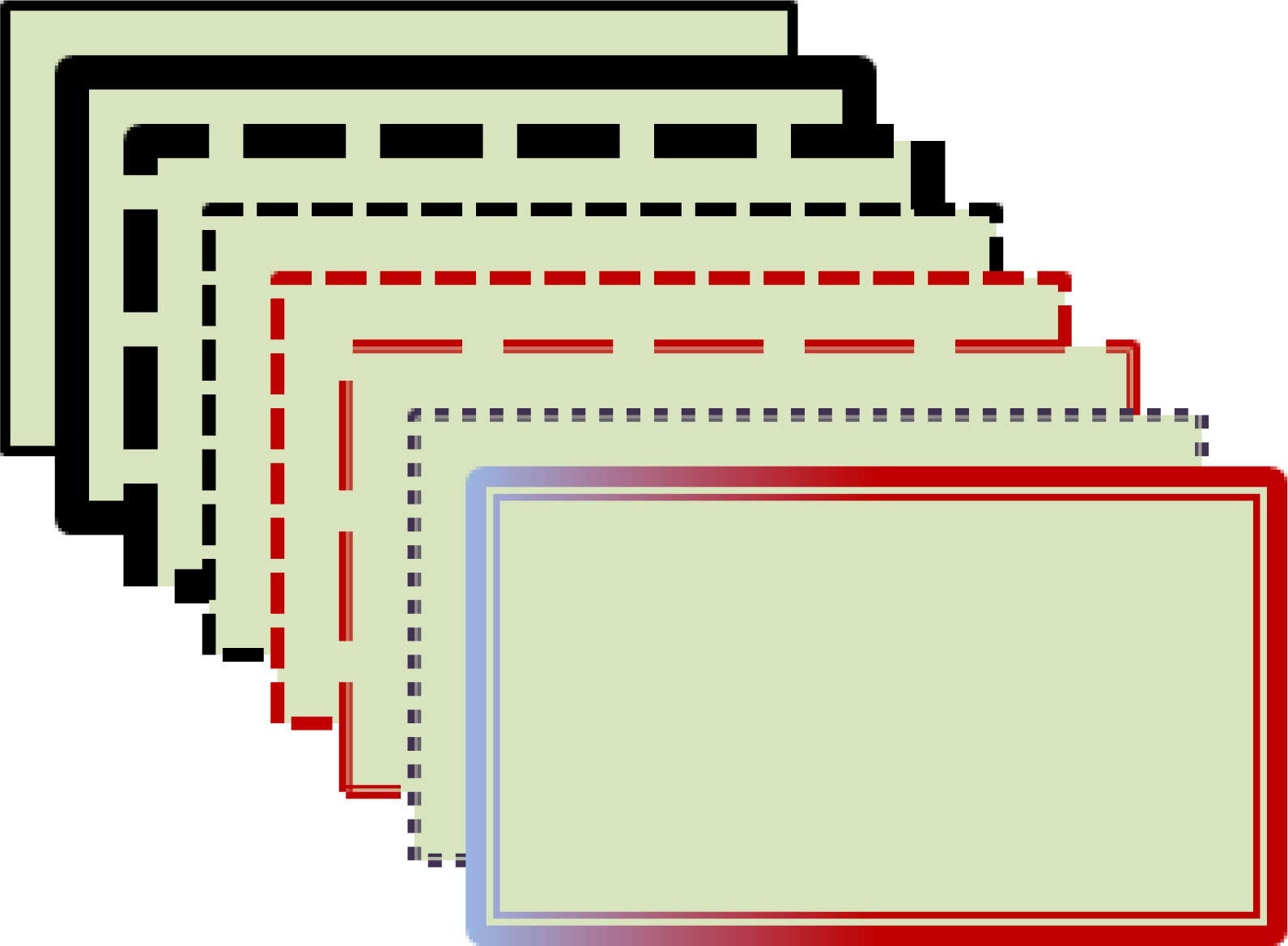
A fill is the color, gradient, or pattern the occupies the inside of a drawn object. An outline is the color, gradient, or pattern that borders the drawn object. PowerPoint has extensive fill and outline options.

Different fills, same outline
Same fill, Different outlines
Repetition Unifies an Image
Repetition ties objects or images together. For instance, we know which football players are on a team because of the repetition of their uniforms. This text uses repetition of fonts, styles, and sizes to unify the design. On the facing page, repetition of graphic elements draws an image together.
The repetition of formatting in the text headings creates a unified professional look.

This ad uses repetition with the colors in the text, arrow, stain, and background to reflect the colors in the logo and nachos. Notice how this ad looks more cohesive and professional.Special thanks to Gregg Fouch for designing the Casa de Yuca marketing materials.
Repetition with Color
Adobe has a wonderful free web-based application called Kuler, which helps you choose a color palette. One of its most spectacular features is the ability to upload an image and have Kuler automatically generate a color palette from that image. You then use that palette for fonts, fills, and so forth in your composition, and you are virtually guaranteed that the colors will all work well together.
To use the more interesting features of Kuler you must first create an account at: kuler.adobe.com. Now you can save your color palettes. Once saved, you can reveal the numerical values that correspond to your color palette. These numeric values may be imported into PowerPoint (under custom color).
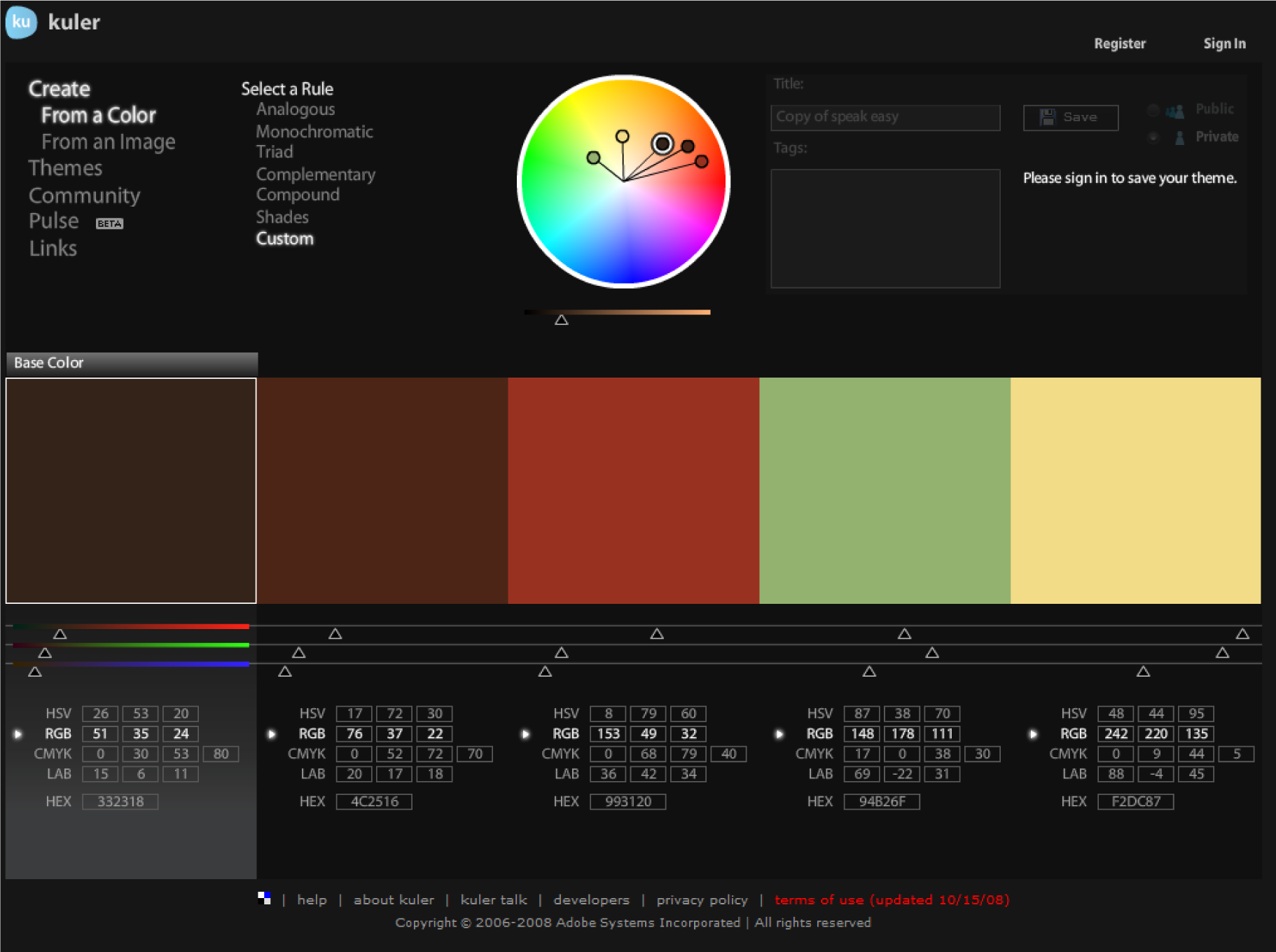
Kuler helps create a color palette. You can create a color palette by uploading a picture. After saving your palette, Kuler will allow you see the RGB values associated with each color. You can then type these values into PowerPoint. Adobe product screenshot reprinted with permission from Adobe Systems Incorporated.
Alignment
Alignment indicates organization, polish, and strength. Text on a page is easier to read and understand if it is properly aligned to the margin. Alignment should be applied to every design or page layout to show order. Alignment on this page is created by left aligning all of the text and graphics.
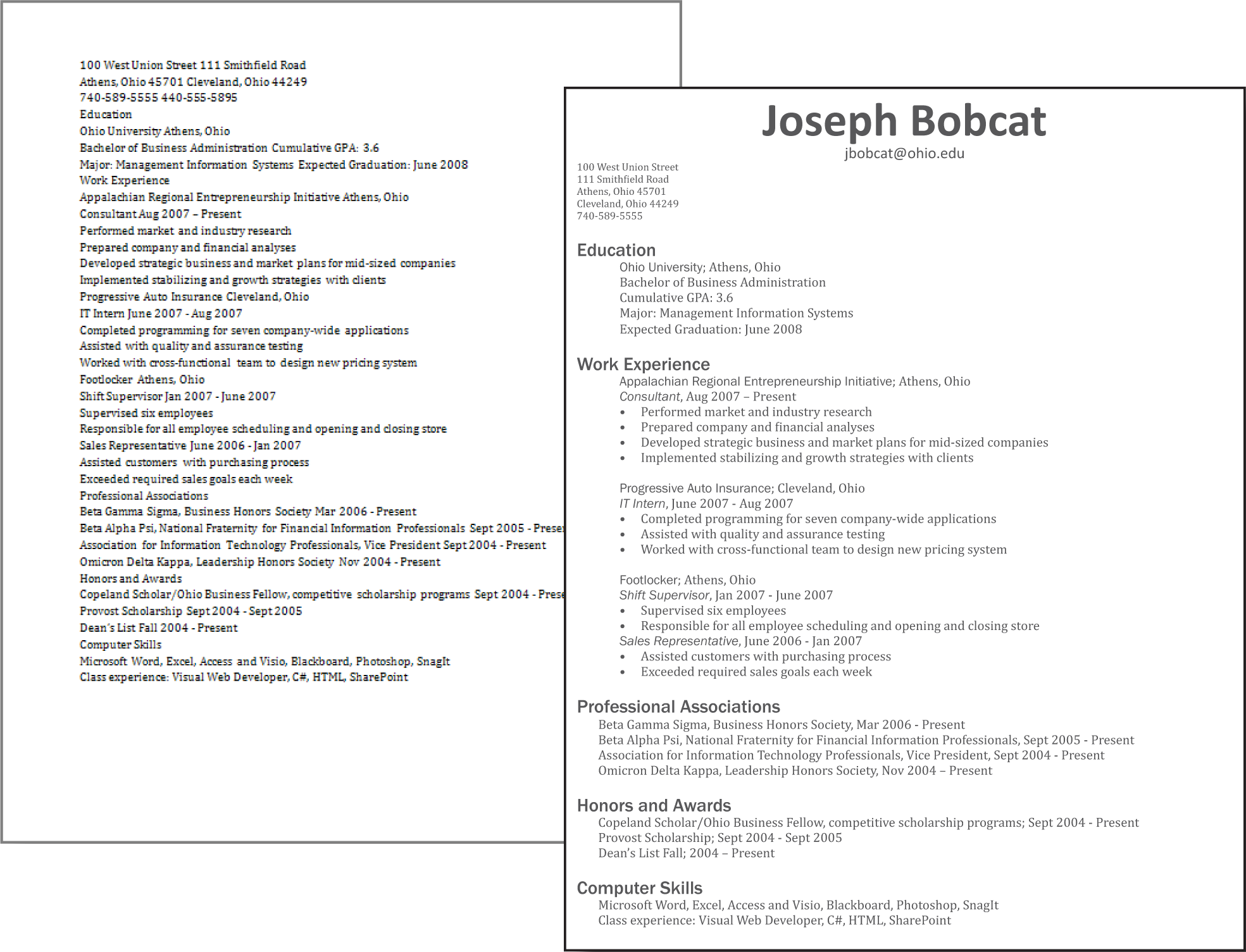
The alignment of text organizes the categories on the resume.
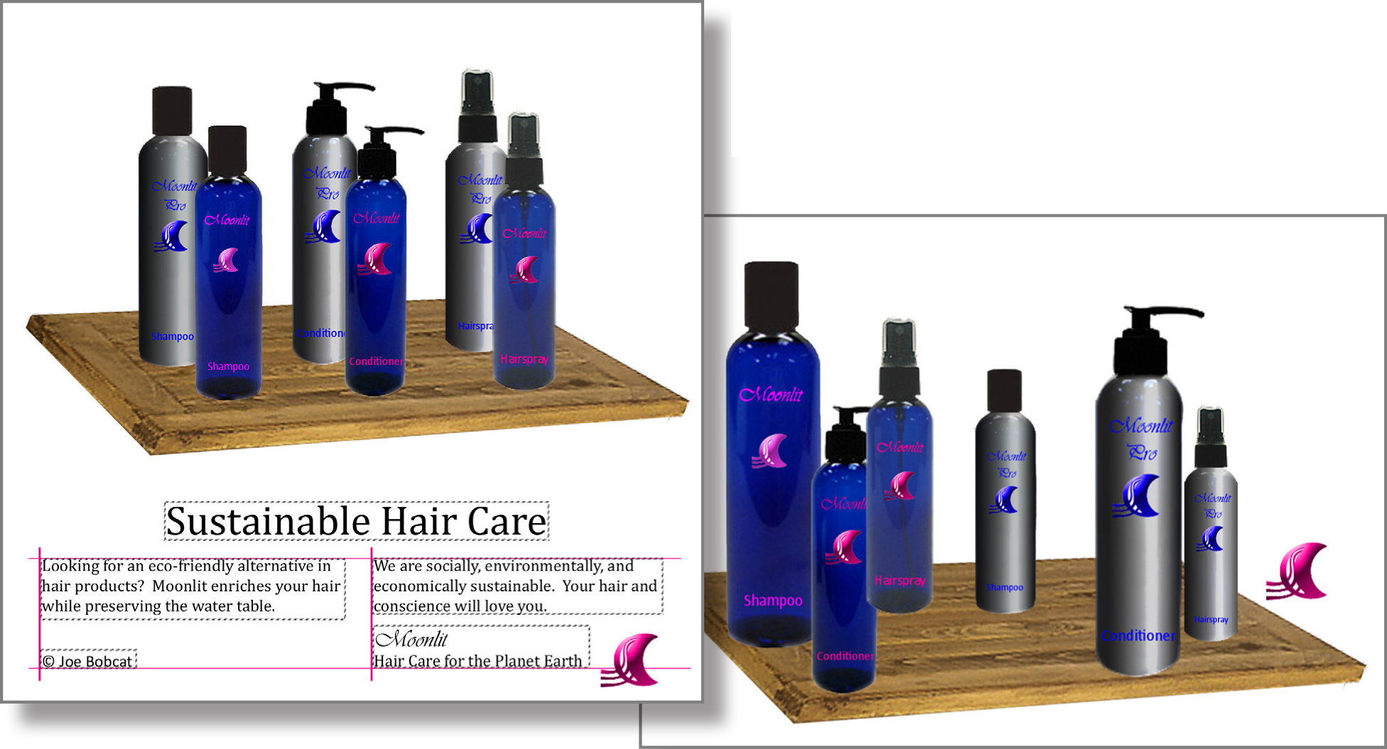
The alignment of text and images in this ad creates a polished and professional look.
Proximity
Proximity creates relationships within objects in an image. Placing objects close together shows their connectedness and focuses the audience’s attention. For example, captions placed near photos on a page layout show that they describe the photos they are near. The page you are reading places headings next to the text they introduce to signify their relationship.
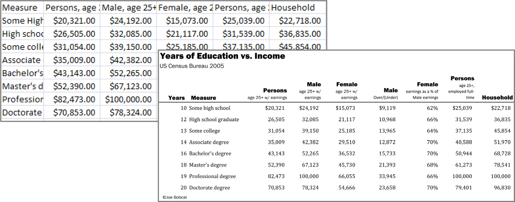
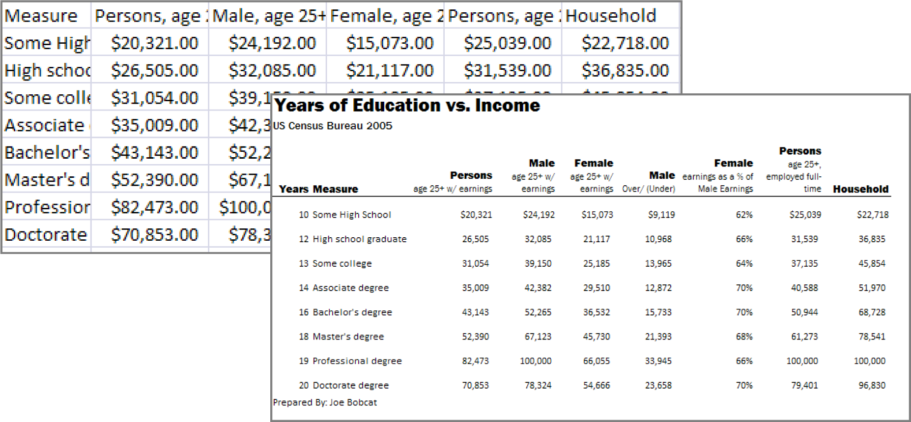
Proximity helps to organize this spreadsheet in Excel. The title and subtitle are separated from the rest of the spreadsheet.
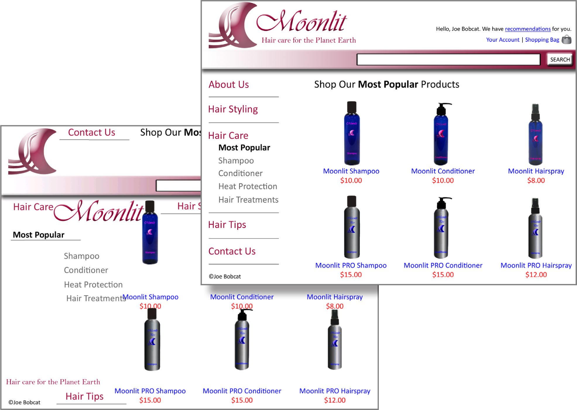
Proximity is used to group the links on the navigation bar. Similarly the image, title, and price of each bottle are grouped together.
Graphic Design Summary
Graphic design is perhaps the most creative aspect of information design. Though design leaves room for originality, there are clearly articulated principles every designer should follow to create clear and effective images. We will adopt four basic principles outlined by Robin Williams. These principles that have been introduced in the previous pages are: contrast, repetition, alignment, and proximity (C.R.A.P.).
Mastering these principles will allow you to produce clear documents and make presentations look more professional. The business cards on the next page demonstrate good and bad examples of each design principle. Please study these principles as they will appear again and again throughout this text.

Good contrast, repetition, alignment, and proximity.

Bland design lacks contrast.

Images lacking repetition look disconnected.

Lack of alignment looks sloppy.

Poor proximity lacks focus.
Ad Design: Picture, Headline, Text, and Logo
The C.R.A.P. graphic design principles are universal. However, most media have additional design principles that should be followed. For example advertisements tend to follow a convention in their composition. These additional principles are described here and serve as the basis for one of the assignments.
An effective ad should position the product in an appealing light to its target audience while also demonstrating the product concept. While there are many ways to design an ad, we will adopt the format advocated by John McWade.John McWade wrote an excellent book called Before & After Page Design. He also maintains a design web site, www.bamagazine.com. The four ad design principles are:
- Picture: Pictures are the focal point of an ad and should occupy a majority of the space. They are used to grab an audience’s attention.
- Headline: The headline of an ad should be concise and illustrated in a clear font. This is one of the few times that centered text works.
- Text: The body of text is used to sell the product. It delivers the message to the audience.
- Logo: Every ad should include a tag line — the company or product motto – and a logo.
Because pictures are the focal point of the ad, they should take center stage. Using a picture in an ad is an opportunity to showcase the product and, therefore, the picture should occupy roughly two-thirds to three-quarters of the available space no matter what the shape of the ad.

Some sample ad layouts. The picture should occupy two-thirds to three quarters of the ad and appear in the space above the white line.
KEY TAKEAWAYS
- The same graphic design principles apply to computer screens, documents, and presentation graphics.
- The four graphic design principles are contrast, repetition, alignment, and proximity (C.R.A.P.).
- Contrast helps to highlight and focus attention. Contrast may be achieved using color, shades of gray, size, visual weight, and so forth.
- Repetition helps to unite a document so that it looks like a
- coherent whole. Repetition may be achieved by repeating fonts, styles, images, and so forth.
- Alignment helps to organize information to make it clearer and more professional looking. Alignment may be achieved using onscreen guidelines.
- Proximity helps to establish relationships between items. Items in close proximity appear related.
- Type design may be used to reinforce contrast and/or repetition. Font, size, weight, color, form, and direction are all type design attributes.
- Colors should harmonize in a palette. Professional tools such as Kuler help to establish a color palette from an image.
- Fills and outlines can create contrast and/or repetition.
- Every ad should have a picture, headline, text, and logo.
QUESTIONS AND EXERCISES
- Identify the Picture, Headline, Text, and Logo in 3 different ads.
- Describe the use of C.R.A.P. principles by your favorite magazine.
- Describe the use of C.R.A.P. principles by your favorite website.
Techniques
The following techniques, found in the software reference, may be useful in completing the assignments for this chapter: PowerPoint: Overview Map of Interface • Image-Crop • Image-Delete Background • Image-Insert • Image-Rotate • Guide Lines-View • Turn Off Snap To Grid; In the Google section of the Cloud Computing software reference: Create an Account • Add a Signature Graphic; and in the Word section of the software reference: Text-Formula
L1 ASSIGNMENT: EMAIL SIGNATURE
Many students wonder how to create eye catching email signatures. A catchy signature helps you to stand out from the crowd. Part of your signature is the font and size that you use to respond to other emails. You will also learn more about cloud computing through Gmail.
Setup
If you don’t have one already, create a Gmail account at www.gmail.com. Sign into your Gmail account and go to Settings to change your signature. The fonts in Gmail are limited as they are trying to show fonts available on all computer platforms—Windows, Mac, and Linux. However, you can type up your signature in Word or PowerPoint and copy/paste it into Gmail with more inventive fonts. To see which fonts are likely to be installed on all systems receiving your messages visit these sites:
http://www.ampsoft.net/webdesign-l/WindowsMacFonts.html
http://www.codestyle.org/css/font-family/sampler-CombinedResults.shtml
Content and Style
- Create a readable, interesting, and professional email signature using text and [optionally] graphics.
- Specify the font you will use to respond to messages.
- Apply and follow all graphic design principles.
- [Optionally] Create graphics for the signature in PowerPoint using drawing tools. Save the slide as a PNG image in your public Dropbox folder. Then right click on the file in Dropbox to copy its URL. If you want to change the signature, just update the PowerPoint file and re—save as a PNG file to replace the prior version. In Gmail click on settings and insert an image in the signature editor. It will ask for a URL. Paste the URL from the file in your public Dropbox folder.
- Send an email to yourself with at least one line of text to test the signature. Save your test email with the signature as a PDF file or take a screen shot of the file using the Windows Snipping Tool (Mac users can use Cmd+Shift+4).
Deliverable
Electronic submission: Submit the PDF or screenshot from your Gmail test message to the course management system as proof of completing the assignment.
Paper submission: Create a printout of your Gmail test message.
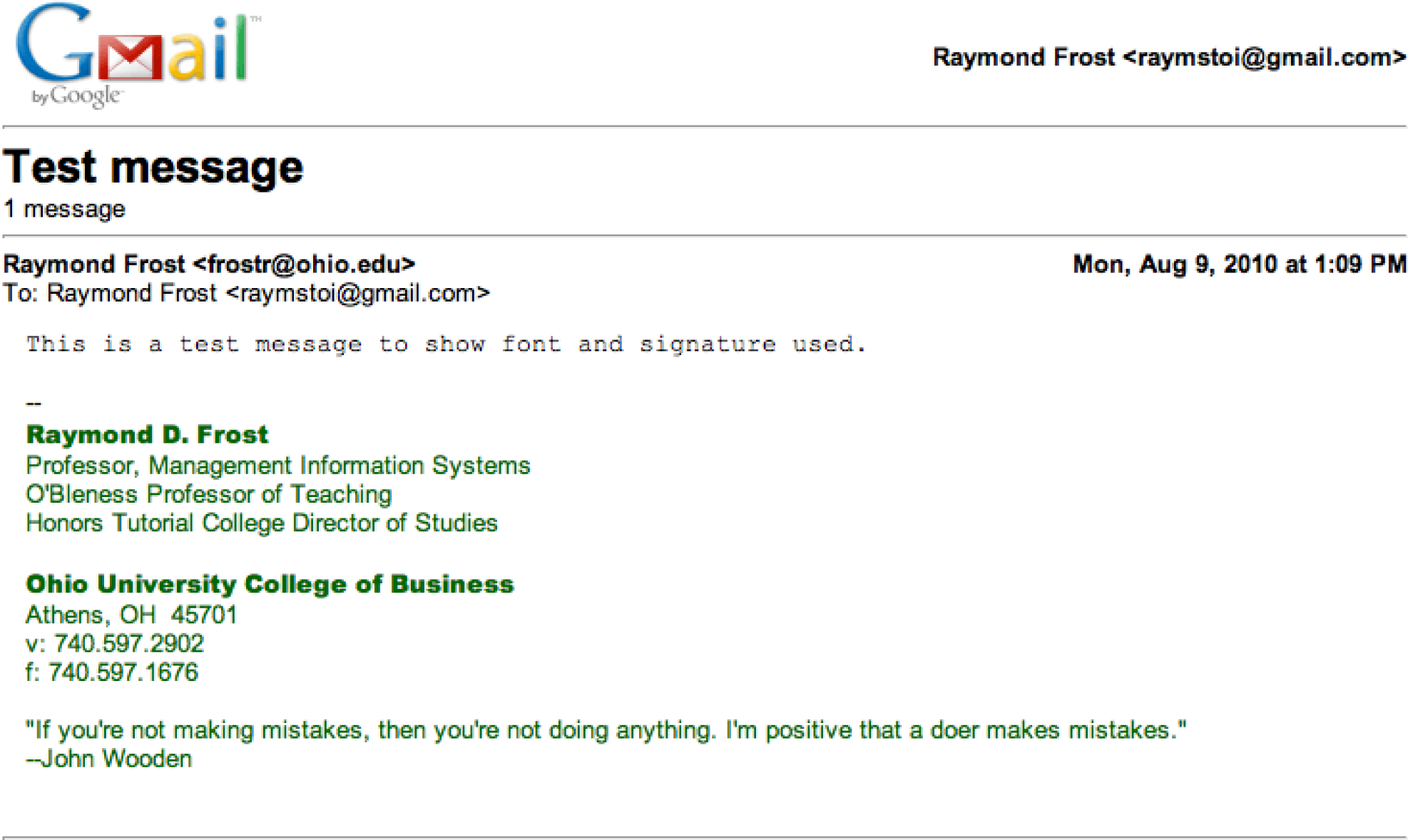
Sample test message for email signature assignment.
L2 ASSIGNMENT: LAPTOP HOTSPOT AD
PowerPoint allows you to alter images to create a composition that does not really exist. Compositions like this should be done with caution. You don’t want to misrepresent anything to a potential client. In this case we are not selling the beach, just the idea of working from the beach, so no harm done. However, this would not be appropriate to advertise a resort. If this were a “photo” for a news article then altering the scene would actually be unethical. The example shown here is an ad for a restaurant, but you will be creating an ad for a cell phone provider—showcasing their ability to use the cell phone as a wifi hotspot so that you can work from your laptop. You pick the provider and then include their logo and appropriate text in the ad.
Setup
Sketch a design on paper then find creative commons images and save them to your folder. Search
http://www.flickr.com/creativecommons.
Content and Style
- Create an original advertisement. You may use some or all of the images given or create a completely different context—e.g. outer space.
- Create an original heading, text, and tagline for this assignment.
- You may have to remove backgrounds from your images using PowerPoint’s background removal tool.
- Apply and follow all graphic and ad design principles.
- Each picture and text box will appear on a separate layer in the selection pane. Name each layer as you create it.
- Make sure that your name and copyright is large enough to be read, but small enough to remain discreet on your document. (Your name replaces “Joe Bobcat”).
- Upload your image to Kuler to find a color for your text background.
- You may choose to include a picture of a laptop, cell phone, and/or person as you deem appropriate to the ad.
Deliverable
Electronic submission: Save your file as a PowerPoint presentation. Submit it electronically.
Paper submission: Create a color printout by printing the slide in color directly out of PowerPoint.

Chapter 4 User Centered Design: Design an iPhone App
4.1 MIS and Marketing
LEARNING OBJECTIVES
- Understand the relationship between MIS and marketing
- Accurately characterize the relationship among the following terms: target market, demographics, market segmentation, and niche market
- Determine a target market for your app
- Describe a persona in the target market
- Use the persona to influence user centered design choices
Introduction
MIS is infused into all the other business disciplines. Marketing is no exception. The relationship is even more pronounced when the item being marketed is itself an MIS product—such as an iPhone app.
In this chapter you will design an iPhone app and create a photo realistic mockup of the app. To do this you need to apply both MIS and marketing skills. Marketing skills help to establish the need for the app—is it something that will sell? MIS skills help to craft the product in order to meet those needs.
At some point in their lives many students dream of starting their own business. The iPhone has given hope to millions of entrepreneurs to do just that by creating and selling an app. You will have the opportunity to envision your own app and make a mockup of that app in PowerPoint or KeyNote.
Every MIS product, including an iPhone app, should be designed with a specific group of people in mind. These groups, called market segments, are normally described demographically using characteristics such as age, income, location, gender, and so forth. When a company identifies a market segment upon which it will focus its efforts, that becomes the target market.
For this class, your target market is your classmates. To make it even more real we ask that you develop a fictional persona in the target market. You design the app for that persona. You need to develop a brand position that will distinguish your app from the competition.
An app should improve a process through higher efficiency or effectiveness. Taking a detailed look at a current process diagram will help you identify where and how a process can be improved and enable you to design an enhanced future process. Through understanding the app’s market segmentation and analyzing the process, a popular app can be put on the market.
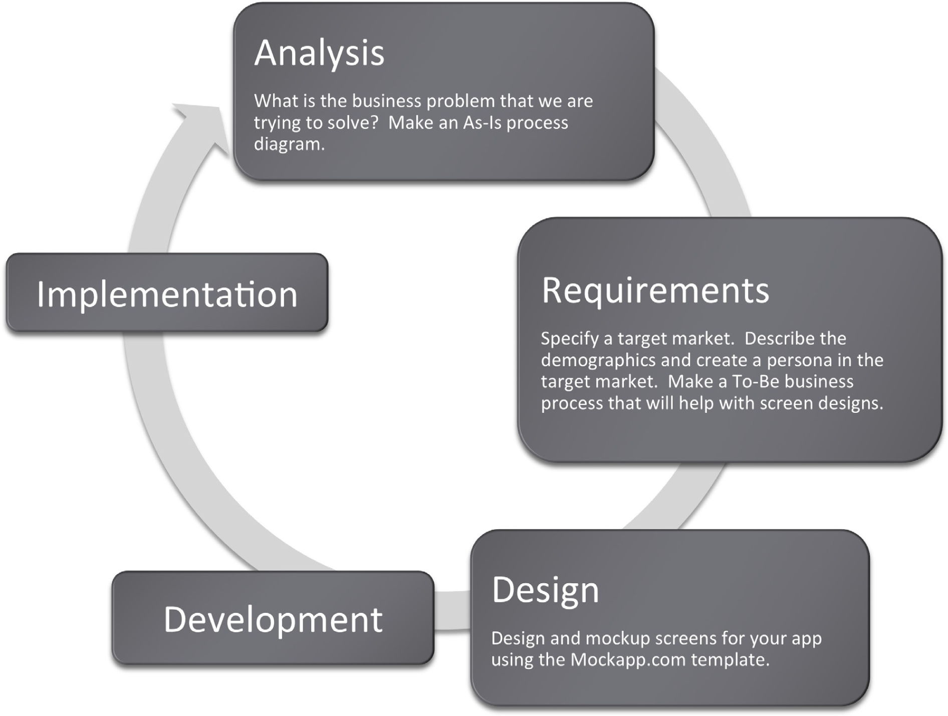
Where Are We in the Life Cycle?
Many information systems projects are conceived of in a life cycle that progresses in stages from analysis to implementation. The diagram below shows the stages that we touch in the current chapter:
Designing for a Target Market
Marketers identify groups of potential customers for a company’s product. This process is called market segmentation. Markets can be segmented based on a variety of demographics, or characteristics of the population. Examples include age, income level, gender, hobbies, or interests. Each group is called a market segment.
Marketing dollars are best spent targeting the segments most likely to buy the product. It would be unwise to waste money on promotional campaigns aimed at audiences not interested in a particular product. For example, a good marketer would not tailor an ad campaign for low-rise jeans to 50-year-old men. Part of the marketer’s job is to persuade the members of the target market that they need the product.
Abercrombie & Fitch has little difficulty convincing 14 to 24-year-olds that they need A&F branded merchandise. However, it would be much harder to sell this merchandise to an older age segment. A good marketer knows not to target everyone for a certain product. Instead, they target only those segments most likely to be interested. The challenge for marketers is to find a way to appeal to each target segment. For A&F, a large part of their appeal is sex — a theme of great interest to its target market. However, universities recruiting students in the same age group would most likely not use sex as an appeal in their advertising. Universities do not use sex appeal because although students are their customers, it is likely that their parents will have veto power over the final decision in college selection. Therefore, a marketer’s job becomes more difficult when there are multiple decision makers, each with different needs and wants.
One common marketing mistake, known as the majority fallacy, is to exclusively pursue those segments that make up the majority of the market. Marketers most likely do this because the competition is also pursuing those segments. It may be wiser to go after a smaller segment, or a niche, that is under served by the competition. Concentrating on a small, highly defined segment is called niche marketing. This type of marketing can be very profitable.
The power of a brand is proportional to its focus. A brand should not try to target everyone. Instead, a brand should narrowly define a product and all of its benefits. Mention of a brand should conjure a single word in the consumer’s imagination, such as “sporty” (Mini Cooper), “safety” (Volvo), or “luxury” (Lexus).
Table 4.1 Apps
| App Name | Price |
|---|---|
| Wheels on the Bus | $0.99 |
| Becker’s 2010 CPA Mobile Flash Cards | $299.99 |
| Dress Up and Makeup | $1.99 |
| Star Chart | $2.99 |
| Kids Song Machine | $1.99 |
| iHomework | $1.99 |
| SkyVoyager | $14.99 |
| Baby Pregnancy Tracker | $2.99 |
These are all apps listed in the education category at the iTunes store. The apps target different market segments. What market segment does each app target? Would it be a good or a bad idea to go after multiple segments?
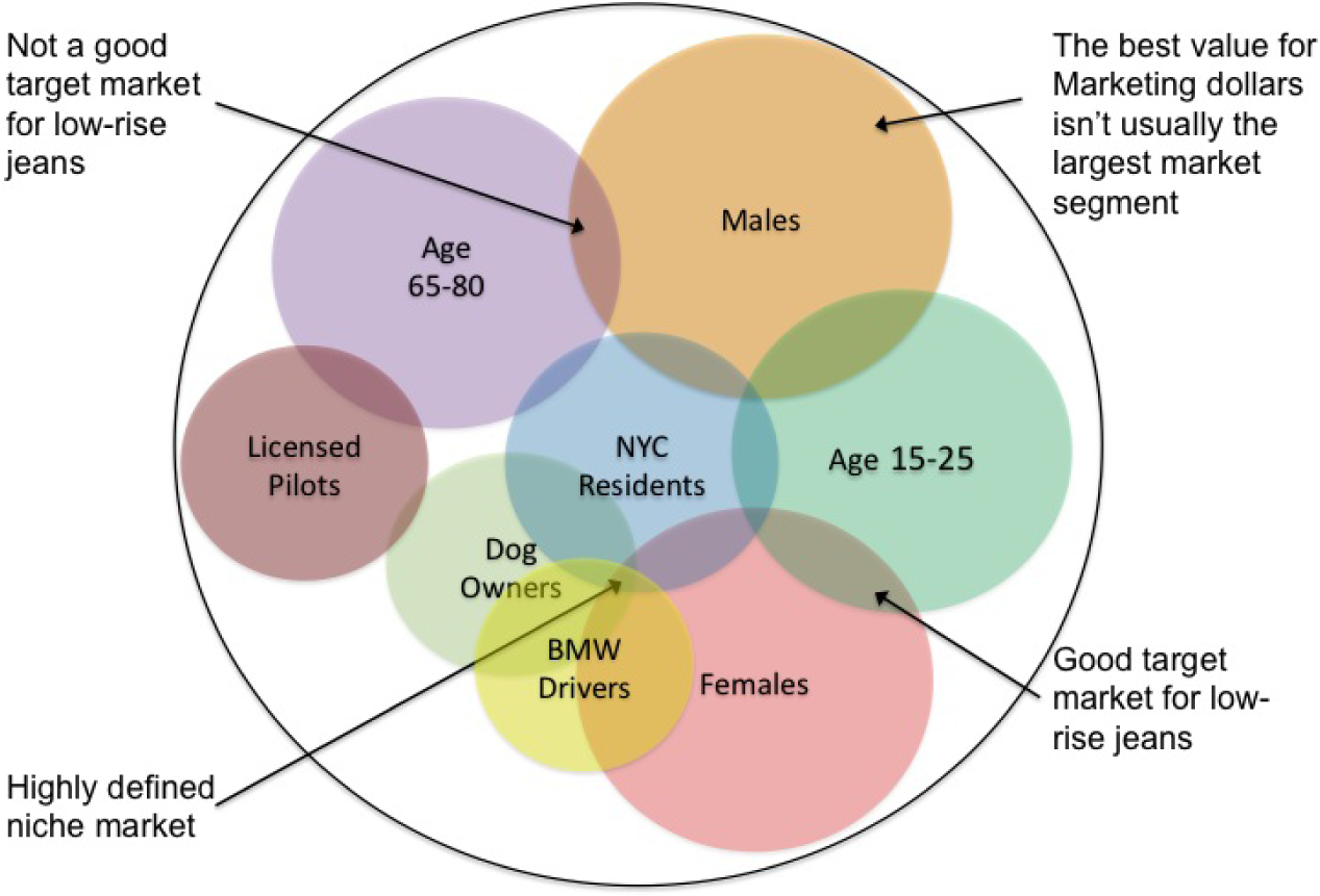
Demographic variables tend to overlap. The market segments are defined at the points of overlap. A niche market is defined where multiple variables overlap.
User centered design
The MIS methodology best suited to designing for a target market is user centered design. According to Wikipedia, “The chief difference from other product design philosophies is that user-centered design tries to optimize the product around how users can, want, or need to use the product, rather than forcing the users to change their behavior to accommodate the product.”
In a later chapter we will look at some heuristic rules of usability—how easy something is to navigate and use—especially as applied to websites. However, in this chapter we are envisioning the overall user experience (UX). What would a person in our target market actually want the app to do? How would they want it to behave? Can we make using the app a natural and pleasant experience?
Designers have found that it is a lot easier to answer these questions if you first envision a user in the target market. This fictional user is called a persona. Once a persona, say Fred, is created then designers can debate what Fred would like based on agreed upon characteristics of Fred. Of course Fred is no substitute for testing an app with real users, but he does help get you off the ground and moving in the right direction.

Create a persona. Fred age 27, earns $60K and just recently moved to the East Side of Cleveland. Fred lives in a 1 bedroom apartment with his dog, Ajax. On weekends Fred likes to mountain bike with his dog and hang out with his fiancée, Mary.
This biking trail app will enable Fred to identify areas to go mountain biking, and because it is ‘animal friendly’, it can also show him maps of areas he can ride with Ajax off leash and the location of areas where they can both stop to rest and get some water.
Test the power of a persona. Which of the restaurant ads below would appeal to Fred?

KEY TAKEAWAYS
- Identify your users using market segmentation and target marketing.
- Design the system according to the needs of the users—don’t make users change their behavior to fit your app. To help focus your design, create a persona in the target market for whom you design the application.
- Segment markets using demographic criteria such as age, gender, income, and so forth.
- Pick a segment to target. Then design an appeal for that target.
- A highly focused target is called a niche market—and can be very profitable.
QUESTIONS AND EXERCISES
- Describe the demographics of a market segment that would be interested in an app that monitors multiple vital signs such as temperature, heart rate, blood glucose, and so forth. In case you think such an app is impossible, check out the following link: http://www.tedmed.com/videos#Eric_Topol_at_TEDMED_2009
- Describe a persona in that target segment.
4.2 Laws of Branding
LEARNING OBJECTIVE
- Choose an appropriate name and color scheme for your App
Law of the Generic
There are hundreds of thousands of apps in the iPhone store. Picking a unique brand name for your app is difficult. It is a good idea to try to avoid names that are easily confused with others. For example for a photography app it might be a good idea to avoid the word camera in the name. To illustrate the dangers of generic names consider that Camera Flash Deluxe is easily confused with Camera Flash & Zoom.
In general, generic names are the most easily confused. If your brand name can be confused then it will be difficult to differentiate your brand in the eyes of the consumer. It may be no accident that very few of the top grossing photography apps actually have camera in their name as is illustrated below.
The law of the generic is a special case of the concept of singularity. Many of the laws of branding are built upon the concept of singularity. A brand’s power is driven by its unique qualities. The following analogy, written by Al and Laura Ries,Al and Laura Ries are marketing professionals and coauthors of 22 Immutable Laws of Branding. describes what a successful brand should entail:
“From a business point of view, branding in the marketplace is very similar to branding on the ranch. A branding program should be designed to differentiate your cow from all other cattle on the range. Even if all the cattle on the range look pretty much alike. A successful branding program is based on the concept of singularity. It creates in the mind of the prospect the perception that there is no product on the market quite like your product. Can a successful brand appeal to everybody? No. The same concept of singularity makes certain that no one brand can possibly have a universal appeal. (page 7)”
Law of the generic in action. Below are the top 12 grossing photography apps in October, 2010. Note very few have camera in their name.
Table 4.2 Top 12 Grossing Photography Apps
| Rank No. | App Name | Price |
|---|---|---|
| 1 | Hipstamatic | $1.99 |
| 2 | iMovie | $4.99 |
| 3 | Color Splash | $1.99 |
| 4 | Pano | $2.99 |
| 5 | Pro HDR | $1.99 |
| 6 | ReelDirector | $3.99 |
| 7 | AutoStitch Panorama | $2.99 |
| 8 | CameraBag | $1.99 |
| 9 | iVideoCamera | $0.99 |
| 10 | Vintage Video Maker | $1.99 |
| 11 | Camera Plus Pro | $1.99 |
| 12 | FX Photo Studio | $0.99 |
Below are those apps that begin with the word camera and their sales rank.
Table 4.3 Other Camera Apps
| Rank No. | App Name | Price |
|---|---|---|
| 8 | CameraBag | $1.99 |
| 87 | Camera Flash Deluxe | $0.99 |
| 167 | Camera Flash & Zoom | $0.99 |
| 128 | Camera for iPad | $0.99 |
| 90 | Camera Fun Pro | $0.99 |
| 19 | Camera Genius | $1.99 |
| 181 | CameraKit | $1.99 |
| 156 | Camera Magic | $1.99 |
| 11 | Camera Plus Pro | $1.99 |
| 135 | Camera Pro: All-In-1 | $0.99 |
| 94 | Camera Vault | $1.99 |
| 63 | Camera Zoom | $0.99 |
Law of Color
According to Al and Laura Ries: “A brand should use a color that is the opposite of its major competitors. What color is a Tiffany box? It’s that distinctive robin’s-egg blue. All Tiffany’s boxes are blue. If Tiffany had used a variety of colors for its boxes, it would have lost a marvelous opportunity to reinforce the brand name with a distinctive color. Basically there are five colors (red, orange, yellow, green, and blue) plus the neutral colors (black, white, and gray).” (pages 134-135)
For icons we would go a step further and recommend using an image that is also different from the competition. For example, a camera app whose icon is a camera lens is not very original. Almost all the brands that start with the word camera also use the color black (as in a black camera lens) — as if to say, “…and if you didn’t get it the first time…” How different really is one black camera lens than another — especially at icon size? Few of the top selling camera apps show a black camera lens. And if it is not original then it does not differentiate, which means customers may have trouble finding your app in the iTunes store.
KEY TAKEAWAYS
- Establish in the mind of the user that there is no app on the market quite like your own.
- To establish your brand, avoid generic names that can easily be confused.
- Pick colors distinct from the competition.
QUESTIONS AND EXERCISES
- What would be an appropriate name and color for an app that monitored multiple vital signs such as temperature, heart rate, blood glucose, and so forth?
4.3 Icon Design
LEARNING OBJECTIVE
- Design the icon that will represent your app
Simplify
For most apps, the icon in the iTunes store also serves as the logo. These icons are very small—especially when viewed on the iPhone. That means that detail on the logo must be avoided as it will be lost.
Curiously enough, the NFL ran into a similar issue with its logo. Prior to 2008 the NFL logo had 25 stars. This was a nightmare for those creating embroidered caps that sport the logo. It was also a challenge for grounds keepers painting the logo on the field of play.
The NFL simplified its logo and sharpened its image at the same time. To get a feel for how the NFL changed their logo, please look at the before and after of the NFL logo at the following link:
http://www.usatoday.com/sports/football/nfl/2007-08-30-shield-change_N.htm
Some of the changes that the NFL made to its logo include:
- The background color has been changed to a deeper blue to enhance contrast
- The font has been changed to a more masculine style
- The football resembles the ball atop the Lombardi championship trophy
- Eight stars represent the eight AFC and NFC divisions
Make Your Icon Meaningful
Your icon is the face of your app — make it meaningful. Designing an icon may require some trial and error. Logo designers typically run through a lot of competing designs before settling on a winner. Each design projects a unique message. During the 2008 United States Presidential Campaign, the Obama team picked a memorable and iconic design. Behind the scenes, the campaign actually considered a variety of designs before deciding on the now famous Obama “O.” So powerful was the logo that its designer, Sol Sender, rose to fame in the design world. The logo was designed to convey hope and change, the sun rising on a new day.
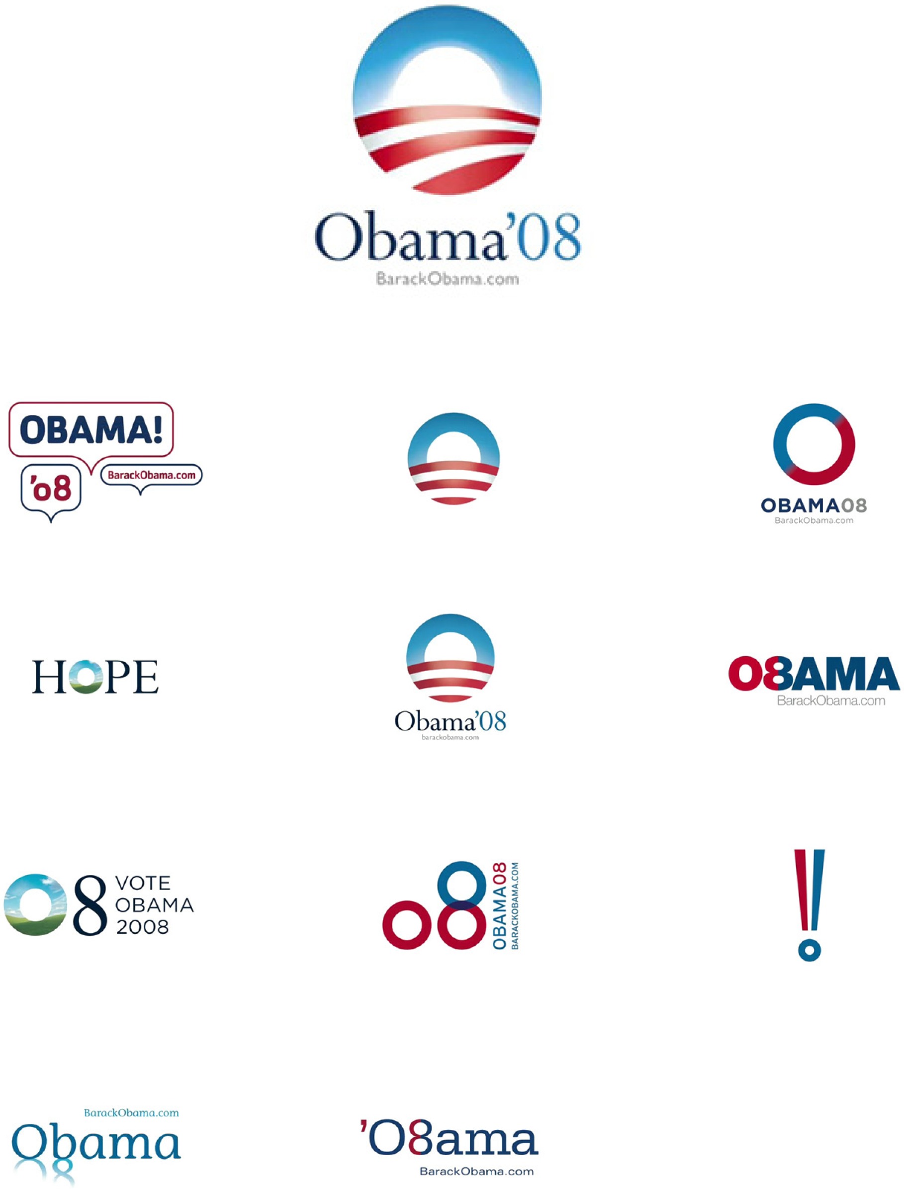
Obama logo: the winner and the runners up as designed by Sol Sender. Which would you have picked?
Source: Sol Sender & VSA Partners
KEY TAKEAWAYS
- The fonts, colors, and graphics in an icon convey specific messages and should be carefully chosen.
- Keep the design of icons simple. Intricate detail will be lost in a small icon.
- Pick an icon that will evoke emotion and meaning on the part of the user.
QUESTIONS AND EXERCISES
- What would be an appropriate icon design for an app that monitored multiple vital signs such as temperature, heart rate, blood glucose, and so forth?
4.4 Plan and Design Your App
LEARNING OBJECTIVES
- Brainstorm an app that solves a business problem
- Identify and describe a target market for an app
- Create process flows that will help you plan your app.
- Mockup an iPhone app using the MockApp.com template
Analyze the Problem
Your app needs to solve a business problem for someone in order to be marketable. For the sake of this lesson, your classmates compose your target market—people like you.
You are asked to identify a problem then describe how your app will solve the problem. Your app should provide some tangible benefits for the target market.
Finally, you are asked to describe a fictional persona in the target market. Having a persona helps you make decisions in the design of the app.
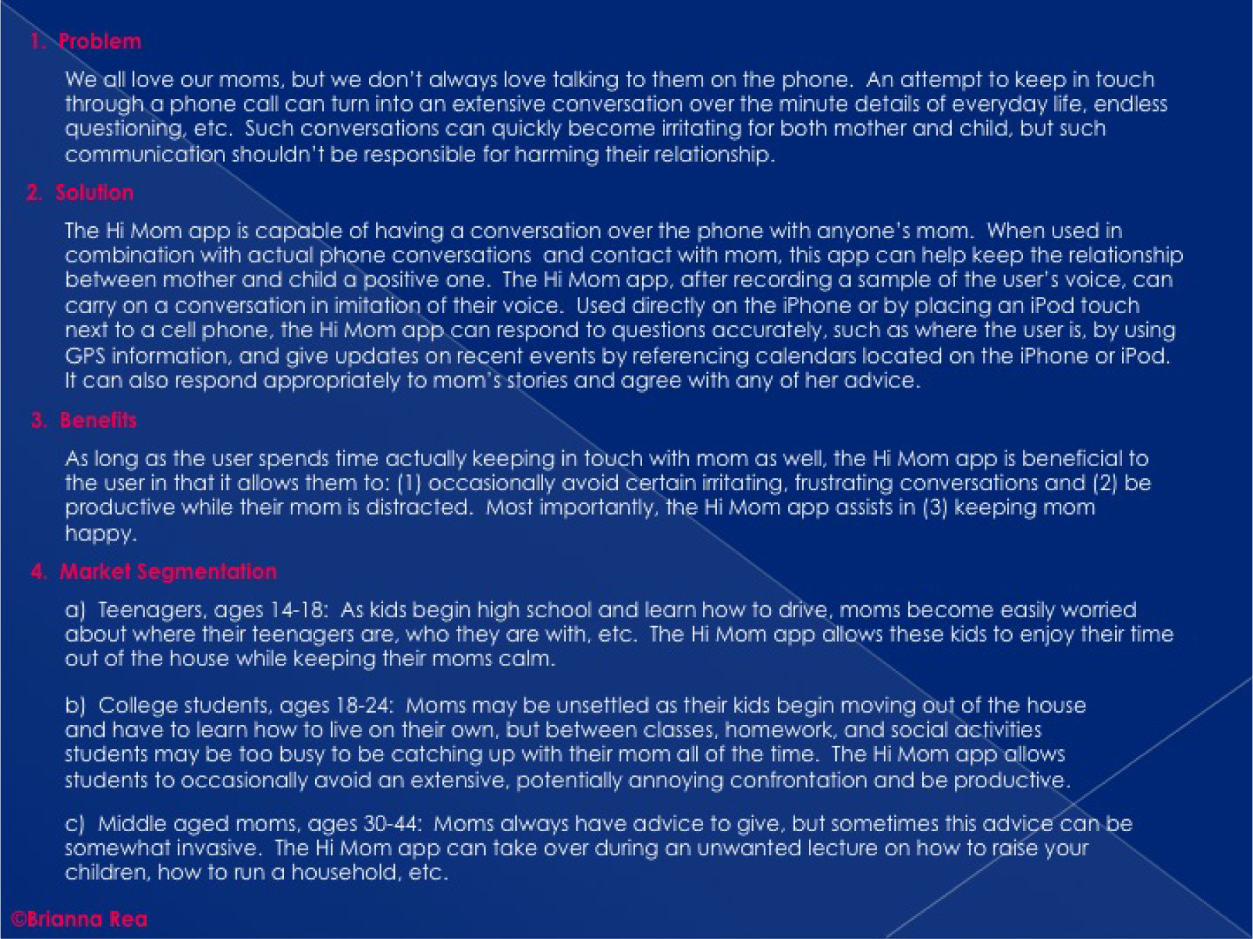
Analyzing the problem and describing the marketability of the Hi Mom app. This app is designed to ease Mom’s worries while giving the student more free time. You should make your own original example.
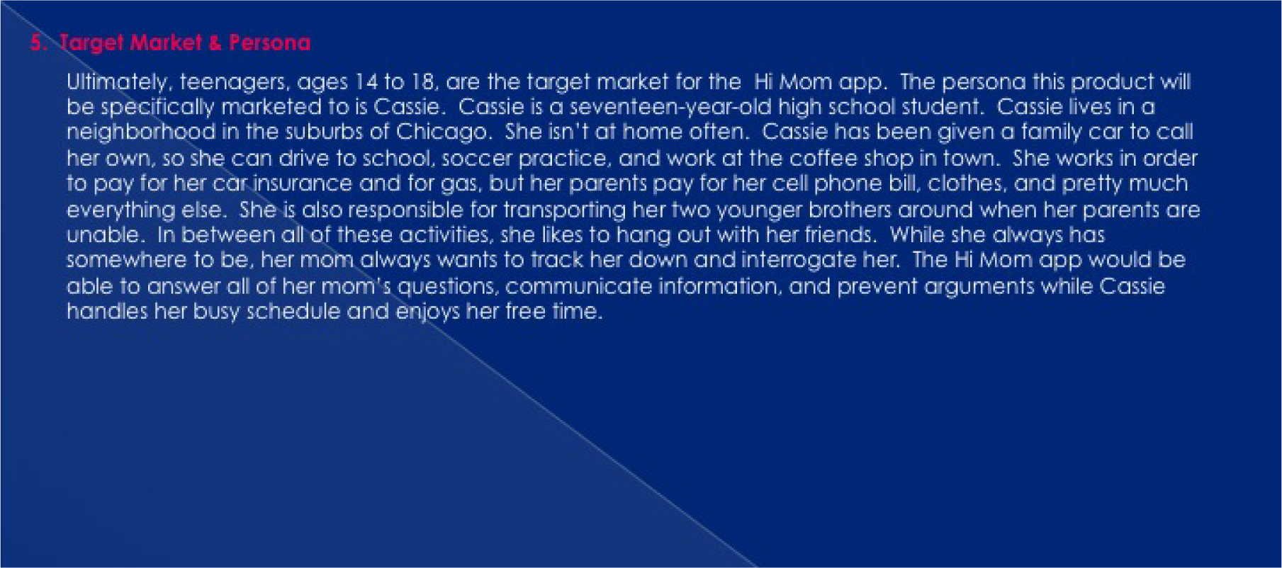
Define Requirements with Process Flows
After analyzing the business problem, you need to set requirements for the design of your app. We will envision requirements using process flow diagrams.
Some students struggle with what they should create for their app screens until they do process flows. The key is to construct an app swim lane in the process flow. Then look at the app swim lane of the To-Be process flow to help determine which screens to create. The screens should follow logically by looking at the action the app is taking (e.g. ask user X or show user X). The connection will not necessarily be one screen per action. In fact you may have multiple screens for each action. It depends upon the level of detail in your process flow.
Creating a planning diagram almost always saves time in the end. It is much easier to add, update, and remove actions from a process diagram than it is to add, update, and remove screens from your app.
Process flows also highlight the importance of doing business process management and business process redesign and why business process is so important to information systems.
How different will your As-Is and To-Be diagrams be? If you are migrating an existing computerized process to the iPhone, they may be fairly similar. However, if you are comparing a non-computerized process to one that uses an iPhone, then they are likely to be quite different.
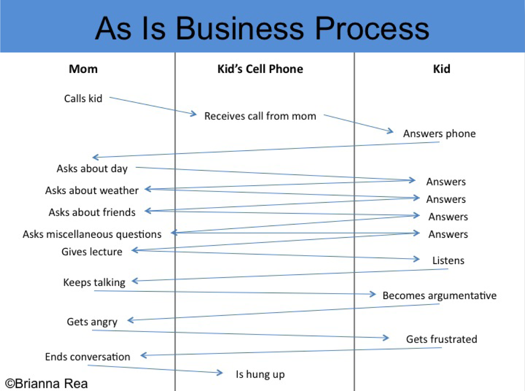
Continuing the analysis (As-Is) and setting the requirements (To-Be) for the Hi Mom app. You should make your own original process flows to match your app.
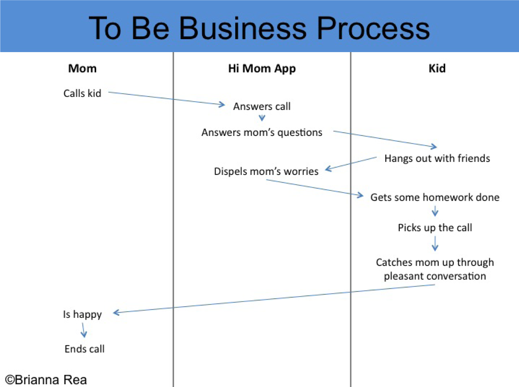
Design Your App According to Plan
Now that we have discussed target markets, laws of branding, icon design, and process flows, you are ready to design your iPhone app. Your app should have a close relationship with your process flows. In other words, the actions identified for the app in the process flows should be illustrated in the mockups.
Fortunately, the iPhone interface is highly standardized, which means you have fewer decisions to make about the placement and style of interface elements. This allows you to focus more on the content of your app.
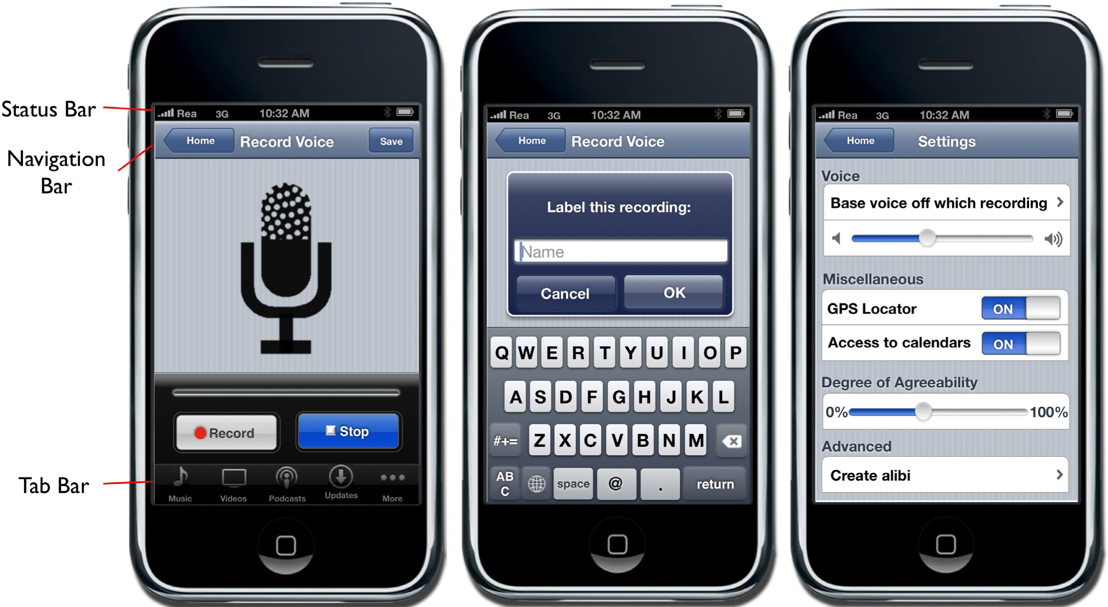
The status bar should appear at the very top of the screen and display important information about the device itself. The status bar displays information such as the current time, battery level, network provider, and network strength.
The navigation bar appears at the top of the screen directly under the status bar and displays the title of the page currently being viewed.
The tab bar always appears at the bottom of the screen and should appear on every screen of your app. The tab bar allows the user to switch modes or views very easily.
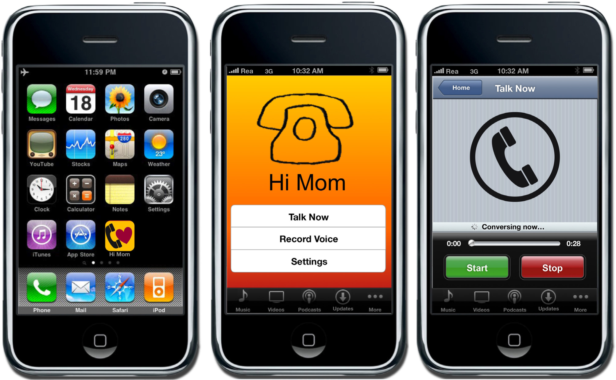
Multiple screenshots from the Hi Mom app. You should make your own original screen shots using the MockApp template and library.
The MockApp Template and Library
To create your iPhone app, you need access to all of the screen elements on the iPhone. Fortunately, there is a wonderful PowerPoint template called MockApp, which contains a comprehensive set of iPhone screen elements. MockApp is located at MockApp.com.
When you download MockApp you will have access to two files—a template and a library. The template is simply a series of blank iPhone screens that you populate with the appropriate screen elements from the library.
Your task is to copy screen elements from the library and then paste them into the template. You then rearrange and relabel screen elements to simulate a working app.
Because PowerPoint supports hyperlinks among slides, you can even simulate buttons that navigate among screens in your app. In this manner, you can create a photo realistic mockup.
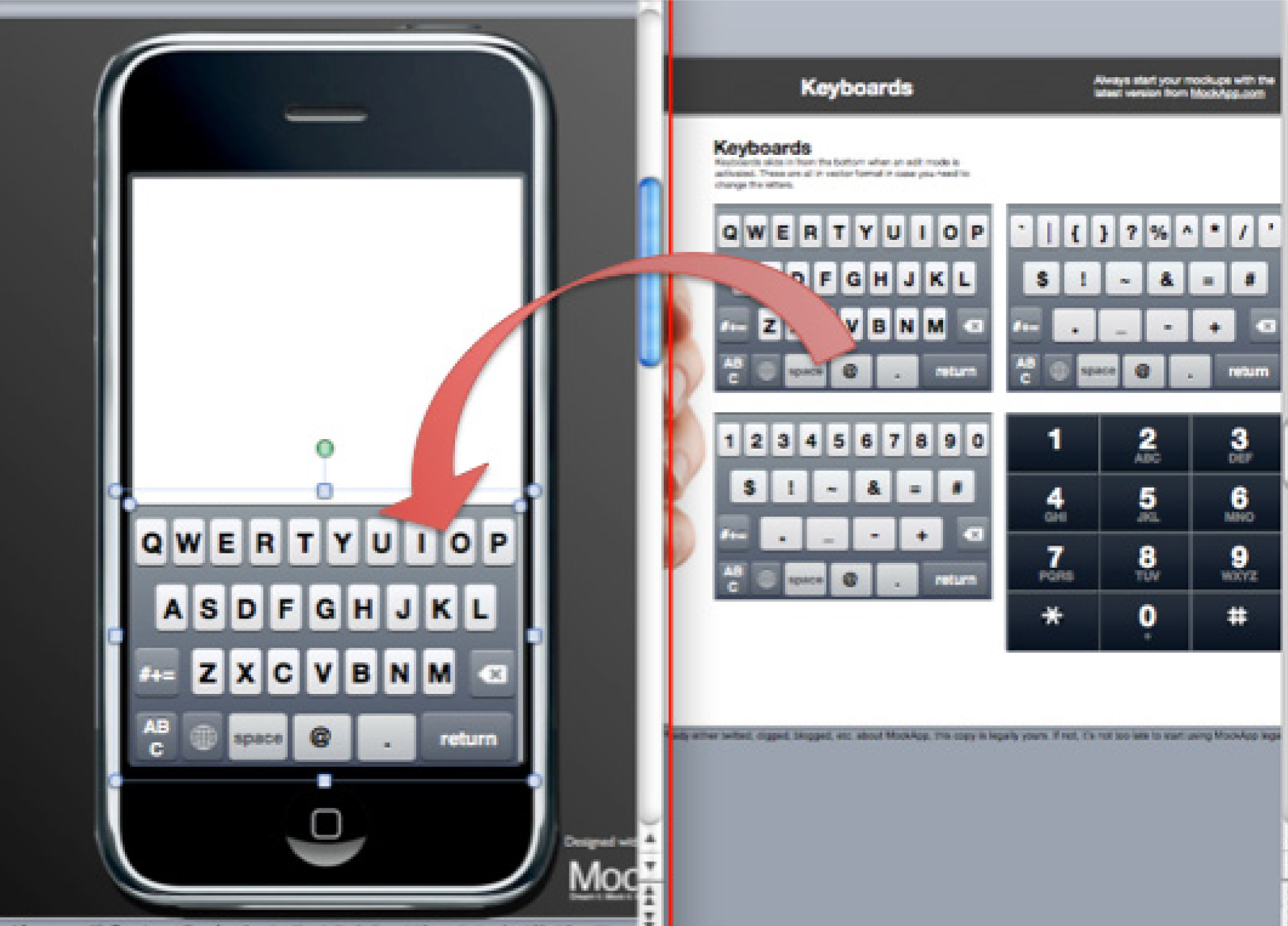
The MockApp template and library are depicted here opened simultaneously in overlapping windows. We recommend setting up in this way. The library consists of a series of PowerPoint slides each having an array of iPhone screen elements. The library slide shown here is for keyboards—but there are many other library slides. Copy elements off any of these library slides and paste them into the blank iPhone template. Then customize the text to suit your app. MockApp.com screen shot reprinted with permission from Dotan Saguy.
KEY TAKEAWAYS
- Process flows help to plan your app by creating a high level overview of functionality.
- Thankfully, the iPhone has enforced interface standards. Knowing what required elements go where frees the designer to focus on the content of the app.
- The four major parts of the iPhone interface are the status bar, the navigation bar, the activity indicator, and the tab bar.
QUESTIONS AND EXERCISES
- Describe the content and screen elements that you would expect to see in an app that monitored multiple vital signs such as temperature, heart rate, blood glucose, and so forth?
Techniques
The following techniques, found in the PowerPoint section of the software reference, may be useful in completing the assignments for this chapter. iPhone Interface Map • Hyperlink • Shape-Insert
L1 ASSIGNMENT: A MARKET AND PERSONA FOR YOUR APP
When brainstorming iPhone Apps it is sometimes helpful to look at other apps already developed. The best way to check out other apps is on the iTunes store (iTunes is free). However, even if you do not have iTunes loaded, you can check out apps at the following link: http://app-store.appspot.com/
We can not overstate the importance of the assignments in this chapter. The rest of the course will build on what you create here. Your app will be viewed by your classmates so make it something you can be proud of.
Your classmates will “buy” your app in a future assignment, so the app needs to appeal to them either for their own consumption or to be given as a gift. You will also construct financial projections for your app in a future chapter. Finally, your report at the end of the course will be a culmination of all the deliverables you have constructed about your app to that point.
Setup
Start a blank PowerPoint presentation. Using a 12 point font, complete the following exercise using complete sentences and paragraphs.
Content and Style
- In one or more paragraphs describe the situation or problem that your app is designed to address. Note that you are not limited by technological constraints. Your app can have superpowers.
- In one or more paragraphs describe your solution to the situation or problem.
- In one or more paragraphs list at least three benefits that your solution will provide. You may use bullets.
- Describe three market segments that would buy your app—one of which must be your classmates. Provide demographics for the market segments—e.g., age, education, household income, gender, geographic location, and so forth.
- Now pick one of those segments and create a fictional persona in the target market. Tell us details about your persona—where they live, how much they earn, where they go on vacation, if they have a girlfriend/boyfriend, and so forth. Remember that your persona must be willing to buy the app.
Deliverables
Electronic submission: Submit a PowerPoint file containing your responses.
Paper submission: Print out your responses.
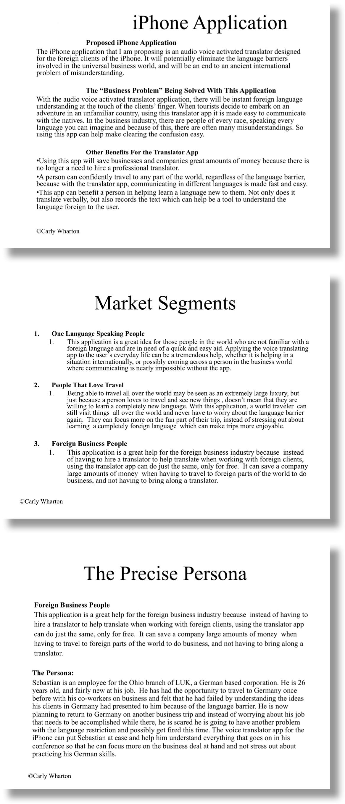
A sample student write-up for the L1 exercise. You Translate is an app that does translation. You should make your own original example.
L2 ASSIGNMENT: DEMONSTRATE THE BENEFITS OF YOUR APP
By creating As-Is and To-Be process flow diagrams, you will be able to analyze the benefits of the app. Here you show us how your persona engages in a business process with, and without, your app. The app should build a strong case that the To-Be process is a significant improvement over the as-is version. Create both the As-Is and the To-Be process flow diagrams of the use of the iPhone app. The As-Is diagrams should model how the persona performs the task without the app. The To-Be diagram will describe how the task is completed using the app.
Setup
Start a blank PowerPoint presentation. Using a 12 point font, complete the following exercise using complete sentences and paragraphs.
Content and Style
- Create each process diagram on separate slides.
- Use a combination of drawing shapes (lines, arrows, etc.) and text.
- Use design principles to maximize professionalism.
- Label each diagram with an appropriate title and your name.
Deliverables
Electronic submission: Submit your PowerPoint file.
Paper submission: Create a color printout by printing directly from PowerPoint.
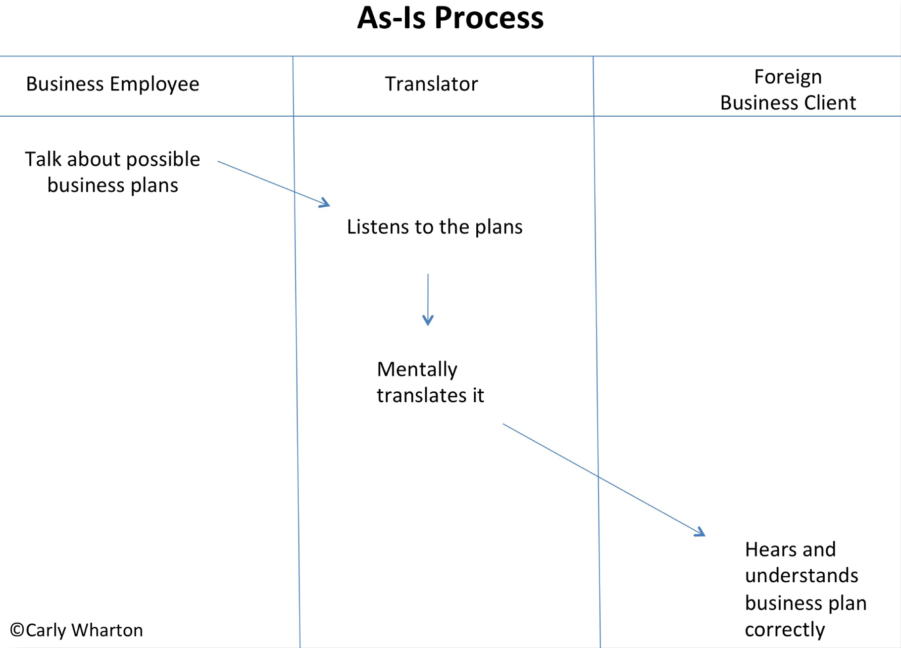
Sample student process flows for the You Translate app. You should make your own original process flows to match your app.
L3 ASSIGNMENT: CREATE A MOCKUP OF YOUR APP
In this assignment you will create an iPhone app mockup based on your analysis. PowerPoint allows you to create a mockup of an application before doing any coding. This mockup acts as a visual model to use in a product proposal. Using the templates provided, design a creative and useful iPhone app.
Setup
Complete the free registration to obtain the files to design your app from MockApp.com. MockApp contains three files—the library of icons used by an iPhone app, and two templates—one that allows you to demo in PowerPoint and one that allows you to demo on an iPhone. You will use the one that allows you to demo in PowerPoint. Note that Mac users can also choose the Keynote versions of the MockApp files.
Build your app in the MockApp template file. Do not build your app in the same file that you used for either the L1 or L2 assignments. The dimensions of the PowerPoint files are different and your images will distort.
Content and Style
- Use the images given to recreate an original mockup.
- The mockup must contain at least six slides.
- Create an icon for your app with an appropriate logo on the first slide.
- Apply and follow all graphic design principles.
- Include all of the necessary images.
- Create hyperlinks between your PowerPoint pages to simulate the app in action. You should build hyperlinks off of the buttons, not the text on the buttons. (Otherwise the text will be underlined, which does not look right).
- Include your name as the wireless carrier instead of AT&T (in upper left corner).
Deliverables
Electronic submission: Save and submit your PowerPoint file.
Paper submission: Create a color printout by printing directly from PowerPoint.
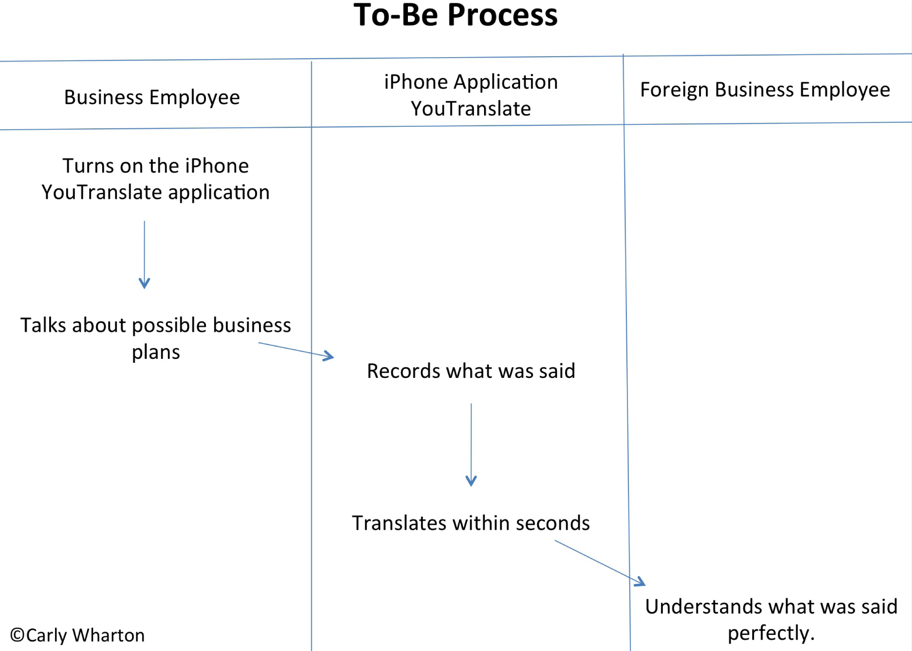
Sample screen shots for the You Translate app. You should make your own original screen shots using the MockApp template and library.
Chapter 5 Planning Usable Websites: Design a Website to Market the App
5.1 Top Ten Guidelines for Site Usability
LEARNING OBJECTIVES
- Compare and contrast a usable website with a non-usable website using Nielsen’s usability principles
- Balance usability and graphic design considerations in a site design
Introduction
For the purposes of this course we will consider your iPhone app to be a fully functional and marketable product. Now the challenge is to build a store to market the app. Building the store will be a community project. Each student will build a piece of the store. But before we build the store, we need to design it.
Part of the beauty of the iPhone interface is its predictability. All iPhone applications share the same interface elements. Apple ensures this uniformity by reviewing every app before it is published on the iTunes store. It’s not that way on the web. To have uniformity on a website the designer must enforce his/her own design standards. In general the website will be more successful with more repeat business if it follows industry standard conventions for website design. Most of those conventions fall under the heading of usability—literally, how usable or easy to navigate is the site?
The problem with usability is that you only notice it when it is absent. It is like the phone system—it only gets your attention when it doesn’t work. We expect sites to be usable and get upset when they are not. Why then do so many sites have usability issues? Because site designers lose sight of the end user. Mastering some common sense rules or heuristics of usability can go a long way toward making sure that designers create a satisfying experience for the end user.
As you go through this chapter you will note some overlap between usability and graphic design principles. For example, creating contrast between the type and page background is also a usability principle.
Where Are We in the Life Cycle?
Many information systems projects are conceived of in a life cycle that progresses in stages from analysis to implementation. The diagram below shows the stages that we touch in the current chapter:
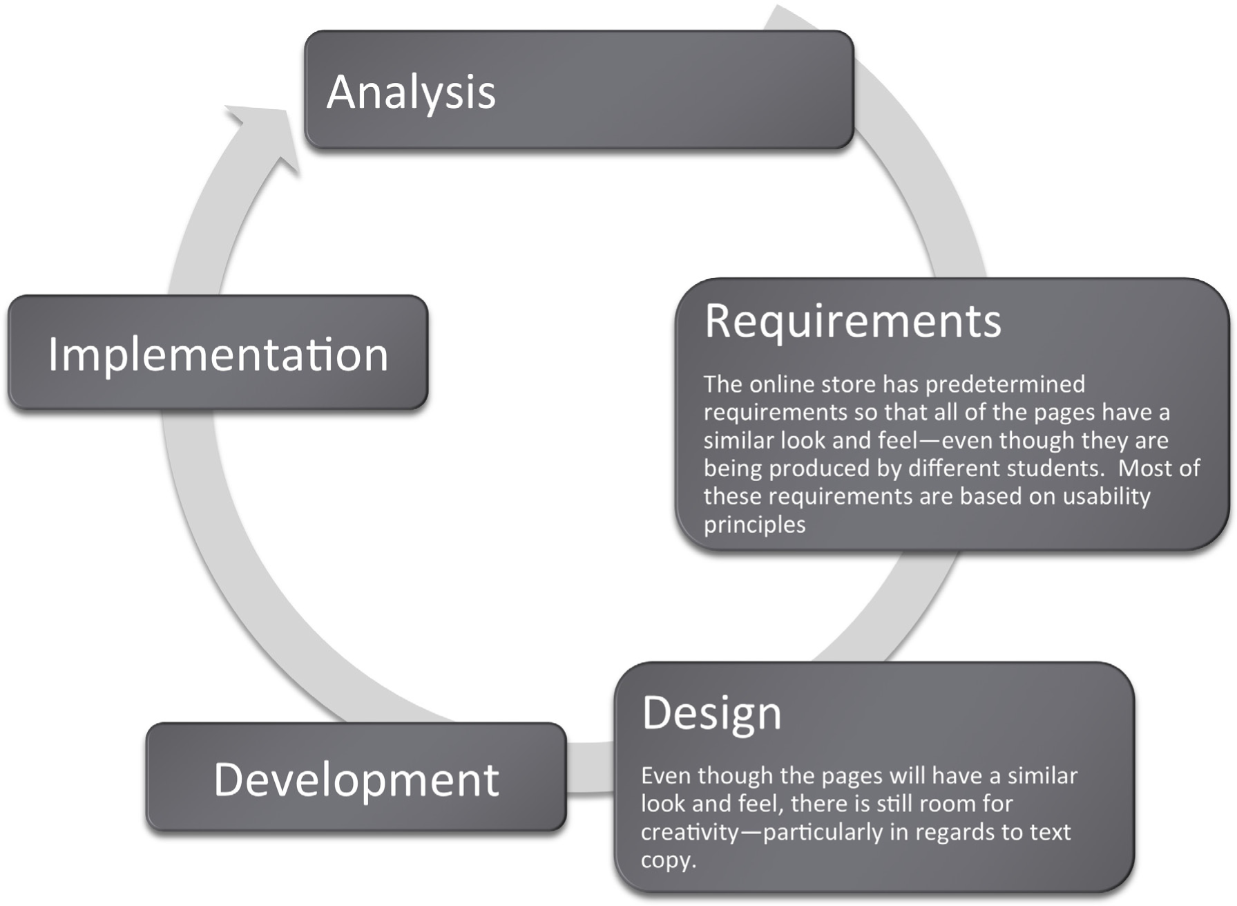
User-Friendly Websites Are in Demand
Web designers have met the need for user-friendly websites by following standard conventions for easy navigation and other site design elements. Internet users should not have to learn how to use a specific site; they should already know how to navigate the site based on prior web experience.
The concept of usability is very familiar to us in other settings. For example, most automobile manufacturers put the pedals, turn signals, and light controls in the same place regardless of car make or model. This way, consumers will not need a tutorial each time they purchase a new car, because they can base their knowledge on previous vehicles. There is also some standardization of icons used in computer operating systems. For example, an icon with a drawing of a printer on it will most likely enable a user to print a document. Similarly, the standardization of websites with regard to usability makes it possible for users to navigate without learning new conventions.
Usability refers to sites that are well-organized, easy to navigate, designed with the consumer in mind, and rigorously tested. These sites allow marketers to deliver the product message to their target markets. Sites that fail to meet these objectives will be abandoned by frustrated users.
Usability also refers to how easy it is to complete tasks, such as purchasing an item or scheduling a meeting. Usability is influenced by site organization, following convention, features of the site, fonts, and colors. Both usability and graphic design are subsets of information design. However, they overlap and reinforce one another.
The most recognizable name in usability is Jakob Nielsen.Nielsen has written numerous books and articles, and has spoken publicly on the subject of website usability. His website is www.useit.com.Yet, Nielsen’s own website sacrifices visual appeal for usability. So are usability and creativity at opposite ends of the spectrum? The solution is to balance the two for the betterment of both.
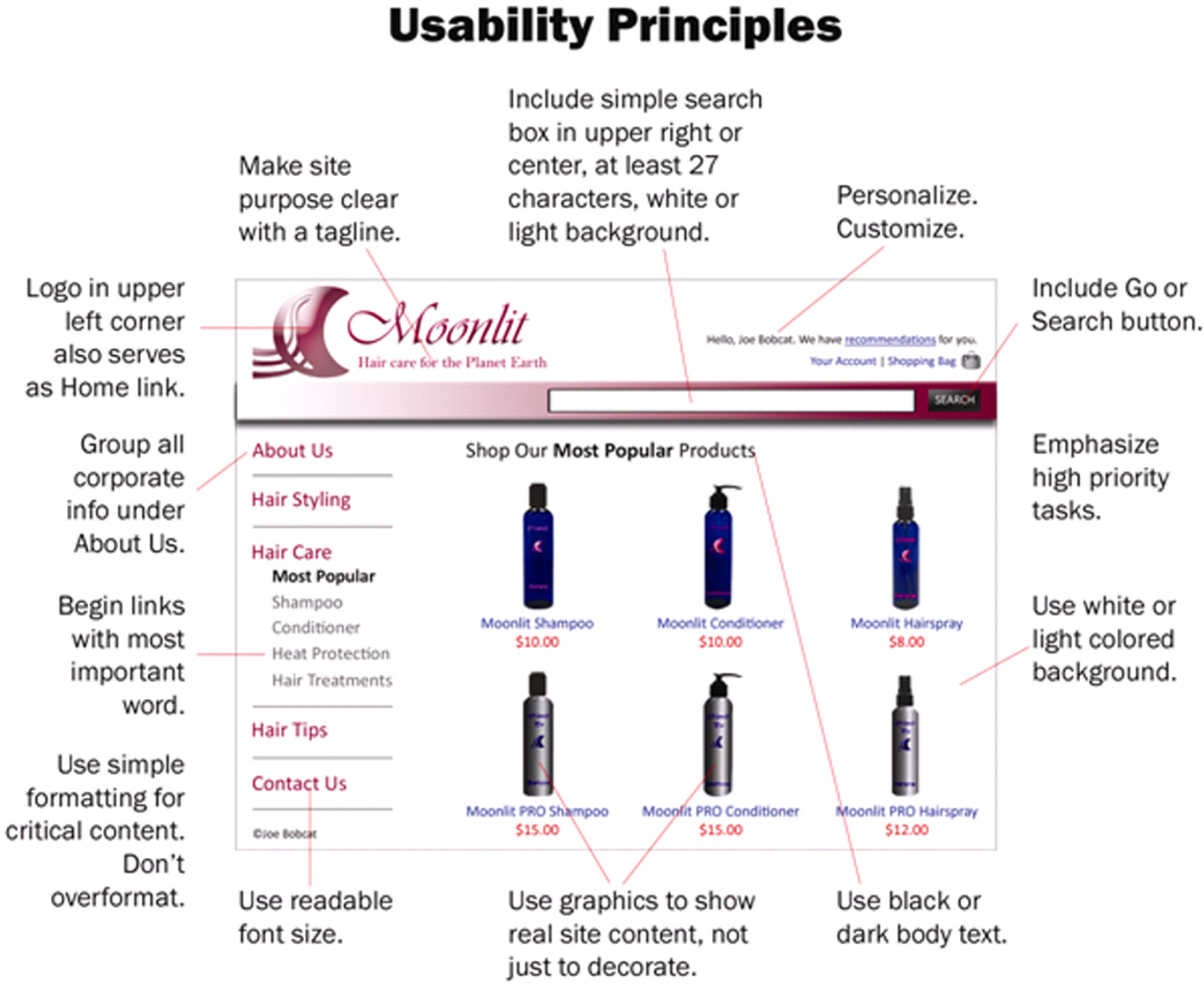
Ultimately, we need a way to evaluate how usable a site is. Nielsen has developed specific design elements to look for in a website. This site demonstrates how to properly balance usability and creativity in a website.
The Importance of the Homepage
Potential customers typically look at a company’s website before doing business with them. The first site page they come across is the homepage, and the design and usability of the homepage can make or break a possible business deal. The following list compiled by Jakob Nielsen is composed of ten things that can be used to increase the usability of a homepage and, therefore, enhance your website business value.All of these guidelines are quoted from Jakob Nielsen, Top Ten Guidelines for Site Usability, copyright © 2003-2007, ISSN 1548-5552.
Images were placed by the authors to illustrate Nielsen’s concepts.
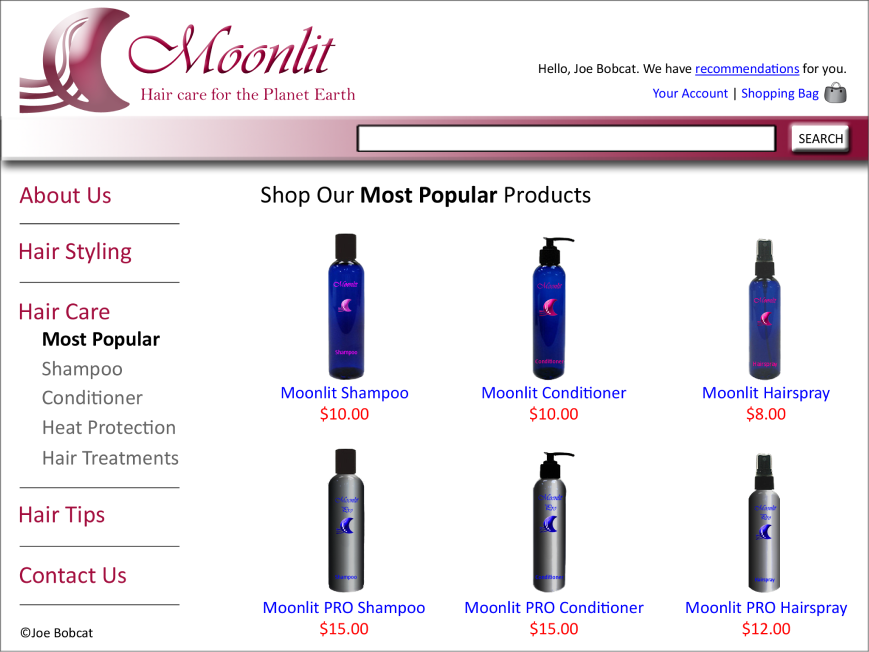
Usability in Action. The site above exhibits good graphic design and usability. The site below does not.
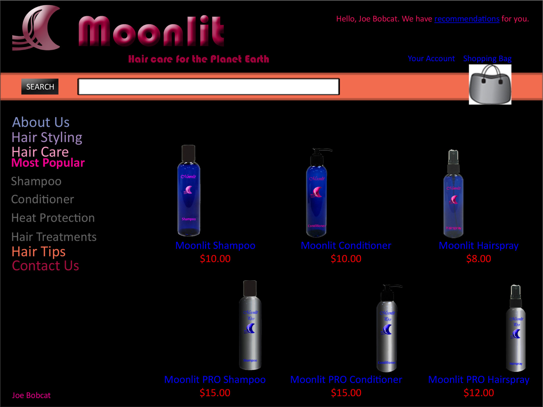
Make the Site’s Purpose Clear: Explain Who You Are and What You Do
1. Include a One-Sentence Tagline
Start the page with a tagline that summarizes what the site or company does, especially if you’re new or less than famous. Even well-known companies presumably hope to attract new customers and should tell first-time visitors about the site’s purpose. It is especially important to have a good tagline if your company’s general marketing slogan is bland and fails to tell users what they’ll gain from using the site.
2. Write a Window Title with Good Visibility in Search Engines and Bookmark Lists
Begin the TITLE tag with the company name, followed by a brief description of the site. Don’t start with words like “The” or “Welcome to” unless you want to be alphabetized under “T” or “W.”
3. Group All Corporate Information in One Distinct Area
Finding out about the company is rarely a user’s first task, but sometimes people do need details about who you are. Good corporate information is especially important if the site hopes to support recruiting, investor relations, or PR, but it can also serve to increase a new or lesser-known company’s credibility. An “About <company-name>” section is the best way to link users to more in-depth information than can be presented on the homepage. [See also my report with 50 guidelines for the design of “about us” areas of corporate websites.]
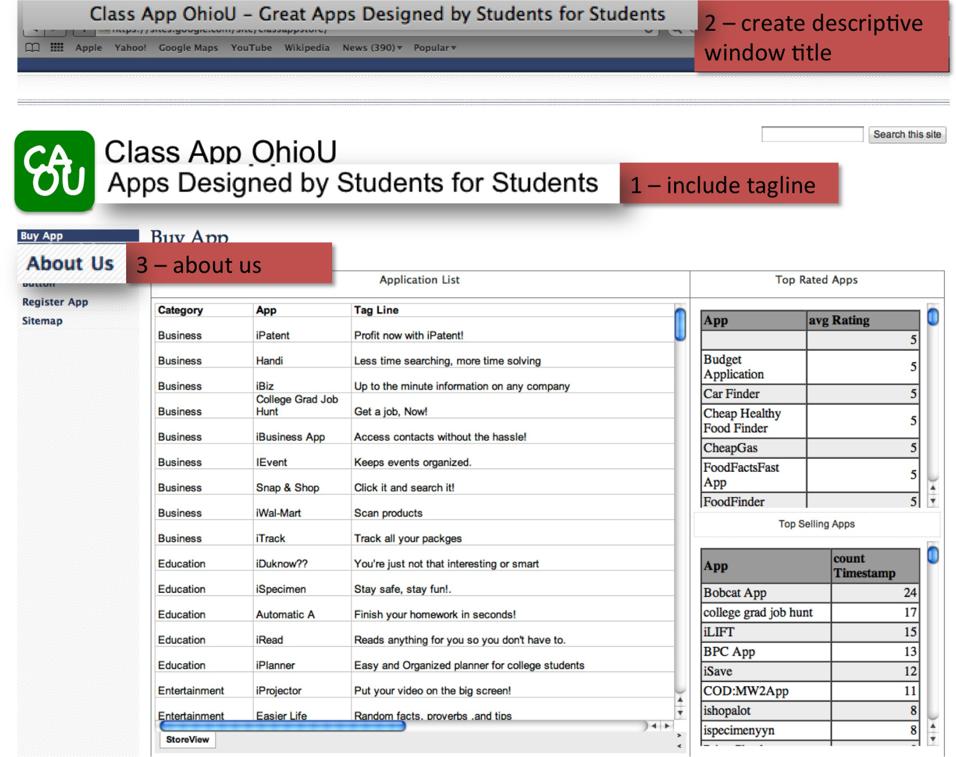
Usability principles in action: 1. Include a one-sentence tagline. 2. Write a window title with good visibility in search engines and bookmark lists. 3. Group all corporate information in one distinct area.
Help Users Find What They Need
4. Emphasize the Site’s Top High-Priority Tasks
Your homepage should offer users a clear starting point for the main one to four tasks they’ll undertake when visiting your site.
5. Include a Search Input Box
Search is an important part of any big website. When users want to search, they typically scan the homepage looking for “the little box where I can type,” so your search should be a box. Make your search box at least 25 characters wide, so it can accommodate multiple words without obscuring parts of the user’s query.
[Update: Based on more recent findings, my recommendation is now to make the search box 27 characters wide. This and other new guidelines are covered in my tutorial on fundamental Guidelines for Web Usability at the User Experience 2007 conference in Las Vegas and Barcelona.]
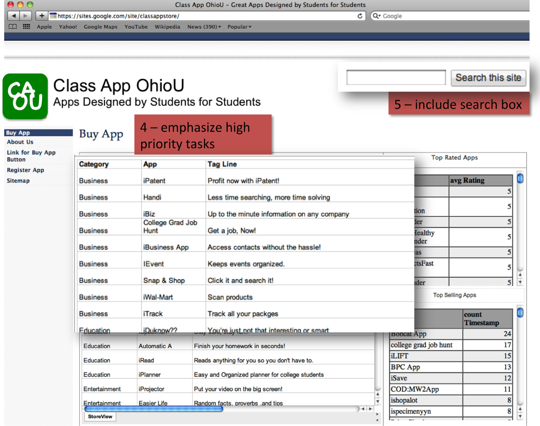
Usability principles in action: 4. Emphasize the site’s top high-priority tasks. 5. Include a search input box.
Reveal Site Content
6. Show Examples of Real Site Content
Don’t just describe what lies beneath the homepage. Specifics beat abstractions, and you have good stuff. Show some of your best or most recent content.
7. Begin Link Names with the Most Important Keyword
Users scan down the page, trying to find the area that will serve their current goal. Links are the action items on a homepage, and when you start each link with a relevant word, you make it easier for scanning eyes to differentiate it from other links on the page. A common violation of this guideline is to start all links with the company name, which adds little value and impairs users’ ability to quickly find what they need.
8. Offer Easy Access to Recent Homepage Features
Users will often remember articles, products, or promotions that were featured prominently on the homepage, but they won’t know how to find them once you move the features inside the site. To help users locate key items, keep a short list of recent features on the homepage and supplement it with a link to a permanent archive of all other homepage features.
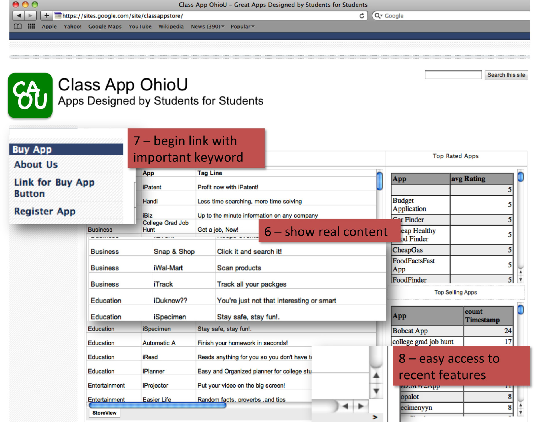
Usability principles in action: 6. Show examples of real site content. 7. Begin link names with the most important keyword 8. Offer easy access to recent homepage features.
Use Visual Design to Enhance, Not Define, Interaction Design
9. Don’t Over-Format Critical Content, Such as Navigation Areas
You might think that important homepage items require elaborate illustrations, boxes, and colors. However, users often dismiss graphics as ads and focus on the parts of the homepage that look more likely to be useful.
10. Use Meaningful Graphics
Don’t just decorate the page with stock art. Images are powerful communicators when they show items of interest to users, but will backfire if they seem frivolous or irrelevant. For example, it’s almost always best to show photos of real people actually connected to the topic, rather than pictures of models.
Designing in the Real World—Putting Usability in Context
As important as usability is—it is only a piece of the design process. How are websites designed in the real world? A professional team might include some or all of the following individuals:
- The brand planner devises the marketing strategy.
- The copywriters and designers produce the creative material for the site.
- The project manager schedules the other individuals on the site’s team, determines how much their time will costs and maintains the budget.
- The database manager ensures that the system ties in smoothly with the backend database. Typically, all of the content is stored in a database and then formatted for the screen.
- Usability experts ensure that the information architecture or site organization is logical, customer focused, and consistent.
- The testing members of the team run the site through its paces to catch errors before releasing it to the public.
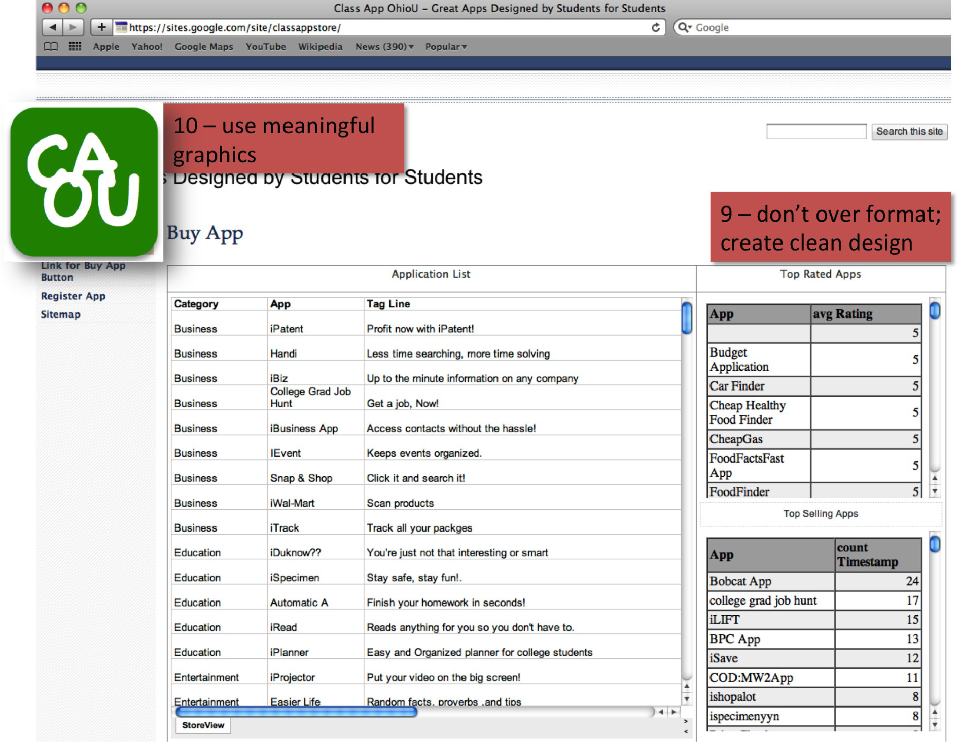
Usability principles in action: 9. Don’t over-format critical content, such as navigation areas. 10. Use meaningful graphics.
Designing the Class App Store
This chapter has shown examples from the homepage of the Class App store. But what about your pages? To be thematically consistent your pages must follow a consistent structure. The key is to roughly maintain the structure as well as thematic colors from the home page of the store. The user should always be aware that he or she is on the same site. Here is a guide to follow:
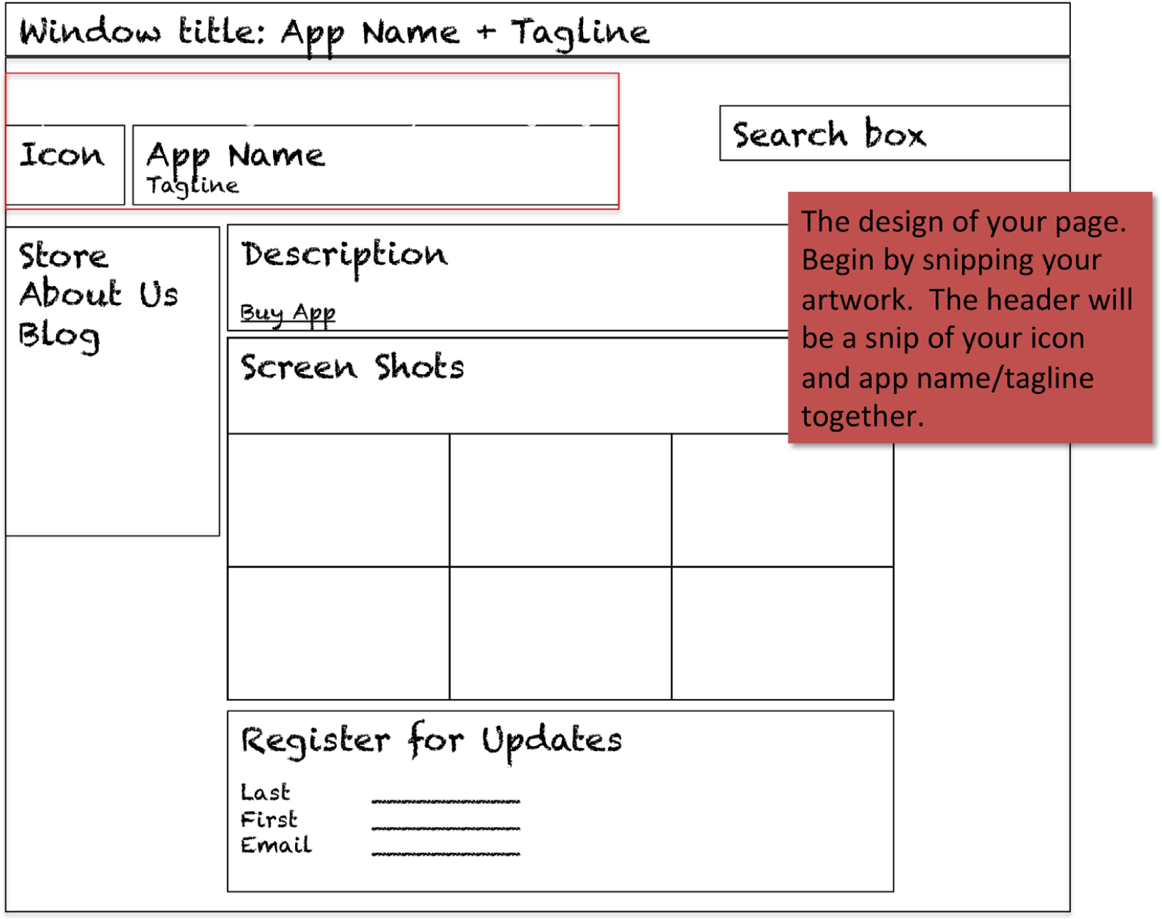
KEY TAKEAWAYS
- Because the web does not enforce interface standards, it is all the more important to follow established conventions.
- You should design your website for a specific target market while ensuring that you follow usability standards.
- Jakob Nielsen is a recognized leader in usability standards. He has found that a surprising number of websites do not follow standards.
- Usability is important but it is only one factor in the design process.
QUESTIONS AND EXERCISES
- Examine a website of your choice and grade it against each of the Nielsen usability principles on a scale of 1 to 10 for each dimension. Then total up the dimensions to create a composite score for the site. Provide a short comment to justify each of your grades.
- Explain how each of the C.R.A.P. principles relates to the usability of a website.
Chapter 6 Build, Buy, or Reuse Solutions: Develop a Website to Market the App
6.1 Development Considerations
LEARNING OBJECTIVES
- Determine when to build vs. buy a website solution
- Compare and contrast the benefits of authoring in the cloud vs. on a workstation
- Bring corporate standards into the decision making process when choosing development options
Introduction
In this chapter you will create a website prototype to help market your iPhone application. Your prototype will become part of the Class App store. Other students will be able to review and purchase your app online. We are going to build a store together—so let’s get started!
Like the iTunes store, our class store will have separate pages describing each app offered for sale. Those pages will include screenshots of the apps—the same screenshots that you produced with MockApp. Each student developer will make his or her own page and then link that page to the store.
Once all the pages are linked we will have a shopping period during which we will “buy” each other’s apps. We will capture the sales data to see which apps are best selling and highest rated.
Where Are We in the Life Cycle?
Many information systems projects are conceived of in a life cycle that progresses in stages from analysis to implementation. The diagram below shows the stages that we touch in the current chapter:
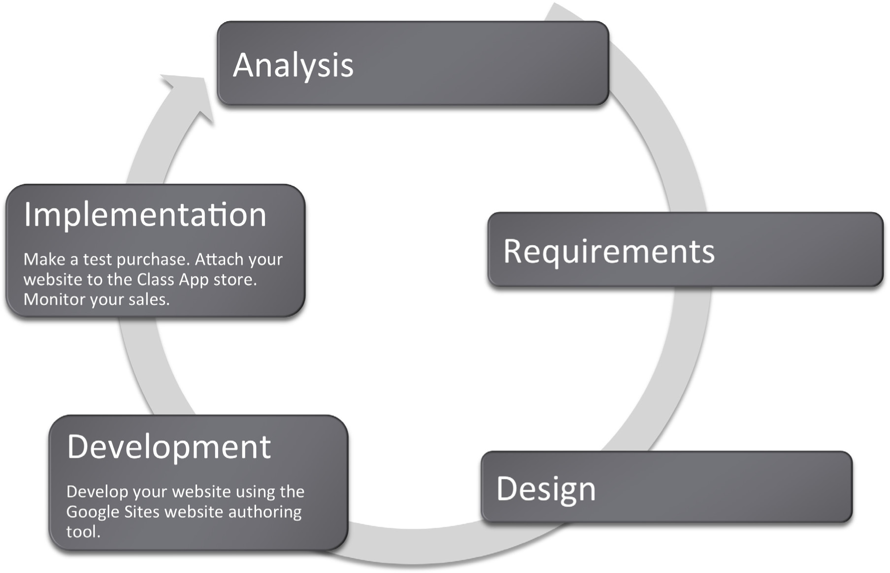
Compatibility with Corporate Standards
In the design chapter we talked about how important it is for us to standardize the look and feel for each page in our store so that it indeed looks like a store and not a loosely affiliated and somewhat bizarre collection of pages. However, it is also important that we standardize the development platform so that our store operates seamlessly.
The corporate world tends to be conservative in choosing information systems solutions. In fact corporations usually like to standardize to preserve the brand image and to ensure reliability and ease of maintenance.
Our classroom corporation is no different. Since we will be developing on online store together, it makes sense for us to agree on a common look and feel for each page in the site as well as a common platform for development. Our common platform is Google Sites and your professor may also require that you use a specific theme family on Google Sites to preserve a common look and feel.
Corporations such as Amazon.com have a clearly established corporate identity, which appears on every page. They use an orange and blue color scheme and consistently place navigation elements. Amazon uses a proprietary development tool since they are an industry leader.
Why is standardization so important? Consider that if you create something wonderful in a cutting edge authoring tool and then leave, no one else will be able to update the site you created. More often than not this is exactly what happens when students create websites for small businesses. The business has no way to update and maintain the site in response to business needs. Concern about site maintenance is one of the reasons that businesses are hesitant to engage students to create their websites as a class project even for free.
If given a choice between features and standardization, corporations will almost always choose standardization. We see this in other arenas as well such as office productivity tools. Corporations often mandate that everyone use the same word processor and even the same version! Students are often surprised when they arrive at the workplace to find that corporations live one or two versions behind on word processing software. Every upgrade represents potential costs in software, hardware, training, and lost productivity during training. Unless there is an overriding benefit to be realized, corporations will often choose to avoid the cost. In sum, corporations tend to be very conservative when it comes to software choice.
The corporate world is also happiest when there are clear market leaders to choose from. The last thing that a corporation needs is to invest in software from a company that later goes out of business.
Build vs. Buy
You might well ask why we are building a store rather than using off the shelf software that performs store management. The bottom line is that we want you to get under the hood to see how an information system functions—particularly how it interacts with a database.
Nonetheless, the first decision that a developer needs to make is whether to build or buy a solution for the business problem. To build means creating a customized solution; to buy means purchasing an off the shelf solution. The rule of thumb here is that if your business is similar in nature to thousands of other businesses, then you should buy a pre-built solution. There is no point in reinventing the wheel.
Off the shelf solutions tend to have a number of advantages. They anticipate functionality that your business requires and they are thoroughly tested. Most systems can be further customized to meet the needs of your business. From a support perspective, not only do you have customer service from the company that developed the solution, but you also have a user community that shares tips and tricks. Furthermore, as new versions are released you can improve the functionality and acquire bug fixes for your website with relatively little additional cost.
There are off the shelf solutions for almost any industry you can imagine—from doctor’s offices to construction companies. And the market is competitive, which helps drive down prices. Rather than hire a programmer, many businesses choose to adopt off the shelf solutions. Many of these off the shelf solutions live in the cloud so that the business does not even need to have a server in their office—only workstations to access the data in the cloud. For example www.curvedental.com is a cloud solution for a dental office.
The major disadvantage of off the shelf solutions is that they are limited in how far they may be customized.
If you do choose to build a customized solution from scratch, you still need to choose an authoring tool. Ideally, you want a tool that has some pre-built features that snap together much like Legos. We will employ a user friendly tool provided by Google called Google Sites.
Design View vs. Code View
Because this is an introductory course we want to avoid writing programming code. Fortunately Google Sites is sophisticated enough to allow us to avoid code view. However, we should understand the relationship between what we see on the screen—design view—and the underlying code.
Every webpage is constructed from HTML code. Professionals go to great lengths to refine that code for optimal look and performance. Most professional sites use a suite of products to prepare images for the site, to manage code on the site, to keep the pages organized, and to integrate with the backend database.
Adobe is probably the leading vendor of professional website authoring tools. Many custom built website solutions are authored at least in part with Adobe tools. The following page shows just a few of the many tools available from Adobe in their Creative Suite. The very fact that Adobe packages the tools in a suite is a hint at the complexity involved in creating a professional site.
Professional authoring tools typically have a design view and a code view allowing the developer to switch back and forth between the two. The design view is much like working with PowerPoint. You drag text and graphics where they belong on the page. The code view allows the developer to edit HTML code for even more precise control or the look, feel, or operation of the site.
However, few beginners ever want to see website code nor pay for the sophisticated code editing features. Fortunately, they don’t have to. A number of website authoring tools have been developed over the years to automate the process of code generation and shield users from code view. One of them, Google Sites, is shown on the following page.
But what if you really need a piece of code to accomplish a specific task? Google Sites created an open platform so that developers can create and publish “gadgets,” which can be dropped into your website. Gadgets are like the prebuilt Lego assemblies mentioned earlier. They snap into an existing site. In fact gadgets are to Google Sites what apps are to the iPhone platform. In the same way that the Apple touts, “There’s an app for that,” for almost every iPhone need, just so Google might boast, “There’s a gadget for that,” for many website development needs. And like iPhone apps, some gadgets provide very sophisticated functionality.
Adobe Creative Suite (above) and Google Sites (below) are both website authoring tools. Creative Suite runs on high powered workstations and is used by professionals who need precise control over the look and feel of their site. Creative Suite is really a family of tools including Photoshop, Flash, and others than work well together. Google Sites is a rapid development solution that lives in the cloud. Control is more limited to template based solutions. Development time is much shorter with Google Sites than with Creative Suite. Adobe product screenshot reprinted with permission from Adobe Systems Incorporated.
Client Side vs. Cloud Development
Our authoring tool, Google Sites, lives in the cloud. Amateur sites and some small businesses tend to prefer cloud based tools for their low cost and ease of use.
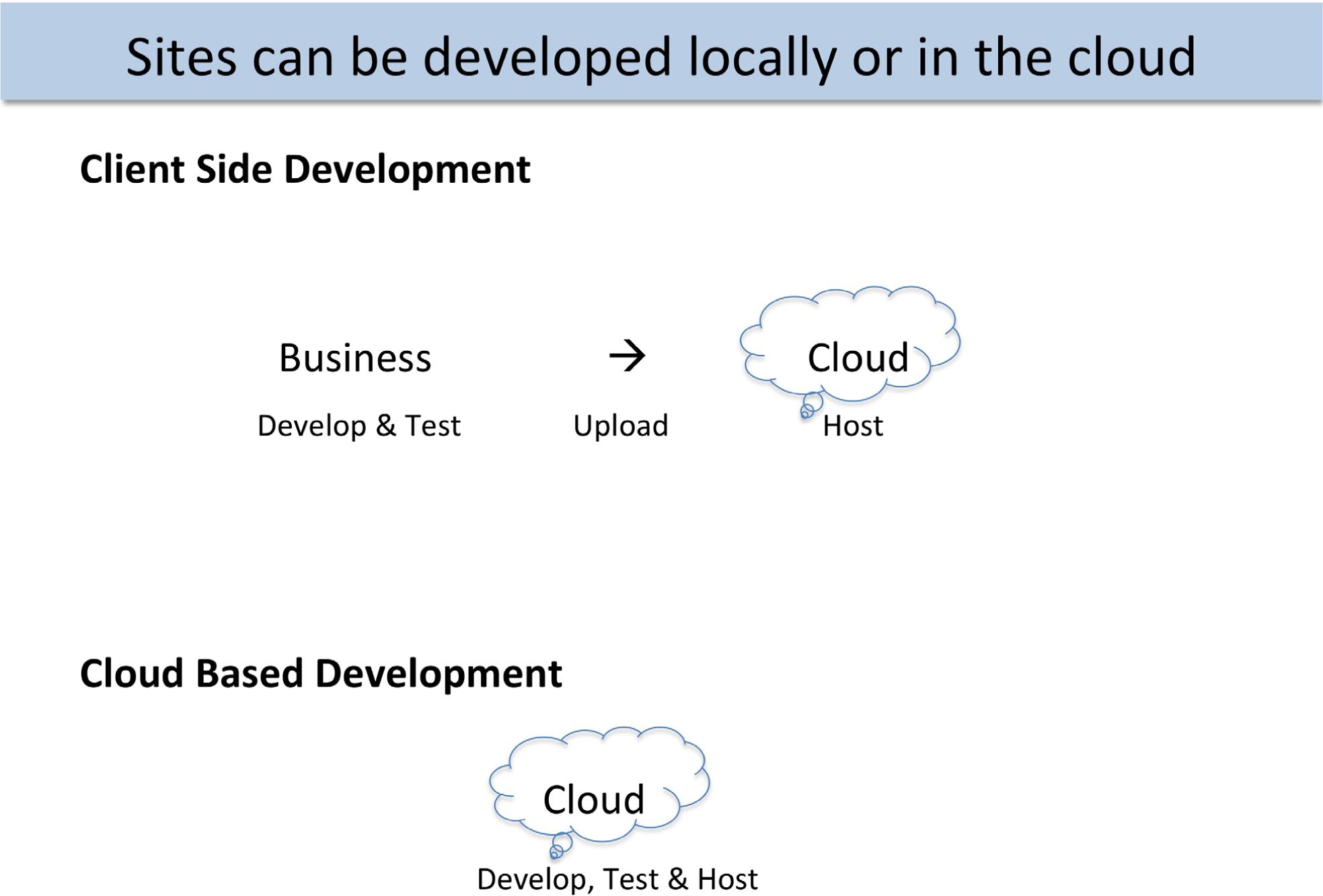
Client side toolkits such as Adobe Creative Suite allow all development and testing to take place offline before uploading to the web server in the cloud. By contrast, cloud based tools such as Google Sites require the development to take place in the cloud. Cloud based tools tend to run a bit slower due to internet response times, but the results are instantly published.
The issue on client side vs. cloud development is where the authoring software is located. Client side development takes place on a local computer. Only after the website is thoroughly tested is it uploaded to the cloud for hosting. Almost all professional systems are developed in this way.
There are numerous advantages to client side development, especially for large sites. The developer tends to have greater control over the look and feel of the website. The response time of the computer during development is very quick since there is no delay waiting for a cloud service to redraw the screen. Furthermore, the site is portable. The developer can choose to host it on any computer in the cloud.
Client side authoring tools range in price from free packages such as Pages, which is part of Apple’s operating system, to very expensive packages such as Adobe Creative Suite, which costs hundreds of dollars.
Cloud development tends to have a more template based look and feel. Google Sites is an example of a cloud development tool. The developer has less fine grained control over the look and feel of the website. However, with cloud development it is potentially easier to collaborate and integrate content.
Cloud development tools tend to be free or very low cost. The vendor of cloud development tools recovers their costs by running ads alongside, or even within, your site. In other words, you have no choice but to host your site with the cloud provider. As the page views or business features of the site begin to increase, the cloud provider will begin charging higher fees.
KEY TAKEAWAYS
- It is usually best to buy rather than build an information system solution. And normally a cloud solution is preferred. Purchased cloud solutions tend to be more cost effective, better tested, and reliable.
- Following corporate standards for software selection tends to lead to better integrated solutions.
- A prototype is one step up from a mockup. It is a working version of the website though incomplete.
- If you do decide to build then you will need an authoring tool to simplify the process of website construction. Authoring tools may live on your computer or you can use a cloud based authoring tool such as Google Sites.
QUESTIONS AND EXERCISES
- As Internet speed and security increases would you expect to see more or fewer businesses turning to cloud solutions? Explain.
- Is it better to outsource domestically or internationally? Explain the factors upon which your decision rests.
6.2 Google Sites
LEARNING OBJECTIVES
- Create a working website prototype
- Author and customize a website in the cloud
- Develop a website with good usability
- Integrate text and graphics
- Integrate other cloud services
- Match colors, logos, fonts, and other design elements to your iPhone App
- Add and modify navigation buttons
Now it is time to build our store. We will walk you through some of the aspects of page creation. We will begin by discussing templates and themes.
Get a Google Account
Google Sites allows users to build a website in the cloud using just a web browser. The site editor as well as all of the content lives in the cloud on Google’s servers. Google Sites is free to Gmail account holders. Sign up for a Gmail account if you do not have one already.
Start Up Sites
Sites is located under the More menu of your Gmail account. You need to pick a unique site name. One way to make it unique is to add your Gmail username as a prefix or suffix to your site name—e.g., FrostCoolApp or CoolAppFrost.
Choose a Site Template = Prebuilt Pages & Theme
A site template is a pre-built site with lorem ipsum (Latin gibberish) placeholder text and images. Each page is already laid out. For example the Family template has Family blog, Family calendar, Family map, and so forth. Template users simply swap in their own content.
Site templates are provided for different types of applications such as a classroom or small business. While some of the templates are pretty slick, we will begin with the Blank template in order to learn Google Sites. The Blank template contains only a home page with a simple theme. You add pages to the Blank template as needed.
Choose a Theme = Layout & Formatting
The theme is similar to a theme in PowerPoint. Every page in the site derives its look and feel, layout, colors, fonts, and so forth from the theme. You must pick a theme in the same family as the Class Store website since your site is part of the store. It is easier to pick a Theme when you create the site but you may change it later by accessing:
More Actions > Manage Site > Themes
<< Return to Site
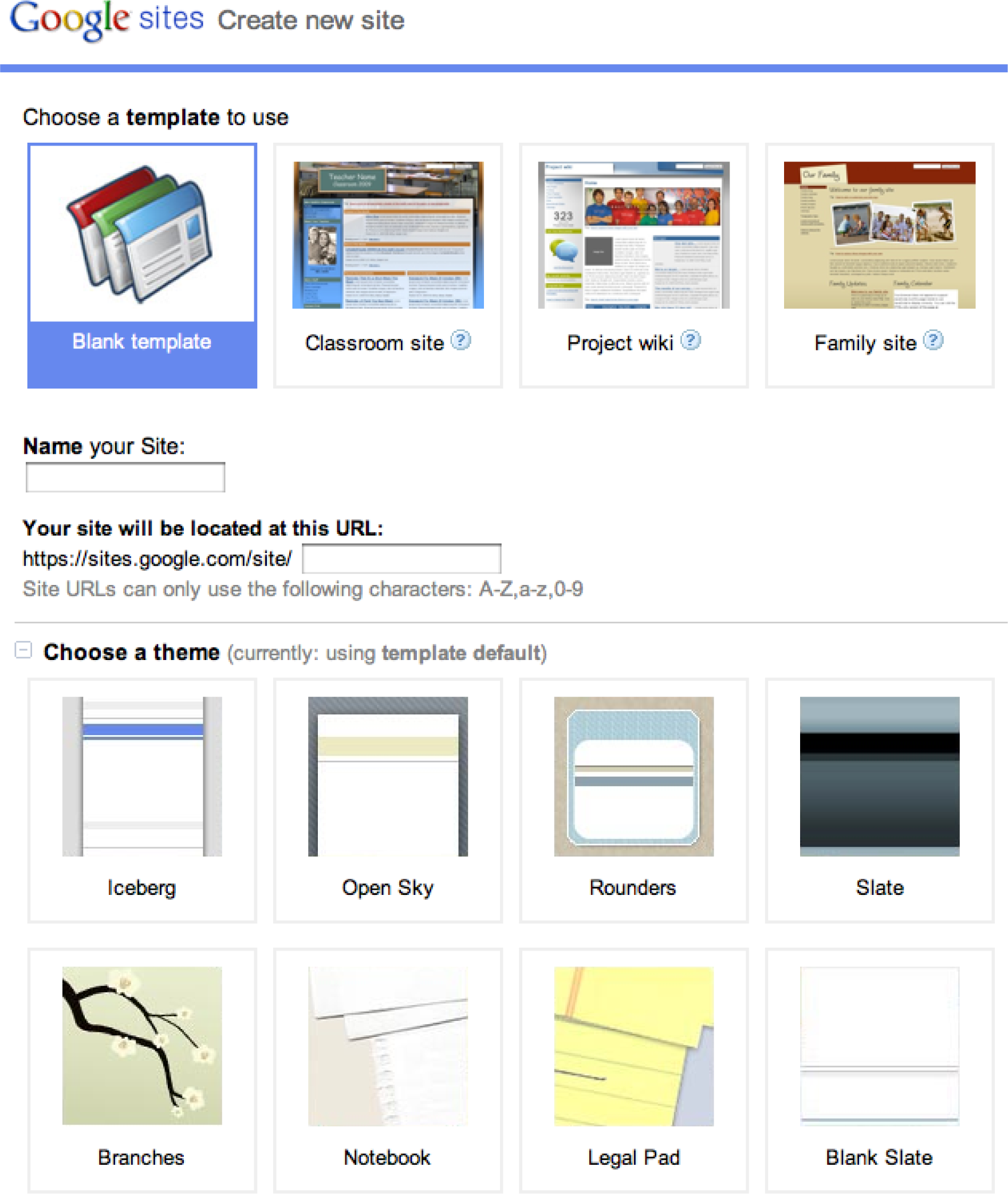
Google Sites opening screen allows you to choose a template, name for your site, and a theme. For our purposes we will stick with the Blank template so that we learn to build a site from scratch.
Google Sites: Management
The built in templates and themes are a good start. However, you will want to control the look and feel of the site to match your corporate standards and the brand.
Tweak the Theme
While the theme is a good start, you may want to tweak the theme on your site much as you might modify the Master Slide in PowerPoint. Modify items such as the Header and Sidebar, which show on every page. Modify background colors and fonts for the different regions of the page if necessary.
More Actions > Manage Site
> Site Settings > General > Site Name …. > Save Changes
> Site Appearance > Site Layout ….. > Save Changes
> Site Appearance > Colors and Fonts
<< Return to Site
Layers on a Page
When working with colors and fonts it is helpful to understand that a web page is made up of a number of layers stacked on top of one another. Here is the order of the layers beginning with the Page Background on the bottom.
- Page Background
- Page Wrapper
- Content Background
- Content
Create Pages from Page Templates
Google Sites was constructed to support workgroup collaboration. Therefore it has some interactive prebuilt page templates (Announcements, File Cabinet, and List). You will probably stick with the simple Web Page template for most pages. Unfortunately, even this template sometimes allows user to attach files and post comments to individual pages. You will have to turn this feature off as described below.
Select template for page. More Actions > Change Page Template
- Web Page (choose this one for most pages)
- Announcements (announcements to the team)
- File Cabinet (if you want users to be able to upload files)
- List (maintain to do lists for a workgroup website)
Eliminate user attachments and comments
- More Actions > Page Settings
Select Layout for Each Page
In edit mode the content area of each page can be edited. In our experience the layout is best controlled by inserting tables to contain the content.
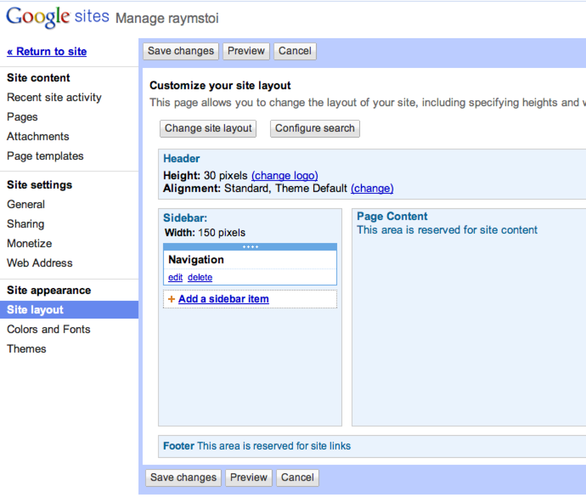
The Manage Site menu has powerful options that control the look and feel of the site. Changes made from this menu affect every page in the site.
Google Sites: Text, Graphics, Video, and Gadgets
Add Text
Add text to the pages. Be consistent on formatting throughout site. Choose appropriate headings styles. Choose appropriate font sizes if necessary.
Add Images
Before you can add images you need to save them and prepare a place on the page to receive the images. When using images from your iPhone app you can save them in two ways. You can right click on the image and save it as a PNG file. (You may have to group it first). Alternatively, you can take screen shots of your app.
To prepare the page to receive images, insert a table to receive the images. Then Insert > Image. Resize and align images in their table cells as necessary.
Insert Gadgets
Gadgets can add tremendous functionality to a page. We will use a gadget that captures customer information for customers who sign up for product updates. The gadget is a form that saves to a Google Docs spreadsheet. Google Docs is yet another free Google service that allows you to store and collaborate on documents in the cloud. You access Google Docs by clicking on the Documents link at the top of your Gmail account. Create and save a Form in Google Docs. Documents > Create > Form. Then insert the Form in your web page. Edit Page > Insert > Spreadsheet Form. To test, try visiting the page and filling out the form with some test data. Then return to Google Docs to view the spreadsheet of customers.
There are many other gadgets available from the Edit Page menu including the ability to embed YouTube videos.
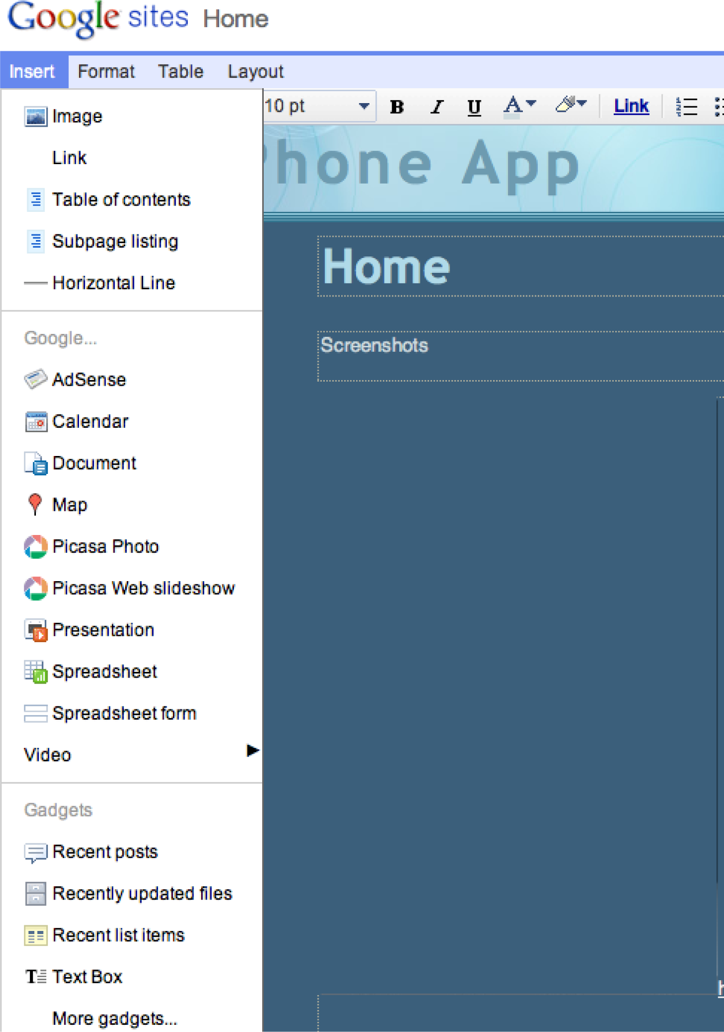
The Insert menu is used to insert images and gadgets. If you get the following error message when inserting a gadget answer NO, otherwise you get only part of the gadget—the part that can be delivered securely.
KEY TAKEAWAYS
- Google Sites tries to simplify the development process by providing pre-built templates for different businesses and themes to control the overall look and feel.
- Gadgets are to Google Sites what apps are to the iPhone.
- You can accomplish most operations in Google Sites without writing a single line of HTML code.
QUESTIONS AND EXERCISES
- In what ways is Google Sites similar to a word processor? In what ways is it different?
- Which repeated elements from the store theme are required to make your page look like part of the store? Explain.
6.3 Database Integration
LEARNING OBJECTIVES
- Explain why websites need to capture and display data
- Explain the role of a form in capturing data
- Create a form that captures data and saves it to a Google spreadsheet
Even our simple store must collect and display data from a database. We collect data about each app—what it is called, its description, and the link to the student page. We also collect data about each sale—who purchased what and when.
Every time you register on a website, your registration information is stored in a database. Similarly, when you make an online purchase the information is stored in a database. If you play online games, your scores are stored in a database. Websites constantly capture customer data in order to improve their services.
A database is a collection of one or more related tables of data stored in rows and columns. By this definition even a spreadsheet is a simple database. However, many business databases consist of multiple files that are interrelated. Databases may be searched, sorted, and summarized to display information. Most businesses would not function without databases of information. For example, imagine a bank trying to function without its database of customer and account information.
Information is usually entered into a database using a form. Each form normally corresponds to a single record or row in the database. Each field in the form normally corresponds to a single column or cell in that record. The form helps ensure that correct information is entered. Drop down menus in particular help ensure that users do not type in gibberish.
Just a short time ago, only professional programmers could save website information to a database. There are now tools that make this functionality easily accessible. The simplest example of database integration is to save information to a one table database. The simplest one table database is a spreadsheet.
Information is extracted from databases in the form of reports. The simplest report is a listing of all the records in the database. However, most reports summarize the information in a way that is helpful to business managers so that they can make data driven decisions. For example, a report might show total sales by product allowing managers to adjust inventory to meet demand.
One very interesting use of database information is to create custom web pages. For example, imagine you have purchased multiple items from Amazon.com. Amazon keeps track of your purchases and those of millions of other customers. By looking for patterns of buying behavior in its database, Amazon is able to suggest products you might like based on the buying behavior of customers who match your purchase profile.
Save Website Data to a File
While the site registration and sale forms are created by the professor, we would like you to have some experience with data integration. Therefore, you will make a form whereby users can register with your site to receive product update information even without making a purchase.
Because the form includes the customer’s email address, the information is a valuable resource for future mass mailings. If used judiciously, such mass mailings are appreciated by customers; if overused they are considered spam.
Google Docs lets you create a form to accept customer information and then stores the information in a spreadsheet. In other words, when you create a form, you get both a form and a spreadsheet automatically.
Start Google Docs
Create New > Form
Complete the form so that it looks similar to the form below. After completing each field you need to click Done. The first two fields are already on the form. To get the third field, check Add item. Then save the form.
Add the form to your web page from the same menu that you use to insert gadgets, calendars, and so forth. Then exit edit mode and practice filling in the form.
Return to Google Docs. You will see a spreadsheet listed with the same name as your form. Open the spreadsheet to view the captured data.
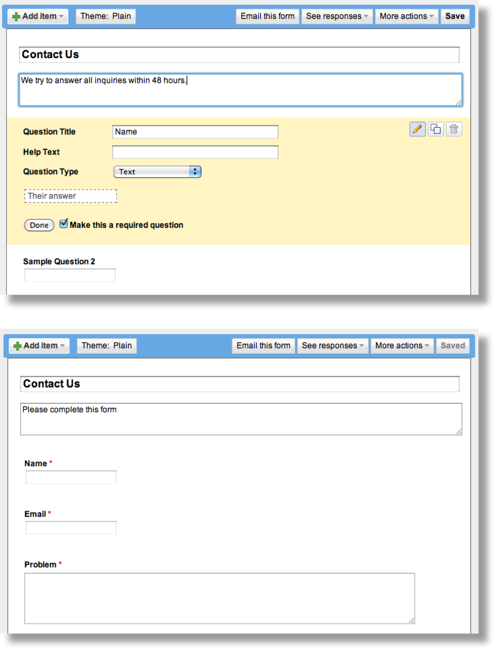
Google Docs allows you to develop an input form, which you can then embed in a page of your website. Data entered into the form by users is automatically saved in a Google spreadsheet. Each user record becomes a new row in the spreadsheet.
KEY TAKEAWAYS
- The ability to capture and store customer data using a Google Docs form and spreadsheet is the first step toward database integration. Full database integration allows you to customize pages for individual customers.
QUESTIONS AND EXERCISES
- A spreadsheet is sometimes referred to as a one table database. Describe a business problem requiring more than one table?
- Why do websites make such heavy use of drop down menus for filling in forms?
Techniques
The following techniques, found in the Google section of the Cloud Computing software reference, may be useful in completing the assignments for this chapter: Overview Map of Interface • Share a Document • Create a Form • Background Color • Copyright in Sidebar • Page Layout • Content-Delete “Comments and Attachments” and the Default Page • Title • Page-Create New • Gadgets-Insert • Logo-Insert
L3 ASSIGNMENT: DEVELOP A WEBSITE
In this assignment you create a working website prototype to help market your app. Your site will become part of the class app store.
Setup
Sign on to your Gmail account. Select Sites from the More menu.
Content and Style
- Follow all graphic design and usability principles.
- Follow your design plan. You may make some changes as necessary. However, the bottom line is that you should meet the requirements that you laid out earlier.
- You will be creating three pages in the Class App store. Your logo should appear in the upper left corner of each page.
-
Homepage
- Text describing your app and its features and benefits
- Show at least six screenshots of your app with a link to purchase the app. For ease of viewing without scrolling horizontally, the screenshots should be in a two row table.
- Provide a form where people can register for email updates about your product.
- Provide a link back to the Store in your navigation panel.
-
About Us
- Describe your business soft skills.
- Include your name, picture, and email address.
-
Blog
- Include at least two entries in the blog. For example, you might describe how you came up with the idea or who the target market is for your product or discuss future plans.
-
Extra Credit (if you make it work)
- Show a real time counter on your home page of how many people have purchased your app. Your counter will use a query similar to that found on the main store site.
- Your pages MUST tie in thematically with the Class App store. You may have an original design, but it MUST be obvious to the user (the grader) that they are still in the same store. Using the same theme or a similar theme family is the most obvious way to do this.
- Register your site with the professor’s online store.
- Embed a working Buy link on your homepage.
- Buy your own app just once to make sure that your Buy link is working. Register for email updates to make sure that your form is working. Check this by viewing the report on your homepage.
- Turn on Google Analytics from the Manage Sites menu using ID number provided by your professor. Do this last after you have thoroughly tested your site.
Deliverables
Electronic submission: Post a WORKING link to your website. Paper submission: Create a printout of each screen of your site.
Shopping
After everyone’s site is posted the professor will open the store for shopping. At that point you need to buy 10 apps of your choice.
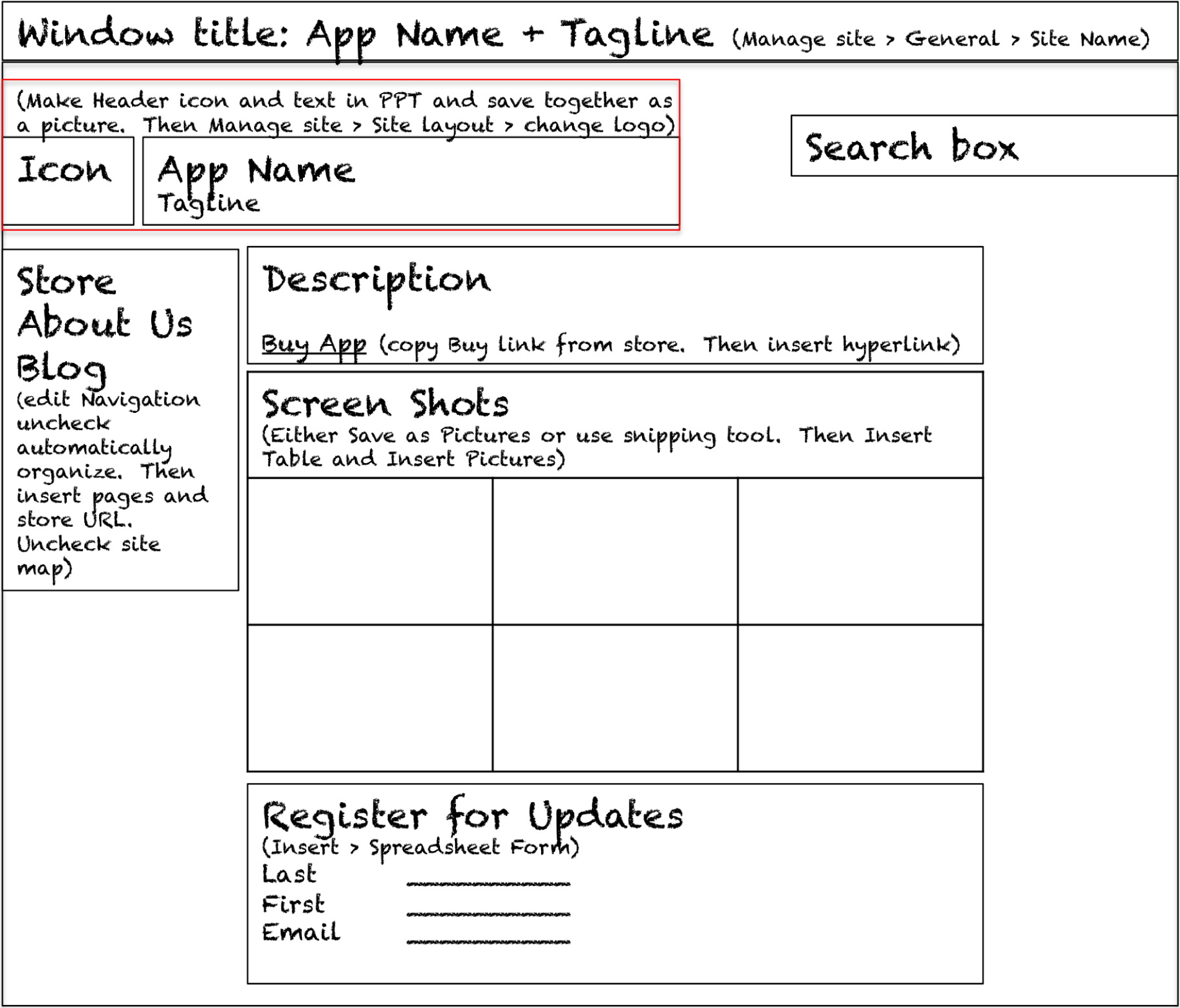
Chapter 7 Knowledge with Information Systems: Forecast Revenues and Expenses for the App
7.1 Development Options and Costs
LEARNING OBJECTIVES
- Diagram the role of a business analyst in the development process
- List pros and cons of outsourcing, both onshore and offshore
- Estimate expenses for iPhone app development
Introduction
In this chapter we will look at the costs and revenues involved in bringing your app to market. The steps involved in bringing an app to market include:
- Brainstorm an idea for an app.
- Analyze potential target markets.
- Create a mockup and description of the app.
- Solicit bids to develop the app.
- File for necessary legal licenses to do business.
- Enroll in the Apple Developer Program.
- Promote your app.
Note that you have already completed steps 1 to 3 and even part of step 7! We have stopped short only of the steps that actually cost money. In this chapter we will look at what those costs are and how to manage them in a spreadsheet.
Where Are We in the Life Cycle?
Many information systems projects are conceived of in a life cycle that progresses in stages from analysis to implementation. The diagram below shows the stages that we touch in the current chapter:
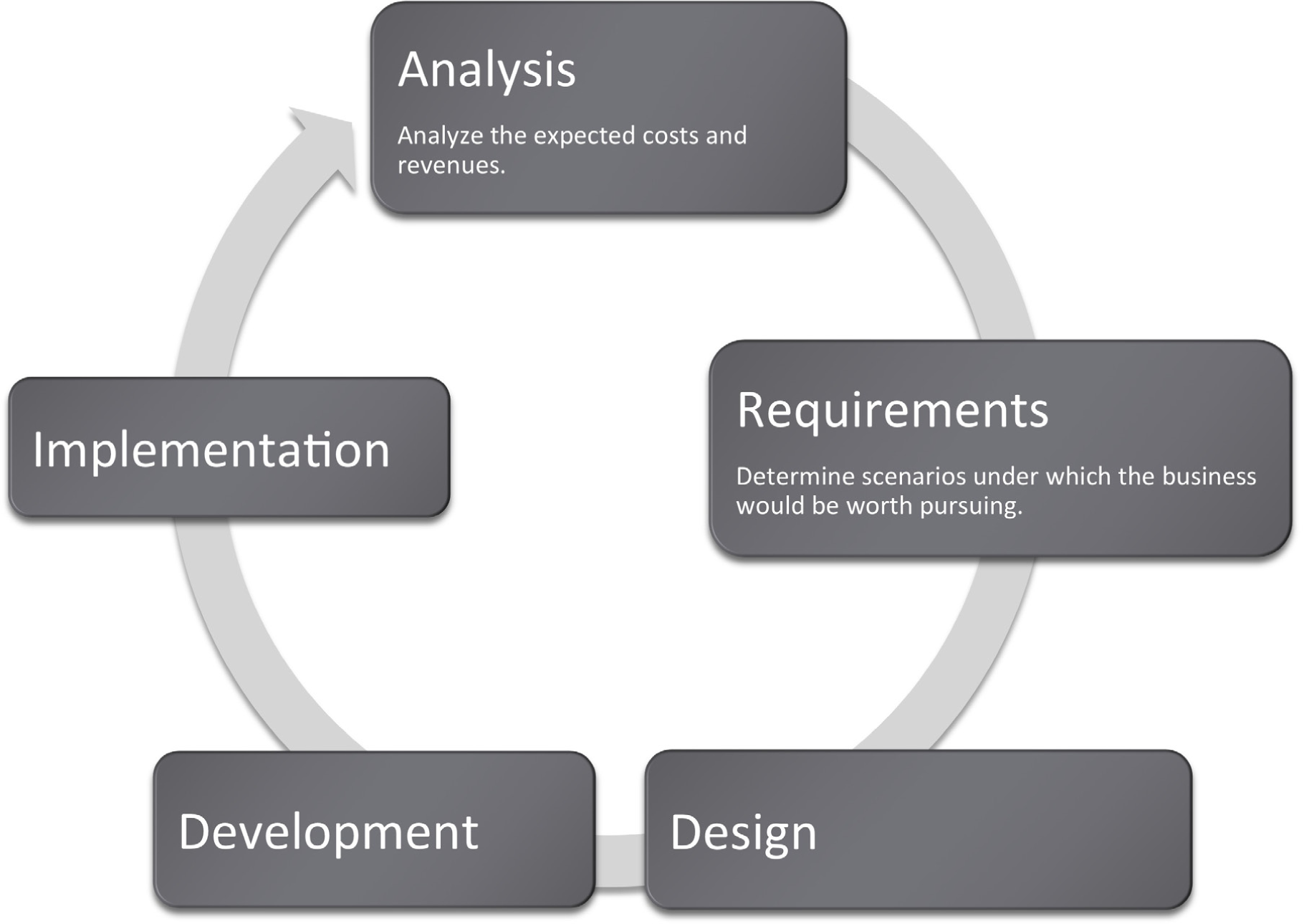
IS Professionals Serve the Role of Intermediary
To actually program an iPhone app requires fairly extensive programming knowledge. Apps are programmed in a language called objective C. This is beyond the scope of most information systems (IS) business analysts. IS professionals hire the programmers, rather than doing the coding themselves. In fact, most IS curricula teach programming only so that the business analyst is able to communicate effectively with programmers by speaking a bit of their language and understanding some of their constraints.
Within a large corporation there will typically be a team of developers (usually computer science majors) and a team of business analysts (usually IS majors). The business analysts communicate with the business units, such as marketing or finance, to analyze the business needs. They then translate those needs into requirements that are delivered to the developers. The process flows, mockups, and market descriptions that you have done in earlier chapters are all part of those requirements.
The developers program the application and then deliver it back to the business analysts for testing. In this way, IS professionals serve as the bridge between the developers and the business units.
The business analyst’s job continues even after the app is developed. They test the app extensively when it is delivered back from the developer.
Most of the iPhone apps with which you are familiar are designed for the consumer market. However, there are a number of corporations that design in-house proprietary iPhone apps for their employees. If you were designing your app for a company you would serve as the intermediary between the business unit and the developers.
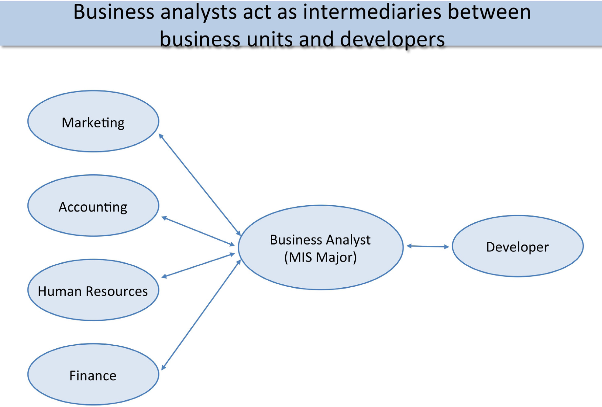
IS professionals typically serve in the role of a business analyst. They find out the requirements of the business unit and then translate those requirements into documentation that the programmers can work with.
Outsourcing: Let Developers Bid for Your Business
Some corporations, especially small ones, do not retain a team of developers. They rely on the ability to contract out development work.
With the advent of the web, the process of locating programmers has become much easier. There are a number of portals such as Elance.com that allow you to auction off your job much the same way that you would auction a product on eBay. Developers then bid on your job and you select your preferred developer. To help you in the decision, these services also maintain ratings of developers based on feedback from prior clients.
The process of bidding out a job to a developer outside of your corporation is called outsourcing. Outsourcing comes in two flavors depending on where the developer is located. Outsourcing to a local developer is called onshoring. Outsourcing to a developer in another country is called offshoring. Offshoring is a popular movement among North American companies due to the high cost of skilled labor in the United States. Many developers live offshore in countries such as India, Pakistan, Russia, and Brazil.
One key factor in outsourcing is communicating clearly with the developer. Any documentation that you prepare in advance helps reduce the possibility of misunderstandings. That is why we spent time planning the app and constructing a mockup.
Choosing a developer is not about getting the lowest price, but rather about getting the best value. You want a good developer, but maybe you do not need the best. Make sure that your developer has a reputation for delivering on time and within budget. Furthermore, you often get what you pay for. Cheaper developers may deliver lower quality.
There is a myth of developers in third world countries working practically for free. However, as countries such as India, Pakistan, and Russia become wealthier, the wages rise.
The offshoring process is imperfect and some U.S. companies have found that documentation requirements are so extensive, and communication problems so prevalent, that it is almost cheaper in the end to hire a local programmer somewhat familiar with the business already. Some portals, such as iPhoneAppQuotes.com, advertise on-shoring as their competitive advantage.
Many companies provide iPhone quotes. Elance.com is more general and worldwide, developing lots of different kinds of systems with developers all over the world. iPhoneAppQuotes.com develops iPhone apps using only developers in the United States.
Estimating Costs: It’s OK to Be Approximately Right
Sometimes students resist the process of estimating costs since there is so much uncertainty in the variables. Uncertainty is normal in business and is accepted by investors. The solution is to proceed with good faith estimates and perhaps produce a range of possible outcomes dependent on positive and negative scenarios.
Uncertainty implies risk. In the negative scenario, you might lose everything and go out of business. On the other hand, in the positive scenario, you might do very well. Fortunately, there are always people willing to take the risk to bring new products to market.
Below you will find a summary of the costs involved in creating an iPhone app. Note that we are not including the value of your time to conceive, document, and test the app. Like many entrepreneurs you will be working for free.
Legal costs: If your business has a name other than your own, then by law you must file for a Doing Business As (DBA) license. However, that license does not protect you from liability. You are still personally liable for the debts of your business. A safer but more expensive option is to set up a Limited Liability Corporation (LLC). The LLC offers some protection from personal liability. We are picking relatively inexpensive options though you may want to add the cost of an attorney to your estimates.
Developer costs: Your greatest cost will be to pay the developer. Avoid being too cheap here or the entire project will fail. To register and test your app with iTunes requires that you have an Apple Developer license. So even though you are not the developer, still you need to register as an Apple developer.
Marketing costs: Finally, you need to promote your app. You have already created a web site to which you can direct traffic. But ultimately people have to find out about you. App review sites such as AppVee.com offer advertising packages for around $200/month.
All of the above are fixed costs. You have to pay them whether you sell one app or 10,000. However, you also have a variable cost from Apple. Apple takes 30% of every sale on iTunes. This is for the privilege of selling your app in their store. Since they are the only store allowed to sell apps, you do not really have a choice. So if your app costs $2.00, Apple gets $0.60 for each app sold. You make $1.40 per sale.
What you make per unit after subtracting variable costs is called the contribution margin. Knowing the contribution margin helps you quickly calculate your total revenue—simply multiply contribution margin by the number of units sold.
Table 7.1
| Various Fixed Costs | Amount | |
|---|---|---|
|
Doing Business As (DBA) or Limited Liability Corporation (LLC) license from a service such as LegalZoom.com |
$199 |
|
|
Outsourcing development from a portal such as Elance |
$3,500 |
|
|
Maintenance and updates from developer after year 1 |
$1,000/year |
|
|
Apple Developer license |
$99/year |
|
|
Ad on app review sites such as AppVee.com |
$2,400/year |
|
|
TOTAL FIRST YEAR |
$6,098 |
Some costs of doing business shown above. Legalzoom.com is one of the less expensive ways to incorporate.
Part I – Variable Costs and Contribution Margin
The concept of variable costs is essential to predicting profitability. Put quite simply, you do not make any money unless you sell a lot of apps. Therefore, we will spend some effort trying to understand variable costs both conceptually and in a spreadsheet.
Year 1
- You think you will sell 700 units of app in Year 1 at $2/unit.
- Apple collects 30% of each sale as commission.
- How much will you earn in Year 1?
Year 2
- You predict that sales will double in Year 2 (still at $2/unit).
- How much will you earn in Year 2?
Year 3
- You predict that Year 3 sales will double over Year 2 sales (still at $2/unit).
- How much will you earn in Year 3?
Discussion
- How much money is brought in through each unit sale before deducting Apple’s commission?
- How much money does Apple earn on every unit sold?
- How much money do you earn on every unit sold? The technical term for your share is called the contribution margin. It refers to how much money you earn from the sale after deducting the variable costs.
Part II – Now Include Fixed Costs
Year 1 (more realistic)
- You must pay the developer $3,500 to develop your app. This includes maintenance and bug fixes for the first year.
- You think you will sell 700 units of app in Year 1 at $2/unit.
- Apple collects 30% of each sale as commission.
- How much will you earn in Year 1?
Year 2 (more realistic)
- You must pay the developer $1,000 to maintain your app.
- You predict that sales will double in Year 2 (still at $2/unit).
- How much will you earn in Year 2?
Year 3 (more realistic)
- You must pay the developer $1,000 to maintain your app.
- You predict that Year 3 sales will double over Year 2 sales (still at $2/unit).
- How much will you earn in Year 3?
Discussion
- How much money is brought in through each unit sale before deducting Apple’s commission?
- How much money does Apple earn on every unit sold?
- How much money do you earn on every unit sold (contribution margin)?
- How much do you have to pay your developer each year even if you don’t sell any units?
- What are your final earnings at the end of each year after paying Apple and your developer?
- In which year(s) did you make rather than lose money?
KEY TAKEAWAYS
- MIS professionals tend not to program—they serve as intermediaries between the business unit and the programmers.
- Outsourcing either onshore or offshore is a popular alternative when a business does not have a dedicated programming staff.
- A business has numerous startup costs such as incorporation, advertising, and so forth, which need to be forecast.
- Fixed costs are incurred even if no products are sold; whereas variable costs are incurred only when a sale is made.
- Contribution margin is the money realized by the business after paying variable costs.
QUESTIONS AND EXERCISES
- Give both a selfish and an unselfish reason for why Apple requires all iPhone apps to be sold through its store.
- Is it better to outsource offshore or onshore? Explain.
7.2 Spreadsheets to Estimate Costs
LEARNING OBJECTIVES
- Format a spreadsheet to make it more readable and professional in appearance.
- Create an assumptions area
- Name cells in a spreadsheet
- Use spreadsheet names in formulas
- Insert rows and columns into a spreadsheet.
- Perform a sensitivity analysis
- Apply graphic design principles to create professional looking spreadsheets.
Apply the C.R.A.P. Principles
Notice the spreadsheets on the following page. The “before” spreadsheet is both sloppy and hard to read. The “after” spreadsheet uses contrast in fonts and size to focus attention on important information, and it uses alignment to create strength and clarity. Numbers and their headings are right justified, and the “Measure” category and its heading is left justified. Proximity and repetition of fonts create a professional finished look.
The “after” spreadsheet also includes three new columns: Years, Male Over/(Under), and Female earnings as a % of male earnings. These new columns are processed data or information. Information summarizes or describes the data in a meaningful way. This information shows that disparity between male and female earnings both as an absolute value and as a percentage. To create information usually involves a formula. Formulas are written by the user to perform calculations on data. Business formulas tend to be simple, usually involving addition, subtraction, multiplication, or division. For example Male Over/(Under) subtracts female earnings from male earnings to show the difference between the two. Similarly female earnings as a percentage of male earnings divides female earnings by male earnings. Note that the information revealed by these columns tells us that there is a difference; it does not tell us why. And most information is very much like this. It needs to be interpreted in order to make business decisions, or in this case public policy decisions.
The total area of a spreadsheet often exceeds the normal width of printing paper. Address this problem by printing in landscape orientation and by scaling the page to the width of the paper.
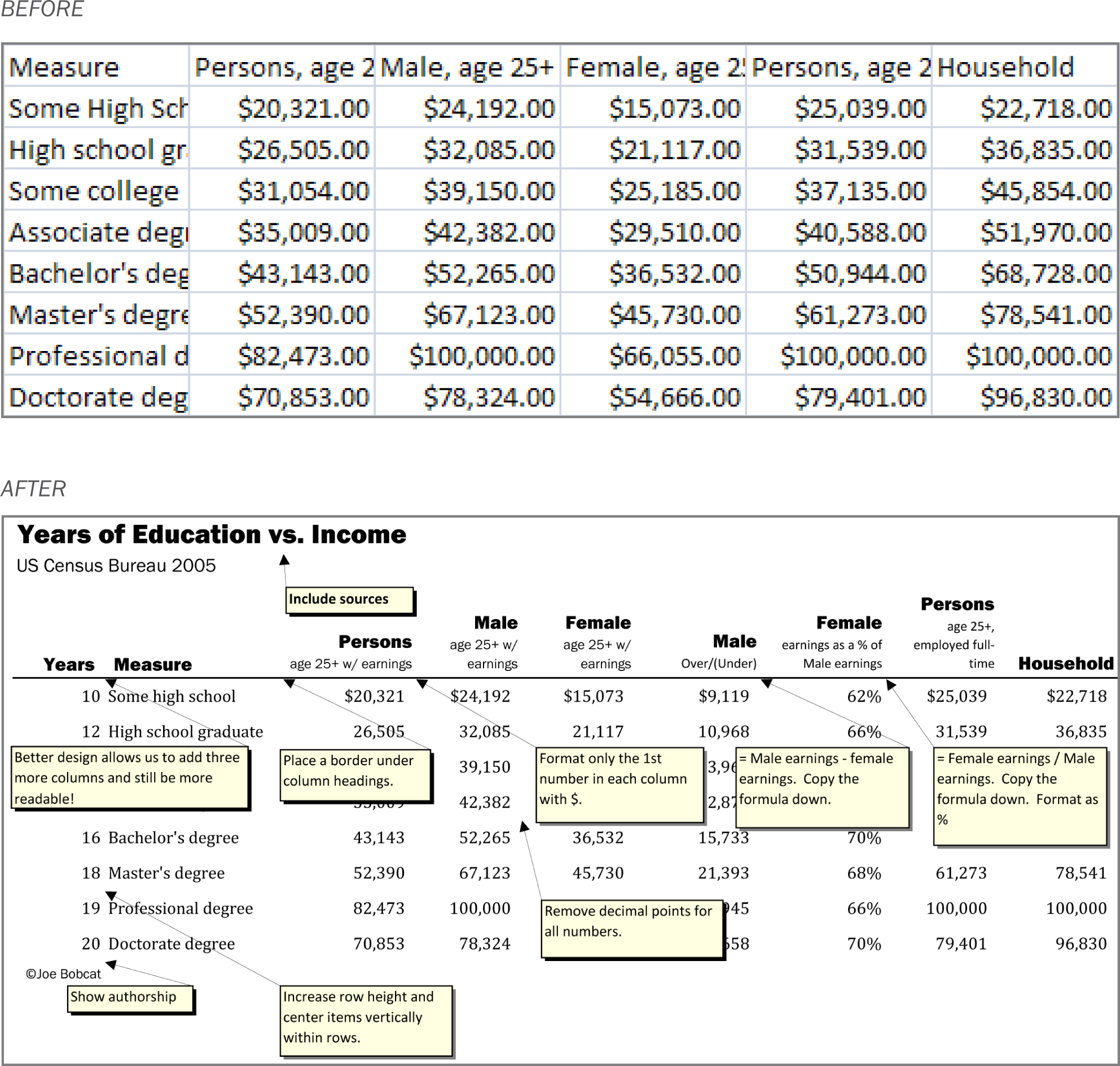
Formatting a spreadsheet makes an enormous difference as to its professionalism. Proper formatting also makes the data much more readable.
Place Estimates in an Assumptions Area
We mentioned previously that all forecasting involves making assumptions. These are educated guesses based upon research. However, assumptions may change over time. Ideally, you would like to be able to update your spreadsheet easily as the assumptions change. The easiest and most error free way to perform the updates is to use an assumptions area.
An assumptions area contains all of the variables that go into your calculations. It is normally located at the top of the spreadsheet. In a perfectly designed spreadsheet, the assumptions area is the only place that you actually type a number. Every other cell in the spreadsheet is a formula that refers back directly or indirectly to the assumptions area.
Consider the Apple Commission located in cell B7. We need to know the commission in order to calculate the contribution margin—how much we make on each sale. We would expect the contribution margin formula in B8 to reference B7. So the formula in B8 might look like this:
=B6*(1-B7)
However, that formula is not particularly informative. The problem is that Excel does not know the meaning of the numbers in B7 and B8. It does not examine the labels to the left either. If we gave cells B6 and B7 meaningful names, we could calculate contribution margin as:
=PricePerUnit*(1-AppleCommission)
or equivalently
=PricePerUnit-(PricePerUnit*AppleCommission)
Note how these names are very similar to the labels. We say very similar because cell names can not contain spaces, whereas labels can. The cell names will be hidden from view but can be used in calculations as shown above.
The place where you create the names is in the name box on the toolbar just above cell A1. Simply type the name and hit Enter. You must hit Enter or the name will not stick.
Remember cell names can not contain spaces. So “Apple_Commission” is OK and so is “AppleCommission.” However, “Apple Commission” as two words with a space in between will not work. By the way, capitalizing the first letter of each word and eliminating the spaces between words (e.g., PricePerUnit) is called CamelBack notation for obvious reasons.
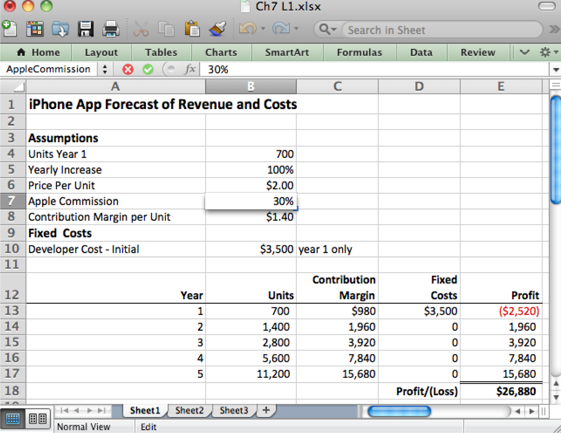
In a well designed spreadsheet the only place that numbers should be updated is in the assumptions area. Every other cell references the assumptions area using formulas.
Formulas are Used to Generate Information
Our last example showed a formula in the assumptions area. It is rare to have formulas in the assumptions area. Most formulas appear in the spreadsheet proper below the assumptions area.
Let us assume that we named B4 as UnitsYear1. Then the formula in B13 is =UnitsYear1. Every formula begins with an equal sign.
B14 is a much more interesting example, and one that shows the power of Excel. We are now in Year 2 and need to represent the projected increase in sales. To represent any increase involves taking the prior value (B13) and adding the increase to it. Calculate the increase by multiplying the prior value by the percentage increase. So we get:
=B13+B13*YearlyIncrease (700+700*100%)
The first B12 is the prior value; the second B12*YearlyIncrease is the amount of the increase. The great thing about this formula is that it can be copied down to the rest of the cells in column B. Simply double click or drag the bottom right corner of B13 and the rest of the column will fill as follows:
B15: =B14+B14*YearlyIncrease (1400+1400*100%)B16: =B15+B15*YearlyIncrease (2800+2800*100%)B17: =B16+B16*YearlyIncrease (5600+5600*100%)
Excel properly repeats the pattern without any further effort on your part! However, note carefully that this was only possible because we had earlier named B5 as YearlyIncrease. If we do not name B5 then the pattern would look like this:
B14: =B13+B13*B5 CORRECT (700+700*100%)B15: =B14+B14*B6 WRONG (1400+1400*$2.00)B16: =B15+B15*B7 WRONG (3200+3200*30%)B17: =B16+B16*B8 WRONG (5440+5440*$1.40)
Excel improperly repeats the pattern moving every cell down one space each time. That is a problem for B5 in the assumptions area because the next cells down are Price Per Unit (B6=$2.00), Apple Commission (B7=30%), and Contribution Margin per Unit (B8=$1.40). These last three have nothing to do with units sold and we get gibberish instead of valuable information. What is even more frightening is that the numbers do not look obviously wrong.
So in addition to being more readable, naming cells in the assumptions area also protects us against errors when copying formulas.
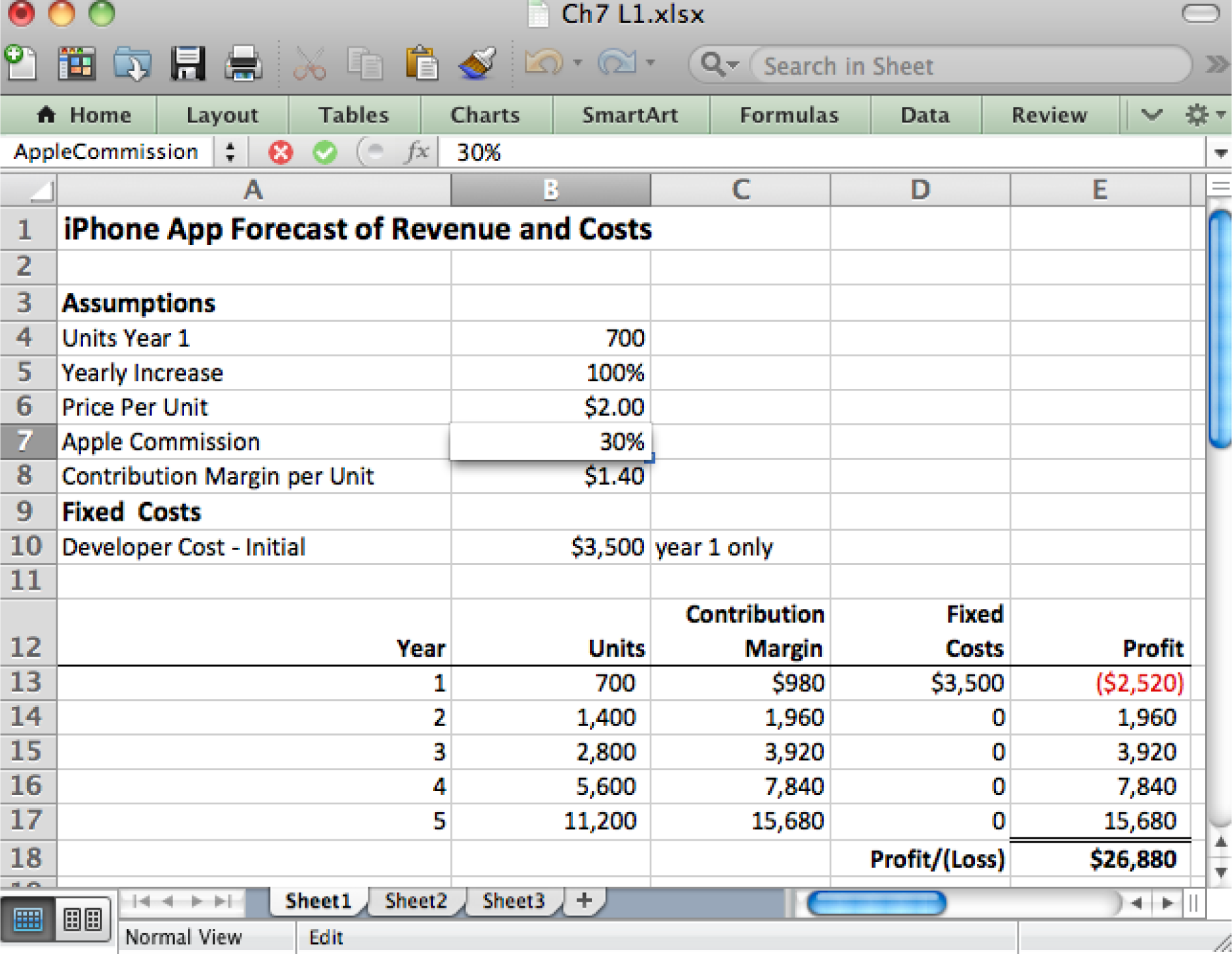
Above each cell in the assumptions area gets a unique name. For example, B7 is called AppleCommission (with no spaces allowed in the name). Below formulas in the calculation section reference values in the assumptions area by name. For example, the formula in B13 references the YearlyIncrease field. Such formulas may be copied down the column without fear that the formula will improperly change when copied.
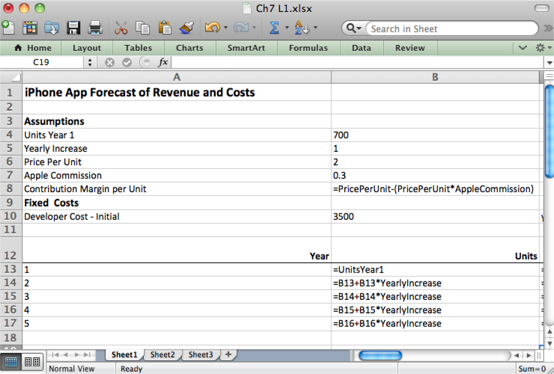
Perform a Sensitivity Analysis to Hedge Your Bets
Any time you make assumptions, you have to allow for the possibility that you might be wrong. Since you are dealing with real money, some of which is probably yours or a relative’s, you need to know the extent of your exposure should things not work out as planned.
Therefore, it is a good idea to vary the assumptions and see what outcomes occur. This sophisticated analysis allows you to have an intelligent discussion about possible future scenarios.
A good way to conduct a sensitivity analysis is using an Excel data table. A table can represent three variables—column headings, row headings, and the results inside the table. You vary the data in the row and column headings to observe changes inside the table. For example, assume that each cell inside the table contains the profit after Year 5. We can vary the growth rate and price per unit to see the effect on profit.
To perform these calculations without the data table would require manually changing growth rate and price per unit assumptions TWENTY times and recording the values after year 5—this is busy work. By contrast, Excel has the built in ability to create a data table.
The trickiest part of creating a data table is shown by the highlighted cells in the spreadsheet. You must repeat the value from your calculations on which you wish to perform the analysis. And not only do you have to repeat it, but you must repeat it using a simple formula. So the formula in B23 is:
B23: =E18
Note how this cell must form the upper left corner of the data table. Now just fill in the row and column headings. We put various values for growth rate in the column headings and various values for price per unit in the row headings. Next highlight the whole table including the row and column headings and choose What If Analysis > Data Table. The last step is to identify for Excel the first cells where growth rate and price per unit appear in the assumptions area. Then Excel will substitute the values from the row and column headings into the assumptions area, redo ALL the calculations in the spreadsheet and then capture the results in the data table—all behind the scenes!
Now it is your job to argue for the ones you think are most favorable and realistic.
KEY TAKEAWAYS
- Well designed spreadsheets group input variables into an assumptions area. Ideally, the assumptions area is the only place that numbers are typed.
- Formulas may be copied. However, cells that should not change in a formula should be named.
- Many information systems projects fail. Your exposure can be analyzed in a sensitivity analysis using a data table.
QUESTIONS AND EXERCISES
- Without using the built in data table function, how could you still construct a table that would perform a sensitivity analysis.
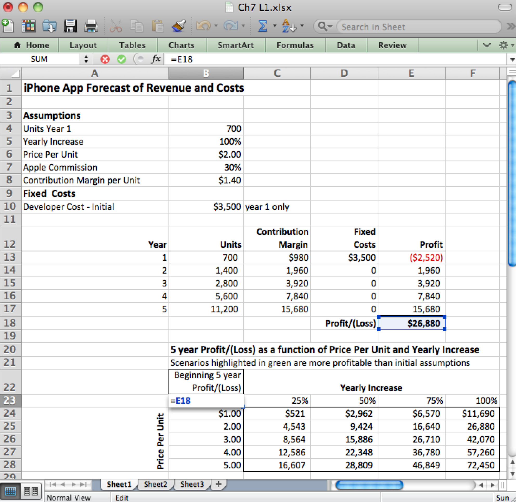
Make sure that the upper left corner of the data table is a simple formula that copies the value that you want to see varied in the data table.
Techniques
The following techniques, found in the PowerPoint section of the software reference, may be useful in completing the assignments for this chapter: Overview Map of Interface • Cell Name-Create • Cell Name-Delete • Format Number • Formula-Copy • Formula-Create • Formula Mode • Insert Column • Insert Row • Move Decimal Point • Sensitivity Analysis
L1 ASSIGNMENT: FORECAST REVENUES/EXPENSES
Professionals are able to represent what they know intuitively in a properly formatted spreadsheet with an assumptions area.
Setup
Start Excel and properly title your spreadsheet.
Content and Style
- Create an assumptions area containing all variables.
- Name each number in the assumptions area.
- Use those names in calculations in the spreadsheet below. Except for the Year column, EVERY number outside of the Assumptions area must be calculated with formulas.
- Follow best practice design techniques in this chapter.
- Only the first number in each column gets formatted as CURRENCY (Do not format as ACCOUNTING.) Update the format using the Number Formatting Technique. All other numbers greater than 1,000 should be in Comma style.
- Include a copyright symbol with your name at the bottom.
- The worksheet gridlines will not appear on the printout.
Deliverables
Electronic submission: Submit the workbook electronically.
Paper submission:
- Print out both the results and formulas. The formulas printout shows the formulas in each column. Reveal the formulas by typing CTRL+ ~ (press the CTRL and ~ keys at the same time). Adjust the column widths to closely crop the formulas by dragging the separator between each column in the gray header area.
- Both printouts should use landscape orientation, which you will find under Page Layout > Page Setup > Orientation > Landscape. Each printout should fit on one page. Choose Page Layout > Scale to Fit > Height: 1 page; Width: 1 page.

Please save the forecast revenues/costs spreadsheet; you will be updating it later.
L2 ASSIGNMENT: MORE EXPENSES & SENSITIVITY ANALYSIS
To make the problem more realistic, we bring in additional fixed costs. To help in decision making, we perform a sensitivity analysis.
Setup
Re-save your workbook file from the L1 under a new name and then modify it to look as below. This must be a new workbook—do not simply create a new sheet in the same workbook or some of your names will conflict and spoil the data table.
Content and Style
- Incorporate new costs including Incorporation ($199), Apple Developer Cost ($99/year), Advertising ($2,400/yr.), Developer maintenance cost ($1,000/yr.). Create an assumptions area containing all variables.
- Name each number in the assumptions area.
- Use those names in calculations in the spreadsheet below. Except for the Year column, EVERY number outside of the assumptions area must be calculated with formulas.
- Follow best practice design techniques in this chapter.
- Only the first number in each column gets formatted as CURRENCY. (Do not format as ACCOUNTING.) Update the format using the Number Formatting Technique. All other numbers greater than 1,000 should be in Comma style.
- Include a copyright symbol with your name at the bottom.
- The worksheet gridlines will not appear on the printout.
- Produce a sensitivity analysis table of total profit/(loss) as a function of growth rate and price per unit.
Deliverables
Electronic submission: Submit the workbook electronically.
Paper submission:
- Print out both the results and formulas. The formulas printout shows the formulas in each column. Reveal the formulas by typing CTRL+ ~. Adjust the column widths to closely crop the formulas by dragging the separator between each column in the gray header area.
- Both printouts should use landscape orientation, which you will find under Page Layout > Page Setup > Orientation > Landscape. Each printout should fit on one page. Choose Page Layout > Scale to Fit > Height: 1 page; Width: 1 page.
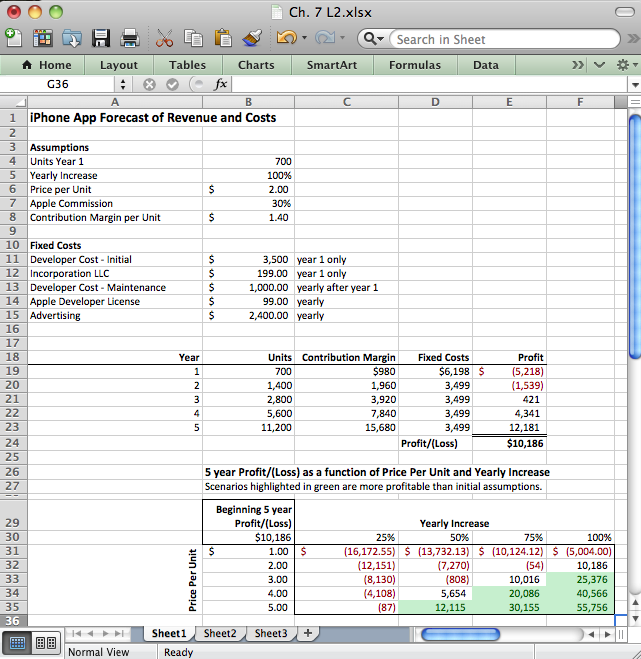
Add assumptions and columns as necessary to accommodate additional costs of maintenance, incorporation, and advertising.
Chapter 8 Decision Support: Determine Feasibility of a Business Loan for the App
8.1 Calculate the Terms of a Loan
LEARNING OBJECTIVES
- Evaluate the cost of borrowed money
- Analyze the profitability of a business enterprise
- Explain the benefits of placing multiple graphs on the same page.
- Use fixed costs and variable costs in a break even analysis
- Engage in “What If” data manipulation scenarios to realize business objectives
- Conditionally format data meeting predetermined criteria
- Choose and successfully employ Excel techniques to solve a complex task
Introduction
Many businesses need a loan in order to cover startup costs. Many entrepreneurs will turn to family for a loan. However, the danger here is that you are risking not only your family’s money, but also the relationships if the business should go under.
On the other hand, small businesses without a prior track record sometimes have trouble securing a bank loan. Fortunately, there are government agencies at both the federal and state levels that help businesses secure grants and loans.
Loan payments form part of the fixed costs of a business. Determining the payments on a loan is an important part of forecasting costs. The financial formula that calculates loan payments is fairly complex. However, Excel provides an easier way to calculate loan payments using the payment (PMT) function. The PMT function is one of many built in Excel functions. In this chapter we will examine functions, how they differ from formulas, and how to use them in a spreadsheet.
Where Are We in the Life Cycle?
Many information systems projects are conceived of in a life cycle that progresses in stages from analysis to implementation. The diagram below shows the stages that we touch in the current chapter:
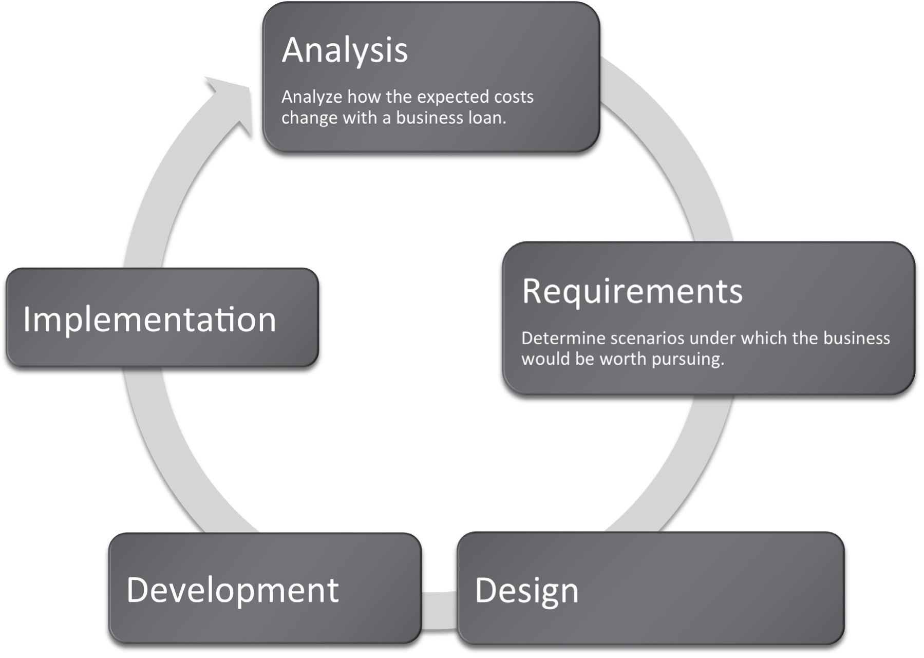
Functions vs. Formulas
In the prior chapter we looked at Excel formulas and how to construct them. In many cases, we want to create our own formulas so we have a clear idea of how the information is constructed.
However, in some cases the formula might involve more complex math where the possibility for error is greater. In these cases it is better to use a built in function that has already been tested and debugged. There are also functions that avoid busywork that you could do yourself but would probably prefer not to do.
On a small scale this is analogous to the build vs. buy issue. Think of formulas as things that you build whereas functions are things that you “buy.” We put buy in quotes because many functions, including the payment function, are bundled with Excel. That is part of the way that Excel maintains its leadership in the spreadsheet marketplace.
Most functions process input to produce a result. Perhaps the most popular function in Excel is the sum (SUM) function, which adds up a long list of numbers. The input for the Sum function are the cells to be added together.
The example below shows the sum function compared with the equivalent formula. The formula is obviously very tedious as it involves adding all the numbers. This is expressed as
=A4+A5+A6+A7+A8+A9+A10+A11+A12
The sum function accomplishes the same task more simplistically. This is expressed as
=SUM(A4:A12)
Note that in both cases the result is the same: 1,427.
One nice advantage of the sum function is that if we were to add a row in the middle of the list, say between row 7 and row 8, the sum function would automatically expand to accommodate the new row, but the formula would not.
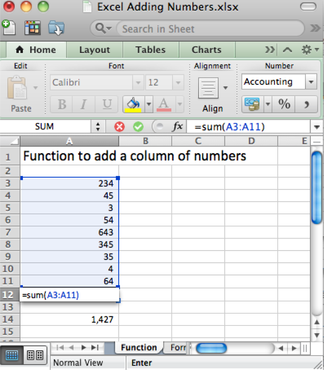
The right way (above) and wrong way (below) to add up a column of numbers. Always try to use the sum function when adding numbers from more than two cells.
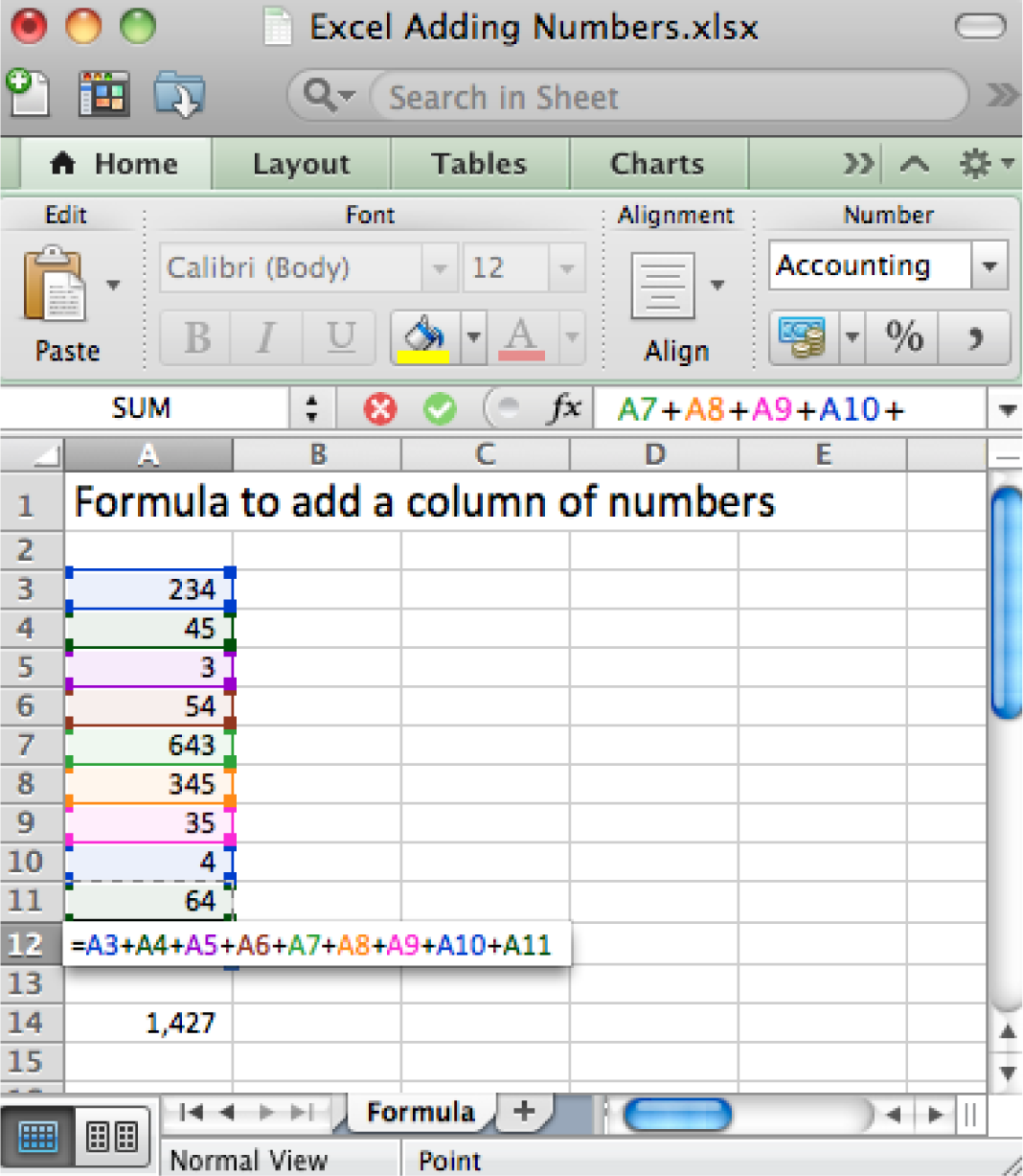
The Payment (PMT) Function Calculates Loan Payments Automatically
The payment (PMT) function calculates loan payments automatically. The format of the PMT function is:
=PMT(rate,nper,pv) correct for YEARLY payments
- Rate is the interest rate, usually expressed as an annual percentage rate (APR). If payments are made once a year then just plug in the APR. However, payments are usually once a month. So you need to divide the rate by 12.
- Nper is the number of payment periods. Again, if payments are made once a year then nper is just the number of years of the loan. However, payments are usually once a month. So you need to multiply the nper by 12.
- Pv is the present value of the loan, in other words the loan amount today.
Adjusting for monthly payments produces this modification of the function:
=PMT(rate/12,nper*12,pv) correct for MONTHLY payments
By the way, you can use the PMT function to calculate payments on car loans and home mortgages. In case you are curious, the actual mathematical formula that the PMT function translates to looks like this:
Payment = pv* apr/12*(1+apr/12)^(nper*12)/((1+apr/12)^(nper*12)-1)
Note that it is hard to even follow a complex mathematical formula when it is written in Excel.
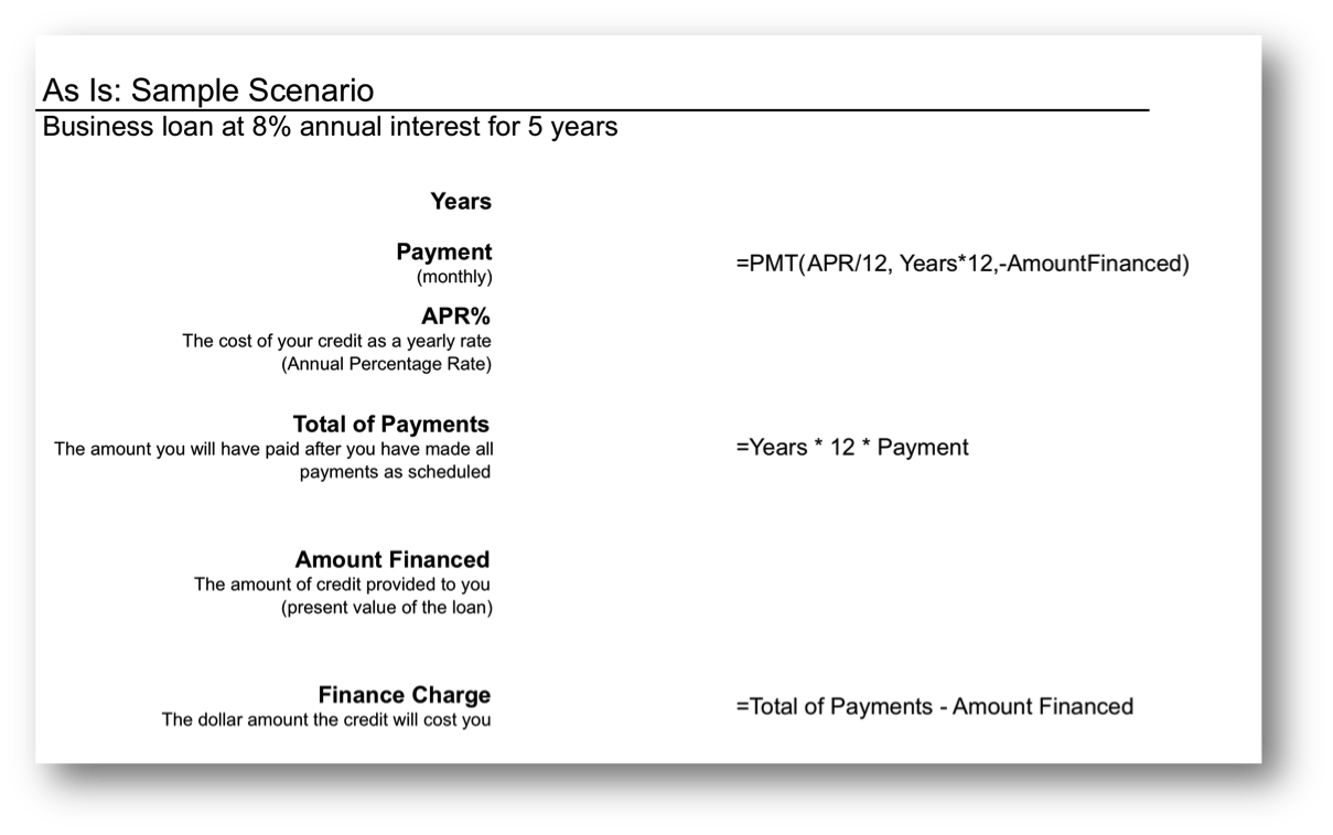
The payment (PMT) function in action. The wording in this illustration is taken directly from U.S. federal guidelines for loan disclosure. The PMT function is used to calculate the monthly payment—in this case $101. The function references three other numbers in the same illustration. Years is multiplied by 12 to get the number of payments (nper), APR% is divided by 12 to get the monthly interest rate, Amount Financed is the present value (pv) of the loan—the amount you are borrowing.
The Payment (PMT) Function
In the United States, the federal government places requirements on the actual wording of a loan. This wording is reflected in the illustration below. The intention is to force lenders to be honest about the terms of the loan and to allow buyers to comparison shop loans.
Note especially the finance charge . This number is what people normally understand to be interest on the loan. It is the cost you pay for the privilege of borrowing the money. Now you might be wondering why this number is so high. After all 8% of $5,000 is only $400 not $1,083. The interest compounds or grows because the loan has been stretched out over five years.
First time home buyers are often shocked to find that their finance charge actually exceeds the amount of the loan. In other words, over the life of the loan they end up paying around twice the closing price of the home. Home loans have higher finance charges because they are often stretched out over thirty years—which is a lot of time to compound interest. Similarly, if we were to stretch our $5,000 business loan out over thirty years, the finance charge climbs to $8,208, which exceeds the amount of the loan.
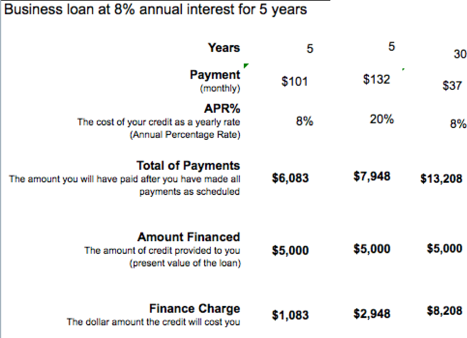
Here the same $5,000 loan is shown under different loan terms. The second loan increases the interest rate to 20%, but leaves all else unchanged from the original. The third loan increases the term of the loan to thirty years but leaves all else unchanged from the original. The lesson here is to borrow at as low an interest rate as possible and for as short a time as possible.
So the bottom line is that you should borrow money for as short a time as possible to avoid large finance charges.
By the way, the situation is even worse with credit card loans because the interest rate on credit cards is so much higher—around 20%. Note how at 20% the finance charge climbs to almost $3,000 over five years. Your goal should be to pay off your credit card in full at the end of each month. If you do not have enough money to do this, then you should try to modify spending habits so that you reach this goal.
KEY TAKEAWAYS
- Businesses sometimes need loans to cover startup costs. Ideally, these should be business loans rather than personal loans.
- At its heart, a function is simply a stored formula.
- Functions are pretested and debugged. They sometimes simplify complex mathematical formulas and/or eliminate busywork.
- One disadvantage of functions is that you sometimes lose a sense of how the information was derived.
- The PMT function calculates loan payments. Since most loan payments are monthly, the function needs to be modified by dividing the interest rate by 12, but multiplying the number of payment periods by 12.
- The United States federal government mandates that loan terms be expressed in a uniform way so that buyers are fully informed of credit terms and can comparison shop.
- Because interest is compounded, loans should be taken out for as few years as possible. Compound interest is especially painful at high interest credit card rates.
QUESTIONS AND EXERCISES
- Credit card companies sometimes refer to customers who pay off their balance in full each month as deadbeats. Why would they use such a derogatory term for responsible behavior?
- Do some research and find the terms of a student loan and a car loan. Which has more favorable terms? Explain.
Techniques
The following techniques, found in the Excel section of the software reference, may be useful in completing the assignments for this chapter: Conditional Formatting
L1 ASSIGNMENT: CALCULATE LOAN PAYMENTS
Create a properly formatted spreadsheet that calculates the payments on a business loan.
Many businesses need to take out loans to cover startup costs. This exercise allows you to create a loan payment calculator and perform a sensitivity analysis on the terms of the loan.
Setup
Start Excel and properly title your spreadsheet. Because there are so few numbers the assumptions area and the calculations are combined.
Content and Style
- Name each number in the As-Is scenario. Use those names in calculations.
- Follow best practice design techniques.
- Include a copyright symbol with your name at the bottom.
- Perform a sensitivity analysis to see how payments change as a function of interest rates and loan amount.
Deliverables
Electronic submission: Submit the workbook electronically.
Paper submission:
- The worksheet grid lines will not appear on the printout.
- Print out both the results and formulas. The formulas printout shows the formulas in each column. Reveal the formulas by typing CTRL+ ~. Adjust the column widths to closely crop the formulas by dragging the separator between each column in the gray header area.
- Both printouts should use landscape orientation, which may be accessed from Page Layout > Page Setup > Orientation > Landscape. Each printout should fit on one page. Choose Page Layout > Scale to Fit > Height: 1 page; Width: 1 page.
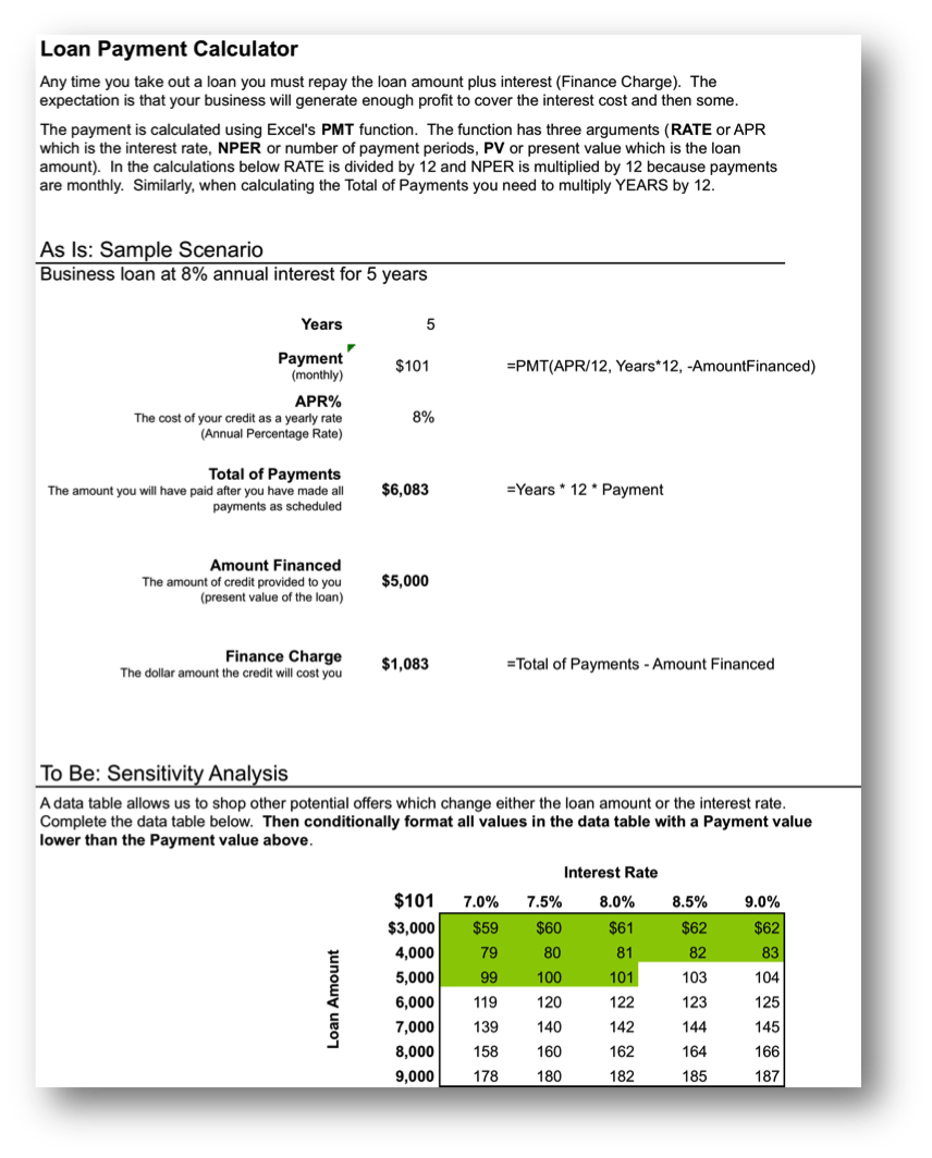
L2 ASSIGNMENT: INCLUDE LOAN PAYMENTS IN FORECAST
Include loan payments in your previous forecast of revenues and costs.
To make the problem more realistic we bring in loan payments as an additional fixed cost. To help in decision making we conditionally format the sensitivity analysis.
Setup
Open your workbook file from the L2 assignment of the prior chapter, re—save it under a different name, and then modify it to look as below.
Content and Style
- Add an assumption for the Loan Payment.
- Add an assumption for the Desired Profit by Year 5.
- Name each number in the assumptions area.
- Use those names in calculations in the spreadsheet below.
- Follow best practice design techniques in this chapter.
- Only the first number in each column gets formatted as CURRENCY. (Do not format as ACCOUNTING.) Update the format using the Number Formatting Technique. All other numbers greater than 1,000 should be in Comma style.
- Include a copyright symbol with your name at the bottom.
- Produce a sensitivity analysis table of total profit/(loss) as a function of growth rate and price per unit.
- Conditionally format all profit scenarios that meet or exceed the desired minimum profit by year 5 listed in the assumptions area. Conditional formatting is located on the Home screen in Excel. Follow the prompts.
Deliverables
Electronic submission: Submit the workbook electronically.
Paper submission:
- The worksheet grid lines will not appear on the printout.
- Print out both the results and formulas. The formulas printout shows the formulas in each column. Reveal the formulas by typing CTRL+ ~. Adjust the column widths to closely crop the formulas by dragging the separator between each column in the gray header area.
- Both printouts should use landscape orientation, which may be accessed from Page Layout > Page Setup > Orientation > Landscape. Each printout should fit on one page. Choose Page Layout > Scale to Fit > Height: 1 page; Width: 1 page.
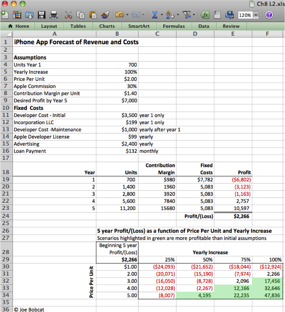
Add assumptions and columns as necessary to accommodate loan payments.
Chapter 9 Industry Analysis: Smartphone Apps
9.1 Big Picture: Industry Analysis
LEARNING OBJECTIVES
- Distinguish between an industry and company analysis
- Analyze an industry using S.W.O.T. and Porter’s five forces model
Introduction
Before launching a business venture with your capital, or someone else’s, it is a good idea to analyze the overall attractiveness of the industry. An industry analysis makes no reference to your particular company. In other words, how likely to succeed would any new company be in this industry? Are there parts of the industry that are more attractive than others?
Loan officers or investors especially, are going to want to see an analysis of the industry. One thing they will look for is growth potential. If you can show that the industry is rapidly growing, you may get funding. From an investor’s point of view, they might simply want to have a dog in the race—even if your company is not necessarily the best dog overall—it may still be the best dog on hand.
One can establish growth potential by showing trends over time. For apps this would include showing growth in sales of apps and the platforms on which the apps run—iPhone, iPod, iPad.
If your app duplicates functionality found in another device, a turn by turn GPS for example, then you could show growth in the GPS industry. You might also want to show growth of competing platforms and apps such as the Droid. However, you should be honest and straightforward about your statistics. Investors are smart and can see through hype and deception.
This chapter will also look at two tools used to perform industry analyses—S.W.O.T. and Michael Porter’s five forces model.
Where Are We in the Life Cycle?
Many information systems projects are conceived of in a life cycle that progresses in stages from analysis to implementation. The diagram below shows the stages that we touch in the current chapter:
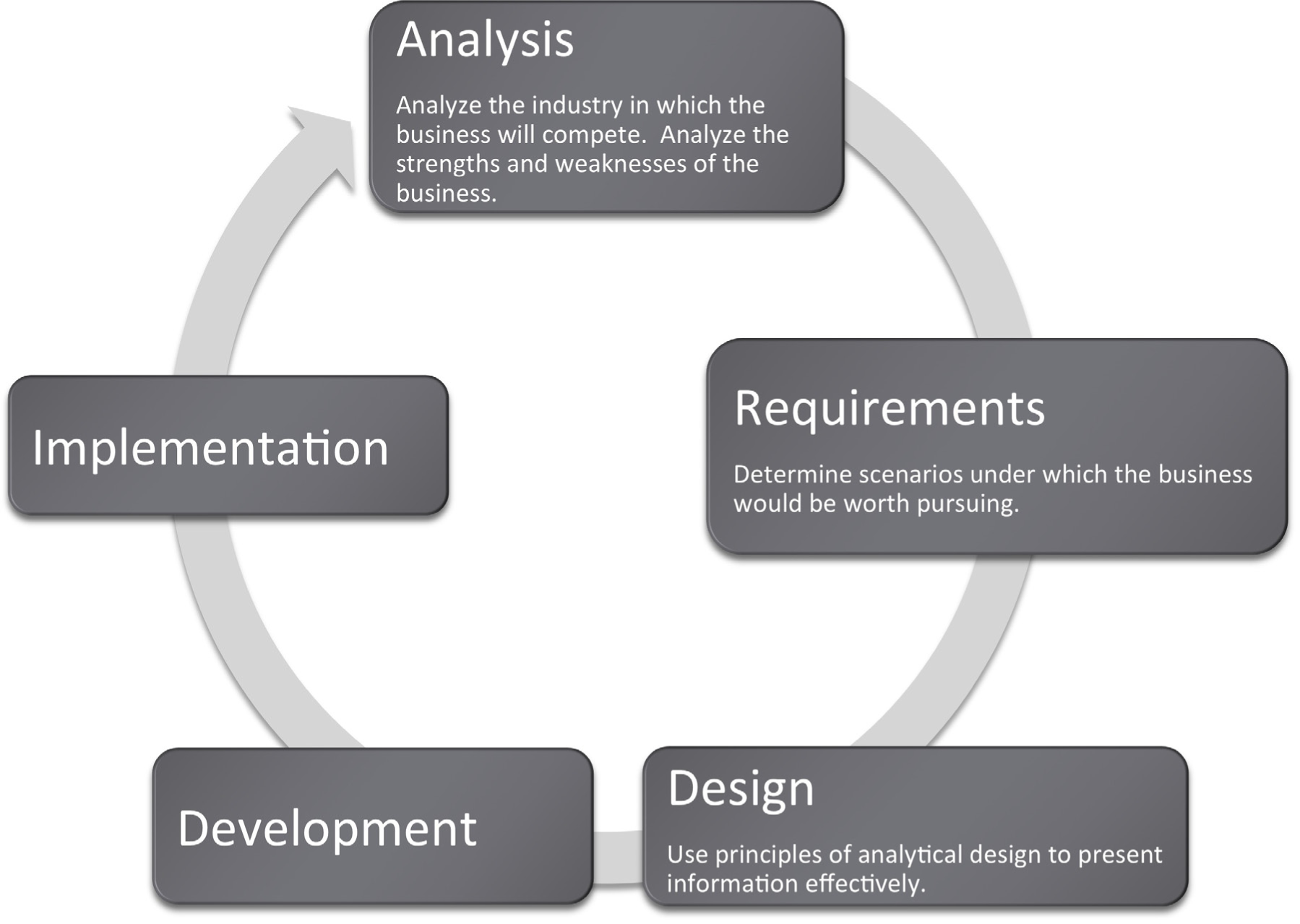
Industry Analysis – SWOT and Porter’s
The content of an industry analysis depends on the purpose of the report. There is no one size fits all. However, if the business is seeking funds, investors will at a minimum want to see two things:
- Industry analysis: An analysis of the industry in which the company operates. What are the opportunities and threats inherent in the industry?
- Company analysis: An analysis of the competitive position of the company within that industry. What are the strengths and weaknesses of the company?
There are a number of analysis techniques designed to get at both the industry and company analysis. We will look at just two:
The first is very popular in the marketing discipline. It is an analysis of strengths, weaknesses, opportunities, and threats (S.W.O.T.) analysis developed by Albert Humphrey in the 1960s. The strengths and weaknesses compose the company analysis, whereas opportunities and threats compose the industry analysis. Using terms from the SDLC, you can consider the strengths and weaknesses as describing the current state of the company. The proposed future state of the company will be planned taking into account the opportunities and threats. It is conventional to show a S.W.O.T. analysis in a four cell grid.
Another very popular analysis tool is Michael Porter’s five forces model. (Porter, M.E. (2008) The Five Competitive Forces That Shape Strategy, Harvard business Review, January 2008). Porter analyzes an industry by looking at how hard it is to get in the industry (barriers to entry), stay in the industry (threat of substitutes), and the bargaining position of suppliers to and buyers of industry products and services. This helps identify the attractiveness of the industry. You might think of Porter as helping to direct our focus to where the opportunities and threats might be found. The fifth force is the competitive position of industry rivals—their strengths and weaknesses.
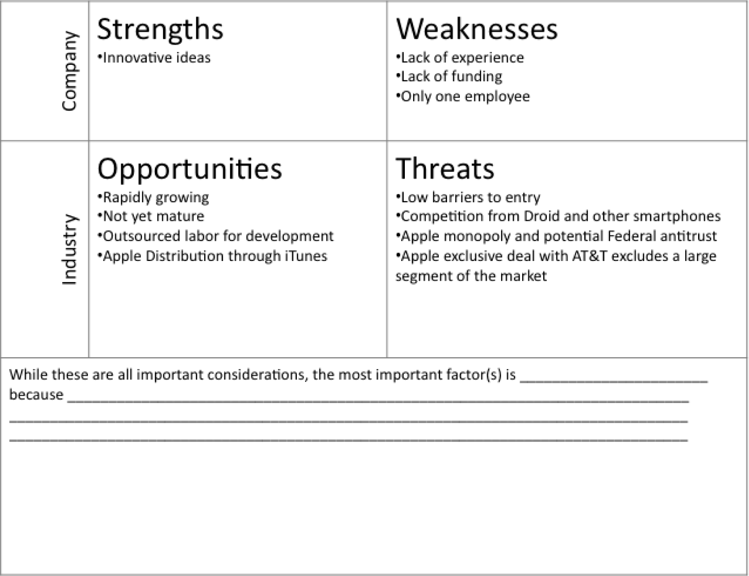
An analysis of the iPhone app industry using S.W.O.T. analysis (above) and Porter’s five forces model (below). Both models overlap in their analyses.
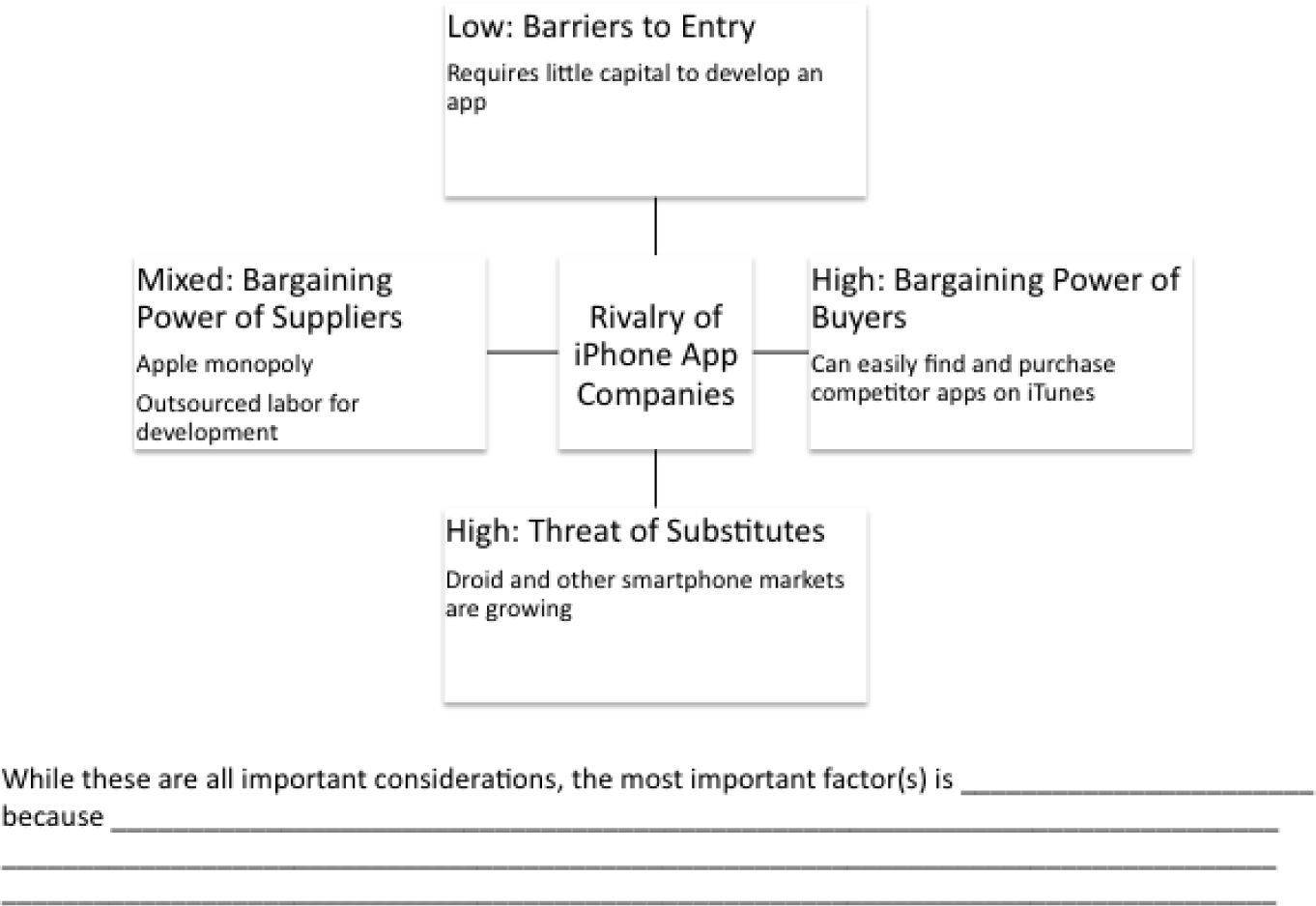
For example, with respect to your iPhone app, you might argue that barriers to entry are very low. There are thousands of iPhone developers and it cost relatively little to develop an iPhone app. The threat of substitutes includes the competing Droid and other smart phones and apps.
Suppliers to your industry include Apple, which supplies the iTunes store for distribution and the developers. Apple’s bargaining power is very high since you must list your app on their store and pay their commission. However, the bargaining power of developers is relatively low since they compete in an open auction for your business.
The bargaining power of buyers is very strong since they can purchase from you or any of your competitors. The only thing that makes this industry attractive is that it is growing at such a phenomenal rate that there are business opportunities even for weak players. As the industry matures, the weaker players will probably get squeezed out.
KEY TAKEAWAYS
- Investors will want to see an analysis of the industry and an analysis of your company’s competitive position in the industry.
- S.W.O.T. and Porter’s five forces assist with industry analysis. S.W.O.T. also helps with the company analysis.
QUESTIONS AND EXERCISES
- Why would an investor need both an industry and company analysis? Explain.
9.2 Representing Industry Information Using Graphs
LEARNING OBJECTIVES
- Show market growth and opportunities using tables and graphs
- Use spreadsheets and graphs to help analyze an industry
- Graphically demonstrate market growth and opportunities
- Integrate words, numbers, and images in order to create a graph that can serve as the effective basis for making a decision
- Describe when each type of graph (line, bar, scatterplot, and pie) should be used
- Apply graphic design principles to create spreadsheets and graphs
Introduction
Graphs are regularly used for presentations in corporate board rooms. The most prevalent use of corporate graphs is to show trends over time, such as sales per quarter. These graphs are especially popular when the trend is on the rise.
A problem with graphs that show trends over time is that they show the changes in trend patterns, but they fail to show the reasons for these changes. One solution is to annotate a time series graph to point out the causal event.
Sometimes a picture is worth a thousand words. The Oscar winning film, An Inconvenient Truth, warns of the dangers of global warming. The film uses many illustrations and graphs, similar to the ones you will create in this course. Many of them show before and after comparisons. At one moment in the film, Al Gore, dramatically ascends, using an hydraulic lift, to point on a giant screen to high projected levels of carbon dioxide in the atmosphere. The message is far clearer than numbers alone would ever show. In the entire history of the earth, the red line (carbon dioxide) spikes disturbingly when man began burning fossil fuels with the advent the industrial revolution. And the situation is quickly getting worse.
Watch the movie trailer for An Inconvenient Truth at:
http://www.apple.com/trailers/paramount_classics/aninconvenienttruth/
Other business uses of graphs are to show relative amounts visually. This is especially helpful when the numbers are large and hard to relate to. David McCandless has produced a series of fascinating graphs that help to explain trends. You can see some of his work at:
Analytical Design
There are sound principles for the display of quantitative information. Perhaps the greatest theorist in the quantitative arena is Edward Tufte. He has written a number of books and articles on the subject and draws huge audiences world wide when he speaks.
Tufte virtually founded the field of analytical design—the field that studies how best to represent information—especially quantitative information. He has developed a number of principles over the years. However, in his latest book, Beautiful Evidence, Graphics Press, 2006, he organized the principles under six major headings:
- Show comparisons, contrasts, differences. Comparisons inform and invite reflection by the reader. For example, showing the growth rate of platforms using the Mac iOS vs. other smartphone operating systems helps show if the market is growing or shrinking.
- Show causality, mechanism, explanation, systematic structure. Sometimes the data clearly suggest a cause or lack of a cause. For example, many predicted a drop in iPhone 4 sales after news that the antenna dropped calls when held in a certain way. But the predicted sales drop was not borne out by the data and the product launch was wildly successful.
- Show multivariate data. That is show more than one or two variables. The more variables graphed, the greater the chance of providing a clear causal explanation. For example, better to show sales of paid apps and free apps per platform.
- Completely integrate, words, numbers, images, diagrams. Tufte sometimes calls this “whatever it takes.” Annotate your graph if that helps explain the data. For example on a time series label key events.
- Thoroughly describe the evidence. Provide a detailed title, indicate the authors and sponsors, document the data sources, show complete measurement scales, point out relevant issues. For example, always show your data sources and list your name as a author. If the data only holds under certain conditions, then state what those are.
- Analytical presentations ultimately stand or fall depending on the quality, relevance, and integrity of their content. This may be the most important principle of all. If your content is bad then nothing will save it. Try to tell the truth at all costs.
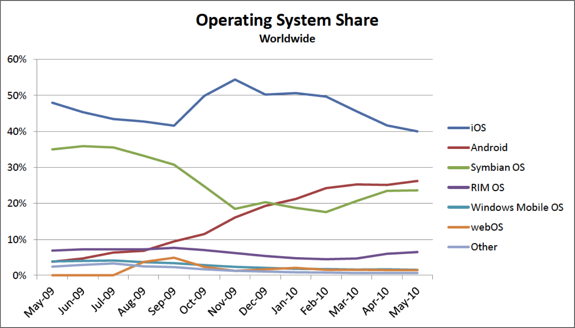
Analytical design in action. In the graph above, 96 data points are easily represented showing the market share for smartphone operating systems. From this, one can see the rapid rise of the Android OS. Below only twelve data points are graphed. The data shows that free apps are downloaded far more frequently than paid apps. However, the greatest market for paid apps is on the Apple iPhone and iPod Touch platforms. Both graphs would be improved if their legends were eliminated and the data series were instead labeled directly. Source for both graphs is Admob.com.
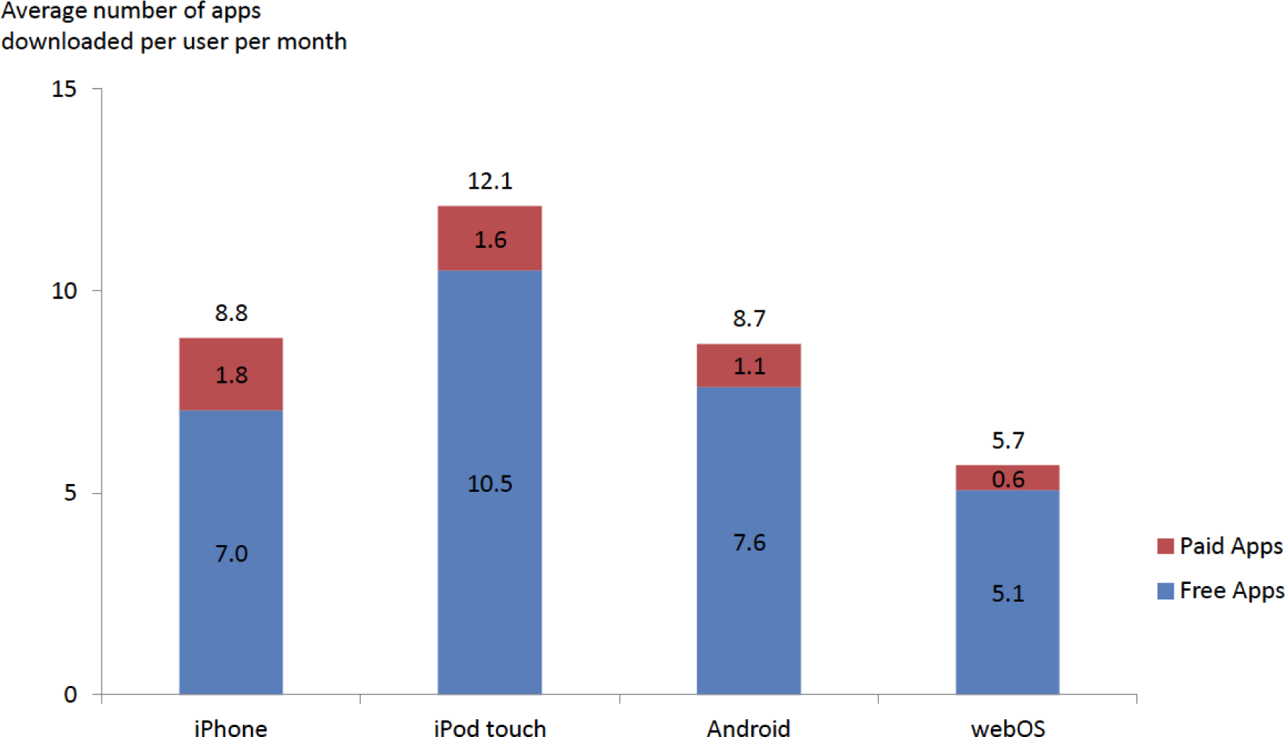
Graph Design Principles
Notice the graphs on the following page. The “after” graph has six design improvements over the first. They deal specifically with formatting the graph to maximize information transfer to the reader. Most of the graph design guidelines come from Edward Tufte’s principles of analytical design. These principles require refining the graph after Excel has applied its default settings. The exercises in this chapter provide instructions on how to carry out these refinements.
Though the design of a graph is important, the content is even more crucial to the delivery of information. Graphs can have good design, but if the data or content is flawed, the graph has no purpose. The data on the X and Y axis of a graph should always have some correlation, or some relationship that can be demonstrated.
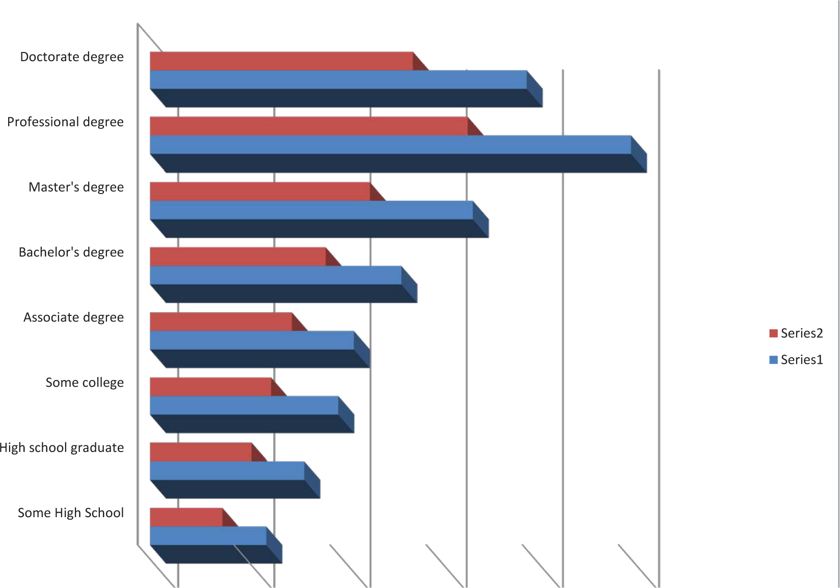
Before—while this graph looks cool, there is no scale. What quantities do the bars represent?
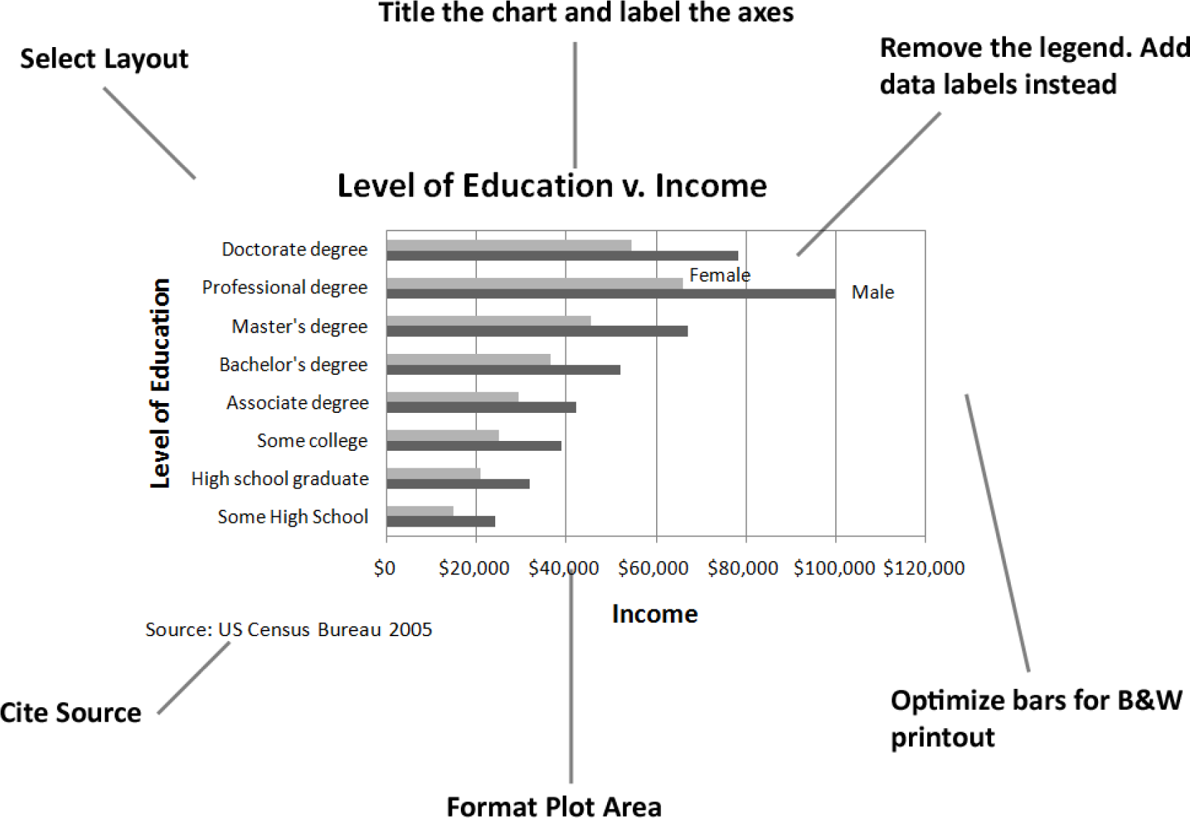
After—even though this graph is somewhat dull, it conveys information far more effectively.
Matching Graph to Data Type
After you establish the integrity and relevance of the content, you will next need to focus on the type of graph you will use to display the information. Most business graphs (bar graphs, line graphs, and pie charts) compare categories on a quantitative dimension. For example, comparing salaries for persons of different education levels.
Bar graph. Bar graphs are used to compare discrete categories on a common measure. In other words, the measure is quantitative and the categories are qualitative. For example, compare sales figures (quantitative) in different geographic regions (qualitative).
Line graph. Line graphs compare continuous categories on a common measure. They are often seen in business, especially to show trends over time. The time appears on the X axis, and the quantitative data to be measured appears on the Y axis. Examples are sales, stock market trends, or mortgage rates over time. A text box is often placed near these graphs to explain the reasoning behind changes in trends.
Pie chart. Much like a bar graph, a pie chart compares discrete categories on a common measure. Unlike a bar graph, a pie chart can only show one series of data. Although pie charts are commonly used in the media, a bar graph is a better way to convey the same information in a way that allows for much easier comparisons between categories. The relative height of bars is easier to compare than pie slices that must be mentally rotated and aligned for comparison. Bar graphs also allow for multiple data series to be compared on the same graph, but pie charts are limited to one data series. Overall, pie charts should be avoided.
Scatterplots. Scatterplots do the best job of adhering to Tufte’s principles of showing multivariate data and causal relationships. In a scatterplot, both sets of data are quantitative. The cause (independent variable) appears on the X axis, and the effect (dependent variable) appears on the Y axis. For example, in economics, scatterplots can be used to show trends in price versus demand. Greater demand for a product or service (independent variable) leads to higher price (dependent variable). In spite of their explanatory power, scatterplots are rarely found in business.
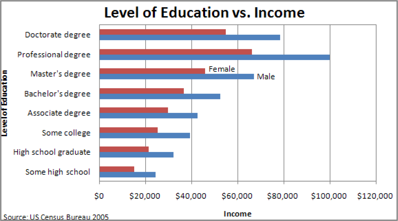
Bar Graph – Compares categories
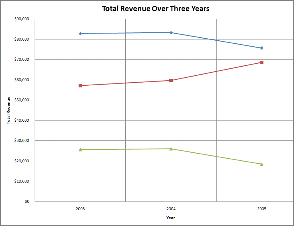
Line Graph – Shows trends

Scatterplot – shows causal relationships
Challenger Disaster: A good graph may improve decision making
The Space Shuttle Program had its first successful launch in 1981. From the beginning NASA made “caution” a buzzword in the program. As just one example, five separate computers were onboard performing identical tasks. A pre-launch failure of even one computer would delay a launch. The Challenger launch had already been postponed twice due first to a malfunctioning door and then due to high winds. The media ridiculed NASA’s inability to launch on schedule. The night of January 28, President Reagan was scheduled to go on national TV to deliver his State of the Union Address. He was expected to mention the launch of the first civilian into space, a school teacher from Vermont named Christa McAuliffe.
The shuttles are launched from Cape Canaveral, Florida. Normally temperatures at the Cape are very moderate. Even in January the mean temperature is 60° F. However, a blast of Arctic air occasionally extends down to northern Florida. Such was the case on January 28, 1986, the launch date of the Space Shuttle Challenger. Temperatures on the morning of the launch were forecasted to be between 26 and 28° F, far below the prior coldest launch temperature of 53° F.
The temperature at launch is significant because it can potentially affect the performance of rubber parts on the shuttle. During the night preceding the launch, there was an eleventh-hour debate on the wisdom of launching between NASA and Morton Thiokol. Thiokol was the contractor for the two solid fuel rocket boosters that help propel the shuttle into orbit. The boosters are made in segments that interlock. At the point the segments meet, two rubber O-rings help seal the joint. The prior coldest launch and, indeed, every launch under 66° F had experienced some amount of compromise to the O-rings. However, there were also cases, though few, of O-ring damage at warmer temperatures. Thiokol engineers feared that the rubber would harden in the cold weather, thereby compromising its ability to seal the joint. The engineers were correct but not persuasive. Unable to substantiate their claim with data, the engineers caved under pressure from NASA and signed off on the launch.
The Challenger and its seven-member crew were lost 73 seconds after launch when the O-ring failure caused the booster rocket to explode.
On the eve of the launch engineers tried to explain the problem with a diagram. Their concern was that escaping hot gases would erode or eat away at the rubber O-ring seal. Sufficient erosion would release a flood of hot gases, sort of like a break in a dam. That was what happened to Challenger and it was catastrophic.
There were 24 successful launches prior to Challenger. However, the entire discussion centered around only two previous launches, SRM 15 and SRM 22. SRM stands for Solid Rocket Motor. SRM 15 was a cold weather launch with erosion. SRM 22 was a warm weather launch with blow by (soot but no erosion). Unfortunately, in the debate, erosion and blow by were put on equal footing, leading one engineer to conclude, “We had blow by on the hottest motor and blow by on the coldest motor.”
You will note that when the engineers reversed their no launch recommendation, it was not because they had new evidence, but rather because their existing evidence was too limited to be conclusive. The moral of the story is to always look at the entire data set.
What does the entire data set show? Damage rarely occurs at warm temperatures, but damage always occurs below 66°F and worsens the colder the temperature.

Christa McAuliffe, school teacher, was chosen by President Reagan to be the first civilian in space. Here she is being tested for weightlessness tolerance before the launch. Image reprinted from www.nasa.gov.

Tufte recommends showing ALL the data when making a decision—but showing it in a meaningful way relating cause and effect. He feels that the this graph, had it been made, would have stopped the launch.

Frigid launch pad on the morning of launch. Image reprinted from NASA Johnson Space Center.

Frozen O-ring fails to seal-fire burns through. Image reprinted from NASA Johnson Space Center.
KEY TAKEAWAYS
- The more data points you have, the more useful it is to graph the data. Graphs can easily show thousands of data points.
- In the same way that there are rules of graphic design, there are also analytical design rules governing how to display information—especially quantitative information. We will only scratch the surface of these rules.
- Always choose a graph appropriate for the data.
- Presenting data well can make a difference. Better presentation of data might have saved the Space Shuttle Challenger.
QUESTIONS AND EXERCISES
- Find a graph in print and evaluate it according to the analytical design principles.
Techniques
The following techniques, found in the software reference, may be useful in completing the assignments for this chapter: PowerPoint: Insert Table; Excel: Best practice formatting-Scatterplot
L1 ASSIGNMENT: S.W.O.T. AND PORTER’S
As part of your industry analysis create S.W.O.T. and Porter’s five forces analyses of the iPhone industry
Setup
Start up PowerPoint.
Content and Style
- Follow all best practice formatting and design techniques.
- Use a PowerPoint table for the S.W.O.T. analysis. Merge cells and control text formatting to match the example.
- If you choose to use colored backgrounds, make sure that they have sufficient contrast with the text.
- Use appropriate PowerPoint smart art for the Porter’s analysis.
- Create one slide for each diagram.
- No matter how good a diagram, it needs explanation. Save enough room on each slide to include a paragraph that tells the reader what message should we get from the diagram. Draw conclusions—do not just summarize the slide.
- Add copyright and your name to each slide.
Deliverables
Electronic submission: Submit the PowerPoint file electronically.
Paper submission: Please print out the slides.
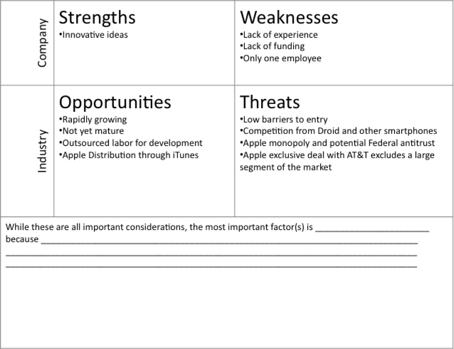
Sample templates for the S.W.O.T. assignment (above) and Porter’s assignment (following).

L2 ASSIGNMENT: SHOW APP TRENDS
As part of your industry analysis create a graph from iPhone app sales data.
Setup
Download the iPhone App Sales Data and create a time series line graph.
Content and Style
- Follow all best practice formatting and design techniques.
- Adjust scales to match the graph.
- Add text boxes, rectangle and arrow where required.
- Add copyright and your name under the source.
- Do not recreate the word “sample.”
Deliverables
Electronic submission: Submit the Excel workbook electronically.
Paper submission: Please print out the graph in landscape orientation.
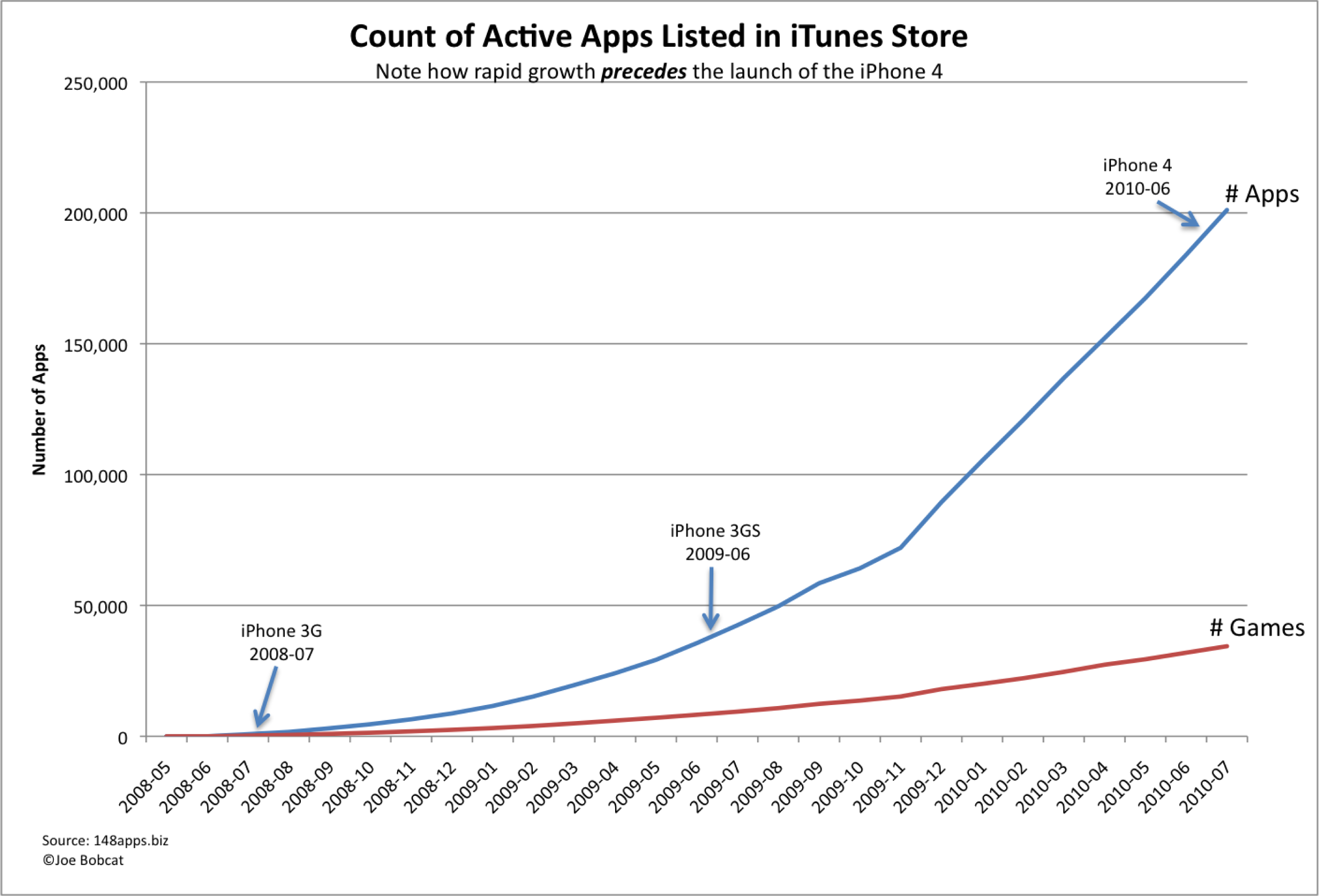
Sample graph for the Show App Trends assignment.
Chapter 10Business Intelligence: Analysis of App Sales Data
10.1 Business Intelligence
LEARNING OBJECTIVES
- Query sales data to spot meaningful trends
- Distinguish between static reports, dynamic reports, and data mining
- For a given situation, determine what type of business intelligence report is required to solve the problem
Introduction
In order to make strategic decisions about which products to feature in our store, we need to carefully analyze the sales and clickstream data. This type of data analysis is one form of business intelligence.
If there is one thing plentiful in the world today, it is data. At the heart of every information system is a database that captures transactional data. For example, who bought what, when, for how much, and so forth. It is useful to know about the architecture of the transactional systems so that it is not a complete mystery how the data is captured.
However, it is critical to know how to distill and analyze the captured data in order to make managerial decisions. For example, after summarizing thousands of records we might find a product selling particularly well with women in a particular age range living in a particular area. That meaningful information could be actionable in terms of the supply chain and marketing initiatives.
If anything in the world today there is perhaps too much data. Distilling that data into meaningful information is a key skill. There are a number of tools available to perform data analysis. These include spreadsheet programs such as Excel and database systems such as Access. Learning to use these tools will enhance your marketability.
Where Are We in the Life Cycle?
Many information systems projects are conceived of in a life cycle that progresses in stages from analysis to implementation. The diagram below shows the stages that we touch in the current chapter:
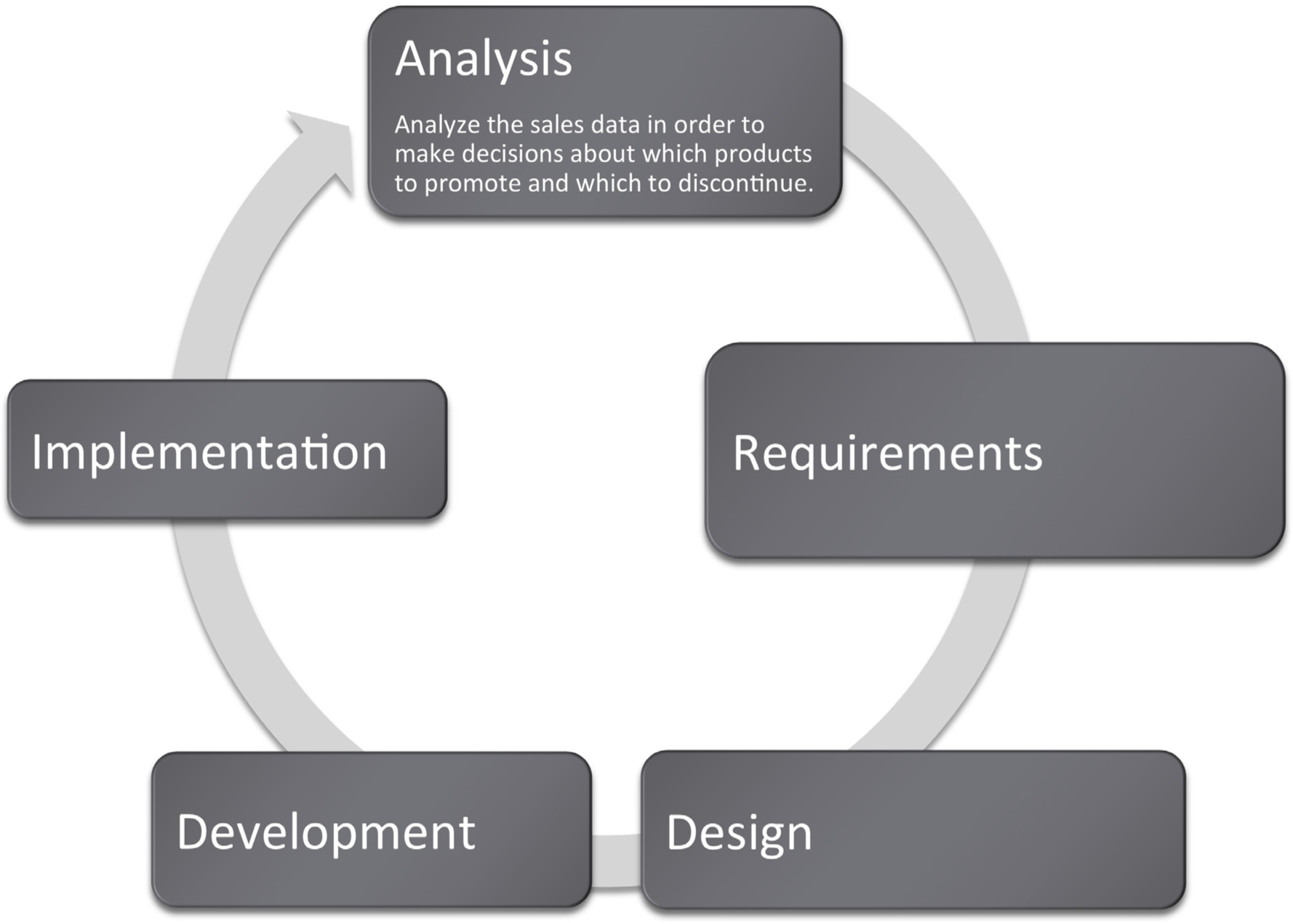
Kiva: Summarize Data to Produce Information
To illustrate the power of summary data, we will first show how it can be used as a marketing vehicle for a website. Impressive statistics can help encourage repeat business. The same marketing principles operate even for nonprofit organizations.
Kiva is a website that lets you make small loans (typically under $500) to entrepreneurs in developing countries. The field of small loans is called microfinance. Microfinance institutions are an incredibly important resource to help third world citizens rise out of poverty. Surprisingly, the repayment rate of the world’s poor ranges from 95 to 98%, far higher than the loan repayment rate in the United States. Over 80% of Kiva’s loans are made to female entrepreneurs. They invest profits back into the businesses and improve the lives of their families.
Kiva works by pooling resources so that for example 50 people could lend $10 each to total $500. As part of its marketing effort Kiva maintains fast facts about their activities to date. For example, they report that they have nearly half a million lenders who together have lent $161 million dollars over the last three years. These fast facts are gathered from the website’s database after scanning millions of records and represent business intelligence. Not only does the information serve a marketing purpose, but it is also an internal scorecard to track the progress of Kiva’s mission and influence decisions.
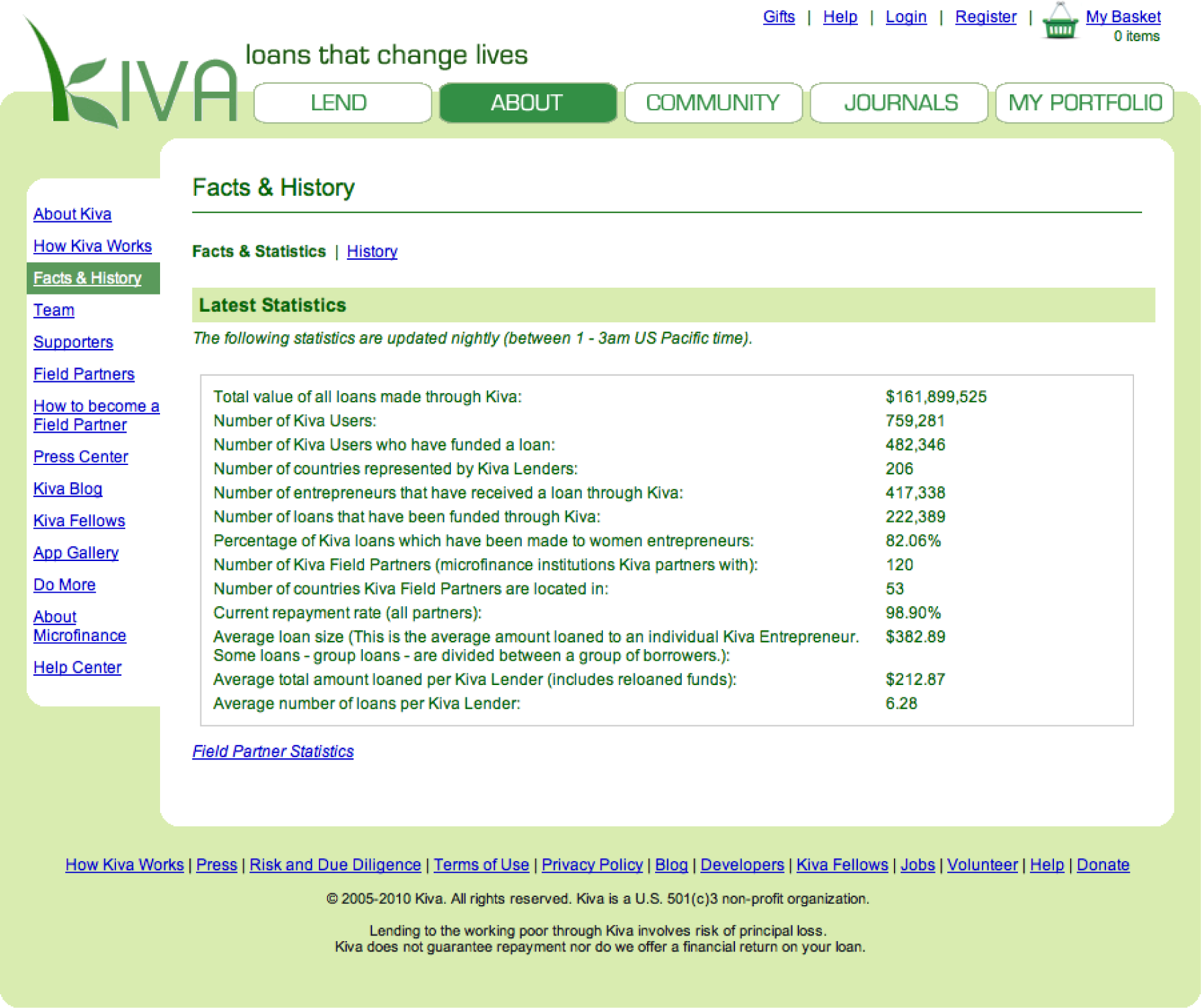
Kiva’s Facts and History page is a business intelligence report. Note the sentence that appears under “Latest Statistics,” which announces that the statistics are updated nightly (between 1 – 3 am). This is typical of business intelligence systems. Searching millions of records puts such a drain on the system that these activities are usually run during off peak hours.
What Is Business Intelligence?
The Kiva example is a form of business intelligence . Business intelligence (BI) is the delivery of accurate, useful information to the appropriate decision makers within the necessary time frame to support effective decision making.
By this definition all the work we have done with Excel would qualify as business intelligence since our deliverables contained accurate and useful information to support effective decision making. However, business intelligence is commonly understood to include distilling and analyzing large data sets such as those found in corporate databases. Extracting and analyzing information stored in databases is the subject of this chapter. It is very likely that at multiple points in your work career you will be asked to engage in just this type of analysis.
Business intelligence is part of the big picture information systems architecture. Most systems in existence can be classified either as enterprise systems, collaboration systems, or business intelligence systems. The enterprise systems—taking orders for example—feed their data to the data warehouse, which in turn is queried to support business intelligence.
From a managerial standpoint, there are three factors necessary to make an effective decision:
- Construct a set of goals to work toward.
- Determine a way to measure whether a chosen path is moving closer or farther from those goals.
- Present information on those measures to decision makers in a timely fashion
For example, let’s say our goals are to develop a clothing business that produces high quality products while lowering costs. We further determine that we will measure product quality by the percentage of products rejected by inspectors at each station. (Think about those inspector 99 tags that you find in pockets of your new clothes. The clothes you are wearing are the ones accepted by the inspector.) A relatively high rejection rate is a red flag to management requiring further analysis. Is this an overzealous inspector? Is there any pattern to the rejected products? Does one station in the factory tend to produce more rejects than the others?
We also need to see performance over time. Is product quality improving or getting progressively worse?
Let’s say that our analysis determines that the high rejection rate comes from just one factory in Southeast Asia. We report the problem to management. They dispatch a team to review the plant. The review discovers child labor, abusive conditions, and very low morale at the plant. The horrible conditions are quickly reversed and the rejection rate returns to average.
Business Intelligence: Analysis of App Sales Data
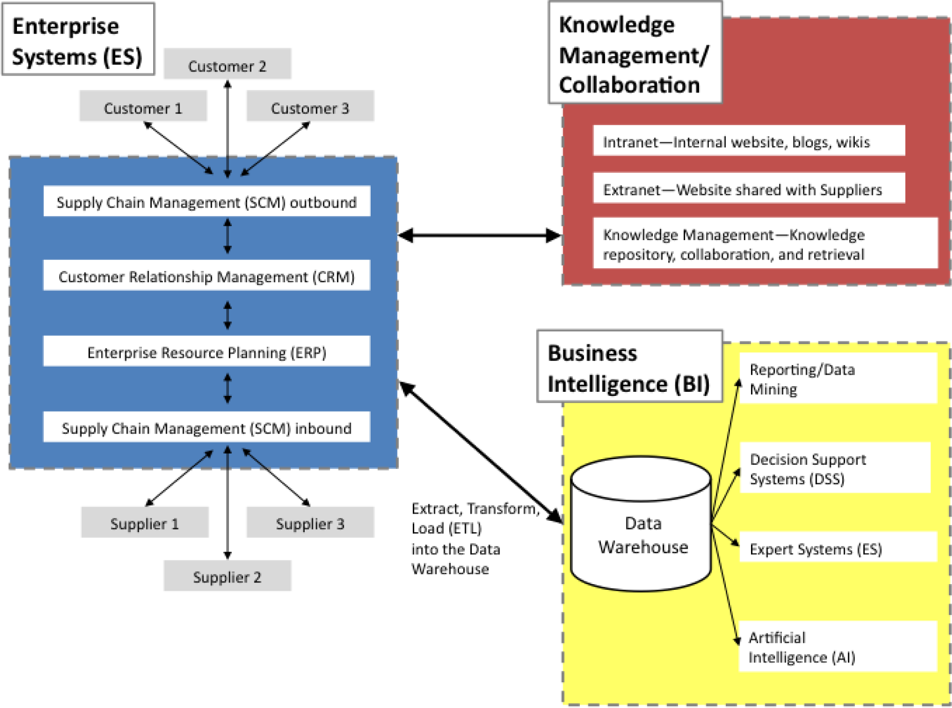
The business intelligence portion of the information systems architecture. Note that business intelligence systems typically operate off of a data warehouse—a repository of data for the corporation. Each enterprise system contains one or more databases. The contents of those databases is routinely copied into the data warehouse to enable the BI analysis. The process of copying is called extract, transform, and load (ETL).
Business Intelligence Process
We will look at three types of business intelligence—static reports, dynamic reports, and data mining.
Static reports are by far the most common form of business intelligence. Most businesses have summarized standard reports already laid out and printed to assist in managerial decision making. For example, universities use enrollment reports to gauge which departments might need to hire more faculty. Credit card companies will request reports of persons with high credit scores to target credit card promotions. Similarly, the companies might target college students with good future earning potential. Marketers might look at sales figures for different stores and regions to determine where there are opportunities to run a sales promotion.
Dynamic reports look similar to static reports but online and interactive. A manager curious as to where a certain summary number on his dashboard comes from can drill down to expose the detail that contributed to that number. In essence it is a fact finding tour where information discovered in each step gives clues on where to search next for information. For example, if sales in North America are down, then drill down to discover a problem in the Midwest region. Then drill down farther to discover a problem in the Cleveland, Ohio plant.
Data mining uses computer programs and statistical analyses to search for unexpected patterns, correlations, trends, and clustering in the data. In essence, it is fishing through the data to see if there are patterns of interest. One often cited example of data mining was the discovery that beer and diapers are frequently purchased on the same trip to the grocery store. Upon further inquiry marketers discovered that Dad picks up some beer on his trip to the grocery store to buy diapers. Marketers can use this information to place the two items in close proximity in the store.
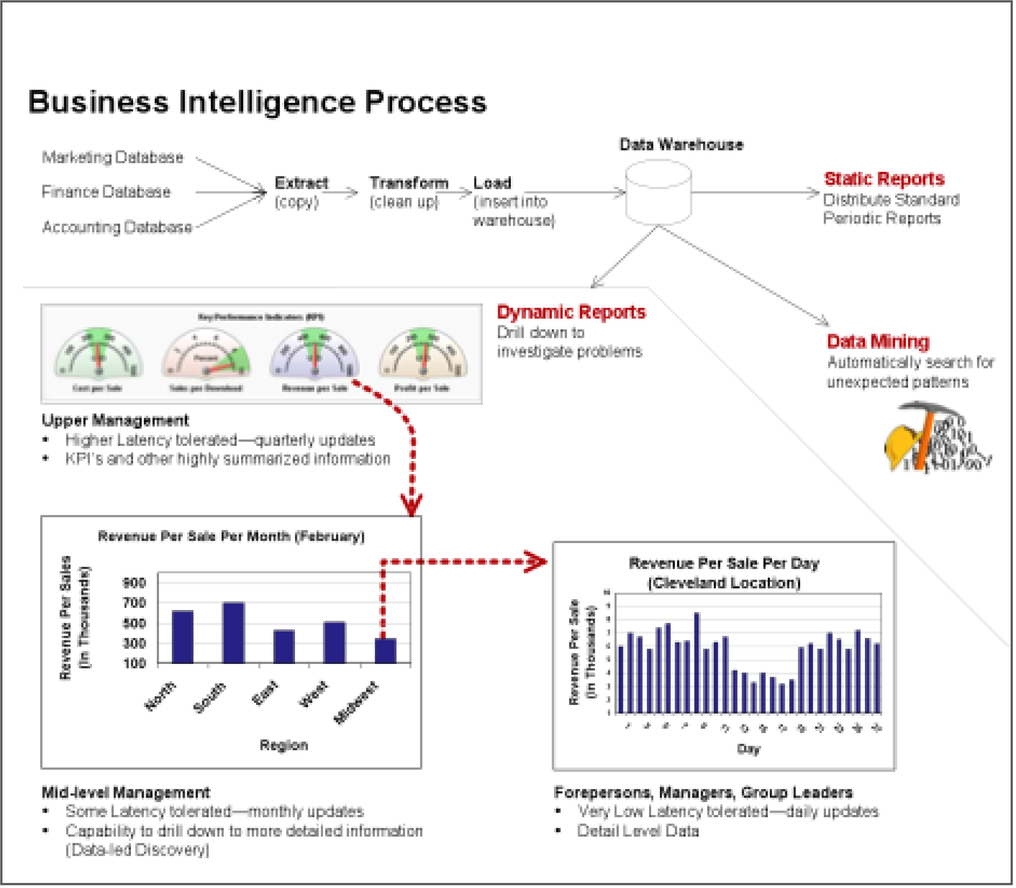
The business intelligence process for dynamic reports is depicted here. The top half of the diagram shows how data finds it way into the data warehouse through the extract, transform, and load process. The dynamic report begins with an executive dashboard providing a high level view of the business. The dashed red arrows represent drilling down to find a reason for a pattern in the data. In this example, a downturn in North American sales is traced all the way back to a Cleveland, Ohio plant.
KEY TAKEAWAYS
- Business intelligence is a way of uncovering trends and patterns in corporate data that might have strategic or operational significance.
- Most corporations already have the data that they need for business intelligence. However analyzing the data, presenting the results, and then following through on where the data leads, separates the winners from the losers in a competitive environment.
- Static reports, dynamic reports, and data mining are three different forms of business intelligence.
QUESTIONS AND EXERCISES
- Managers are often most interested in exceptions—data that does not fit pre-established expectations. Describe how business intelligence can aid in this process.
- Why do lower level managers require higher level detail in their information?
- In what ways does fantasy football rely on business intelligence?
10.2 Databases
LEARNING OBJECTIVES
- Determine which tables and fields in a database are needed to complete a query
- Explain how data is captured in our Class App store
- Explain how the Class App store data can be used for business intelligence
Introduction
In all of the forms of BI described above, you must actually store data to analyze. Organizations store their data in databases connected to their production systems. Here are some examples:
- Banking transaction systems store data in databases containing information about customers, accounts, and transactions against those accounts.
- University enrollment systems store data in databases containing information about students, faculty, courses, and enrollment in those courses.
- Cell phone billing systems store data in databases containing information about customers, rate plans, and calls made.
- Credit card billing systems store data in databases containing information about customers, credit plans, and items charged.
- Supermarket checkout systems store data in databases containing information about customers, products, and buying habits of their customers. The loyalty card that you have swiped at the checkout ties all your purchases back to your name.
What do these databases actually look like? They consist of tables of data that are related to each other. This is called a relational database. Each table must have a unique identifier that is called a primary key. The database is organized into parent and child tables to avoid duplicating data. Data common to each child is stored in the parent table. Diagrammatically a parent table points to its child tables. Each parent record can have zero or more child records. To logically link the tables together simply repeat the primary key as a foreign key in each corresponding record of the child table. To get information in and out of a relational database requires a relational database management system (RDBMS) such as Microsoft Access. The goal of the system is to facilitate transactions while safe guarding the integrity of the data.
The theory behind database design is one of the most elegant areas in all of information systems. If you continue in information systems, you will see it in detail. However, for our purposes all we need to know is that data is typically stored in multiple files even if the report that we get is contained in a single file. Why? The simple answer is that we want to avoid duplicate data by storing information common to each child in the parent table. Why do we care? Because duplicate data opens up the possibility that one of the duplicates will be different in an important way. For example you would not want your bank balance to be sometimes one number, sometimes another depending on which record happens to be called up by the database.
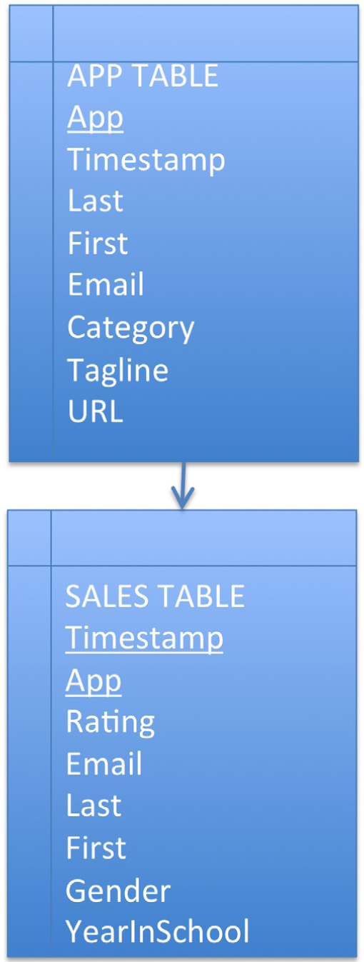
The data from the Class App store is stored in a relational database consisting of two tables—an APP table and a SALES table. The primary key of the APP table is App name. The primary key of the SALES table is the combination of Timestamp and App name. App name in the SALES table is also a foreign key linking each sale with its corresponding App.
Architecture of Class App Store
The Class App store created for this course has at its heart a simple database. Nonetheless, that database supports some fairly sophisticated functionality. The beauty of the Class App store is that it was created almost entirely without writing code, by using Google Sites and Google Docs.
The database consists of two tables—an App table and a Sales table. The App table captures registration information about each app. The Sales table captures sales information—who bought what and when.
Conceptually the tables are linked by what is called a one to many relationship. One app has many sales. Every database has one to many links of this sort. The relationships are formed by the primary key to foreign key correspondence.
Once the architecture is established the next step is to get data in and out of the database. Data is entered into a database using forms. For the App table, use the Register App form. For the Sales table, use the Purchase App form.
Data is extracted from the database using reports. The listing of apps on the Class App store home page is a report.
When the reports involve summary data, we would characterize that as meaningful information. For example, listing the best selling apps and the top rated apps qualifies as information. The number of apps purchased by each student is also information—it reveals how many students have completed the assignment.
And there are a variety of reports that can come out of even a simple database such as this. For example, a report might list the best selling apps for men who are freshmen. One can be quite specific as to the information extracted for analysis.
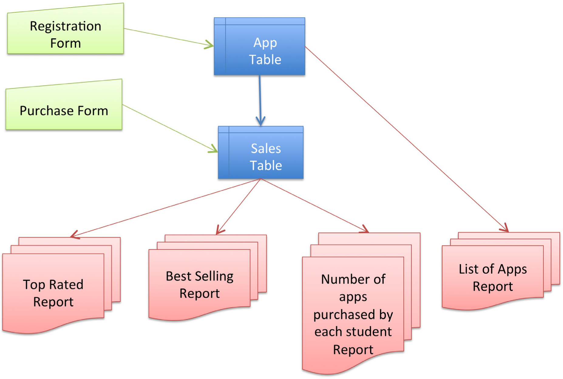
Architecture of the Class App store. Even this simple database requires two forms and four reports.
Group and Summarize Data
We will analyze the sales data for our own app store to find trends in buying patterns for the class. Distilling that data and finding meaningful patterns is a form of business intelligence.
The important concepts here are to group and summarize data, and then to order and compare groups. For example, showing a list of the best selling apps. Creating this list requires counting total sales for each app and then listing those totals in descending order.
To do this in real time requires sending a query to the store typically written in a language called Structured Query Language (SQL). This is how we were able to get the store to display tables of best selling and top rated apps. The query looks similar to this:
select App, count(Timestamp)
group by App
order by count(Timestamp) desc, App asc
Translation: select the app name and count the number of records (timestamps) for that app. Produce a subtotal (group by) for each App name. Then order the subtotals in descending order. If two apps have the same subtotal, then order them alphabetically.
However, SQL is beyond the scope of this course. What is within the scope of the course is to download and analyze the data in a spreadsheet. Database data can be downloaded and then analyzed using Excel pivot tables. A pivot table is a visual query tool that allows you to answer sophisticated questions without writing any SQL code.
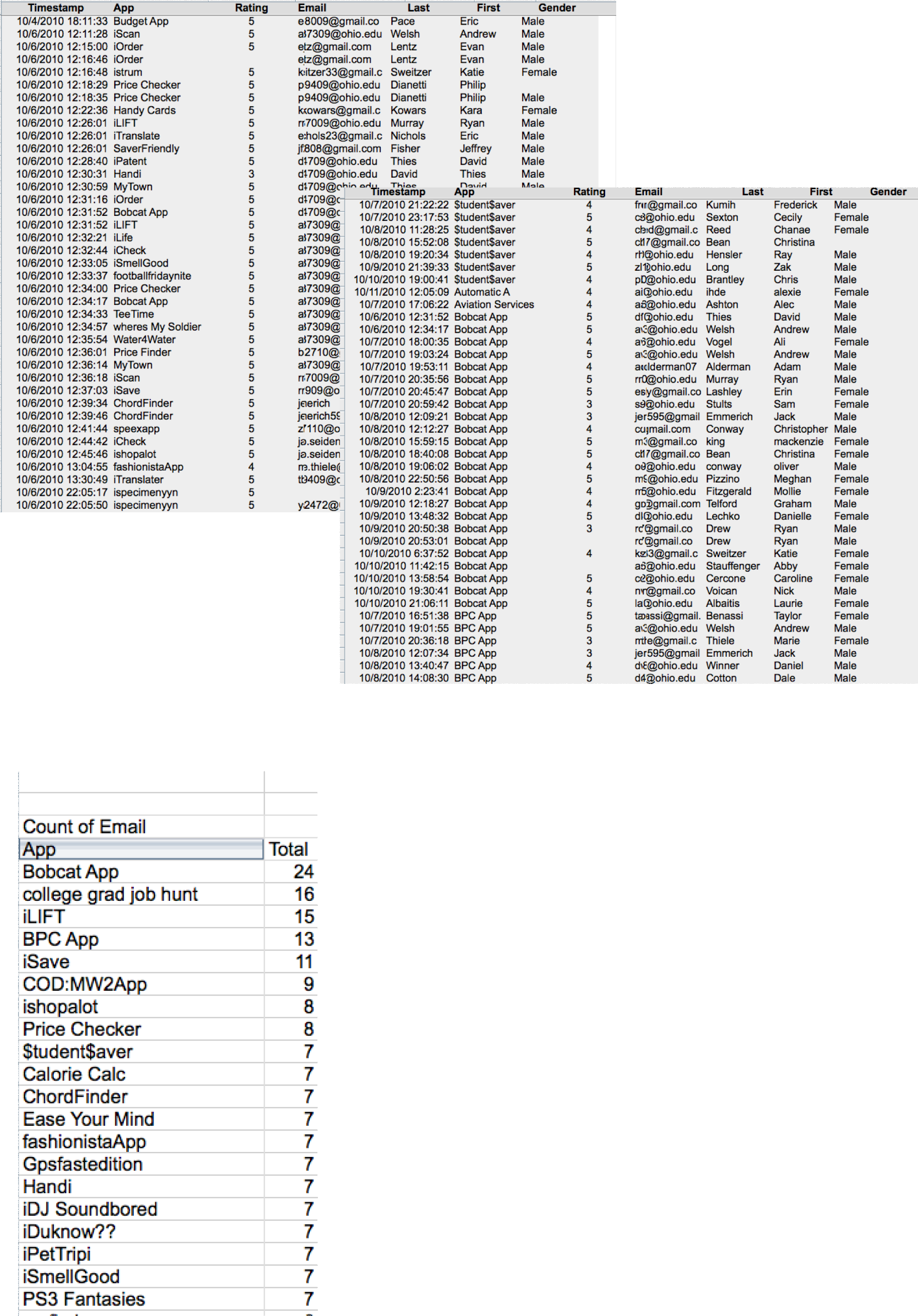
Data is sorted by timestamp above left and by app above right. However, neither sorting produces useful information. Left we download and then group, summarize and sort the data by sales in descending order to reveal the top selling apps. This is meaningful information. “Count of Email” means that we are counting the number of email addresses registered for each app. We count emails since they are unique whereas names might not be. This analysis is performed using an Excel pivot table on the downloaded data.
Multi-Table Databases
The problem with one table databases is that we are limited to querying the data that happens to be in that table. For example, there is no way to see which developers bought their own apps. The sales data here shows only the buyer not the seller. The seller data is stored in a different table. What we need is a way to join information between the two tables. While joining information between tables is possible to do with a spreadsheet (using the Vlookup operation), it is rather difficult and is error prone. The best practice way to accomplish a join is using a database system such as Microsoft Access.
The magic of database systems is that they are able to make data that lives in separate tables appear to reside in the same table. Once the data appears to reside in a single table, then all of the query techniques that apply to one table databases become tools for analysis.
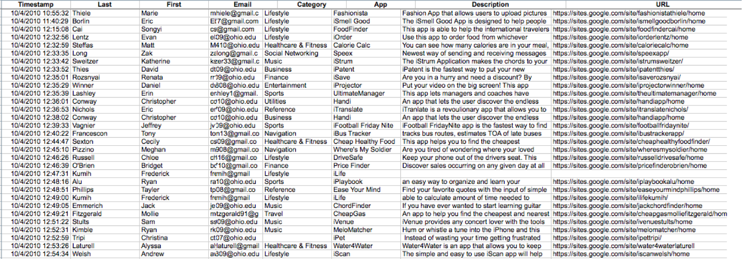
The APP table above and the SALES table below. A relational database is able to integrate information between the two tables.
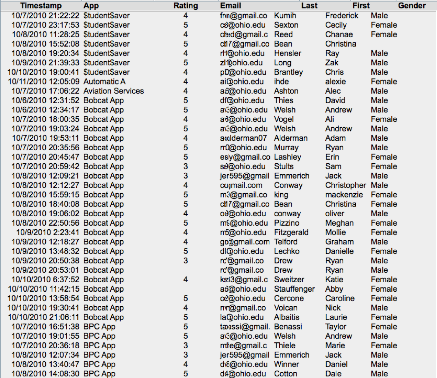
Data Warehouse
As with many subjects in the course, it is more complicated than that. It would be relatively rare to pull business intelligence data from a live database. The drain on the system might slow down the entire business and thereby frustrate customers. Instead, corporations typically copy data from their databases into a repository called a data warehouse. The warehouse can then be queried repeatedly without affecting the production system.
Periodically, perhaps once a day, data is copied from the company’s many databases to a very large database called the data warehouse. The process of copying the data is called extract, transform, and load (ETL).
- Extract — Copies data from one or more databases systems.
- Transform — Cleans the data so that related records in different databases appear in a consistent format.
- Load — Inserts the cleansed data into the data warehouse.
Why go to all this trouble? One of the main reasons is that analyzing the data on the production system would slow it down considerably leading to poor customer service. Another reason to copy the data is so that multiple databases can be merged into a single data warehouse.
It is the data warehouse that is analyzed to produce management reports.
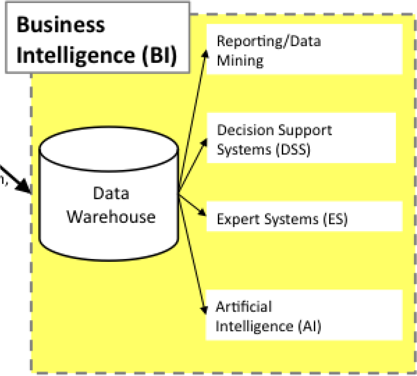
Note the role of the data warehouse as the central repository for all the business intelligence data.
Latency is the amount of time between the occurrence of a transaction and the loading of that transaction’s information into the business intelligence system. In other words it is the amount of time that passes before a manager has a distilled report in hand analyzing the operation. Some mangers are content to get a monthly update, others need daily or even hourly updates. It depends on the nature of the job. Ironically, lower level managers tend to need more up to the minute data. This is because they control the systems in real time. Upper level managers, by contrast, tend to focus on the big picture over a larger time horizon.
KEY TAKEAWAYS
- Multiple corporate databases feed into a large data warehouse that is used for querying the data.
- The greatest sin in database design is allowing duplicate data. Duplicate data has the potential to become inconsistent—sometimes one value, sometimes another.
- The higher up a manager is in the organization, the less detail he or she needs to see in the data. In fact, detail only becomes important to an upper manager when it is needed to explain an unexpected trend.
QUESTIONS AND EXERCISES
- The transform step in the ETL process can be quite involved. Research and find an example of data that needs to be cleaned.
- Explain why databases beyond one table require relationships among the tables.
Techniques
The following techniques, found in the Excel section of the software reference, may be useful in completing the assignments for this chapter: Pivot Table
L3 ASSIGNMENT: SALES DATA ANALYSIS
How do you increase sales of your app in the store? In order to answer that question you need to examine your competitive position in the store. Your competitive position is defined by comparisons with other apps selling in the same category. So if you designed a music app, then you should compare with other music apps. There are a number of dimensions along which you can examine your competitive position: market share, unique visitors, conversion rate, personal sales, or cross selling.
Setup
To complete this assignment, you will need two files from your professor. The first is the sales file from the class store. The second is the content drilldown report from Google Analytics. Then create a new blank Excel spreadsheet with the column headings shown in the example. You need to include a row for every app that sold in your category. So if your category is music and there are ten music apps in the store, then you need to have ten rows including your own. Your row should be boldfaced.
Content and Style
Number and answer all of the following questions in the space below your spreadsheet. (Use merge cells and text wrap to make sure that your answers do not exceed the width of your spreadsheet.
- Market share: Of all the sales in your category, what percentage does your app account for? How does that compare with the competition?
- Unique visitors: How many unique visitors came to your page in the store? How does that compare to the competition? What could you do to encourage more visits?
- Conversion rate: Of all the visitors to your page, what percentage actually bought your app? This is called the conversion rate. How does your conversion rate compare with the competition? What could you do to improve your conversion rate?
- Personal sales: The sales records reveal who bought your app. Some of those sales may be the result of you personally promoting the app to others in the class. What percentage of your sales are the result of personal selling? How many people did you try to sell that did not buy your app? What is your closing rate?
- Cross Selling: Of the people that bought your app, what other apps did they buy? What apps cross sell well with your app? Perhaps you could promote your app on those pages and vice versa. To find this answer you need to import the sales table into Microsoft Access and then run both of the queries listed below. It is so worth it; the output is really interesting.
Deliverables
Electronic submission: Submit the Excel file electronically
Paper submission: Please print out the Excel file in landscape view using fit to page.
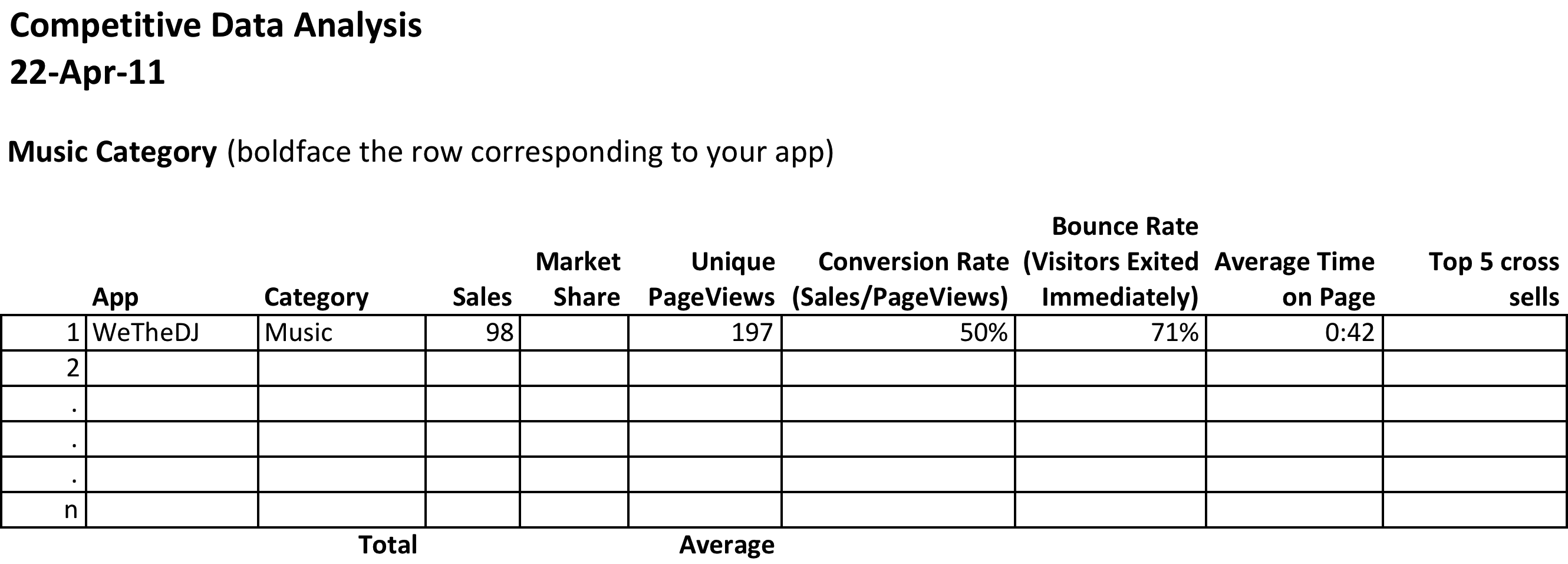
How to Find the Cross Selling Information
Begin by importing the sales data into a blank database in MS Access. Under the External Data tab select Excel and follow the screen prompts. The worksheet should come in as the RawData table or whatever name your professor calls it.
Now you will create two queries to run against the table. The first query, PurchasedTogether, creates a new row for each combination bought by a customer. For example, (WickedCrazyApp, CoolMusicApp), (BogusFlowerApp, IntenseAwesomeApp) and so forth. The logic of this query is to find all records from both tables where the emails match but the apps purchased do not. To create this query go to Create > Query Design and add the RawData table twice in the query design process. The second version of the table is called RawData_1. Drag a connector from one email field to the other to join the Email fields from both tables. (The example shown is simplified, showing only two fields.) Fill out the grid at the bottom to match the example. Run the query by clicking the red exclamation point.
The second query, PurchasedTogetherTotals, counts how many times each combination appears. The logic of this query is to count combinations no matter who bought them. We have further limited the results to those counts greater than 4, but you can change this number as need be. To create this query you must add the PurchasedTogether query in the query design process. In other words you are doing a query of a query! Add the Total row to the grid by clicking the Σ, then fill out the rest of the grid as shown. Run the query and you have your cross selling data!
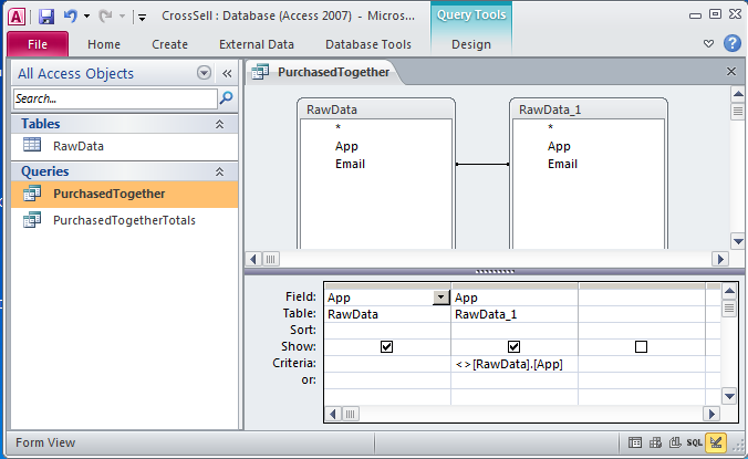
PurchasedTogether creates a new row for each combination bought by a customer. PurchasedTogetherTotals counts how many times each combination appears no matter who bought it.
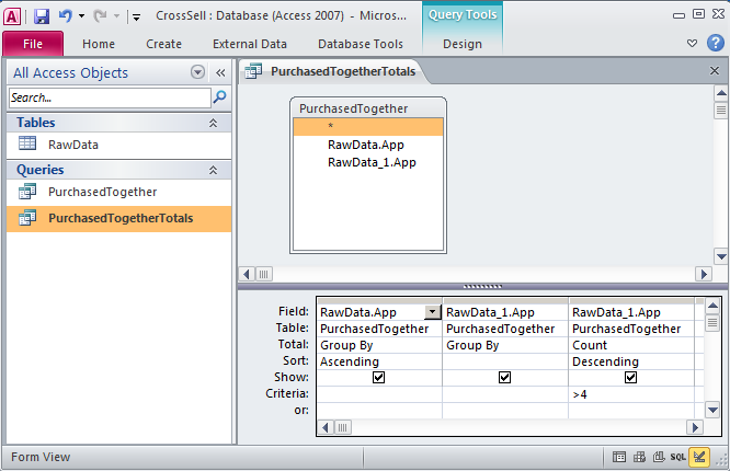
Chapter 11 Writing the Business Case: Design a Report for the App
11.1 Pros and Cons of PowerPoint
LEARNING OBJECTIVES
- Present evidence for your conclusions
- Determine when to use PowerPoint as a report writer rather than a presentation tool
- Describe the conditions under which PowerPoint fails to communicate well
Introduction
When applying for a business loan or seeking investors, you will have to present your project. You are likely to fare better if you follow accepted standards of business presentations. One of those standards is the schematic report.
You are probably already familiar with the use of PowerPoint to create presentations for an audience. Such presentations will be covered in more detail in the next chapter. However, in this chapter we look at PowerPoint as a report generation tool.
In business, PowerPoint has been gaining traction as a page layout tool to generate reports. These reports use smaller fonts, mix text and graphics, and are designed primarily to be read rather than projected on the screen. Businesses use different names for this type of report including decks, reading decks, and schematic reports.
Used in this way, PowerPoint becomes equivalent to a poor man’s desktop publishing package—but with the added advantage that the report also fits neatly on the screen.
However, it is difficult for an audience to read a font smaller than 24 point onscreen. Small font presentations (around 11 point) raise the obvious question as to why the presentation should be projected at all.
Where Are We in the Life Cycle?
Many information systems projects are conceived of in a life cycle that progresses in stages from analysis to implementation. The diagram below shows the stages that we touch in the current chapter:
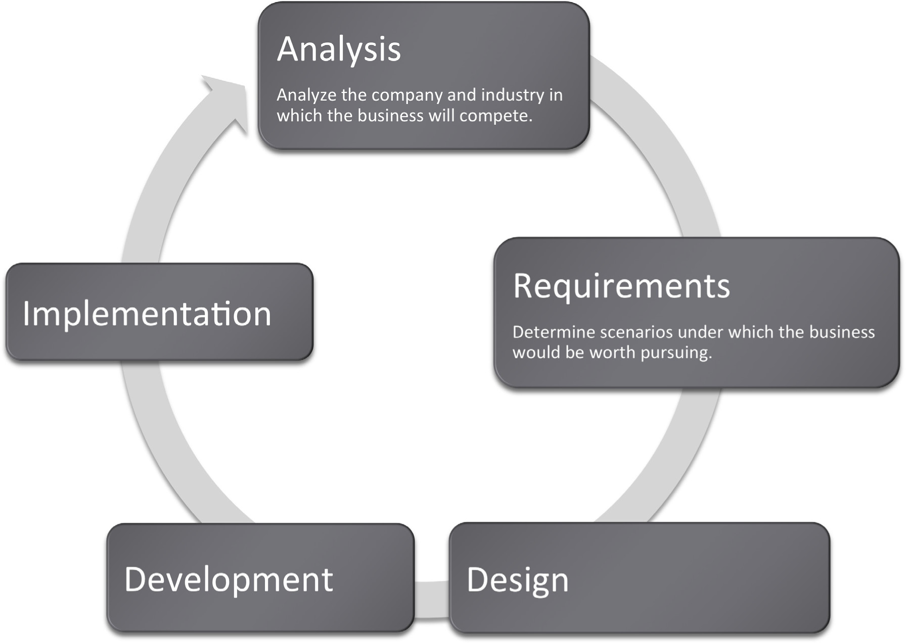
Focus on Evidence
Rarely can you prove anything in business. The best you can do is give evidence for your position. Your audience will decide whether your evidence is compelling. And if it is not compelling, well then you have learned something for next time.
In most business presentations, you will need to get across information that inspires your audience to take action. Design is not a substitute for good content, but the combination of the two produces excellent results. The table below demonstrates a method of critical thinking. The method shows how to organize an argument in order to support a claim. Note that every point is supported by hard evidence. This format can be used both in papers and presentations:
Table 11.1
|
Paragraph |
Thought Process |
Sample Words |
|---|---|---|
|
Claim or thesis |
Here’s what I believe based on points A, B, and C. |
I believe we should allocate$50K to investigate sustainable business practices because of cost savings, employee morale, and community support. |
|
Evidence of A: examples and credible sources |
Here’s why I believe A. |
Cost savings through reduced energy usage. |
|
Evidence for B: examples and credible sources |
Here’s why I believe B. |
Improved employee morale by working for socially responsible company. |
|
Evidence for C: examples and credible sources |
Here’s why I believe C. |
Community support for green practices. |
|
Summary |
As I have shown, my belief _____ is reinforced by points A, B, and C. |
In summary, cost savings, employee morale, and community support, encourages allocation of $50K to investigate sustainable business practices. |
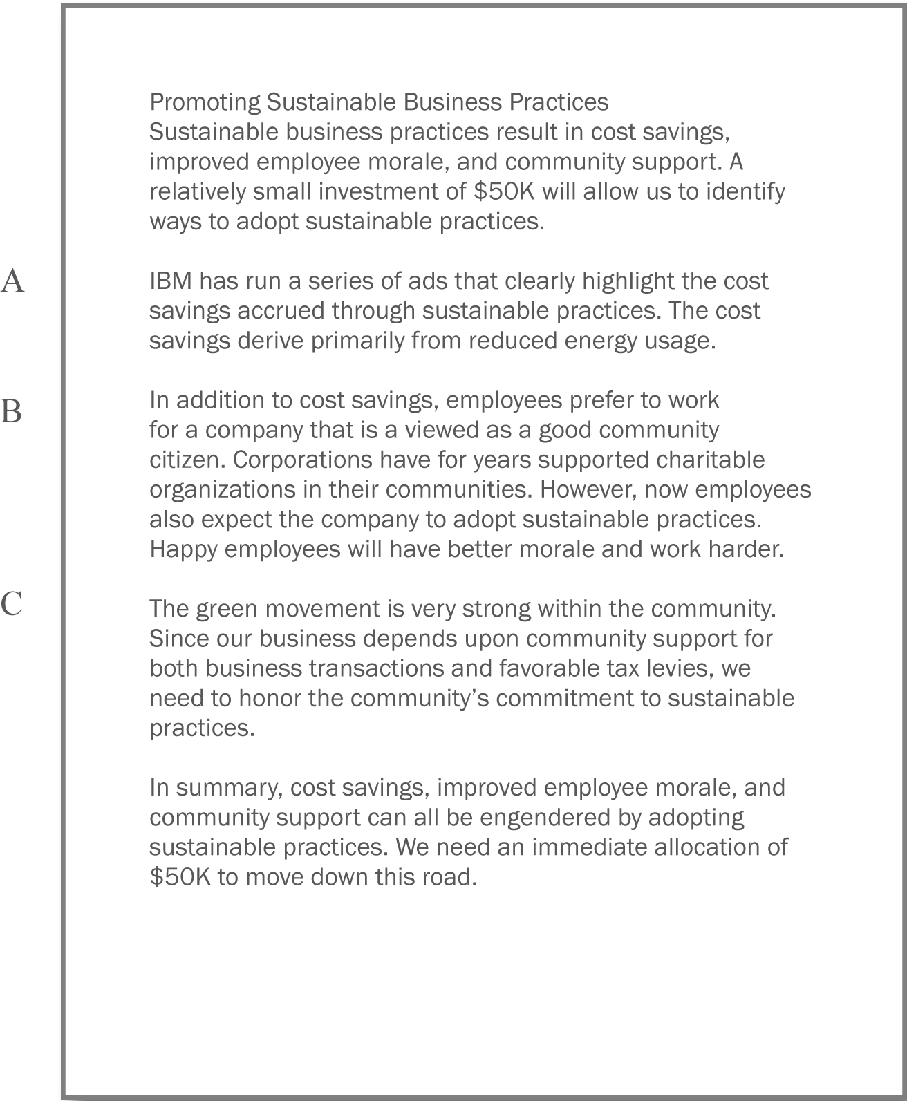
PowerPoint as a Report Writer
Traditionally students are taught to write reports using a word processor such as Microsoft Word. The emphasis in the reports is on grammar and composition. However, much of corporate America has been moving in a different direction. The primary means of formal communication in corporations is with PowerPoint.
PowerPoint was developed as a presentation graphics package. PowerPoint presentations are designed to supplement a live presenter. For this reason, the fonts used tend to be large (around 24 point) and the words few (less than fifty per page) so that the audience can read them. The bullet points also serve as a cue for the presenter in lieu of note cards.
To put this in perspective, a single page of a word processed document could have 500 words or ten times as many words as a slide. The words would be set using a smaller font—usually 10 or 11 point.
With relatively few words to express oneself, every word should be carefully chosen. Unfortunately, very often we see the opposite—presentations hastily assembled at the last minute.
However, there is a growing movement to create presentations that can stand with or without the presenter. This requires using smaller fonts and adding far more text. The small text creates a presentation that can no longer be read easily by the audience. What should be a presentation turns into an eye test. To compensate, many times audience members are each provided with a copy of the presentation. So while they may not be able to read the screen, they can follow along.
Hopefully the copy provided to the audience contains one slide per page. Unfortunately, sometimes in an effort to save paper, the presenter will use a PowerPoint handout with three slides per page and a space for the audience to write notes. This simply transfers the eye test to paper.
The term used in corporate America to describe a PowerPoint presentation is a deck. The term has obvious ties to a deck of cards. And like a deck of cards, one can easily reorganize a deck to customize the presentation for a new audience. The term deck is used whether the slides are primarily designed for a presentation or primarily designed to be read. However, to be clear about which we mean, we will use the term schematic report to describe a deck intended to be read rather than projected.
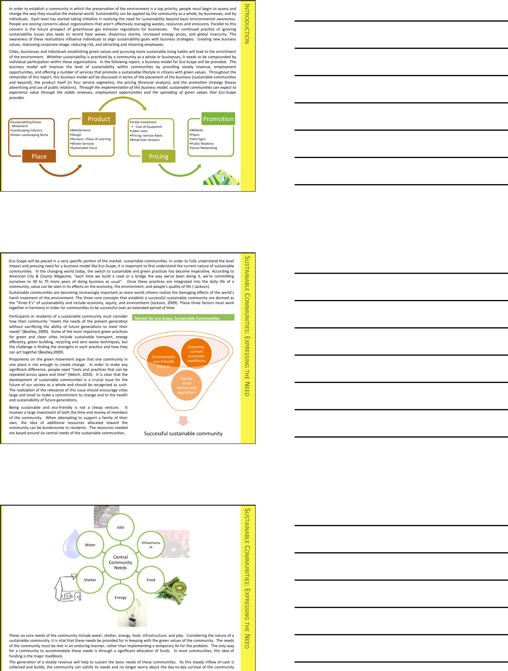
Distributing handouts to the audience is only helpful if the slides are readable. Here they are not, nor would they be readable projected on the screen. The only way to make this presentation readable is to print one slide per page.
How to Overcome the Cons
PowerPoint has four advantages over Word. First, it does help keep everyone on the same “page.” A PowerPoint “page” fits conveniently on one screen—a Word page would not. Second, PowerPoint allows for easy integration of text and graphics. Text boxes and images stay put and resize intuitively without creating awkward page breaks. You can similarly integrate text and images in Word—but it is less intuitive. Third, PowerPoint themes allow the presentation to take on a slick and unified look, almost like a brochure. Each theme has a number of layouts associated with it so that each slide can be structured to accommodate the material for that slide while still having the same look as the rest of the presentation. Fourth, because each slide tends to encapsulate a complete idea, it is fairly easy to reorganize the deck to customize it for a new audience. There is even a slide sorter view to help with this task.
PowerPoint also has some disadvantages as a report writer, as compared with Word. First, without text flow the presenter is tempted to fit each idea, no matter how complex, onto a single slide. Lack of text flow can lead to over abbreviation of complex concepts—sometimes with disastrous results. Second, PowerPoint resizes text automatically to fit on the slide. As you add words to a slide, the font shrinks in size so that all the text will fit. If the subsequent slide has fewer words, the text will be larger; if it has more words, the text will be smaller. Auto text resize leads to awkward differences in text size among slides—which does not look professional.
To expand on the text resize point a little bit more, consider that memos and other office documents are normally set in around 11 point type. PowerPoint slides usually opt for at least 24 point type. The no man’s land between 11 point and 24 point might be around 16 to 18 point. This looks like the font of a children’s book, which is not professional. The example below shows the body text at both 12 point and 18 point.
Both PowerPoint disadvantages—auto text resize, and one idea per slide—can be overcome. Some PowerPoint templates, such as Pitchbook, suppress text resize. With the font locked at 11 point, the writer can avoid a no man’s land 16 or 18 point font. Overcoming the text flow problem is harder. Our recommendation is that the writer create all content in Microsoft Word and then flow the content into PowerPoint. In fact that is how we created the slides below.
11 point (above) is good for a written report. 16 point (following) looks like the font in a children’s book.
Does PowerPoint Corrupt Us?
There is a third, more controversial, disadvantage of PowerPoint. Edward Tufte argues that PowerPoint encourages the pitching of ideas rather than dispassionate reflection. He cautions that when we pitch out, we corrupt within. In other words, if we tend to use a medium designed to sell ideas, rather than discuss them, we might lose our own objectivity to the detriment of our message—and our organization. Certainly there is some evidence for Tufte’s position. A quick look at the built in PowerPoint templates, reveals a decidedly marketing orientation. For example, there is a built in Pitchbook template, but there does not appear to be a built in “weigh all angles” template.
Tufte terms the tendency to market and simplify ideas the cognitive style of PowerPoint. He is especially troubled by the use of bullets rather than complete sentences and paragraphs to convey information. Such presentations he argues should not circulate alone as though they are documents. He provides a compelling example of the dangers of PowerPoint reports with the Columbia Space Shuttle disaster. On February 1, 2003, the Columbia Space Shuttle disintegrated and burned up on reentry, when its heat shield was compromised by a foam hit 16 days earlier. The official presidential report faulted the way that the potential danger had been poorly communicated by Boeing using bulleted lists rather than paragraphs and complete sentences.
Tufte goes on further to claim that for on screen presentations, PowerPoint should only be used as a slide projector to project images. Words should be supplied by the speaker. There is some truth to the slide projector position as we shall see in the next section.
Having said that, however, perhaps Tufte’s remarks should be taken as a caution, rather than a condemnation of the PowerPoint medium. Having fewer words makes it more challenging to communicate, but does not preclude effective communication.
Columbia Disaster
On February 1, 2003, the Space Shuttle Columbia disintegrated upon re-entry to the earth’s atmosphere. All seven astronauts on board perished. The cause of the accident was a piece of hard foam insulation the size of a small briefcase and about the same weight as a basketball, which broke off the external fuel tank, slamming into the wing at 500 miles per hour during liftoff sixteen days earlier. The impact would be the equivalent of a 100 pound weight dropped from 200 feet in the air.
NASA knew about the foam hit the day after liftoff. They asked the fuel tank manufacturer, Boeing, to analyze the foam hit. Boeing developed a computer program called Crater to analyze the effects of foam hits. The program was calibrated using the history of foam hits on previous flights. To be safe, Crater was programmed to over predict damage. As it happens, foam hits on prior launches were a regular occurrence. However, most of the foam pieces were tiny and put only minor chinks in the ceramic heat shield tiles. However, this piece of foam was much bigger. Nonetheless, NASA’s reading of the report back from Boeing was that there was no danger to Columbia. They took no further action.
Unfortunately, the report back from Boeing took the form of a poorly designed PowerPoint deck. Edward Tufte presents a compelling case that one of the contributing factors in the Columbia Space Shuttle accident was this deck. The key slide from that deck appears on the following page. Tufte argues that PowerPoint encourages the type of sloppy writing that appears on the key slide. As you read the “Before” slide, it will appear that there is very little danger to Columbia. The title of the slide, “Review of Test Date Indicates Conservatism for Tile Penetration,” gives a false sense of reassurance. In fact, they are talking about the Crater program being conservative, not the projected damage to Columbia. Tufte feels that an author writing in complete sentences and paragraphs in a report would be less likely to be misunderstood. Maybe.
However, we would argue that the real culprit is bad writing. Bad writing is bad writing whatever the medium of expression. To us, it appears that the authors of the slide were trying to sell the virtues of the Crater program rather than acknowledge its limitations. Selling has a place at the beginning of a presentation to engage the audience interest. However, selling should never be mixed with content.
To make our point, we rewrote the key slide to remove the selling, express clearly what it really provides evidence for, and what it should have concluded. We believe that our rewrite would not have been similarly misunderstood.Tufte, Edward, The Cognitive Style of PowerPoint, Graphics Press, May 2003.
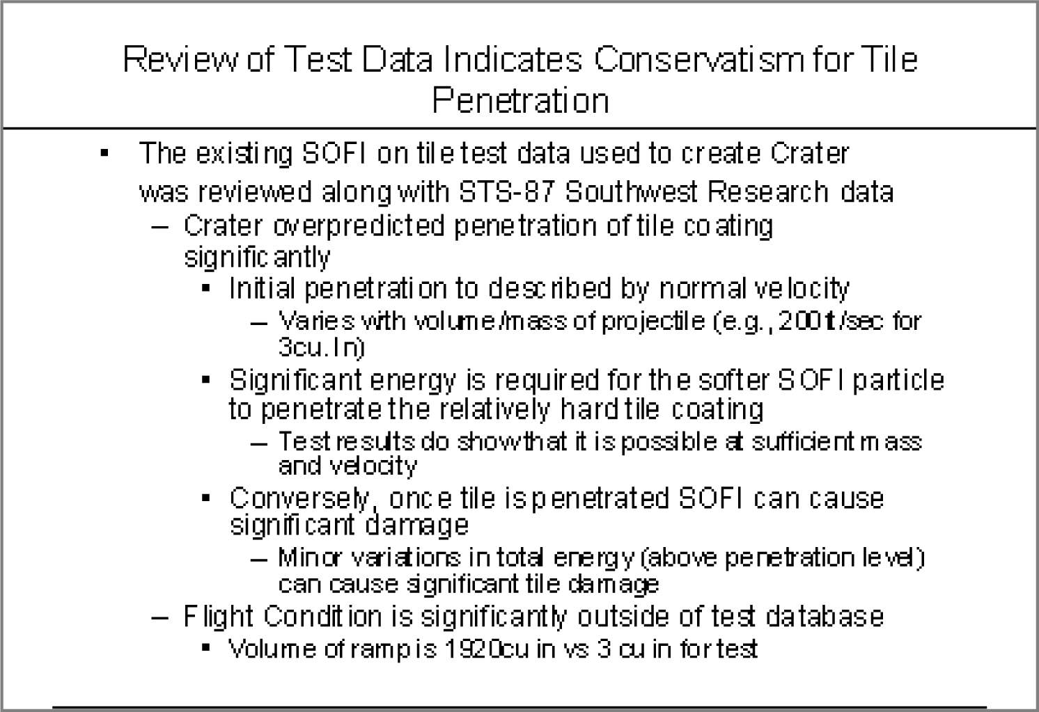
The original Boeing slide (above) and the authors’ rewrite to clarify the material below. Lead off with your conclusion and then give evidence.
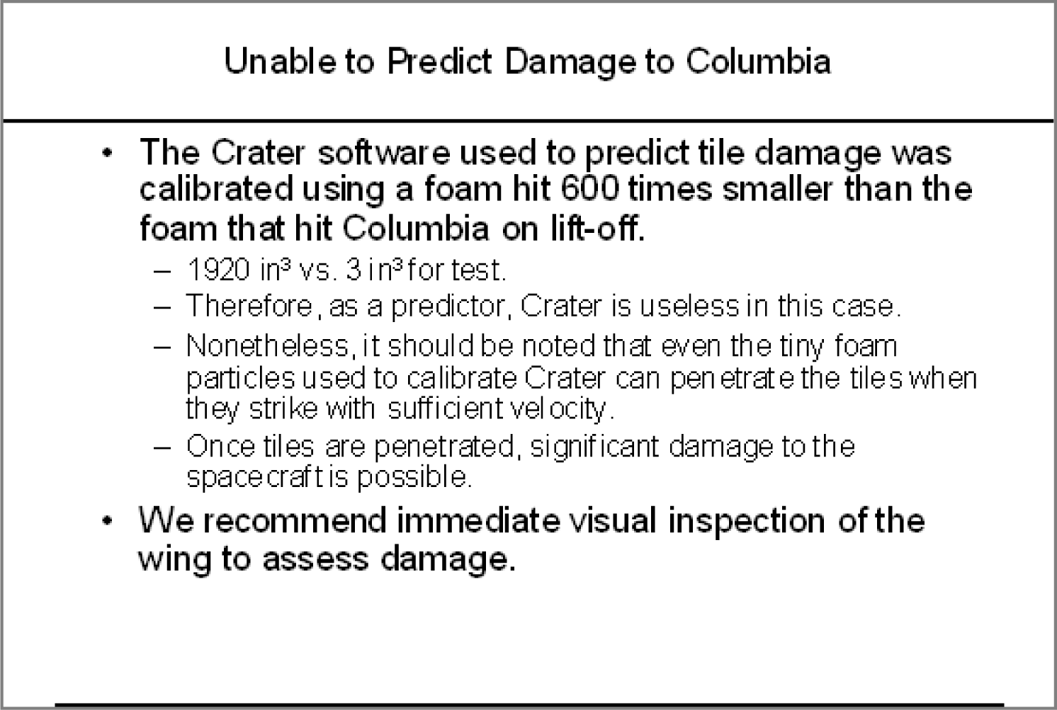
KEY TAKEAWAYS
- Reports should use a font size around 11 point.
- Disadvantages of PowerPoint include oversimplification of ideas, inconsistent font sizes, and a tendency to pitch rather than discuss ideas.
QUESTIONS AND EXERCISES
- Does the abbreviated style of PowerPoint require even better writing? Explain.
11.2 Schematic Report
LEARNING OBJECTIVES
- Create a schematic report used in business communications
- Make a business case to have investors or a bank provide development funds for your iPhone app
- Integrate deliverables produced earlier in the course to help make the business case
Report vs. Presentation
A schematic report minimally contains the following elements.
- Title page with author.
- Executive summary: A summary analysis of the report with the key facts, issues, and conclusions. An executive should be able to get the gist of your entire report just by reading the executive summary.
- Table of contents—with page numbers identifying section and second level headings only.
- Introduction.
- Body: that includes the analysis and recommendations (most of your report). To provide continuity the evidence should point back to the main argument.
- Conclusion.
The report may also include a letter of transmittal, references, and appendices.
If a schematic report contains too much detail to be projected, what can you use for your presentation? The solution is to create two decks—a schematic report intended to be read and an accompanying presentation intended to be projected. The task is not as hard as it might seem. Schematic reports tend to be heavy on graphics. All of those graphics can be copied from the schematic report to the presentation report. Within the presentation, those graphics should be enlarged, perhaps to fill the entire screen. Key summary points can similarly be lifted from the schematic report while leaving the bulk of the text behind. The speaker will provide the gist of the text during the presentation. The two decks can even run in the same order so that the audience can follow along in the written report.
Hopefully, Microsoft will one day modify PowerPoint so that it produces the presentation automatically from the schematic. Here is how it might work. The writer tags text and graphics from the schematic report that are intended for the presentation. PowerPoint automatically enlarges the tagged graphics to fill the screen. The tagged text is similarly enlarged to at least 24 point, then placed in a text box overlaying the illustration—like subtitles in a foreign movie. When the slide loads it could even begin with the slide from the schematic, which then morphs to become the presentation slide.
Until Microsoft provides the transformation utility, we will have to create the presentation from the schematic ourselves. The easiest way to do this is by beginning with the schematic and then stripping it down to the graphics and key text, then enlarging those and arranging them on the screen.
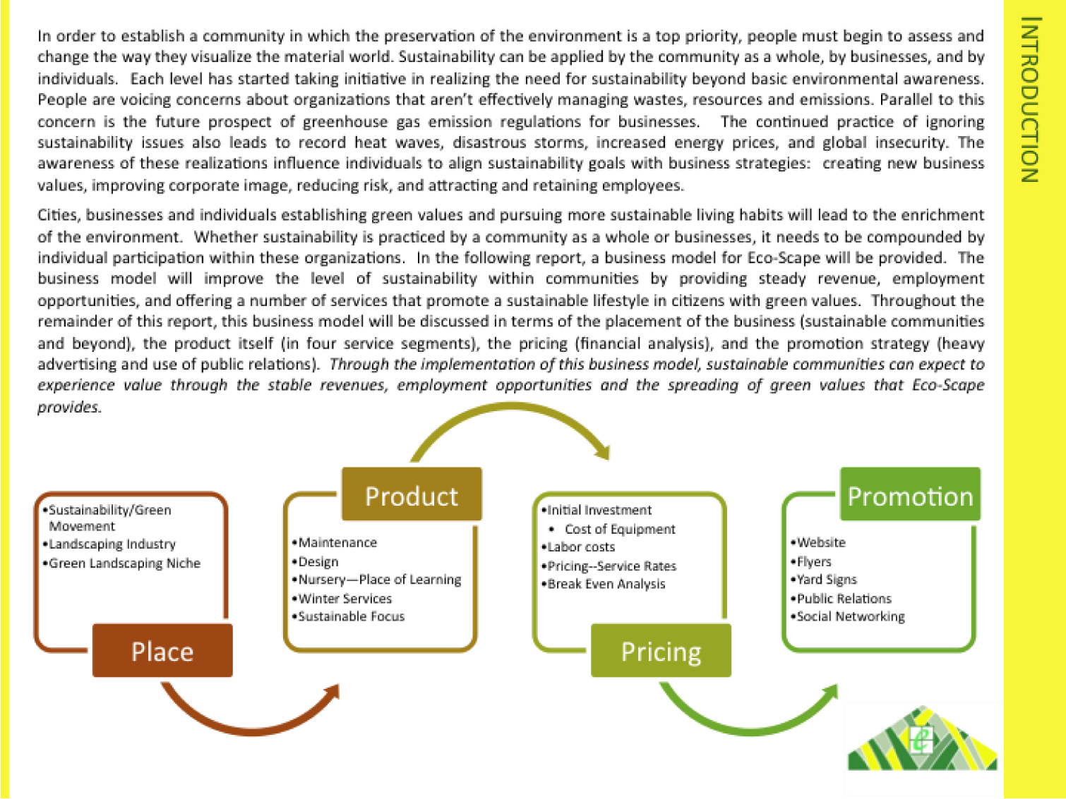
Page from schematic report (above), which matches the presentation slide (below). The key sentence from the schematic slide becomes the title of the presentation slide. The artwork is enlarged. Note that even the text in the artwork has been enlarged.
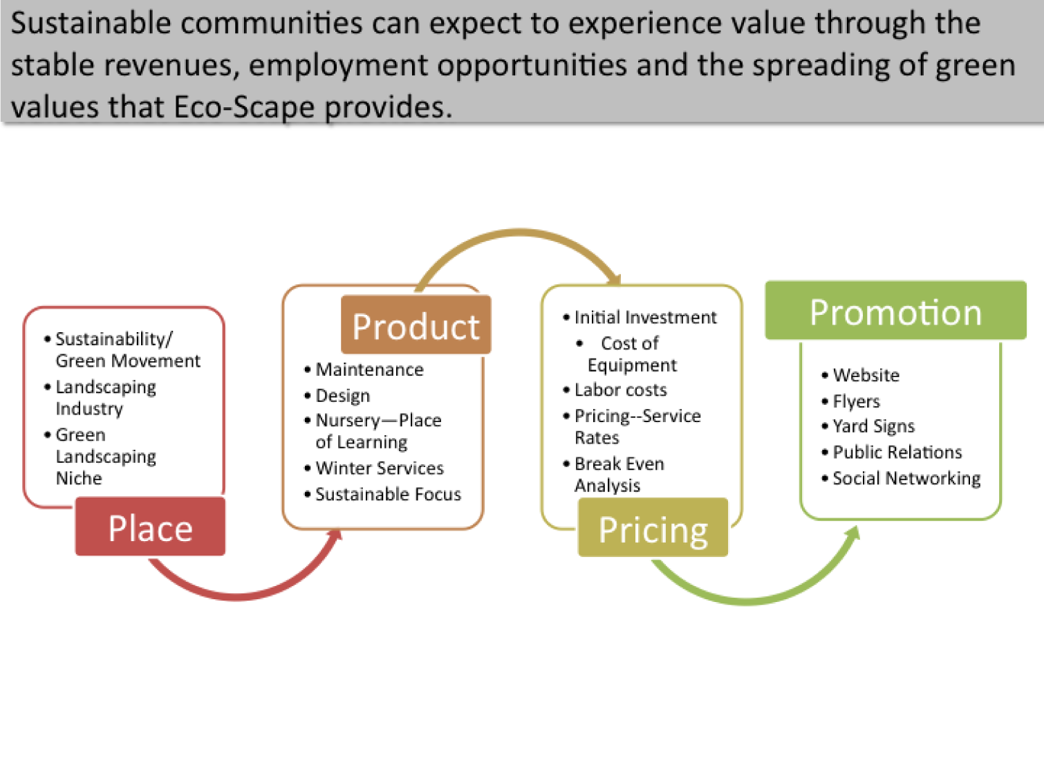
Writing an Executive Summary
Every schematic report leads off with an executive summary. An executive summary usually occupies one page and summarizes the key facts, issues, and conclusions of the report. A manager should be able to garner enough information from the executive summaryThere are many definitions of an executive summary—some are highly specific. We have chosen to go with one of the more general definitions modified from: smallbusinessdictionary.com to make a decision. The rest of the report is effectively backup if there are questions that arise from the executive summary.
Many times a senior level manager will not even read past the executive summary. Rather they will assign one or more junior level managers to follow up on a subsection of the report. Looked at this way, the executive summary is obviously something that you want to spend a lot of time crafting—not a reluctant chore at the end of the process.
The key to writing an executive summary is to get quickly to the point. We can actually tie the parts of the executive summary back to terms with which we are already familiar:
- Key facts—what is the current state? What are enablers that will help with the proposed solution?
- Issues—what are the barriers that would impede the proposed solution?
- Conclusions—what is the report specifically recommending? What course of action should the reader take?
One of the most common mistakes is to treat the executive summary as an introduction to the report. You will have an opportunity later to write a gentle introduction to the report, but not in the executive summary.
Because our reports are relatively short, you probably will reference most sections in the executive summary. However, in a larger report, there may be entire foundation or due diligence sections not covered in the executive summary. That’s OK. You still need to do the due diligence to make your case. When deciding what to include simply ask yourself, would a manager need to know this to make a decision?
An executive summary should highlight the key facts, issues, and conclusions of the report. The example above is pretty good, but it is missing the issues—what barriers are present that would prevent the proposed solution?
KEY TAKEAWAYS
- You should prepare both a written report and a PowerPoint presentation rather than projecting the written report.
- The most important part of your report may be the executive summary as that may be the only page a busy manager will read.
QUESTIONS AND EXERCISES
- Write an executive summary of your decision process in choosing your university.
11.3 Template for the Report
LEARNING OBJECTIVES
- Choose an appropriate template for a schematic report
- Modify the master page to change the look and feel of the report
- Choose an appropriate layout for each page of the report
The Pitchbook Template
While you could custom design a template for your schematic report, it is far easier to begin with a template and then modify it to fit your needs. We recommend the Pitchbook template. In spite of its name, the template is fairly reserved in its appearance. We recommend Pitchbook, because of its fonts, layouts, and table of contents.
The font in Pitchbook is Calibri, a Microsoft font designed to be read well on screen and in print. The body text size is 11 point. Curiously, minor section headings within a slide are set even smaller at 10 point, though they still stand out since there are set in white text on a colored background. The only disproportionate font is found in the major section headings that run down the right hand side of the page. These are set in 22 point white text on a large colored background. Why would we want the most prominent visual element on the screen to be the section that we happen to be in? Is navigation within say a hundred page report so onerous? To put this in perspective, consider that most textbooks bury the section name inconspicuously in a discreet footer—and usually set the footer in a smaller font than the body text. However, this defect can be remedied by modifying the slide master to reduce both the font size and background size of the major section headings.
The layouts that Pitchbook provides are versatile and have a consistent look and feel. Each slide can have a layout appropriate to its content—whether that is section title, heading only, or 1 up, 2 up, 3 up, 4 up, or 5 up. No matter which layout is chosen the heading and body text styles remain the same.
The table of contents in Pitchbook is just another layout called Agenda. Note how this name gives away the intention of presenting rather than reading the Pitchbook. We mention table of contents separately because though it may seem like a minor thing, a table of contents is often missing in reports.
The Pitchbook template includes a slide with instructions on how to customize the template.
Templates, Themes, Layouts, Masters
Every deck is based on a theme. The theme specifies a coherent set of colors, fonts, backgrounds, and slide layouts. Even the blank white background with which PowerPoint starts up is a theme called Office. Best practice is to choose a theme ahead of adding content to your presentation. That way you can ensure that the content fits well within the structure of a particular theme.
Every theme is defined by a slide master. The master is a series of model slides that define the theme and its layouts. Any change to the slide master affects every slide in the presentation. If you want to modify the theme, for example by changing the text size on the section heading, then you should do so on the slide master.
The slide master consists of a large master slide and smaller layout masters. The master slide is where most of the background elements, fonts, and colors are defined. The layout masters define the placement of items on each slide. Every slide can have a different layout and yet still look like it belongs to the presentation. For example 1 up, 2 up, 3 up, 4 up, and so forth are all different slide layouts. Furthermore, 2 up in one theme may have different spacing than 2 up in another. These differences are part of the reason that it is so critical to choose the theme in advance.
A template takes this process one step further. A template is a theme with content slides already preloaded. Templates help ensure that the content appears in a particular order.
For our purposes we begin with the Pitchbook template because of its theme. The theme specifies small fonts and clear section headings. That Pitchbook has slides already made is of no consequence to us and in fact we will replace those slides with our own content. What we want is the theme with its layouts.
First we will customize the Pitchbook template to correct its minor flaws.
KEY TAKEAWAYS
- Templates, themes, layouts, and slide masters facilitate the graphic design of a PowerPoint deck.
- For a written report done in PowerPoint it is important to have uniform font sizes on each page.
QUESTIONS AND EXERCISES
- Why does PowerPoint have a slide master in addition to the individual layout masters? Explain.
Slide master (top) with layout masters below it.
L3 ASSIGNMENT: CREATE A SCHEMATIC REPORT
Setup
Start MS PowerPoint.
Choose a template. We recommend using the PowerPoint Pitchbook template. You may opt for a different template or even create your own but these designs should be cleared in advance.
(File > New > Presentations > Business > Pitchbook)
Content and Style
- Title page with author.
- Executive summary: A summary analysis of the report with the key facts, issues, and conclusions. An executive should be able to get the gist of your entire report just by reading the executive summary.
- Table of contents—with page numbers identifying section and second level headings only. Do this last as PowerPoint does not automatically generate or update a table of contents. Also, you would be wise to avoid the table of contents slide in Pitchbook—it is overly decorated and difficult to work with. If you add or move sections after the fact, the table of contents is a chore to update. A bulleted list on a blank slide is just fine and very easy to update.
- Introduction.
- Body: that includes the analysis and recommendations (most of your report). To provide continuity the evidence should point back to the main argument.
- Conclusion.
- Apply all graphic design principles
- Each slide should have 25 to 50% text. Obviously, there will be exceptions. Some slides may be all graphics, while other slides may be all text, e.g. the executive summary.
- Make all text left justified. Avoid centered text or text justified to both margins.
-
Customize Pitchbook as follows:
- Select View > Master > Slide Master.
- Reduce the major section headings from 22 point to 12 point. Reduce the size of the text background to match.
- Replace the logo with your own. Because the logo appears in a slightly different position on different slides, you will need to replace the logo in three places: the large Slide Master, the Title layout, and the Section Header layout.
- Change the theme colors to match colors for your app. Format > Theme Colors and modify accents #4 and #6.
- Activate the page numbers with Insert > Header & Footer > then check page numbers.
- The Pitchbook master has multiple layouts—1 up, 2 up, 3 up, and so forth. Use these as appropriate.
Deliverables
Electronic submission: Post your PowerPoint file.
Paper submission: Create a printout of each slide of your report. Print two slides per page.
Sample pages from a schematic report. Note that the colors have been changed to match the brand.
Chapter 12 Presenting the Business Case: Design a Presentation for the App
12.1 Designing Presentations
LEARNING OBJECTIVES
- Design a memorable PowerPoint presentation
- Manipulate images and text to create a compelling business case presentation
- Accurately characterize and use Presentation Zen principles
Introduction
PowerPoint presentations have become the standard method of presenting information in corporate America. This program is not only used in corporations; however, even professional sports teams and the military use PowerPoint to convey information internally.
Yet, there are still those who claim that PowerPoint is one of the least effective forms of communication for many reasons:
- Most presenters use slides with words only and yet very few words fit on a slide.
- Presenters tend to cram an entire idea—no matter how complex—onto a single slide.
- Most presentations are thrown together with limited preparation, and the goal of most presentations is to summarize and sell ideas rather than to engage the audience in serious discourse.
- Slides are only displayed one at a time. Therefore, the audience has the difficult task of trying to remember what information appeared on previous slides.
- Presenters tend to read their slides.
- Presenters tend to look at the screen when reading the slides thereby avoiding eye contact with the audience.
The result are presentations that are visually bland, intellectually insulting, and easily forgettable.
During your college career, you will use PowerPoint for almost every class in which you or a group has to do a presentation. In this chapter, you will learn how to make those presentations great. Presentations should explain material clearly and concisely while also prompting the audience to take a certain course of action.
A PowerPoint presentation should be a complement to your schematic report. In fact, you should be able to generate the PowerPoint presentation fairly quickly from your schematic report.
Where Are We in the Life Cycle?
Many information systems projects are conceived of in a life cycle that progresses in stages from analysis to implementation. The diagram below shows the stages that we touch in the current chapter:
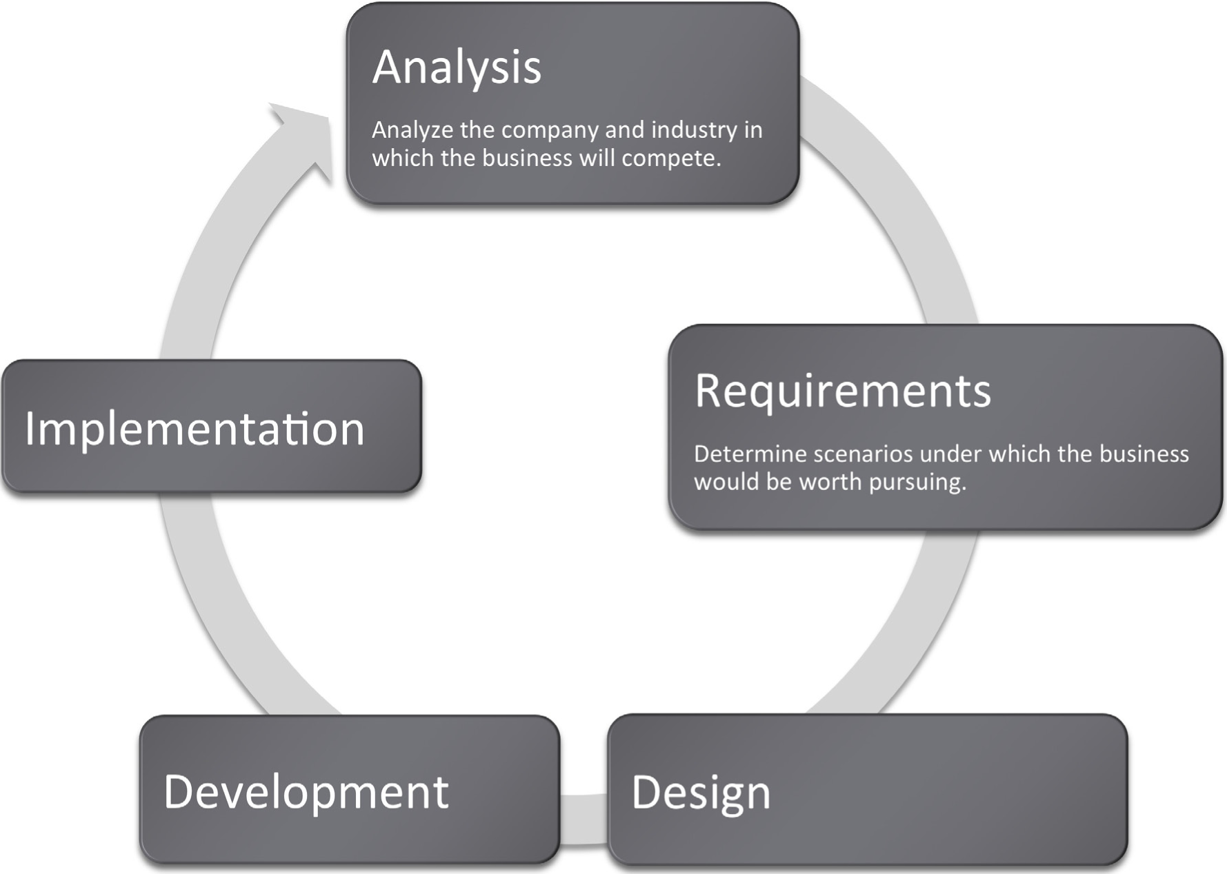
Presentation Content
You need to determine the purpose of the presentation and possible circumstances or contexts in which the presentation might be given. This is a time to showcase your ideas and highlight all of the great things about your project. Be concise and powerful. This may be the most crucial deliverable of the project—especially if given to higher-ups who will have only skimmed the actual report.
Think of your presentation as an illustrated version of the executive summary of your schematic report. If you look at it that way, you have already done the work! Each idea from your executive summary should correspond to a slide. Pull ideas out of your executive summary and illustrate them with exhibits from inside the report. Each illustration should be accompanied by a sentence. The sentence can come from the executive summary or from the relevant slide in the report. You may even find that in the process, you end up revising and improving your executive summary.
Not every slide needs to be illustrated, and not every illustration needs to be included. A slide with a single sentence and no illustration may actually have great visual impact by contrast with the rest of the report. Furthermore, some of your illustrations may simply set up foundation knowledge or due diligence and need not make it to the presentation.
To finish up, create slides that bookend your presentation with an agenda up front and a summary at the end. Follow the old adage, tell them what you are going to tell them, then tell them, then tell them what you told them.
Here are some additional tips:
- Master the content. 90% of the words that come out of your mouth will not be on the slide. You want the audience to look at you not the slide. Furthermore, if you know your content, you can look at the audience. If necessary, have note cards that you could refer to in an emergency.
- Try to avoid handing out miniatures of your slides. Slides created using the method above will be virtually meaningless without the presenter. Hand out the schematic report or even just the executive summary instead.
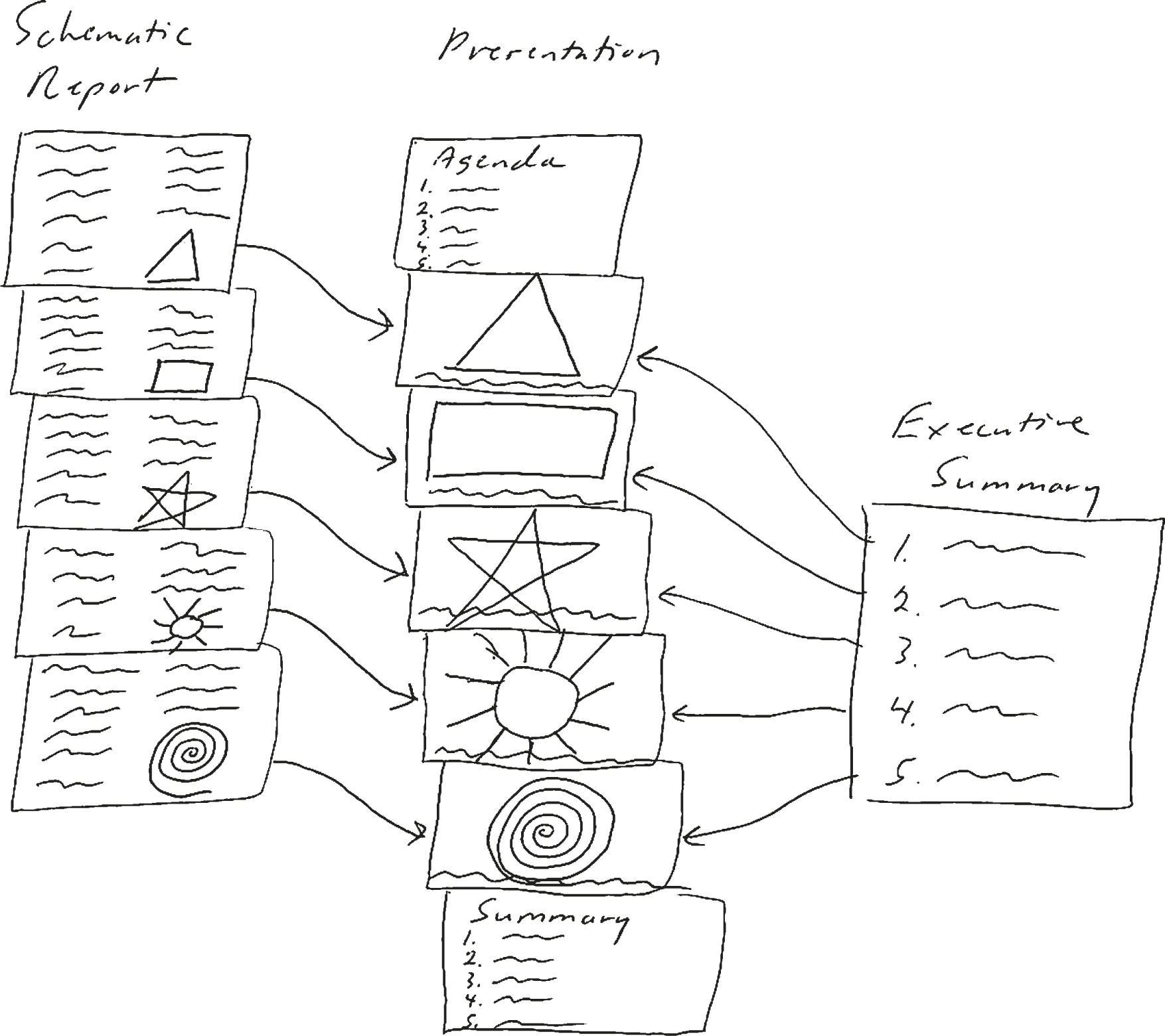
Depicting the process of moving from an executive summary to a PowerPoint presentation. Each sentence in your executive summary can form a slide heading (use your judgement). Then pull the images from your schematic report and enlarge them.
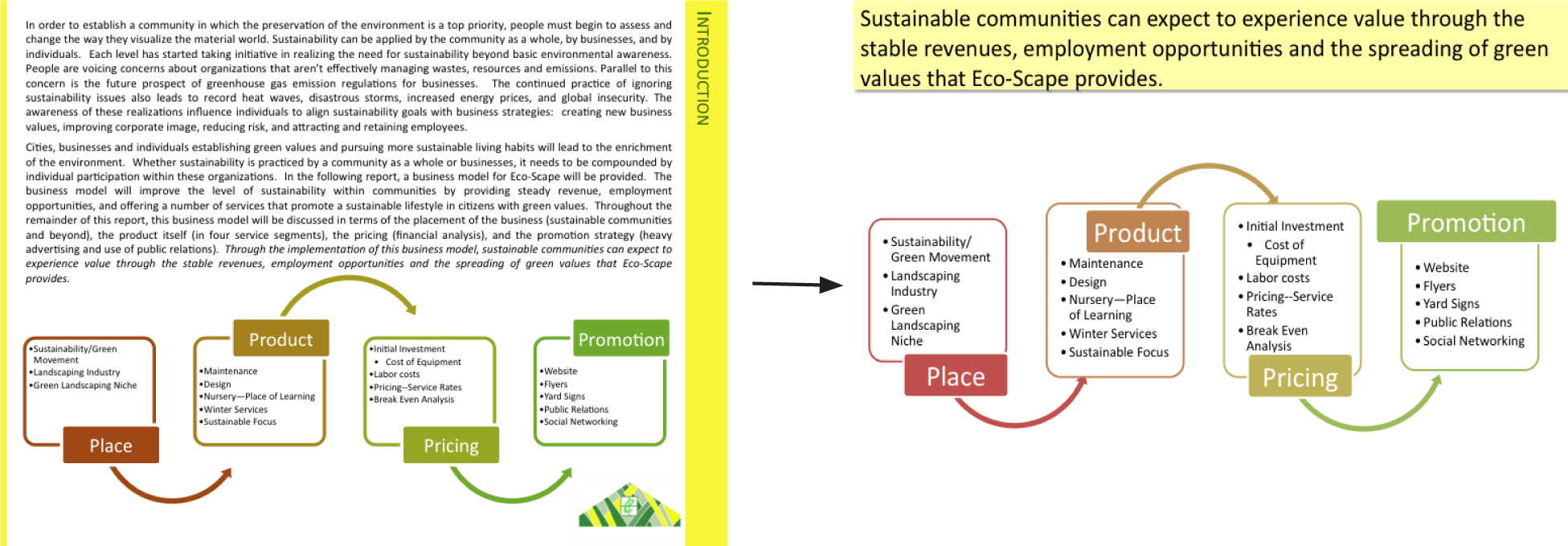
Slide Design – Themes
PowerPoint comes with many different themes to apply to your slides. In general, try to choose either a very light or a very dark colored background. Anything in between will wash out in a bright room.
Themes cannot save a text heavy slide. It is still a boring slide and the speaker may feel obligated to read it to the audience. Many students turn to a dark background theme with the hope that it will convey more professionalism. However, as you can see, it doesn’t solve the problem of a boring slide.
A better option is to move most of the words to your schematic report and instead make your point in a dramatic visual fashion. Visual slides take much longer to create but could differentiate your presentation from every other boring PowerPoint presentation making yours more persuasive.


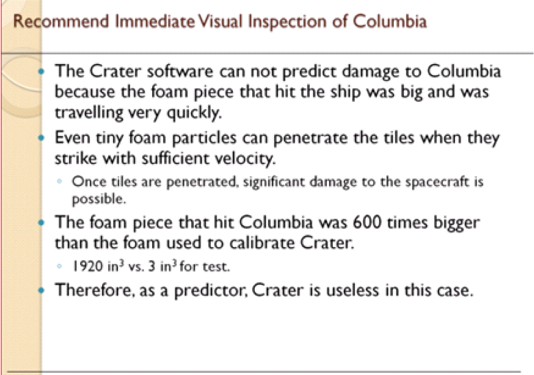
Slide Design – Principles
You want your presentation to be professional and engaging. To get there you will need the C.R.A.P. principles you have already learned. You will also need stylistic enhancements that come under the heading of Presentation Zen. Finally a little (and we do mean little) multimedia—embedded video or subtle use of animation serves to spice up a presentation.
The C.R.A.P. graphic design principles apply to slide design as well. Contrast, repetition, alignment, and proximity help organize information on your slide, focus attention, and create an overall professional look and feel.
Highly visual presentations with very few words are popularized by Garr Reynolds in his book, Presentation Zen. Reynolds advocates restraint, simplicity, and naturalness. The idea is that the slides naturally support your presentation rather than serving as a narrative. You are supposed to know your material.
Presentation Zen slides are characterized by very large illustrations—often full page bleeds—and usually just one sentence of text. This is called the picture superiority effect—basically that pictures are more memorable than words.
Three other Presentation Zen principles are to aim for a high signal to noise ratio, make good use of empty space, and align images using the rule of thirds. These will be covered next.

Presentation Zen in action. Above a text heavy slide cannot be saved no matter which PowerPoint theme is applied. Below the key message of the slide is illustrated by a full page bleed of a picture of the damaged tiles of a previous shuttle flight. We also enlarge and crop the foam picture. Text is set in white on a black fill for contrast. Which slide do you find more interesting, and memorable? Images reprinted from NASA.

High Signal to Noise Ratio: Inform, Don’t Decorate
Every item on your slide should be there for a reason. You are trying to inform the reader and transfer information. You should not aim to decorate your slide with meaningless fluff.
In technical terms you want a strong communication signal and very weak distracting noise in your slide. This is called a high signal to noise ratio. Normally, words, numbers, and graphs are your communications signal—the information you are trying to convey. Pictures can also be part of that signal if they are used judiciously—otherwise they become part of the noise.
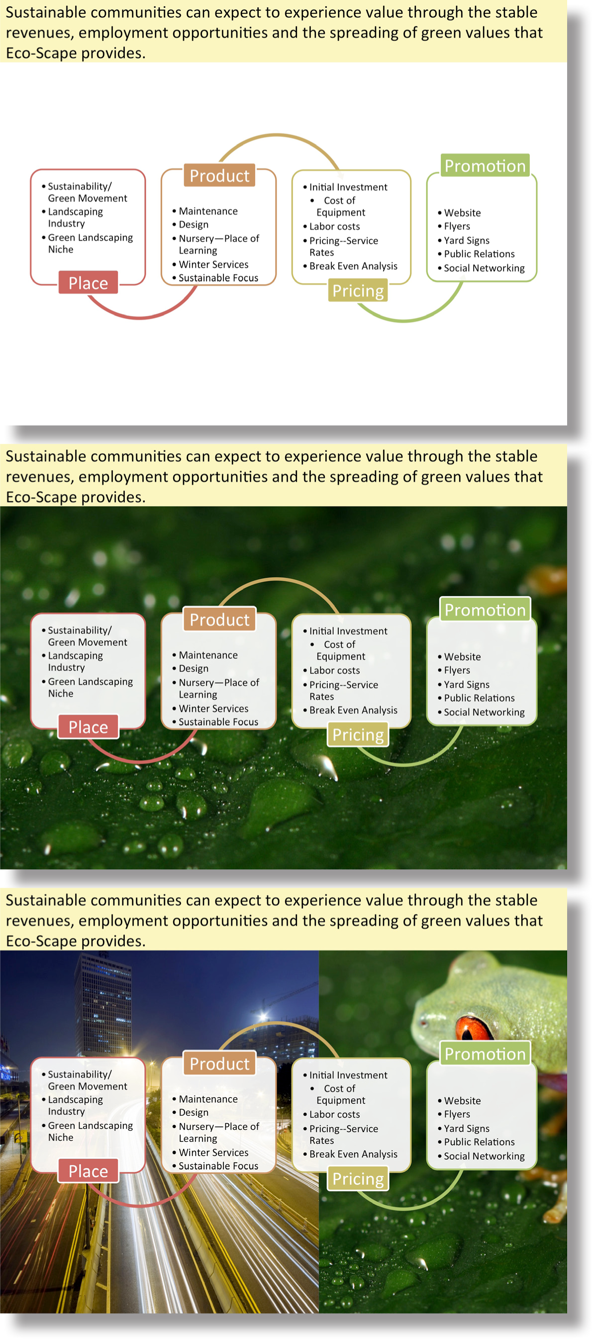
Our preference is for the top slide. With no distracting illustrations the audience can focus on the content. However, the illustration in the middle slide is calm enough so as to be acceptable. The bottom slide is just too busy—it has too much noise.
Use of Empty Space: White Space Is Good!
Resist the temptation to fill every available space on your slide with words or images. White space is good! White space is pleasing to the eye and can represent balance and harmony.
However, too much white space might convey that you don’t have very much to say about a particular topic, or that it is not important. Again, it’s all about balance.
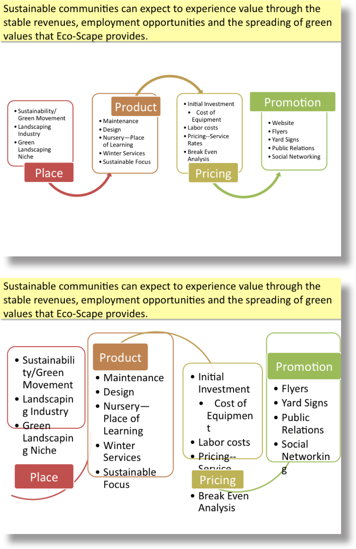
The top slide makes good use of white space to let the image breathe. The bottom slide tries to use up all of the white space and in the process horribly distorts the slide. If it looks cartoonish, then don’t do it.
Rule of Thirds
One of the advantages of using a full page bleed is that the picture is often larger than the slide. This gives you the option of positioning and cropping the picture for maximum visual impact.
For many years professional photographers have used the rule of thirds to compose a picture, and you can too. Simply divide the slide horizontally and vertically in thirds using the guides (see technique). The place where the lines meet are called “power points.” No lie. Try to place your subject whether words or images at the power points for maximum visual impact.

This full page bleed was positioned and cropped so that the key illustrations and text would appear on the “power points” of the slide. The power points are determined by the rule of thirds.
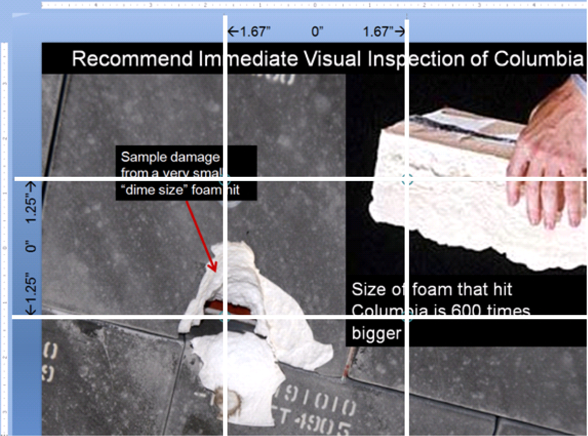
Fills for Text Blocks
The problem with a full page bleed is that the text may be unreadable on top of the image depending on the image. One easy solution is to place the text on top of a fill. The fill may be solid (opaque) or semi-transparent if you would like the picture to show through. In either case, the fill allows you to add dimensionality to your document in much the same way that magazines layer text and graphics on their covers.
The easiest way to create this effect is to create a layout on the master slide. Reposition the title so that it completely covers a strip at the top or bottom of the slide. Then right-click and format the text box adding a fill and adjusting the text color as necessary.
To ensure consistency among slides, turn OFF the auto—fit text. Instead simply set the font size to 24 point.
On individual slides you may have to arrange layers so that the text box sits on top rather than below the graphic.

The same slide shown with black background text above and a 60% semi-transparent screen below.

Presentation Zen Resources
Check out the YouTube video below to see Garr himself present, and learn the essence of Presentation Zen.
Watch Garr Reynolds present:
http://www.youtube.com/watch?v=DZ2vtQCESpk
Garr’s presentation tips on his website:
http://www.garrreynolds.com/Presentation/slides.html
Garr’s blog:
Nancy Duarte, a colleague of Garr Reynolds, has written an excellent book called Slide:ology, which emphasizes similar design themes. Nancy’s firm, Duarte Design, created the multimedia presentation used by Al Gore in the movie, An Inconvenient Truth.
Free Pictures
Free pictures (and some for a fee) may be found at the following links. Please remember to cite sources.
- Everystockphoto search engine (www.everystockphoto.com)
- Flickr Creative Commons (www.flickr.com/creativecommons)
- Image After (www.imageafter.com)
- Morgue File (www.morguefile.com)
- Stock.xchng (www.sxc.hu)
In addition, as a taxpayer, you may use pictures found on most government sites as long as you properly cite them.
KEY TAKEAWAYS
- Used properly PowerPoint can be an effective means of communication. However, most of the time it is used improperly, thereby creating extreme boredom.
- Think of your presentation as an illustrated version of your executive summary. By definition, your executive summary contains the key facts, issues, and conclusions of your report.
- Bookend your presentation with an agenda and a summary with conclusions.
- A PowerPoint theme will not save your presentation if the content is dull.
- C.R.A.P., Presentation Zen, and a little animation will serve to liven up your presentation and give it a professional look.
- Presentation Zen is characterized by many large illustrations, relatively little text, high signal to noise ratios, and effective use of white space.
- The rule of thirds helps to position text and images on a slide.
- You may need to modify your slide master to create an effective Presentation Zen design.
QUESTIONS AND EXERCISES
- In what way do the Presentation Zen concepts help focus attention and preserve only the essential elements? Explain.
L3 ASSIGNMENT: PROFESSIONAL PRESENTATION DEVELOPMENT
Develop professional presentation skills that you can use on the job as well as in your other classes.
Setup
Create a new PowerPoint presentation that complements your schematic report.
Content and Style
- Create an organized, clear, and polished presentation.
- Follow all C.R.A.P. and Presentation Zen principles.
- Create a title slide with your name and the date.
- Create an agenda slide at the beginning and a summary and conclusions slide at the end.
- The body of the presentation should consist of Presentation Zen slides—pictures with very few words.
- Use the Office theme (plain white background).
- Use full page bleeds for the visuals whenever possible.
- Use a contrasting fill or semi transparent screen for text boxes.
Deliverables
Electronic submission: Submit the document electronically.
Paper submission: Print handouts with two slides per page.
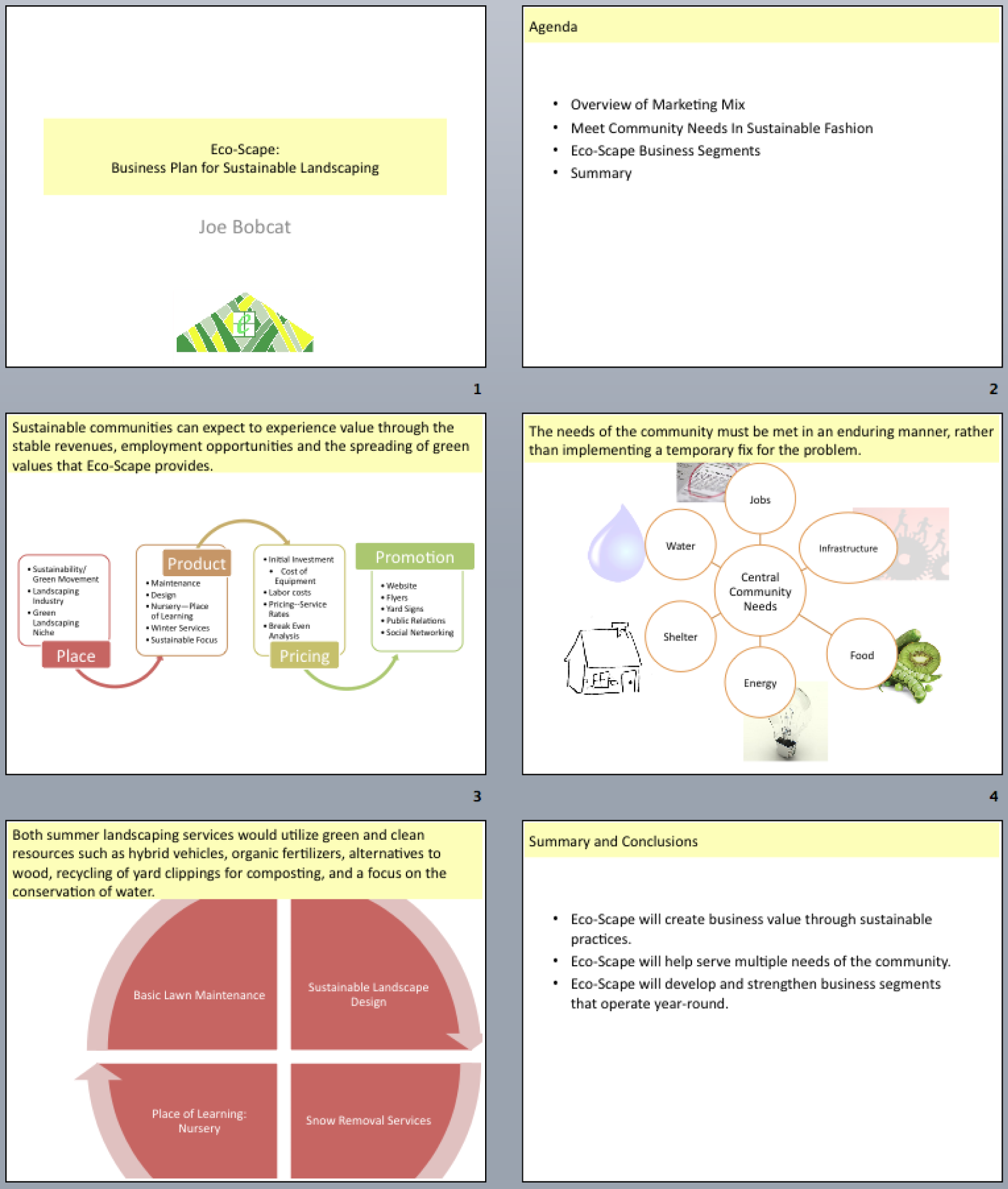
Sample student presentation made from an executive summary. Sentences from the executive summary form the slide headings. Note the graphics are the same as from the schematic report—only enlarged.
Chapter 13 Establishing Credentials: Networking and Placement
13.1 Cover Letters, Resumes, Interviews
LEARNING OBJECTIVES
- Manipulate type and alignment to reproduce a cover letter
- Use design principles to reproduce a resume
- Identify critical elements in cover letters, resumes, and responses to interview questions
- Distinguish between traditional and behavioral based interview questions
- Following design and content principles, create your own resume, cover letter, and responses to interview questions
- Choose and successfully employ MS-Word techniques to solve a complex task
Introduction
There are at least two situations in which you will need to provide a cover letter and resume. One is when applying for a job. However, when you apply for a business loan you may also be asked for a resume. After all the bank wants to gauge whether or not you have the experience and talent to make the business a success.
Your job is to summarize, highlight, and organize your experiences and skills so that it is easy for an employer or loan officer to see what you have to offer. There are guidelines available to help you format your resume and cover letter in an organized and effective manner. Even the most impressive professional experiences can come across poorly if they are displayed on an unorganized resume.
Most of this chapter is written from the perspective of a job search. We have done this so that you will be able to reference the chapter upon graduation to look for a job. However, the same lessons are equally useful in applying for a loan for the purposes of our iPhone assignment.
Initially, employers spend an average of less than one minute looking over a resume, so you need to sell yourself well by having a resume that stands apart from the rest. A resume is your first impression to a potential employer. During a job search, it is the most important tool you can use to get your foot in the door for an interview with a desired employer.
This chapter will provide valuable guidelines to help you create a well-designed and organized resume and cover letter.
Where Are We in the Life Cycle?
Many information systems projects are conceived of in a life cycle that progresses in stages from analysis to implementation. The diagram below shows the stages that we touch in the current chapter:
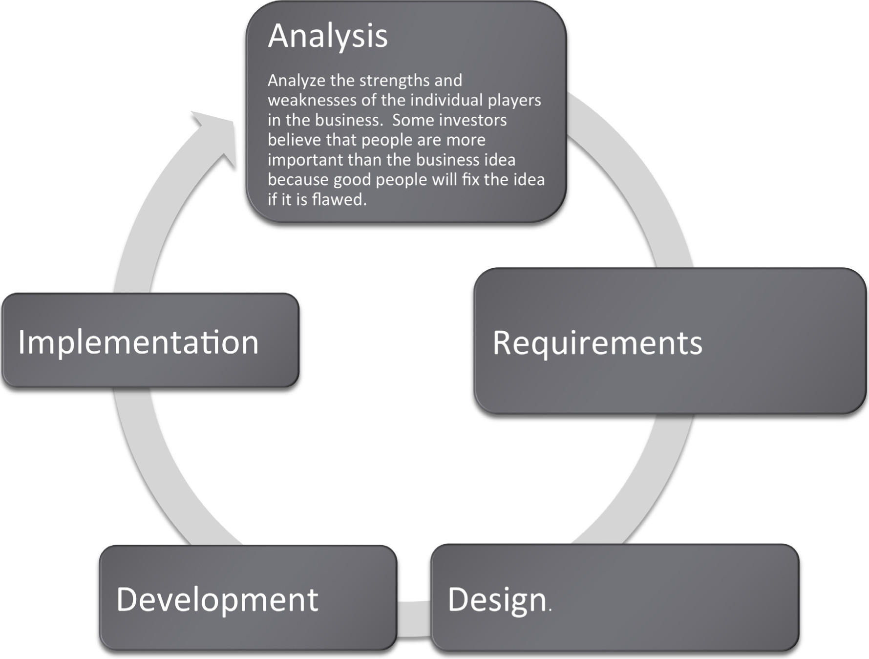
Creating a Cover Letter
When sending a resume to an employer, it is often appropriate to include a cover letter. The purpose of a cover letter is to introduce yourself, explain your reason for contacting the employer, and to sell yourself as a desirable candidate for employment.
Introduction
A cover letter may be your first contact to an employer, or it could be a follow up from a previous meeting. If it is a follow up, remind the employer about your interaction to help him or her recall the original meeting.
Reason for Contact
A cover letter should explain your reason for contacting an employer. There are two types of cover letters: letters of inquiry and letters of application. A letter of inquiry is written when you want more information regarding potential job openings. A letter of application is written when you know specifically which position you would like to obtain and to inform an employer of your qualifications for employment. In both types of letters, you should include information that you already know about the employer and/or position and why you are interested in working for the company. This shows your interest and demonstrates that you have taken the time to research the company.
Sell Yourself
A cover letter should be used to sell yourself more effectively to a potential employer. In a resume, you have limited space to outline yourself and your experiences. In a cover letter, you have much more space to highlight your skills and what you can contribute to the company. You can use the letter to expand upon your best qualities or most important experiences or achievements. You can also emphasize information that directly relates to the position for which you are applying, furthering your chances for consideration. It also allows you to demonstrate your written communication skills.
Writing and Printing a Cover Letter
Cover letters should be personalized and should be prepared individually with each job application. They should be addressed to a specific person, not just a company or department. You can find employee addresses in directories on the company website or through a personal inquiry. CareerSearch®, is a web-based employer research system, and the VAULT Online Career Library are two other ways to research companies and find contact information.
Cover letters should be no more than one page long and should be produced on the same paper as your resume and reference sheet. Also, be sure to double check grammar and spelling to avoid unprofessional errors, and use an organized and neat letter format.
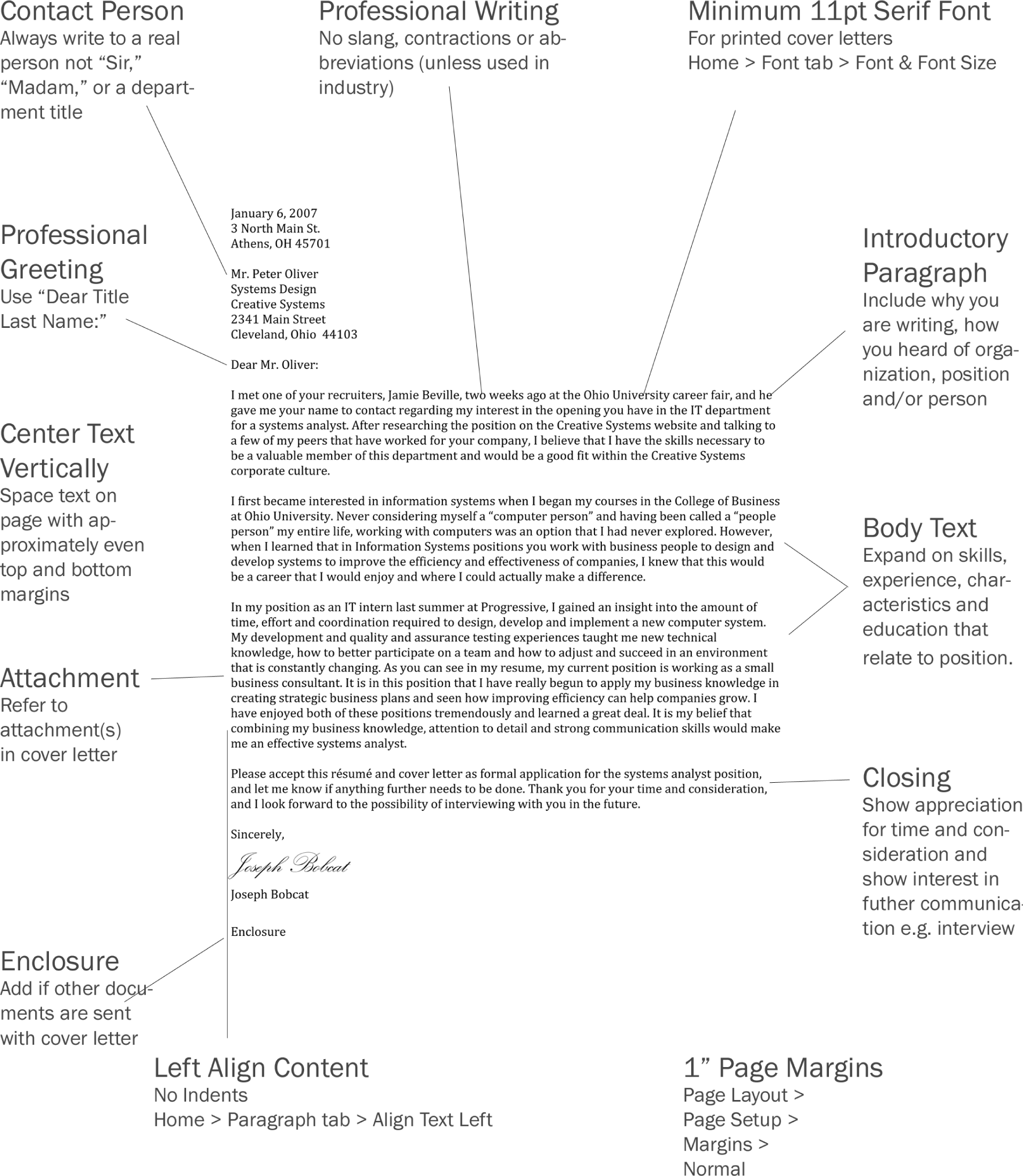
Creating a Resume
A resume is an employer’s first impression of a potential employee. Before you start creating a resume, you will need to gather information concerning your skills and experiences and decide on a career goal.
Content
As you gain career experiences, you will need to update your resume. You may also want to tweak your resume for specific positions for which you are applying to include your knowledge and skills pertaining to that particular job. Though each copy of your resume that you hand out may differ slightly, most resumes need to have the same basic content.
Contact Information
A resume should contain your personal contact information so an employer can reach you for an interview. It should be displayed prominently toward the top of your resume and should include your name, address, phone number, a personal website (if you have one) and an e-mail address. Be sure that you use a professional e-mail address.
Objective
Including an objective on a resume is optional. If you decide not to include an objective, be sure to state this information in your cover letter. An objective should be clear, concise, and should state what you can do for an organization rather than what it can do for you. It should also be updated for each position or employer.
Education
In this section, list all academic information in reverse chronological order with the most recent listed first, including each school you have attended, graduation or expected graduation date, degree(s) earned and major(s), and your GPA (if it is over a 3.0).
Work Experiences
Work experience should also be listed in reverse chronological order and can include any volunteer positions, internships, co-ops, field or practicum experiences, and major class projects. For each listing, include the employer name and location, position title, dates of employment, and at least two points explaining your responsibilities.
Relevant Courses
You may list courses that apply directly to your career goals, but list the full course title rather than the abbreviation.
Activities/Associations
This section should include your extracurricular activities and interests. List any professional organizations, student organizations, athletic teams, or other clubs to which you belong. You may also include any honors or awards you have received or any professional workshops you have attended.
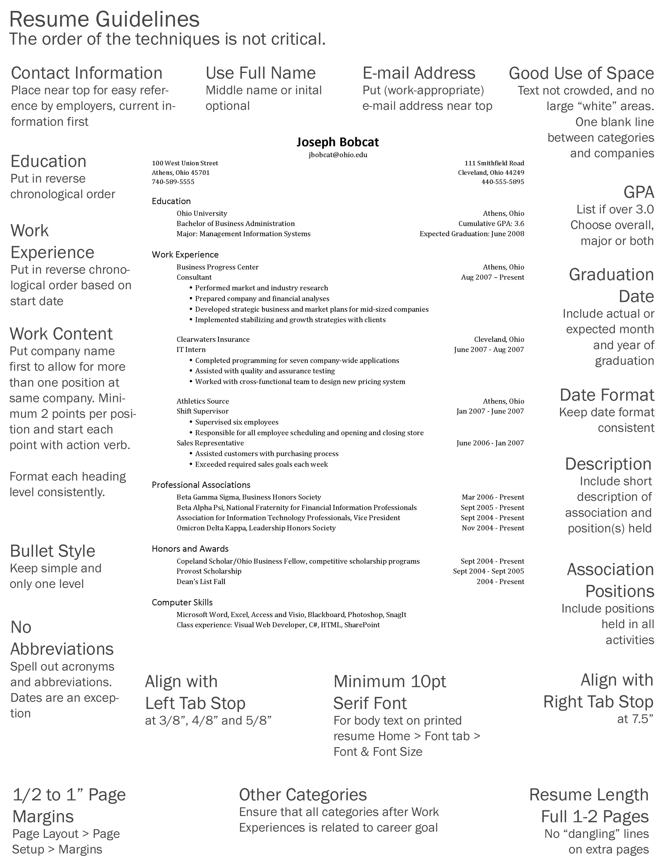
Interviewing Guidelines
Most people are familiar with traditional interviews and can anticipate what type of questions they will be asked in the interview process. Many companies are now using behavioral interview questions in order to discover an applicant’s skills and capabilities.
Traditional Interviews
In a traditional interview, applicants are asked about themselves and their experiences found on their resume. Possible questions include:
- “Please tell me a little about yourself.”
- “What are your strengths and weaknesses?”
- “Why do you think you are the best candidate for this position?”
Behavioral Interviews
In a behavioral interview, the skills and characteristics desired for the chosen employee have already been decided, and the questions that will be asked will be based on those qualifications and will require interviewees to give specific examples of past experiences and how they have handled those situations. This helps the employer see how candidates are likely to perform in similar situations likely to occur in the new position. These questions may be interspersed in conversation or they may be in a set list of questions to be answered. An example question may be, “Describe a difficult problem that you tried to solve. How did you identify the problem and solve it?”
What Employees Look for During an Interview
Employers most commonly look for the following skill sets during an interview:
- Problem solving
- Leadership and teamwork
- Dealing with ambiguity and conflict
- Listening and communication skills
- Showing creativity, assertiveness, and decisiveness
- Demonstrating initiative, and determination
How to Prepare for an Interview
Before an interview, you can prepare by planning to answer possible questions that may be asked. Since no two interviews are alike, it is wise to prepare for both behavioral and traditional interview questions. By reading the position’s description, you can often get a sense of what types of questions will be asked and which of your skills you should be prepared to discuss. Also, be sure to review your resume before an interview to remind yourself of experiences you can talk about with the employer.
Answering Behavior-Based Questions
Employers who ask behavior-based questions want interviewees to describe specific projects, situations, or experiences that can apply to the open position. Before answering a behavior-based question, make sure you understand the question and do not be afraid to ask for clarification if something is vague or unclear. In each response, the interviewer is looking for three main things:
- Problem or situation — describe the context of the situation
- Action — explain what you did
- Result — show the outcome or solution
PAR Examples
By including a problem or situation description, your actions, and a solution in your answer, you can respond to interview questions on PAR. Your responses will help the interviewer understand how you behaved in a certain scenario and determine if you would be a good fit for the open position. Below are two examples of complete and well-structured responses to behavioral interviews questions:
“Please tell me about a time that you worked in a team where the work was not being shared among the members. How did you react to the situation?”
P: I was working on a team with four others on a project in my Management capstone course. Our roles in the assignment were delegated by our group leader, and one member of our team wasn’t doing her portion of the work. Our group leader even confronted her during a group meeting, but she just shrugged and said she was trying, but I could tell she was embarrassed to talk about it.
A: After our meeting, I suggested that she and I meet for coffee. I asked her how she felt about the project and how her section was coming along. She explained that she wasn’t confident about doing the research task she was given because she didn’t know how to use many of the resources that were required by our professor. She said she felt badly but was embarrassed to be singled out in front of the whole group. I told her that we could have a general discussion about the project tasks in the next group meeting so she wouldn’t be singled out. During that meeting, I suggested that everyone share their general strengths instead of weaknesses and encouraged everyone to participate. It turned out that her strength was editing and formatting, and the person formally responsible for that portion of the project had a knack for research, so they switched tasks.
R: Because they were both more comfortable with their new responsibilities, they were happier and more productive. I learned from that experience that laziness isn’t always the reason that people don’t participate, and it’s important to find out what motivates people in order to help create a productive and cohesive team.
“We don’t always agree with a professor’s evaluation of us. Tell me about a time when you disagreed with a particular professor’s evaluation. How did you handle the situation?”
P: It was my third year here at the university. I was taking a speech class that required us to give five minute speeches in front of the class every other week. For my first speech, we were asked to evaluate our favorite Super Bowl commercial and explain why we felt it marketed so well to its audience. I was nervous during my presentation, but felt I covered everything I needed and that it went well. Afterward the presentation, the professor gave me a C+. I set up a meeting to speak with her the next day during office hours.
A: She explained to me that I didn’t follow the necessary format for my presentation. She also mentioned that I could have made better eye contact and engaged my audience more. At this point, I felt since this was my first speech class that my approach and preparation for my speeches may not be working. I needed to make some adjustments to my presentation technique, and I started attending weekly help sessions with one of her teaching assistants. In addition to those sections, I asked my professor for some additional feedback prior to each presentation.
R: I received an A on the very next presentation and every presentation afterward. I learned from this class that you always have to be open to adjusting your learning style as you take different classes during your time at the university.
KEY TAKEAWAYS
- Interviews may be either traditional or behavioral. A traditional interview normally uses open ended questions that ask you to reflect on your abilities. A behavioral interview asks you to recall how you performed in specific situations. Many businesses are moving towards behavioral interviews on the theory that past behavior is the best predictor of future behavior.
- Answer behavior based questions using the problem, action, result (PAR) method.
- In a world where all resumes look about the same, applying graphic design principles can help your resume and cover letter stand out.
QUESTIONS AND EXERCISES
- To what extent do online job posting services such as Monster.com let you preserve the formatting in your resume? Investigate two services and provide results.
Techniques
The following techniques, found in the Word section of the software reference, may be useful in completing the assignments for this chapter: Increase/Decrease Indent • Line spacing • Margins • Ruler • Tab-left • Tab-right • Text-align • Text-bullet • Text-format
L1 ASSIGNMENT: COVER LETTER DESIGN
This exercise also helps you become more familiar with Word and how to format professional documents.
At some point you will apply for a job. You will have to prepare a resume (the L2 exercise). However, for the personal touch often a cover letter is written to accompany the resume.
Setup
Download the file Cover Letter Before.doc from the class web site and save it to your folder. Start MS Word and open the file. Format the given cover letter so that it looks like the “After” example. Use the techniques on the following pages.
Content and Style
Recreate the After example so that your format and alignment is similar to the example.
- Heading and spacing should be the same as the “After” cover letter.
- Fill in any missing elements.
- Add the greeting to the letter.
- Add your name at the bottom and use a script font for your “signature.” In real life you would print out and sign the letter.
- Be sure to use the current date to begin your letter.
Deliverables
Electronic Submission: Submit the “After” cover letter version electronically.
Paper submission: Print the “After”document directly out of Word.
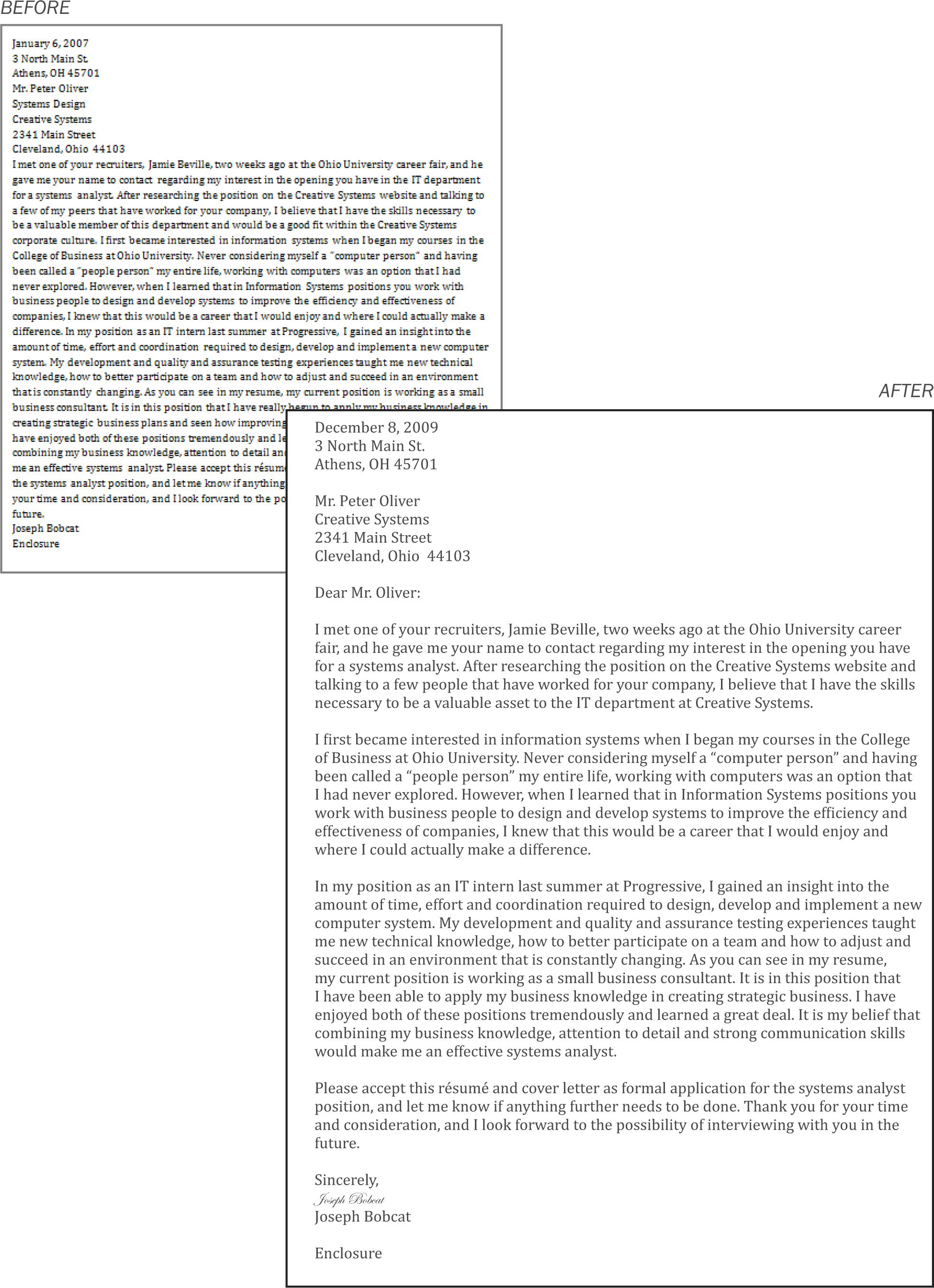
L2 ASSIGNMENT: RESUME DESIGN
This exercise helps make sure that your resume goes in the “good” pile.
Your resume is the number form of communication that you have to apply for a job. It has to be perfect to help present yourself well. Most resumes are viewed for less than a minute by recruiters.
Setup
Download the file Resume Before.doc and save it to your folder. Start MS Word and open the file. Format the given resume so that it looks like the “After” example. Use the techniques on the following pages.
Content and Style
Recreate the “After” example making sure that your alignment and spacing is similar to the example. Each heading level and text should be formatted CONSISTENTLY.
- Add your name and your email address at the top of the page in place of Joe Bobcat’s.
- To start: Set the margins to narrow. Then highlight the entire document (Ctrl + A) and place Left Tab Stops at 3/8″, 4/8″, and 5/8″ and a Right Tab stop at 7.5″. Each time you press the Tab key, the content will move to the next Tab stop.
-
Follow these guidelines for fonts.
- Name: Choose a sans-serif font and make it very large.
- Body text: Choose a serif font.
- Category headings: Same sans-serif font as your name, 2 points larger than body text size, bold.
- School/company name: Same sans-serif font as your name, body text size.
- Position: Same sans-serif font, body text size, italicized.
- Body Text: 10 pt or larger text size, Serif font.
- Make sure there is one blank line between categories and after each employer section.
- Make sure your e-mail address does not become hyperlinked (blue and underlined). If it does become hyperlinked, right click on your e-mail address and select Delete Hyperlink.
Deliverables
Electronic submission: Submit the “After” resume version electronically. It should be only one page.
Paper submission: Create a printout of your “After” resume. It should be only one page.
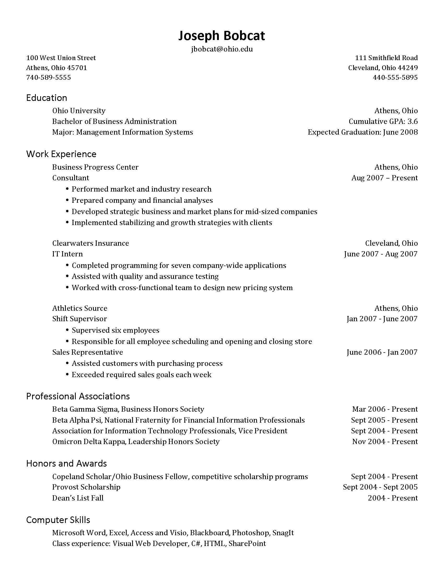
L3 ASSIGNMENT: RESUME, COVER LETTER, AND INTERVIEW
Customize a cover letter, resume, and answer interview questions to prepare for life outside of college.
When you’re out looking for a job, you’ll need a resume (maybe several versions) and likely an individual cover letter for each position for which you apply. It is important that you always keep an updated version of your resume, constantly adding to it each time you get a new job, master a new skill, or anything else that could have an impact on your future career. You will also answer sample behavioral based interview questions in this assignment.
Setup
Create your resume and cover letter in two separate Word documents.
Content and Style
Create a resume and cover letter tailored to your ideal job or internship and answer behavior-based interview questions. You should have your contact information, school details, and work experience on your resume. The other categories that you choose to include are based on your experiences and career goals. You will be graded on both your content and formatting. An additional Word document should be submitted with answers to two behavioral-based questions, which will be graded on your clear and concise use of the PAR method.
- The most important characteristic of your documents is professionalism. Spelling and grammar must be perfect, so make sure you proofread, and have someone else proofread for you.
- Make sure to follow the formatting guidelines from the L1 and L2, although your content will obviously vary from the examples.
- Your resume does not have to be in the same exact layout as the L2, but it should follow all of the guidelines in this chapter.
- You can add and remove categories as your resume content demands.
- You must create your own content for the cover letter. DO NOT COPY THE EXAMPLE IN THE L1. Create your own content in both the resume and cover letter.
- If you only have one address, center align it on the resume
- The cover letter should be addressed to a person. If you don’t know one, make up a name.
- Make sure your e-mail address does not become hyperlinked (blue and underlined). If it does become hyperlinked right click on your e-mail address and select Delete Hyperlink.
-
Please answer any two of the following questions in a separate Word document. Follow the PAR method, and be sure to use your own experiences in your answers.
- Tell me about a skill or technique you learned in school and how you have put that to use in real life.
- How did you make the decision to attend your college or university?
- Tell me about a time when a project was changed after you had already done a significant amount of work. How did you react?
- From a student’s perspective, what is your definition of good performance? What do you do to perform up to that standard?
- Describe a time you made a risky decision. What happened?
Deliverables
Electronic submission: Submit the resume, cover letter (“signed”), and interview answer documents –totaling three separate documents, electronically.
Paper submission: Create a printout of your resume, cover letter, and interview answer document, and sign your cover letter with black or blue ink.
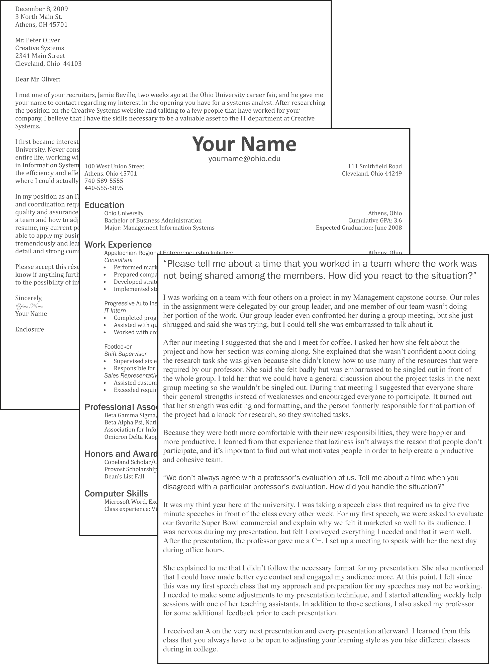
Chapter 14 Microsoft PowerPoint Techniques
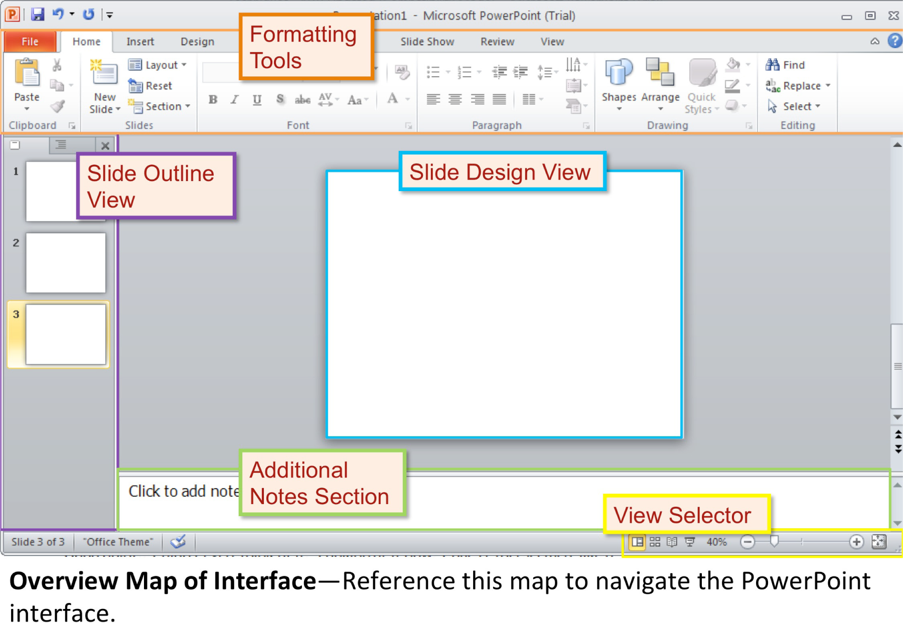
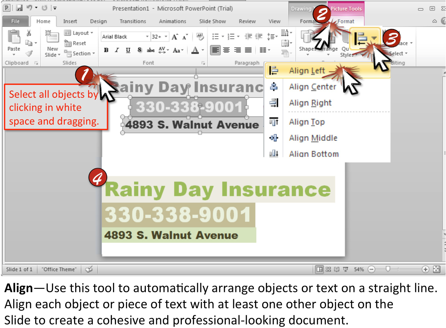
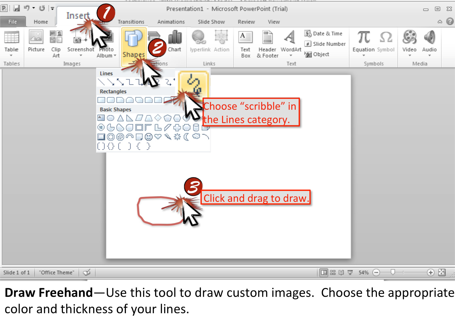
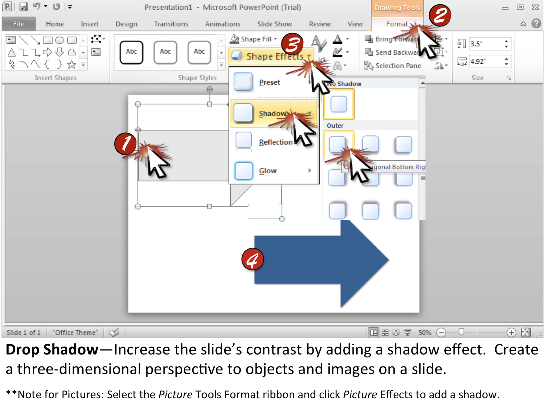
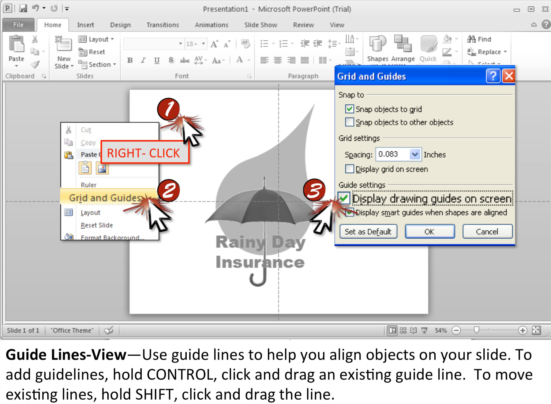
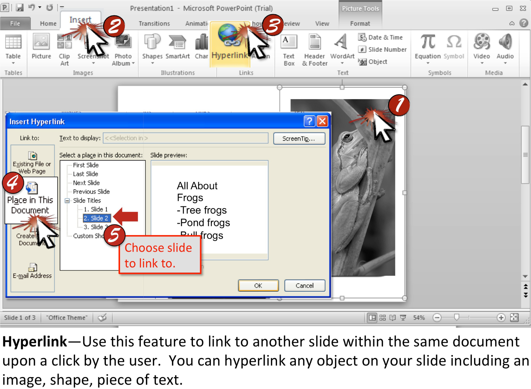
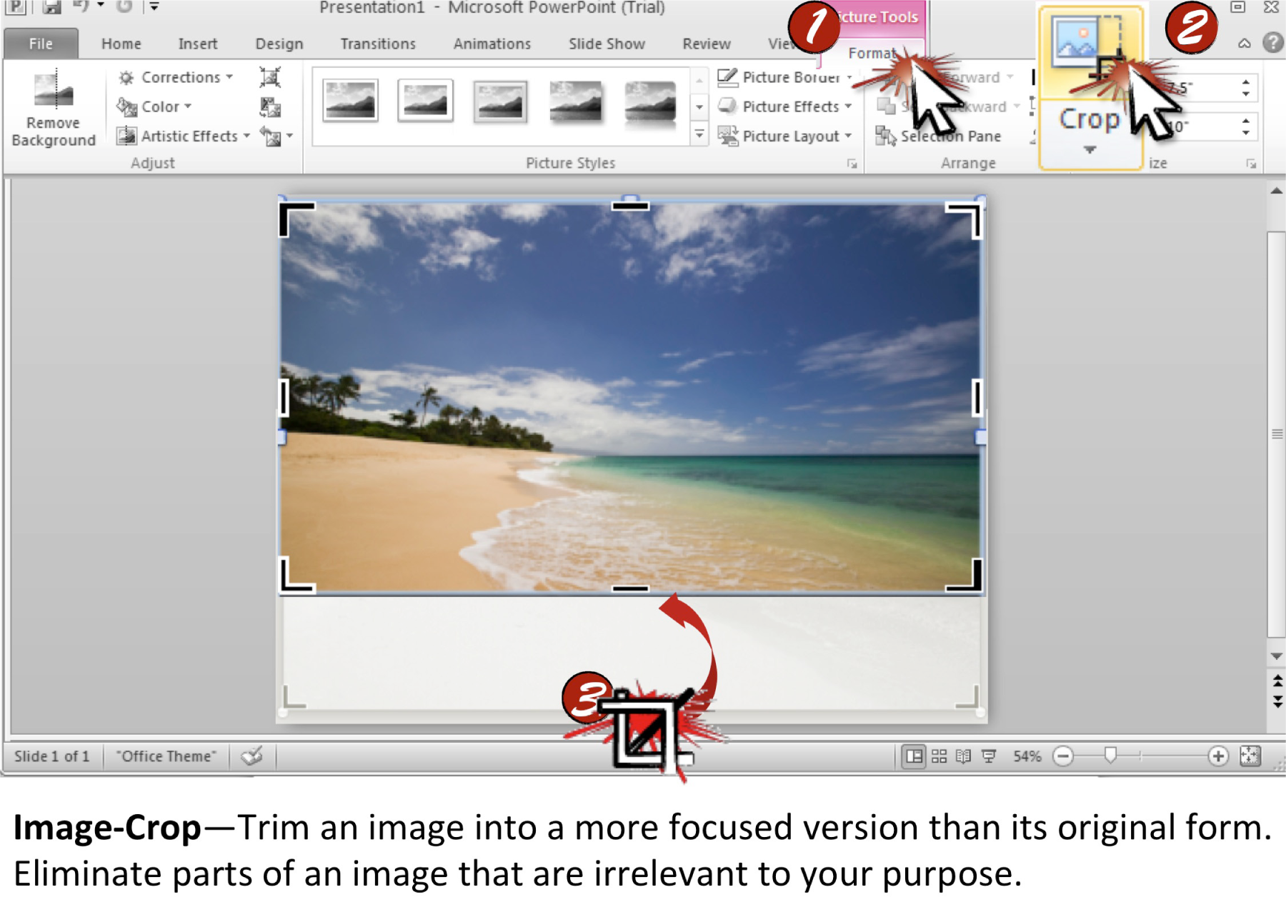
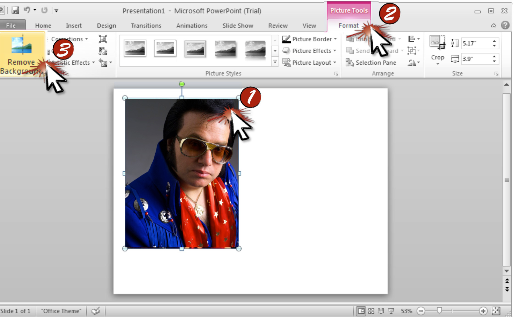
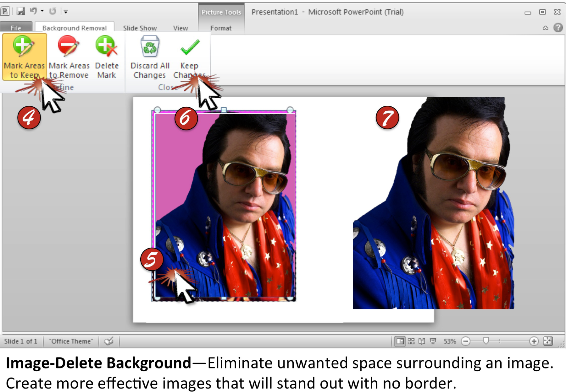
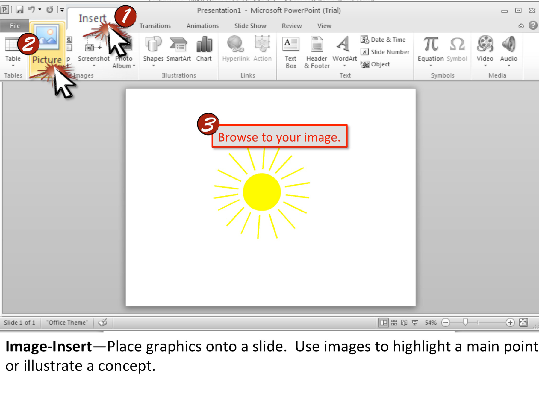
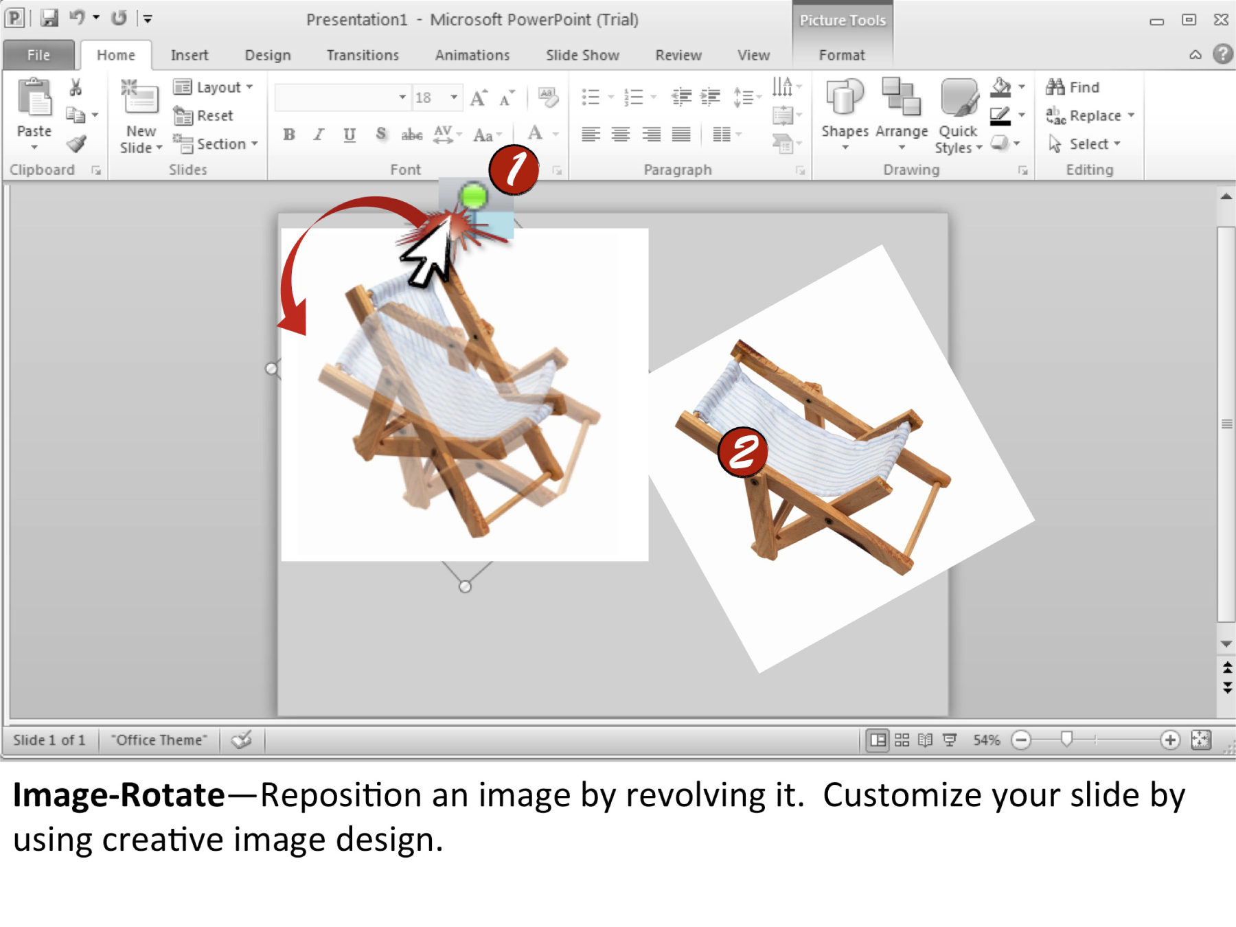
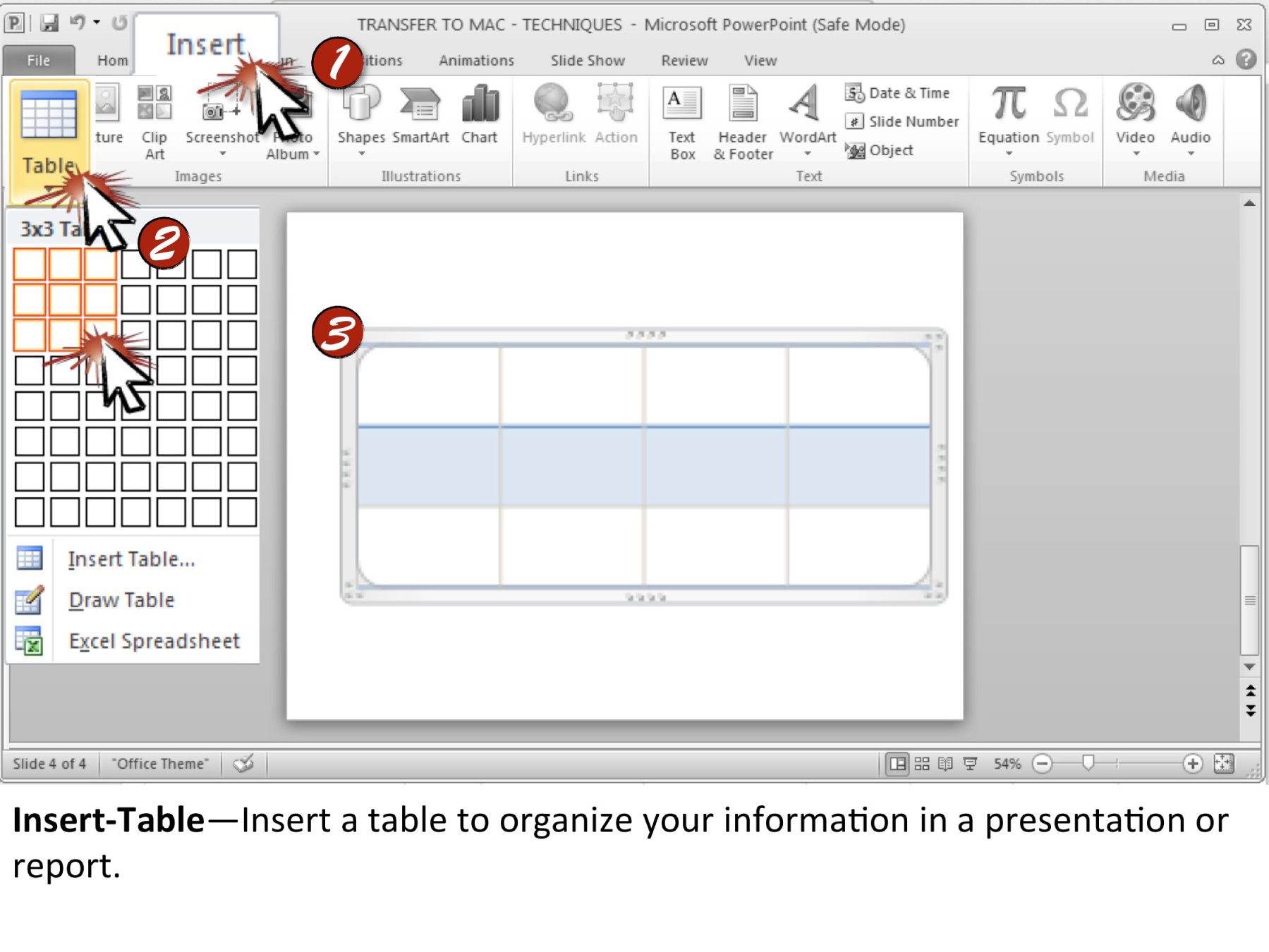
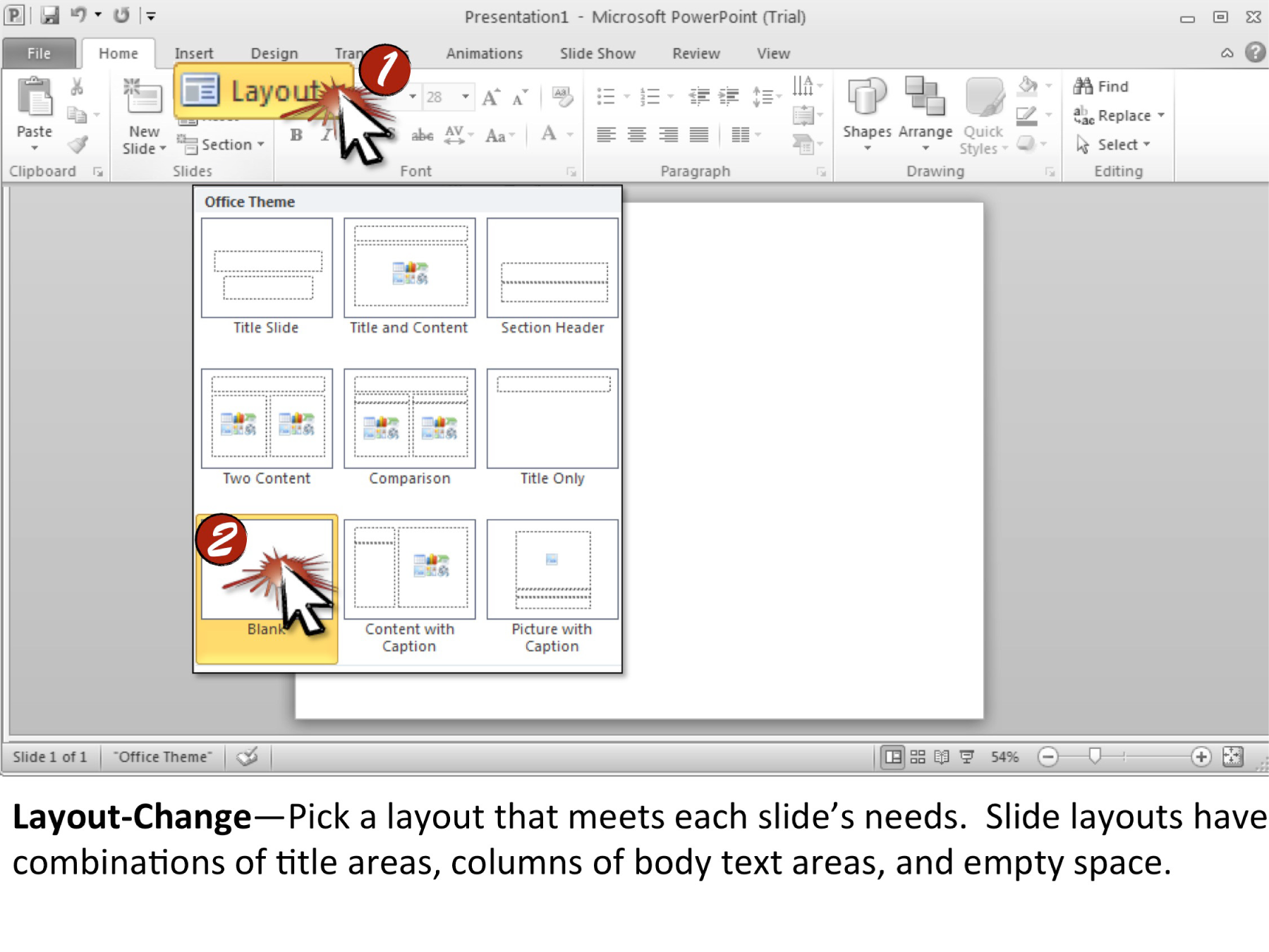
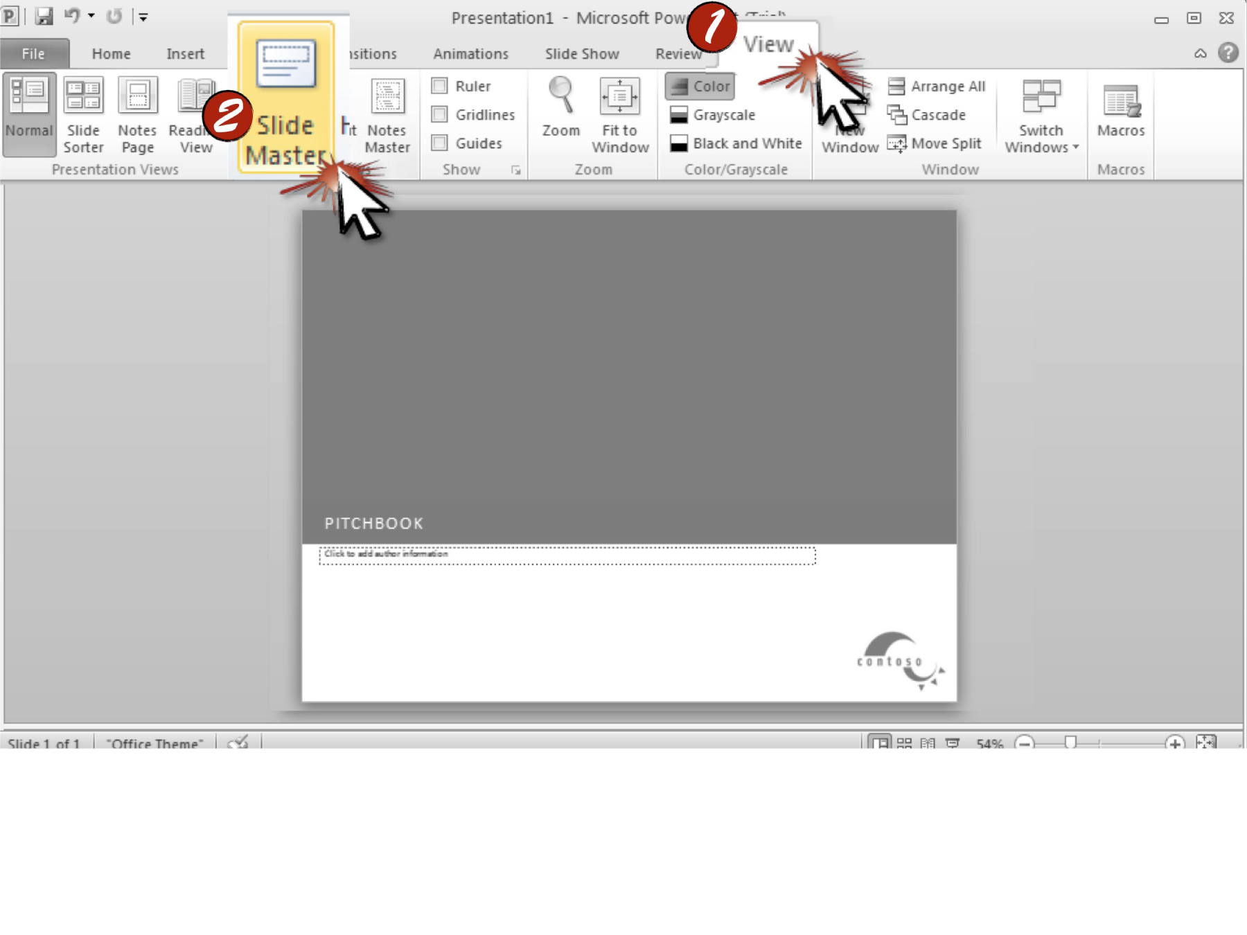
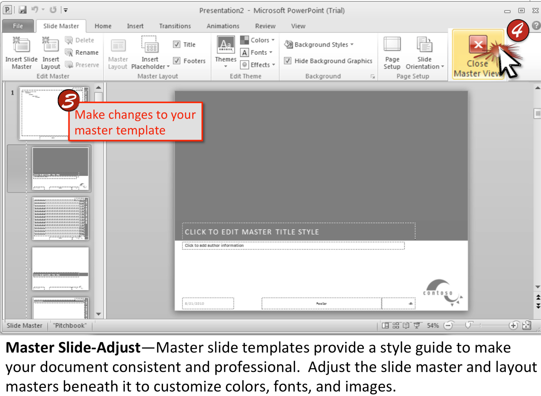
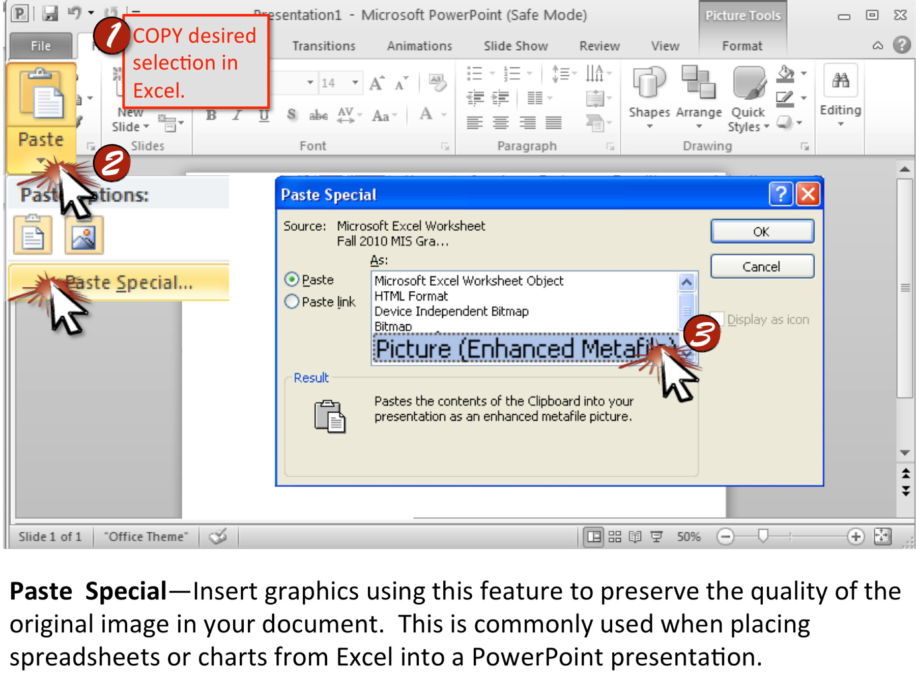
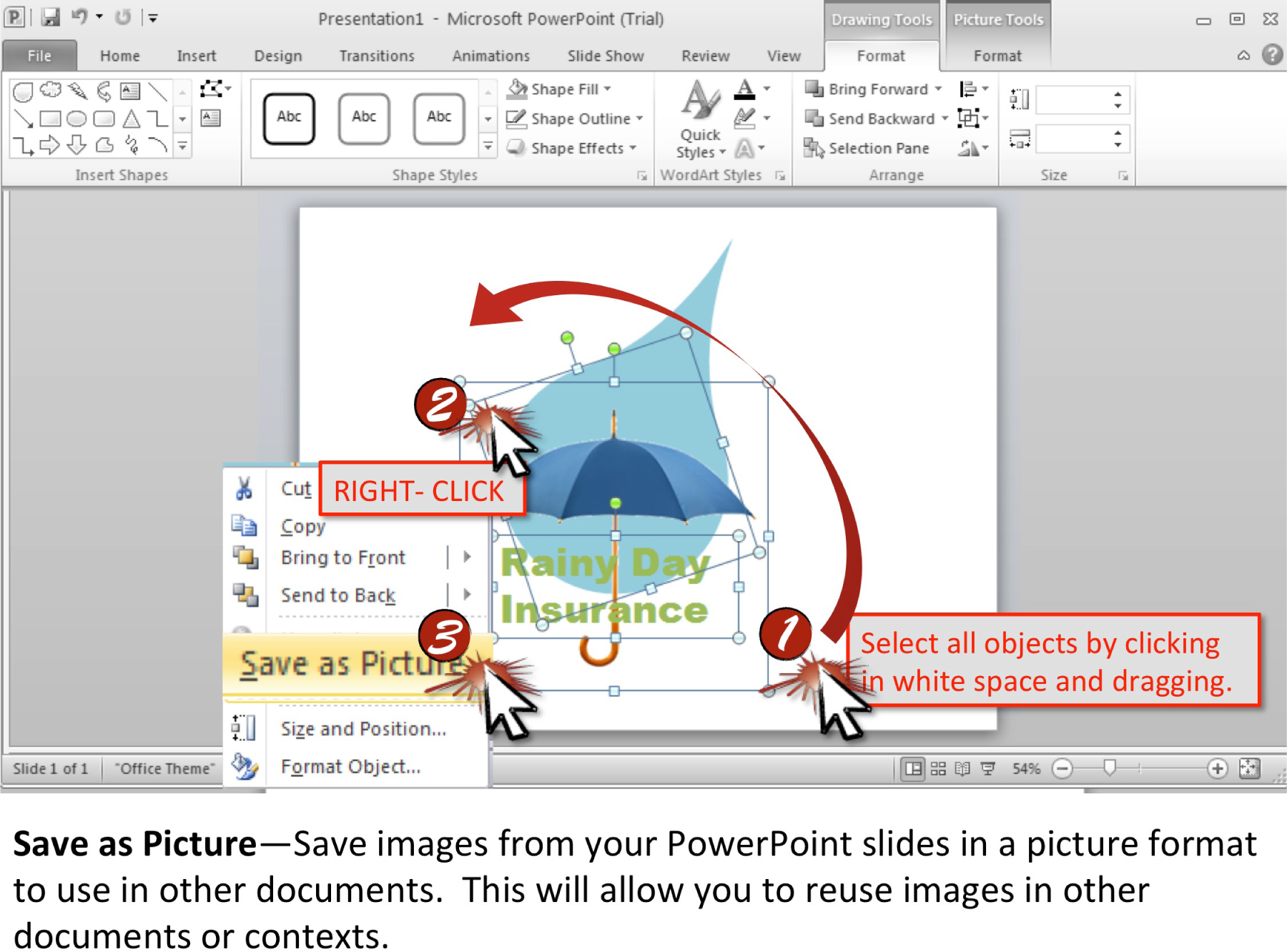
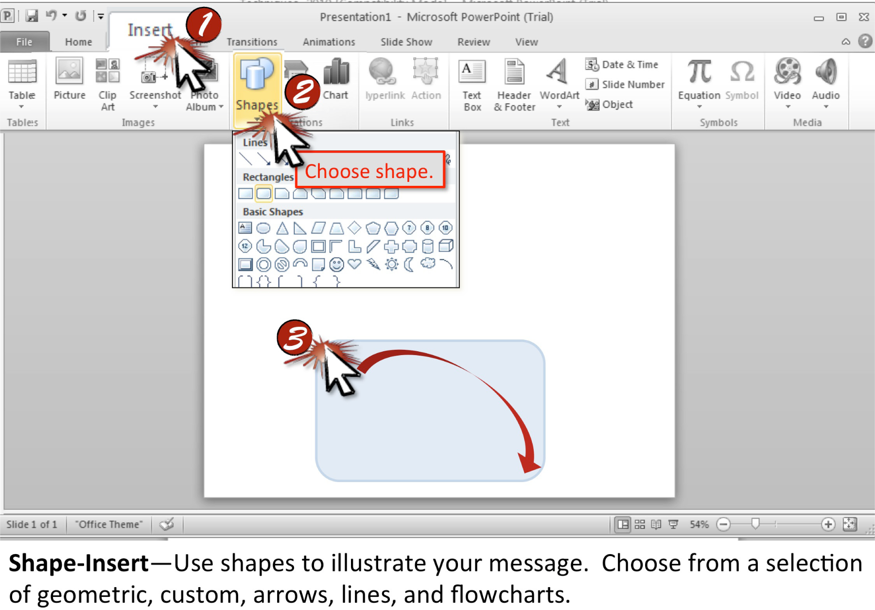
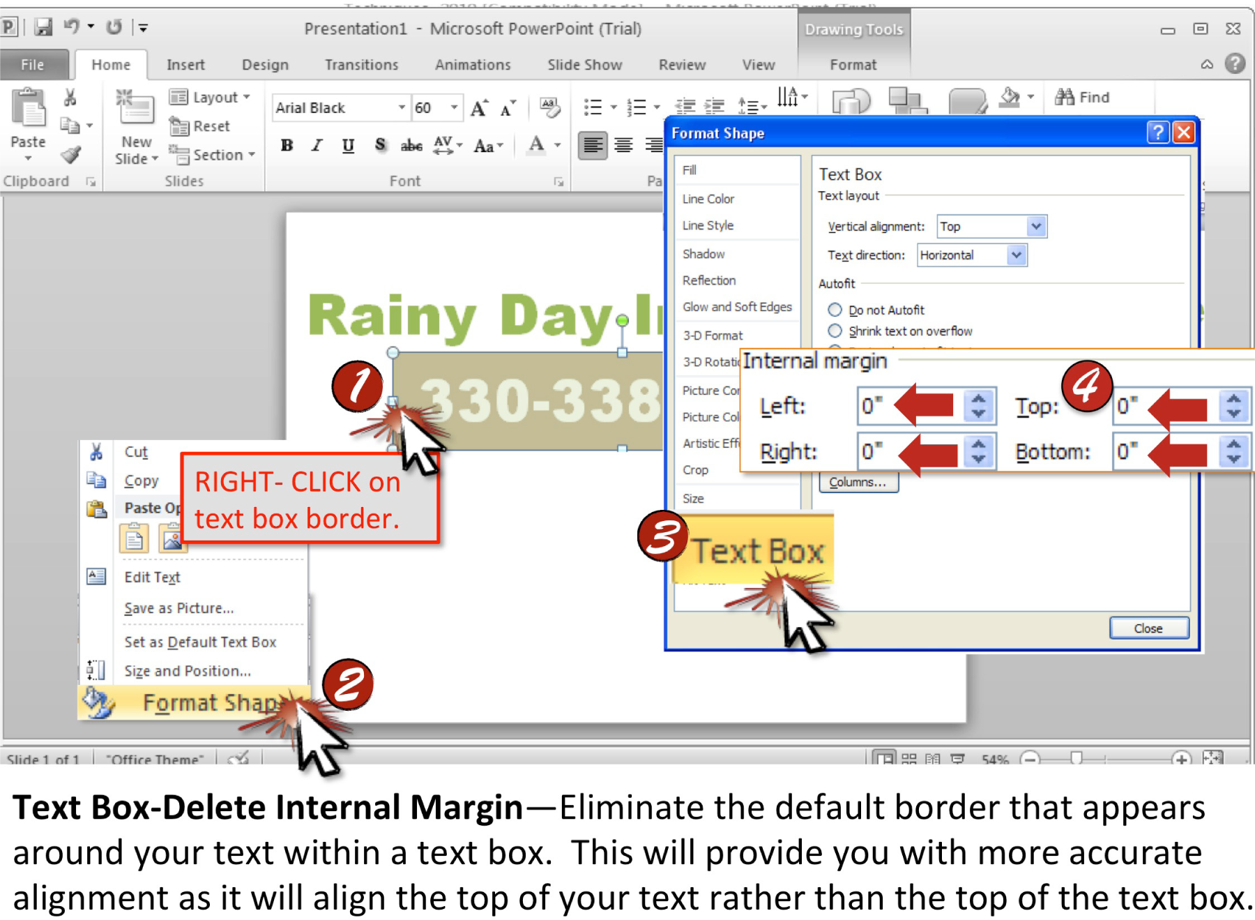
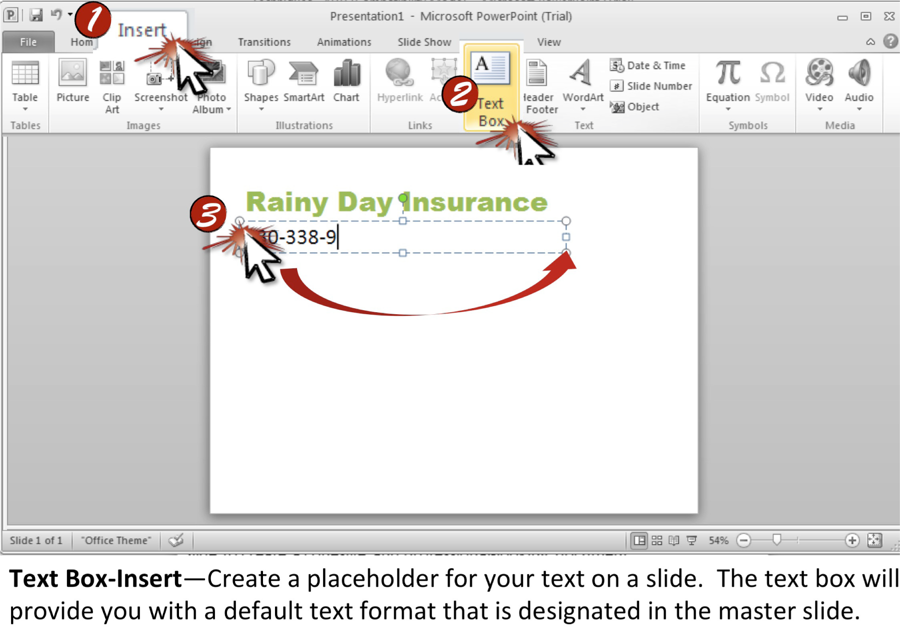
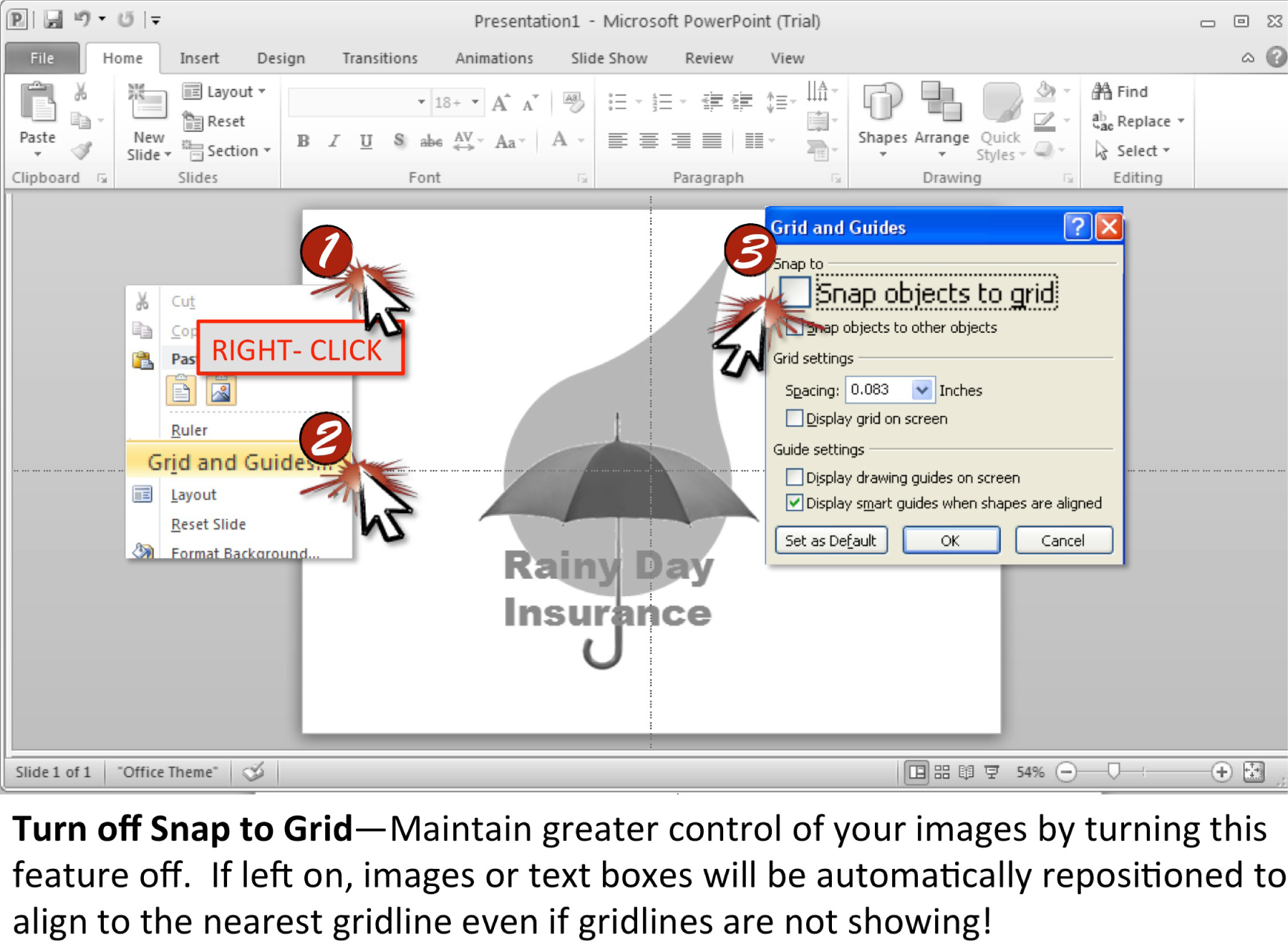
Chapter 15 Cloud Computing Techniques
Dropbox, Adobe Kuler Colors, Google Gmail, Sites, and Docs
15.1 Dropbox
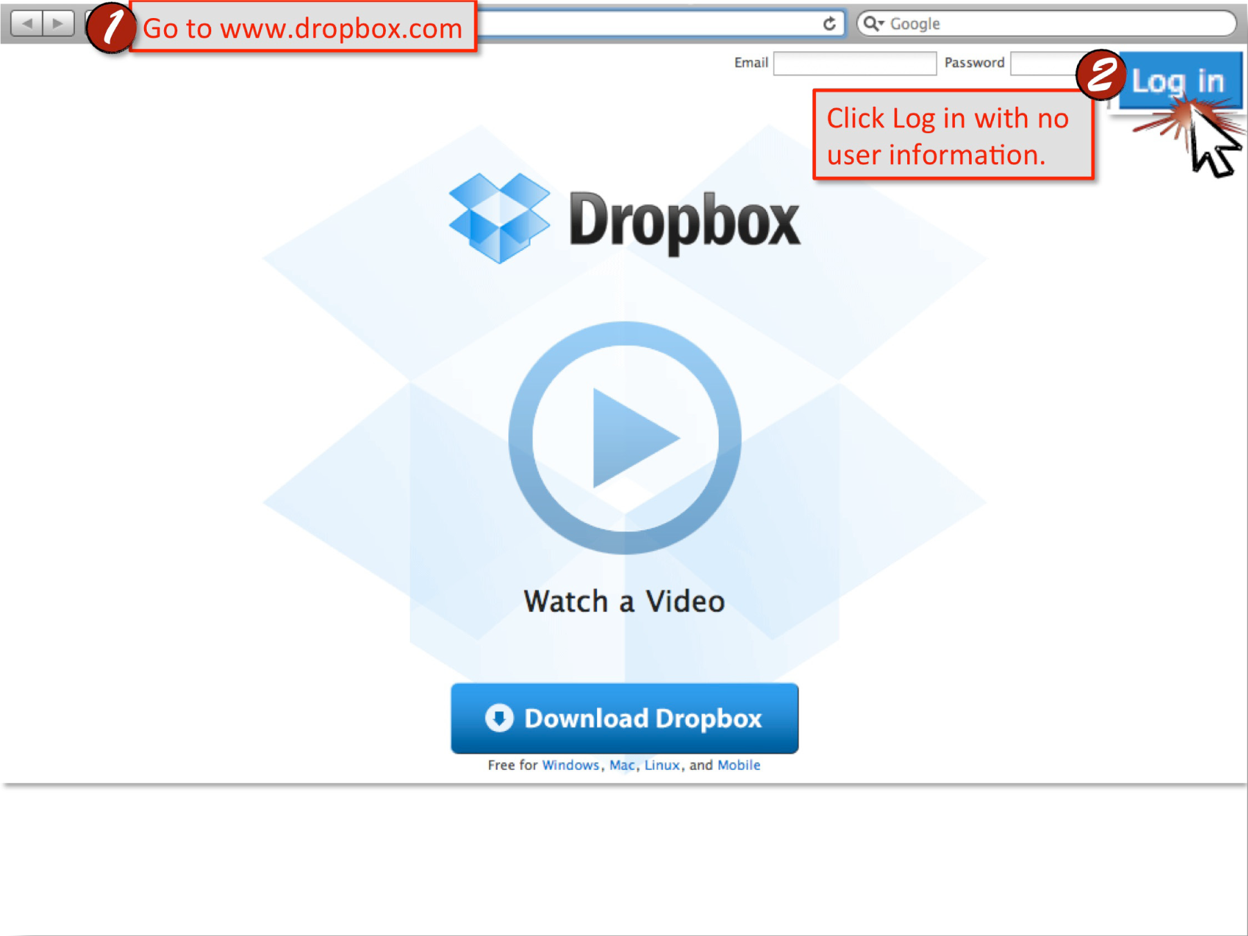
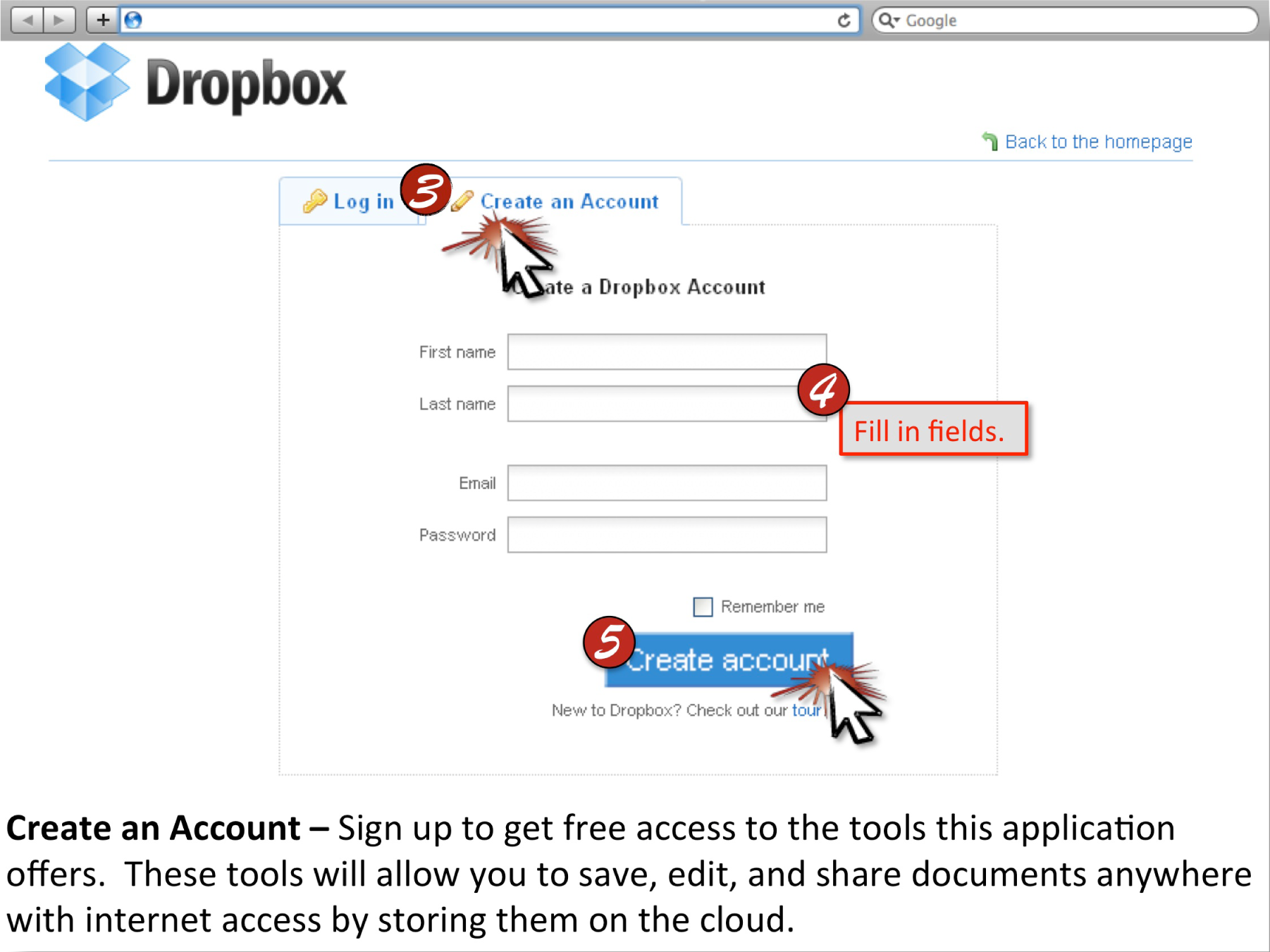
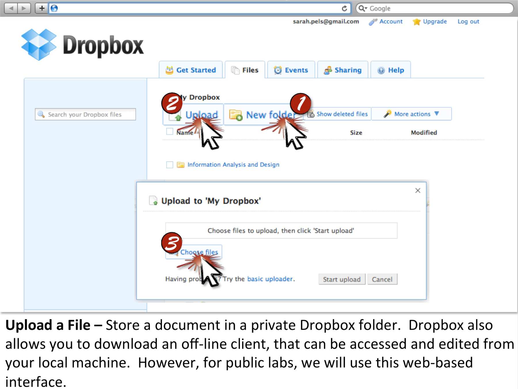
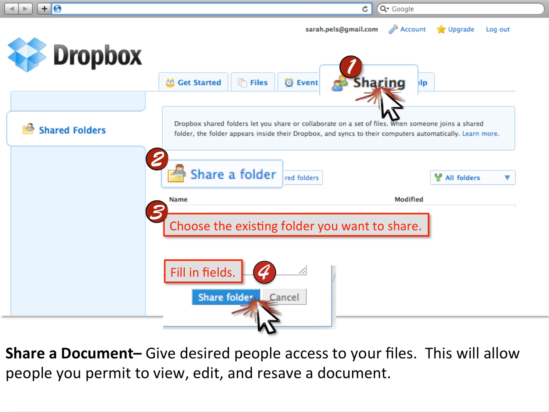
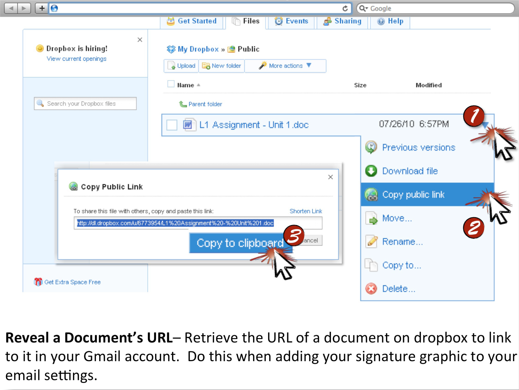
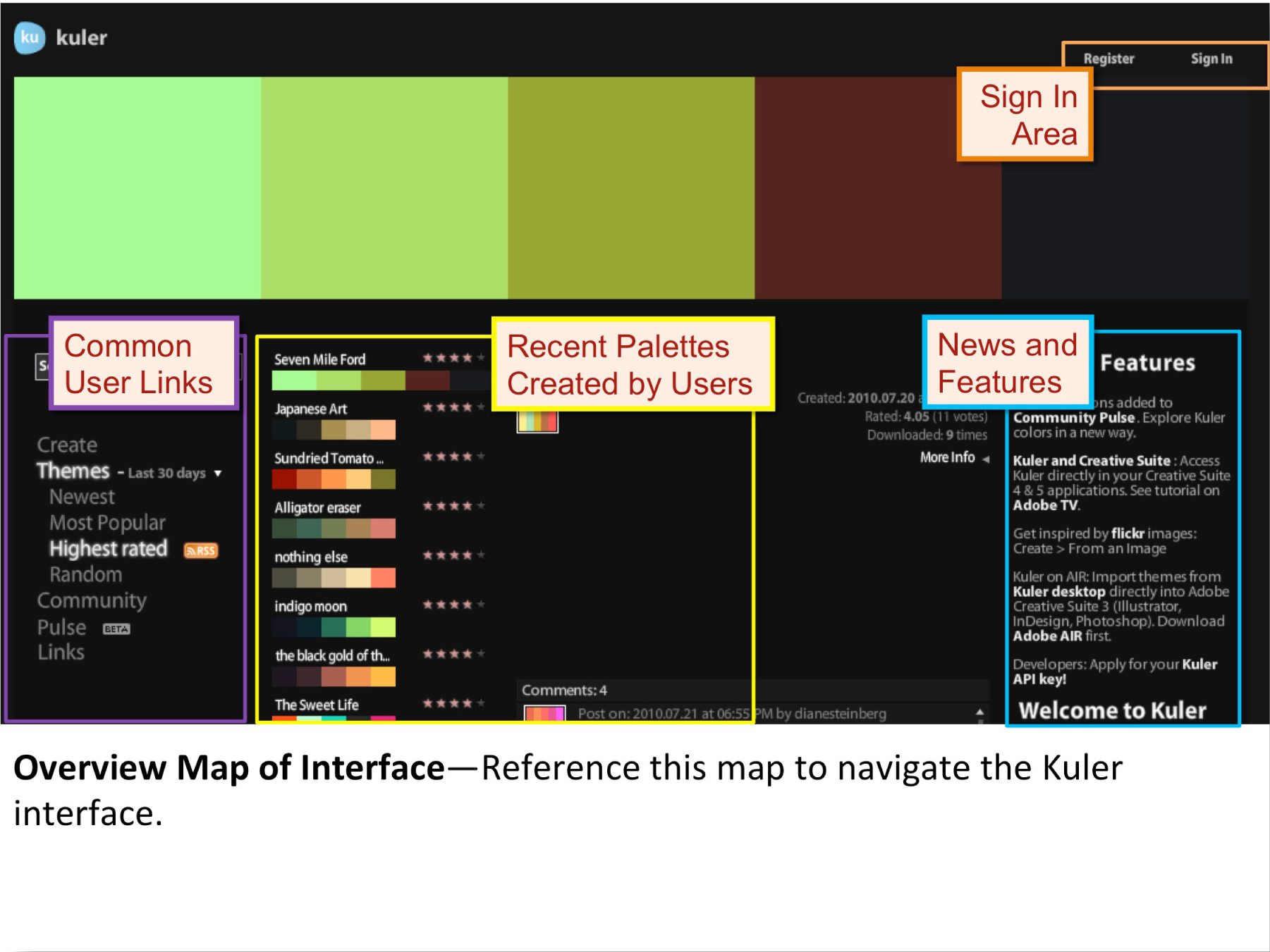
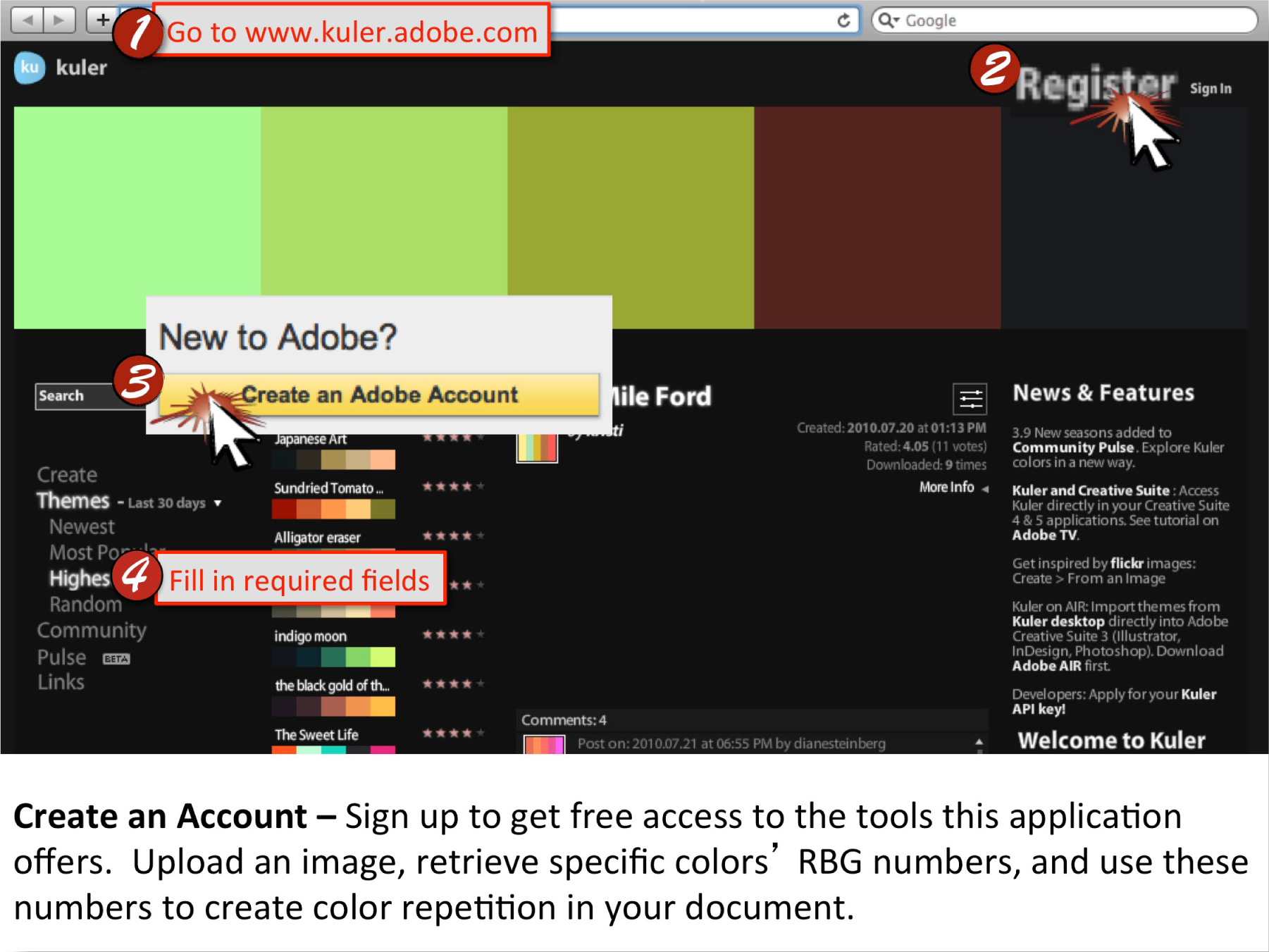
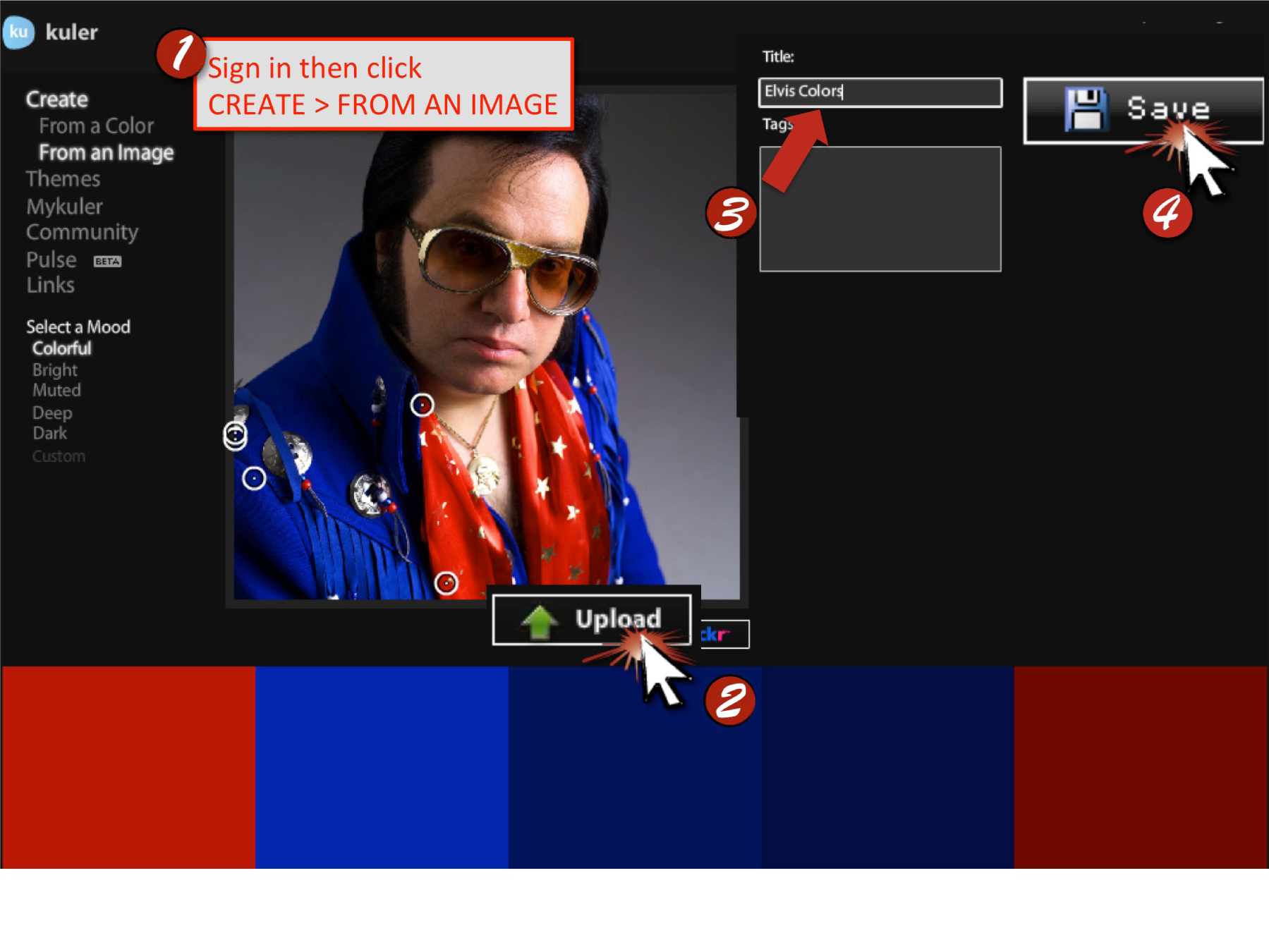
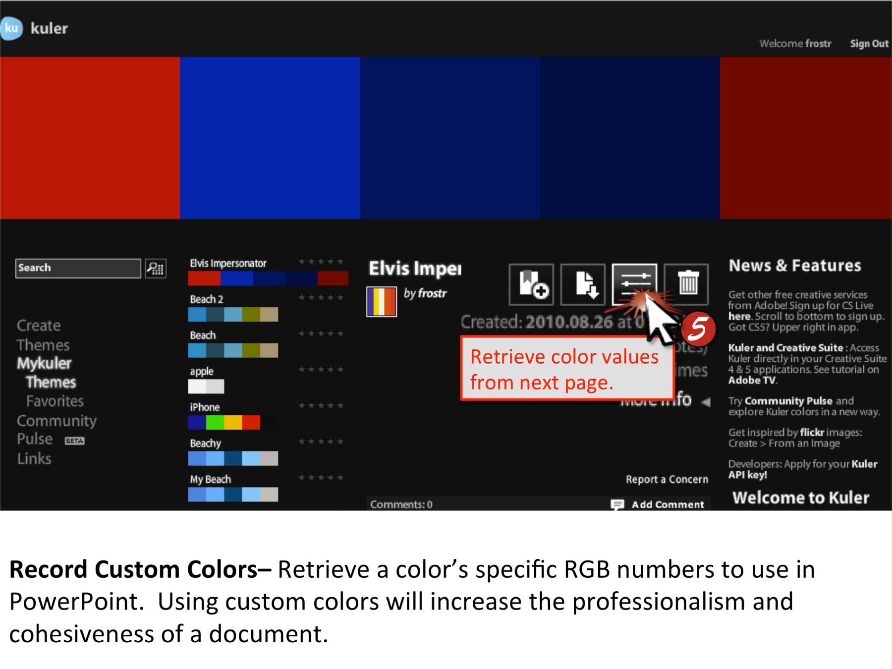
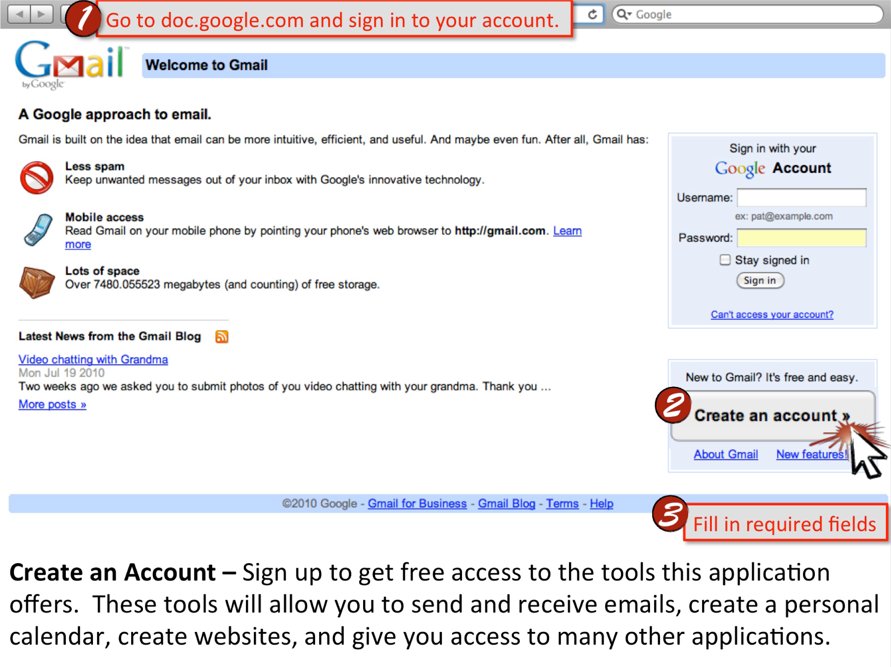
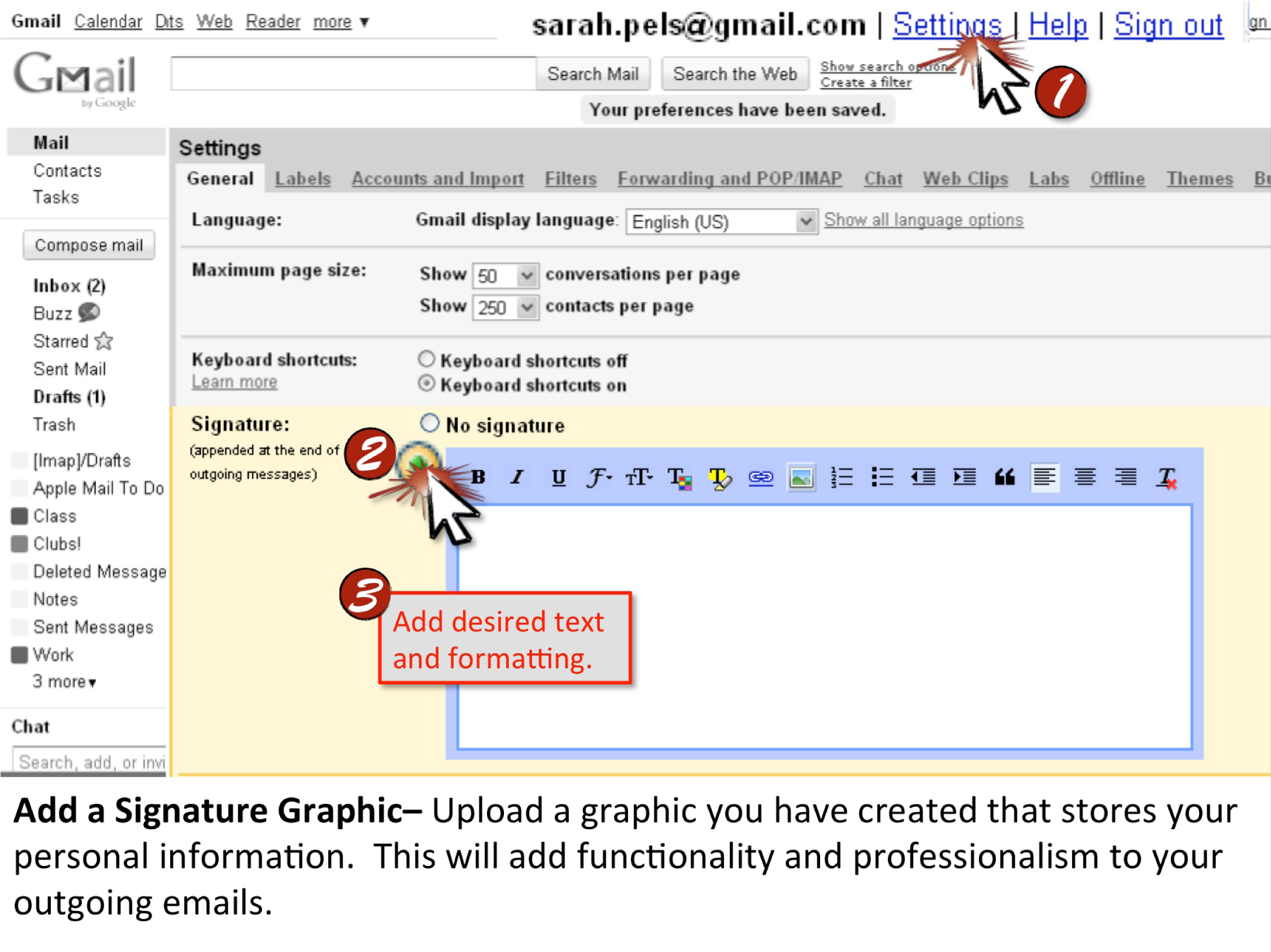
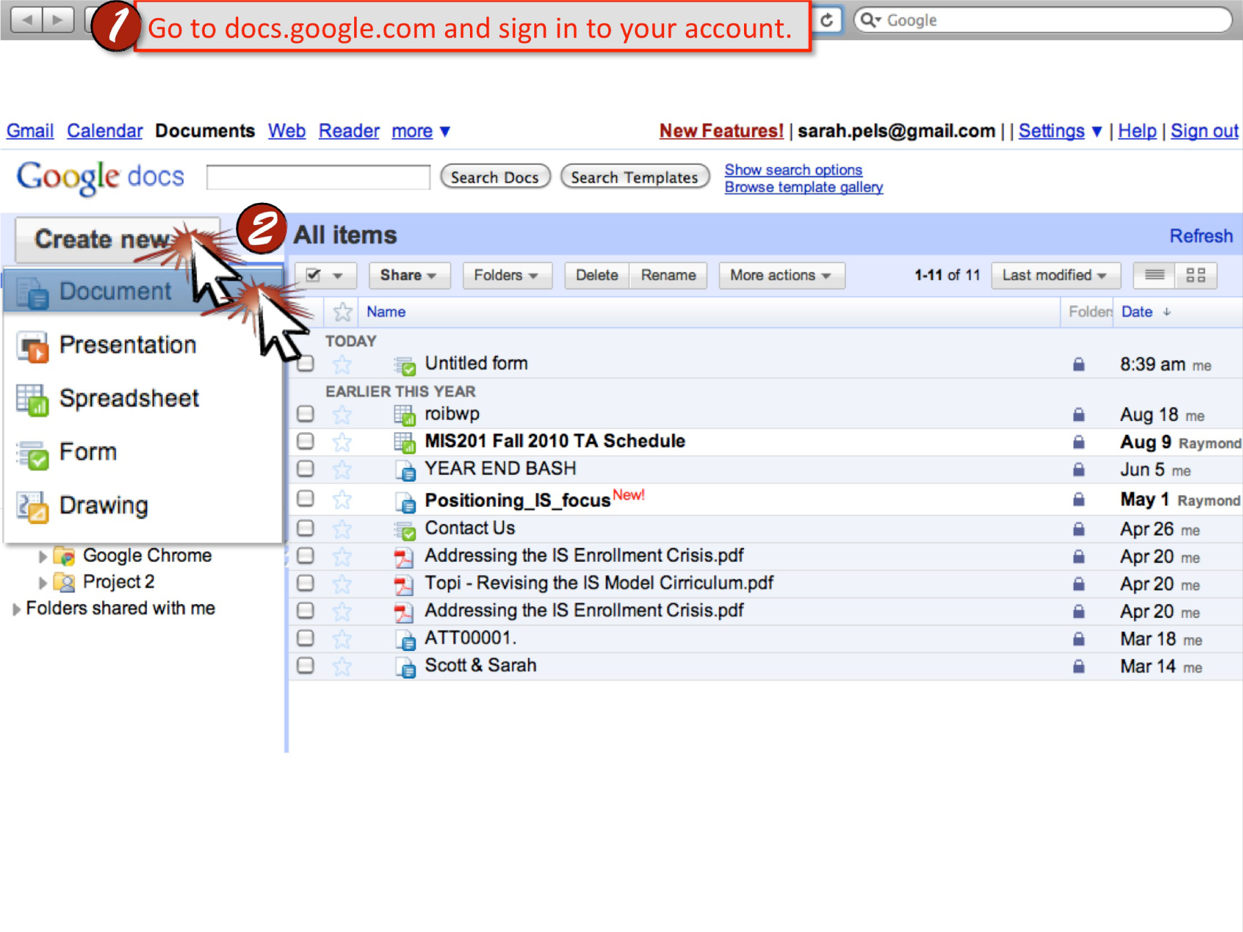
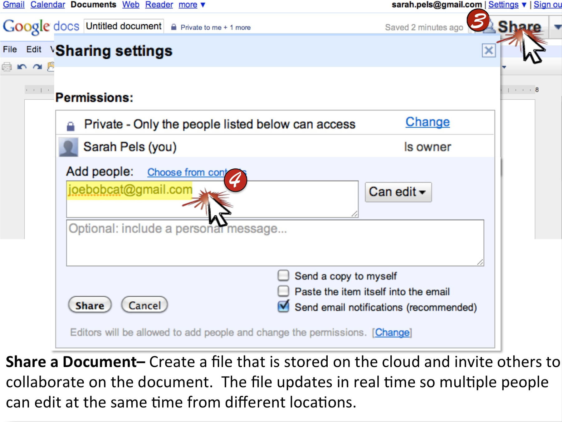
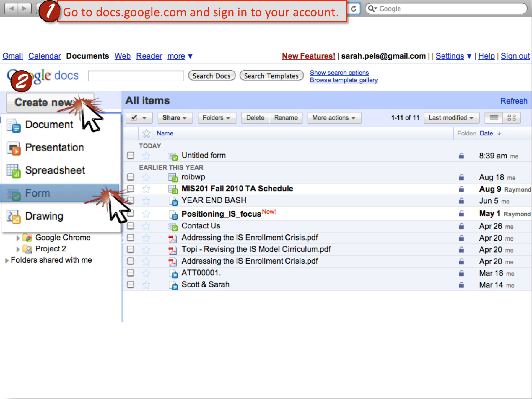
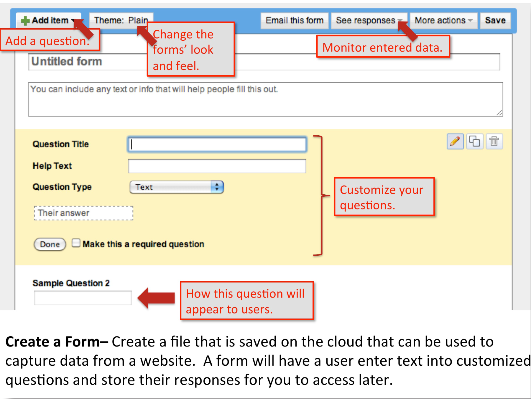
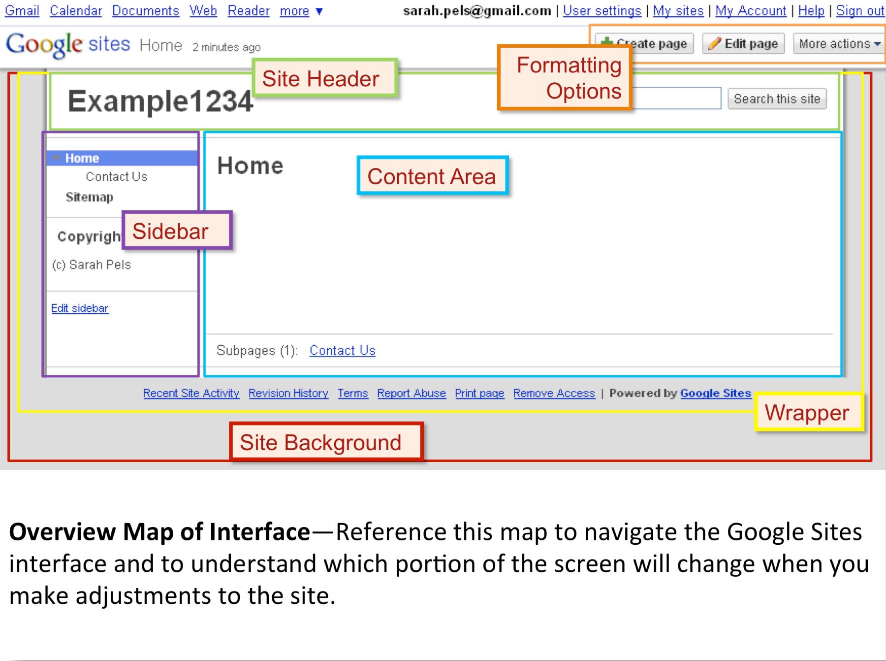
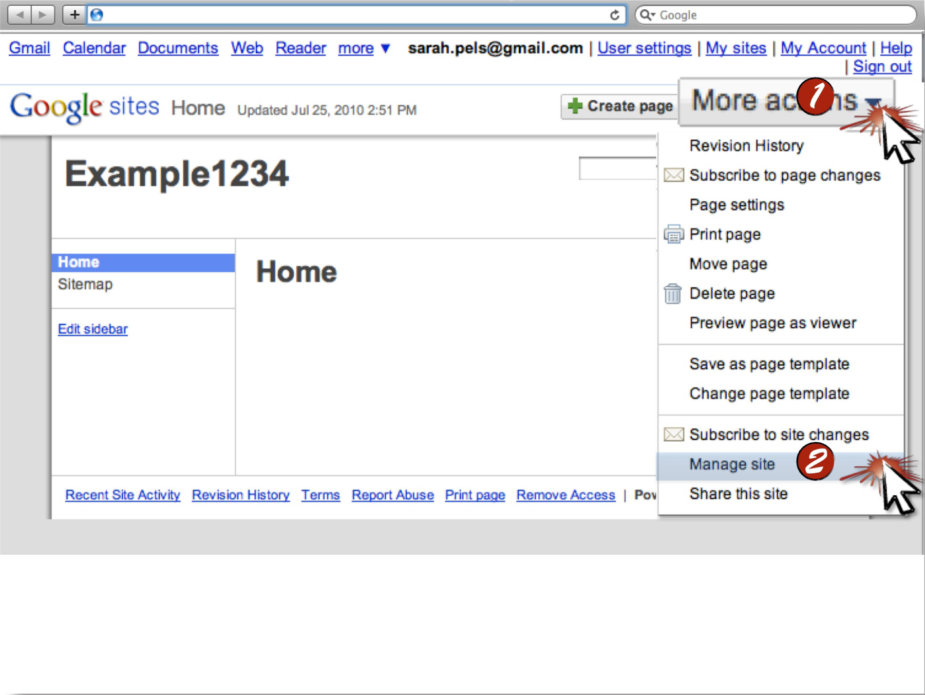
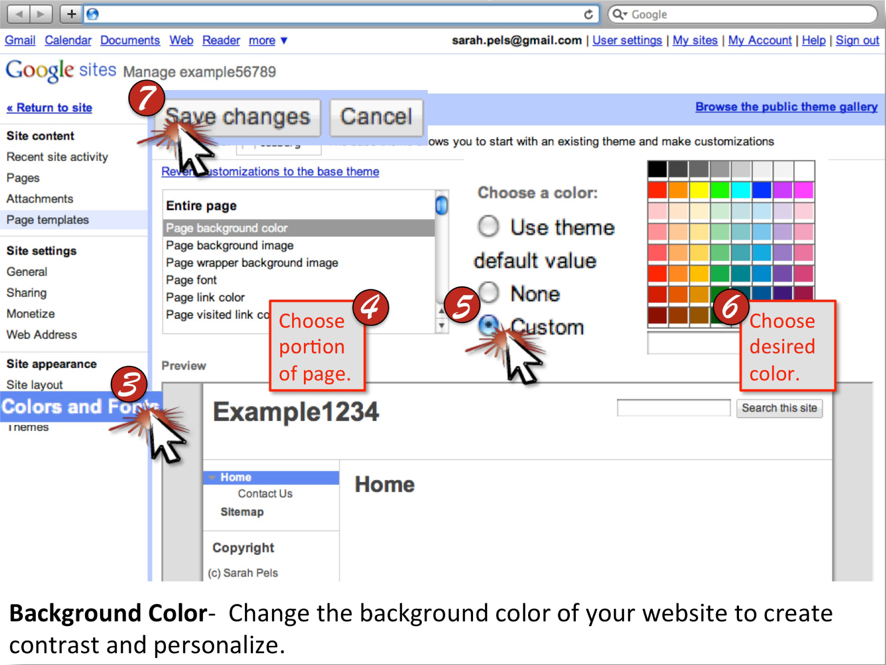
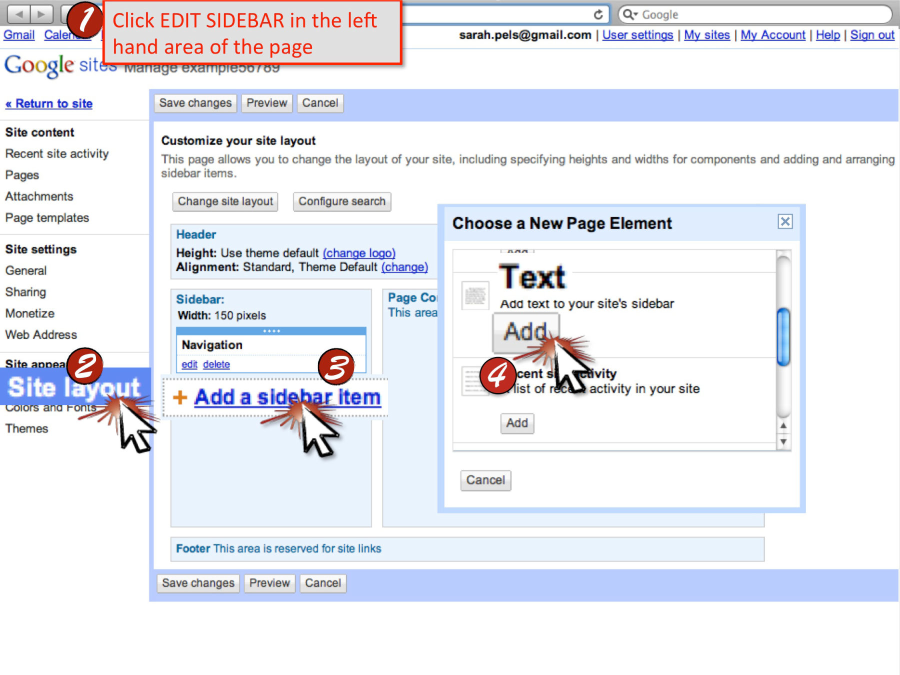
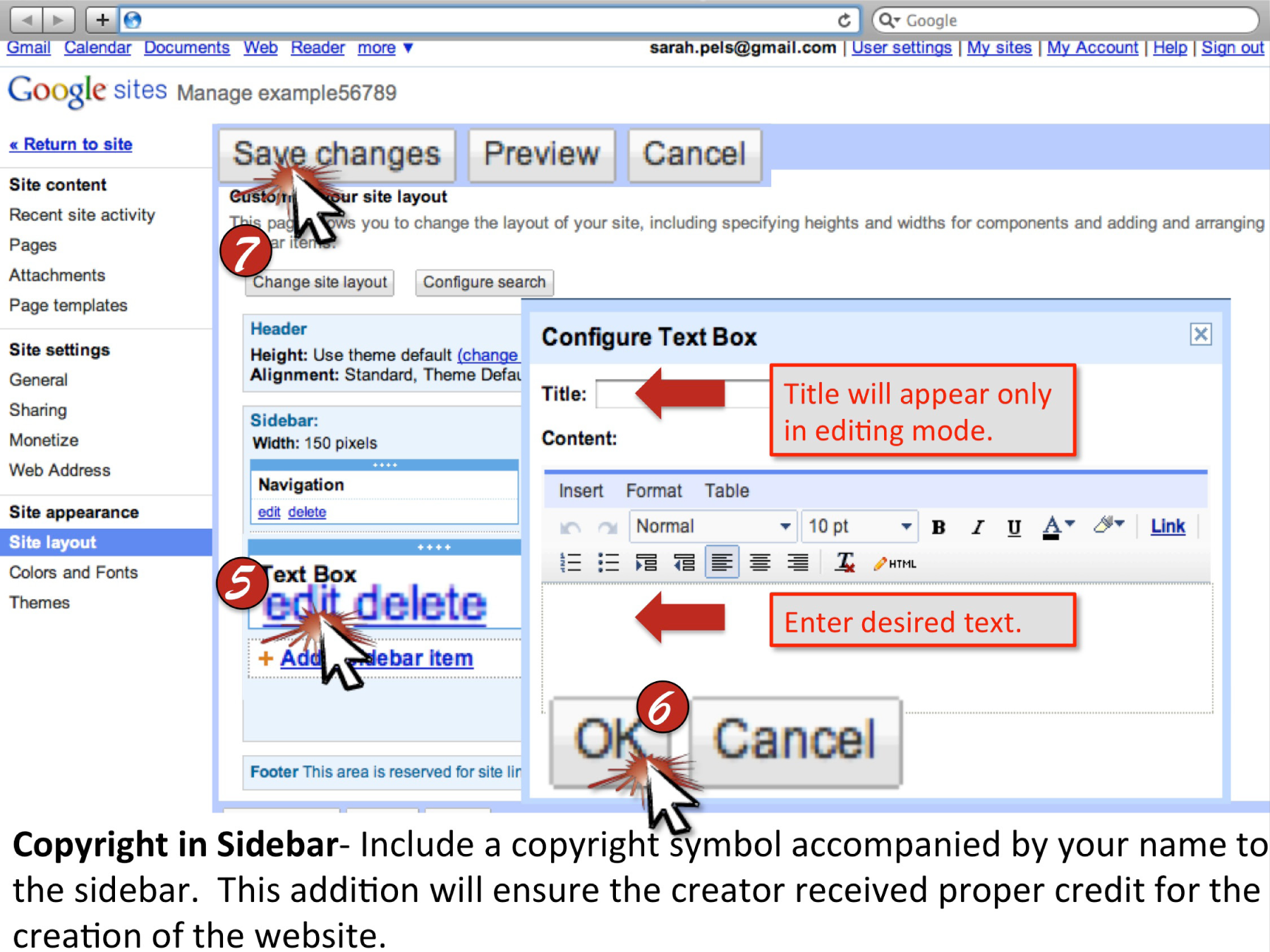
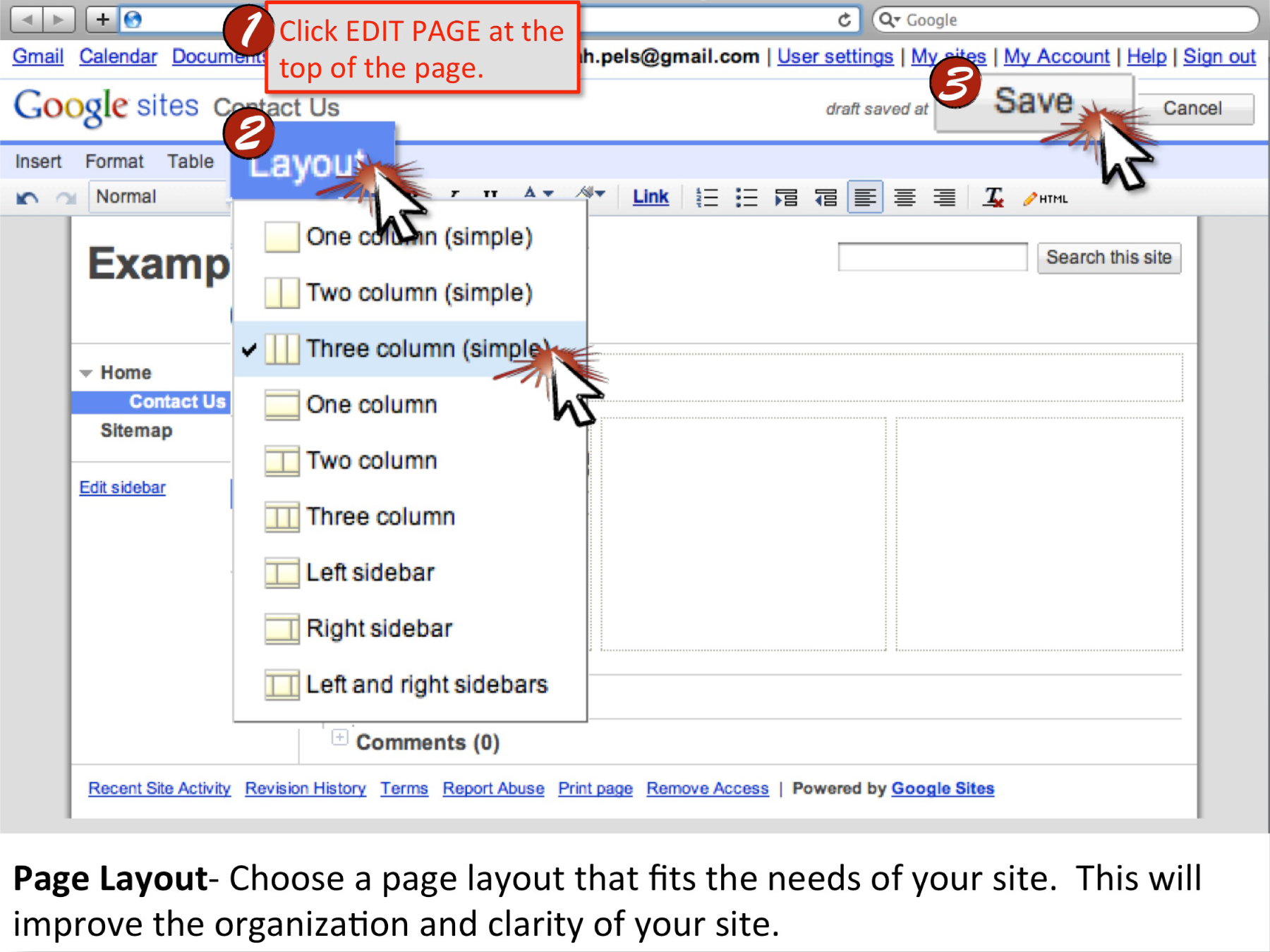
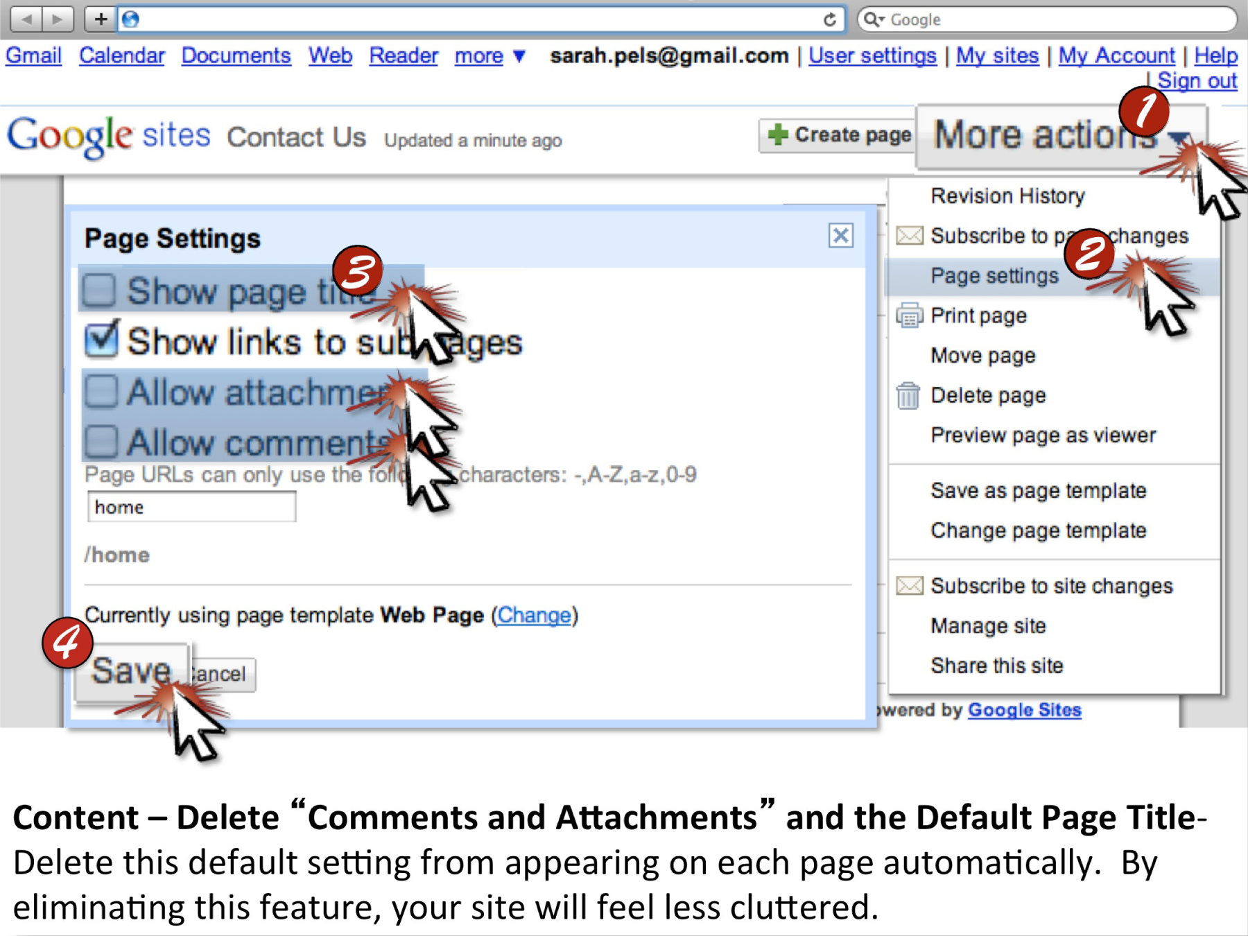
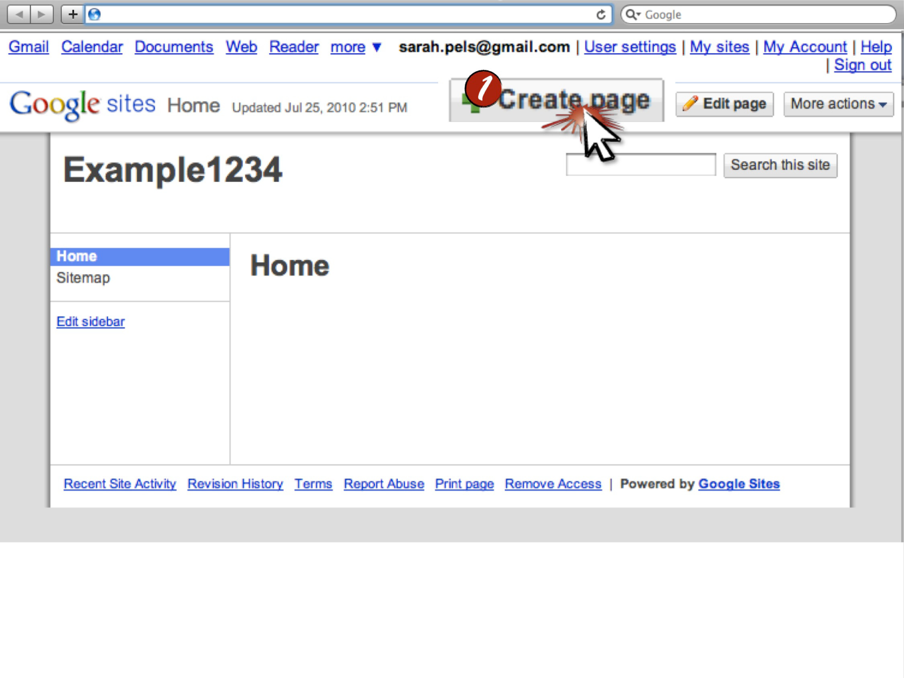
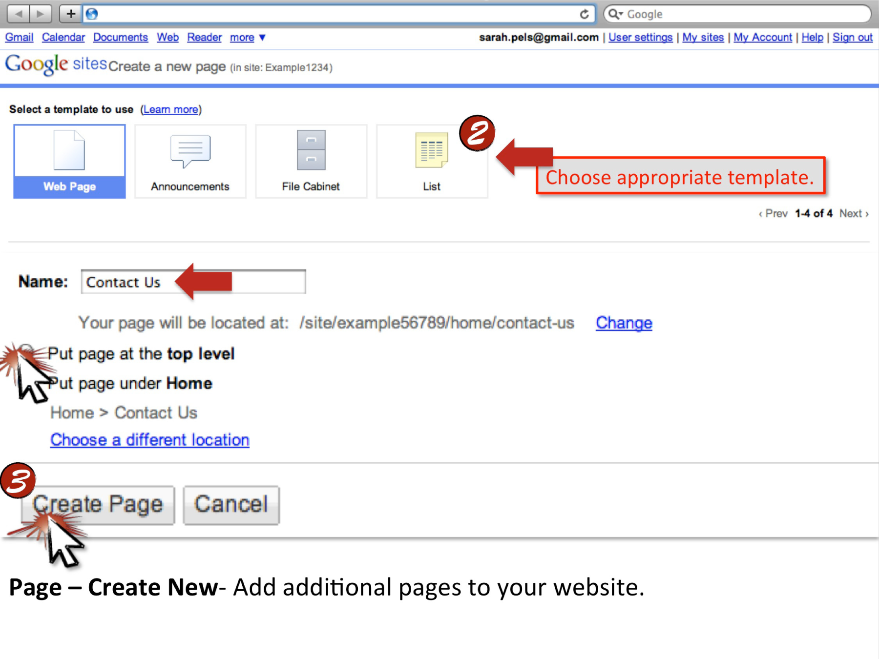
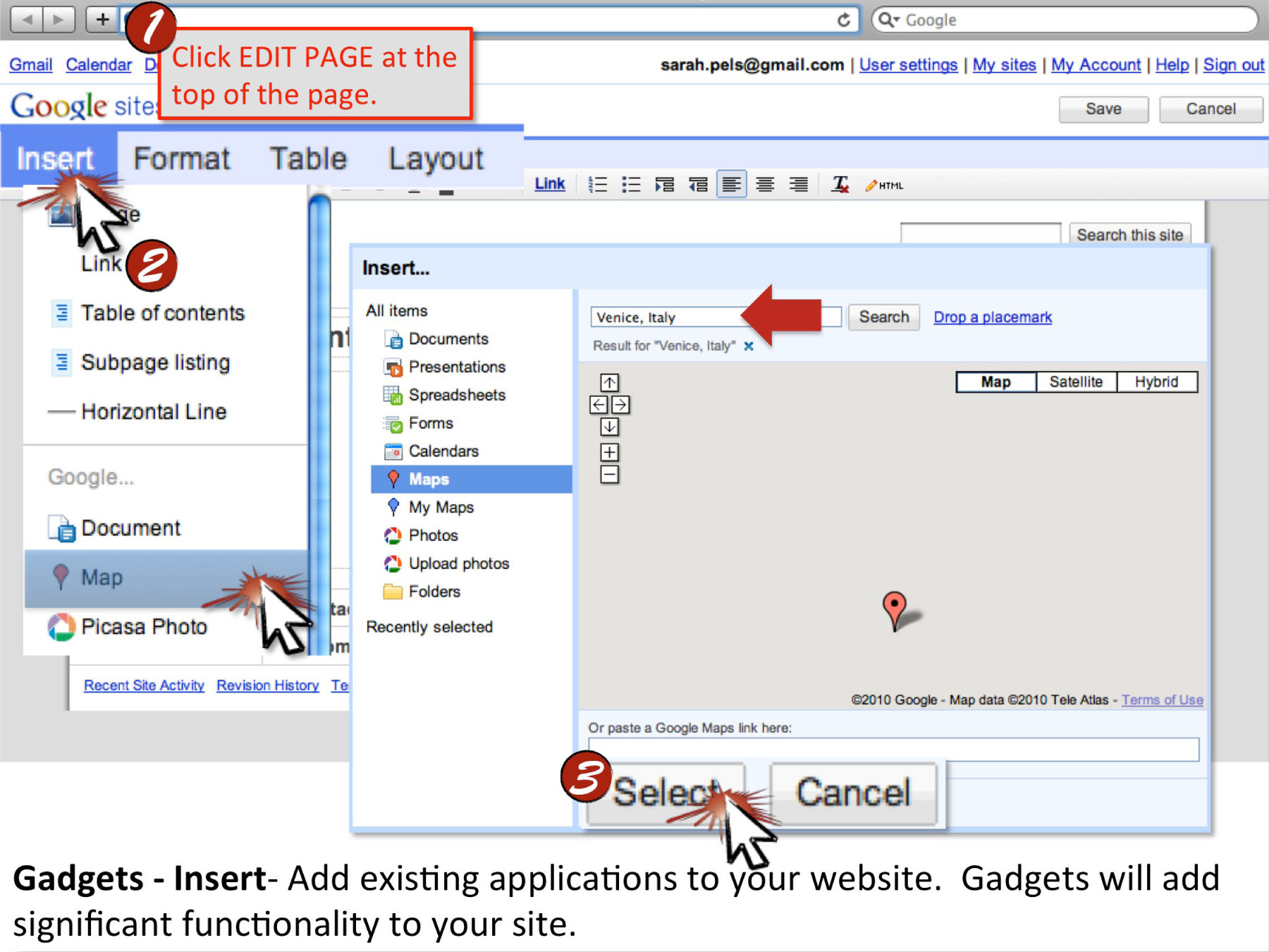
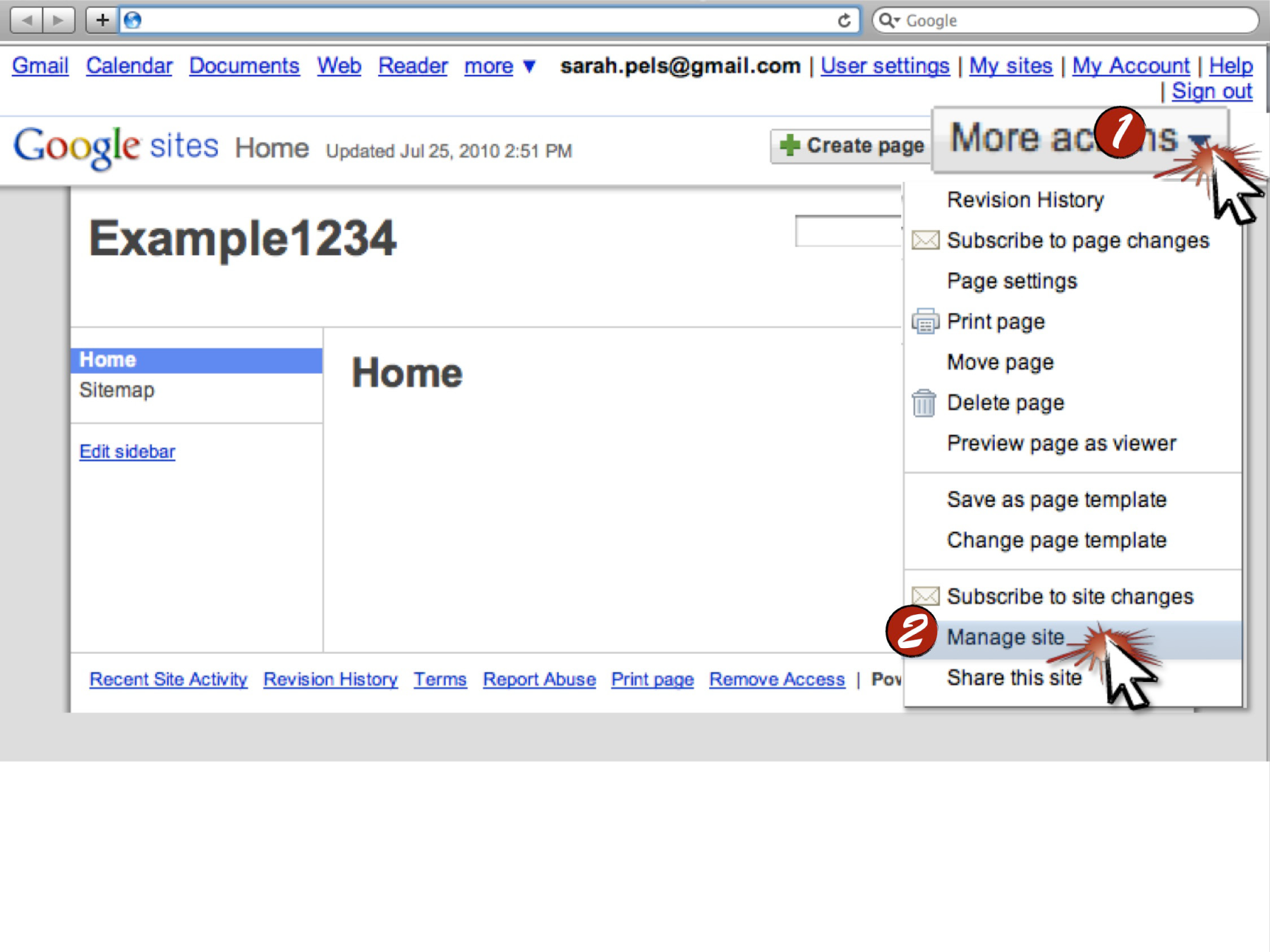
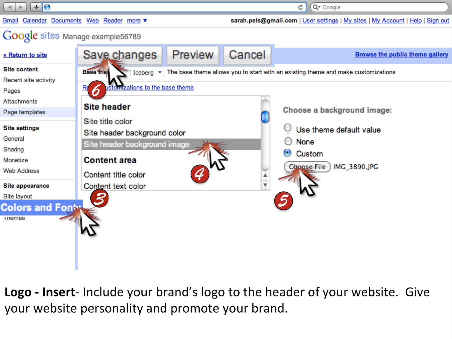
Chapter 16 Microsoft Excel Techniques
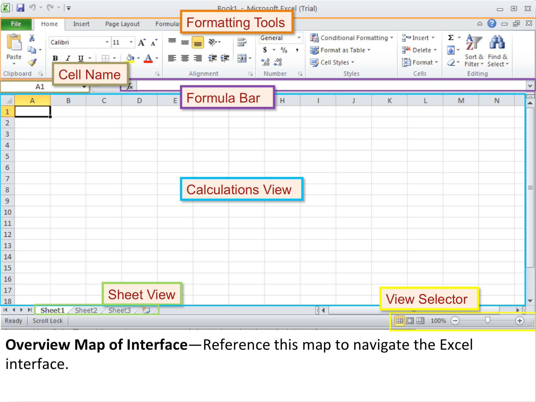
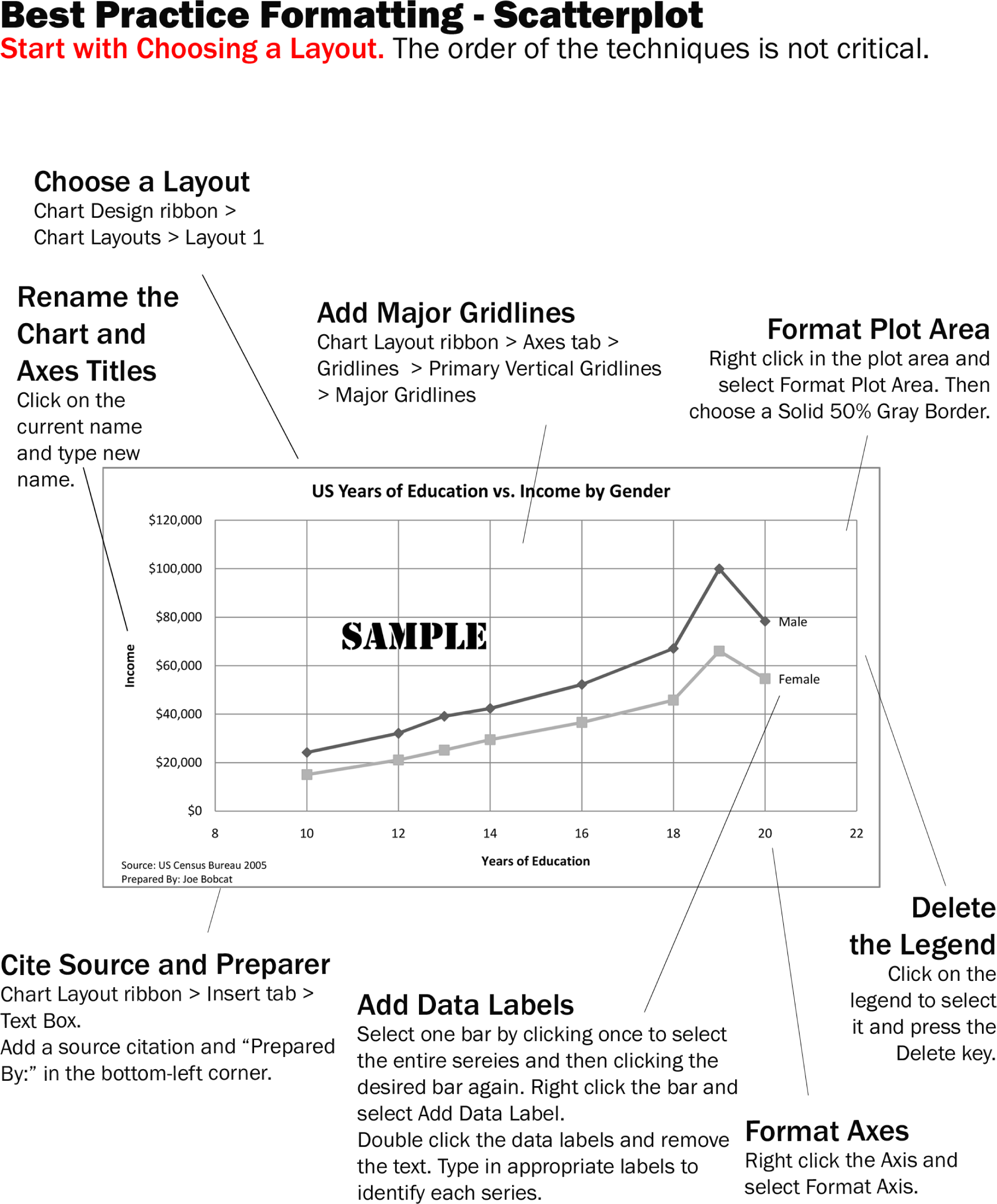
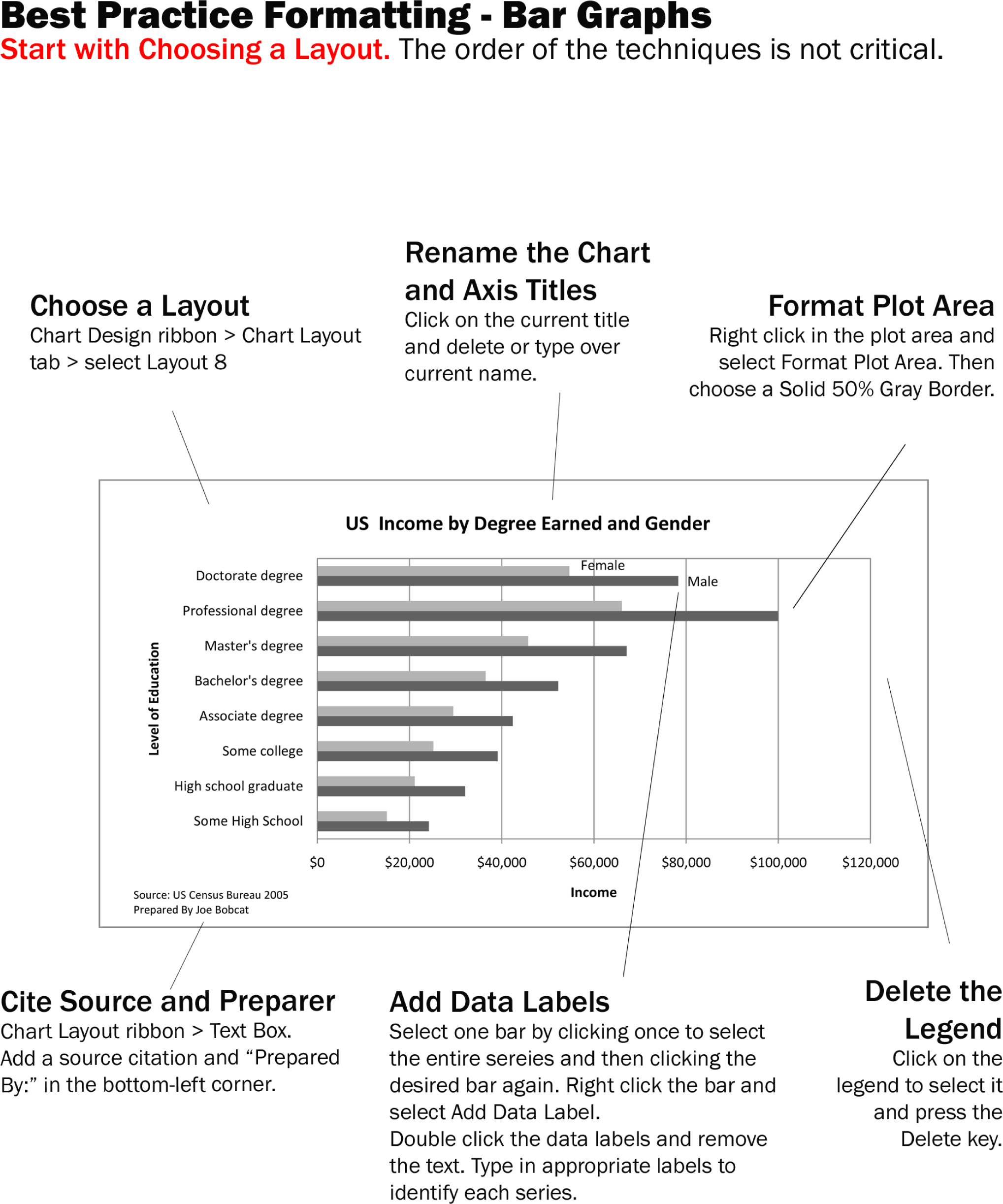
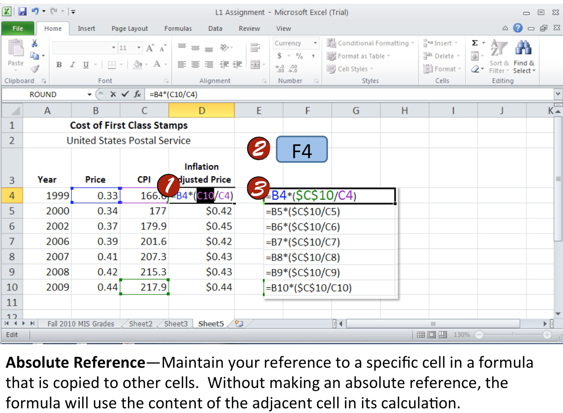
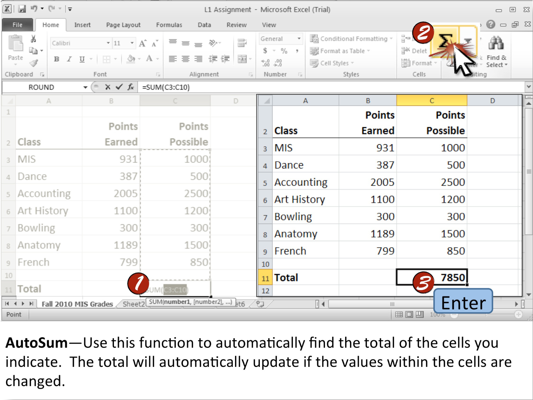
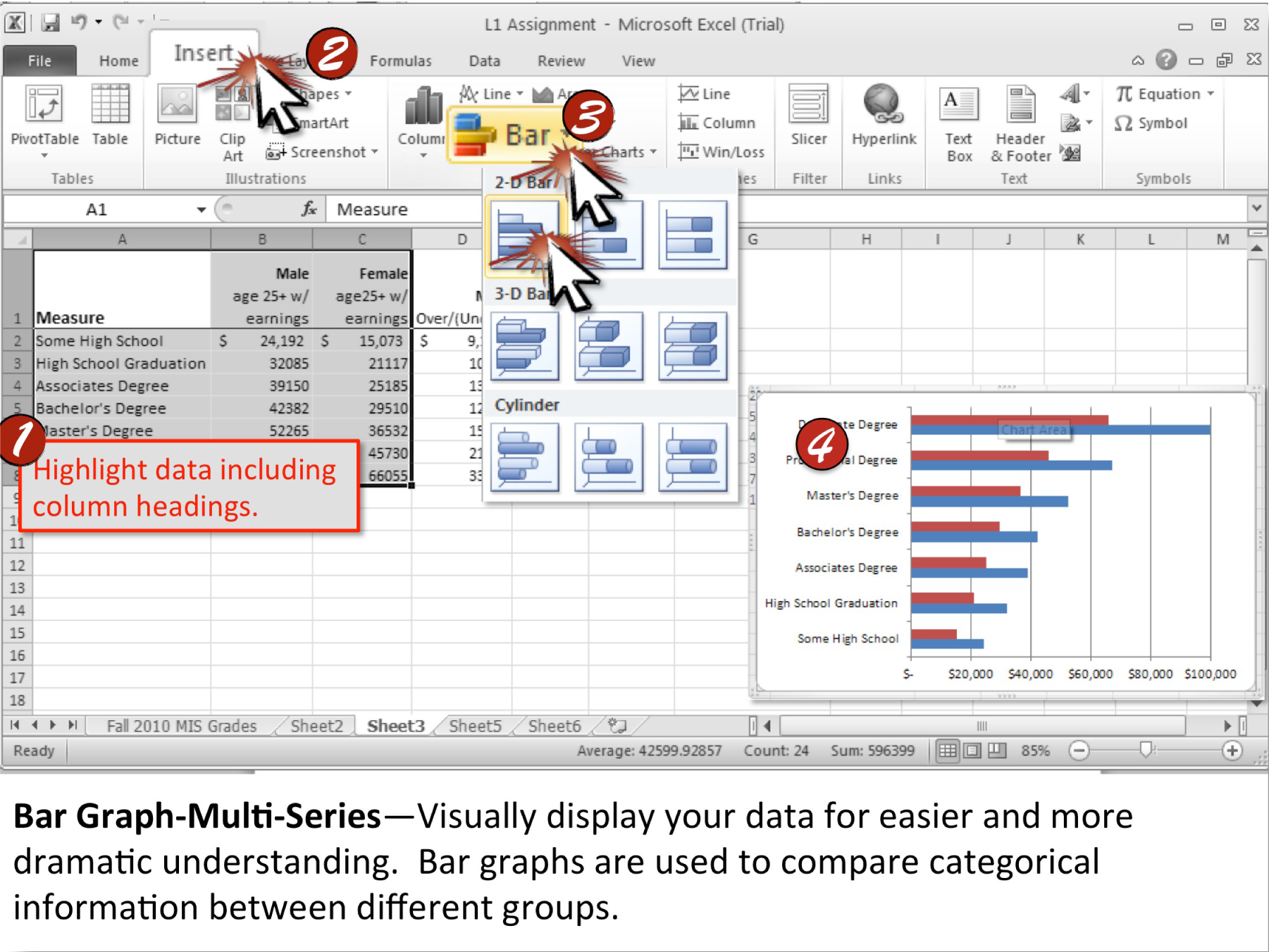
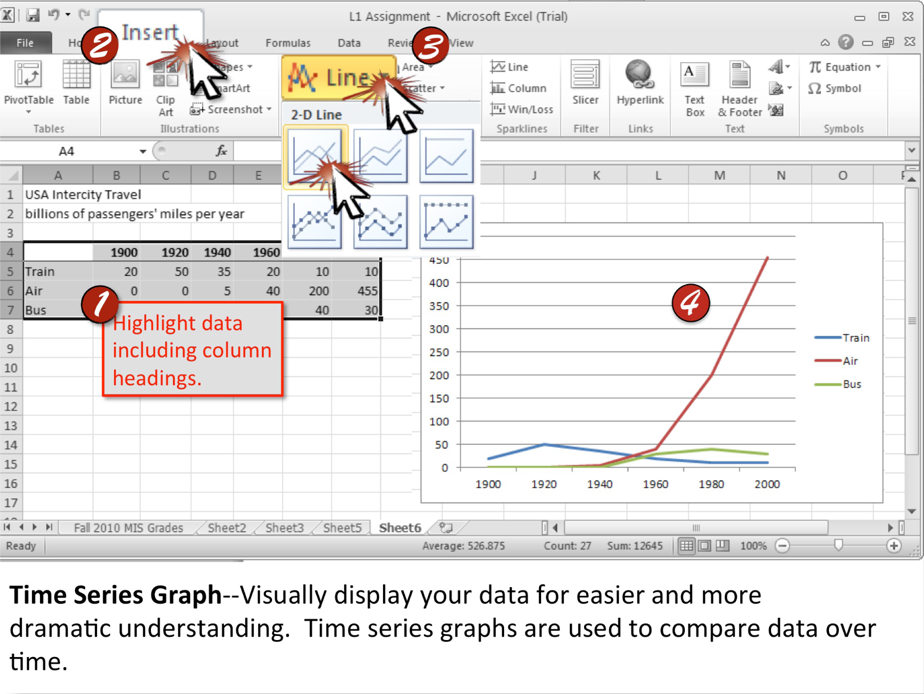
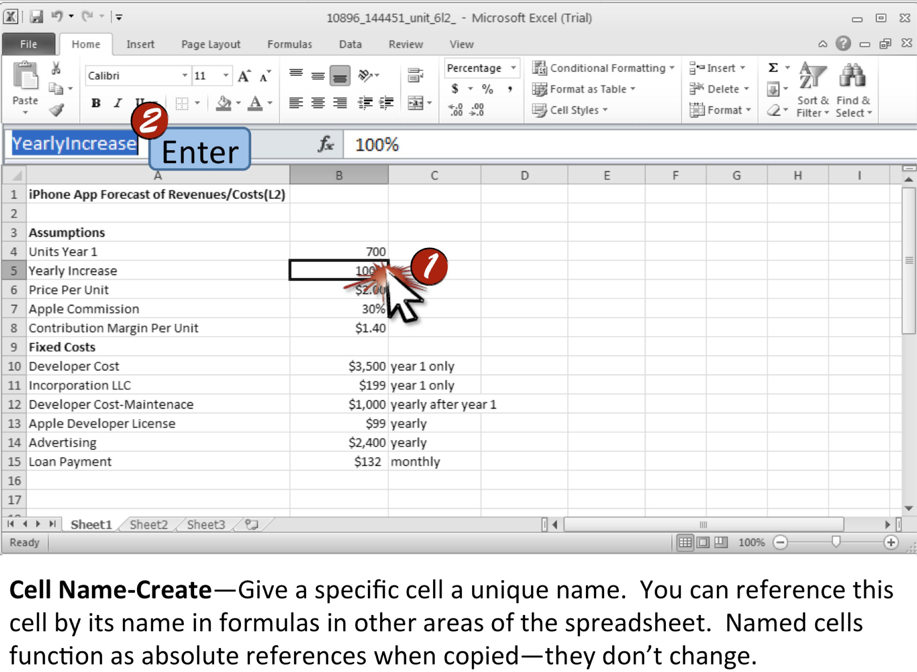
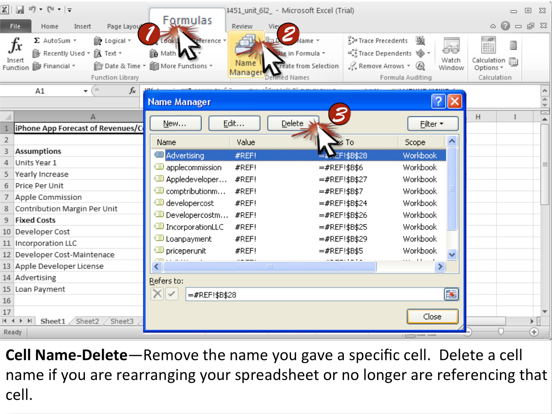
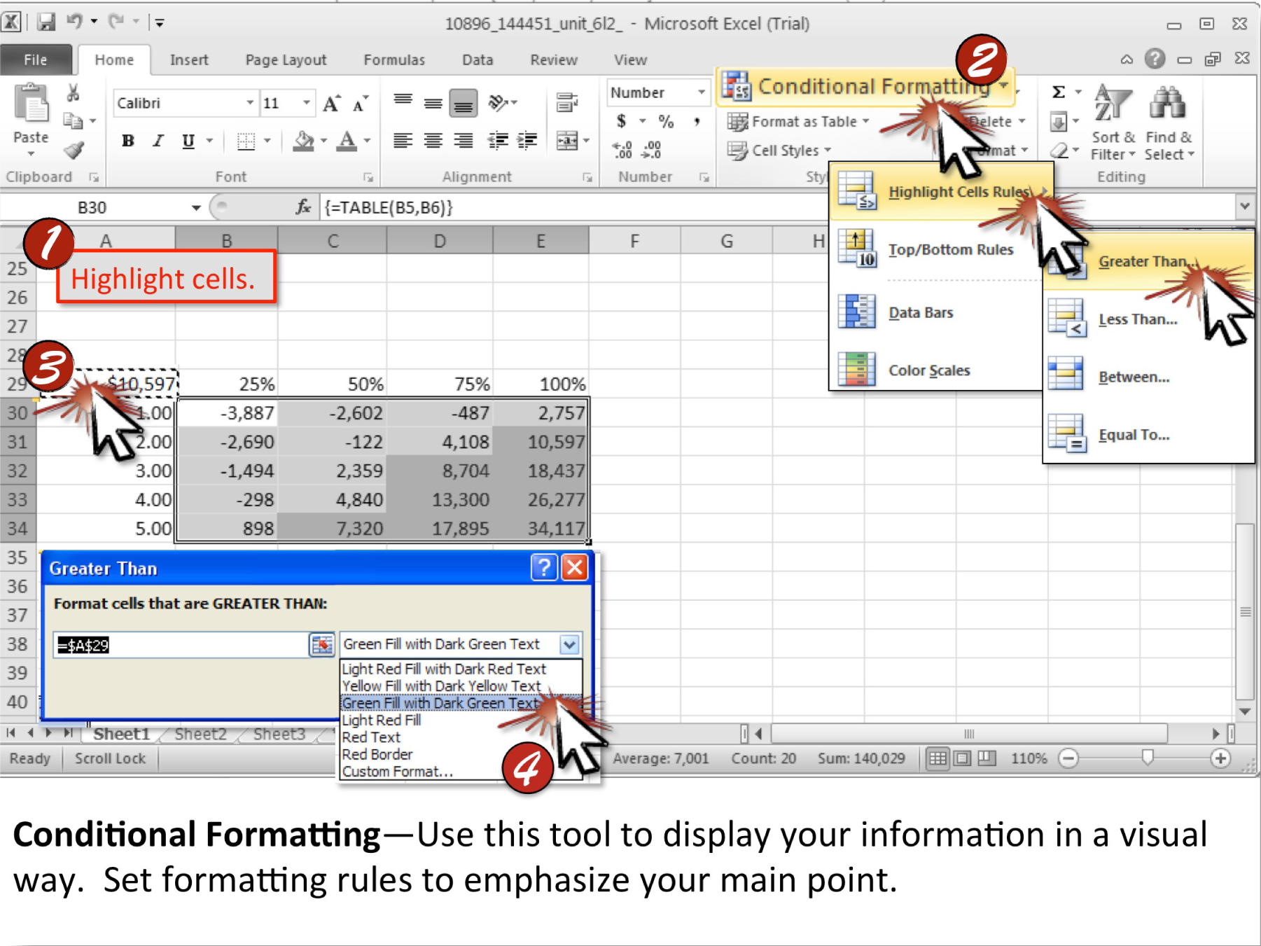
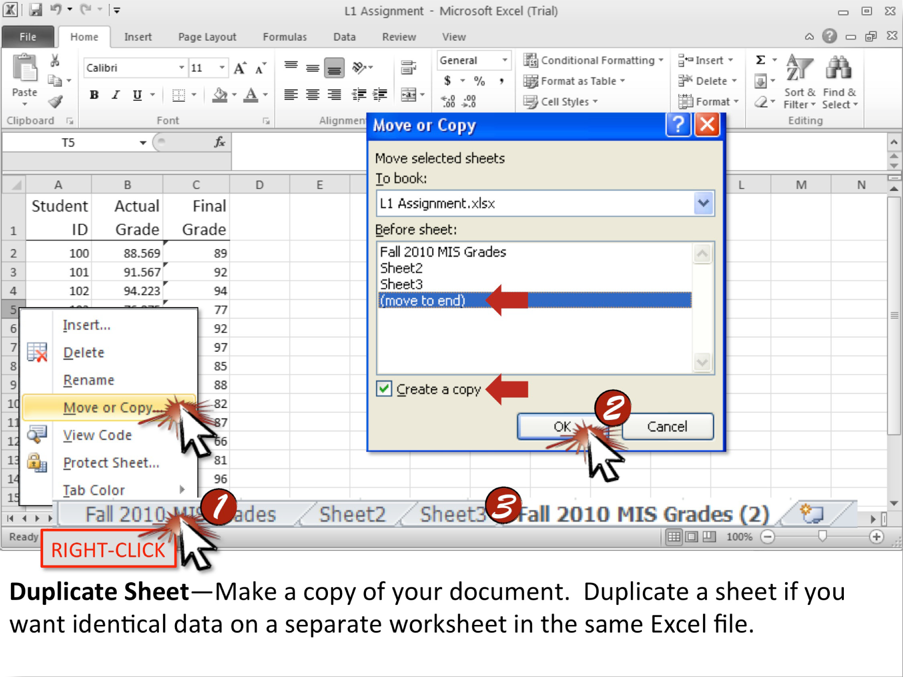
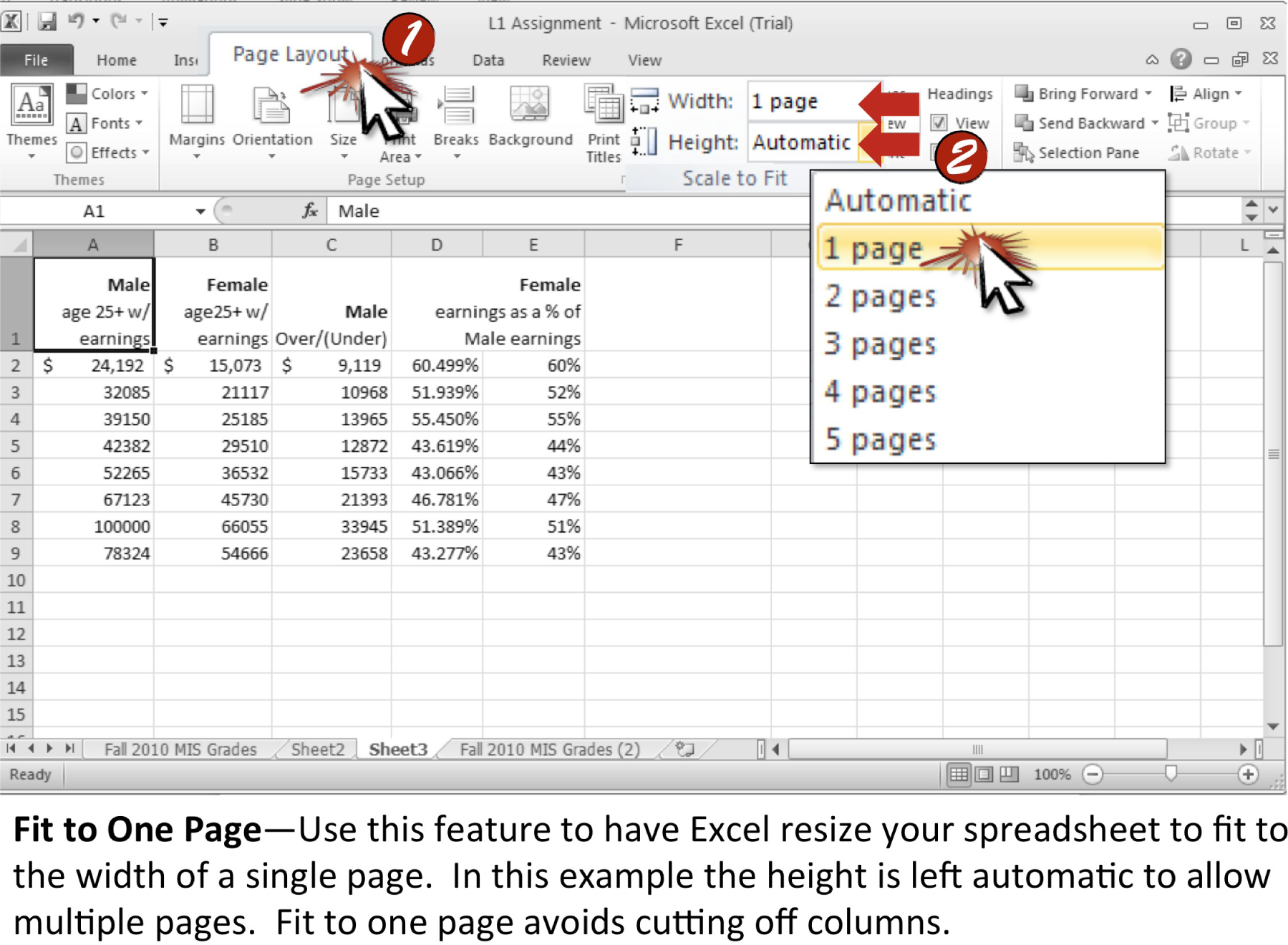
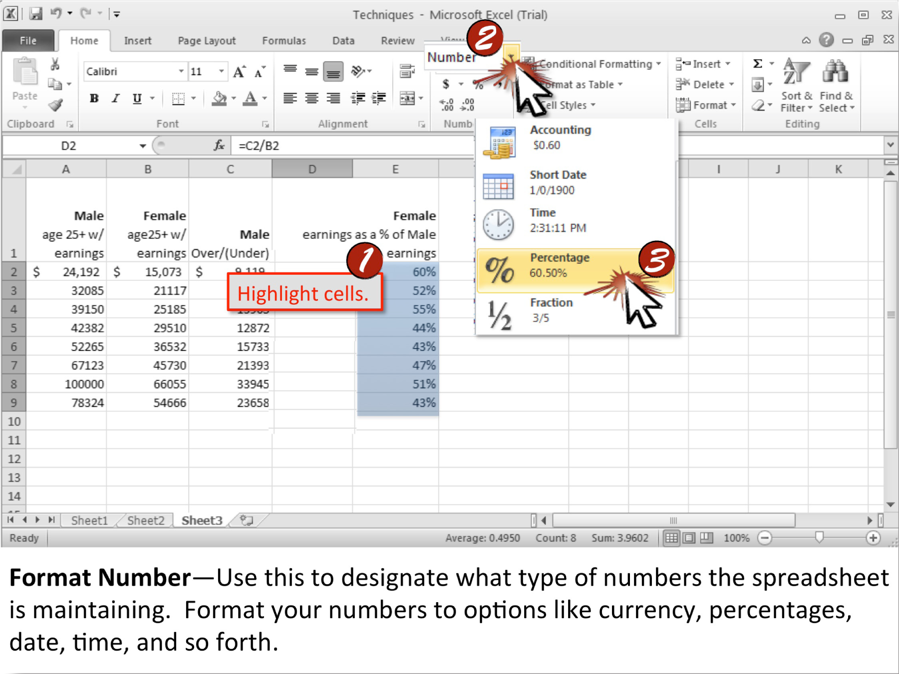
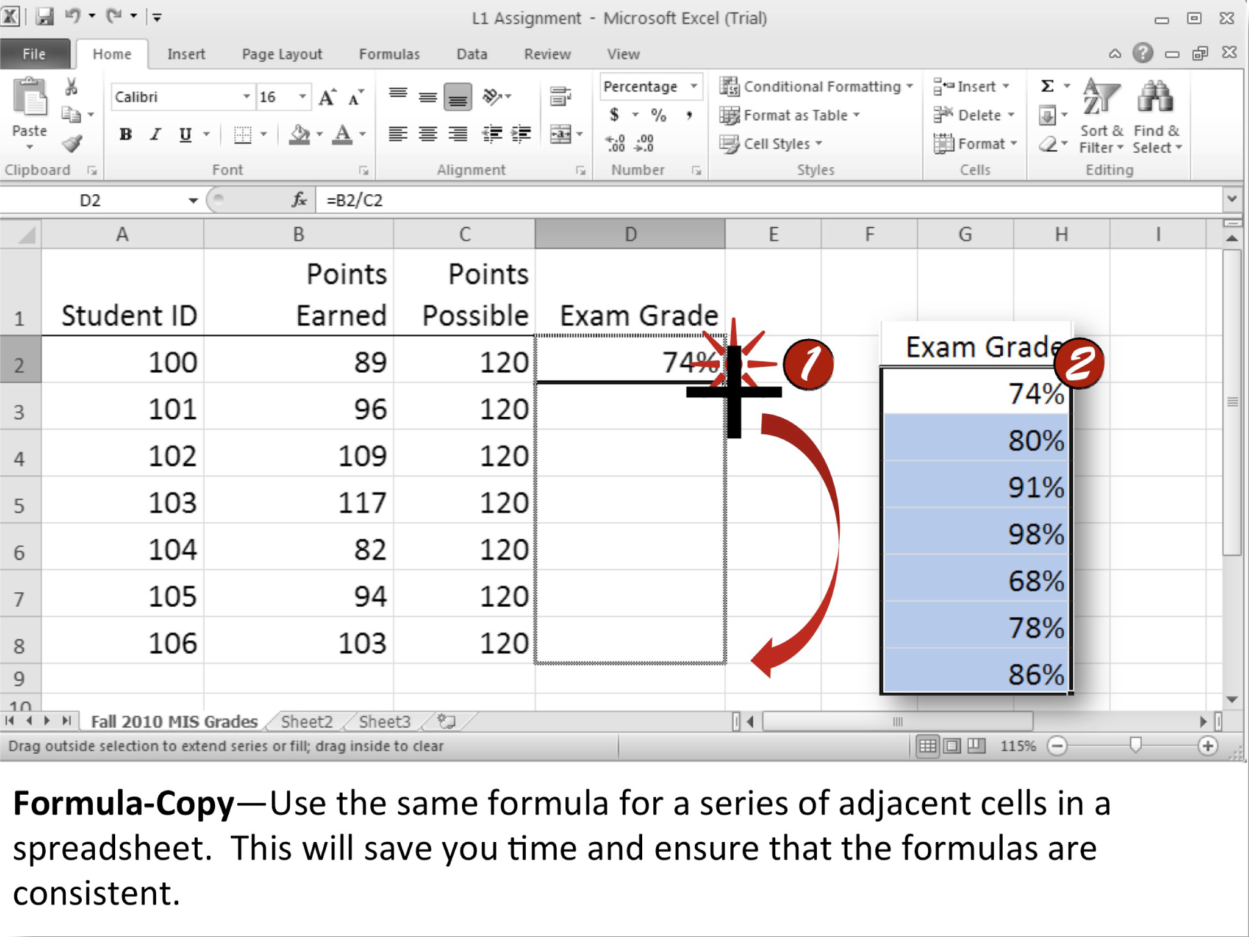
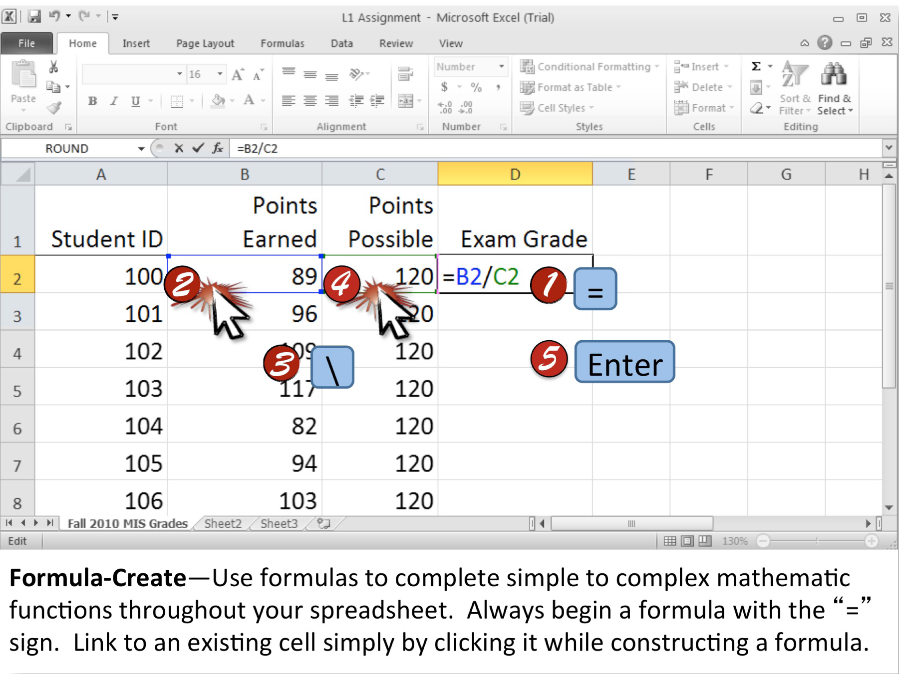
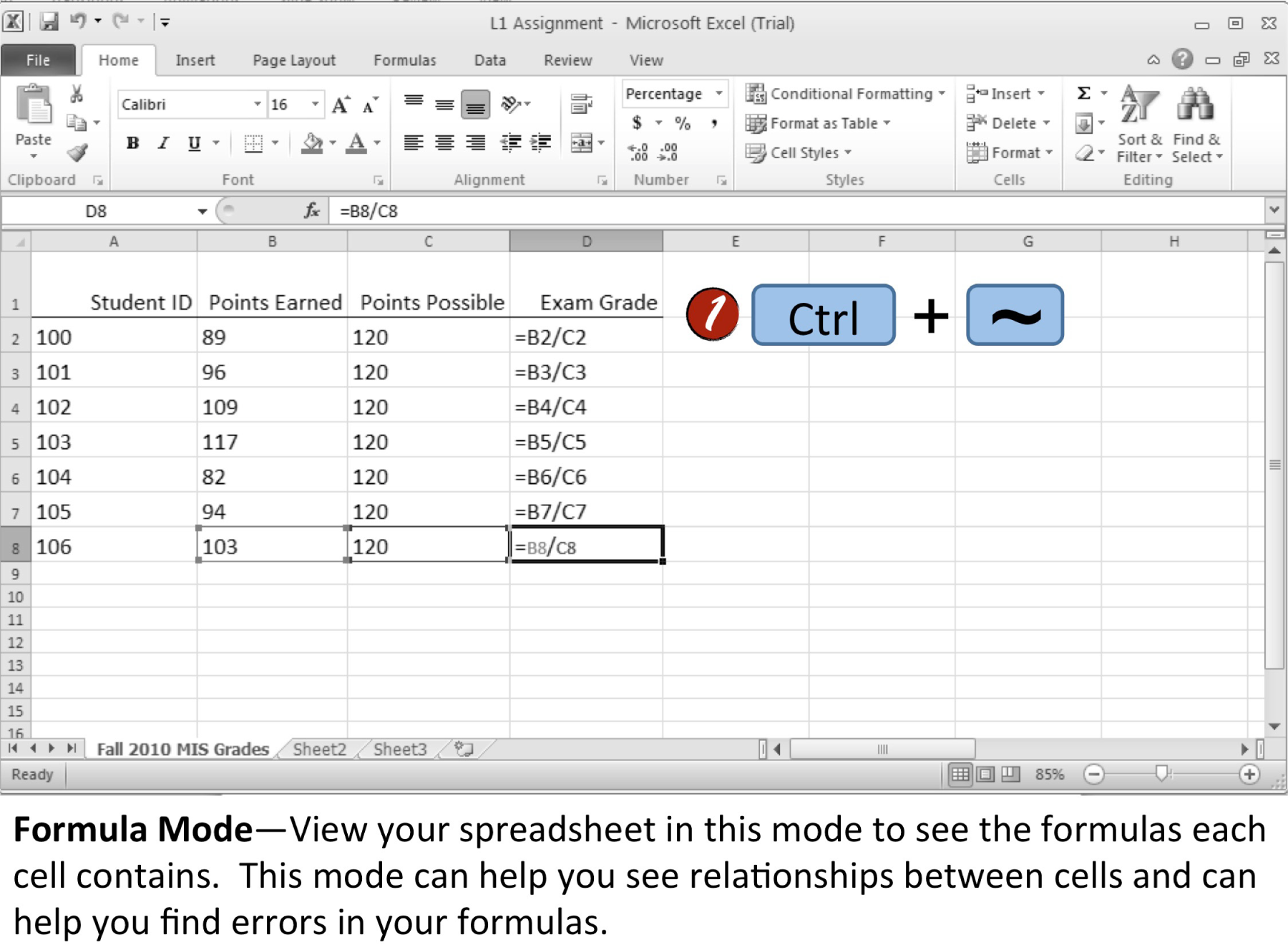
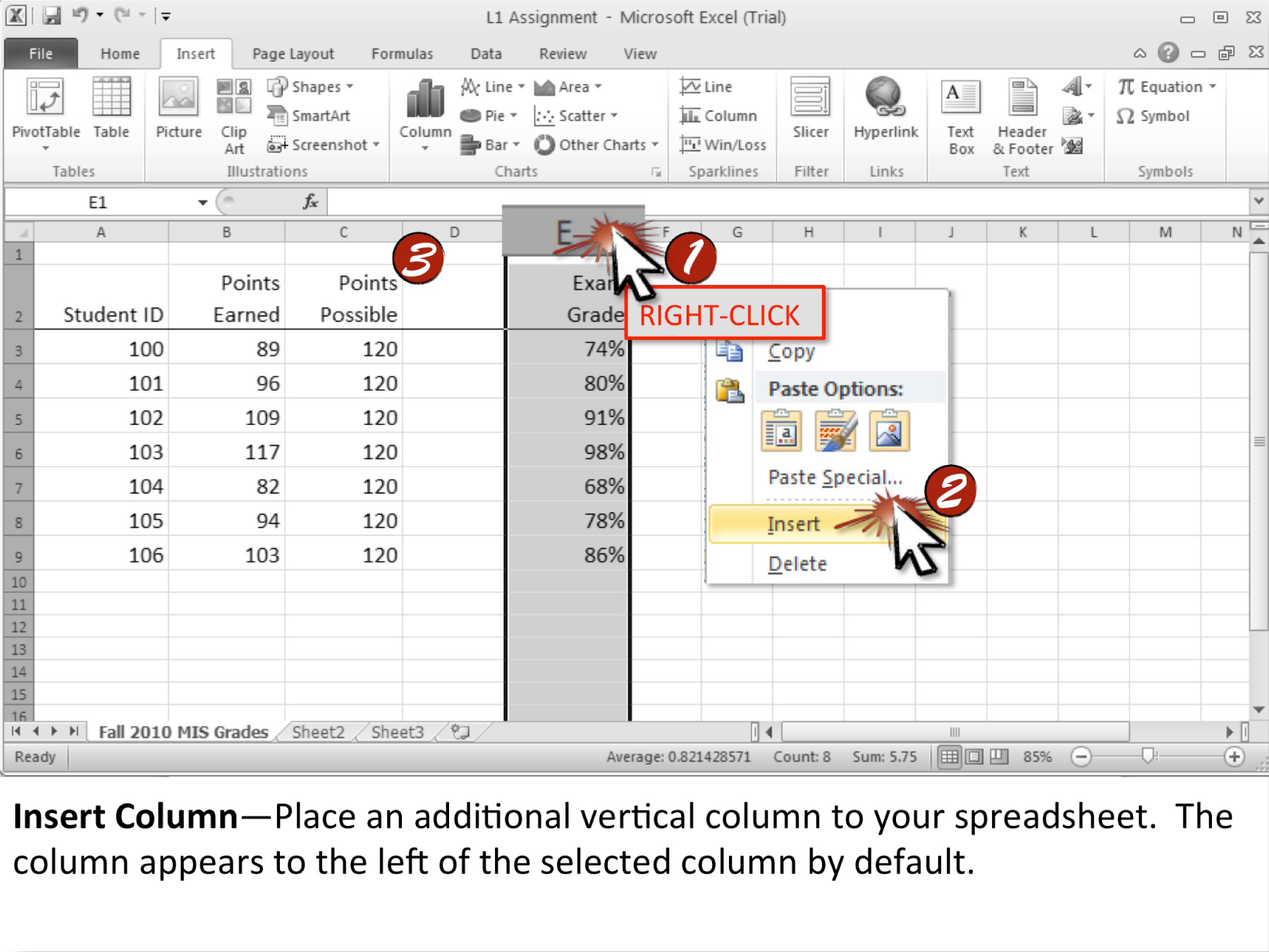
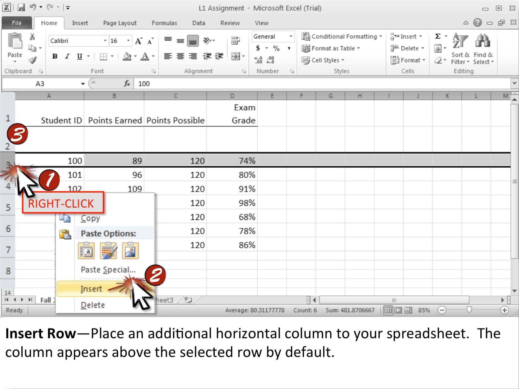
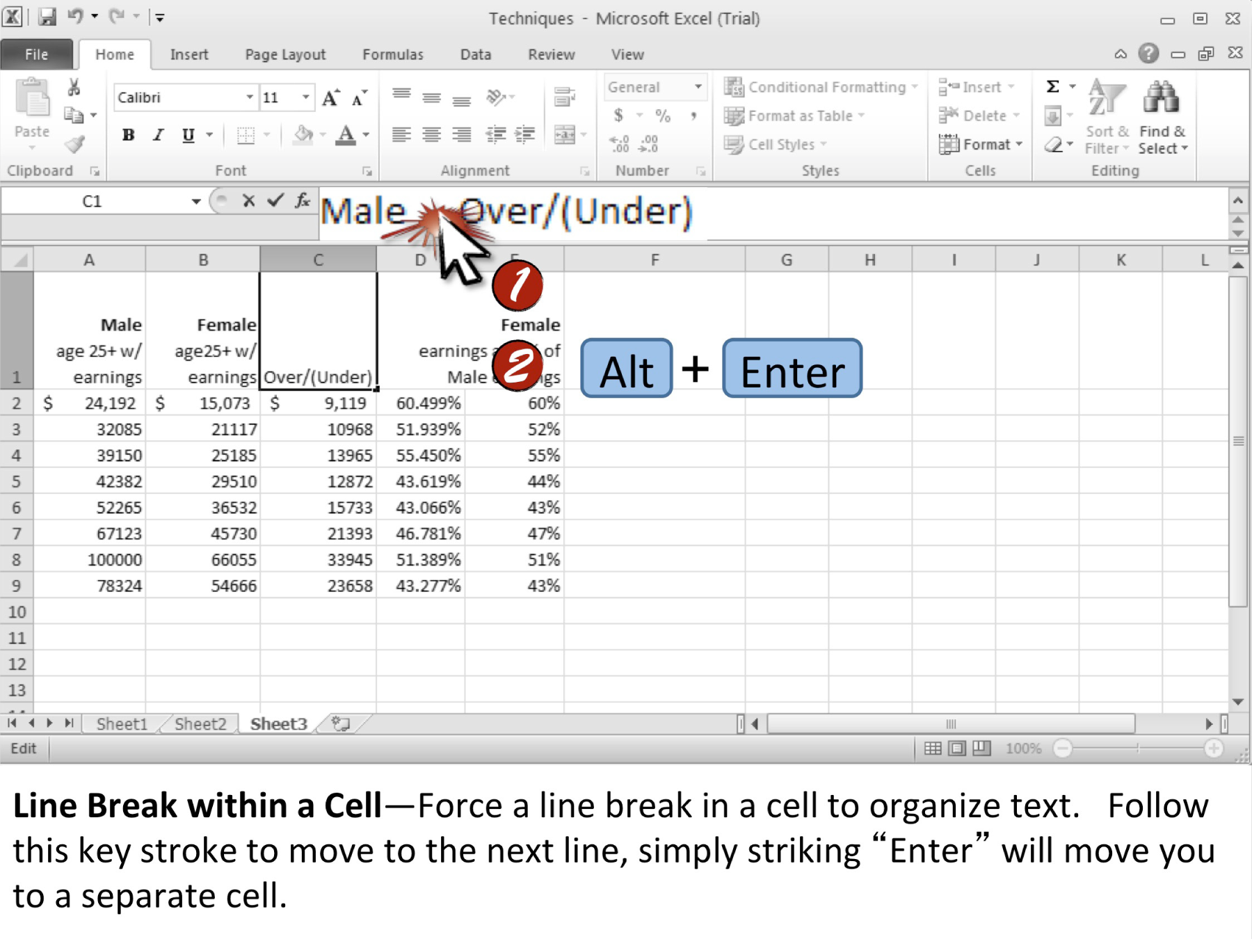
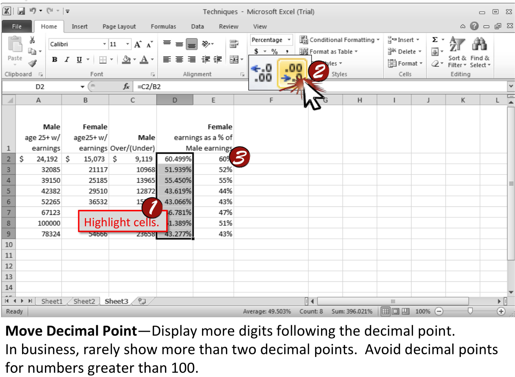
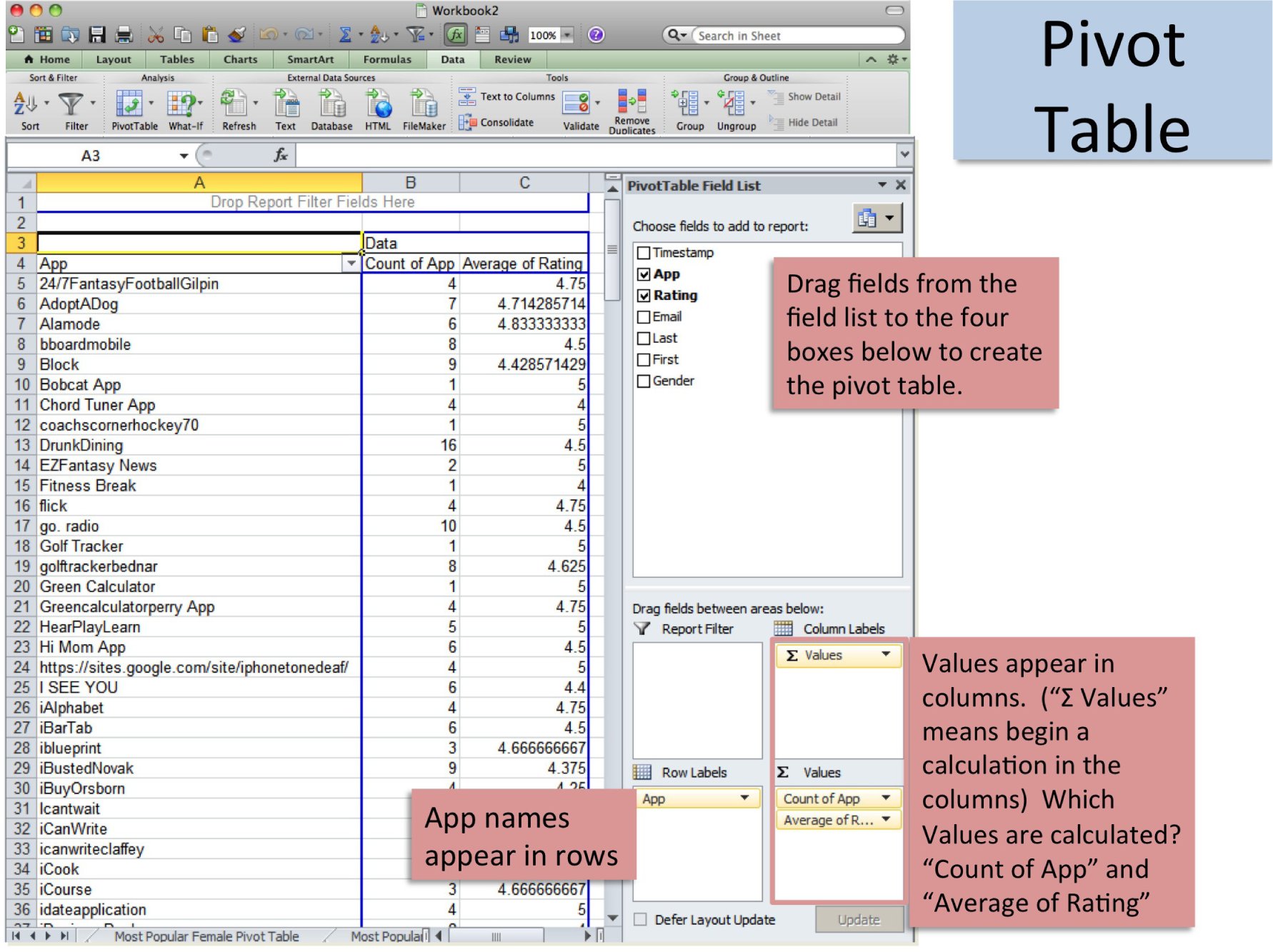
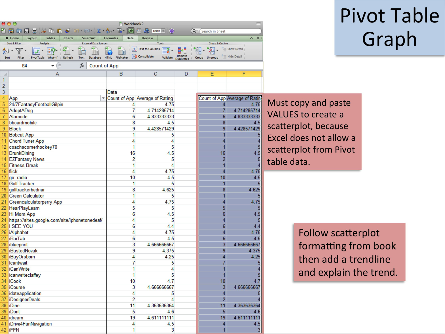
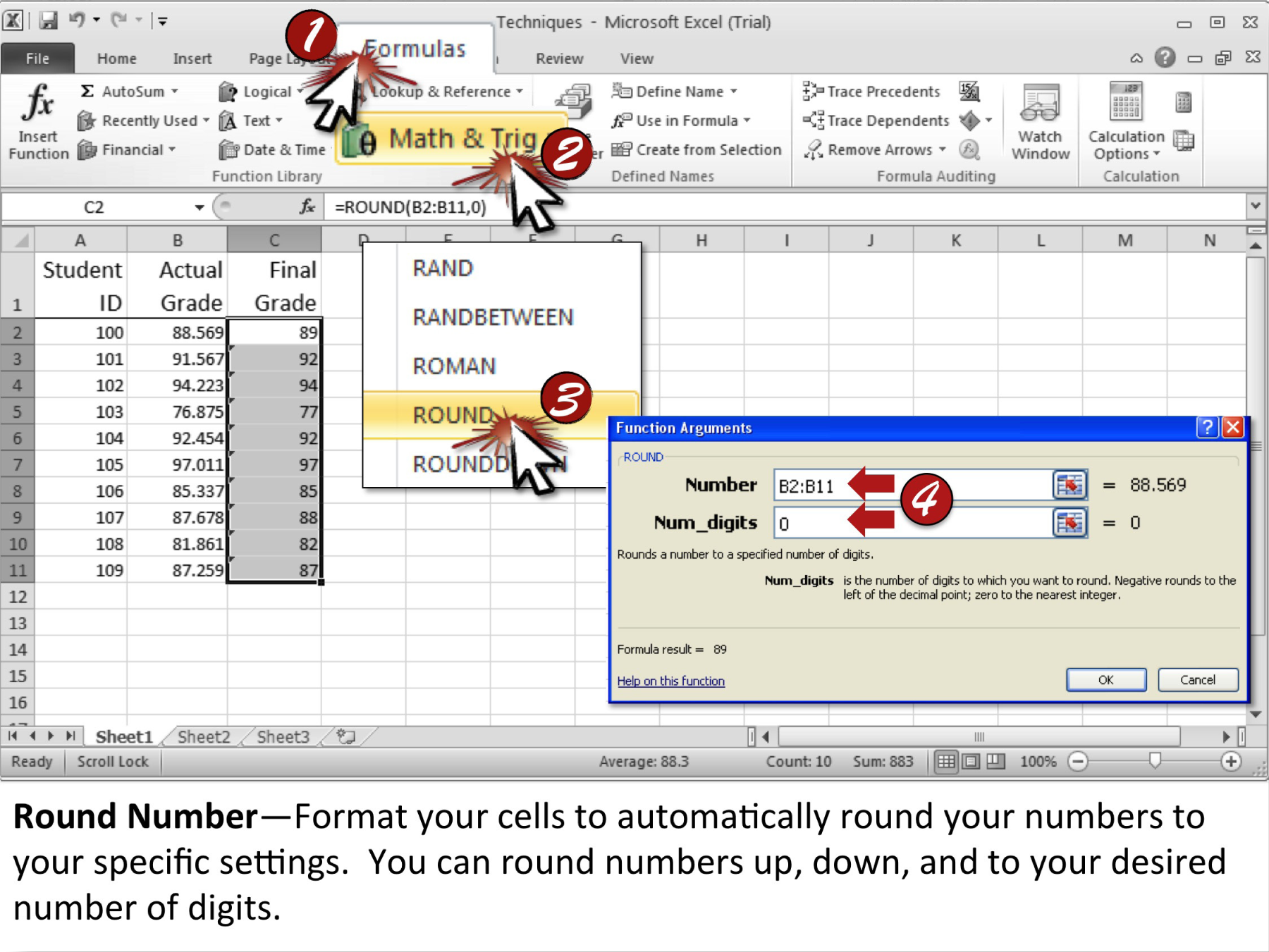
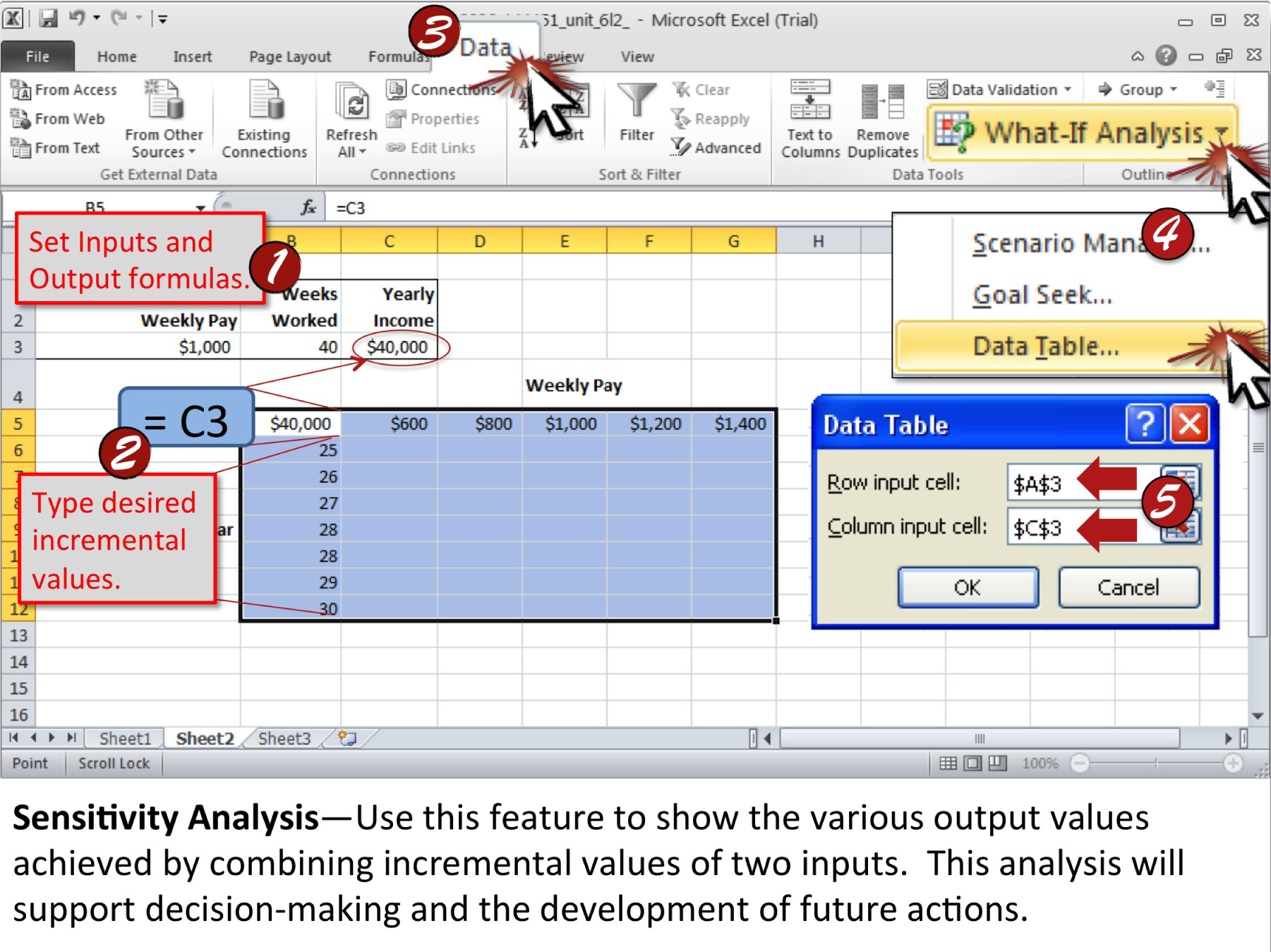
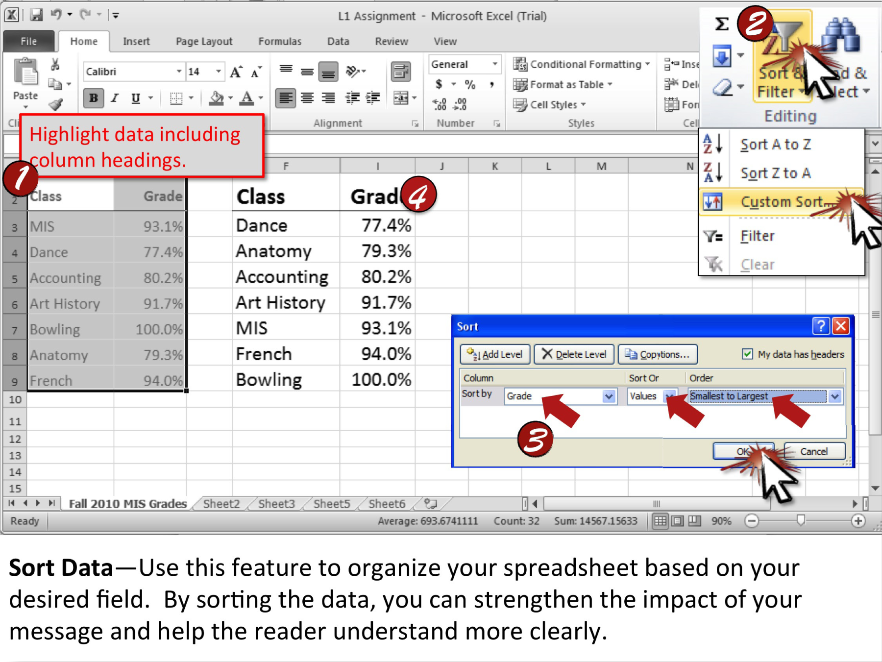
Chapter 17 Microsoft Access Techniques
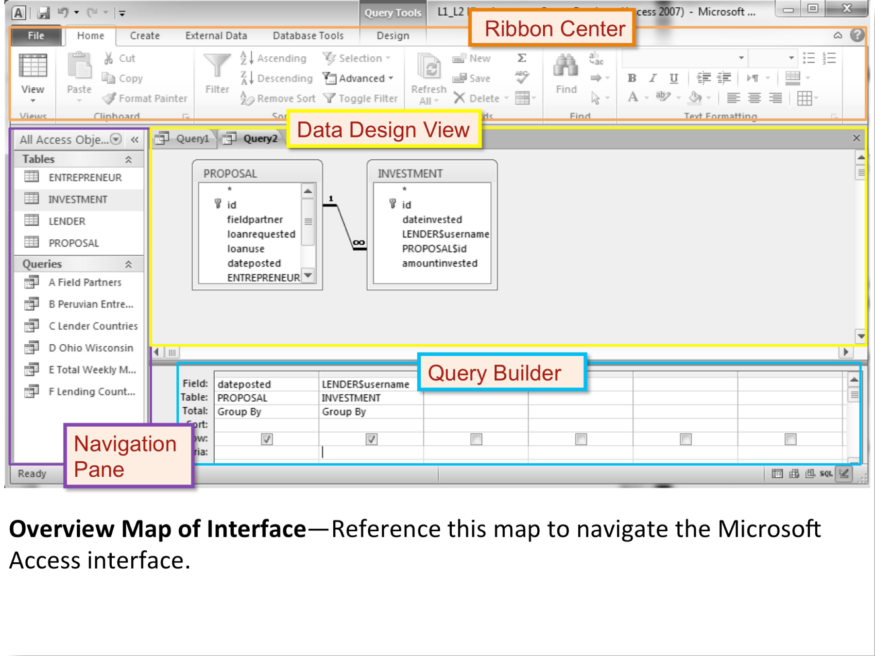
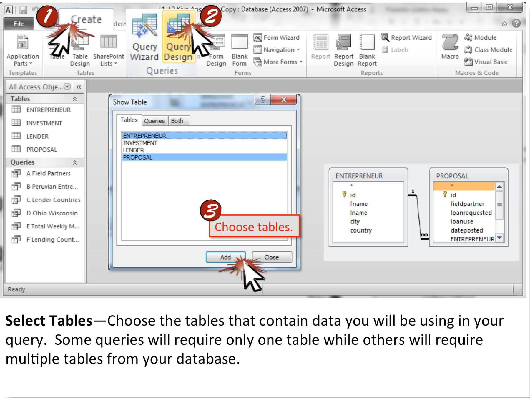
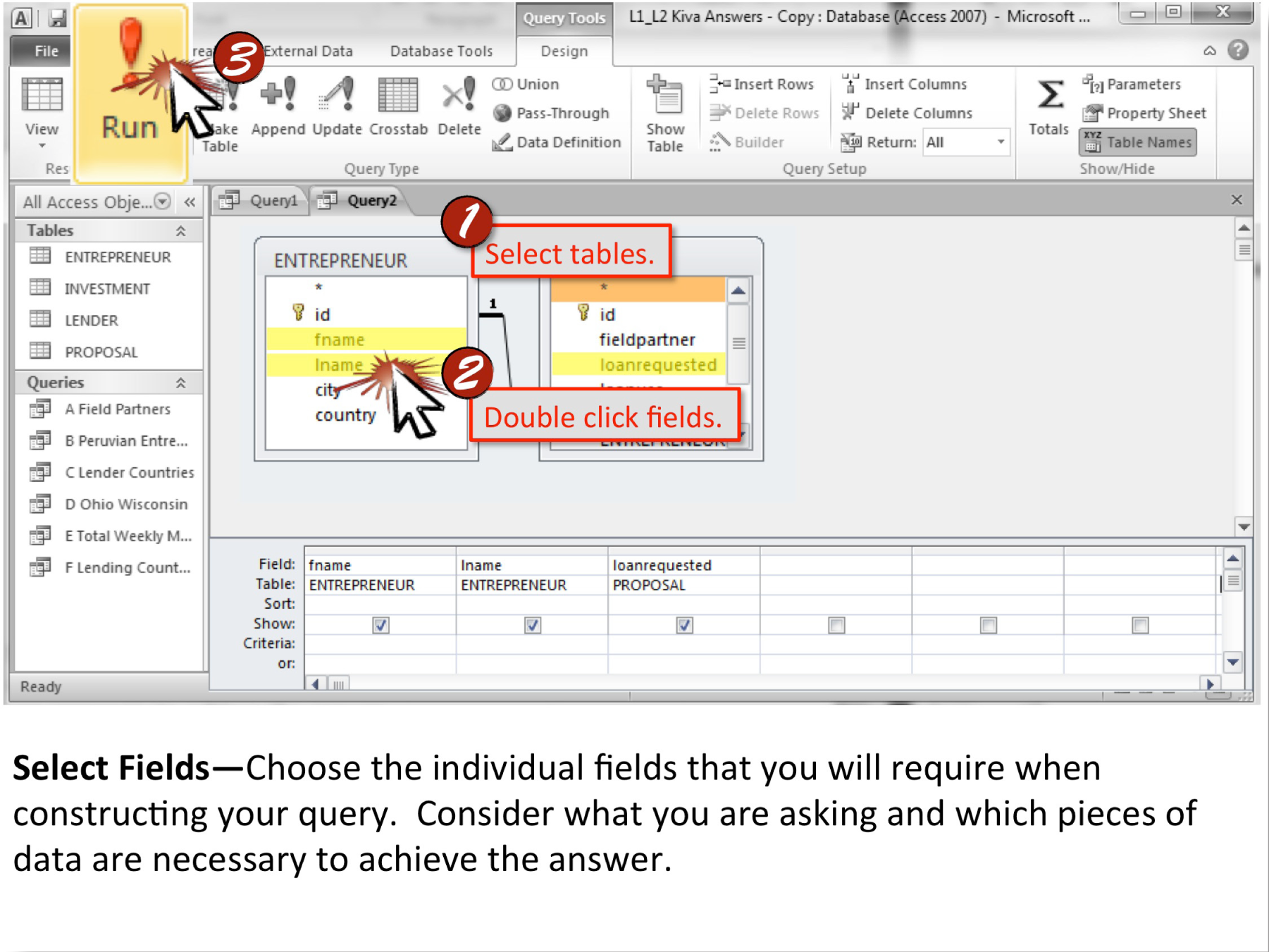
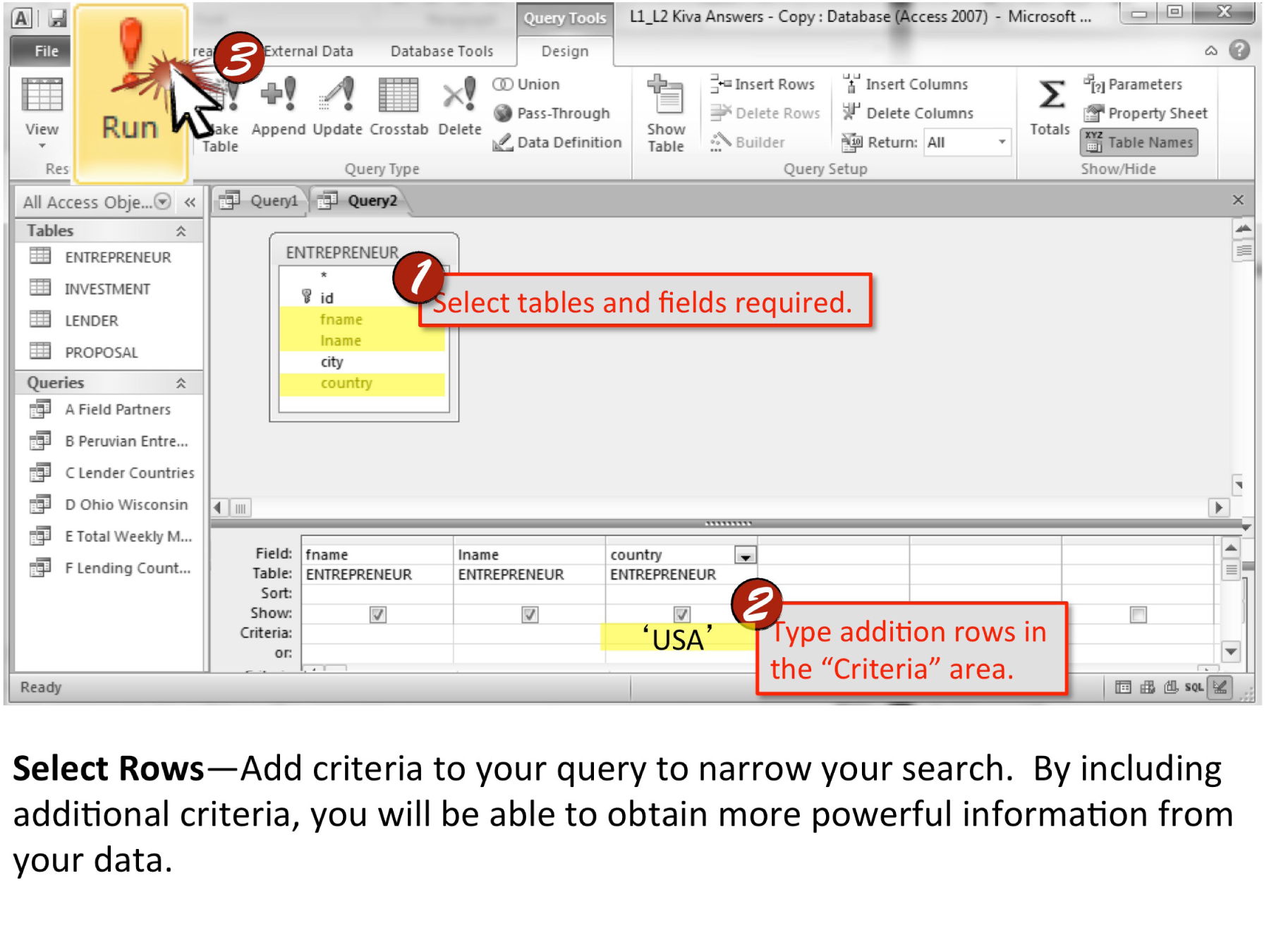
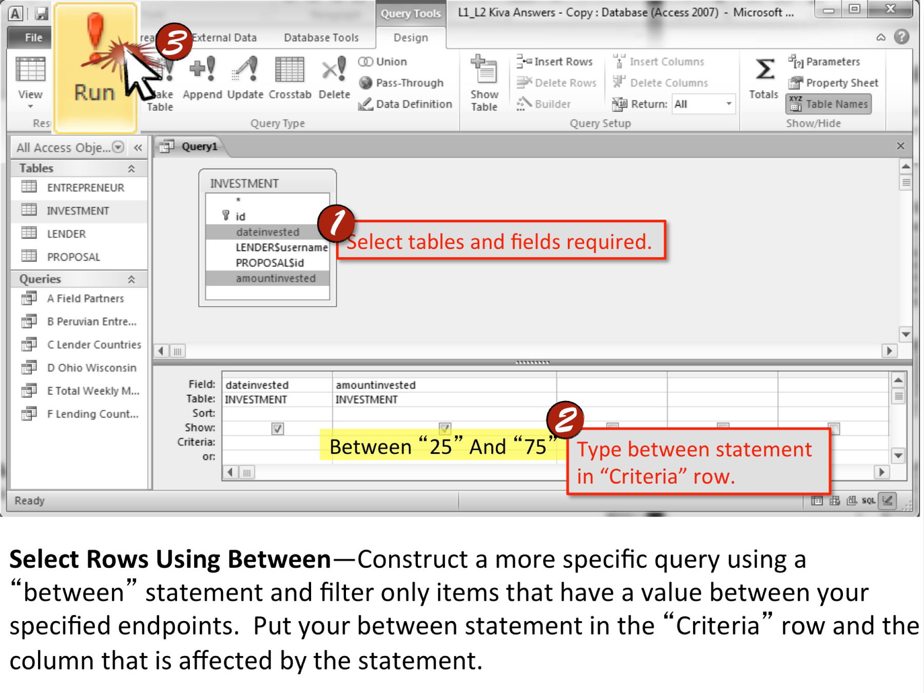
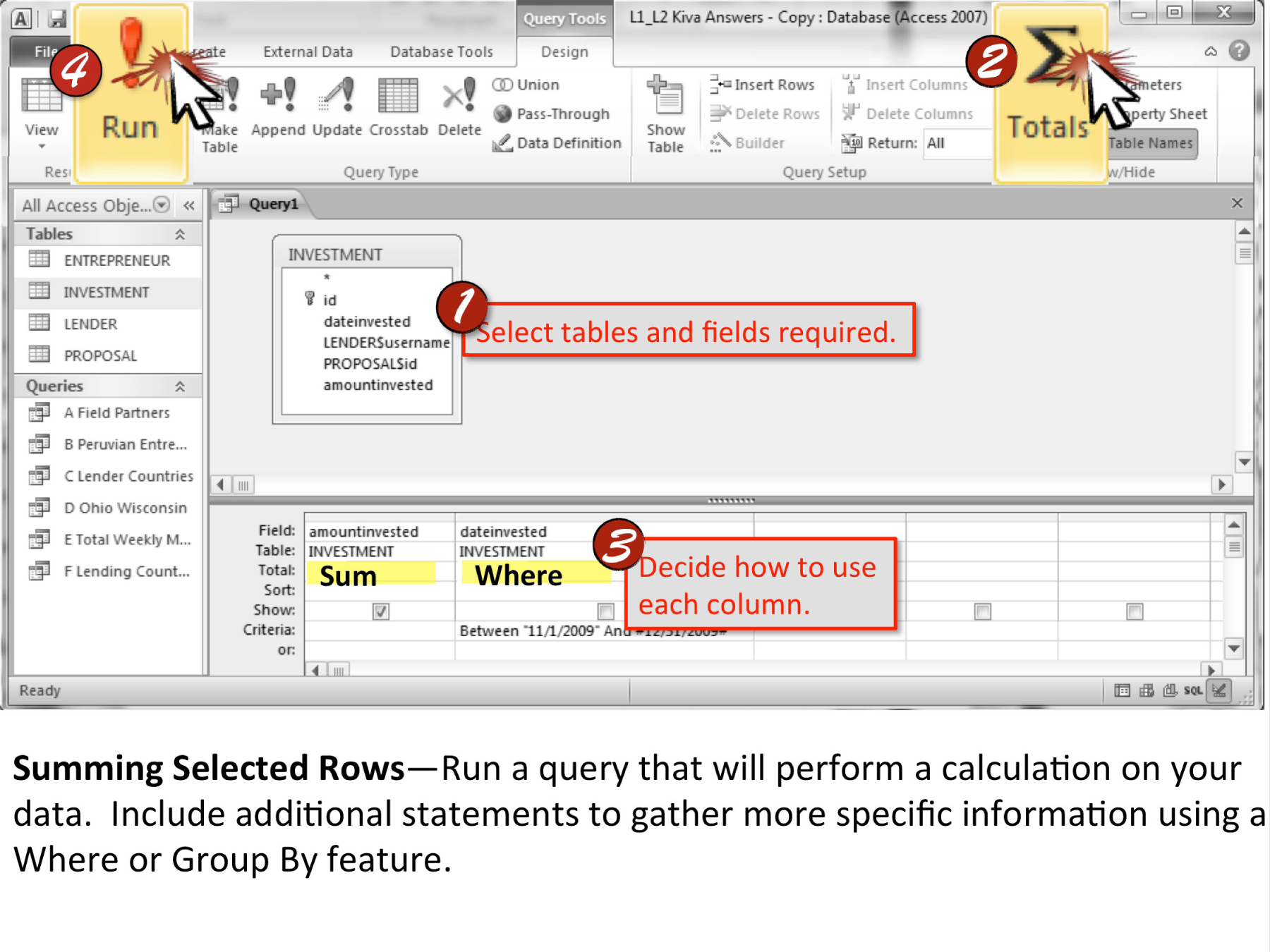
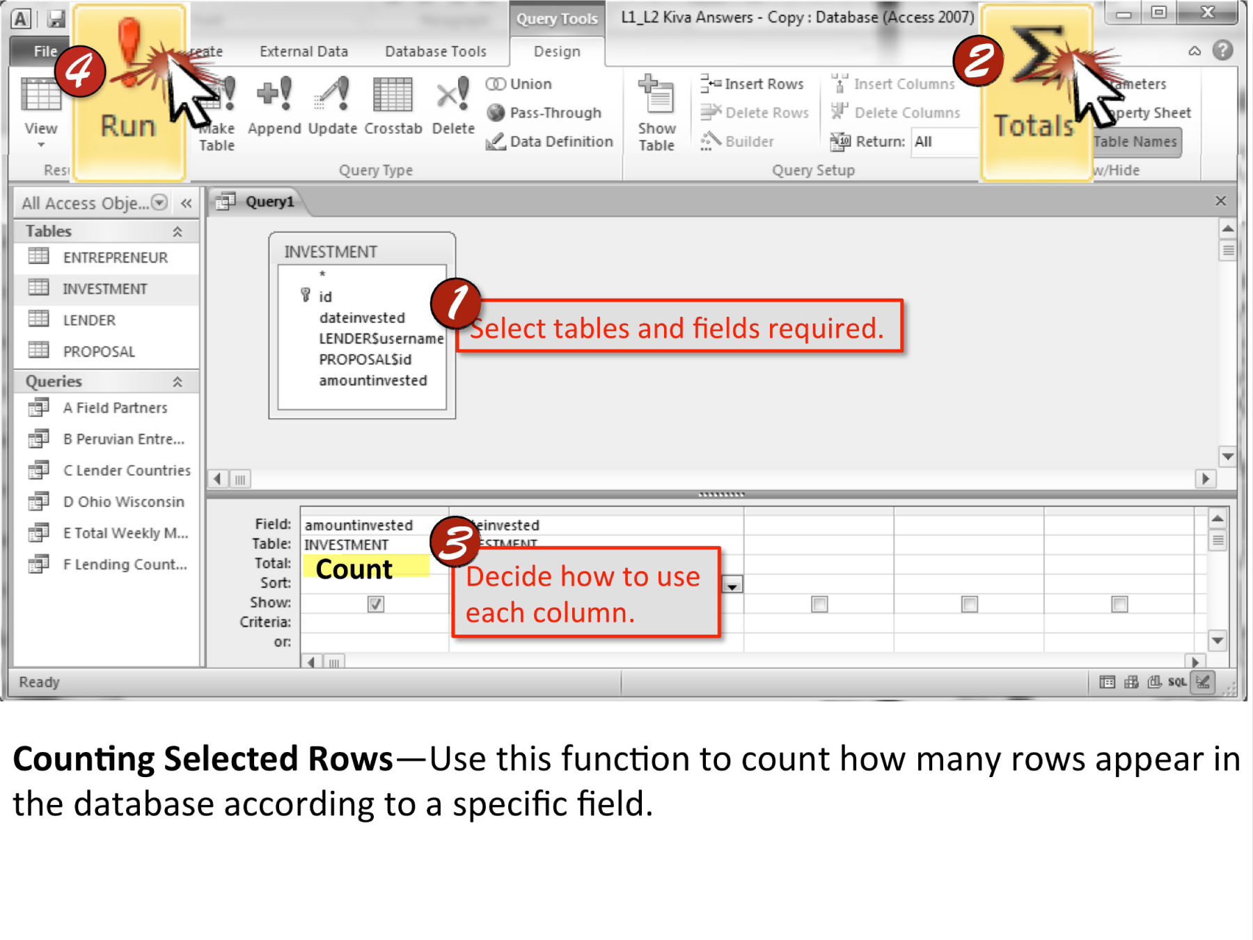
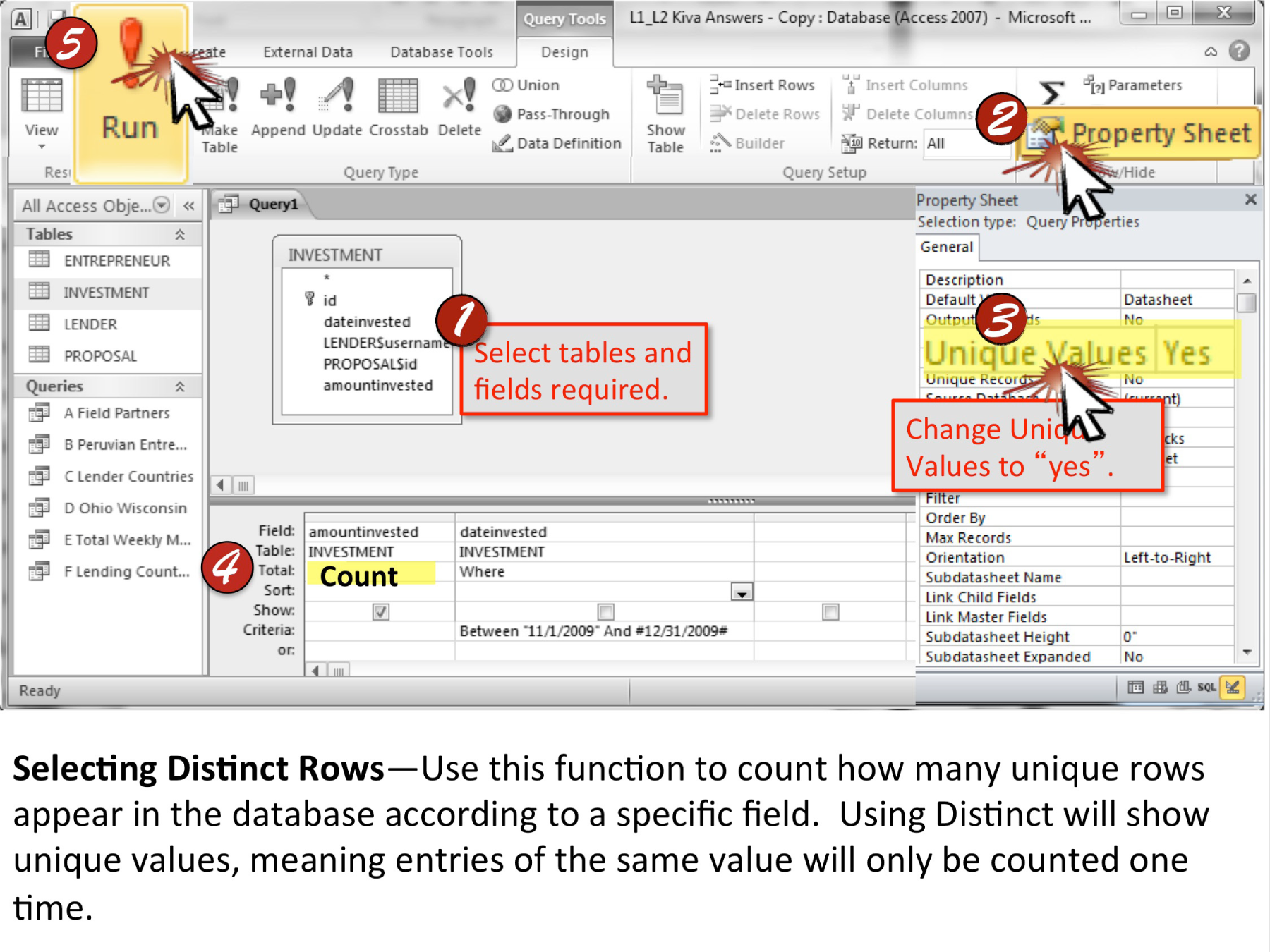
Chapter 18 Microsoft Word Techniques
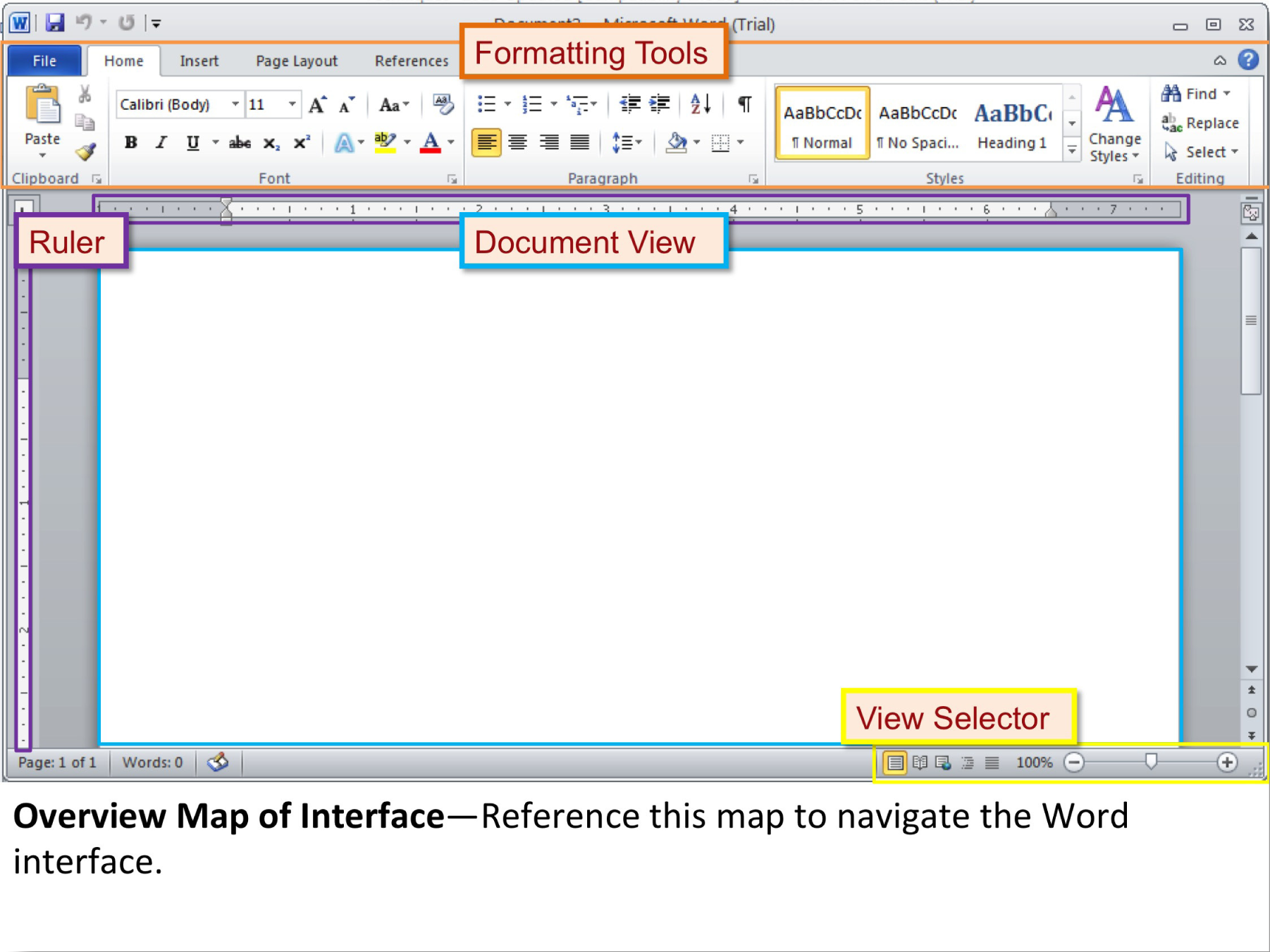
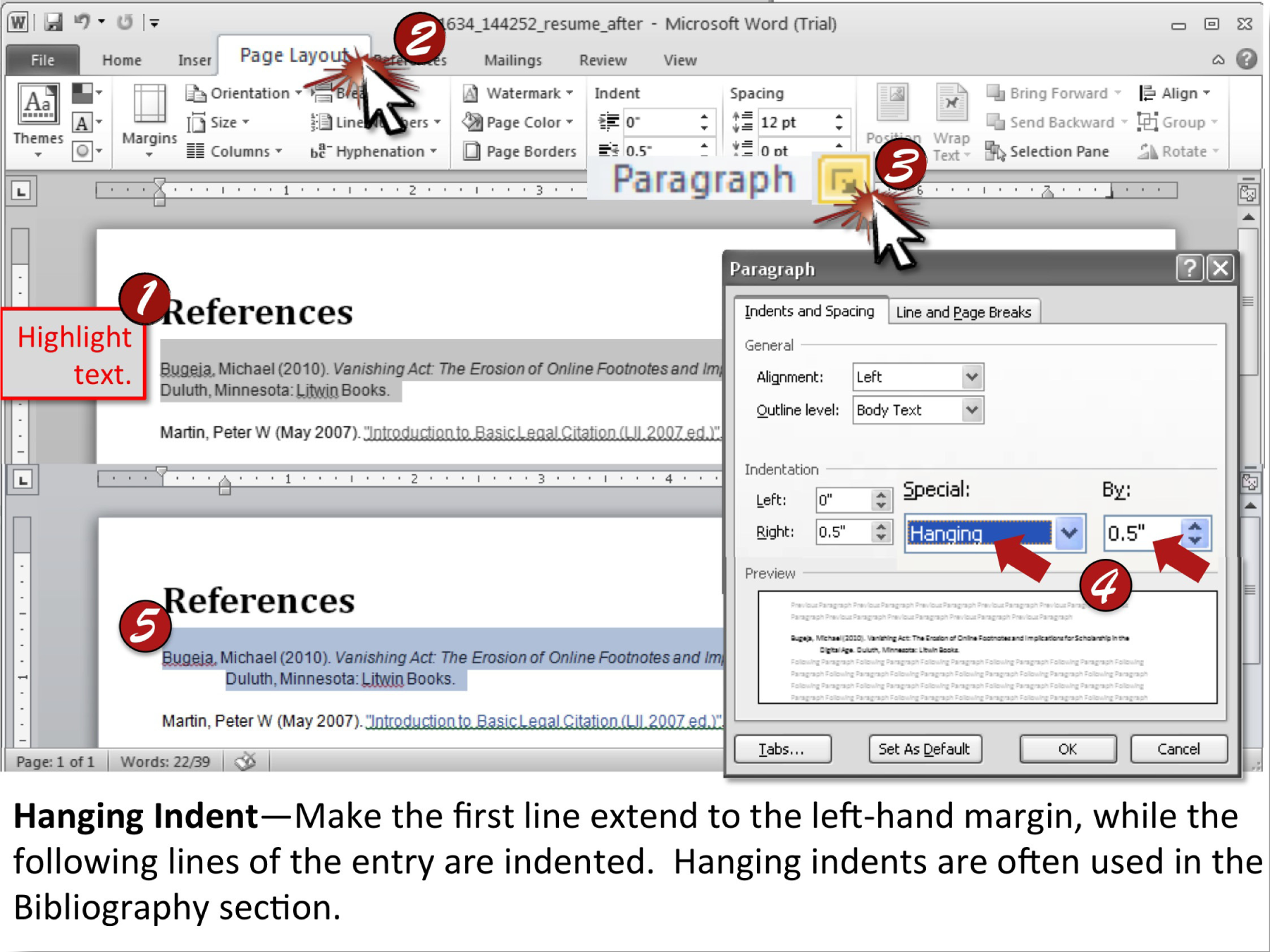
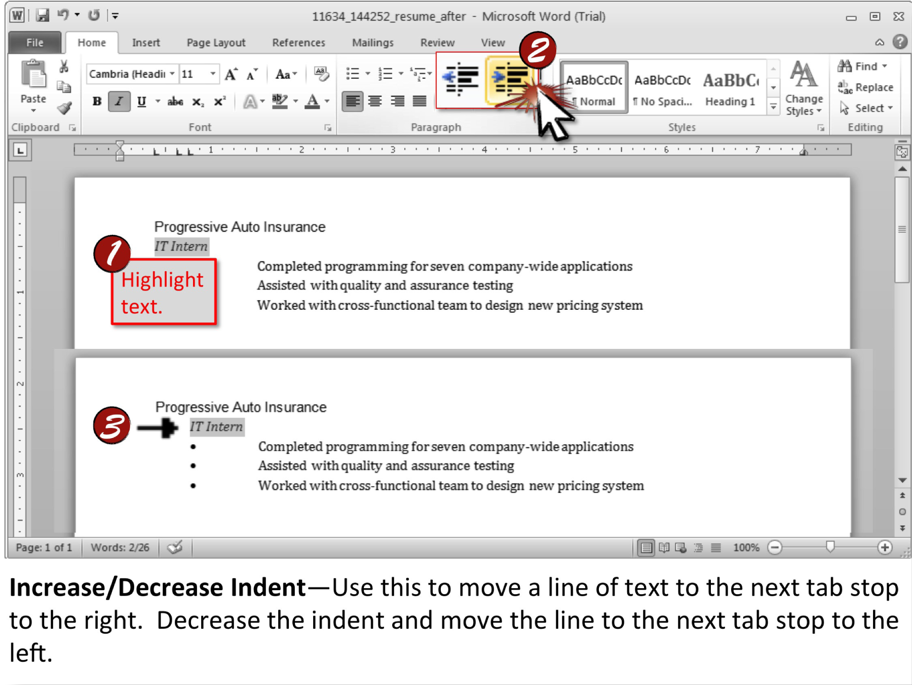
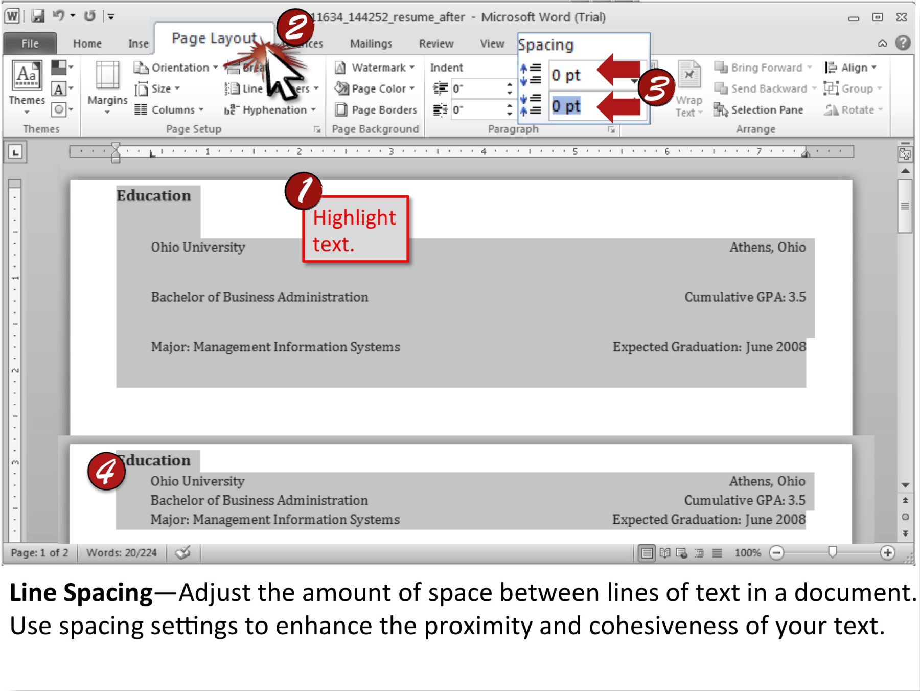
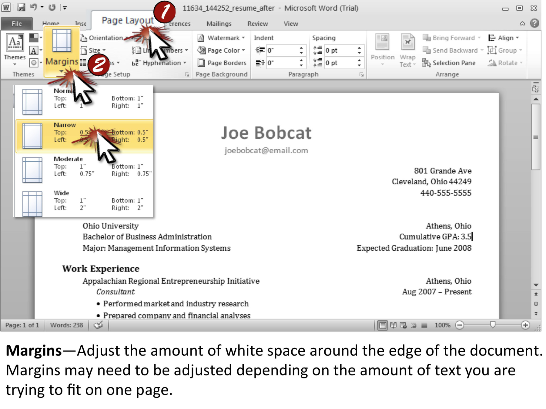
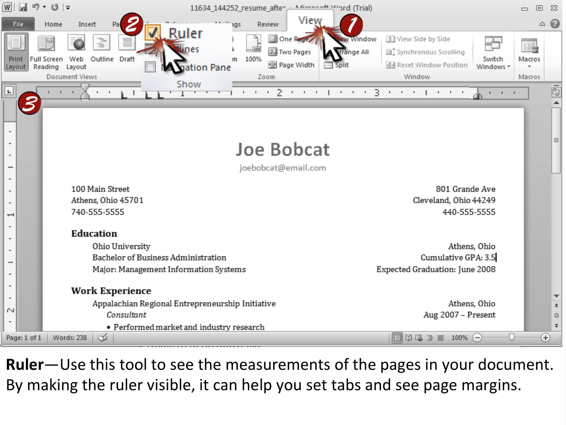
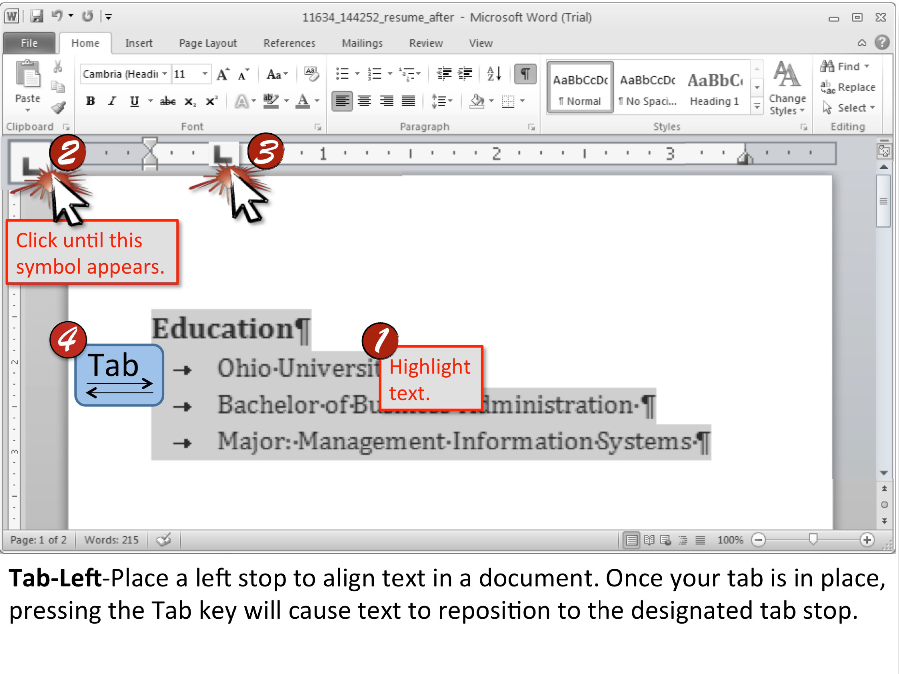
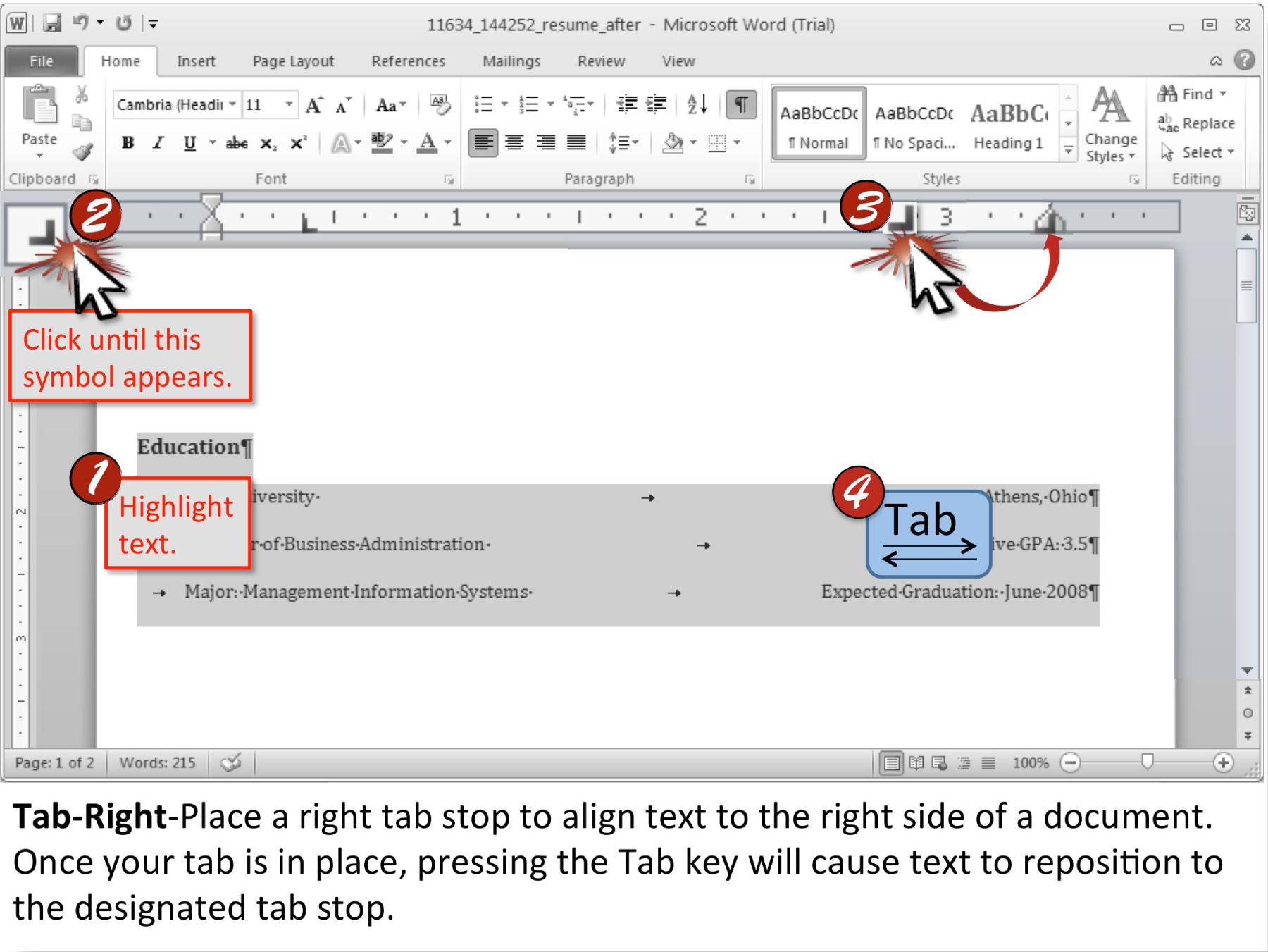
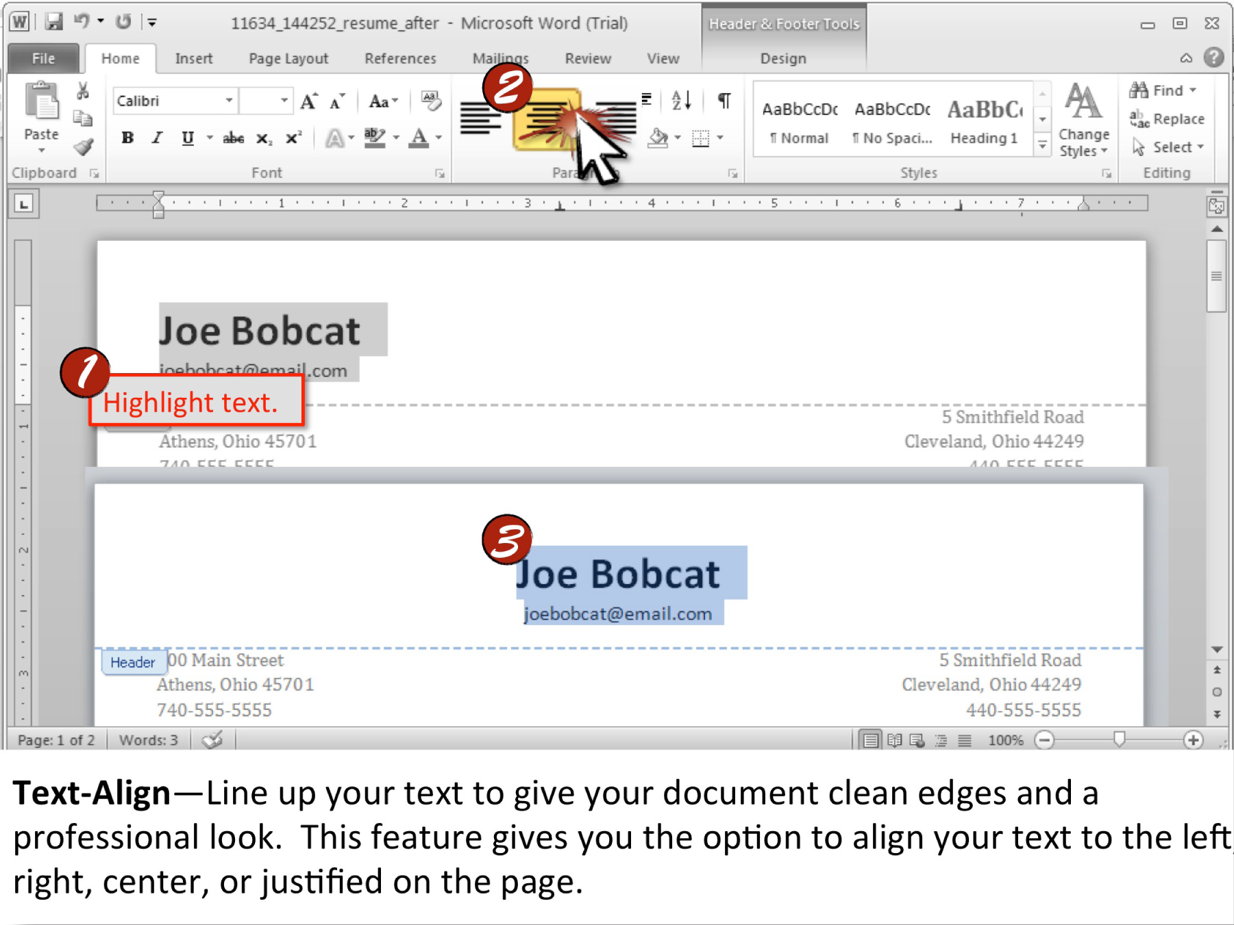
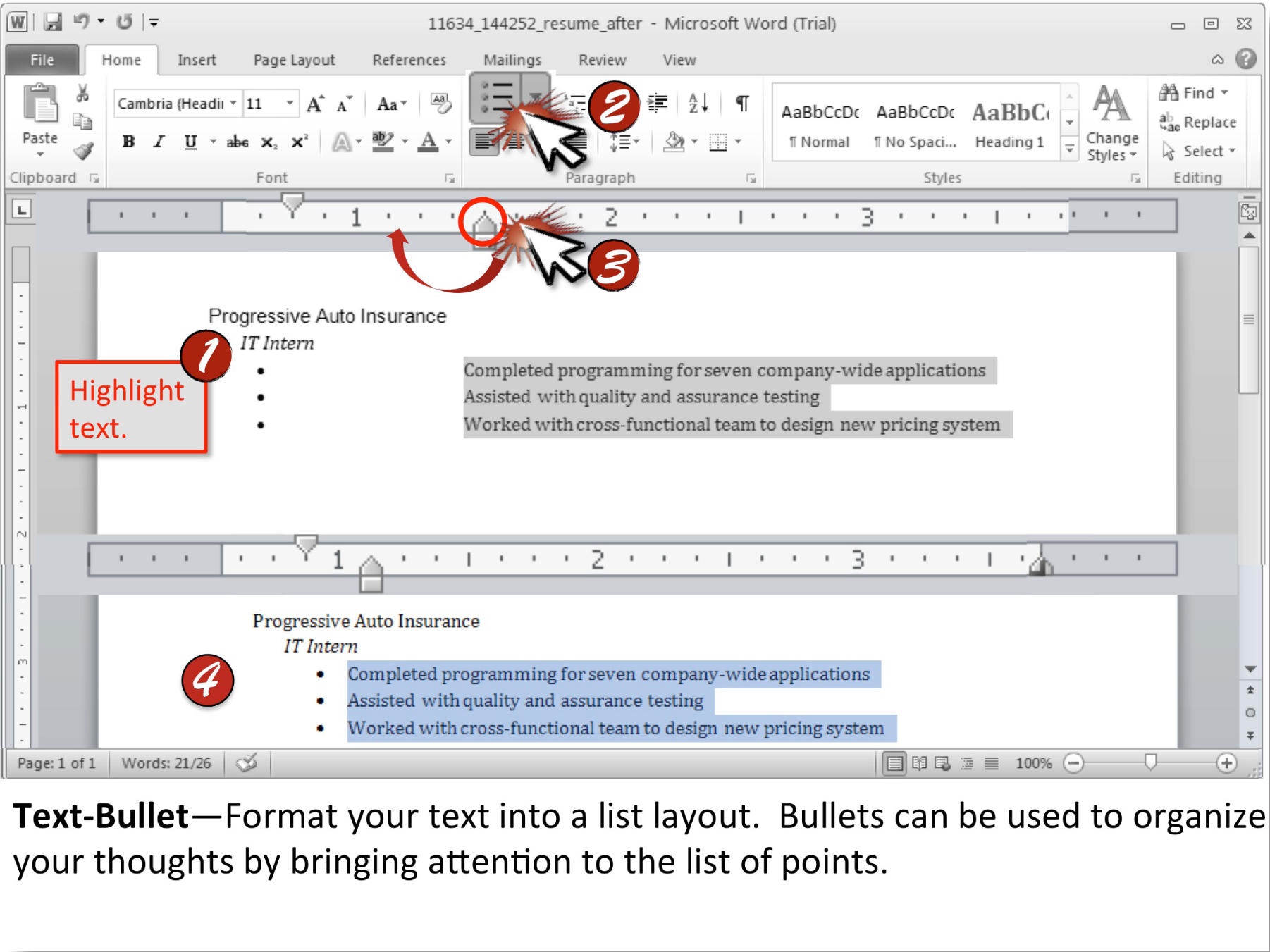
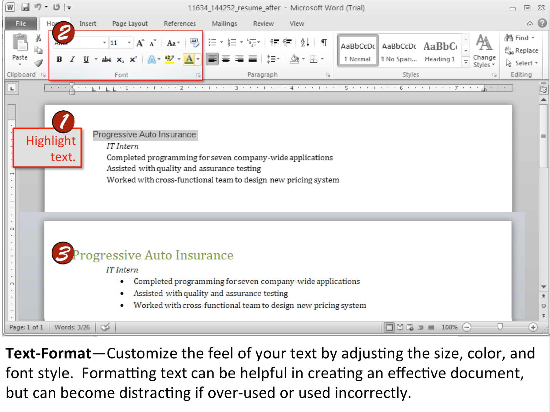
Chapter 19 Appendix A: Fonts
19.1 Additional Font Categories
There are several font categories in addition to serif and sans serif fonts that may be utilized.
In earlier chapters, we discussed the difference between serif and sans serif fonts. However, as you might imagine, the story is far more complex than that. There are many more specific font categories. These categories are based on fonts that share certain characteristics. We consider five basic font classifications though there are more. To create contrast, mix fonts from different classifications. Never mix two fonts from the same category—it will look like a mistake. The classifications are adapted from Robin Williams and are shown here enlarged to highlight the differences.
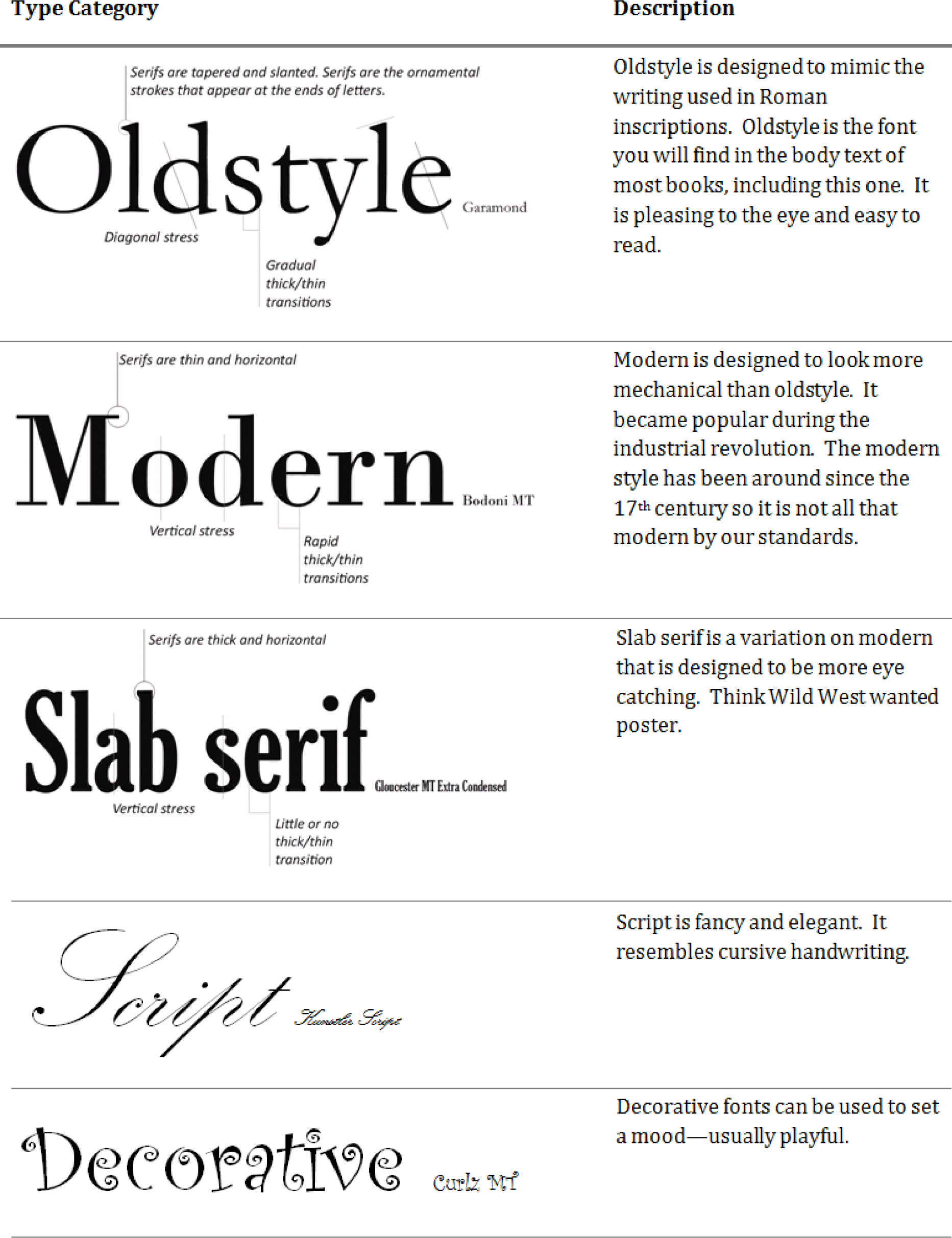
19.2 Combining Fonts and Effects
Combining fonts and effects can also be used to create different looks for fonts.
Normally, this is done to create contrast and visual interest.
The rule for combining fonts is very simple—you may combine fonts in a document as long as each font comes from a different category. For example any of the combinations on the opposing page will work.
Want even more drama? Contrasting techniques may also be used in combination for dramatic effect. See examples on opposite page.
Examples of Combining Fonts

Examples of Combining Contrasting Techniques
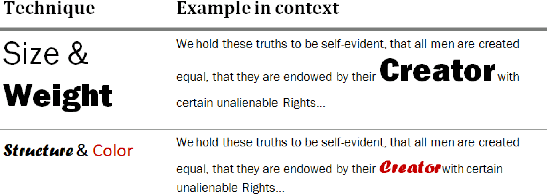
19.3 Font Categories in Detail
Here is a list of categorized fonts that may be available on a Microsoft Office machine:
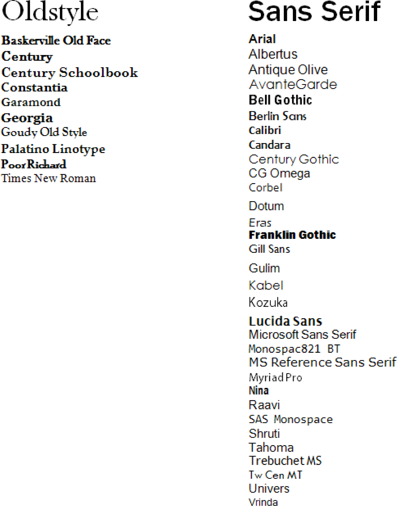
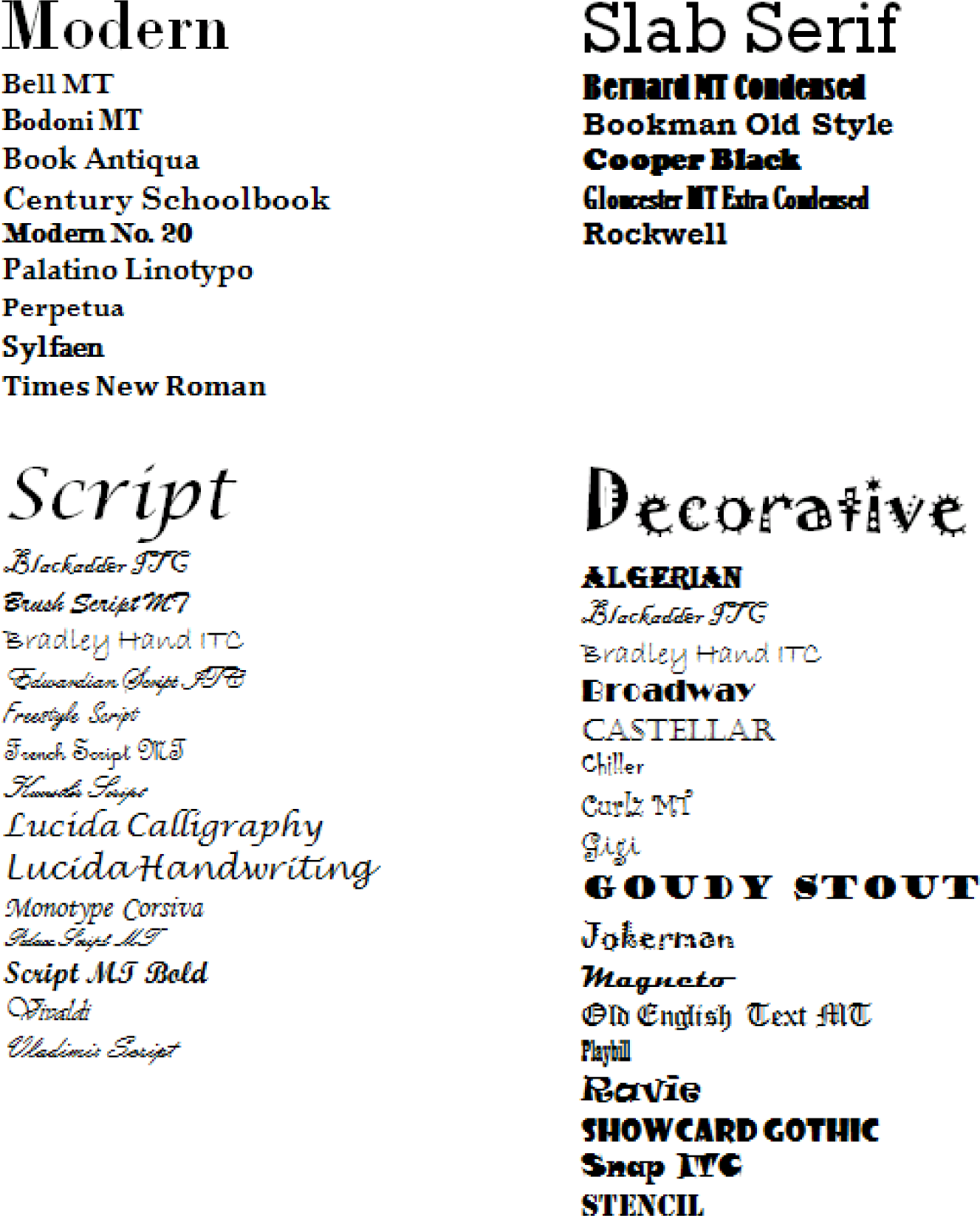
Candela Citations
- Business Information Systems: Design an App for That. Provided by: Saylor Academy. Located at: https://www.saylor.org/. License: CC BY-NC-SA: Attribution-NonCommercial-ShareAlike
