Licensing Information
This text was adapted by Saylor Academy under a Creative Commons Attribution-NonCommercial-ShareAlike 3.0 License without attribution as requested by the work’s original creator or licensor.
Saylor Academy would like to thank Andy Schmitz for his work in maintaining and improving the HTML versions of these textbooks. This textbook is adapted from his HTML version, and his project can be found here.
How to cite this work:
- Publisher: Saylor Academy
- Year Published: 2012
Preface
Maps are everywhere—on the Internet, in your car, and even on your mobile phone. Moreover, maps of the twenty-first century are not just paper diagrams folded like an accordion. Maps today are colorful, searchable, interactive, and shared. This transformation of the static map into dynamic and interactive multimedia reflects the integration of technological innovation and vast amounts of geographic data. The key technology behind this integration, and subsequently the maps of the twenty-first century, is geographic information systems or GIS.
Put simply, GIS is a special type of information technology that integrates data and information from various sources as maps. It is through this integration and mapping that the question of “where” has taken on new meaning. From getting directions to a new restaurant in San Francisco on your mobile device to exploring what will happen to coastal cities like Venice if oceans were to rise due to global warming, GIS provides insights into daily tasks and the big challenges of the future.
Essentials of Geographic Information Systems integrates key concepts behind the technology with practical concerns and real-world applications. Recognizing that many potential GIS users are nonspecialists or may only need a few maps, this book is designed to be accessible, pragmatic, and concise. Essentials of Geographic Information Systems also illustrates how GIS is used to ask questions, inform choices, and guide policy. From the melting of the polar ice caps to privacy issues associated with mapping, this book provides a gentle, yet substantive, introduction to the use and application of digital maps, mapping, and GIS.
In today’s world, learning involves knowing how and where to search for information. In some respects, knowing where to look for answers and information is arguably just as important as the knowledge itself. Because Essentials of Geographic Information Systems is concise, focused, and directed, readers are encouraged to search for supplementary information and to follow up on specific topics of interest on their own when necessary. Essentials of Geographic Information Systemsprovides the foundations for learning GIS, but readers are encouraged to construct their own individual frameworks of GIS knowledge. The benefits of this approach are two-fold. First, it promotes active learning through research. Second, it facilitates flexible and selective learning—that is, what is learned is a function of individual needs and interest.
Chapter 1Introduction
Stuff Happens…
What’s more is that stuff happens somewhere. Knowing something about where something happens can help us to understand what happened, when it happened, how it happened, and why it happened. Whether it is an outbreak of a highly contagious disease, the discovery of a new frog species, the path of a deadly tornado, or the nearest location of a supermarket, knowing something about where things happen is important to how we understand and relate to our local environment and to the world at large.
A geographic information system—or GIS—is a special type of information technology that can help us understand and relate to the “what,” “when,” “how,” and “why” of the world by answering “where.” Geographic information systems are indeed about maps, but they are also about much, much more.
A GIS is used to organize, analyze, visualize, and share all kinds of data and information from different historical periods and at various scales of analysis. From climatologists trying to understand the causes and consequences of global warming, to epidemiologists locating ground zero of a virulent disease outbreak, to archaeologists reconstructing ancient Rome, to political consultants developing campaign strategies for the next presidential election, GIS is a very powerful tool.
More important, GIS is about geography and learning about the world in which we live. As GIS technology develops, as society becomes ever more geospatially enabled, and as more and more people rediscover geography and the power of maps, the future uses and applications of GIS are unlimited.
To take full advantage of the benefits of GIS and related geospatial technology both now and in the future, it is useful to take stock of the ways in which we already think spatially with respect to the world in which we live. In other words, by recognizing and increasing our geographical awareness about how we relate to our local environment and the world at large, we will benefit more from our use and application of GIS.
The purpose of this chapter is to increase our geographical awareness and to refine our spatial thinking. First, a simple mental mapping exercise is used to highlight our geographical knowledge and spatial awareness, or lack thereof. Second, fundamental concepts and terms that are central to geographic information systems, and more generally geography, are identified, defined, and explained. This chapter concludes with a description of the frameworks that guide the use and application of GIS, as well as its future development.
1.1 Spatial Thinking
LEARNING OBJECTIVE
- The objective of this section is to illustrate how we think geographically every day with mental maps and to highlight the importance of asking geographic questions.
At no other time in the history of the world has it been easier to create or to acquire a map of nearly anything. Maps and mapping technology are literally and virtually everywhere. Though the modes and means of making and distributing maps have been revolutionized with recent advances in computing like the Internet, the art and science of map making date back centuries. This is because humans are inherently spatial organisms, and in order for us to live in the world, we must first somehow relate to it. Enter the mental map.
Mental Maps
Mental or cognitive maps are psychological tools that we all use every day. As the name suggests, mental maps are maps of our environment that are stored in our brain. We rely on our mental maps to get from one place to another, to plan our daily activities, or to understand and situate events that we hear about from our friends, family, or the news. Mental maps also reflect the amount and extent of geographic knowledge and spatial awareness that we possess. To illustrate this point, pretend that a friend is visiting you from out of town for the first time. Using a blank sheet of paper, take five to ten minutes to draw a map from memory of your hometown that will help your friend get around.
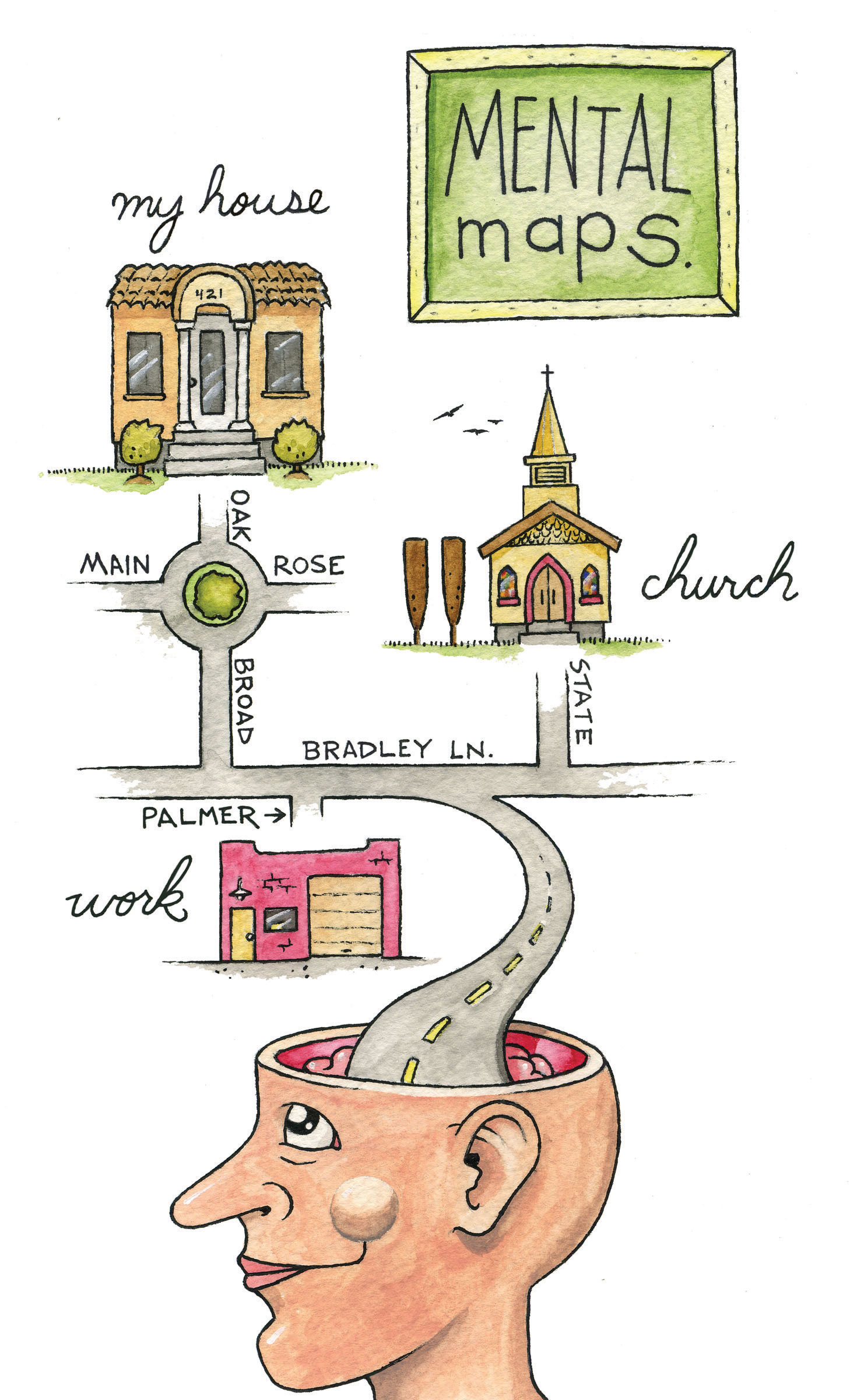
What did you choose to draw on your map? Is your house or where you work on the map? What about streets, restaurants, malls, museums, or other points of interest? How did you draw objects on your map? Did you use symbols, lines, and shapes? Are places labeled? Why did you choose to include certain places and features on your map but not others? What limitations did you encounter when making your map?
This simple exercise is instructive for several reasons. First, it illustrates what you know about where you live. Your simple map is a rough approximation of your local geographic knowledge and mental map. Second, it highlights the way in which you relate to your local environment. What you choose to include and exclude on your map provides insights about what places you think are important and how you move through your place or residence. Third, if we were to compare your mental map to someone else’s from the same place, certain similarities emerge that shed light upon how we as humans tend to think spatially and organize geographical information in our minds. Fourth, this exercise reveals something about your artistic, creative, and cartographic abilities. In this respect, not only are mental maps unique, but also the way in which such maps are drawn or represented on the page is unique too.
To reinforce these points, consider the series of mental maps of Los Angeles provided in Figure 1.1 “Mental Map of Los Angeles A”.
Figure 1.1 Mental Map of Los Angeles A
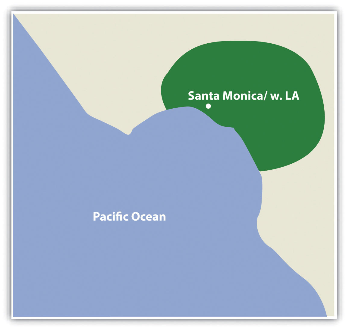
Figure 1.2 Mental Map of Los Angeles B
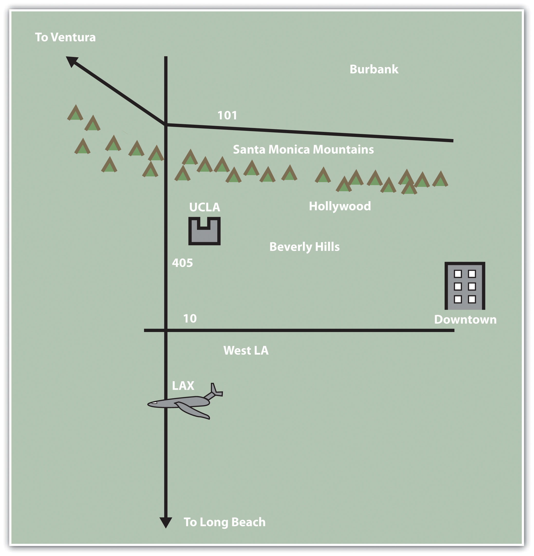
Figure 1.3 Mental Map of Los Angeles C
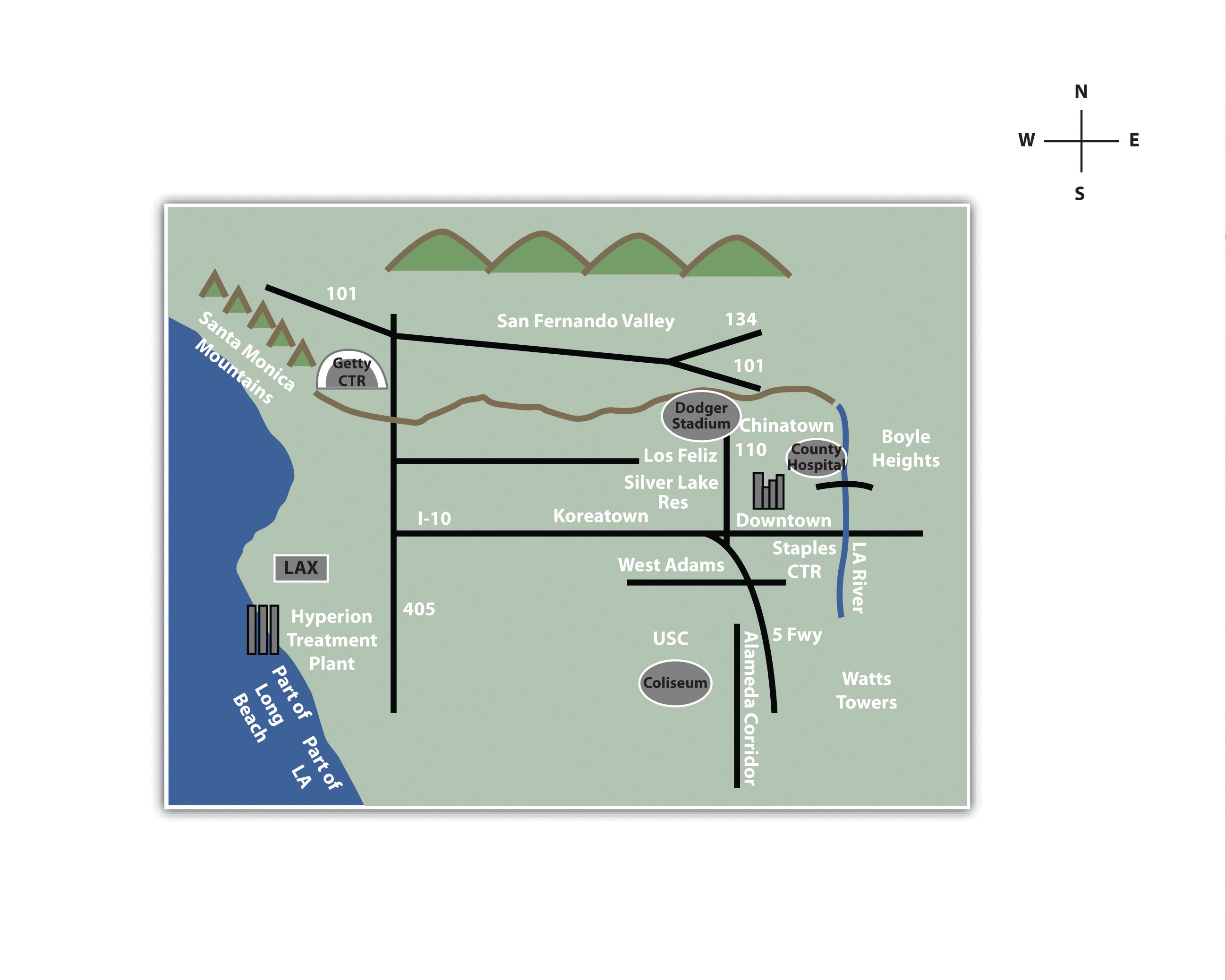
Take a moment to look at each map and compare the maps with the following questions in mind:
- What similarities are there on each map?
- What are some of the differences?
- Which places or features are illustrated on the map?
- From what you know about Los Angeles, what is included or excluded on the maps?
- What assumptions are made in each map?
- At what scale is the map drawn?
Each map is probably an imperfect representation of one’s mental map, but we can see some similarities and differences that provide insights into how people relate to Los Angeles, maps, and more generally, the world. First, all maps are oriented so that north is up. Though only one of the maps contains a north arrow that explicitly informs viewers the geographic orientation of the map, we are accustomed to most maps having north at the top of the page. Second, all but the first map identify some prominent features and landmarks in the Los Angeles area. For instance, Los Angeles International Airport (LAX) appears on two of these maps, as do the Santa Monica Mountains. How the airport is represented or portrayed on the map, for instance, as text, an abbreviation, or symbol, also speaks to our experience using and understanding maps. Third, two of the maps depict a portion of the freeway network in Los Angeles, and one also highlights the Los Angeles River and Ballona Creek. In a city where the “car is king,” how can any map omit the freeways?
What you include and omit on your map, by choice or not, speaks volumes about your geographical knowledge and spatial awareness—or lack thereof. Recognizing and identifying what we do not know is an important part of learning. It is only when we identify the unknown that we are able to ask questions, collect information to answer those questions, develop knowledge through answers, and begin to understand the world where we live.
Asking Geographic Questions
Filling in the gaps in our mental maps and, more generally, the gaps in our geographic knowledge requires us to ask questions about the world where we live and how we relate to it. Such questions can be simple with a local focus (e.g., “Which way is the nearest hospital?”) or more complex with a more global perspective (e.g., “How is urbanization impacting biodiversity hotspots around the world?”). The thread that unifies such questions is geography. For instance, the question of “where?” is an essential part of the questions “Where is the nearest hospital?” and “Where are the biodiversity hotspots in relation to cities?” Being able to articulate questions clearly and to break them into manageable pieces are very valuable skills when using and applying a geographic information system (GIS).
Though there may be no such thing as a “dumb” question, some questions are indeed better than others. Learning how to ask the right question takes practice and is often more difficult than finding the answer itself. However, when we ask the right question, problems are more easily solved and our understanding of the world is improved. There are five general types of geographic questions that we can ask and that GIS can help us to answer. Each type of question is listed here and is also followed by a few examples (Nyerges 1991).Nyerges, T. 1991. “Analytical Map Use.” Cartography and Geographic Information Systems (formerly The American Cartographer) 18: 11–22.
Questions about geographic location:
- Where is it?
- Why is it here or there?
- How much of it is here or there?
Questions about geographic distribution:
- Is it distributed locally or globally?
- Is it spatially clustered or dispersed?
- Where are the boundaries?
Questions about geographic association:
- What else is near it?
- What else occurs with it?
- What is absent in its presence?
Questions about geographic interaction:
- Is it linked to something else?
- What is the nature of this association?
- How much interaction occurs between the locations?
Questions about geographic change:
- Has it always been here?
- How has it changed over time and space?
- What causes its diffusion or contraction?
These and related geographic questions are frequently asked by people from various areas of expertise, industries, and professions. For instance, urban planners, traffic engineers, and demographers may be interested in understanding the commuting patterns between cities and suburbs (geographic interaction). Biologists and botanists may be curious about why one animal or plant species flourishes in one place and not another (geographic location/distribution). Epidemiologists and public health officials are certainly interested in where disease outbreaks occur and how, why, and where they spread (geographic change/interaction/location).
A GIS can assist in answering all these questions and many more. Furthermore, a GIS often opens up additional avenues of inquiry when searching for answers to geographic questions. Herein is one of the greatest strengths of the GIS. While a GIS can be used to answer specific questions or to solve particular problems, it often unearths even more interesting questions and presents more problems to be solved in the future.
KEY TAKEAWAYS
- Mental maps are psychological tools that we use to understand, relate to, and navigate through the environment in which we live, work, and play.
- Mental maps are unique to the individual.
- Learning how to ask geographic questions is important to using and applying GISs.
- Geographic questions are concerned with location, distributions, associations, interactions, and change.
EXERCISES
- Draw a map of where you live. Discuss the similarities, differences, styles, and techniques on your map and compare them with two others. What are the commonalities between the maps? What are the differences? What accounts for such similarities and differences?
- Draw a map of the world and compare it to a world map in an atlas. What similarities and differences are there? What explains the discrepancies between your map and the atlas?
- Provide two questions concerned with geographic location, distribution, association, interaction, and change about global warming, urbanization, biodiversity, economic development, and war.
1.2 Geographic Concepts
LEARNING OBJECTIVE
- The objective of this section is to introduce and explain how the key concepts of location, direction, distance, space, and navigation are relevant to geography and geographic information systems (GISs).
Before we can learn “how to do” a geographic information system (GIS), it is first necessary to review and reconsider a few key geographic concepts that are often taken for granted. For instance, what is a location and how can it be defined? At what distance does a location become “nearby”? Or what do we mean when we say that someone has a “good sense of direction”? By answering these and related questions, we establish a framework that will help us to learn and to apply a GIS. This framework will also permit us to share and communicate geographic information with others, which can facilitate collaboration, problem solving, and decision making.
Location
The one concept that distinguishes geography from other fields is location, which is central to a GIS. Location is simply a position on the surface of the earth. What is more, nearly everything can be assigned a geographic location. Once we know the location of something, we can a put it on a map, for example, with a GIS.
Generally, we tend to define and describe locations in nominal or absolute terms. In the case of the former, locations are simply defined and described by name. For example, city names such as New York, Tokyo, or London refer to nominal locations. Toponymy, or the study of place names and their respective history and meanings, is concerned with such nominal locations (Monmonier 1996, 2006).Monmonier, M. 1996. How to Lie with Maps. Chicago: University of Chicago Press., ———. 2006. From Squaw Tit to Whorehouse Meadow: How Maps Name, Claim, and Inflame. Chicago: University of Chicago Press. Though we tend to associate the notion of location with particular points on the surface of the earth, locations can also refer to geographic features (e.g., Rocky Mountains) or large areas (e.g., Siberia). The United States Board on Geographic Names (http://geonames.usgs.gov) maintains geographic naming standards and keeps track of such names through the Geographic Names Information Systems (GNIS; http://geonames.usgs.gov/pls/gnispublic). The GNIS database also provides information about which state and county the feature is located as well as its geographic coordinates.
Contrasting nominal locations are absolute locations that use some type of reference system to define positions on the earth’s surface. For instance, defining a location on the surface of the earth using latitude and longitude is an example of absolute location. Postal codes and street addresses are other examples of absolute location that usually follow some form of local logic. Though there is no global standard when it comes to street addresses, we can determine the geographic coordinates (i.e., latitude and longitude) of particular street addresses, zip codes, place names, and other geographic data through a process called geocoding. There are several free online geocoders (e.g., http://worldkit.org/geocoder) that return the latitude and longitude for various locations and addresses around the world.
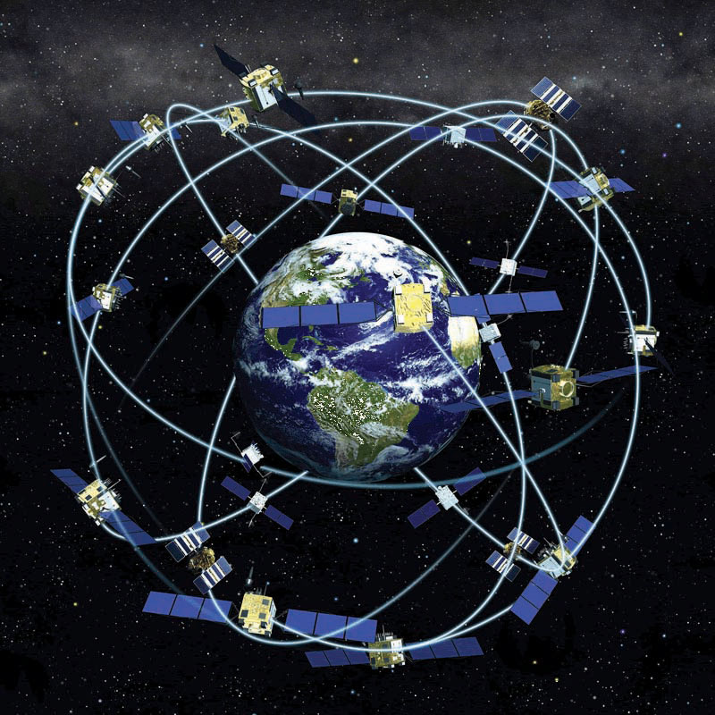
With the advent of the global positioning system (GPS) (see also http://www.gps.gov), determining the location of nearly any object on the surface of the earth is a relatively simple and straightforward exercise. GPS technology consists of a constellation of twenty-four satellites that are orbiting the earth and constantly transmitting time signals (see Figure 1.4 “Constellation of Global Positioning System (GPS) Satellites”). To determine a position, earth-based GPS units (e.g., handheld devices, car navigation systems, mobile phones) receive the signals from at least three of these satellites and use this information to triangulate a location. All GPS units use the geographic coordinate system (GCS) to report location. Originally developed by the United States Department of Defense for military purposes, there are now a wide range of commercial and scientific uses of a GPS.
Figure 1.4 Constellation of Global Positioning System (GPS) Satellites
Location can also be defined in relative terms. Relative location refers to defining and describing places in relation to other known locations. For instance, Cairo, Egypt, is north of Johannesburg, South Africa; New Zealand is southeast of Australia; and Kabul, Afghanistan, is northwest of Lahore, Pakistan. Unlike nominal or absolute locations that define single points, relative locations provide a bit more information and situate one place in relation to another.
Direction
Like location, the concept of direction is central to geography and GISs. Direction refers to the position of something relative to something else usually along a line. In order to determine direction, a reference point or benchmark from which direction will be measured needs to be established. One of the most common benchmarks used to determine direction is ourselves. Egocentric direction refers to when we use ourselves as a directional benchmark. Describing something as “to my left,” “behind me,” or “next to me” are examples of egocentric direction.
As the name suggests, landmark direction uses a known landmark or geographic feature as a benchmark to determine direction. Such landmarks may be a busy intersection of a city, a prominent point of interest like the Colosseum in Rome, or some other feature like a mountain range or river. The important thing to remember about landmark direction, especially when providing directions, is that the landmark should be relatively well-known.
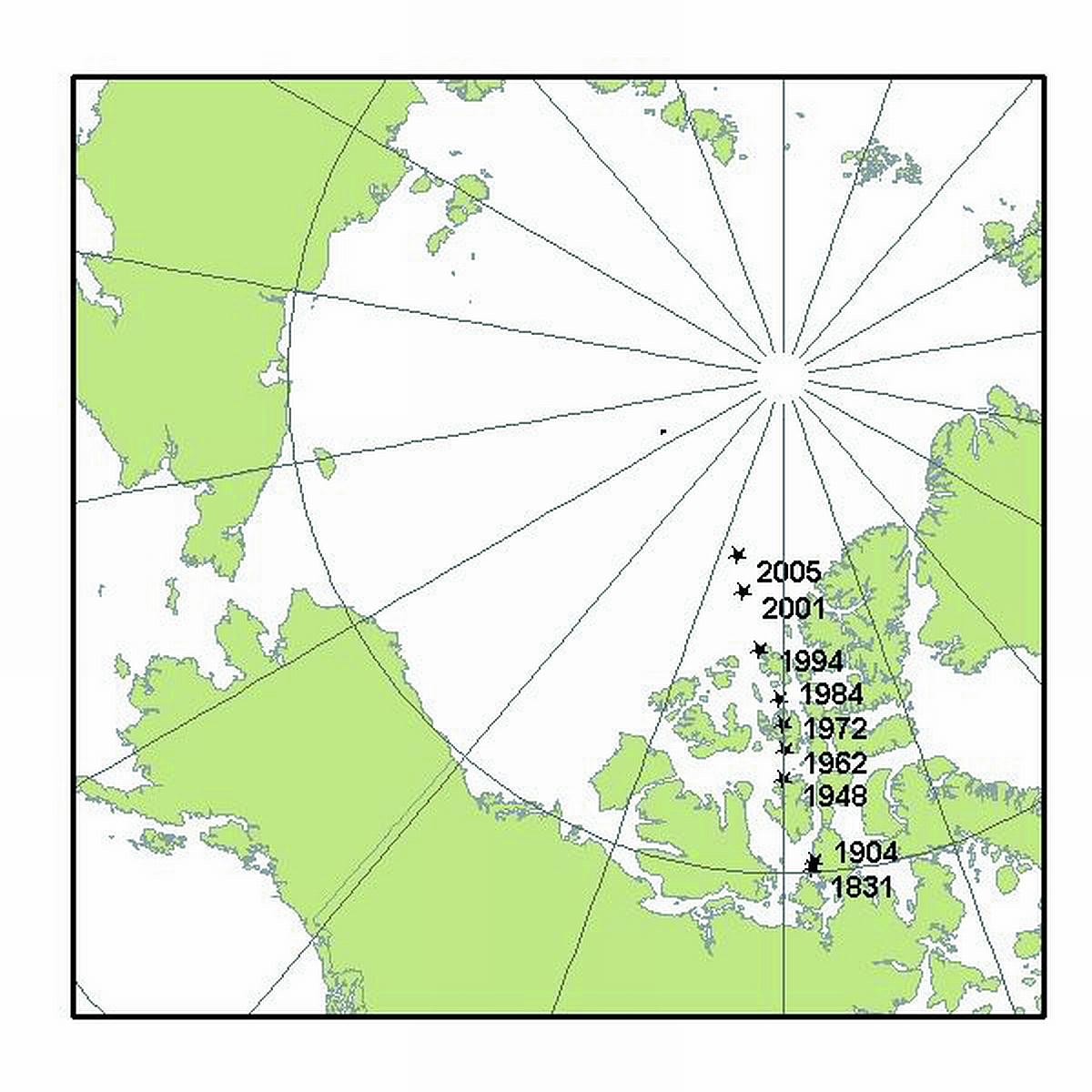
In geography and GISs, there are three more standard benchmarks that are used to define the directions of true north, magnetic north, and grid north. True north is based on the point at which the axis of the earth’s rotation intersects the earth’s surface. In this respect the North and South Poles serve as the geographic benchmarks for determining direction. Magnetic north (and south) refers to the point on the surface of the earth where the earth’s magnetic fields converge. This is also the point to which magnetic compasses point. Note that magnetic north falls somewhere in northern Canada and is not geographically coincident with true north or the North Pole. Grid north simply refers to the northward direction that the grid lines of latitude and longitude on a map, called a graticule, point to.
Figure 1.5 The Three Norths: True, Magnetic, and Grid
Distance
Complementing the concepts of location and direction is distance. Distance refers to the degree or amount of separation between locations and can be measured in nominal or absolute terms with various units. We can describe the distances between locations nominally as “large” or “small,” or we can describe two or more locations as “near” or “far apart.” Absolute distance is measured or calculated using a standard metric. The formula for the distance between two points on a planar (i.e., flat) surface is the following:
Calculating the distance between two locations on the surface of the earth, however, is a bit more involved because we are dealing with a three-dimensional object. Moving from the three-dimensional earth to two-dimensional maps on paper, computer screens, and mobile devices is not a trivial matter and is discussed in greater detail in Chapter 2 “Map Anatomy”.
We also use a variety of units to measure distance. For instance, the distance between London and Singapore can be measured in miles, kilometers, flight time on a jumbo jet, or days on a cargo ship. Whether or not such distances make London and Singapore “near” or “far” from each other is a matter of opinion, experience, and patience. Hence the use of absolute distance metrics, such as that derived from the distance formula, provide a standardized method to measure how far away or how near locations are from each other.
Space
Where distance suggests a measurable quantity in terms of how far apart locations are situated, space is a more abstract concept that is more commonly described rather than measured. For example, space can be described as “empty,” “public,” or “private.”
Within the scope of a GIS, we are interested in space, and in particular, we are interested in what fills particular spaces and how and why things are distributed across space. In this sense, space is a somewhat ambiguous and generic term that is used to denote the general geographic area of interest.
One kind of space that is of particular relevance to a GIS is topological space. Simply put, topological space is concerned with the nature of relationships and the connectivity of locations within a given space. What is important within topological space are (1) how locations are (or are not) related or connected to each other and (2) the rules that govern such geographic relationships.
Transportation maps such as those for subways provide some of the best illustrations of topological spaces (see Figure 1.6 “Metro Map from London” and Figure 1.7 “Metro Map from Moscow”). When using such maps, we are primarily concerned with how to get from one stop to another along a transportation network. Certain rules also govern how we can travel along the network (e.g., transferring lines is possible only at a few key stops; we can travel only one direction on a particular line). Such maps may be of little use when traveling around a city by car or foot, but they show the local transportation network and how locations are linked together in an effective and efficient manner.
Figure 1.6 Metro Map from London
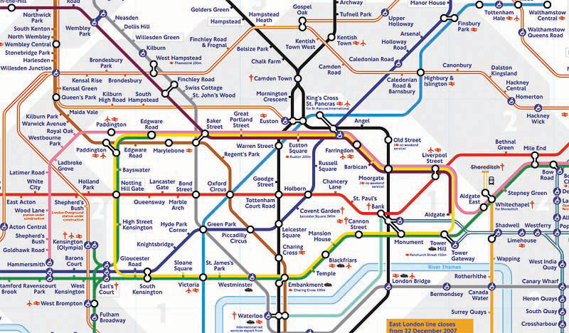
Figure 1.7 Metro Map from Moscow

Navigation
Transportation maps like those discussed previously illustrate how we move through the environments where we live, work, and play. This movement and, in particular, destination-oriented travel are generally referred to as navigation. How we navigate through space is a complex process that blends together our various motor skills; technology; mental maps; and awareness of locations, distances, directions, and the space where we live (Golledge and Stimson 1997).Golledge, R., and R. Stimson. 1997. Spatial Behavior: A Geographic Perspective. New York: Guilford. What is more, our geographical knowledge and spatial awareness is continuously updated and changed as we move from one location to another.
The acquisition of geographic knowledge is a lifelong endeavor. Though several factors influence the nature of such knowledge, we tend to rely on the three following types of geographic knowledge when navigating through space:
- Landmark knowledge refers to our ability to locate and identify unique points, patterns, or features (e.g., landmarks) in space.
- Route knowledge permits us to connect and travel between landmarks by moving through space.
- Survey knowledge enables us to understand where landmarks are in relation to each other and to take shortcuts.
Each type of geographic knowledge is acquired in stages, one after the other. For instance, when we find ourselves in a new or an unfamiliar location, we usually identify a few unique points of interest (e.g., hotel, building, fountain) to orient ourselves. We are in essence building up our landmark knowledge. Using and traveling between these landmarks develops our route knowledge and reinforces our landmark knowledge and our overall geographical awareness. Survey knowledge develops once we begin to understand how routes connect landmarks together and how various locations are situated in space. It is at this point, when we are somewhat comfortable with our survey knowledge, that we are able to take shortcuts from one location to another. Though there is no guarantee that a shortcut will be successful, if we get lost, we are at least expanding our local geographic knowledge.
Landmark, route, and survey knowledge are the cornerstones of having a sense of direction and frame our geographical learning and awareness. While some would argue that they are born with a good sense of direction, others admit to always getting lost. The popularity of personal navigation devices and online mapping services speaks to the overwhelming desire to know and to situate where we are in the world. Though developing and maintaining a keen sense of direction presumably matters less and less as such devices and services continue to develop and spread, it can also be argued that the more we know about where we are in the world, the more we will want to learn about it.
This section covers concepts essential to geography, GISs, and many other fields of interest. Understanding how location, direction, and distance can be defined and described provides an important foundation for the successful use and implementation of a GIS. Thinking about space and how we navigate through it also serves to improve and own geographic knowledge and spatial awareness.
KEY TAKEAWAYS
- Location refers to the position of an object on the surface of the earth and is commonly expressed in terms of latitude and longitude.
- Direction is always determined relative to a benchmark.
- Distance refers to the separation between locations.
- Navigation is the destination-oriented movement through space.
EXERCISES
- Find your hometown in the GNIS and see what other features share this name. Explore the toponymy of your hometown online.
- How are GPSs and related navigation technology influencing how we learn about our local environments?
- Does navigation technology improve or impede our sense of direction and learning about where we live?
- Compare and contrast the driving directions between two locations provided by two different online mapping services (e.g., Google Maps vs. Yahoo! Maps). Is there a discrepancy? If so, what explanations can you think of for this difference? Is this the best way to travel between these locations?
1.3 Geographic Information Systems for Today and Beyond
LEARNING OBJECTIVE
- The objective of this section is to define and describe how a geographic information system (GIS) is applied, its development, and its future.
Up to this point, the primary concern of this chapter was to introduce concepts essential to geography that are also relevant to geographic information systems (GISs). Furthermore, the introduction of these concepts was prefaced by an overview of how we think spatially and the nature of geographic inquiry. This final section is concerned with defining a GIS, describing its use, and exploring its future.
GIS Defined
So what exactly is a GIS? Is it computer software? Is it a collection of computer hardware? Is it a service that is distributed and accessed via the Internet? Is it a tool? Is it a system? Is it a science? The answer to all these questions is, “GIS is all of the above—and more.”
From a software perspective, a GIS consists of a special type of computer program capable of storing, editing, processing, and presenting geographic data and information as maps. There are several GIS software providers, such as Environmental Systems Research Institute Inc. (http://www.esri.com), which distributes ArcGIS, and PitneyBowes (http://www.pbinsight.com), which distributes MapInfo GIS. Though online mapping services and interfaces are provided by companies like Google, Yahoo!, and Microsoft, such services are not (yet) considered fully fledged GIS platforms. There are also open-source GIS options, such as GRASS (http://grass.itc.it), which is freely distributed and maintained by the open-source community. All GIS software, regardless of vendor, consists of a database management system that is capable of handling and integrating two types of data: spatial data and attribute data.
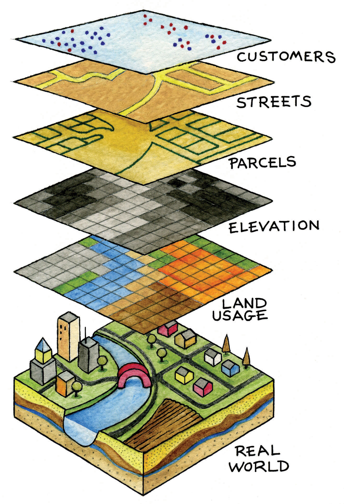
Spatial data refer to the real-world geographic objects of interest, such as streets, buildings, lakes, and countries, and their respective locations. In addition to location, each of these objects also possesses certain traits of interest, or attributes, such as a name, number of stories, depth, or population. GIS software keeps track of both the spatial and attribute data and permits us to link the two types of data together to create information and facilitate analysis. One popular way to describe and to visualize a GIS is picturing it as a cake with many layers. Each layer of the cake represents a different geographic theme, such as water features, buildings, and roads, and each layer is stacked one on top of another (see Figure 1.8 “A GIS as a Layered Cake”).
Figure 1.8 A GIS as a Layered Cake
As hardware, a GIS consists of a computer, memory, storage devices, scanners, printers, global positioning system (GPS) units, and other physical components. If the computer is situated on a network, the network can also be considered an integral component of the GIS because it enables us to share data and information that the GIS uses as inputs and creates as outputs.
As a tool, a GIS permits us to maintain, analyze, and share a wealth of data and information. From the relatively simple task of mapping the path of a hurricane to the more complex task of determining the most efficient garbage collection routes in a city, a GIS is used across the public and private sectors. Online and mobile mapping, navigation, and location-based services are also personalizing and democratizing GISs by bringing maps and mapping to the masses.
These are just a few definitions of a GIS. Like several of the geographic concepts discussed previously, there is no single or universally accepted definition of a GIS. There are probably just as many definitions of GISs as there are people who use GISs. In this regard, it is the people like you who are learning, applying, developing, and studying GISs in new and compelling ways that unifies it.
Three Approaches to GISs
In addition to recognizing the many definitions of a GIS, it is also constructive to identify three general and overlapping approaches to understanding GISs—the application approach, the developer approach, and the science approach. Though most GIS users would probably identify with one approach more than another, they are not mutually exclusive. Moreover, as GISs and, more generally, information technology advance, the following categories will be transformed and reshaped accordingly.
The application approach to GISs considers a GIS primarily to be a tool. This is also perhaps the most common view of a GIS. From this perspective, a GIS is used to answer questions, support decision making, maintain an inventory of geographic data and information, and, of course, make maps. As a tool, there are arguably certain skills that should be acquired and required in order to use and apply a GIS properly. The application approach to a GIS is more concerned with using and applying GISs to solve problems than the GIS itself.
For instance, suppose we want to determine the best location for a new supermarket. What factors are important behind making this decision? Information about neighborhood demographics, existing supermarkets, the location of suppliers, zoning regulations, and available real estate are all critical to this decision. A GIS platform can integrate such information that is obtained from the census bureau, realtors, the local zoning agency, and even the Internet. A suitability analysis can then be carried out with the GIS, the output of which will show the best locations for the supermarket given the various local geographic opportunities (e.g., demographics/consumers) and constraints (e.g., supply chain, zoning, and real estate limitations) that exist.
There are several professional communities and organizations concerned with the use and application of a GIS, such as the Urban and Regional Information Systems Association (http://urisa.org) and the Global Spatial Data Infrastructure Association (http://www.gsdi.org).
Unlike the previous example in which a GIS is applied to answer or solve a particular question, the developer approach to GISs is concerned with the development of the GIS as a software or technology platform. Rather than focusing on how a GIS is used and applied, the developer approach is concerned with improving, refining, and extending the tool and technology itself and is largely in the realm of computer programmers and software developers.
The ongoing integration and evolution of GISs, maps, the Internet, and web-based mapping can be considered an outcome of the developer approach to GISs. In this regard, delivering maps, navigation tools, and user-friendly GISs to people via the Internet is the central challenge at hand. The underlying, and to a large extent hidden, logic and computer code that permit us to ask questions about how to get from point A to point B on a navigation website or to see where a new restaurant or open house is located on a web-based map are for the most part the domain of GIS programmers and developers. The Open Source Geospatial Foundation (http://www.osgeo.org) is another example of a community of GIS developers working to build and distribute open-source GIS software.
It is the developer approach to GISs that drives and introduces innovation and is informed and guided by the existing needs and future demands of the application approach. As such, it is indeed on the cutting edge, it is dynamic, and it represents an area for considerable growth in the future.
The science approach to GISs not only dovetails with the applications and developer approaches but also is more concerned with broader questions and how geography, cognition, map interpretation, and other geospatial issues such as accuracy and errors are relevant to GISs and vice versa (see Longley et al. 2005).Longley, P., M. Goodchild, D. Maguire, and D. Rhind. 2005. Geographic Information Systems and Science. 2nd ed. West Sussex, England: John Wiley. This particular approach is often referred to as geographic information science (GIScience), and it is also interested in the social consequences and implications of the use and diffusion of GIS technology. From exploring the propagation of error to examining how privacy is being redefined by GISs and related technology, GIScience is at the same time an agent of change as well as one of understanding.
In light of the rapid rate of technological and GIS innovation, in conjunction with the widespread application of GISs, new questions about GIS technology and its use are continually emerging. One of the most discussed topics concerns privacy, and in particular, what is referred to as locational privacy. In other words, who has the right to view or determine your geographic location at any given time? Your parents? Your school? Your employer? Your cell phone carrier? The government or police? When are you willing to divulge your location? Is there a time or place where you prefer to be “off the grid” or not locatable? Such questions concerning locational privacy were of relatively little concern a few years ago. However, with the advent of GPS and its integration into cars and other mobile devices, questions, debates, and even lawsuits concerning locational privacy and who has the right to such information are rapidly emerging.
As the name suggests, the developer approach to GISs is concerned with the development of GISs. Rather than focusing on how a GIS is used and applied, the developer approach is concerned with improving, refining, and extending the tool itself and is largely in the realm of computer programmers and software developers. For instance, the advent of web-based mapping is an outcome of the developer approach to GISs. In this regard, the challenge was how to bring GISs to people via the Internet and not necessarily how people would use web-based GISs. The developer approach to GISs drives and introduces innovation and is guided by the needs of the application approach. As such, it is indeed on the cutting edge, it is dynamic, and it represents an area for considerable growth in the future.
GIS Futures
The definitions and approaches to GISs described previously illustrate the scope and breadth of this special type of information technology. Furthermore, as GISs become more accessible and widely distributed, there will always be new questions to be answered, new applications to be developed, and innovative technologies to integrate.
One notable development is the emergence of what is called the geospatial web. The geospatial web or geoweb refers to the integration of the vast amounts of content available on the Internet (e.g., text, photographs, video, and music) with geographic information, such as location. Adding such geographic information to such content is called geotagging and is similar to geocoding. The integration of geographic information with such content opens up new ways to access, search, organize, share, and distribute information.
Mapping mashups, or web-based applications that combine data and information from one source and map it with online mapping applications, are an example of the geoweb at work. There are mashups for nearly everything that can be assigned a location, from restaurants and music festivals to your photographs and favorite hikes. Several examples of such mapping mashups can be found on the Internet at sites such as http://googlemapsmania.blogspot.com.
Though the geoweb may not necessarily be considered a GIS, it certainly draws upon the same concepts and ideas of geography and may someday encompass GISs. Perhaps more important, the diffusion of GISs and the emergence of the geoweb have increased geographic awareness by lowering the barriers of viewing, using, and even creating maps and related geographic data and information. Though there are several benefits to this democratization of GISs, and more generally information and technology, it should also be recognized that there are also consequences and implications.
As with any other technology, great care must be taken in the use and application of GISs. For instance, when was the last time you questioned what appeared on a map? For better or worse, maps are among the most authoritative forms of information and are the subject of Chapter 2 “Map Anatomy”. As tomorrow’s GIS practitioners, you will have the ability to influence greatly how decisions are made and how others view and relate to the world with the maps that you create in a GIS environment. What and how you choose to map is therefore a nontrivial exercise. Becoming more aware of our biases, limitations, and preferences permits us to take full advantage of geographic information systems with confidence.
KEY TAKEAWAYS
- There is no single or universal definition of a GIS; it is defined and used in many different ways.
- One of the key features of a GIS is that it integrates spatial data with attribute data.
EXERCISES
- Explore the web for mapping mashups that match your personal interests. How can they be improved?
- Create your own mapping mashup with a free online mapping service.
Chapter 2Map Anatomy
Maps and mapping are essential components of any and all geographic information systems (GISs). For instance, maps constitute both the input and output of a GIS. Hence a GIS utilizes many concepts and themes from cartography, the formal study of maps and mapping. Therefore, in order for us to become proficient with GISs, we need to learn more about cartography, maps, and mapping. The first part of this chapter defines what a map is and describes a few key map types. Next, cartographic or mapping conventions are discussed with particular emphasis placed upon map scale, coordinate systems, and map projections. The chapter concludes with a discussion of the process of map abstraction as it relates to GISs. This chapter provides the foundations for working with, integrating, and making maps with GISs.
2.1 Maps and Map Types
LEARNING OBJECTIVE
- The objective of this section is to define what a map is and to describe reference, thematic, and dynamic maps.
Maps are among the most compelling forms of information for several reasons. Maps are artistic. Maps are scientific. Maps preserve history. Maps clarify. Maps reveal the invisible. Maps inform the future. Regardless of the reason, maps capture the imagination of people around the world. As one of the most trusted forms of information, map makers and geographic information system (GIS) practitioners hold a considerable amount of power and influence (Wood 1992; Monmonier 1996).Wood, D. 1992. The Power of Maps. New York: Guilford., Monmonier, M. 1996. How to Lie with Maps. Chicago: University of Chicago Press. Therefore, understanding and appreciating maps and how maps convey information are important aspects of GISs. The appreciation of maps begins with exploring various map types.
So what exactly is a map? Like GISs, there are probably just as many definitions of maps as there are people who use and make them (see Muehrcke and Muehrcke 1998).Muehrcke, P., and J. Muehrcke. 1998. Map Use. Madison, WI: JP Publications. For starters, we can define a map simply as a representation of the world. Such maps can be stored in our brain (i.e., mental maps), they can be printed on paper, or they can appear online. Notwithstanding the actual medium of the map (e.g., our fleeting thoughts, paper, or digital display), maps represent and describe various aspects of the world. For purposes of clarity, the three types of maps are the reference map, the thematic map, and the dynamic map.
Reference Maps
The primary purpose of a reference map is to deliver location information to the map user. Geographic features and map elements on a reference map tend to be treated and represented equally. In other words, no single aspect of a reference map takes precedent over any other aspect. Moreover, reference maps generally represent geographic reality accurately. Examples of some common types of reference maps include topographic maps such as those created by the United States Geological Survey (USGS; see http://topomaps.usgs.gov) and image maps obtained from satellites or aircraft that are available through online mapping services.
Figure 2.1 USGS Topographic Map of Boulder, CO
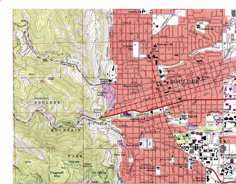
Figure 2.2 Image Map of Palm Island, Dubai, from NASA

The accuracy of a given reference map is indeed critical to many users. For instance, local governments need accurate reference maps for land use, zoning, and tax purposes. National governments need accurate reference maps for political, infrastructure, and military purposes. People who depend on navigation devices like global positioning system (GPS) units also need accurate and up-to-date reference maps in order to arrive at their desired destinations.
Thematic Maps
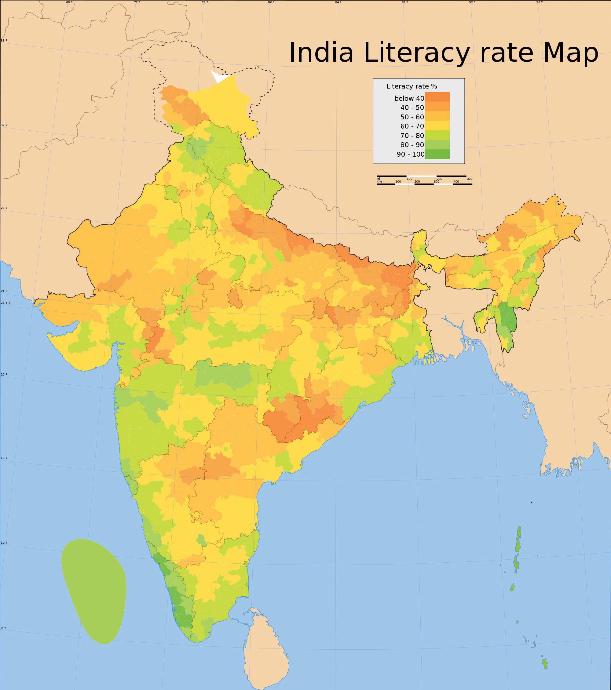
Contrasting the reference map are thematic maps. As the name suggests, thematic maps are concerned with a particular theme or topic of interest. While reference maps emphasize the location of geographic features, thematic maps are more concerned with how things are distributed across space. Such things are often abstract concepts such as life expectancy around the world, per capita gross domestic product (GDP) in Europe, or literacy rates across India. One of the strengths of mapping, and in particular of thematic mapping, is that it can make such abstract and invisible concepts visible and comparable on a map.
Figure 2.3 World Life Expectancies
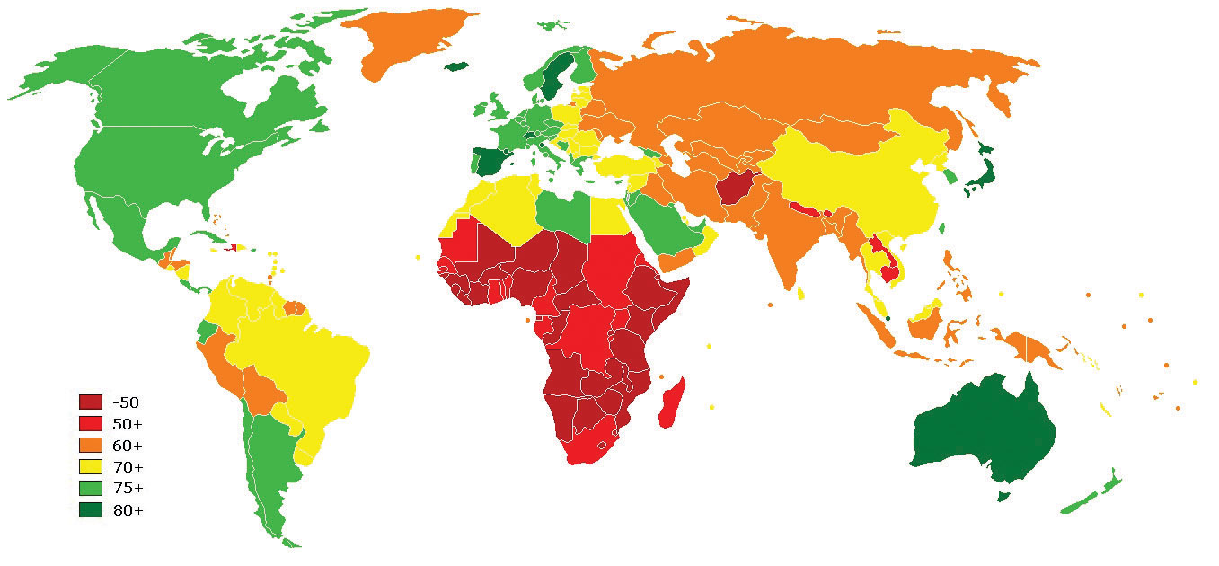
Figure 2.4 European GDP

Figure 2.5 Indian Literacy Rates
It is important to note that reference and thematic maps are not mutually exclusive. In other words, thematic maps often contain and combine geographical reference information, and conversely, reference maps may contain thematic information. What is more, when used in conjunction, thematic and reference maps often complement each other.
For example, public health officials in a city may be interested in providing equal access to emergency rooms to the city’s residents. Insights into this and related questions can be obtained through visual comparisons of a reference map that shows the locations of emergency rooms across the city to thematic maps of various segments of the population (e.g., households below poverty, percent elderly, underrepresented groups).
Within the context of a GIS, we can overlay the reference map of emergency rooms directly on top of the population maps to see whether or not access is uniform across neighborhood types. Clearly, there are other factors to consider when looking at emergency room access (e.g., access to transport), but through such map overlays, underserved neighborhoods can be identified.
Figure 2.6 Map Overlay Process

When presented in hardcopy format, both reference and thematic maps are static or fixed representations of reality. Such permanence on the page suggests that geography and the things that we map are also in many ways fixed or constant. This is far from reality. The integration of GISs with other forms of information technology like the Internet and mobile telecommunications is rapidly changing this view of maps and mapping, as well as geography at large.
Dynamic Maps
The diffusion of GISs and the popularity of online mapping tools and applications speak to this shift in thinking about maps and map use. In this regard, it is worthwhile to discuss the diffusion of dynamic maps. Dynamic maps are simply changeable or interactive representations of the earth. Dynamic mapping refers more to how maps are used and delivered to the map user today (e.g., online, via mobile phone) than to the content of the map itself. Both reference and thematic maps can be dynamic in nature, and such maps are an integral component to any GIS. The key point about dynamic maps is that more and more people, not just GIS professionals, have access to such maps.
Unlike a hardcopy map that has features and elements users cannot modify or change, dynamic maps encourage and sometimes require user interaction. Such interaction can include changing the scale or visible area by zooming in or zooming out, selecting which features or layers to include or to remove from a map (e.g., roads, imagery), or even starting and stopping a map animation.
Figure 2.7 Google Maps on an iPhone
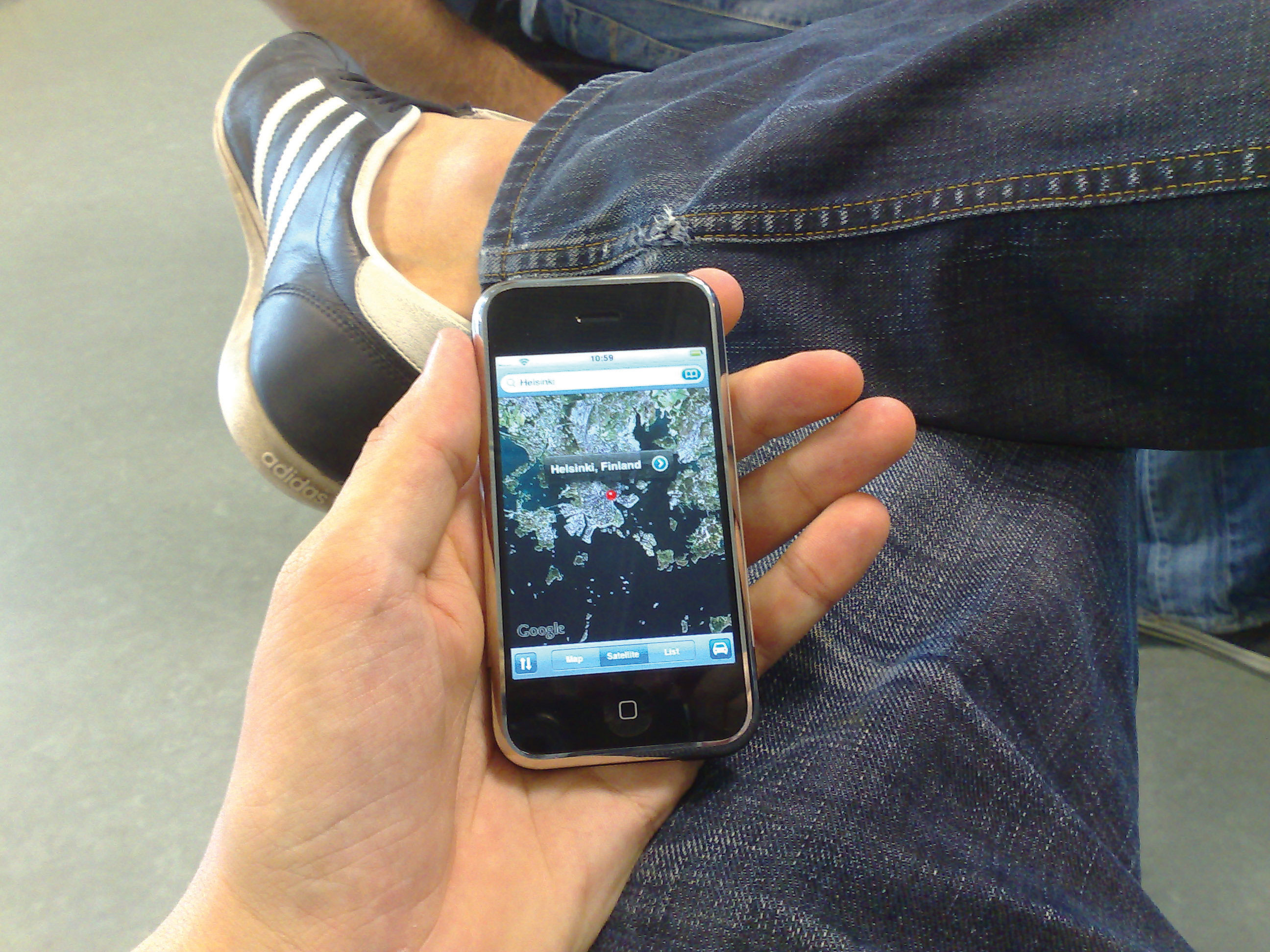
Just as dynamic maps will continue to evolve and require more user interaction in the future, map users will demand more interactive map features and controls. As this democratization of maps and mapping continues, the geographic awareness and map appreciation of map users will also increase. Therefore, it is of critical importance to understand the nature, form, and content of maps to support the changing needs, demands, and expectations of map users in the future.
KEY TAKEAWAYS
- The main purpose of a reference map is to show the location of geographical objects of interest.
- Thematic maps are concerned with showing how one or more geographical aspects are distributed across space.
- Dynamic maps refer to maps that are changeable and often require user interaction.
- The democratization of maps and mapping is increasing access, use, and appreciation for all types of maps, as well as driving map innovations.
EXERCISES
- Go to the website of the USGS, read about the history and use of USGS maps, and download the topographic map that corresponds to your place of residence.
- What features make a map “dynamic” or “interactive”? Are dynamic maps more informative than static maps? Why or why not?
2.2 Map Scale, Coordinate Systems, and Map Projections
LEARNING OBJECTIVE
- The objective of this section is to describe and discuss the concepts of map scale, coordinate systems, and map projections and explain why they are central to maps, mapping, and geographic information systems (GISs).
All map users and map viewers have certain expectations about what is contained on a map. Such expectations are formed and learned from previous experience by working with maps. It is important to note that such expectations also change with increased exposure to maps. Understanding and meeting the expectations of map viewers is a challenging but necessary task because such expectations provide a starting point for the creation of any map.
The central purpose of a map is to provide relevant and useful information to the map user. In order for a map to be of value, it must convey information effectively and efficiently. Mapping conventions facilitate the delivery of information in such a manner by recognizing and managing the expectations of map users. Generally speaking, mapping or cartographic conventions refer to the accepted rules, norms, and practices behind the making of maps. One of the most recognized mapping conventions is that “north is up” on most maps. Though this may not always be the case, many map users expect north to be oriented or to coincide with the top edge of a map or viewing device like a computer monitor.
Several other formal and informal mapping conventions and characteristics, many of which are taken for granted, can be identified. Among the most important cartographic considerations are map scale, coordinate systems, and map projections. Map scale is concerned with reducing geographical features of interest to manageable proportions, coordinate systems help us define the positions of features on the surface of the earth, and map projections are concerned with moving from the three-dimensional world to the two dimensions of a flat map or display, all of which are discussed in greater detail in this chapter.
Map Scale
The world is a big place…really big. One of the challenges behind mapping the world and its resident features, patterns, and processes is reducing it to a manageable size. What exactly is meant by “manageable” is open to discussion and largely depends on the purpose and needs of the map at hand. Nonetheless, all maps reduce or shrink the world and its geographic features of interest by some factor. Map scale refers to the factor of reduction of the world so it fits on a map.
Map scale can be represented by text, a graphic, or some combination of the two. For example, it is common to see “one inch represents one kilometer” or something similar written on a map to give map users an idea of the scale of the map. Map scale can also be portrayed graphically with what is called a scale bar. Scale bars are usually used on reference maps and allow map users to approximate distances between locations and features on a map, as well as to get an overall idea of the scale of the map.
Figure 2.9 Map Scale from a United States Geological Survey (USGS) Topographic Map

The representative fraction (RF) describes scale as a simple ratio. The numerator, which is always set to one (i.e., 1), denotes map distance and the denominator denotes ground or “real-world” distance. One of the benefits of using a representative fraction to describe scale is that it is unit neutral. In other words, any unit of measure can be used to interpret the map scale. Consider a map with an RF of 1:10,000. This means that one unit on the map represents 10,000 units on the ground. Such units could be inches, centimeters, or even pencil lengths; it really does not matter.
Map scales can also be described as either “small” or “large.” Such descriptions are usually made in reference to representative fractions and the amount of detail represented on a map. For instance, a map with an RF of 1:1,000 is considered a large-scale map when compared to a map with an RF of 1:1,000,000 (i.e., 1:1,000 > 1:1,000,000). Furthermore, while the large-scale map shows more detail and less area, the small-scale map shows more area but less detail. Clearly, determining the thresholds for small- or large-scale maps is largely a judgment call.
All maps possess a scale, whether it is formally expressed or not. Though some say that online maps and GISs are “scaleless” because we can zoom in and out at will, it is probably more accurate to say that GISs and related mapping technology are multiscalar. Understanding map scale and its overall impact on how the earth and its features are represented is a critical part of both map making and GISs.
Coordinate Systems
Just as all maps have a map scale, all maps have locations, too. Coordinate systems are frameworks that are used to define unique positions. For instance, in geometry we use x (horizontal) and y (vertical) coordinates to define points on a two-dimensional plane. The coordinate system that is most commonly used to define locations on the three-dimensional earth is called the geographic coordinate system (GCS), and it is based on a sphere or spheroid. A spheroid (a.k.a. ellipsoid) is simply a sphere that is slightly wider than it is tall and approximates more closely the true shape of the earth. Spheres are commonly used as models of the earth for simplicity.
The unit of measure in the GCS is degrees, and locations are defined by their respective latitude and longitude within the GCS. Latitude is measured relative to the equator at zero degrees, with maxima of either ninety degrees north at the North Pole or ninety degrees south at the South Pole. Longitude is measured relative to the prime meridian at zero degrees, with maxima of 180 degrees west or 180 degrees east.
Note that latitude and longitude can be expressed in degrees-minutes-seconds (DMS) or in decimal degrees (DD). When using decimal degrees, latitudes above the equator and longitudes east of the prime meridian are positive, and latitudes below the equator and longitudes west of the prime meridian are negative (see the following table for examples).
| Nominal location | Absolute location (DMS) | Absolute location (DD) |
|---|---|---|
| Los Angeles, US | 34° 3′ North, 118° 15′ West | +34.05, –118.25 |
| Mumbai, India | 18° 58′ North, 72° 49′ East | +18.975, +72.8258 |
| Sydney, Australia | 33° 51′ South, 151° 12′ East | –33.859, 151.211 |
| Sao Paolo, Brazil | 23° 33′ South, 46° 38′ West | –23.550, –46.634 |
Converting from DMS to DD is a relatively straightforward exercise. For example, since there are sixty minutes in one degree, we can convert 118° 15 minutes to 118.25 (118 + 15/60). Note that an online search of the term “coordinate conversion” will return several coordinate conversion tools.
When we want to map things like mountains, rivers, streets, and buildings, we need to define how the lines of latitude and longitude will be oriented and positioned on the sphere. A datum serves this purpose and specifies exactly the orientation and origins of the lines of latitude and longitude relative to the center of the earth or spheroid.
Depending on the need, situation, and location, there are several datums to choose from. For instance, local datums try to match closely the spheroid to the earth’s surface in a local area and return accurate local coordinates. A common local datum used in the United States is called NAD83 (i.e., North American Datum of 1983). For locations in the United States and Canada, NAD83 returns relatively accurate positions, but positional accuracy deteriorates when outside of North America.
The global WGS84 datum (i.e., World Geodetic System of 1984) uses the center of the earth as the origin of the GCS and is used for defining locations across the globe. Because the datum uses the center of the earth as its origin, locational measurements tend to be more consistent regardless where they are obtained on the earth, though they may be less accurate than those returned by a local datum. Note that switching between datums will alter the coordinates (i.e., latitude and longitude) for all locations of interest.
Map Projections
Previously we noted that the earth is really big. Not only is it big, but it is a big round spherical shape called a spheroid. A globe is a very common and very good representation of the three-dimensional, spheroid earth. One of the problems with globes, however, is that they are not very portable (i.e., you cannot fold a globe and put in it in your pocket), and their small scale makes them of limited practical use (i.e., geographic detail is sacrificed). To overcome these issues, it is necessary to transform the three-dimensional shape of the earth to a two-dimensional surface like a flat piece of paper, computer screen, or mobile device display in order to obtain more useful map forms and map scales. Enter the map projection.
Map projections refer to the methods and procedures that are used to transform the spherical three-dimensional earth into two-dimensional planar surfaces. Specifically, map projections are mathematical formulas that are used to translate latitude and longitude on the surface of the earth to x and y coordinates on a plane. Since there are an infinite number of ways this translation can be performed, there are an infinite number of map projections. The mathematics behind map projections are beyond the scope of this introductory overview (but see Robinson et al. 1995; Muehrcke and Muehrcke 1998),Muehrcke, P., and J. Muehrcke. 1998. Map Use. Madison, WI: JP Publications. and for simplicity, the following discussion focuses on describing types of map projections, the distortions inherent to map projections, and the selection of appropriate map projections.
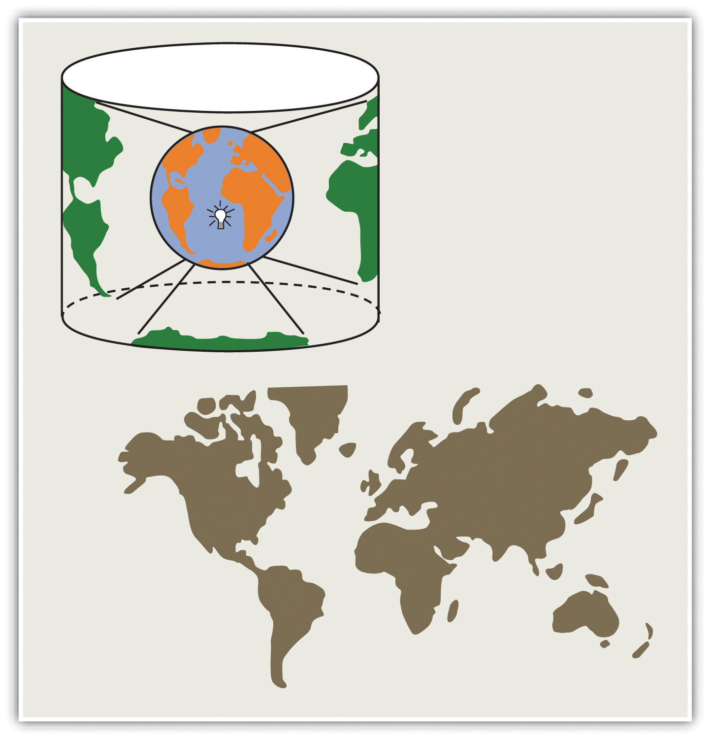
To illustrate the concept of a map projection, imagine that we place a light bulb in the center of a translucent globe. On the globe are outlines of the continents and the lines of longitude and latitude called the graticule. When we turn the light bulb on, the outline of the continents and the graticule will be “projected” as shadows on the wall, ceiling, or any other nearby surface. This is what is meant by map “projection.”
Figure 2.10 The Concept of Map “Projection”
Within the realm of maps and mapping, there are three surfaces used for map projections (i.e., surfaces on which we project the shadows of the graticule). These surfaces are the plane, the cylinder, and the cone. Referring again to the previous example of a light bulb in the center of a globe, note that during the projection process, we can situate each surface in any number of ways. For example, surfaces can be tangential to the globe along the equator or poles, they can pass through or intersect the surface, and they can be oriented at any number of angles.
Figure 2.11 Map Projection Surfaces
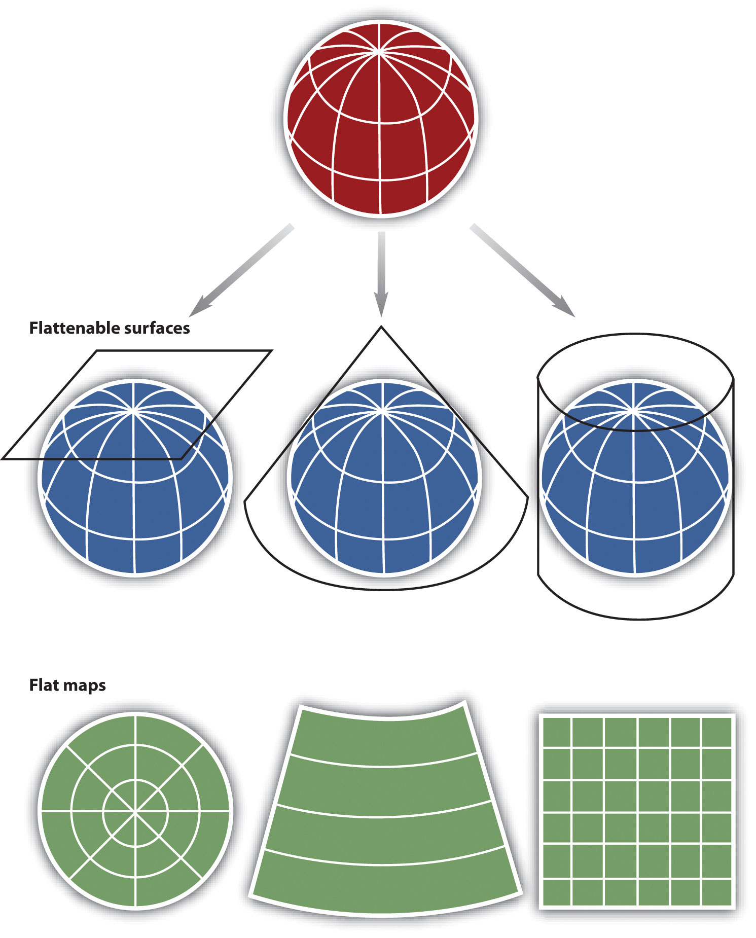
In fact, naming conventions for many map projections include the surface as well as its orientation. For example, as the name suggests, “planar” projections use the plane, “cylindrical” projections use cylinders, and “conic” projections use the cone. For cylindrical projections, the “normal” or “standard” aspect refers to when the cylinder is tangential to the equator (i.e., the axis of the cylinder is oriented north–south). When the axis of the cylinder is perfectly oriented east–west, the aspect is called “transverse,” and all other orientations are referred to as “oblique.” Regardless the orientation or the surface on which a projection is based, a number of distortions will be introduced that will influence the choice of map projection.
When moving from the three-dimensional surface of the earth to a two-dimensional plane, distortions are not only introduced but also inevitable. Generally, map projections introduce distortions in distance, angles, and areas. Depending on the purpose of the map, a series of trade-offs will need to be made with respect to such distortions.
Map projections that accurately represent distances are referred to as equidistant projections. Note that distances are only correct in one direction, usually running north–south, and are not correct everywhere across the map. Equidistant maps are frequently used for small-scale maps that cover large areas because they do a good job of preserving the shape of geographic features such as continents.
Maps that represent angles between locations, also referred to as bearings, are called conformal. Conformal map projections are used for navigational purposes due to the importance of maintaining a bearing or heading when traveling great distances. The cost of preserving bearings is that areas tend to be quite distorted in conformal map projections. Though shapes are more or less preserved over small areas, at small scales areas become wildly distorted. The Mercator projection is an example of a conformal projection and is famous for distorting Greenland.
As the name indicates, equal area or equivalent projections preserve the quality of area. Such projections are of particular use when accurate measures or comparisons of geographical distributions are necessary (e.g., deforestation, wetlands). In an effort to maintain true proportions in the surface of the earth, features sometimes become compressed or stretched depending on the orientation of the projection. Moreover, such projections distort distances as well as angular relationships.
As noted earlier, there are theoretically an infinite number of map projections to choose from. One of the key considerations behind the choice of map projection is to reduce the amount of distortion. The geographical object being mapped and the respective scale at which the map will be constructed are also important factors to think about. For instance, maps of the North and South Poles usually use planar or azimuthal projections, and conical projections are best suited for the middle latitude areas of the earth. Features that stretch east–west, such as the country of Russia, are represented well with the standard cylindrical projection, while countries oriented north–south (e.g., Chile, Norway) are better represented using a transverse projection.
If a map projection is unknown, sometimes it can be identified by working backward and examining closely the nature and orientation of the graticule (i.e., grid of latitude and longitude), as well as the varying degrees of distortion. Clearly, there are trade-offs made with regard to distortion on every map. There are no hard-and-fast rules as to which distortions are more preferred over others. Therefore, the selection of map projection largely depends on the purpose of the map.
Within the scope of GISs, knowing and understanding map projections are critical. For instance, in order to perform an overlay analysis like the one described earlier, all map layers need to be in the same projection. If they are not, geographical features will not be aligned properly, and any analyses performed will be inaccurate and incorrect. Most GISs include functions to assist in the identification of map projections, as well as to transform between projections in order to synchronize spatial data. Despite the capabilities of technology, an awareness of the potential and pitfalls that surround map projections is essential.
KEY TAKEAWAYS
- Map scale refers to the factor by which the real world is reduced to fit on a map.
- A GIS is multiscalar.
- Map projections are mathematical formulas used to transform the three-dimensional earth to two dimensions (e.g., paper maps, computer monitors).
- Map projections introduce distortions in distance, direction, and area.
EXERCISES
- Determine and discuss the most appropriate representative fractions for the following verbal map scale descriptions: individual, neighborhood, urban, regional, national, and global.
- Go to the National Atlas website and read about map projections (http://nationalatlas.gov/articles/mapping/a_projections.html). Define the following terms: datum, developable surface, secant, azimuth, rhumb line, and zenithal.
- Describe the general properties of the following projections: Universe Transverse Mercator (UTM), State plane system, and Robinson projection.
- What are the scale, projection, and contour interval of the USGS topographic map that you downloaded for your place of residence?
- Find the latitude and longitude of your hometown. Explain how you can convert the coordinates from DD to DMS or vice versa.
2.3 Map Abstraction
LEARNING OBJECTIVE
- The objective of this section is to highlight the decision-making process behind maps and to underscore the need to be explicit and consistent when mapping and using geographic information systems (GISs).
As previously discussed, maps are a representation of the earth. Central to this representation is the reduction of the earth and its features of interest to a manageable size (i.e., map scale) and its transformation into a useful two-dimensional form (i.e., map projection). The choice of both map scale and, to a lesser extent, map projection will influence the content and shape of the map.
In addition to the seemingly objective decisions made behind the choices of map scale and map projection are those concerning what to include and what to omit from the map. The purpose of a map will certainly guide some of these decisions, but other choices may be based on factors such as space limitations, map complexity, and desired accuracy. Furthermore, decisions about how to classify, simplify, or exaggerate features and how to symbolize objects of interest simultaneously fall under the realms of art and science (Slocum et al. 2004).Slocum, T., R. McMaster, F. Kessler, and H. Hugh. 2008. Thematic Cartography and Geovisualization. Upper Saddle River, NJ: Prentice Hall.
The process of moving from the “real world” to the world of maps is referred to as map abstraction. This process not only involves making choices about how to represent features but also, more important with regard to geographic information systems (GISs), requires us to be explicit, consistent, and precise in terms of defining and describing geographical features of interest. Failure to be explicit, consistent, and precise will return incorrect; inconsistent; and error-prone maps, analyses, and decisions based on such maps and GISs. This final section discusses map abstraction in terms of geographical features and their respective graphical representation.
What Is a Forest?
One of the most pressing environmental issues facing the world is deforestation. Generally, deforestation refers to the reduction of forest area. This is an important issue because it has possible implications for climate change, global warming, biodiversity, and the water balance of the earth, among other things. In the last century, deforestation has increased at an alarming rate and is mostly attributed to human activity. Mapping forests regularly with a GIS is a logical way to monitor deforestation and has the potential to inform policies regarding forest conservation efforts. Easy enough, so let’s get started.
So what exactly is a forest? How do we know where a forest begins and where it ends? How can naturally caused forest fires be differentiated from those started by humans? Can a forest exist in a swamp or wetland? For that matter, what is the difference between a swamp and wetland? Such questions are not trivial in the context of mapping and GISs. In fact, consistent and precise definitions of features like forests or swamps increase the reliability and efficiency of maps, mapping, and analysis with GISs.
Figure 2.12 Deforestation in the Amazon: 2001
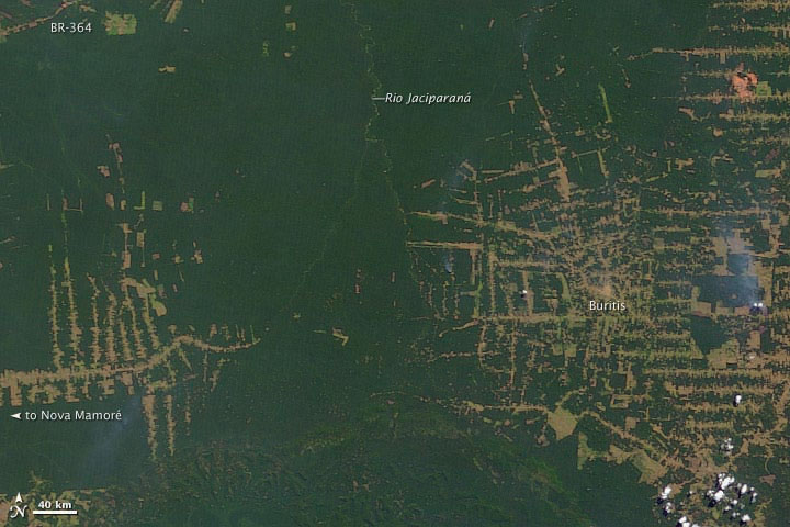
Figure 2.13 Deforestation in the Amazon: 2009
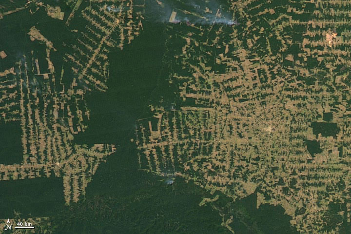
Within the realm of maps, cartography, and GISs, the world is made up of various features or entities. Such entities include but are not restricted to fire hydrants, caves, roads, rivers, lakes, hills, valleys, oceans, and the occasional barn. Moreover, such features have a form, and more precisely, a geometric form. For instance, fire hydrants and geysers are considered point-like features; rivers and streams are linear features; and lakes, countries, and forests are areal features.
Features can also be categorized as either discrete or continuous. Discrete features are well defined and are easy to locate, measure, and count, and their edges or boundaries are readily defined. Examples of discrete features in a city include buildings, roads, traffic signals, and parks. Continuous features, on the other hand, are less well defined and exist across space. The most commonly cited examples of continuous features are temperature and elevation. Changes in both temperature and elevation tend to be gradual over relatively large areas.
Geographical features also have several characteristics, traits, or attributes that may or may not be of interest. For instance, to continue the deforestation example, determining whether a forest is a rainforest or whether a forest is in a protected park may be important. More general attributes may include measurements such as tree density per acre, average canopy height in meters, or proportions like percent palm trees or invasive species per hectare in the forest.
Notwithstanding the purpose of the map or GIS project at hand, it is critical that definitions of features are clear and remain consistent. Similarly, it is important that the attributes of features are also consistently defined, measured, and reported in order to generate accurate and effective maps in an efficient manner. Defining features and attributes of interest is often an iterative process of trial and error. Being able to associate a feature with a particular geometric form and to determine the feature type are central to map abstraction, facilitate mapping, and the application of GISs.
Map Content and Generalization
The shape and content of maps vary according to purpose, need, and resources, among other factors. What is common to most maps, and in particular to those within a GIS, is that they are graphical representations of reality. Put another way, various graphical symbols are used to represent geographical features or entities. Annotation or text is also commonly used on maps and facilitates map interpretation. Learning about map content and map generalization is important because they serve as the building blocks for spatial data that are used within a GIS.
Building upon the previous discussion about the geometric form of geographic features, maps typically rely on three geometric objects: the point, the line, and the polygon or area. A point is defined by x and y coordinates, a line is defined by two points, and a polygon is defined by a minimum of three points. The important thing to note is that the definition of a point is analogous to a location that is defined by longitude and latitude. Furthermore, since lines and polygons are made up of points, location information (i.e., x and y, or longitude and latitude, coordinates) is intrinsic to points, lines, and polygons.
Figure 2.14 Geographic Features as Points, Lines, and Polygons

Both simple and complex maps can be made using these three relatively simple geometric objects. Additionally, by changing the graphical characteristics of each object, an infinite number of mapping possibilities emerge. Such changes can be made to the respective size, shape, color, and patterns of points, lines, and polygons. For instance, different sized points can be used to reflect variations in population size, line color or line size (i.e., thickness) can be used to denote volume or the amount of interaction between locations, and different colors and shapes can be used to reflect different values of interest.
Figure 2.15 Variations in the Graphical Parameters of Points, Lines, and Polygons
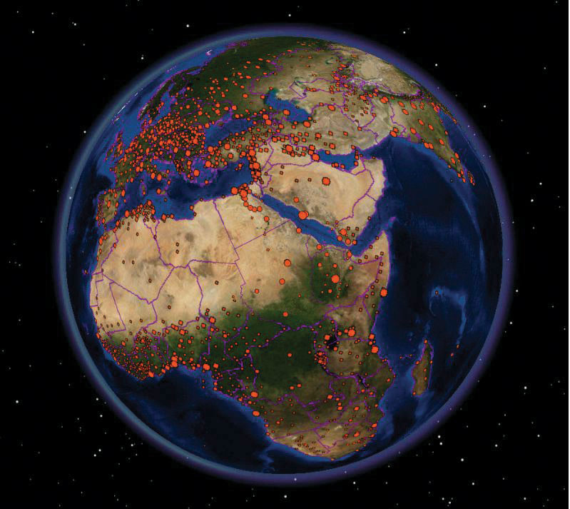
Figure 2.16
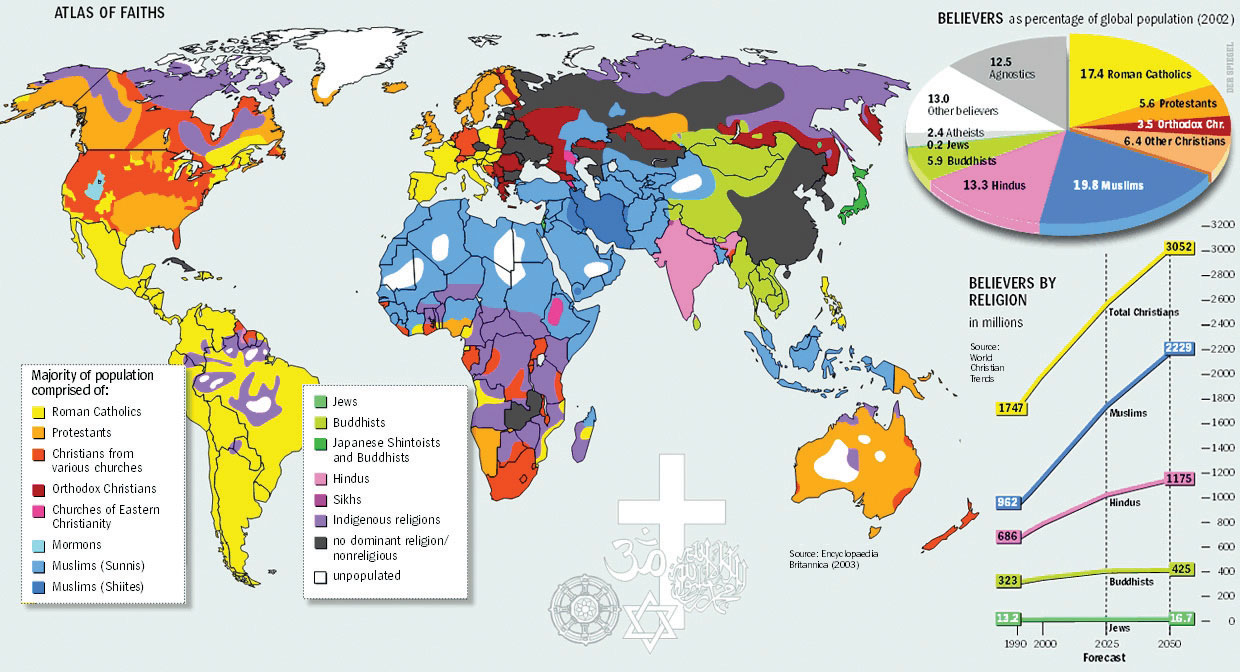
Complementing the graphical elements described previously is annotation or text. Annotation is used to identify particular geographic features, such as cities, states, bodies of water, or other points of interest. Like the graphical elements, text can be varied according to size, orientation, or color. There are also numerous text fonts and styles that are incorporated into maps. For example, bodies of water are often labeled in italics.
Another map element that deserves to be mentioned and that combines both graphics and text is the map legend or map key. A map legend provides users information about the how geographic information is represented graphically. Legends usually consist of a title that describes the map, as well as the various symbols, colors, and patterns that are used on the map. Such information is often vital to the proper interpretation of a map.
As more features and graphical elements are put on a given map, the need to generalize such features arises. Map generalization refers to the process of resolving conflicts associated with too much detail, too many features, or too much information to map. In particular, generalization can take several forms (Buttenfield and McMaster 1991):Buttenfield, B., and R. McMaster. 1991. Map Generalization. Harlow, England: Longman.
- The simplification or symbolization of features for emphasis
- The masking or displacement of detail to increase clarity or legibility
- The selection of detail for inclusion or omission from the map
- The exaggeration of features for emphasis
Determining which aspects of generalization to use is largely a matter of personal preference, experience, map purpose, and trial and error. Though there are general guidelines about map generalization, there are no universal standards or requirements with regard to the generalization of maps and mapping. It is at this point that cartographic and artistic license, prejudices and biases, and creativity and design sense—or lack thereof—emerge to shape the map.
Making a map and, more generally, the process of mapping involve a range of decisions and choices. From the selection of the appropriate map scale and map projection to deciding which features to map and to omit, mapping is a complex blend of art and science. In fact, many historical maps are indeed viewed like works of art, and rightly so. Learning about the scale, shape, and content of maps serves to increase our understanding of maps, as well as deepen our appreciation of maps and map making. Ultimately, this increased geographical awareness and appreciation of maps promotes the sound and effective use and application of a GIS.
KEY TAKEAWAYS
- Map abstraction refers to the process of explicitly defining and representing real-world features on a map.
- The three basic geometric forms of geographical features are the point, line, and polygon (or area).
- Map generalization refers to resolving conflicts that arise on a map due to limited space, too many details, or too much information.
EXERCISES
- Examine an online map of where you live. Which forms of map generalization were used to create the map? Which three elements of generalization would you change? Which three elements are the most effective?
- If you were to start a GIS project on deforestation, what terms would need to be explicitly defined, and how would you define them?
Waypoint: More than Just Clouds and Weather
Image maps, in large part derived from satellites, are ubiquitous. Such maps can be found on the news, the Internet, in your car, and on your mobile phone. What’s more is that such images are in living color and of very high resolution. Not long ago, such image maps from satellites were the sole domain of meteorologists, local weather forecasters, and various government agencies. Public access to such images was pretty much limited to the evening news.
Technological advances in imaging technology, in conjunction with the commercialization of space flight, opened the door for companies like GeoEye (http://www.geoeye.com) and DigitalGlobe (http://www.digitalglobe.com) to provide satellite imagery and maps to the masses at the turn of the twenty-first century. With online mapping services such as Google Earth providing free and user-friendly access to such images, a revolution in maps and mapping was born.
Image maps now provide geographic context for nightly news stories around the world, serve as a backdrop to local real estate searches and driving directions, and are also used for research purposes . The popularity and widespread use of such images speaks not only to recent technological advances and innovations but also, perhaps more important, to the geographer in us all.
Figure 2.17The Inauguration of Barack Obama from Space

GeoEye 2008.
Chapter 3Data, Information, and Where to Find Them
Maps are shared, available, and distributed unlike at any other time in history. What’s more is that the process of mapping has also been decentralized and democratized so that many more people not only have access to maps but also are enabled and empowered to create their own maps. This democratization of maps and mapping is in large part attributable to a shift to digital map production and consumption. Unlike analog or hardcopy maps that are static or fixed once they are printed onto paper, digital maps are highly changeable, exchangeable, and as noted in Chapter 2 “Map Anatomy”, dynamic in terms of scale, form, and content.
To understand digital maps and mapping, it is necessary to put them into the context of computing and information technology. First, this chapter provides an introduction to the building blocks of digital maps and geographic information systems (GISs), with particular emphasis placed upon how data and information are stored as files on a computer. Second, key issues and considerations as they relate to data acquisition and data standards are presented. The chapter concludes with a discussion of where data for use with a GIS can be found. This chapter serves as the bridge between the conceptual materials presented in Chapter 1 “Introduction” and Chapter 2 “Map Anatomy” and the chapters that follow, which contain more formal discussions about the use and application of a GIS.
3.1 Data and Information
LEARNING OBJECTIVE
- The objective of this section is to define and describe data and information and how it is organized into files for use in a computing and geographic information system (GIS) environment.
To understand how we get from analog to digital maps, let’s begin with the building blocks and foundations of the geographic information system (GIS)—namely, data and information. As already noted on several occasions, GIS stores, edits, processes, and presents data and information. But what exactly is data? And what exactly is information? For many, the terms “data” and “information” refer to the same thing. For our purposes, it is useful to make a distinction between the two. Generally, data refer to facts, measurements, characteristics, or traits of an object of interest. For you grammar sticklers out there, note that “data” is the plural form of “datum.” For example, we can collect all kinds of data about all kinds of things, like the length of rainbow trout in a Colorado stream, the number of vegetarians in Alaska, the diameter of mahogany tree trunks in the Brazilian rainforest, student scores on the last GIS midterm, the altitude of mountain peaks in Nepal, the depth of snow in the Austrian Alps, or the number of people who use public transportation to get to work in London.
Once data are put into context, used to answer questions, situated within analytical frameworks, or used to obtain insights, they become information. For our purposes, information simply refers to the knowledge of value obtained through the collection, interpretation, and/or analysis of data. Though a computer is not necessary to collect, record, manipulate, process, or visualize data, or to process it into information, information technology can be of great help. For instance, computers can automate repetitive tasks, store data efficiently in terms of space and cost, and provide a range of tools for analyzing data from spreadsheets to GISs, of course. What’s more is the fact that the incredible amount of data collected each and every day by satellites, grocery store product scanners, traffic sensors, temperature gauges, and your mobile phone carrier, to name just a few, would not be possible without the aid and innovation of information technology.
Since this is a text about GISs, it is useful to also define geographic data. Like generic data, geographic or spatial data refer to geographic facts, measurements, or characteristics of an object that permit us to define its location on the surface of the earth. Such data include but are not restricted to the latitude and longitude coordinates of points of interest, street addresses, postal codes, political boundaries, and even the names of places of interest. It is also important to note and reemphasize the difference between geographic data and attribute data, which was discussed in Chapter 2 “Map Anatomy”. Where geographic data are concerned with defining the location of an object of interest, attribute data are concerned with its nongeographic traits and characteristics.
To illustrate the distinction between geographic and attribute data, think about your home where you grew up or where you currently live. Within the context of this discussion, we can associate both geographic and attribute data to it. For instance, we can define the location of your home many ways, such as with a street address, the street names of the nearest intersection, the postal code where your home is located, or we could use a global positioning system–enabled device to obtain latitude and longitude coordinates. What is important is geographic data permit us to define the location of an object (i.e., your home) on the surface of the earth.
In addition to the geographic data that define the location of your home are the attribute data that describe the various qualities of your home. Such data include but are not restricted to the number of bedrooms and bathrooms in your home, whether or not your home has central heat, the year when your home was built, the number of occupants, and whether or not there is a swimming pool. These attribute data tell us a lot about your home but relatively little about where it is.
Not only is it useful to recognize and understand how geographic and attribute data differ and complement each other, but it is also of central importance when learning about and using GISs. Because a GIS requires and integrates these two distinct types of data, being able to differentiate between geographic and attribute data is the first step in organizing your GIS. Furthermore, being able to determine which kinds of data you need will ultimately aid in your implementation and use of a GIS. More often than not, and in the age and context of information technology, the data and information discussed thus far is the stuff of computer files, which are the focus of the next section.
Of Files and Formats…
When we collect data about your home, rainforests, or anything, really, we usually need to put them somewhere. Though we may scribble numbers and measures on the back of an envelope or write them down on a pad of paper, if we want to update, share, analyze, or map them in the future, it is often useful to record them in digital form so a computer can read them. Though we won’t bother ourselves with the bits and bytes of computing, it is necessary to discuss some basic elements of computing that are both relevant and required when learning and working with a GIS.
One of the most common elements of working with computers and computing itself is the file. Files in a computer can contain any number of things from a complex set of instructions (e.g., a computer program) to a list of numbers and letters (e.g., address book). Furthermore, computer files come in all different sizes and types. One of the clues we can use to distinguish one file from another is the file extension. The file extension refers to the letters that follow the period (“.”) after the name of the file. Table 3.1 contains some of the most common file extensions and the types of files with which they are associated.
Table 3.1
| filename.txt | Simple text file |
| filename.doc | Microsoft Word document |
| filename.pdf | Adobe portable document format |
| filename.jpg | Compressed image file |
| filename.tif | Tagged image format |
| filename.html | Hypertext markup language (used to create web pages) |
| filename.xml | Extensible markup language |
| filename.zip | Zipped/compressed archive |
Some computer programs may be able to read or work with only certain file types, while others are more adept at reading multiple file formats. What you will realize as you begin to work more with information technology, and GISs in particular, is that familiarity with different file types is important. Learning how to convert or export one file type to another is also a very useful and valuable skill to obtain. In this regard, being able to recognize and knowing how to identify different and unfamiliar file types will undoubtedly increase your proficiency with computers and GISs.
Of the numerous file types that exist, one of the most common and widely accessed file is the simple text, plain text, or just text file. Simple text files can be read widely by word processing programs, spreadsheet and database programs, and web browsers. Often ending with the extension “.txt” (i.e., filename.txt), text files contain no special formatting (e.g., bold, italic, underlining) and contain only alphanumeric characters. In other words, images or complex graphics are not well suited for text files. Text files, however, are ideal for recording, sharing, and exchanging data because most computers and operating systems can recognize and read simple text files with programs called text editors.
When a text file contains data that are organized or structured in some fashion, it is sometimes called a flat file (but the file extension remains the same, i.e., .txt). Generally, flat files are organized in a tabular format or line by line. In other words, each line or row of the file contains one and only one record. So if we collected height measurements on three people, Tim, Jake, and Harry, the file might look something like this:
| Name | Height |
|---|---|
| Tim | 6’1” |
| Jake | 5’9” |
| Harry | 6’2” |
Each row corresponds to one and only one record, observation or case. There are two other important elements to know about this file. First, note that the first row does not contain any data; rather, it provides a description of the data contained in each column. When the first row of a file contains such descriptors, it is referred to as a header row or just a header. Columns in a flat file are also called fields, variables, or attributes. “Height” is the attribute, field, or variable that we are interested in, and the observations or cases in our data set are “Tim,” “Jake,” and “Harry.” In short, rows are for records; columns are for fields.
The second unseen but critical element to the file is the spaces in between each column or field. In the example, it appears as though a space separates the “name” column from the “height” column. Upon closer inspection, however, note how the initial values of the “height” column are aligned. If a single space was being used to separate each column, the height column would not be aligned. In this case a tab is being used to separate the columns of each row. The character that is used to separate columns within a flat file is called the delimiter or separator. Though any character can be used as a delimiter, the most common delimiters are the tab, the comma, and a single space. The following are examples of each.
| Tab-Delimited | Single-Space-Delimited | Comma-Delimited |
|---|---|---|
| Name Height | Name Height | Name, Height |
| Tim 6.1 | Tim 6.1 | Tim, 6.1 |
| Jake 5.9 | Jake 5.9 | Jake, 5.9 |
| Harry 6.2 | Harry 6.2 | Harry, 6.2 |
Knowing the delimiter to a flat file is important because it enables us to distinguish and separate the columns efficiently and without error. Sometimes such files are referred to by their delimiter, such as a “comma-separated values” file or a “tab-delimited” file.
When recording and working with geographic data, the same general format is applied. Rows are reserved for records, or in the case of geographic data, locations and columns or fields are used for the attributes or variables associated with each location. For example, the following tab-delimited flat file contains data for three places (i.e., countries) and three attributes or characteristics of each country (i.e., population, language, continent) as noted by the header.
| Country | Population | Language | Continent |
|---|---|---|---|
| France | 65,000,000 | French | Europe |
| Brazil | 192,000,000 | Portuguese | South America |
| Australia | 22,000,000 | English | Australia |
Files like those presented here are the building blocks of the various tables, charts, reports, graphs, and other visualizations that we see each and every day online, in print, and on television. They are also key components to the maps and geographic representations created by GISs. Rarely if ever, however, will you work with one and only one file or file type. More often than not, and especially when working with GISs, you will work with multiple files. Such a grouping of multiple files is called a database. Since the files within a database may be different sizes, shapes, and even formats, we need to devise some type of system that will allow us to work, update, edit, integrate, share, and display the various data within the database. Such a system is generally referred to as a database management system (DBMS). Databases and DBMSs are so important to GISs that a later chapter is dedicated to them. For now it is enough to remember that file types are like ice cream—they come in all different kinds of flavors. In light of such variety, Section 3.2 “Data about Data” details some of the key issues that need to be considered when acquiring and working with data and information for GISs.
KEY TAKEAWAYS
- Data refer to specific facts, measurements, or characteristics of objects and phenomena of interest.
- Information refers to knowledge of value that is obtained from the analysis of data.
EXERCISES
- What is the difference between data and information?
- What are the differences between spatial and attribute data?
- Identify each of the files in Table 3.1 according to their extension.
- Search for and download three different simple text or flat files. Open them in a word processor and spreadsheet program. Use the search and replace function to change the delimiters (e.g., from commas to tabs or vice versa).
- The US Bureau of Census distributes geospatial data as TIGER files. What are they?
- Identify resources and websites on the Internet that can help you make sense of file extensions.
3.2 Data about Data
LEARNING OBJECTIVE
- The objective of this section is to highlight the difference between primary and secondary data sources and to understand the importance of metadata and data standards.
Consider the following comma-delimited file:
city, sun, temp, precip
Los Angeles, 300, 70, 10
London, 50, 55, 40
Singapore, 330, 80, 60
Looking at the contents of the file, we can see that it contains data about the cities of Los Angeles, London, and Singapore. As noted, each field or attribute is separated by a comma, and the file also contains a header row that tells us about the data contained in each column. Or does it? What does the column “sun” refer to? Is it the number of sunny days this year, last year, annually, or when? What about “temp”? Does this refer to the average daytime, evening, or annual temperature? For that matter, how is temperature measured? In Celsius? Fahrenheit? Kelvin? The column “precip” probably refers to precipitation, but again, what are the units or time frame for such measures and data? Finally, where did these data come from? Who collected them, when were they collected and for what purpose?
It is amazing to think that such a small text file can lead to so many questions. Now let’s extend the example to a file with one hundred records on ten variables, one thousand records on one hundred variables or better yet, ten thousand records on one thousand variables. Through this rather simple example, a number of general but central issues that are related to data emerge. Such issues range from the relatively mundane naming conventions that are used to identify individual records (i.e., rows) and distinguish one field (i.e., column) from another, to the issue of providing documentation about what data are included in a given file; when the data were collected; for what purpose are the data to be used; who collected them; and, of course, where did the data come from?
The previous simple text file illustrates how we cannot and should not take data and information for granted. It also highlights two important concepts with regard to the source of data and to the contents of data files. With regard to data sources, data can be put into one of two distinct categories. The first category is called primary data. Primary data refer to data that are collected directly or on a firsthand basis. For example, if you wanted to examine the variability of local temperatures in the month of May, and you recorded the temperature at noon every day in May, you would be constructing a primary data set. Conversely, secondary data refer to data collected by someone else or some other party. For instance, when we work with census or economic data collected and distributed by the government, we are using secondary data.
Several factors influence the decision behind the construction and use of primary data sets versus secondary data sets. Among the most important factors are the costs associated with data acquisition in terms of money, availability, and time. In fact, the data acquisition and integration phase of most geographic information system (GIS) projects is often the most time consuming. In other words, locating, obtaining, and putting together the data to be used for a GIS project, whether you collect the data yourself or use secondary data, may indeed take up most of your time. Of course, depending on the purpose, availability, and need, it may not be necessary to construct an entirely new data set (i.e., primary data set). In light of the vast amounts of data and information that are publicly available, for example, via the Internet, the cost and time savings of using secondary data often offset any benefits that are associated with primary data collection.
Now that we have a basic understanding of the difference between primary and secondary data, as well as the rationale behind each, how do we go about finding the data and information that we need? As noted earlier, there is an incredibly vast and growing amount of data and information available to us, and performing an online search for “deforestation data” will return hundreds—if not thousands—of results. To overcome this data and information overload we need to turn to…even more data. In particular, we are looking for a special kind of data called metadata. Simply defined, metadata are data about data. At one level, a header row in a simple text file like those discussed in the previous section is analogous to metadata. The header row provides data (e.g., names and labels) about the subsequent rows of data.
Header rows themselves, however, may need additional explanation as previously illustrated. Furthermore, when working with or searching through several data sets, it can be quite tedious at best or impossible at worst to open each and every file in order to determine its contents and usability. Enter metadata. Today many files, and in particular secondary data sets, come with a metadata file. These metadata files contain items such as general descriptions about the contents of the file, definitions for the various terms used to identify records (rows) and fields (fields), the range of values for fields, the quality or reliability of the data and measurements, how the data were collected, when the data were collected, and who collected the data. Though not all data are accompanied by metadata, it is easy to see and understand why metadata are important and valuable when searching for secondary data, as well as when constructing primary data that may be shared in the future.
Just as simple files come in all shapes, sizes, and formats, so too do metadata. As the amount and availability of data and information increase each and every day, metadata play a critical role in making sense of it all. The class of metadata that we are most concerned with when working with a GIS is called geospatial metadata. As the name suggests, geospatial metadata are data about geographical and spatial data. According to the Federal Geographic Data Committee (FGDC) in the United States (see http://www.fgdc.gov), “Geospatial metadata are used to document geographic digital resources such as GIS files, geospatial databases, and earth imagery. A geospatial metadata record includes core library catalog elements such as Title, Abstract, and Publication Data; geographic elements such as Geographic Extent and Projection Information; and database elements such as Attribute Label Definitions and Attribute Domain Values.” The definition of geospatial metadata is about improving transparency when it comes to data, as well as promoting standards. Take a few moments to explore and examine the contents of a geospatial metadata file that conforms to the FGDC here.
Generally, standards refer to widely promoted, accepted, and followed rules and practices. Given the range and variability of data and data sources, identifying a common thread to locate and understand the contents of any given file can be a challenge. Just as the rules of grammar and mathematics provide the foundations for communication and numeric calculations, respectively, metadata provide similar frameworks for working with and sharing data and information from various sources.
The central point behind metadata is that it facilitates data and information sharing. Within the context of large organizations such as governments, data and information sharing can eliminate redundancies and increase efficiencies. Moreover, access to data and information promotes the integration of different data that can improve analyses, inform decisions, and shape policy. The role that metadata—and in particular geospatial metadata—play in the world of GISs is critical and offers enormous benefits in terms of cost and time savings. It is precisely the sharing, widespread distribution and integration of various geographic and nongeographic data and information, enabled by metadata, that drive some of the most interesting and compelling innovations in GISs and the broader geospatial information technology community. More important, widespread access, distribution, and sharing of geographic data and information have important social costs and benefits and yield better analyses and more informed decisions.
KEY TAKEAWAYS
- Primary data refer to data that are obtained via direct observation or measure, and secondary data refer to data collected by a different party.
- Data acquisition is among the most time-consuming aspects of any GIS project.
- Metadata are data about data and promote data exchange, dissemination, and integration.
EXERCISES
- What are the costs and benefits of using primary data instead of secondary data?
- Refer to the Federal Geographic Data Committee website (http://www.fgdc.gov) and describe in detail what information should be included in a metadata file. Why are metadata and standards important?
3.3 Finding Data
LEARNING OBJECTIVE
- The objective of this section is to identify and evaluate key considerations when searching for data.
Now that we have a basic understanding of data and information, where can we find such data and information? Though an Internet search will certainly come up with myriad sources and types of data, the hunt for relevant and useful data is often a challenging and iterative process. Therefore, prior to hopping online and downloading the first thing that appears from a web search, it is useful to frame our search for data with the following questions and considerations:
- What exactly is the purpose of the data? Given the fact the world is swimming in vast amounts of data, articulating why we need (or why we don’t need) a given set of data will streamline the search for useful and relevant data. To this end, the more specific we can be about the purpose of the needed data, the more efficient our search for data will be. For example, if we are interested in understanding and studying economic growth, it is useful to determine both temporal and geographic scales. In other words, for what time periods (e.g., 1850–1900) and intervals (e.g., quarterly, annually) are we interested, and at what level of analysis (e.g., national, regional, state)? Oftentimes, data availability, or more specifically, the lack of relevant data, will force us to change the purpose or scope of our original question. A clear purpose will yield a more efficient search for data and enables us to accept or discard quickly the various data sets that we may come across.
- The second question we need to ask ourselves is what data already exist and to what data do we have access already? Prior to searching for new data, it is always a good idea to take an inventory of the data that we already have. Such data may be from previous projects or analyses, or from colleagues and classmates, but the key point here is that we can save a lot of time and effort by using data that we already possess. Furthermore, by identifying what we have, we get a better understanding of what we need. For instance, though we may already have census data (i.e., attribute data), we may need updated geographic data that contains the boundaries of US states or counties.
- Next, we need to assess and evaluate the costs associated with data acquisition. Data acquisition costs go beyond financial costs. Just as important as the financial costs to data are those that involve your time. After all, time is money. The time and energy you spend on collecting, finding, cleaning, and formatting data are time and energy taken away from data analysis. Depending on deadlines, time constraints, and deliverables, it is critical to learn how to manage your time when looking for data.
- Finally, the format of the data that is needed is of critical importance. Though many programs can read many formats of data, there are some data types that can only be read by some programs and some programs that require particular data formats. Understanding what data formats you can use and those that you cannot will aid in your search for data. For instance, one of the most common forms of geographic information system (GIS) data is called the shapefile. Not all GIS programs can read or use shapefiles, but it may be necessary to convert to or from a shapefile or some other format. Hence, as noted earlier, the more data formats with which we are familiar, the better off we will be in our search for data because we will have an understanding of not only what we can use but also what format conversions will need to be made if necessary.
All these questions are of equal importance and being able to answer them will assist in a more efficient and effective search for data. Obviously, there are several other considerations behind the search for data, and in particular GIS data, but those listed here provide an initial pathway to a successful search for data.
As information technology evolves, and as more and more data are collected and distributed, the various forms of data that can be used with a GIS increases. Generally, and as discussed previously, a GIS uses and integrates two types of data: geographic data and attribute data. Sometimes the source of both geographic and attribute data are one in the same. For instance, the US Bureau of Census (http://www.census.gov) distributes geographic boundary files (e.g., census tract level, county level, state level) as well as the associated attribute data (e.g., population, race/ethnicity, income). What’s more is that such data are freely available at no charge. In many respects, US census data are exceptional: they are free and comprehensive. If only all data were free and comprehensive!
Obviously, each and every search for data will vary according to purpose, but data from governments tend to have good coverage and provide a point of reference from which other data can be added, compared, and evaluated. Whether you need satellite imagery data from the National Aeronautics and Space Administration (http://www.nasa.gov) or land use data from the United States Geological Survey (http://www.usgs.gov), such government sources tend to be reliable, reputable, and consistent. Another key element of most government data is that they are freely accessible to the public. In other words, there is no charge to use or to acquire the data. Data that are free to use are generally called public data.
Unlike publicly available data, there are numerous sources of private or proprietary data. The main difference between public and private data is that the former tend to be free, and the latter must be acquired at a cost. Furthermore, there are often restrictions on the redistribution and dissemination of proprietary data sets (i.e., sharing the purchased data is not allowed). Again, depending on the subject matter, proprietary data may be the only option. Another reason for using proprietary data is that the data may be formatted and cleaned according to your needs. The trade-off between financial cost and time saved is one that must be seriously considered and evaluated when working with deadlines.
The search for data, and in particular the data that you need, is often the most time consuming aspect of any GIS-related project. Therefore, it is critical to try to define and clarify your data requirements and needs—from the temporal and geographic scales of data to the formats required—as clearly as possible and as early as possible. Such definition and clarity will pay dividends in your search for the right data, which in turn will yield better analyses and well-informed decisions.
KEY TAKEAWAY
- Prior to searching for data, ask yourself the following questions: Why do I need the data? At what time scale do I need the data? At what geographic scale do I want the data? What data already exist? What format do I need the data?
EXERCISES
- Identify five possible sources for data on the gross domestic product (GDP) for the countries in Africa.
- Identify two sources for geographic data (boundary files) for Africa.
- What kind of geographic data does the United Nations provide?
Chapter 4Data Models for GIS
In order to visualize natural phenomena, one must first determine how to best represent geographic space. Data models are a set of rules and/or constructs used to describe and represent aspects of the real world in a computer. Two primary data models are available to complete this task: raster data models and vector data models.
4.1 Raster Data Models
LEARNING OBJECTIVE
- The objective of this section is to understand how raster data models are implemented in GIS applications.
The raster data model is widely used in applications ranging far beyond geographic information systems (GISs). Most likely, you are already very familiar with this data model if you have any experience with digital photographs. The ubiquitous JPEG, BMP, and TIFF file formats (among others) are based on the raster data model (see Chapter 5 “Geospatial Data Management”, Section 5.3 “File Formats”). Take a moment to view your favorite digital image. If you zoom deeply into the image, you will notice that it is composed of an array of tiny square pixels (or picture elements). Each of these uniquely colored pixels, when viewed as a whole, combines to form a coherent image (Figure 4.1 “Digital Picture with Zoomed Inset Showing Pixilation of Raster Image”).
Figure 4.1 Digital Picture with Zoomed Inset Showing Pixilation of Raster Image

Furthermore, all liquid crystal display (LCD) computer monitors are based on raster technology as they are composed of a set number of rows and columns of pixels. Notably, the foundation of this technology predates computers and digital cameras by nearly a century. The neoimpressionist artist, Georges Seurat, developed a painting technique referred to as “pointillism” in the 1880s, which similarly relies on the amassing of small, monochromatic “dots” of ink that combine to form a larger image (Figure 4.2 “Pointillist Artwork”). If you are as generous as the author, you may indeed think of your raster dataset creations as sublime works of art.
Figure 4.2 Pointillist Artwork

The raster data model consists of rows and columns of equally sized pixels interconnected to form a planar surface. These pixels are used as building blocks for creating points, lines, areas, networks, and surfaces (Chapter 2 “Map Anatomy”, Figure 2.6 “Map Overlay Process” illustrates how a land parcel can be converted to a raster representation). Although pixels may be triangles, hexagons, or even octagons, square pixels represent the simplest geometric form with which to work. Accordingly, the vast majority of available raster GIS data are built on the square pixel (Figure 4.3 “Common Raster Graphics Used in GIS Applications: Aerial Photograph (left) and USGS DEM (right)”). These squares are typically reformed into rectangles of various dimensions if the data model is transformed from one projection to another (e.g., from State Plane coordinates to UTM [Universal Transverse Mercator] coordinates).
Figure 4.3 Common Raster Graphics Used in GIS Applications: Aerial Photograph (left) and USGS DEM (right)
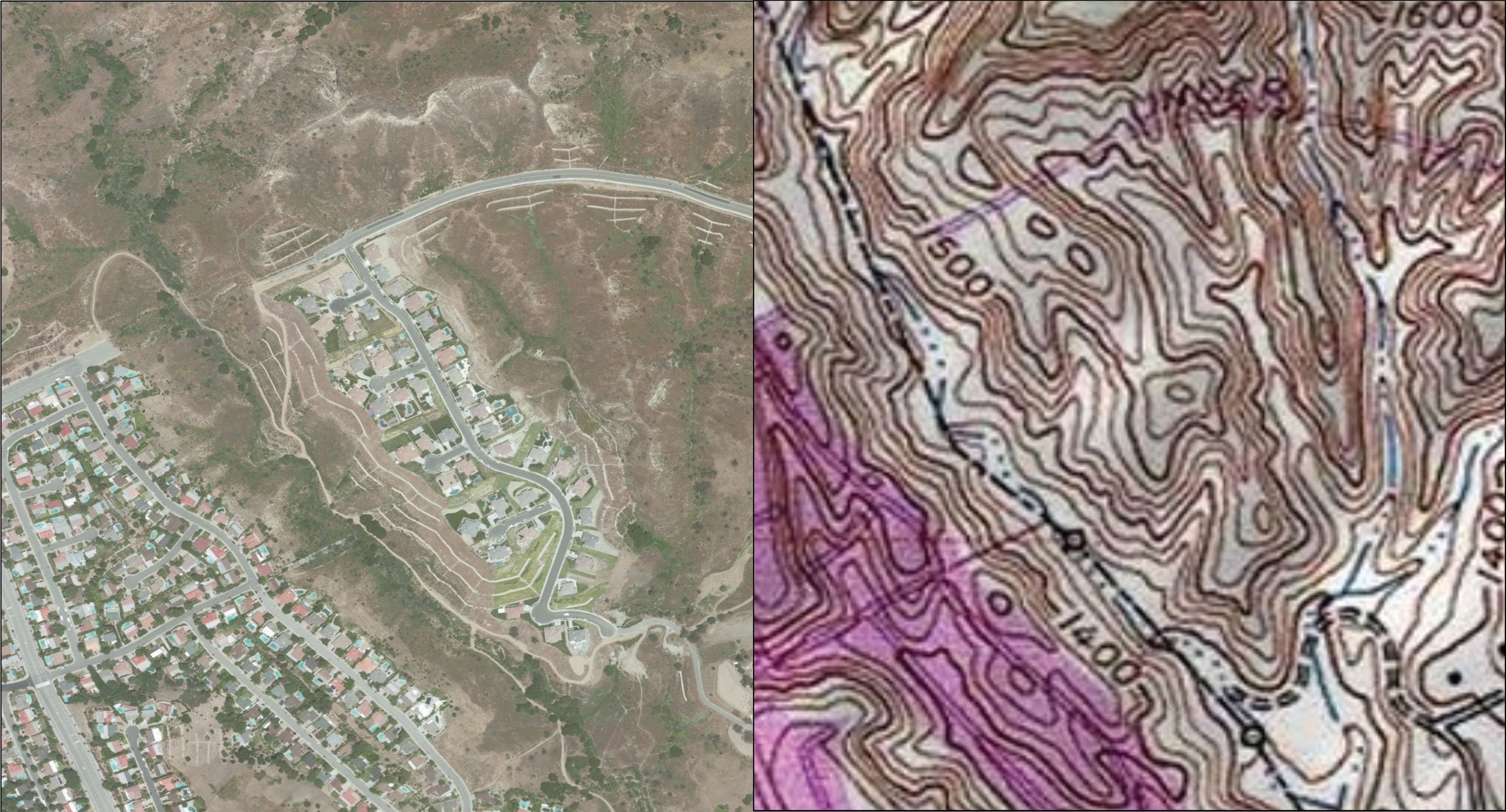
Source: Data available from U.S. Geological Survey, Earth Resources Observation and Science (EROS) Center, Sioux Falls, SD.
Because of the reliance on a uniform series of square pixels, the raster data model is referred to as a grid-based system. Typically, a single data value will be assigned to each grid locale. Each cell in a raster carries a single value, which represents the characteristic of the spatial phenomenon at a location denoted by its row and column. The data type for that cell value can be either integer or floating-point (Chapter 5 “Geospatial Data Management”, Section 5.1 “Geographic Data Acquisition”). Alternatively, the raster graphic can reference a database management system wherein open-ended attribute tables can be used to associate multiple data values to each pixel. The advance of computer technology has made this second methodology increasingly feasible as large datasets are no longer constrained by computer storage issues as they were previously.
The raster model will average all values within a given pixel to yield a single value. Therefore, the more area covered per pixel, the less accurate the associated data values. The area covered by each pixel determines the spatial resolution of the raster model from which it is derived. Specifically, resolution is determined by measuring one side of the square pixel. A raster model with pixels representing 10 m by 10 m (or 100 square meters) in the real world would be said to have a spatial resolution of 10 m; a raster model with pixels measuring 1 km by 1 km (1 square kilometer) in the real world would be said to have a spatial resolution of 1 km; and so forth.
Care must be taken when determining the resolution of a raster because using an overly coarse pixel resolution will cause a loss of information, whereas using overly fine pixel resolution will result in significant increases in file size and computer processing requirements during display and/or analysis. An effective pixel resolution will take both the map scale and the minimum mapping unit of the other GIS data into consideration. In the case of raster graphics with coarse spatial resolution, the data values associated with specific locations are not necessarily explicit in the raster data model. For example, if the location of telephone poles were mapped on a coarse raster graphic, it would be clear that the entire cell would not be filled by the pole. Rather, the pole would be assumed to be located somewhere within that cell (typically at the center).
Imagery employing the raster data model must exhibit several properties. First, each pixel must hold at least one value, even if that data value is zero. Furthermore, if no data are present for a given pixel, a data value placeholder must be assigned to this grid cell. Often, an arbitrary, readily identifiable value (e.g., −9999) will be assigned to pixels for which there is no data value. Second, a cell can hold any alphanumeric index that represents an attribute. In the case of quantitative datasets, attribute assignation is fairly straightforward. For example, if a raster image denotes elevation, the data values for each pixel would be some indication of elevation, usually in feet or meters. In the case of qualitative datasets, data values are indices that necessarily refer to some predetermined translational rule. In the case of a land-use/land-cover raster graphic, the following rule may be applied: 1 = grassland, 2 = agricultural, 3 = disturbed, and so forth (Figure 4.4 “Land-Use/Land-Cover Raster Image”). The third property of the raster data model is that points and lines “move” to the center of the cell. As one might expect, if a 1 km resolution raster image contains a river or stream, the location of the actual waterway within the “river” pixel will be unclear. Therefore, there is a general assumption that all zero-dimensional (point) and one-dimensional (line) features will be located toward the center of the cell. As a corollary, the minimum width for any line feature must necessarily be one cell regardless of the actual width of the feature. If it is not, the feature will not be represented in the image and will therefore be assumed to be absent.
Figure 4.4 Land-Use/Land-Cover Raster Image
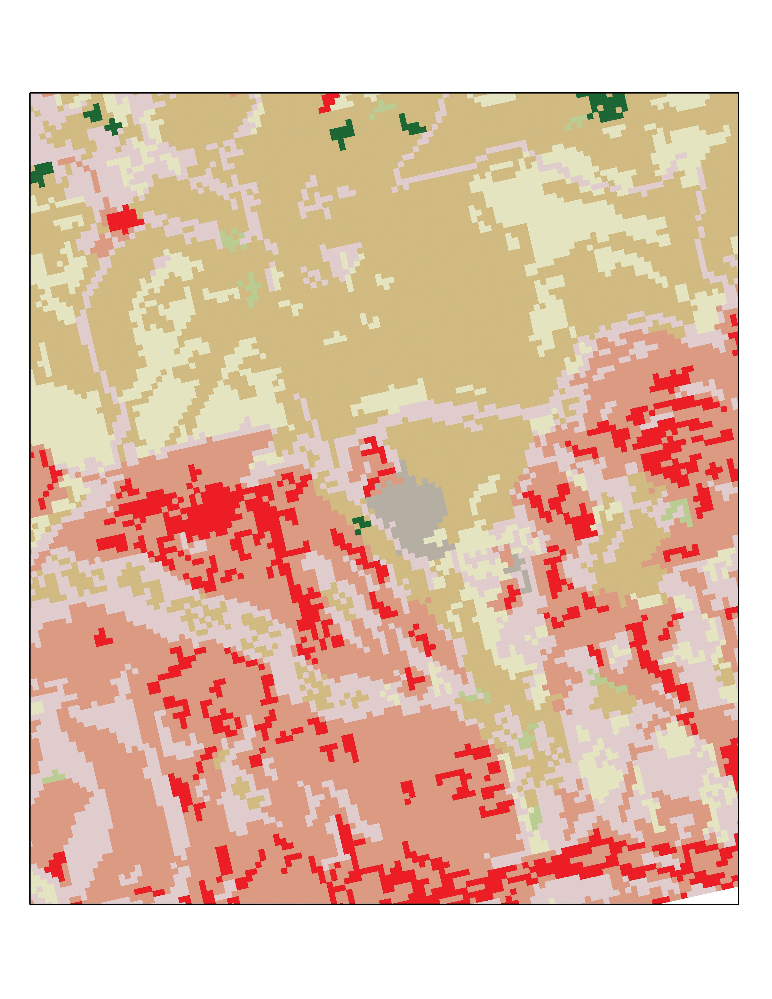
Source: Data available from U.S. Geological Survey, Earth Resources Observation and Science (EROS) Center, Sioux Falls, SD.
Several methods exist for encoding raster data from scratch. Three of these models are as follows:
- Cell-by-cell raster encoding. This minimally intensive method encodes a raster by creating records for each cell value by row and column (Figure 4.5 “Cell-by-Cell Encoding of Raster Data”). This method could be thought of as a large spreadsheet wherein each cell of the spreadsheet represents a pixel in the raster image. This method is also referred to as “exhaustive enumeration.”
- Run-length raster encoding. This method encodes cell values in runs of similarly valued pixels and can result in a highly compressed image file (Figure 4.6 “Run-Length Encoding of Raster Data”). The run-length encoding method is useful in situations where large groups of neighboring pixels have similar values (e.g., discrete datasets such as land use/land cover or habitat suitability) and is less useful where neighboring pixel values vary widely (e.g., continuous datasets such as elevation or sea-surface temperatures).
- Quad-tree raster encoding. This method divides a raster into a hierarchy of quadrants that are subdivided based on similarly valued pixels (Figure 4.7 “Quad-Tree Encoding of Raster Data”). The division of the raster stops when a quadrant is made entirely from cells of the same value. A quadrant that cannot be subdivided is called a “leaf node.”
Figure 4.5 Cell-by-Cell Encoding of Raster Data
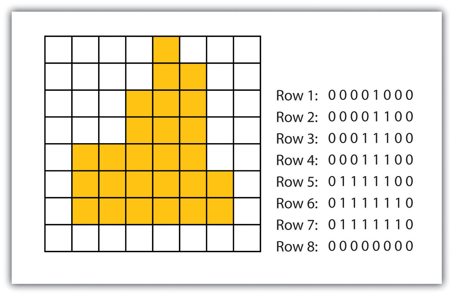
Figure 4.6 Run-Length Encoding of Raster Data
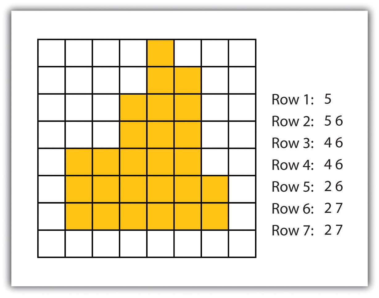
Figure 4.7 Quad-Tree Encoding of Raster Data
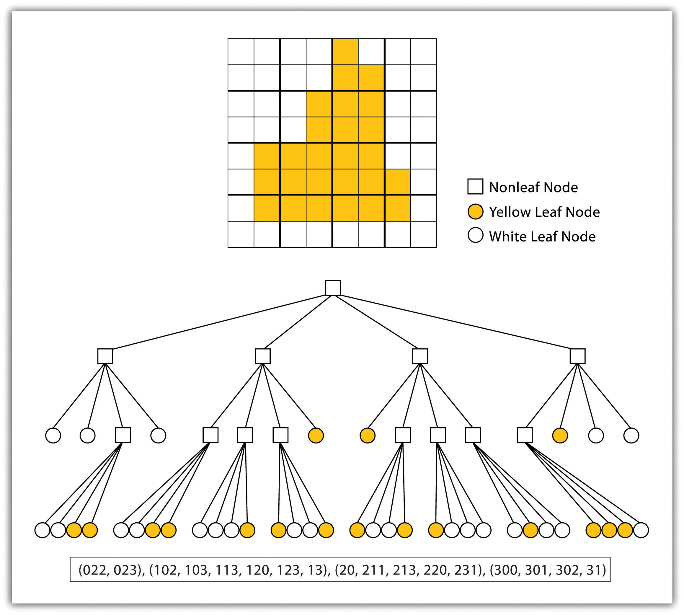
Advantages/Disadvantages of the Raster Model
The use of a raster data model confers many advantages. First, the technology required to create raster graphics is inexpensive and ubiquitous. Nearly everyone currently owns some sort of raster image generator, namely a digital camera, and few cellular phones are sold today that don’t include such functionality. Similarly, a plethora of satellites are constantly beaming up-to-the-minute raster graphics to scientific facilities across the globe (Chapter 5 “Geospatial Data Management”, Section 5.3 “File Formats”). These graphics are often posted online for private and/or public use, occasionally at no cost to the user.
Additional advantages of raster graphics are the relative simplicity of the underlying data structure. Each grid location represented in the raster image correlates to a single value (or series of values if attributes tables are included). This simple data structure may also help explain why it is relatively easy to perform overlay analyses on raster data (for more on overlay analyses, see Chapter 7 “Geospatial Analysis I: Vector Operations”, Section 7.1 “Single Layer Analysis”). This simplicity also lends itself to easy interpretation and maintenance of the graphics, relative to its vector counterpart.
Despite the advantages, there are also several disadvantages to using the raster data model. The first disadvantage is that raster files are typically very large. Particularly in the case of raster images built from the cell-by-cell encoding methodology, the sheer number of values stored for a given dataset result in potentially enormous files. Any raster file that covers a large area and has somewhat finely resolved pixels will quickly reach hundreds of megabytes in size or more. These large files are only getting larger as the quantity and quality of raster datasets continues to keep pace with quantity and quality of computer resources and raster data collectors (e.g., digital cameras, satellites).
A second disadvantage of the raster model is that the output images are less “pretty” than their vector counterparts. This is particularly noticeable when the raster images are enlarged or zoomed (refer to Figure 4.1 “Digital Picture with Zoomed Inset Showing Pixilation of Raster Image”). Depending on how far one zooms into a raster image, the details and coherence of that image will quickly be lost amid a pixilated sea of seemingly randomly colored grid cells.
The geometric transformations that arise during map reprojection efforts can cause problems for raster graphics and represent a third disadvantage to using the raster data model. As described in Chapter 2 “Map Anatomy”, Section 2.2 “Map Scale, Coordinate Systems, and Map Projections”, changing map projections will alter the size and shape of the original input layer and frequently result in the loss or addition of pixels (White 2006).White, D. 2006. “Display of Pixel Loss and Replication in Reprojecting Raster Data from the Sinusoidal Projection.” Geocarto International 21 (2): 19–22.These alterations will result in the perfect square pixels of the input layer taking on some alternate rhomboidal dimensions. However, the problem is larger than a simple reformation of the square pixel. Indeed, the reprojection of a raster image dataset from one projection to another brings change to pixel values that may, in turn, significantly alter the output information (Seong 2003).Seong, J. C. 2003. “Modeling the Accuracy of Image Data Reprojection.” International Journal of Remote Sensing 24 (11): 2309–21.
The final disadvantage of using the raster data model is that it is not suitable for some types of spatial analyses. For example, difficulties arise when attempting to overlay and analyze multiple raster graphics produced at differing scales and pixel resolutions. Combining information from a raster image with 10 m spatial resolution with a raster image with 1 km spatial resolution will most likely produce nonsensical output information as the scales of analysis are far too disparate to result in meaningful and/or interpretable conclusions. In addition, some network and spatial analyses (i.e., determining directionality or geocoding) can be problematic to perform on raster data.
KEY TAKEAWAYS
- Raster data are derived from a grid-based system of contiguous cells containing specific attribute information.
- The spatial resolution of a raster dataset represents a measure of the accuracy or detail of the displayed information.
- The raster data model is widely used by non-GIS technologies such as digital cameras/pictures and LCD monitors.
- Care should be taken to determine whether the raster or vector data model is best suited for your data and/or analytical needs.
EXERCISES
- Examine a digital photo you have taken recently. Can you estimate its spatial resolution?
- If you were to create a raster data file showing the major land-use types in your county, which encoding method would you use? What method would you use if you were to encode a map of the major waterways in your county? Why?
4.2 Vector Data Models
LEARNING OBJECTIVE
- The objective of this section is to understand how vector data models are implemented in GIS applications.
In contrast to the raster data model is the vector data model. In this model, space is not quantized into discrete grid cells like the raster model. Vector data models use points and their associated X, Y coordinate pairs to represent the vertices of spatial features, much as if they were being drawn on a map by hand (Aronoff 1989).Aronoff, S. 1989. Geographic Information Systems: A Management Perspective. Ottawa, Canada: WDL Publications. The data attributes of these features are then stored in a separate database management system. The spatial information and the attribute information for these models are linked via a simple identification number that is given to each feature in a map.
Three fundamental vector types exist in geographic information systems (GISs): points, lines, and polygons (Figure 4.8 “Points, Lines, and Polygons”). Points are zero-dimensional objects that contain only a single coordinate pair. Points are typically used to model singular, discrete features such as buildings, wells, power poles, sample locations, and so forth. Points have only the property of location. Other types of point features include the node and the vertex. Specifically, a point is a stand-alone feature, while a node is a topological junction representing a common X, Y coordinate pair between intersecting lines and/or polygons. Vertices are defined as each bend along a line or polygon feature that is not the intersection of lines or polygons.
Figure 4.8 Points, Lines, and Polygons
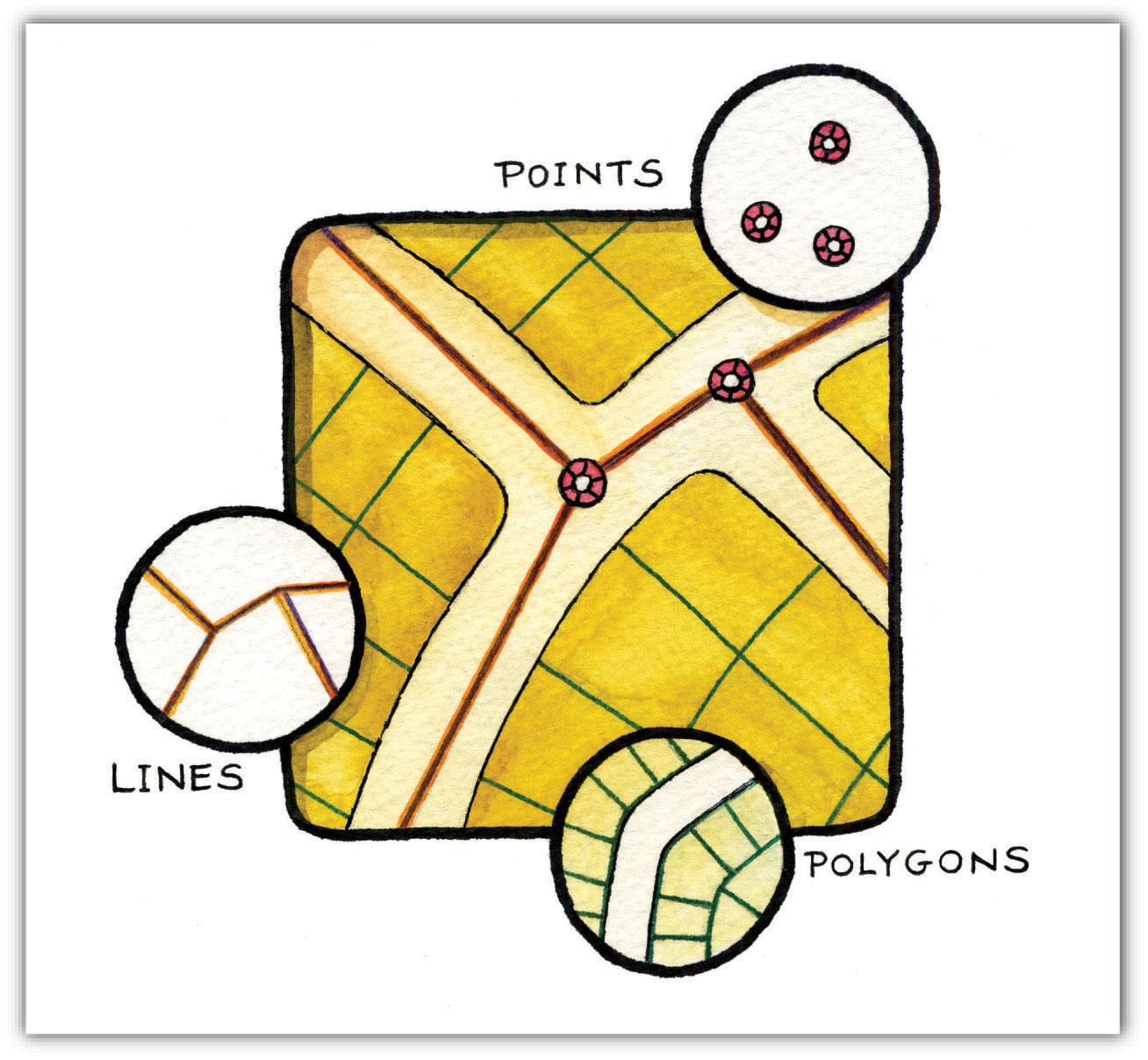
Points can be spatially linked to form more complex features. Lines are one-dimensional features composed of multiple, explicitly connected points. Lines are used to represent linear features such as roads, streams, faults, boundaries, and so forth. Lines have the property of length. Lines that directly connect two nodes are sometimes referred to as chains, edges, segments, or arcs.
Polygons are two-dimensional features created by multiple lines that loop back to create a “closed” feature. In the case of polygons, the first coordinate pair (point) on the first line segment is the same as the last coordinate pair on the last line segment. Polygons are used to represent features such as city boundaries, geologic formations, lakes, soil associations, vegetation communities, and so forth. Polygons have the properties of area and perimeter. Polygons are also called areas.
Vector Data Models Structures
Vector data models can be structured many different ways. We will examine two of the more common data structures here. The simplest vector data structure is called the spaghetti data model(Dangermond 1982).Dangermond, J. 1982. “A Classification of Software Components Commonly Used in Geographic Information Systems.” In Proceedings of the U.S.-Australia Workshop on the Design and Implementation of Computer-Based Geographic Information Systems, 70–91. Honolulu, HI. In the spaghetti model, each point, line, and/or polygon feature is represented as a string of X, Y coordinate pairs (or as a single X, Y coordinate pair in the case of a vector image with a single point) with no inherent structure (Figure 4.9 “Spaghetti Data Model”). One could envision each line in this model to be a single strand of spaghetti that is formed into complex shapes by the addition of more and more strands of spaghetti. It is notable that in this model, any polygons that lie adjacent to each other must be made up of their own lines, or stands of spaghetti. In other words, each polygon must be uniquely defined by its own set of X, Y coordinate pairs, even if the adjacent polygons share the exact same boundary information. This creates some redundancies within the data model and therefore reduces efficiency.
Figure 4.9 Spaghetti Data Model
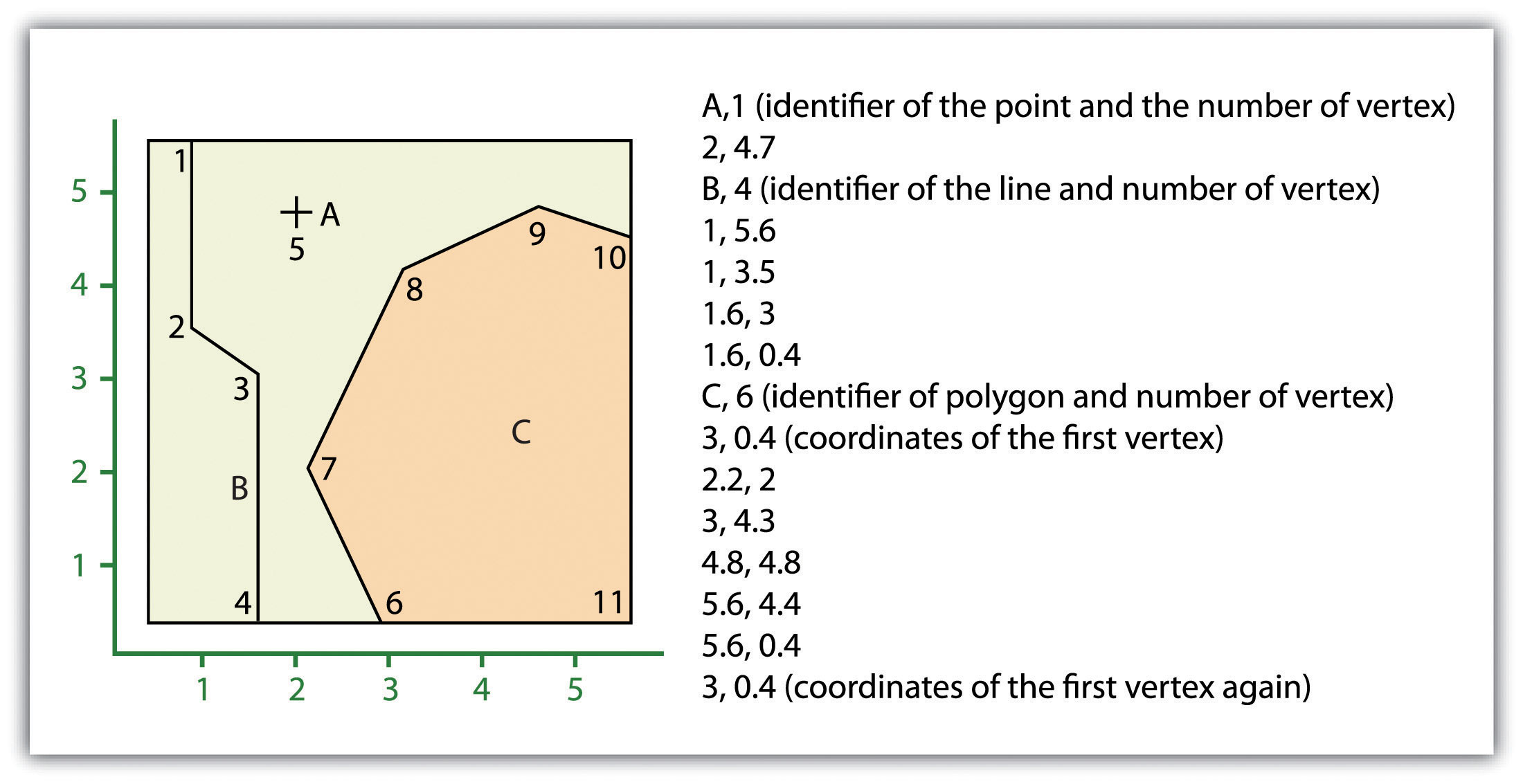
Despite the location designations associated with each line, or strand of spaghetti, spatial relationships are not explicitly encoded within the spaghetti model; rather, they are implied by their location. This results in a lack of topological information, which is problematic if the user attempts to make measurements or analysis. The computational requirements, therefore, are very steep if any advanced analytical techniques are employed on vector files structured thusly. Nevertheless, the simple structure of the spaghetti data model allows for efficient reproduction of maps and graphics as this topological information is unnecessary for plotting and printing.
In contrast to the spaghetti data model, the topological data model is characterized by the inclusion of topological information within the dataset, as the name implies. Topology is a set of rules that model the relationships between neighboring points, lines, and polygons and determines how they share geometry. For example, consider two adjacent polygons. In the spaghetti model, the shared boundary of two neighboring polygons is defined as two separate, identical lines. The inclusion of topology into the data model allows for a single line to represent this shared boundary with an explicit reference to denote which side of the line belongs with which polygon. Topology is also concerned with preserving spatial properties when the forms are bent, stretched, or placed under similar geometric transformations, which allows for more efficient projection and reprojection of map files.
Three basic topological precepts that are necessary to understand the topological data model are outlined here. First, connectivity describes the arc-node topology for the feature dataset. As discussed previously, nodes are more than simple points. In the topological data model, nodes are the intersection points where two or more arcs meet. In the case of arc-node topology, arcs have both a from-node (i.e., starting node) indicating where the arc begins and a to-node (i.e., ending node) indicating where the arc ends (Figure 4.10 “Arc-Node Topology”). In addition, between each node pair is a line segment, sometimes called a link, which has its own identification number and references both its from-node and to-node. In Figure 4.10 “Arc-Node Topology”, arcs 1, 2, and 3 all intersect because they share node 11. Therefore, the computer can determine that it is possible to move along arc 1 and turn onto arc 3, while it is not possible to move from arc 1 to arc 5, as they do not share a common node.
Figure 4.10 Arc-Node Topology
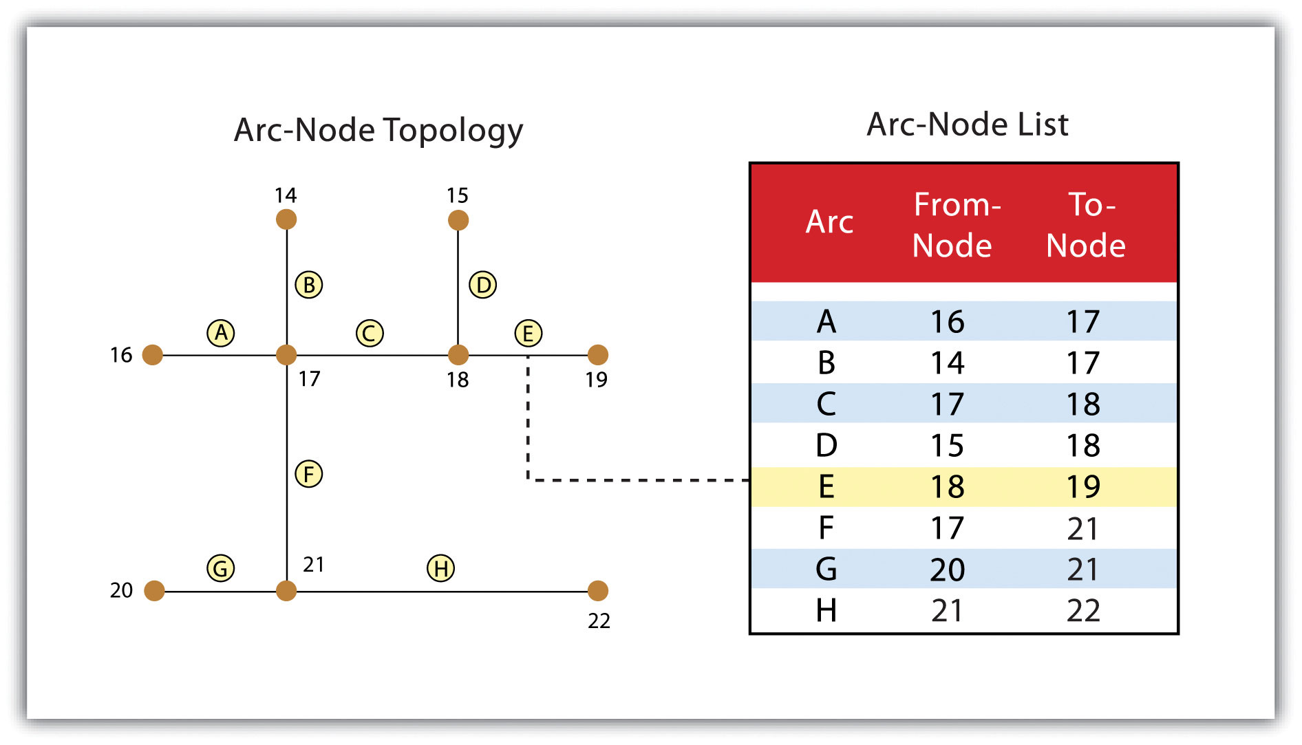
The second basic topological precept is area definition. Area definition states that an arc that connects to surround an area defines a polygon, also called polygon-arc topology. In the case of polygon-arc topology, arcs are used to construct polygons, and each arc is stored only once (Figure 4.11 “Polygon-Arc Topology”). This results in a reduction in the amount of data stored and ensures that adjacent polygon boundaries do not overlap. In the Figure 4.11 “Polygon-Arc Topology”, the polygon-arc topology makes it clear that polygon F is made up of arcs 8, 9, and 10.
Figure 4.11 Polygon-Arc Topology
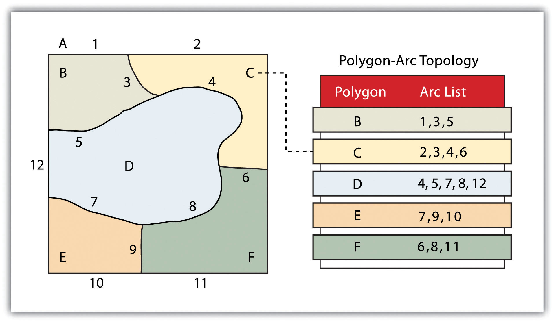
Contiguity, the third topological precept, is based on the concept that polygons that share a boundary are deemed adjacent. Specifically, polygon topology requires that all arcs in a polygon have a direction (a from-node and a to-node), which allows adjacency information to be determined (Figure 4.12 “Polygon Topology”). Polygons that share an arc are deemed adjacent, or contiguous, and therefore the “left” and “right” side of each arc can be defined. This left and right polygon information is stored explicitly within the attribute information of the topological data model. The “universe polygon” is an essential component of polygon topology that represents the external area located outside of the study area. Figure 4.12 “Polygon Topology” shows that arc 6 is bound on the left by polygon B and to the right by polygon C. Polygon A, the universe polygon, is to the left of arcs 1, 2, and 3.
Figure 4.12 Polygon Topology
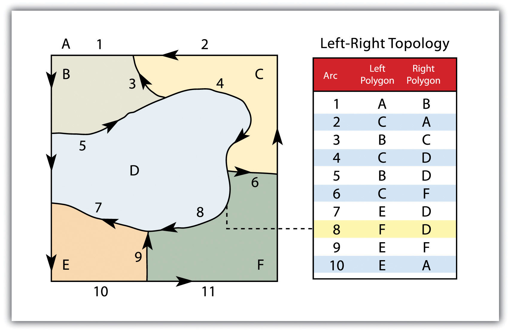
Topology allows the computer to rapidly determine and analyze the spatial relationships of all its included features. In addition, topological information is important because it allows for efficient error detection within a vector dataset. In the case of polygon features, open or unclosed polygons, which occur when an arc does not completely loop back upon itself, and unlabeled polygons, which occur when an area does not contain any attribute information, violate polygon-arc topology rules. Another topological error found with polygon features is the sliver. Slivers occur when the shared boundary of two polygons do not meet exactly (Figure 4.13 “Common Topological Errors”).
In the case of line features, topological errors occur when two lines do not meet perfectly at a node. This error is called an “undershoot” when the lines do not extend far enough to meet each other and an “overshoot” when the line extends beyond the feature it should connect to (Figure 4.13 “Common Topological Errors”). The result of overshoots and undershoots is a “dangling node” at the end of the line. Dangling nodes aren’t always an error, however, as they occur in the case of dead-end streets on a road map.
Figure 4.13 Common Topological Errors
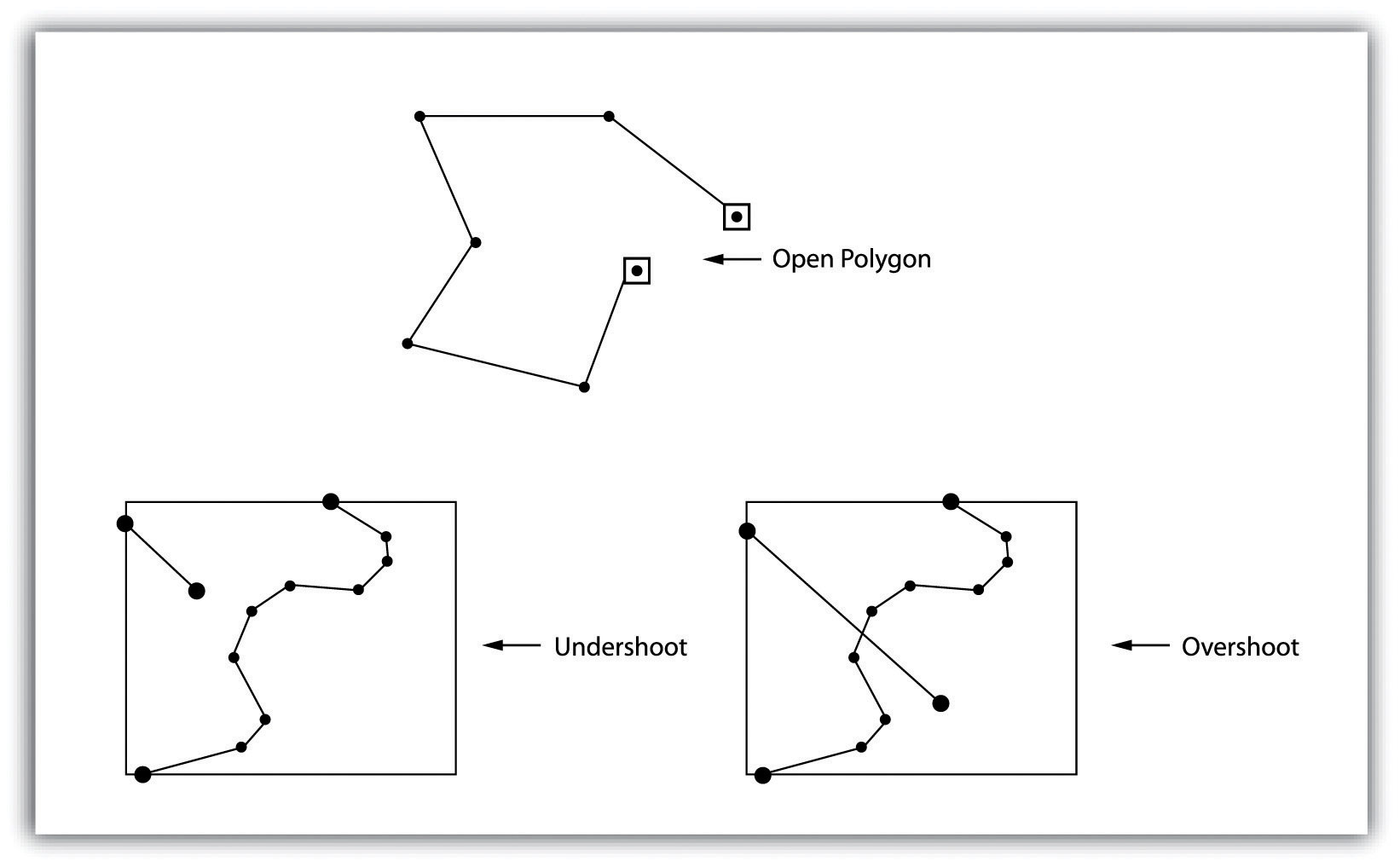
Many types of spatial analysis require the degree of organization offered by topologically explicit data models. In particular, network analysis (e.g., finding the best route from one location to another) and measurement (e.g., finding the length of a river segment) relies heavily on the concept of to- and from-nodes and uses this information, along with attribute information, to calculate distances, shortest routes, quickest routes, and so forth. Topology also allows for sophisticated neighborhood analysis such as determining adjacency, clustering, nearest neighbors, and so forth.
Now that the basics of the concepts of topology have been outlined, we can begin to better understand the topological data model. In this model, the node acts as more than just a simple point along a line or polygon. The node represents the point of intersection for two or more arcs. Arcs may or may not be looped into polygons. Regardless, all nodes, arcs, and polygons are individually numbered. This numbering allows for quick and easy reference within the data model.
Advantages/Disadvantages of the Vector Model
In comparison with the raster data model, vector data models tend to be better representations of reality due to the accuracy and precision of points, lines, and polygons over the regularly spaced grid cells of the raster model. This results in vector data tending to be more aesthetically pleasing than raster data.
Vector data also provides an increased ability to alter the scale of observation and analysis. As each coordinate pair associated with a point, line, and polygon represents an infinitesimally exact location (albeit limited by the number of significant digits and/or data acquisition methodologies), zooming deep into a vector image does not change the view of a vector graphic in the way that it does a raster graphic (see Figure 4.1 “Digital Picture with Zoomed Inset Showing Pixilation of Raster Image”).
Vector data tend to be more compact in data structure, so file sizes are typically much smaller than their raster counterparts. Although the ability of modern computers has minimized the importance of maintaining small file sizes, vector data often require a fraction the computer storage space when compared to raster data.
The final advantage of vector data is that topology is inherent in the vector model. This topological information results in simplified spatial analysis (e.g., error detection, network analysis, proximity analysis, and spatial transformation) when using a vector model.
Alternatively, there are two primary disadvantages of the vector data model. First, the data structure tends to be much more complex than the simple raster data model. As the location of each vertex must be stored explicitly in the model, there are no shortcuts for storing data like there are for raster models (e.g., the run-length and quad-tree encoding methodologies).
Second, the implementation of spatial analysis can also be relatively complicated due to minor differences in accuracy and precision between the input datasets. Similarly, the algorithms for manipulating and analyzing vector data are complex and can lead to intensive processing requirements, particularly when dealing with large datasets.
KEY TAKEAWAYS
- Vector data utilizes points, lines, and polygons to represent the spatial features in a map.
- Topology is an informative geospatial property that describes the connectivity, area definition, and contiguity of interrelated points, lines, and polygon.
- Vector data may or may not be topologically explicit, depending on the file’s data structure.
- Care should be taken to determine whether the raster or vector data model is best suited for your data and/or analytical needs.
EXERCISES
- What vector type (point, line, or polygon) best represents the following features: state boundaries, telephone poles, buildings, cities, stream networks, mountain peaks, soil types, flight tracks? Which of these features can be represented by multiple vector types? What conditions might lead you choose one vector type over another?
- Draw a point, line, and polygon feature on a simple Cartesian coordinate system. From this drawing, create a spaghetti data model that approximates the shapes shown therein.
- Draw three adjacent polygons on a simple Cartesian coordinate system. From this drawing, create a topological data model that incorporates arc-node, polygon-arc, and polygon topology.
4.3 Satellite Imagery and Aerial Photography
LEARNING OBJECTIVE
- The objective of this section is to understand how satellite imagery and aerial photography are implemented in GIS applications.
A wide variety of satellite imagery and aerial photography is available for use in geographic information systems (GISs). Although these products are basically raster graphics, they are substantively different in their usage within a GIS. Satellite imagery and aerial photography provide important contextual information for a GIS and are often used to conduct heads-up digitizing (Chapter 5 “Geospatial Data Management”, Section 5.1.4 “Secondary Data Capture”) whereby features from the image are converted into vector datasets.
Satellite Imagery
Remotely sensed satellite imagery is becoming increasingly common as satellites equipped with technologically advanced sensors are continually being sent into space by public agencies and private companies around the globe. Satellites are used for applications such as military and civilian earth observation, communication, navigation, weather, research, and more. Currently, more than 3,000 satellites have been sent to space, with over 2,500 of them originating from Russia and the United States. These satellites maintain different altitudes, inclinations, eccentricities, synchronies, and orbital centers, allowing them to image a wide variety of surface features and processes (Figure 4.14 “Satellites Orbiting the Earth”).
Figure 4.14 Satellites Orbiting the Earth
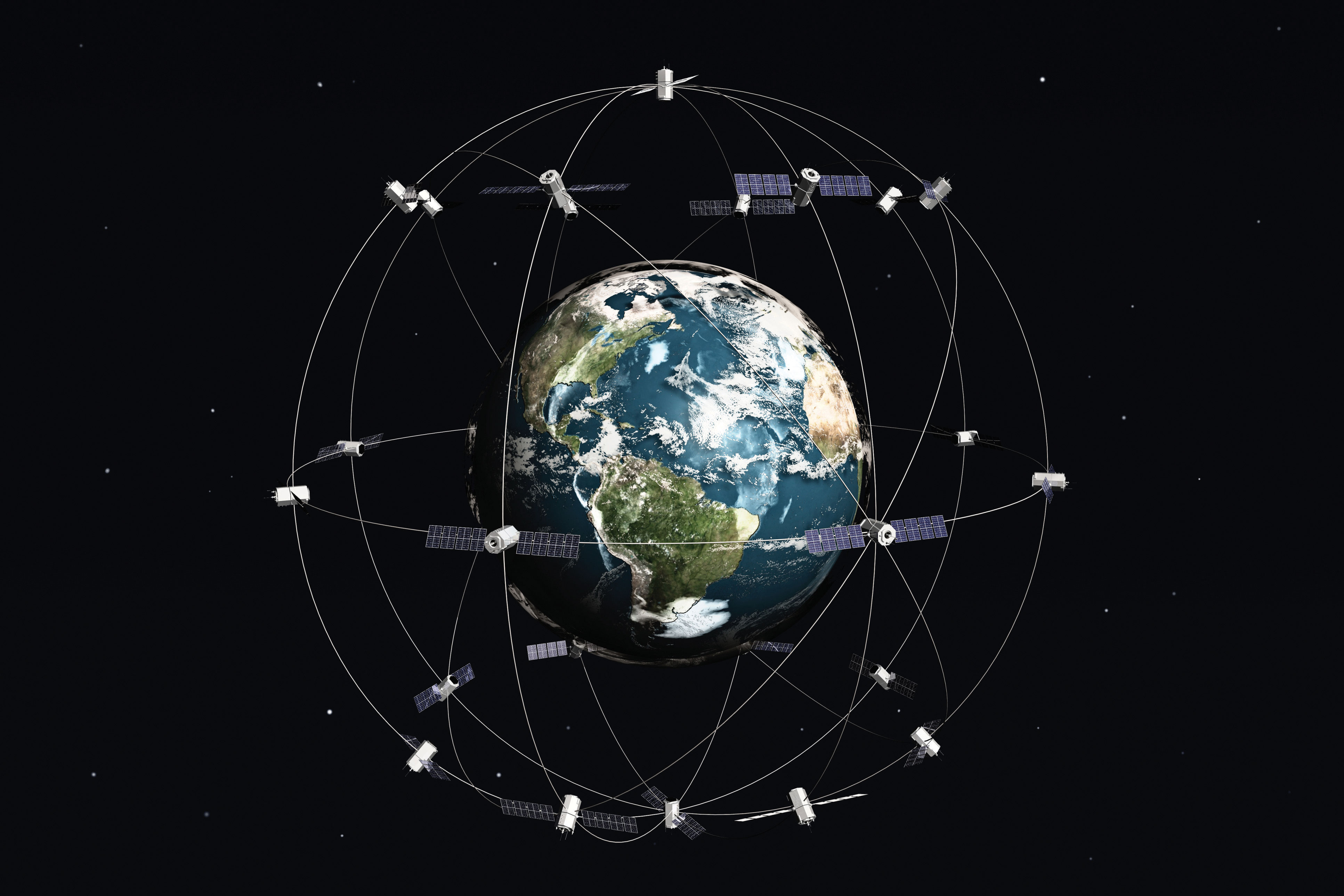
Satellites can be active or passive. Active satellites make use of remote sensors that detect reflected responses from objects that are irradiated from artificially generated energy sources. For example, active sensors such as radars emit radio waves, laser sensors emit light waves, and sonar sensors emit sound waves. In all cases, the sensor emits the signal and then calculates the time it takes for the returned signal to “bounce” back from some remote feature. Knowing the speed of the emitted signal, the time delay from the original emission to the return can be used to calculate the distance to the feature.
Passive satellites, alternatively, make use of sensors that detect the reflected or emitted electromagnetic radiation from natural sources. This natural source is typically the energy from the sun, but other sources can be imaged as well, such as magnetism and geothermal activity. Using an example we’ve all experienced, taking a picture with a flash-enabled camera would be active remote sensing, while using a camera without a flash (i.e., relying on ambient light to illuminate the scene) would be passive remote sensing.
The quality and quantity of satellite imagery is largely determined by their resolution. There are four types of resolution that characterize any particular remote sensor (Campbell 2002).Campbell, J. B. 2002. Introduction to Remote Sensing. New York: Guilford Press. The spatial resolution of a satellite image, as described previously in the raster data model section (Section 4.1 “Raster Data Models”), is a direct representation of the ground coverage for each pixel shown in the image. If a satellite produces imagery with a 10 m resolution, the corresponding ground coverage for each of those pixels is 10 m by 10 m, or 100 square meters on the ground. Spatial resolution is determined by the sensors’ instantaneous field of view (IFOV). The IFOV is essentially the ground area through which the sensor is receiving the electromagnetic radiation signal and is determined by height and angle of the imaging platform.
Spectral resolution denotes the ability of the sensor to resolve wavelength intervals, also called bands, within the electromagnetic spectrum. The spectral resolution is determined by the interval size of the wavelengths and the number of intervals being scanned. Multispectral and hyperspectral sensors are those sensors that can resolve a multitude of wavelengths intervals within the spectrum. For example, the IKONOS satellite resolves images for bands at the blue (445–516 nm), green (506–95 nm), red (632–98 nm), and near-infrared (757–853 nm) wavelength intervals on its 4-meter multispectral sensor.
Temporal resolution is the amount of time between each image collection period and is determined by the repeat cycle of the satellite’s orbit. Temporal resolution can be thought of as true-nadir or off-nadir. Areas considered true-nadir are those located directly beneath the sensor while off-nadir areas are those that are imaged obliquely. In the case of the IKONOS satellite, the temporal resolution is 3 to 5 days for off-nadir imaging and 144 days for true-nadir imaging.
The fourth and final type of resolution, radiometric resolution, refers to the sensitivity of the sensor to variations in brightness and specifically denotes the number of grayscale levels that can be imaged by the sensor. Typically, the available radiometric values for a sensor are 8-bit (yielding values that range from 0–255 as 256 unique values or as 28 values); 11-bit (0–2,047); 12-bit (0–4,095); or 16-bit (0–63,535) (see Chapter 5 “Geospatial Data Management”, Section 5.1.1 “Data Types” for more on bits). Landsat-7, for example, maintains 8-bit resolution for its bands and can therefore record values for each pixel that range from 0 to 255.
Because of the technical constraints associated with satellite remote sensing systems, there is a trade-off between these different types of resolution. Improving one type of resolution often necessitates a reduction in one of the other types of resolution. For example, an increase in spatial resolution is typically associated with a decrease in spectral resolution, and vice versa. Similarly, geostationary satellites (those that circle the earth proximal to the equator once each day) yield high temporal resolution but low spatial resolution, while sun-synchronous satellites (those that synchronize a near-polar orbit of the sensor with the sun’s illumination) yield low temporal resolution while providing high spatial resolution. Although technological advances can generally improve the various resolutions of an image, care must always be taken to ensure that the imagery you have chosen is adequate to the represent or model the geospatial features that are most important to your study.
Aerial Photography
Aerial photography, like satellite imagery, represents a vast source of information for use in any GIS. Platforms for the hardware used to take aerial photographs include airplanes, helicopters, balloons, rockets, and so forth. While aerial photography connotes images taken of the visible spectrum, sensors to measure bands within the nonvisible spectrum (e.g., ultraviolet, infrared, near-infrared) can also be fixed to aerial sources. Similarly, aerial photography can be active or passive and can be taken from vertical or oblique angles. Care must be taken with aerial photographs as the sensors used to take the images are similar to cameras in their use of lenses. These lenses add a curvature to the images, which becomes more pronounced as one moves away from the center of the photo (Figure 4.15 “Curvature Error Due to Lenticular Properties of Camera”).
Figure 4.15 Curvature Error Due to Lenticular Properties of Camera
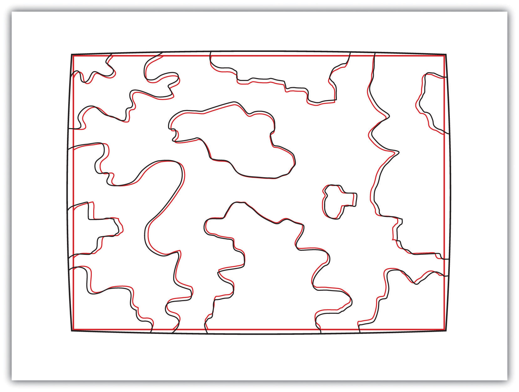
Another source of potential error in an aerial photograph is relief displacement. This error arises from the three-dimensional aspect of terrain features and is seen as apparent leaning away of vertical objects from the center point of an aerial photograph. To imagine this type of error, consider that a smokestack would look like a doughnut if the viewing camera was directly above the feature. However, if this same smokestack was observed near the edge of the camera’s view, one could observe the sides of the smokestack. This error is frequently seen with trees and multistory buildings and worsens with increasingly taller features.
Orthophotos are vertical photographs that have been geometrically “corrected” to remove the curvature and terrain-induced error from images (Figure 4.16 “Orthophoto”). The most common orthophoto product is the digital ortho quarter quadrangle (DOQQ). DOQQs are available through the US Geological Survey (USGS), who began producing these images from their library of 1:40,000-scale National Aerial Photography Program photos. These images can be obtained in either grayscale or color with 1-meter spatial resolution and 8-bit radiometric resolution. As the name suggests, these images cover a quarter of a USGS 7.5 minute quadrangle, which equals an approximately 25 square mile area. Included with these photos is an additional 50 to 300-meter edge around the photo that allows users to mosaic many DOQQs into a single, continuous image. These DOQQs are ideal for use in a GIS as background display information, for data editing, and for heads-up digitizing.
Figure 4.16 Orthophoto
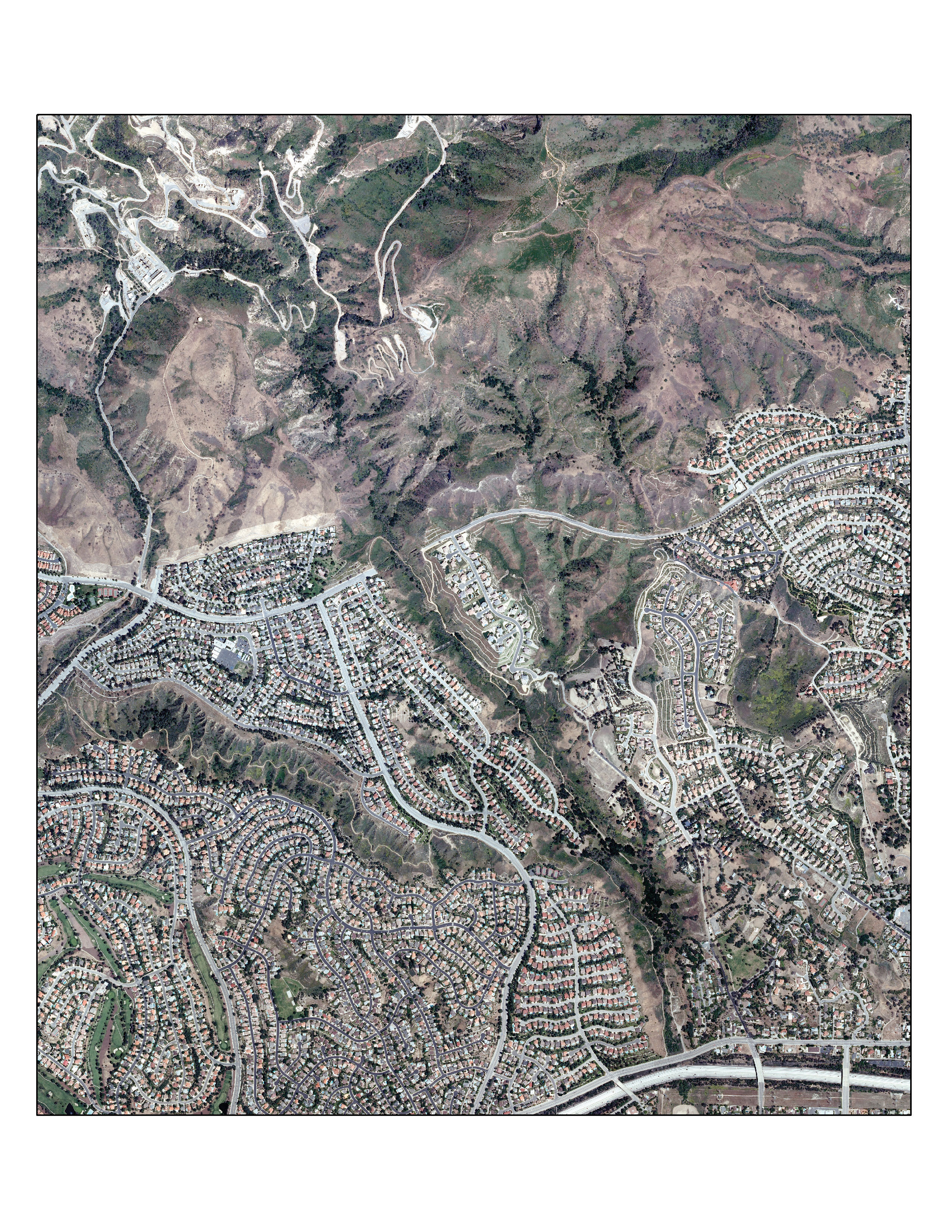
Source: Data available from U.S. Geological Survey, Earth Resources Observation and Science (EROS) Center, Sioux Falls, SD.
KEY TAKEAWAYS
- Satellite imagery is a common tool for GIS mapping applications as this data becomes increasingly available due to ongoing technological advances.
- Satellite imagery can be passive or active.
- The four types of resolution associated with satellite imagery are spatial, spectral, temporal, and radiometric.
- Vertical and oblique aerial photographs provide valuable baseline information for GIS applications.
EXERCISE
- Go to the EarthExplorer website (http://edcsns17.cr.usgs.gov/EarthExplorer) and download two satellite images of the area in which you reside. What are the different spatial, spectral, temporal, and radiometric resolutions for these two images? Do these satellites provide active or passive imagery (or both)? Are they geostationary or sun-synchronous?
Chapter 5Geospatial Data Management
Every user of geospatial data has experienced the challenge of obtaining, organizing, storing, sharing, and visualizing their data. The variety of formats and data structures, as well as the disparate quality, of geospatial data can result in a dizzying accumulation of useful and useless pieces of spatially explicit information that must be poked, prodded, and wrangled into a single, unified dataset. This chapter addresses the basic concerns related to data acquisition and management of the various formats and qualities of geospatial data currently available for use in modern geographic information system (GIS) projects.
5.1 Geographic Data Acquisition
LEARNING OBJECTIVE
- The objective of this section is to introduce different data types, measurement scales, and data capture methods.
Acquiring geographic data is an important factor in any geographic information system (GIS) effort. It has been estimated that data acquisition typically consumes 60 to 80 percent of the time and money spent on any given project. Therefore, care must be taken to ensure that GIS projects remain mindful of their stated goals so the collection of spatial data proceeds in an efficient and effective manner as possible. This chapter outlines the many forms and sources of geospatial data available for use in a GIS.
Data Types
The type of data that we employ to help us understand a given entity is determined by (1) what we are examining, (2) what we want to know about that entity, and (3) our ability to measure that entity at a desired scale. The most common types of data available for use in a GIS are alphanumeric strings, numbers, Boolean values, dates, and binaries.
An alphanumeric string, or text, data type is any simple combination of letters and numbers that may or may not form coherent words. The number data type can be subcategorized as either floating-point or integer. A floating-point is any data value that contains decimal digits, while an integer is any data value that does not contain decimal digits. Integers can be short or long depending on the amount of significant digits in that number. Also, they are based on the concept of the “bit” in a computer. As you may recall, a bit is the most basic unit of information in a computer and stores values in one of two states: 1 or 0. Therefore, an 8-bit attribute would consist of eight 1s or 0s in any combination (e.g., 10010011, 00011011, 11100111).
Short integers are 16-bit values and therefore can be used to characterize numbers ranging either from −32,768 to 32,767 or from 0 to 65,535 depending on whether the number is signed or unsigned (i.e., contains a + or − sign). Long integers, alternatively, are 32-bit values and therefore can characterize numbers ranging either from −2,147,483,648 to 2,147,483,647 or from 0 to 4,294,967,295.
A single precision floating-point value occupies 32 bits, like the long integer. However, this data type provides for a value of up to 7 bits to the left of the decimal (a maximum value of 128, or 127 if signed) and up to 23-bit values to the right of the decimal point (approximately 7 decimal digits). A double precision floating-point value essentially stores two 32-bit values as a single value. Double precision floats, then, can represent a value with up to 11 bits to the left of the decimal point and values with up to 52 bits to the right of the decimal (approximately 16 decimal digits) (Figure 5.1 “Double Precision Floating-Point (64-Bit Value), as Stored in a Computer”).
Figure 5.1 Double Precision Floating-Point (64-Bit Value), as Stored in a Computer

Boolean, date, and binary values are less complex. Boolean values are simply those values that are deemed true or false based on the application of a Boolean operator such as AND, OR, and NOT. The date data type is presumably self-explanatory, while the binary data type represents attributes whose values are either 1 or 0.
Measurement Scale
In addition to defining data by type, a measurement scale acts to group data according to level of complexity (Stevens 1946).Stevens, S. S. 1946. “On the Theory of Scales of Measurement.” Science 103 (2684): 677–80. For the purposes of GIS analyses, measurement scales can be grouped in to two general categories. Nominal and ordinal data represent categorical data; interval and ratio data represent numeric data.
The most simple data measurement scale is the nominal, or named, scale. The nominal scale makes statements about what to call data points but does not allow for scalar comparisons between one object and another. For example, the attribution of nominal information to a set of points that represent cities will describe whether the given locale is “Los Angeles” or “New York.” However, no further denotations, such as population or voting history, can be made about those locales. Other examples of nominal data include last name, eye color, land-use type, ethnicity, and gender.
Ordinal data places attribute information into ranks and therefore yields more precisely scaled information than nominal data. Ordinal data describes the position in which data occur, such as first, second, third, and so forth. These scales may also take on names, such as “very unsatisfied,” “unsatisfied,” “satisfied,” and “very satisfied.” Although this measurement scale indicates the ranking of each data point relative to other data points, the ordinal scale does not explicitly denote the exact quantitative difference between these rankings. For example, if an ordinal attribute represents which runner came in first, second, or third place, it does not state by how much time the winning runner beat the second place runner. Therefore, one cannot undertake arithmetic operations with ordinal data. Only sequence is explicit.
A measurement scale that does allow precise quantitative statements to be made about attributes is interval data. Interval data are measured along a scale in which each position is equidistant to one another. Elevation and temperature readings are common representations of interval data. For example, it can be determined through this scale that 30 ºF is 5 ºF warmer than 25 ºF. A notable property of the interval scale is that zero is not a meaningful value in the sense that zero does not represent nothingness, or the absence of a value. Indeed, 0 ºF does not indicate that no temperature exists. Similarly, an elevation of 0 feet does not indicate a lack of elevation; rather, it indicates mean sea level.
Ratio data are similar to the interval measurement scale; however, it is based around a meaningful zero value. Population density is an example of ratio data whereby a 0 population density indicates that no people live in the area of interest. Similarly, the Kelvin temperature scale is a ratio scale as 0 K does imply that no heat (temperature) is measurable within the given attribute.
Specific to numeric datasets, data values also can be considered to be discrete or continuous. Discrete data are those that maintain a finite number of possible values, while continuous datacan be represented by an infinite number of values. For example, the number of mature trees on a small property will necessarily be between one and one hundred (for argument’s sake). However, the height of those trees represents a continuous data value as there are an infinite number of potential values (e.g., one tree may be 20 feet tall, 20.1 feet, or 20.15 feet, 20.157 feet, and so forth).
Primary Data Capture
Now that we have a sense of the different data types and measurement scales available for use in a GIS, we must direct our thoughts to how this data can be acquired. Primary data capture is a direct data acquisition methodology that is usually associated with some type of in-the-field effort. In the case of vector data, directly captured data commonly comes from a global positioning system (GPS) or other types of surveying equipment such as a total station (Figure 5.2 “GPS Unit (left) and Total Station (right)”). Total stations are specialized, primary data capture instruments that combine a theodolite (or transit), which measures horizontal and vertical angles, with a tool to measure the slope distance from the unit to an observed point. Use of a total station allows field crews to quickly and accurately derive the topography for a particular landscape.
Figure 5.2 GPS Unit (left) and Total Station (right)
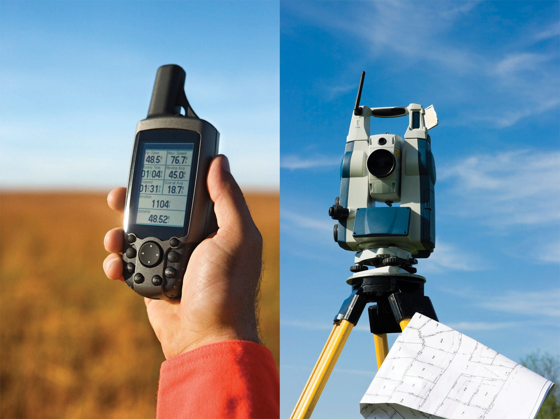
In the case of GPS, handheld units access positional data from satellites and log the information for subsequent retrieval. A network of twenty-four navigation satellites is situated around the globe and provides precise coordinate information for any point on the earth’s surface (Figure 5.3 “Earth Imaging Satellite Capturing Primary Data”). Maintaining a line of sight to four or more of these satellites provides the user with reasonably accurate location information. These locations can be collected as individual points or can be linked together to form lines or polygons depending on user preference. Attribute data such as land-use type, telephone pole number, and river name can be simultaneously entered by the user. This location and attribute data can then be uploaded to the GIS for visualization. Depending on the GPS make and model, this upload often requires some type of intermediate file conversion via software provided by the manufacturer of the GPS unit. However, there are some free online resources that can convert GPS data from one format to another. GPSBabel is an example of such an online resource (http://www.gpsvisualizer.com/gpsbabel).
In addition to the typical GPS unit shown in Figure 5.2 “GPS Unit (left) and Total Station (right)”, GPS is becoming increasingly incorporated into other new technologies. For example, smartphones now embed GPS capabilities as a standard technological component. These phone/GPS units maintain comparable accuracy to similarly priced stand-alone GPS units and are largely responsible for a renaissance in facilitating portable, real-time data capture and sharing to the masses. The ubiquity of this technology led to a proliferation of crowdsourced data acquisition alternatives. Crowdsourcing is a data collection method whereby users contribute freely to building spatial databases. This rapidly expanding methodology is utilized in such applications as TomTom’s MapShare application, Google Earth, Bing Maps, and ArcGIS.
Raster data obtained via direct capture comes more commonly from remotely sensed sources (Figure 5.3 “Earth Imaging Satellite Capturing Primary Data”). Remotely sensed data offers the advantage of obviating the need for physical access to the area being imaged. In addition, huge tracts of land can be characterized with little to no additional time and labor by the researcher. On the other hand, validation is required for remotely sensed data to ensure that the sensor is not only operating correctly but properly calibrated to collect the desired information. Satellites and aerial cameras provide the most ubiquitous sources of direct-capture raster data (Chapter 4 “Data Models for GIS”, Section 4.3.1 “Satellite Imagery”).
Figure 5.3 Earth Imaging Satellite Capturing Primary Data
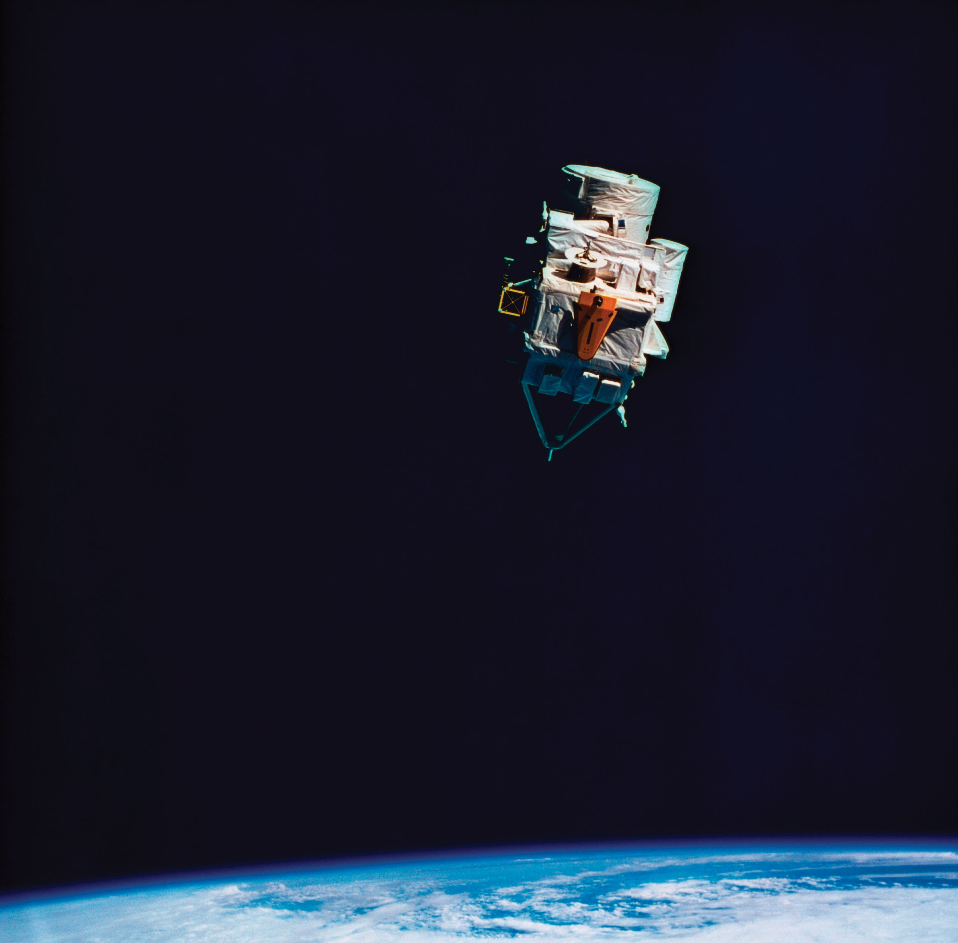
Secondary Data Capture
Secondary data capture is an indirect methodology that utilizes the vast amount of existing geospatial data available in both digital and hard-copy formats. Prior to initiating any GIS effort, it is always wise to mine online resources for existing GIS data that may fulfill your mapping needs without the potentially intensive step of creating the data from scratch. Such digital GIS data are available from a variety of sources including international agencies (CGIAR, CIESIN, United Nations, World Bank, etc.); federal governments (USGS, USDA, NOAA, USFWS, NASA, EPA, US Census, etc.); state governments (CDFG, Teale Data Center, INGIS, MARIS, NH GIS Resources, etc.); local governments (SANDAG, RCLIS, etc.); university websites (UCLA, Duke, Stanford, University of Chicago, Indiana Spatial Data Portal, etc.); and commercial websites (ESRI, GeoEye, Geocomm, etc.). These secondary data are available in a wide assortment of file types, extents, and sizes but is ready-made to be used in most GIS software packages. Often these data are free, but many sites will charge a fee for access to the proprietary information they have developed.
Although these data sources are all cases where the information has been converted to digital format and properly projected for use in a GIS, there is also a great deal of spatial information that can be gleaned from existing, nondigital sources. Paper maps, for example, may contain current or historic information on a locale that cannot be found in digital format. In this case, the process of digitization can be used to create digital files from the original paper copy. Three primary methods exist for digitizing spatial information: two are manual, and one is automated.
Tablet digitizing is a manual data capture method whereby a user enters coordinate information into a computer through the use of a digitizing tablet and a digitizing puck. To begin, a paper map is secured to a back-lit digitizing tablet. The backlight allows all features on the map to be easily observed, which reduces eyestrain. The coordinates of the point, line, and/or polygon features on the paper map are then entered into a digital file as the user employs a puck, which is similar to a multibutton mouse with a crosshair, to “click” their way around the vertices of each desired feature. The resulting digital file will need to be properly georeferenced following completion of the digitization task to ensure that this information will properly align with existing datasets.
Heads-up digitizing, the second manual data capture method, is referred to as “on-screen” digitizing. Heads-up digitizing can be used on either paper maps or existing digital files. In the case of a paper map, the map must first be scanned into the computer at a high enough resolution that will allow all pertinent features to be resolved. Second, the now-digital image must be registered so the map will conform to an existing coordinate system. To do this, the user can enter control points on the screen and transform, or “rubber-sheet,” the scanned image into real world coordinates. Finally, the user simply zooms to specific areas on the map and traces the points, lines, and/or polygons, similar to the tablet digitization example. Heads-up digitizing is particularly simple when existing GIS files, satellite images, or aerial photographs are used as a baseline. For example, if a user plans to digitize the boundary of a lake as seen from a georeferenced satellite image, the steps of scanning and registering can be skipped, and projection information from the originating image can simply be copied over to the digitized file.
The third, automated method of secondary data capture requires the user to scan a paper map and vectorize the information therein. This vectorization method typically requires a specific software package that can convert a raster scan to vector lines. This requires a very high-resolution, clean scan. If the image is not clean, all the imperfections on the map will likely be converted to false points/lines/polygons in the digital version. If a clean scan is not available, it is often faster to use a manual digitization methodology. Regardless, this method is much quicker than the aforementioned manual methods and may be the best option if multiple maps must be digitized and/or if time is a limiting factor. Often, a semiautomatic approach is employed whereby a map is scanned and vectorized, followed by a heads-up digitizing session to edit and repair any errors that occurred during automation.
The final secondary data capture method worth noting is the use of information from reports and documents. Via this method, one enters information from reports and documents into the attribute table of an existing, digital GIS file that contains all the pertinent points, lines, and polygons. For example, new information specific to census tracts may become available following a scientific study. The GIS user simply needs to download the existing GIS file of census tracts and begin entering the study’s report/document information directly into the attribute table. If the data tables are available digitally, the use of the “join” and “relate” functions in a GIS (Section 5.2.2 “Joins and Relates”) are often extremely helpful as they will automate much of the data entry effort.
KEY TAKEAWAYS
- The most common types of data available for use in a GIS are alphanumeric strings, numbers, Boolean values, dates, and binaries.
- Nominal and ordinal data represent categorical data, while interval and ratio data represent numeric data.
- Data capture methodologies are derived from either primary or secondary sources.
EXERCISES
-
The following data are derived from which measurement scale?
- My happiness score on a scale of 1 to 10 = 7
- My weight = 192 lbs.
- The city I live in = Culver City
- My current body temperature = 99.8 ºF
- The number of cheeseburgers I can eat before passing out = 12
- My license plate number = 1LUVG1S
- Describe at least two different methods for adding the information from a USGS topographic map to your GIS dataset.
5.2 Geospatial Database Management
LEARNING OBJECTIVE
- The objective of this section is to understand the basic properties of a relational database management system.
A database is a structured collection of data files. A database management system (DBMS) is a software package that allows for the creation, storage, maintenance, manipulation, and retrieval of large datasets that are distributed over one or more files. A DBMS and its associated functions are usually accessed through commercial software packages such as Microsoft Access, Oracle, FileMaker Pro, or Avanquest MyDataBase. Database management normally refers to the management of tabular data in row and column format and is frequently used for personal, business, government, and scientific endeavors. Geospatial database management systems, alternatively, include the functionality of a DBMS but also contain specific geographic information about each data point such as identity, location, shape, and orientation. Integrating this geographic information with the tabular attribute data of a classical DBMS provide users with powerful tools to visualize and answer the spatially explicit questions that arise in an increasingly technological society.
Several types of database models exist, such as the flat, hierarchical, network, and relational models (Worboys 1995; Jackson 1999).Worboys, M. F. 1995. GIS: A Computing Perspective. London: Taylor & Francis., Jackson, M. 1999. “Thirty Years (and More) of Databases.” Information and Software Technology 41: 969–78. A flat database is essentially a spreadsheet whereby all data are stored in a single, large table (Figure 5.4 “Flat Database”). A hierarchical database is also a fairly simple model that organizes data into a “one-to-many” association across levels (Figure 5.5 “Hierarchical Database”). Common examples of this model include phylogenetic trees for classification of plants and animals and familial genealogical trees showing parent-child relationships. Network databases are similar to hierarchical databases, however, because they also support “many-to-many” relationships (Figure 5.6 “Network Database”). This expanded capability allows greater search flexibility within the dataset and reduces potential redundancy of information. Alternatively, both the hierarchical and network models can become incredibly complex depending on the size of the databases and the number of interactions between the data points. Modern geographic information system (GIS) software typically employs a fourth model referred to as a relational database (Codd 1970).Codd, E. 1970. “A Relational Model of Data for Large Shared Data Banks.” Communications of the Association for Computing Machinery 13 (6): 377–87.
Figure 5.4 Flat Database
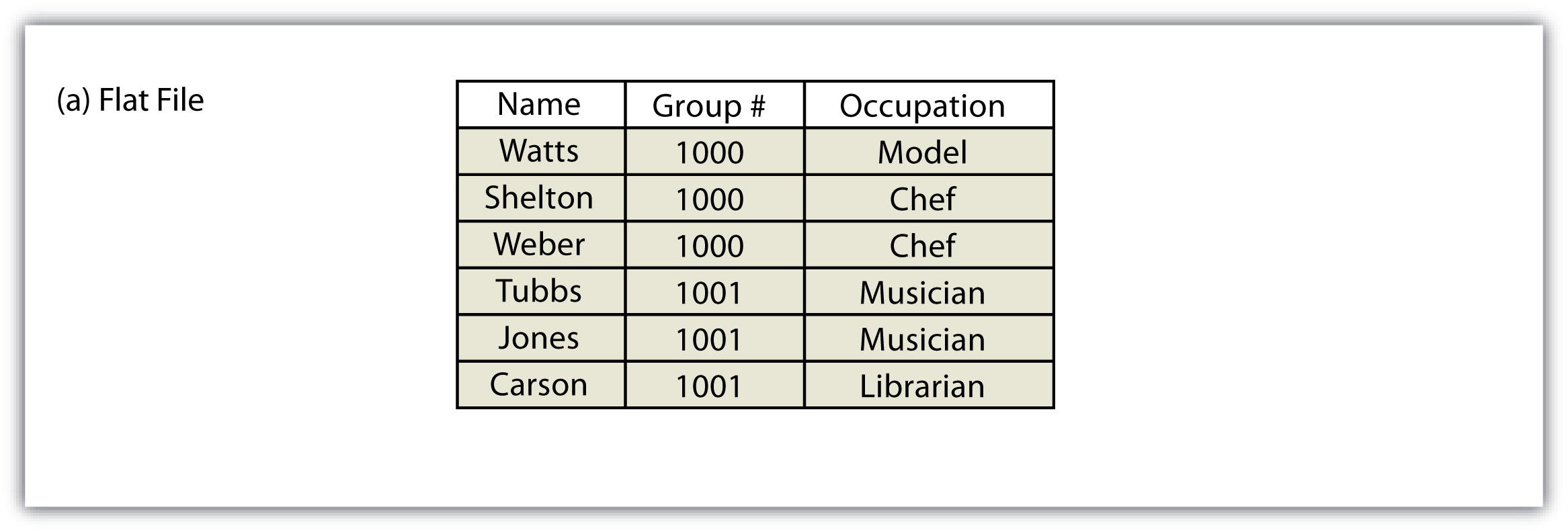
Figure 5.5 Hierarchical Database
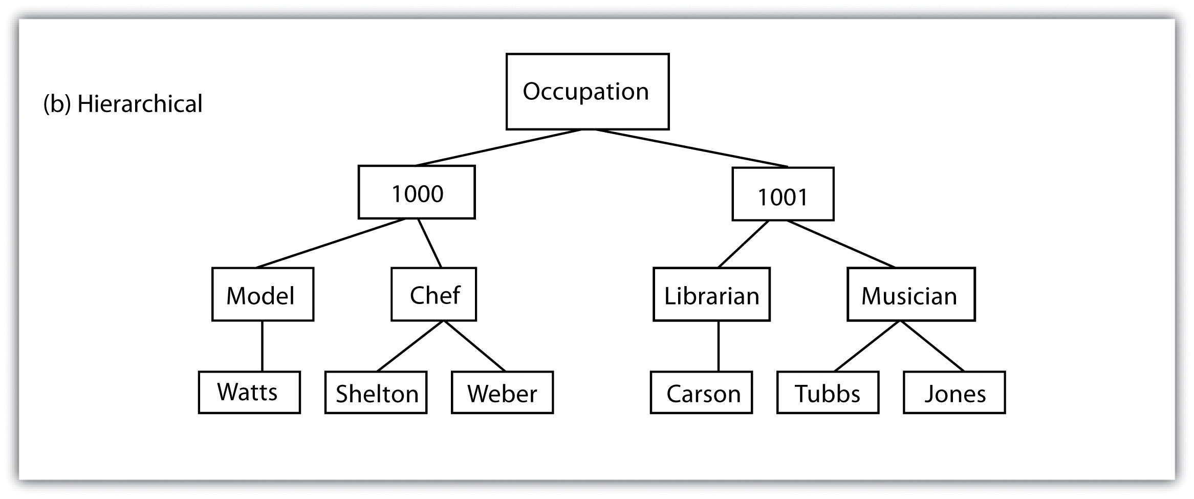
Figure 5.6 Network Database
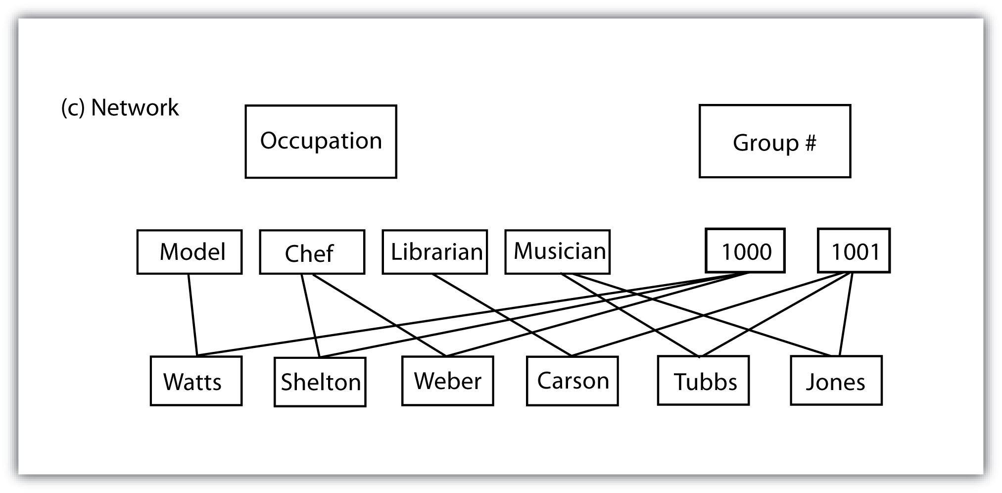
Relational Database Management Systems
A relational database management system (RDBMS) is a collection of tables that are connected in such a way that that data can be accessed without reorganization of the tables. The tables are created such that each column represents a particular attribute (e.g., soil type, PIN number, last name, acreage) and each row contains a unique instance of data for that columnar attribute (e.g., Delhi Sands Soils, 5555, Smith, 412.3 acres)
In the relational model, each table (not surprisingly called a relation) is linked to each other table via predetermined keys (Date 1995).Date, C. 1995. An Introduction to Database Systems. Reading, MA: Addison-Wesley. The primary key represents the attribute (column) whose value uniquely identifies a particular record (row) in the relation (table). The primary key may not contain missing values as multiple missing values would represent nonunique entities that violate the basic rule of the primary key. The primary key corresponds to an identical attribute in a secondary table (and possibly third, fourth, fifth, etc.) called a foreign key. This results in all the information in the first table being directly related to the information in the second table via the primary and foreign keys, hence the term “relational” DBMS. With these links in place, tables within the database can be kept very simple, resulting in minimal computation time and file complexity. This process can be repeated over many tables as long as each contains a foreign key that corresponds to another table’s primary key.
The relational model has two primary advantages over the other database models described earlier. First, each table can now be separately prepared, maintained, and edited. This is particularly useful when one considers the potentially huge size of many of today’s modern databases. Second, the tables may be maintained separately until the need for a particular query or analysis calls for the tables to be related. This creates a large degree of efficiency for processing of information within a given database.
It may become apparent to the reader that there is great potential for redundancy in this model as each table must contain an attribute that corresponds to an attribute in every other related table. Therefore, redundancy must actively be monitored and managed in a RDBMS. To accomplish this, a set of rules called normal forms have been developed (Codd 1970).Codd, E. 1970. “A Relational Model of Data for Large Shared Data Banks.” Communications of the Association for Computing Machinery13 (6): 377–87. There are three basic normal forms. The first normal form (Figure 5.7 “First Normal Form Violation (above) and Fix (below)”) refers to five conditions that must be met (Date 1995).Date, C. 1995. An Introduction to Database Systems. Reading, MA: Addison-Wesley. They are as follows:
- There is no sequence to the ordering of the rows.
- There is no sequence to the ordering of the columns.
- Each row is unique.
- Every cell contains one and only one value.
- All values in a column pertain to the same subject.
Figure 5.7 First Normal Form Violation (above) and Fix (below)
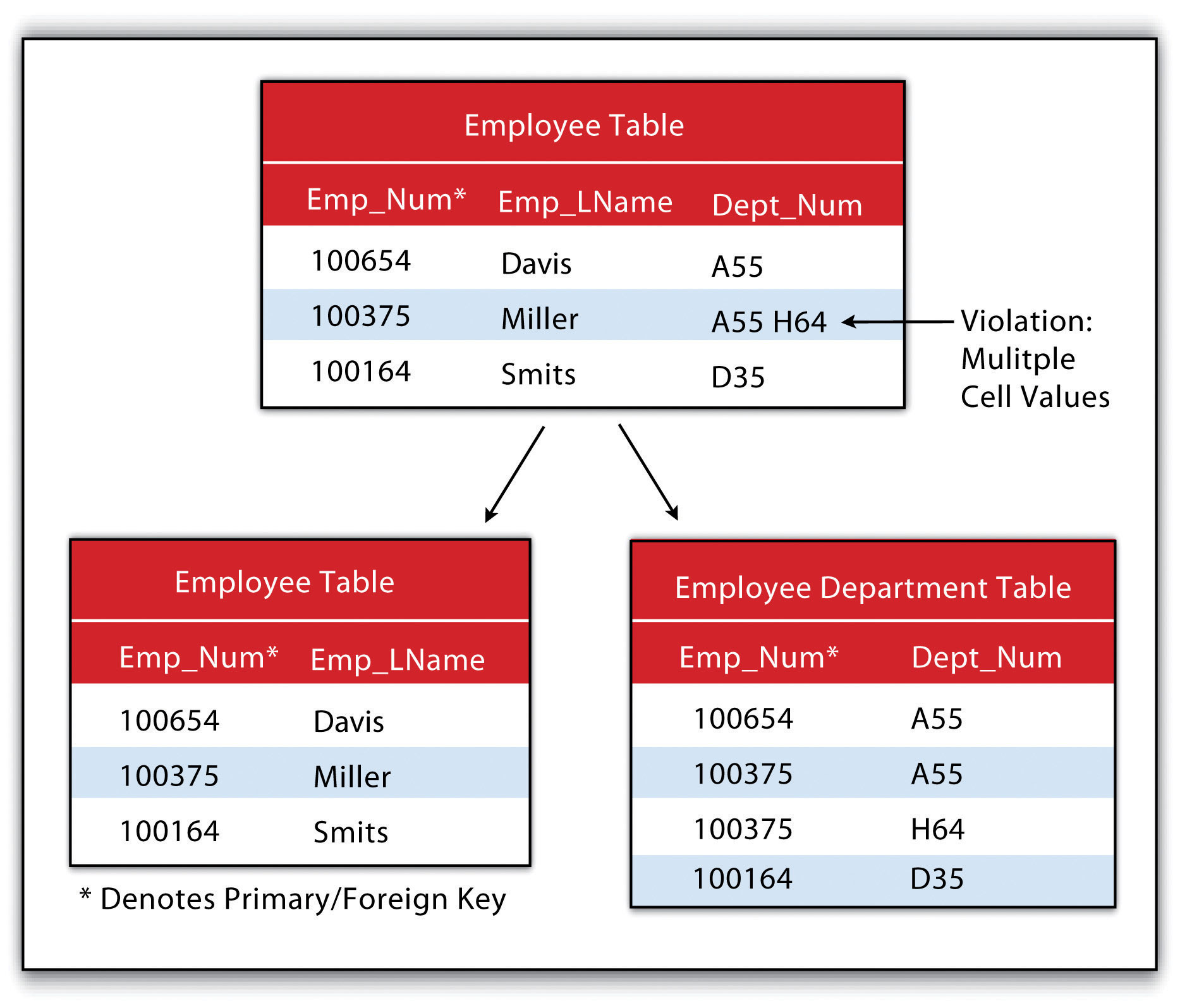
The second normal form states that any column that is not a primary key must be dependent on the primary key. This reduces redundancy by eliminating the potential for multiple primary keys throughout multiple tables. This step often involves the creation of new tables to maintain normalization.
Figure 5.8 Second Normal Form Violation (above) and Fix (below)
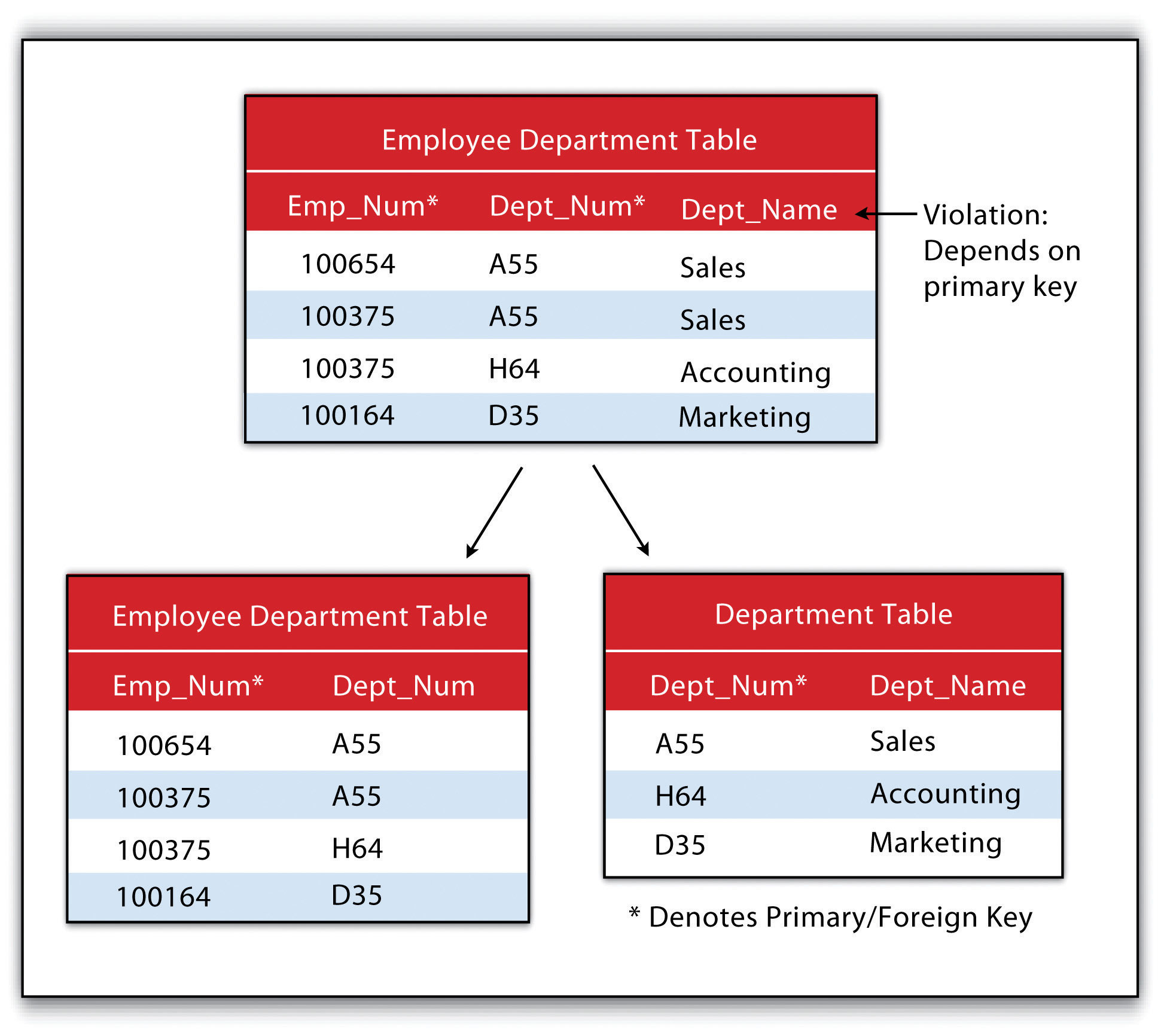
The third normal form states that all nonprimary keys must depend on the primary key, while the primary key remains independent of all nonprimary keys. This form was wittily summed up by Kent (1983)Kent, W. 1983. “A Simple Guide to Five Formal Forms in Relational Database Theory.” Communications of the Association for Computing and Machinery. 26 (2): 120–25. who quipped that all nonprimary keys “must provide a fact about the key, the whole key, and nothing but the key.” Echoing this quote is the rejoinder: “so help me Codd” (personal communication with Foresman 1989).
Figure 5.9 Third Normal Form Violation (above) and Fix (below)
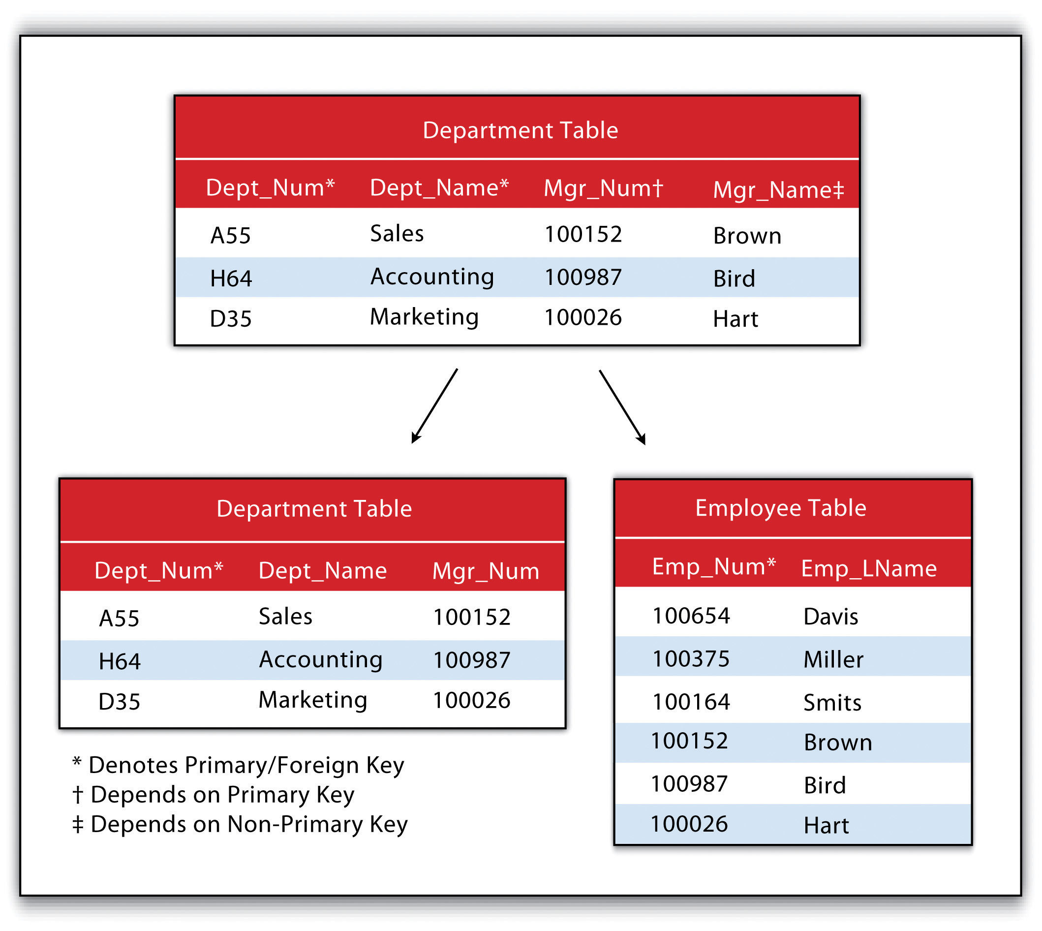
Joins and Relates
An additional advantage of an RDBMS is that it allows attribute data in separate tables to be linked in a post hoc fashion. The two operations commonly used to accomplish this are the join and relate. The join operation appends the fields of one table into a second table through the use of an attribute or field that is common to both tables. This is commonly utilized to combine attribute information from one or more nonspatial data tables (i.e., information taken from reports or documents) with a spatially explicit GIS feature layer. A second type of join combines feature information based on spatial location and association rather than on common attributes. In ArcGIS, three types of spatial joins are available. Users may (1) match each feature to the closest feature, (2) match each feature to the feature that it is part of, or (3) match each feature to the feature that it intersects.
Alternatively, the relate operation temporarily associates two map layers or tables while keeping them physically separate. Relates are bidirectional, so data can be accessed from the one of the tables by selecting records in the other table. The relate operation also allows for the association of three or more tables, if necessary.
Sometimes it can be unclear as to which operation one should use. As a general rule, joins are most suitable for instances involving one-to-one or many-to-one relationships. Joins are also advantageous due to the fact that the data from the two tables are readily observable in the single output table. The use of relates, on the other hand, are suitable for all table relationships (one-to-one, one-to-many, many-to-one, and many-to-many); however, they can slow down computer access time if the tables are particularly large or spread out over remote locations.
KEY TAKEAWAYS
- Database management systems can be flat, hierarchical, network, or relational.
- Relational database management systems (RDBMS) utilize primary keys and foreign keys to link data tables.
- The RDBMS model reduces data redundancy by employing three basic “normal forms.”
EXERCISE
- Identify the three violations of normal forms in the following table.
| Instructor | Class | Class Number | Enrollment |
|---|---|---|---|
| Lennon | Advanced Calculus | 10073 | 34 |
| McCartney | Introductory Physical Education | 10045 | 23 |
| Harrison | Auto Repair and Feminism | 10045 | 54 |
| Starr, Best | Quantum Physics | 10023 | 39 |
5.3 File Formats
LEARNING OBJECTIVE
- The objective of this section is to overview a sample of the most common types of vector, raster, and hybrid file formats.
Geospatial data are stored in many different file formats. Each geographic information system (GIS) software package, and each version of these software packages, supports different formats. This is true for both vector and raster data. Although several of the more common file formats are summarized here, many other formats exist for use in various GIS programs.
Vector File Formats
The most common vector file format is the shapefile. Shapefiles, developed by ESRI in the early 1990s for use with the dBASE III database management software package in ArcView 2, are simple, nontopological files developed to store the geometric location and attribute information of geographic features. Shapefiles are incapable of storing null values, as well as annotations or network features. Field names within the attribute table are limited to ten characters, and each shapefile can represent only point, line, or polygon feature sets. Supported data types are limited to floating point, integer, date, and text. Shapefiles are supported by almost all commercial and open-source GIS software.
Despite being called a “shapefile,” this format is actually a compilation of many different files. Table 5.1 “Shapefile File Types” lists and describes the different file formats associated with the shapefile. Among those listed, only the SHP, SHX, and DBF file formats are mandatory to create a functioning shapefile, while all others are conditionally required. As a general rule, the names for each file should conform to the MS-DOS 8.3 convention when using older versions of GIS software packages. According to this convention, the filename prefix can contain up to eight characters, and the filename suffix contains three characters. The more recent GIS software packages have relaxed this requirement and will accept longer filename prefixes.
Table 5.1 Shapefile File Types
| File Extension | Purpose |
|---|---|
| SHP* | Feature geometry |
| SHX* | Index format for the feature geometry |
| DBF* | Feature attribute information in dBASE IV format |
| PRJ | Projection information |
| SBN and SBX | Spatial index of the features |
| FBN and FBX | Read-only spatial index of the features |
| AIN and AIH | Attribute information for active fields in the table |
| IXS | Geocoding index for read-write shapefiles |
| MXS | Geocoding index for read-write shapefiles with ODB format |
| ATX | Attribute index used in ArcGIS 8 and later |
| SHP.XML | Metadata in XML format |
| CPG | Code page specifications for identifying character encoding |
| * Indicates mandatory files | |
The earliest vector format file for use in GIS software packages, which is still in use today, is the ArcInfo coverage. This georelational file format supports multiple features types (e.g., points, lines, polygons, annotations) while also storing the topological information associated with those features. Attribute data are stored as multiple files in a separate directory labeled “Info.” Due to its creation in an MS-DOS environment, these files maintain strict naming conventions. File names cannot be longer than thirteen characters, cannot contain spaces, cannot start with a number, and must be completely in lowercase. Coverages cannot be edited in ArcGIS 9.x or later versions of ESRI’s software package.
The US Census Bureau maintains a specific type of shapefile referred to as TIGER or TIGER/Line (Topologically Integrated Geographic Encoding and Referencing system). Although these open-source files do not contain actual census information, they map features such as census tracts, roads, railroads, buildings, rivers, and other features that support and improve the bureauand improve the Bureau’s ability to#8217;s ability to collect census information. TIGER/Line shapefiles, first released in 1990, are topologically explicit and are linked to the Census Bureau’s Master Address File (MAF), therefore enabling the geocoding of street addresses. These files are free to the public and can be freely downloaded from private vendors that support the format.
The AutoCAD DXF (Drawing Interchange Format or Drawing Exchange Format) is a proprietary vector file format developed by Autodesk to allow interchange between engineering-based CAD (computer-aided design) software and other mapping software packages. DXF files were originally released in 1982 with the purpose of providing an exact representation of AutoCAD’s native DWG format. Although the DXF is still commonly used, newer versions of AutoCAD have incorporated more complex data types (e.g., regions, dynamic blocks) that are not supported in the DXF format. Therefore, it may be presumed that the DXF format may become less popular in geospatial analysis over time.
Finally, the US Geological Survey (USGS) maintains an open-source vector file format that details physical and cultural features across the United States. These topologically explicit DLGs (Digital Line Graphics) come in large-, intermediate-, and small-scale depending on whether they are derived from 1:24,000-; 1:100,000-; or 1:2,000,000-scale USGS topographic quadrangle maps. The features available in the different DLG types depend on the scale of the DLG but generally include data such as administrative and political boundaries, hydrography, transportation systems, hypsography, and land cover.
Vector data files can also be structured to represent surface elevation information. A TIN (Triangulated Irregular Network) is an open-source vector data structure that uses contiguous, nonoverlapping triangles to represent geographic surfaces (Figure 5.10 “Triangulated Irregular Network (TIN)”). Whereas the raster depiction of a surface represents elevation as an average value over the spatial extent of the individual pixel (see Section 5.3.2 “Raster File Formats”), the TIN data structure models each vertex of the triangle as an exact elevation value at a specific point on the earth. The arcs between each vertex are an approximation of the elevation between two vertices. These arcs are then aggregated into triangles from which information on elevation, slope, aspect, and surface area can be derived across the entire extent of the model’s space. Note that term “irregular” in the name of the data model refers to the fact that the vertices are typically laid out in a scattered fashion.
Figure 5.10 Triangulated Irregular Network (TIN)
The use of TINs confers certain advantages over raster-based elevation models (see Section 5.3.2 “Raster File Formats”). First, linear topographic features are very accurately represented relative to their raster counterpart. Second, a comparatively small number of data points are needed to represent a surface, so file sizes are typically much smaller. This is particularly true as vertices can be clustered in areas where relief is complex and can be sparse in areas where relief is simple. Third, specific elevation data can be incorporated into the data model in a post hoc fashion via the placement of additional vertices if the original is deemed insufficient or inadequate. Finally, certain spatial statistics can be calculated that cannot be obtained when using a raster-based elevation model, such as flood plain delineation, storage capacity curves for reservoirs, and time-area curves for hydrographs.
Raster File Formats
A multitude of raster file format types are available for use in GIS. The selection of raster formats has dramatically increased with the widespread availability of imagery from digital cameras, video recorders, satellites, and so forth. Raster imagery is typically 8-bit (256 colors) or 24-bit (16 million colors). Due to ongoing technological advancements, raster image file sizes have been getting larger and larger. To deal with this potential constraint, two types of file compression are commonly used: lossless and lossy. Lossless compression reduces file size without decreasing image quality. Lossy compression attempts to exploit limitations of the human eye by removing information from the image that cannot be sensed. As you may guess, lossy compression results in smaller file sizes than lossless compression.
Among the most common raster files used on the web are the JPEG, TIFF, and PNG formats, all of which are open source and can be used with most GIS software packages. The JPEG (Joint Photographic Experts Group) and TIFF (Tagged Image File Format) raster formats are most frequently used by digital cameras to store 8-bit values for each of the red, blue, and green colors spaces (and sometimes 16-bit colors, in the case of TIFF images). JPEGs support lossy compression, while TIFFs can be either lossy or lossless. Unlike JPEG, TIFF images can be saved in either RGB or CMYK color spaces. PNG (Portable Network Graphics) files are 24-bit images that support either lossy or lossless compression. PNG files are designed for efficient viewing in web-based browsers such as Internet Explorer, Mozilla Firefox, Netscape, and Safari.
Native JPEG, TIFF, and PNG files do not have georeferenced information associated with them and therefore cannot be used in any geospatial mapping efforts. In order to employ these files in a GIS, a world file must first be created. A world file is a separate, plaintext data file that specifies the locations and transformations that allow the image to be projected into a standard coordinate system (e.g., Universal Transverse Mercator [UTM] or State Plane). The filename of the world file is based on the name of the raster file, while a w is typically added into to the file extension. The world file extension name for a JPEG is JPW; for a TIFF, it is TFW; and for a PNG, PGW.
An example of a raster file format with explicit georeferencing information is the proprietary MrSID (Multiresolution Seamless Image Database) format. This lossless compression format was developed by LizardTech, Inc., for use with large aerial photographs or satellite images, whereby portions of a compressed image can be viewed quickly without having to decompress the entire file. The MrSID format is frequently used for visualizing orthophotos.
Like MrSID, the proprietary ECW (Enhanced Compression Wavelet) format also includes georeferencing information within the file structure. This lossy compression format was developed by Earth Resource Mapping and supports up to 255 layers of image information. Due to the potentially huge file sizes associated with an image that supports so many layers, ECW files represent an excellent option for performing rapid analysis on large images while using a relatively small amount of the computer’s RAM (Random Access Memory), thus accelerating computation speed.
Like the open-source, vector-based DLG, DRGs (Digital Raster Graphics) are scanned versions of USGS topographic maps and include all of the collar material from the originals. The geospatial information found within the image’s neatline is georeferenced, specifically to the UTM coordinate system. These graphics are scanned at a minimum of 250 dpi (dots per inch) and therefore have a spatial resolution of approximately 2.4 meters. DRGs contain up to thirteen colors and therefore may look slightly different from the originals. In addition, they include all the collar material from the original print version, are georeferenced to the surface of the earth, fit the Universal Transverse Mercator (UTM) projection, and are most likely based on the NAD27 data points (NAD stands for North American Datum).
Like the TIN vector format, some raster file formats are developed explicitly for modeling elevation. These include the USGS DEM, USGS SDTS, and DTED file formats. The USGS DEM (US Geological Survey Digital Elevation Model) is a popular file format due to widespread availability, the simplicity of the model, and the extensive software support for the format. Each pixel value in these grid-based DEMs denotes spot elevations on the ground, usually in feet or meters. Care must be taken when using grid-based DEMs due to the enormous volume of data that accompanies these files as the spatial extent covered in the image begins to increase. DEMs are referred to as digital terrain models (DTMs) when they represent a simple, bare-earth model and as digital surface models (DSMs) when they include the heights of landscape features such as buildings and trees (Figure 5.11 “Digital Surface Model (left) and Digital Terrain Model (right)”).
Figure 5.11 Digital Surface Model (left) and Digital Terrain Model (right)
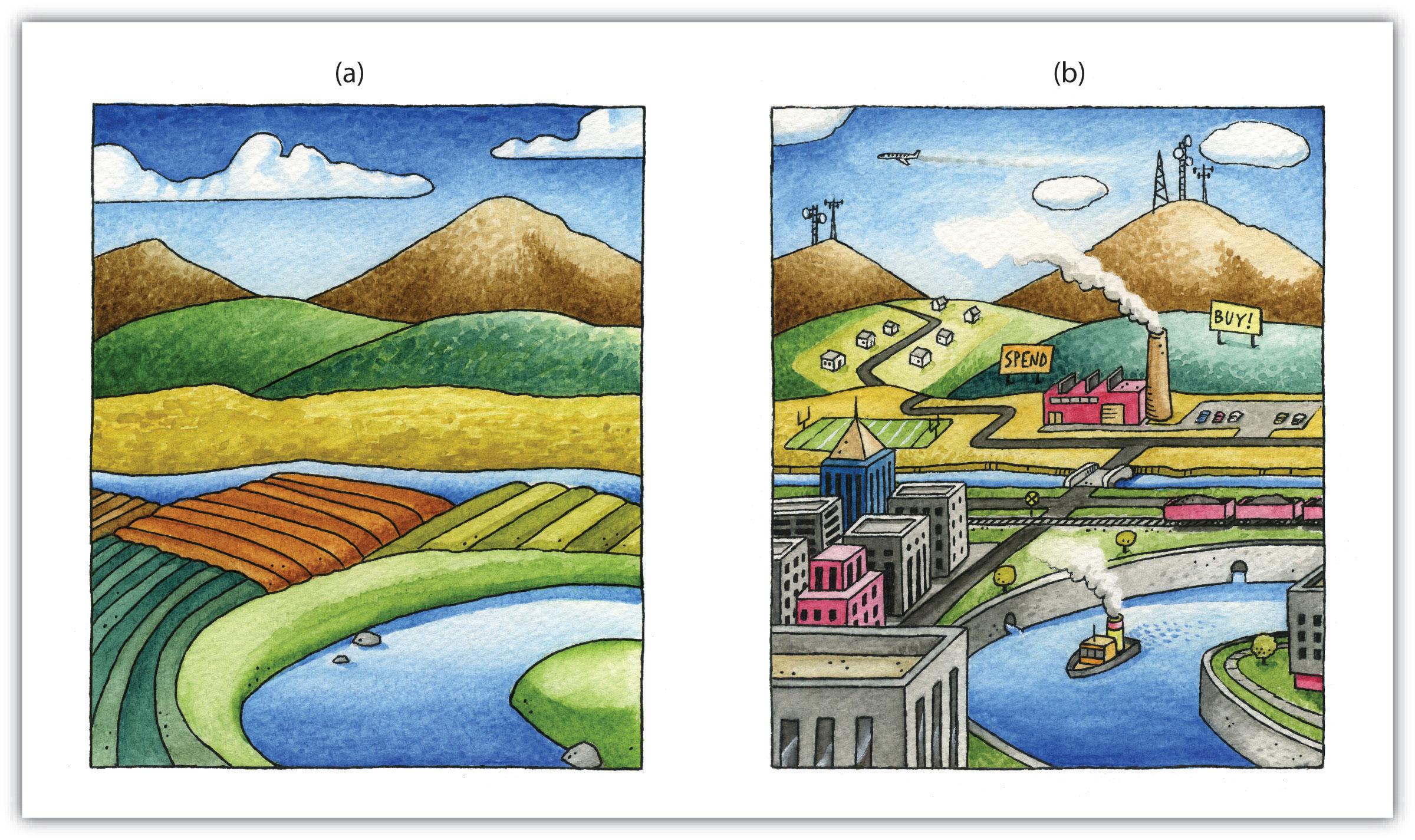
USGS DEMs can be classified into one of four levels of quality (labeled 1 to 4) depending on its source data and resolution. This source data can be 1:24,000-; 1:63,360-; or 1:250,000-scale topographic quadrangles. The DEM format is a single file of ASCII text comprised of three data blocks; A, B, and C. The A block contains header information such as data origin, type, and measurement systems. The B block contains contiguous elevation data described as a six-character integer. The C block contains trailer information such as root-mean square (RMS) error of the scene. The USGS DEM format has recently been succeeded by the USGS SDTS (Spatial Data Transfer Standard) DEM format. The SDTS formatUSGS. 2010. “What is SDTS?” USGS, http://mcmcweb.er.usgs.gov/sdts/whatsdts.html. was specifically developed as a distribution format for transferring data from one computer to another with zero data loss.
The DTED (Digital Terrain Elevation Data) format is another elevation specific raster file format. It was developed in the 1970s for military purposes such as line of sight analysis, 3-D visualization, and mission planning. The DTED format maintains three levels of data over five different latitudinal zones. Level 0 data has a resolution of approximately 900 meters; Level 1 data has a resolution of approximately 90 meters; and Level 2 data has a resolution of approximately 30 meters.
Hybrid File Formats
A geodatabase is a recently developed, proprietary ESRI file format that supports both vector and raster feature datasets (e.g., points, lines, polygons, annotation, JPEG, TIFF) within a single file. This format maintains topological relationships and is stored as an MDB file. The geodatabase was developed to be a comprehensive model for representing and modeling geospatial information.
There are three different types of geodatabases. The personal geodatabase was developed for single-user editing, whereby two editors cannot work on the same geodatabase at a given time. The personal geodatabase employs the Microsoft Access DBMS file format and maintains a size limit of 2 gigabytes per file, although it has been noted that performance begins to degrade after file size approaches 250 megabytes. The personal geodatabase is currently being phased out by ESRI and is therefore not used for new data creation.
The file geodatabase similarly allows only single-user editing, but this restriction applies only to unique feature datasets within a geodatabase. The file geodatabase incorporates new tools such as domains (rules applied to attributes), subtypes (groups of objects with a feature class or table), and split/merge policies (rules to control and define the output of split and merge operations). This format stores information as binary files with a size limit of 1 terabyte and has been noted to perform and scale much more efficiently than the personal geodatabase (approximately one-third of the feature geometry storage required by shapefiles and personal geodatabases). File databases are not tied to any specific relational database management system and can be employed on both Windows and UNIX platforms. Finally, file geodatabases can be compressed to read-only formats that further reduce file size without subsequently reducing performance.
The third hybrid ESRI format is the ArcSDE geodatabase, which allows multiple editors to simultaneously work on feature datasets within a single geodatabase (a.k.a. versioning). Like the file geodatabase, this format can be employed on both Windows and UNIX platforms. File size is limited to 4 gigabytes and its proprietary nature requires an ArcInfo or ArcEditor license for use. The ArcSDE geodatabase is implemented on the SQL Server Express software package, which is a free DBMS platform developed by Microsoft.
In addition to the geodatabase, Adobe Systems Incorporated’s geospatial PDF (Portable Document Format) is an open-source format that allows for the representation of geometric entities such as points, lines, and polygons. Geospatial PDFs can be used to find and mark coordinate pairs, measure distances, reproject files, and georegister raster images. This format is particularly useful as the PDF is widely accepted to be the preferred standard for printable web documents. Although functionally similar, the geospatial PDF should not be confused with the GeoPDF format developed by TerraGo Technologies. Rather, the GeoPDF is a branded version of the geospatial PDF.
Finally, Google Earth supports a new, open-source, hybrid file format referred to as a KML (Keyhole Markup Language). KML files associate points, lines, polygons, images, 3-D models, and so forth, with a longitude and latitude value, as well as other view information such as tilt, heading, altitude, and so forth. KMZ files are commonly encountered, and they are zipped versions KML files.
KEY TAKEAWAYS
- Common vector file formats used in geospatial applications include shapefiles, coverages, TIGER/Lines, AutoCAD DXFs, and DLGs.
- Common raster file formats used in geospatial applications include JPGs, TIFFs, PNGs, MrSIDs, ECWs, DRGs, USGS DEMs, and DTEDs.
- Common hybrid file formats used in geospatial applications include geodatabases (personal, file, and ArcSDE) and geospatial PDFs.
EXERCISES
- If you were a city planner tasked with creating a GIS database for mapping features throughout the city, would you prefer using a DLG or a DRG? What are the advantages and disadvantages of using either of these formats?
- Search the web and create a list of URLs that contain working files for each of the raster and vector formats discussed in this section.
5.4 Data Quality
LEARNING OBJECTIVE
- The objective of this section is to ascertain the different types of error inherent in geospatial datasets.
Not all geospatial data are created equally. Data quality refers to the ability of a given dataset to satisfy the objective for which it was created. With the voluminous amounts of geospatial data being created and served to the cartographic community, care must be taken by individual geographic information system (GIS) users to ensure that the data employed for their project is suitable for the task at hand.
Two primary attributes characterize data quality. Accuracy describes how close a measurement is to its actual value and is often expressed as a probability (e.g., 80 percent of all points are within +/− 5 meters of their true locations). Precision refers to the variance of a value when repeated measurements are taken. A watch may be correct to 1/1000th of a second (precise) but may be 30 minutes slow (not accurate). As you can see in Figure 5.12 “Accuracy and Precision”, the blue darts are both precise and accurate, while the red darts are precise but inaccurate.
Figure 5.12 Accuracy and Precision

Several types of error can arise when accuracy and/or precision requirements are not met during data capture and creation. Positional accuracy is the probability of a feature being within +/− units of either its true location on earth (absolute positional accuracy) or its location in relation to other mapped features (relative positional accuracy). For example, it could be said that a particular mapping effort may result in 95 percent of trees being mapped to within +/− 5 feet for their true location (absolute), or 95 percent of trees are mapped to within +/− 5 feet of their location as observed on a digital ortho quarter quadrangle (relative).
Speaking about absolute positional error does beg the question, however, of what exactly is the true location of an object? As discussed in Chapter 2 “Map Anatomy”, differing conceptions of the earth’s shape has led to a plethora of projections, data points, and spheroids, each attempting to clarify positional errors for particular locations on the earth. To begin addressing this unanswerable question, the US National Map Accuracy Standard (or NMAS) suggests that to meet horizontal accuracy requirements, a paper map is expected to have no more than 10 percent of measurable points fall outside the accuracy values range shown in Figure 5.13 “Relation between Positional Error and Scale”. Similarly, the vertical accuracy of no more than 10 percent of elevations on a contour map shall be in error of more than one-half the contour interval. Any map that does not meet these horizontal and vertical accuracy standards will be deemed unacceptable for publication.
Figure 5.13 Relation between Positional Error and Scale
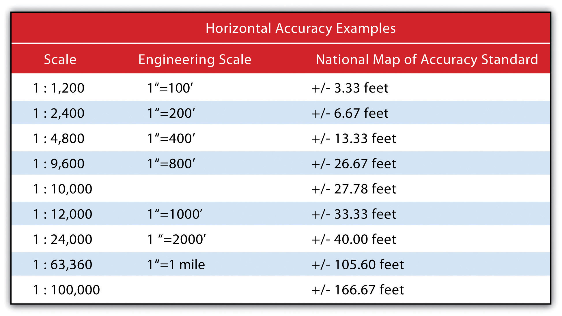
Positional errors arise via multiple sources. The process of digitizing paper maps commonly introduces such inaccuracies. Errors can arise while registering the map on the digitizing board. A paper map can shrink, stretch, or tear over time, changing the dimensions of the scene. Input errors created from hastily digitized points are common. Finally, converting between coordinate systems and transforming between data points may also introduce errors to the dataset.
The root-mean square (RMS) error is frequently used to evaluate the degree of inaccuracy in a digitized map. This statistic measures the deviation between the actual (true) and estimated (digitized) locations of the control points. Figure 5.14 “Potential Digitization Error” illustrates the inaccuracies of lines representing soil types that result from input control point location errors. By applying an RMS error calculation to the dataset, one could determine the accuracy of the digitized map and thus determine its suitability for inclusion in a given study.
Figure 5.14 Potential Digitization Error

Positional errors can also arise when features to be mapped are inherently vague. Take the example of a wetland (Figure 5.15 “Defining a Wetland Boundary”). What defines a wetland boundary? Wetlands are determined by a combination of hydrologic, vegetative, and edaphic factors. Although the US Army Corps of Engineers is currently responsible for defining the boundary of wetlands throughout the country, this task is not as simple as it may seem. In particular, regional differences in the characteristics of a wetland make delineating these features particularly troublesome. For example, the definition of a wetland boundary for the riverine wetlands in the eastern United States, where water is abundant, is often useless when delineating similar types of wetlands in the desert southwest United States. Indeed, the complexity and confusion associated with the conception of what a “wetland” is may result in difficulties defining the feature in the field, which subsequently leads to positional accuracy errors in the GIS database.
Figure 5.15 Defining a Wetland Boundary
In addition to positional accuracy, attribute accuracy is a common source of error in a GIS. Attribute errors can occur when an incorrect value is recorded within the attribute field or when a field is missing a value. Misspelled words and other typographical errors are common as well. Similarly, a common inaccuracy occurs when developers enter “0” in an attribute field when the value is actually “null.” This is common in count data where “0” would represent zero findings, while a “null” would represent a locale where no data collection effort was undertaken. In the case of categorical values, inaccuracies occasionally occur when attributes are mislabeled. For example, a land-use/land-cover map may list a polygon as “agricultural” when it is, in fact, “residential.” This is particularly true if the dataset is out of date, which leads us to our next source of error.
Temporal accuracy addresses the age or timeliness of a dataset. No dataset is ever completely current. In the time it takes to create the dataset, it has already become outdated. Regardless, there are several dates to be aware of while using a dataset. These dates should be found within the metadata. The publication date will tell you when the dataset was created and/or released. The field date relates the date and time the data was collected. If the dataset contains any future prediction, there should also be a forecast period and/or date. To address temporal accuracy, many datasets undergo a regular data update regimen. For example, the California Department of Fish and Game updates its sensitive species databases on a near monthly basis as new findings are continually being made. It is important to ensure that, as an end-user, you are constantly using the most up-to-date data for your GIS application.
The fourth type of accuracy in a GIS is logical consistency. Logical consistency requires that the data are topologically correct. For example, does a stream segment of a line shapefile fall within the floodplain of the corresponding polygon shapefile? Do roadways connect at nodes? Do all the connections and flows point in the correct direction in a network? In regards to the last question, the author was recently using an unnamed smartphone application to navigate a busy city roadway and was twice told to turn the wrong direction down one-way streets. So beware, errors in logical consistency may lead to traffic violations, or worse!
The final type of accuracy is data completeness. Comprehensive inclusion of all features within the GIS database is required to ensure accurate mapping results. Simply put, all the data must be present for a dataset to be accurate. Are all of the counties in the state represented? Are all of the stream segments included in the river network? Is every convenience store listed in the database? Are only certain types of convenience stores listed within the database? Indeed, incomplete data will inevitably lead to incomplete or insufficient analysis.
KEY TAKEAWAYS
- All geospatial data contains error.
- Accuracy represents how close a measurement is to its actual value, while precision refers to the variance of a value when repeated measurements are taken.
- The five types of error in a geospatial dataset are related to positional accuracy, attribute accuracy, temporal accuracy, logical consistency, and data completeness.
EXERCISES
- What are the five types of accuracy/precision errors associated geographic information? Provide an example of each type of error.
- Per the description of the positional accuracy of wetland boundaries, discuss a map feature whose boundaries are inherently vague and difficult to map.
Chapter 6Data Characteristics and Visualization
In previous chapters, we learned how geographic information system (GIS) software packages use databases to store extensive attribute information for geospatial features within a map. The true usefulness of this information, however, is not realized until similarly powerful analytical tools are employed to access, process, and simplify the data. To accomplish this, GIS typically provides extensive tools for searching, querying, describing, summarizing, and classifying datasets. With these data exploration tools, even the most expansive datasets can be mined to provide users the ability to make meaningful insights into and statements about that information.
6.1 Descriptions and Summaries
LEARNING OBJECTIVE
- The objective of this section is to review the most frequently used measures of distribution, central tendency, and dispersion.
No discussion of geospatial analysis would be complete without a brief overview of basic statistical concepts. The basic statistics outlined here represent a starting point for any attempt to describe, summarize, and analyze geospatial datasets. An example of a common geospatial statistical endeavor is the analysis of point data obtained by a series of rainfall gauges patterned throughout a particular region. Given these rain gauges, one could determine the typical amount and variability of rainfall at each station, as well as typical rainfall throughout the region as a whole. In addition, you could interpolate the amount of rainfall that falls between each station or the location where the most (or least) rainfall occurs. Furthermore, you could predict the expected amount of rainfall into the future at each station, between each station, or within the region as a whole.
The increase of computational power over the past few decades has given rise to vast datasets that cannot be summarized easily. Descriptive statistics provide simple numeric descriptions of these large datasets. Descriptive statistics tend to be univariate analyses, meaning they examine one variable at a time. There are three families of descriptive statistics that we will discuss here: measures of distribution, measures of central tendency, and measures of dispersion. However, before we delve too deeply into various statistical techniques, we must first define a few terms.
- Variable: a symbol used to represent any given value or set of values
- Value: an individual observation of a variable (in a geographic information system [GIS] this is also called a record)
- Population: the universe of all possible values for a variable
- Sample: a subset of the population
- n: the number of observations for a variable
- Array: a sequence of observed measures (in a GIS this is also called a field and is represented in an attribute table as a column)
- Sorted Array: an ordered, quantitative array
Measures of Distribution
The measure of distribution of a variable is merely a summary of the frequency of values over the range of the dataset (hence, this is often called a frequency distribution). Typically, the values for the given variable will be grouped into a predetermined series of classes (also called intervals, bins, or categories), and the number of data values that fall into each class will be summarized. A graph showing the number of data values within each class range is called a histogram. For example, the percentage grades received by a class on an exam may result in the following array (n = 30):
Array of Exam Scores: {87, 76, 89, 90, 64, 67, 59, 79, 88, 74, 72, 99, 81, 77, 75, 86, 94, 66, 75, 74, 83, 100, 92, 75, 73, 70, 60, 80, 85, 57}
When placing this array into a frequency distribution, the following general guidelines should be observed. First, between five and fifteen different classes should be employed, although the exact number of classes depends on the number of observations. Second, each observation goes into one and only one class. Third, when possible, use classes that cover an equal range of values (Freund and Perles 2006).Freund, J., and B. Perles. 2006. Modern Elementary Statistics. Englewood Cliffs, NJ: Prentice Hall. With these guidelines in mind, the exam score array shown earlier can be visualized with the following histogram (Figure 6.1 “Histogram Showing the Frequency Distribution of Exam Scores”).
Figure 6.1 Histogram Showing the Frequency Distribution of Exam Scores
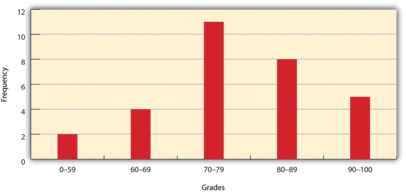
As you can see from the histogram, certain descriptive observations can be readily made. Most students received a C on the exam (70–79). Two students failed the exam (50–59). Five students received an A (90–99). Note that this histogram does violate the third basic rule that each class cover an equal range because an F grade ranges from 0–59, whereas the other grades have ranges of equal size. Regardless, in this case we are most concerned with describing the distribution of grades received during the exam. Therefore, it makes perfect sense to create class ranges that best suit our individual needs.
Measures of Central Tendency
We can further explore the exam score array by applying measures of central tendency. There are three primary measures of central tendency: the mean, mode, and median. The mean, more commonly referred to as the average, is the most often used measure of central tendency. To calculate the mean, simply add all the values in the array and divide that sum by the number of observations. To return to the exam score example from earlier, the sum of that array is 2,340, and there are 30 observations (n = 30). So, the mean is 2,340 / 30 = 78.
The mode is the measure of central tendency that represents the most frequently occurring value in the array. In the case of the exam scores, the mode of the array is 75 as this was received by the most number of students (three, in total). Finally, the median is the observation that, when the array is ordered from lowest to highest, falls exactly in the center of the sorted array. More specifically, the median is the value in the middle of the sorted array when there are an odd number of observations. Alternatively, when there is an even number of observations, the median is calculated by finding the mean of the two central values. If the array of exam scores were reordered into a sorted array, the scores would be listed thusly:
Sorted Array of Exam Scores: {57, 59, 60, 64, 66, 67, 70, 72, 73, 74, 74, 75, 75, 75, 76, 77, 79, 80, 81, 83, 85, 86, 87, 88, 89, 90, 92, 93, 94, 99}
Since n = 30 in this example, there are an even number of observations. Therefore, the mean of the two central values (15th = 76 and 16th = 77) is used to calculate the median as described earlier, resulting in (76 + 77) / 2 = 76.5. Taken together, the mean, mode, and median represent the most basic ways to examine trends in a dataset.
Measures of Dispersion
The third type of descriptive statistics is measures of dispersion (also referred to as measures of variability). These measures describe the spread of data around the mean. The simplest measure of dispersion is the range. The range equals the largest value minus in the dataset the smallest. In our case, the range is 99 − 57 = 42.
The interquartile range represents a slightly more sophisticated measure of dispersion. This method divides the data into quartiles. To accomplish this, the median is used to divide the sorted array into two halves. These halves are again divided into halves by their own median. The first quartile (Q1) is the median of the lower half of the sorted array and is also referred to as the lower quartile. Q2 represents the median. Q3 is the median of the upper half of the sorted array and is referred to as the upper quartile. The difference between the upper and lower quartile is the interquartile range. In the exam score example, Q1 = 72.25 and Q3 = 86.75. Therefore, the interquartile range for this dataset is 86.75 − 72.25 = 14.50.
A third measure of dispersion is the variance (s2). To calculate the variance, subtract the raw value of each exam score from the mean of the exam scores. As you may guess, some of the differences will be positive, and some will be negative, resulting in the sum of differences equaling zero. As we are more interested in the magnitude of differences (or deviations) from the mean, one method to overcome this “zeroing” property is to square each deviation, thus removing the negative values from the output (Figure 6.2). This results in the following:
Figure 6.2
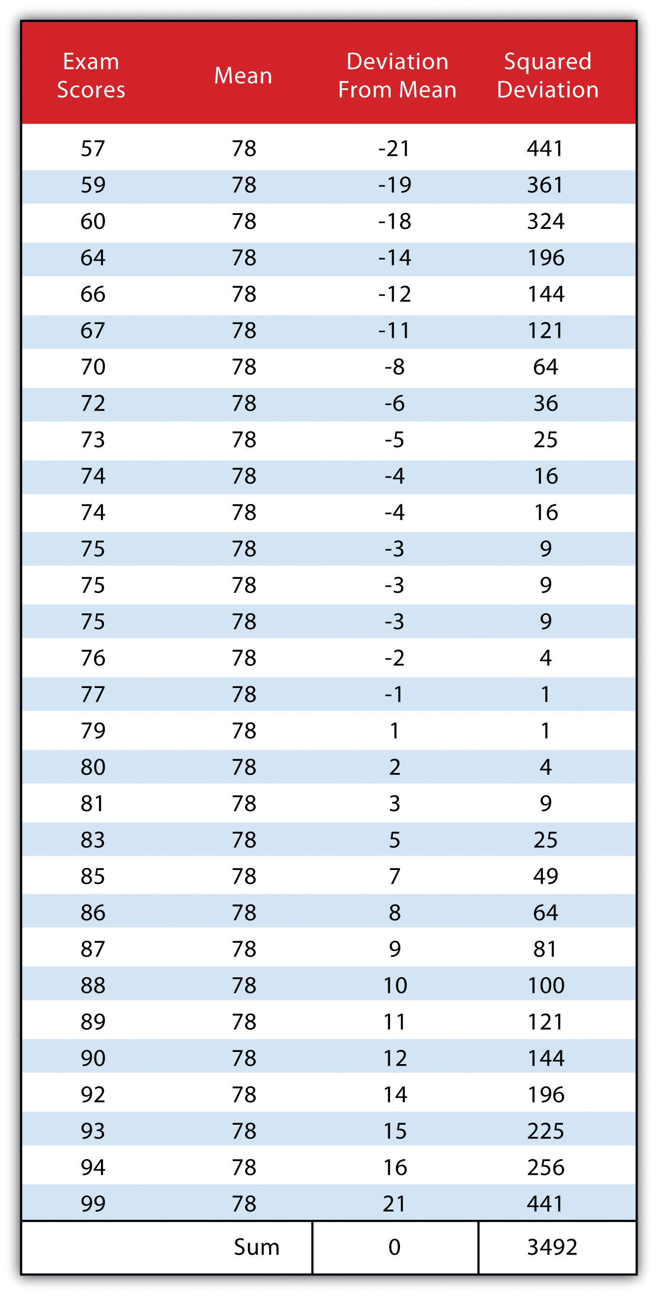
We then divide the sum of squares by either n − 1 (in the case of working with a sample) or n (in the case of working with a population). As the exam scores given here represent the entire population of the class, we will employ Figure 6.3 “Variance”, which results in a variance of s2 = 116.4. If we wanted to use these exam scores to extrapolate information about the larger student body, we would be working with a sample of the population. In that case, we would divide the sum of squares by n − 1.
Figure 6.3 Variance
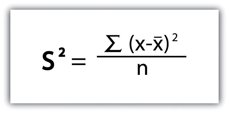
Standard deviation, the final measure of dispersion discussed here, is the most commonly used measure of dispersion. To compensate for the squaring of each difference from the mean performed during the variance calculation, standard deviation takes the square root of the variance. As determined from Figure 6.4 “Standard Deviation”, our exam score example results in a standard deviation of s = SQRT(116.4) = 10.8.
Figure 6.4 Standard Deviation
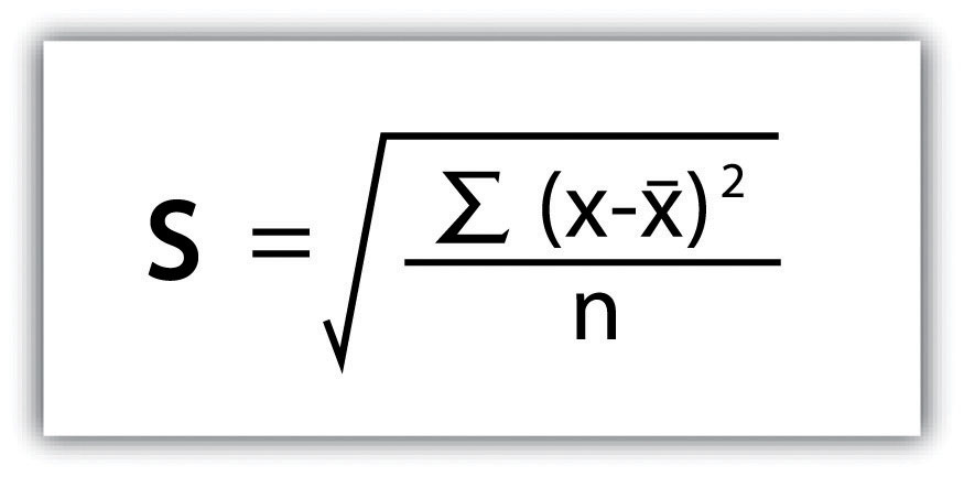
Calculating the standard deviation allows us to make some notable inferences about the dispersion of our dataset. A small standard deviation suggests the values in the dataset are clustered around the mean, while a large standard deviation suggests the values are scattered widely around the mean. Additional inferences may be made about the standard deviation if the dataset conforms to a normal distribution. A normal distribution implies that the data, when placed into a frequency distribution (histogram), looks symmetrical or “bell-shaped.” When not “normal,” the frequency distribution of dataset is said to be positively or negatively “skewed” (Figure 6.5 “Histograms of Normally Curved, Positively Skewed, and Negatively Skewed Datasets”). Skewed data are those that maintain values that are not symmetrical around the mean. Regardless, normally distributed data maintains the property of having approximately 68 percent of the data values fall within ± 1 standard deviation of the mean, and 95 percent of the data value fall within ± 2 standard deviations of the mean. In our example, the mean is 78, and the standard deviation is 10.8. It can therefore be stated that 68 percent of the scores fall between 67.2 and 88.8 (i.e., 78 ± 10.8), while 95 percent of the scores fall between 56.4 and 99.6 (i.e., 78 ± [10.8 * 2]). For datasets that do not conform to the normal curve, it can be assumed that 75 percent of the data values fall within ± 2 standard deviations of the mean.
Figure 6.5 Histograms of Normally Curved, Positively Skewed, and Negatively Skewed Datasets
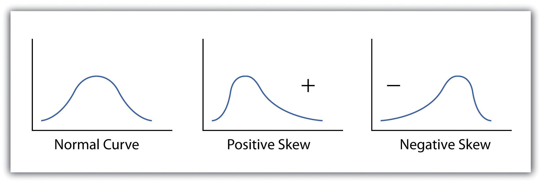
KEY TAKEAWAYS
- The measure of distribution for a given variable is a summary of the frequency of values over the range of the dataset and is commonly shown using a histogram.
- Measures of central tendency attempt to provide insights into “typical” value for a dataset.
- Measures of dispersion (or variability) describe the spread of data around the mean or median.
EXERCISES
- Create a table containing at least thirty data values.
- For the table you created, calculate the mean, mode, median, range, interquartile range, variance, and standard deviation.
6.2 Searches and Queries
LEARNING OBJECTIVE
- The objective of this section is to outline the basics of the SQL language and to understand the various query techniques available in a GIS.
Access to robust search and query tools is essential to examine the general trends of a dataset. Queries are essentially questions posed to a database. The selective display and retrieval of information based on these queries are essential components of any geographic information system (GIS). There are three basic methods for searching and querying attribute data: (1) selection, (2) query by attribute, and (3) query by geography.
Selection
Selection represents the easiest way to search and query spatial data in a GIS. Selecting features highlight those attributes of interest, both on-screen and in the attribute table, for subsequent display or analysis. To accomplish this, one selects points, lines, and polygons simply by using the cursor to “point-and-click” the feature of interest or by using the cursor to drag a box around those features. Alternatively, one can select features by using a graphic object, such as a circle, line, or polygon, to highlight all of those features that fall within the object. Advanced options for selecting subsets of data from the larger dataset include creating a new selection, selecting from the currently selected features, adding to the current selection, and removing from the current selection.
Query by Attribute
Map features and their associated data can be retrieved via the query of attribute information within the data tables. For example, search and query tools allow a user to show all the census tracts that have a population density of 500 or greater, to show all counties that are less than or equal to 100 square kilometers, or to show all convenience stores within 1 mile of an interstate highway.
Specifically, SQL (Structured Query Language) is a commonly used computer language developed to query attribute data within a relational database management system. Created by IBM in the 1970s, SQL allows for the retrieval of a subset of attribute information based on specific, user-defined criteria via the implementation of particular language elements. More recently, the use of SQL has been extended for use in a GIS (Shekhar and Chawla 2003).Shekhar, S., and S. Chawla. 2003. Spatial Databases: A Tour. Upper Saddle River, NJ: Prentice Hall. One important note related to the use of SQL is that the exact expression used to query a dataset depends on the GIS file format being examined. For example, ANSI SQL is a particular version used to query ArcSDE geodatabases, while Jet SQL is used to access personal geodatabases. Similarly, shapefiles, coverages, and dBASE tables use a restricted version of SQL that doesn’t support all the features of ANSI SQL or Jet SQL.
As discussed in Chapter 5 “Geospatial Data Management”, Section 5.2 “Geospatial Database Management”, all attribute tables in a relational database management system (RDBMS) used for an SQL query must contain primary and/or foreign keys for proper use. In addition to these keys, SQL implements clauses to structure database queries. A clause is a language element that includes the SELECT, FROM, WHERE, ORDER BY, and HAVING query statements.
- SELECT denotes what attribute table fields you wish to view.
- FROM denotes the attribute table in which the information resides.
- WHERE denotes the user-defined criteria for the attribute information that must be met in order for it to be included in the output set.
- ORDER BY denotes the sequence in which the output set will be displayed.
- HAVING denotes the predicate used to filter output from the ORDER BY clause.
While the SELECT and FROM clauses are both mandatory statements in an SQL query, the WHERE is an optional clause used to limit the output set. The ORDER BY and HAVING are optional clauses used to present the information in an interpretable manner.
Figure 6.6 Personal Addresses in “ExampleTable” Attribute Table
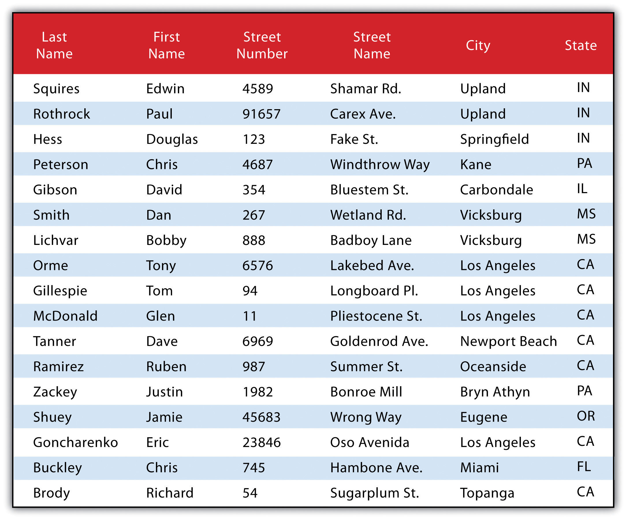
The following is a series of SQL expressions and results when applied to Figure 6.6 “Personal Addresses in “ExampleTable” Attribute Table”. The title of the attribute table is “ExampleTable.” Note that the asterisk (*) denotes a special case of SELECT whereby all columns for a given record are selected:
SELECT * FROM ExampleTable WHERE City = “Upland”
This statement returns the following:

Consider the following statement:
SELECT LastName FROM ExampleTable WHERE State = “CA” ORDER BY FirstName
This statement results in the following table sorted in ascending order by the FirstName column (not included in the output table as directed by the SELECT clause):
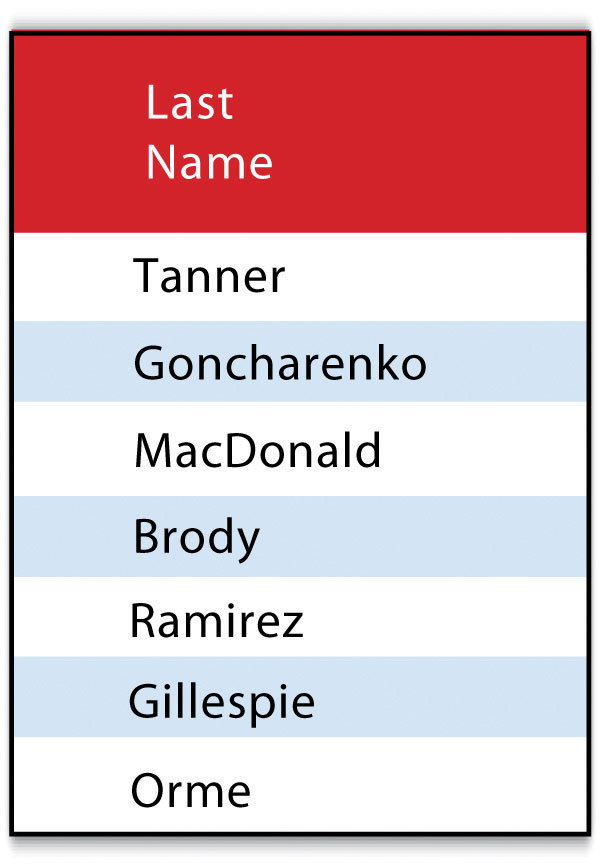
In addition to clauses, SQL allows for the inclusion of specific operators to further delimit the result of query. These operators can be relational, arithmetic, or Boolean and will typically appear inside of conditional statements in the WHERE clause. A relational operator employs the statements equal to (=), less than (<), less than or equal to (<=), greater than (>), or greater than or equal to (>=). Arithmetic operators are those mathematical functions that include addition (+), subtraction (−), multiplication (*), and division (/). Boolean operators (also called Boolean connectors) include the statements AND, OR, XOR, and NOT. The AND connector is used to select records from the attribute table that satisfies both expressions. The OR connector selects records that satisfy either one or both expressions. The XOR connector selects records that satisfy one and only one of the expressions (the functional opposite of the AND connector). Lastly, the NOT connector is used to negate (or unselect) an expression that would otherwise be true. Put into the language of probability, the AND connector is used to represent an intersection, OR represents a union, and NOT represents a complement. Figure 6.7 “Venn Diagram of SQL Operators” illustrates the logic of these connectors, where circles A and B represent two sets of intersecting data. Keep in mind that SQL is a very exacting language and minor inconsistencies in the statement, such as additional spaces, can result in a failed query.
Figure 6.7 Venn Diagram of SQL Operators
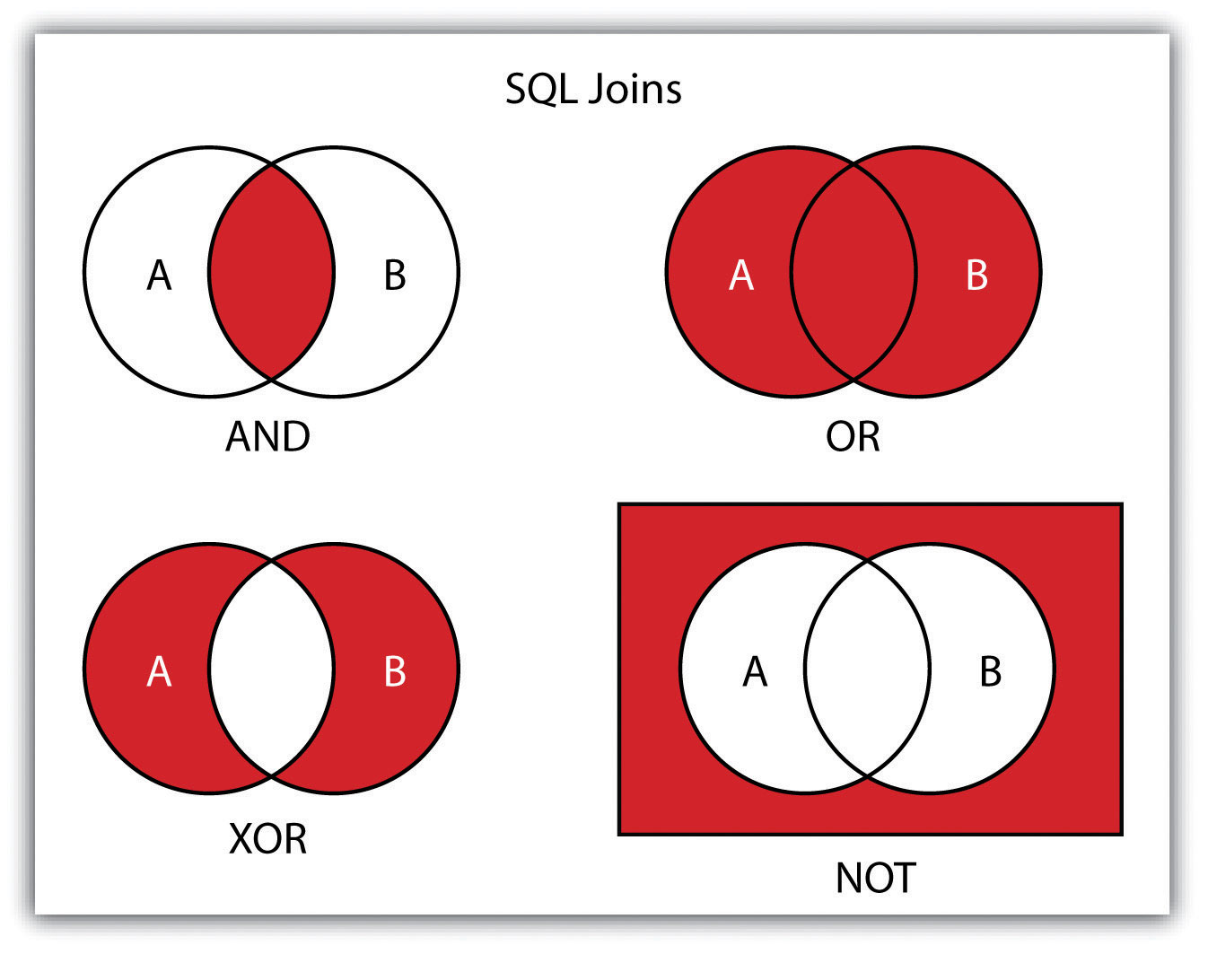
Used together, these operators combine to provide the GIS user with powerful and flexible search and query options. With this in mind, can you determine the output set of the following SQL query as it is applied to Figure 6.1 “Histogram Showing the Frequency Distribution of Exam Scores”?
SELECT LastName, FirstName, StreetNumber FROM ExampleTable WHERE StreetNumber >= 10000 AND StreetNumber < 100 ORDER BY LastName
The following are the results:
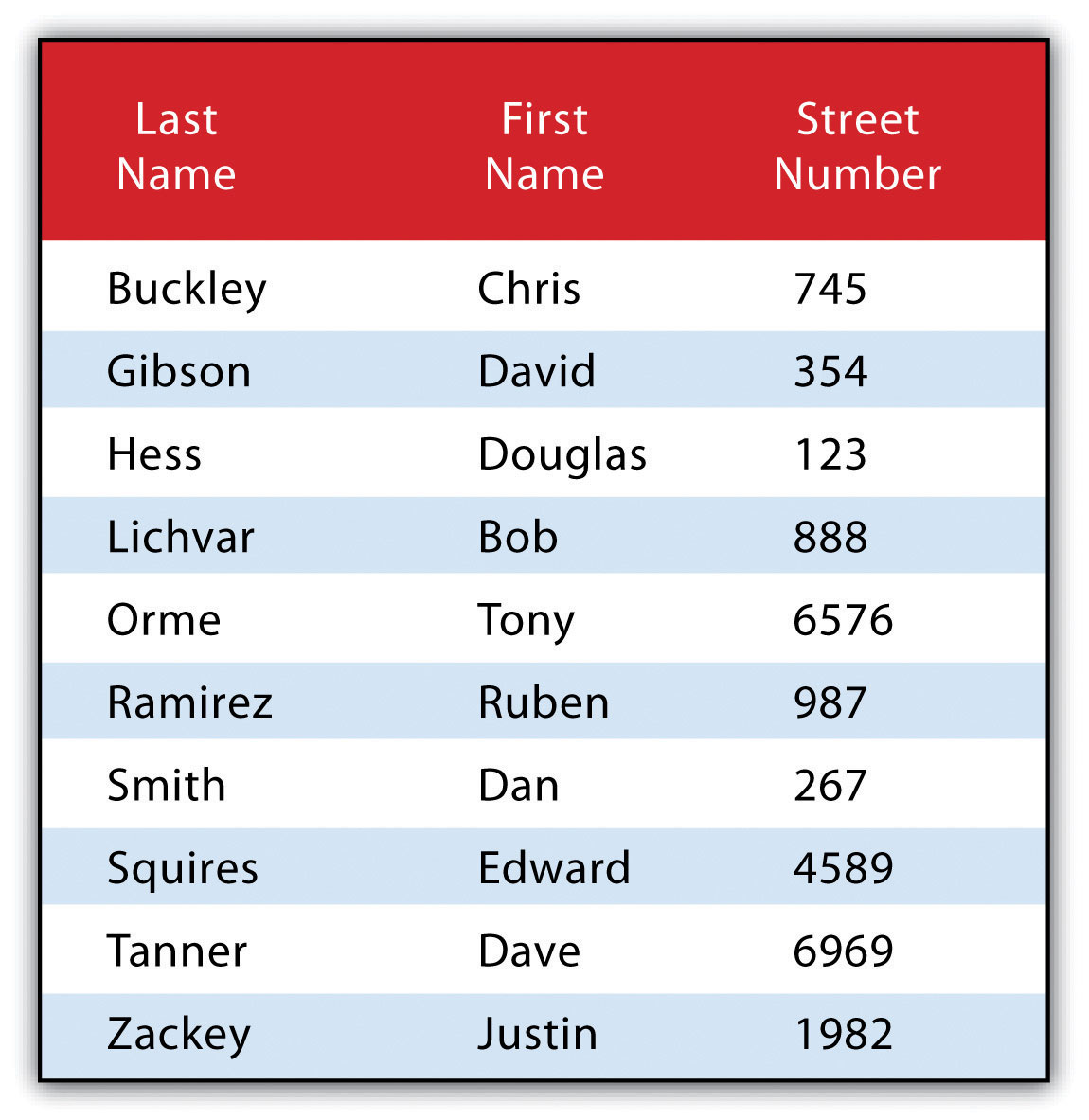
Query by Geography
Query by geography, also known as a “spatial query,” allows one to highlight particular features by examining their position relative to other features. For example, a GIS provides robust tools that allow for the determination of the number of schools within 10 miles of a home. Several spatial query options are available, as outlined here. Throughout this discussion, the “target layer” refers to the feature dataset whose attributes are selected, while the “source layer” refers to the feature dataset on which the spatial query is applied. For example, if we were to use a state boundary polygon feature dataset to select highways from a line feature dataset (e.g., select all the highways that run through the state of Arkansas), the state layer is the source, while the highway layer is the target.
- INTERSECT. This oft-used spatial query technique selects all features in the target layer that share a common locale with the source layer. The “intersect” query allows points, lines, or polygon layers to be used as both the source and target layers (Figure 6.8).
Figure 6.8
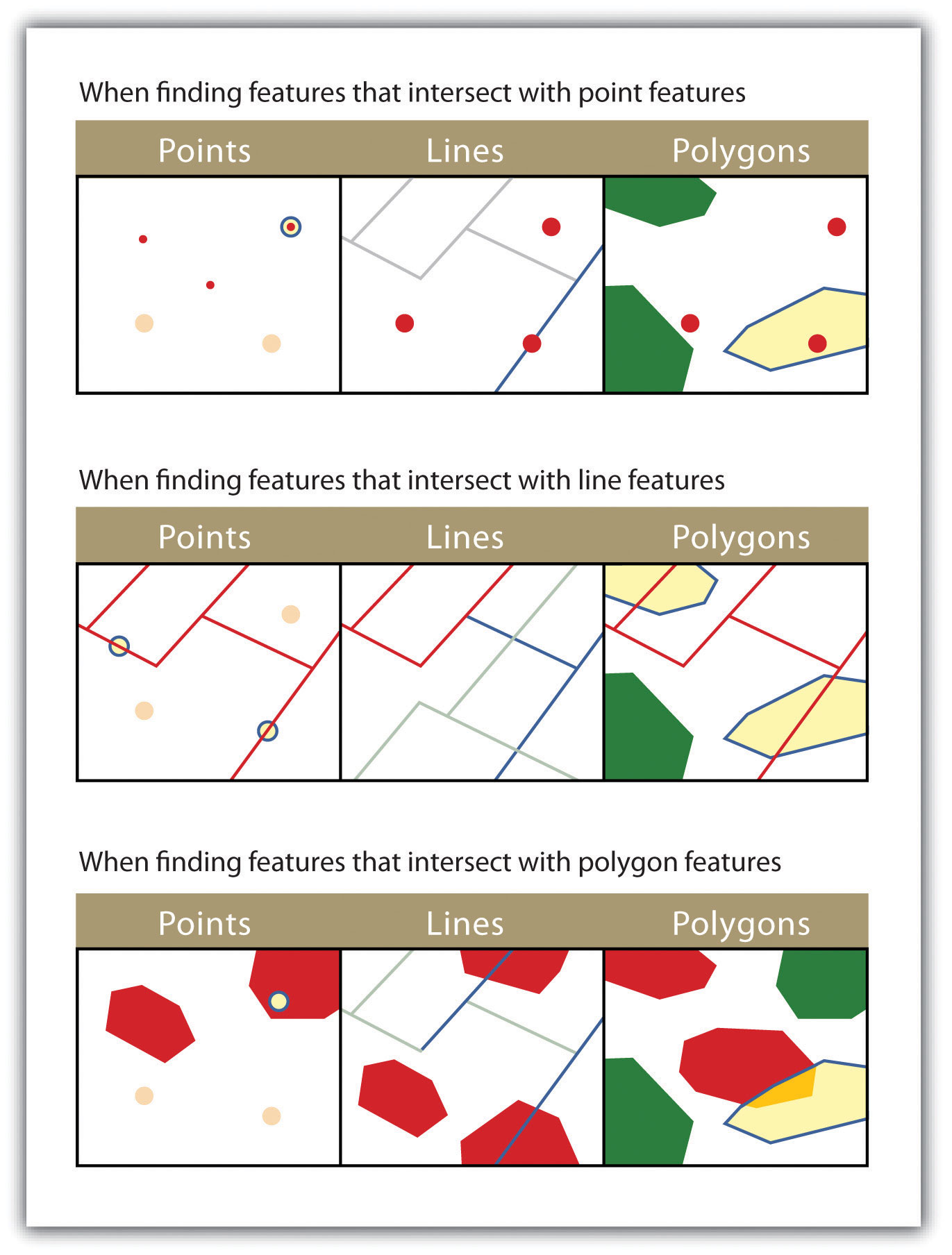
The highlighted blue and yellow features are selected because they intersect the red features.
- ARE WITHIN A DISTANCE OF. This technique requires the user to specify some distance value, which is then used to buffer (Chapter 7 “Geospatial Analysis I: Vector Operations”, Section 7.2 “Multiple Layer Analysis”) the source layer. All features that intersect this buffer are highlighted in the target layer. The “are within a distance of” query allows points, lines, or polygon layers to be used for both the source and target layers (Figure 6.9).
Figure 6.9
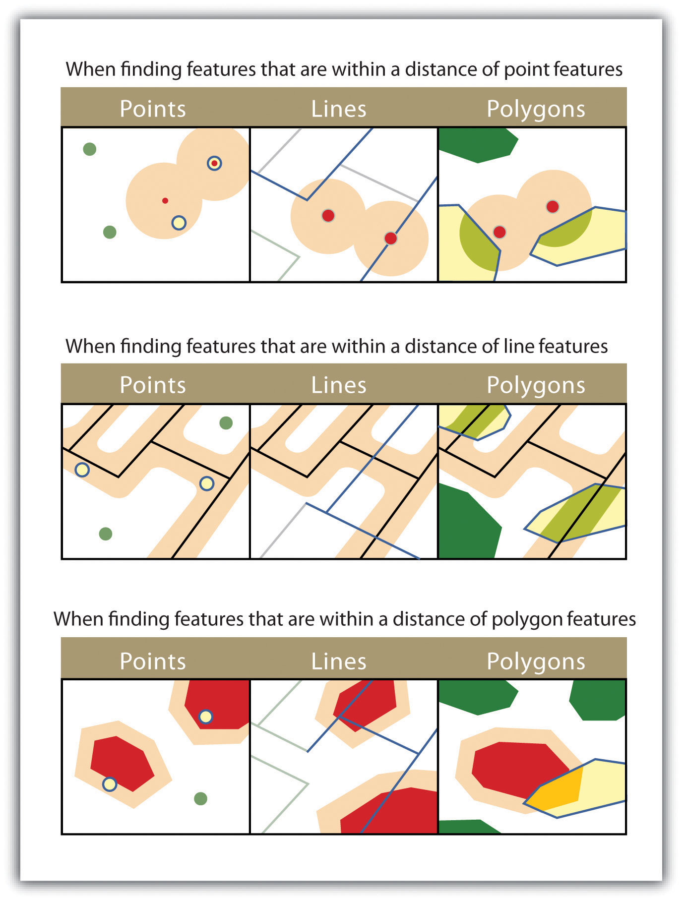
The highlighted blue and yellow features are selected because they are within the selected distance of the red features; tan areas represent buffers around the various features.
- COMPLETELY CONTAIN. This spatial query technique returns those features that are entirely within the source layer. Features with coincident boundaries are not selected by this query type. The “completely contain” query allows for points, lines, or polygons as the source layer, but only polygons can be used as a target layer (Figure 6.10).
Figure 6.10
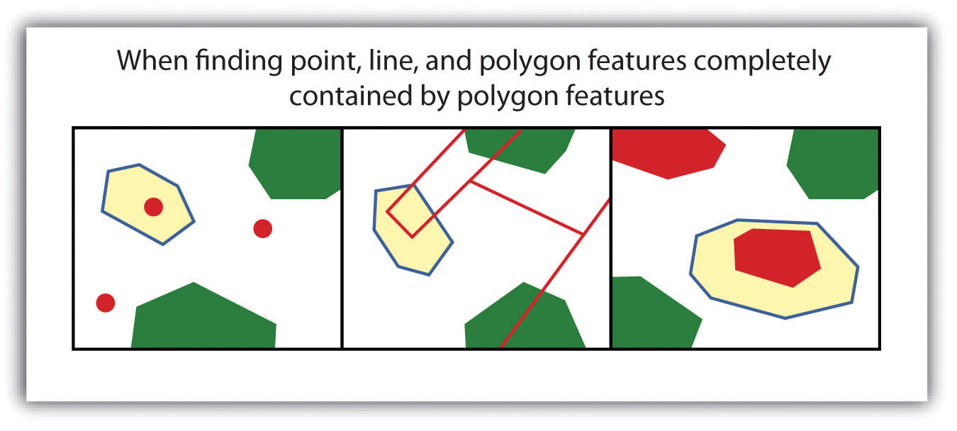
The highlighted blue and yellow features are selected because they completely contain the red features.
- ARE COMPLETELY WITHIN. This query selects those features in the target layer whose entire spatial extent occurs within the geometry of the source layer. The “are completely within” query allows for points, lines, or polygons as the target layer, but only polygons can be used as a source layer (Figure 6.11).
Figure 6.11
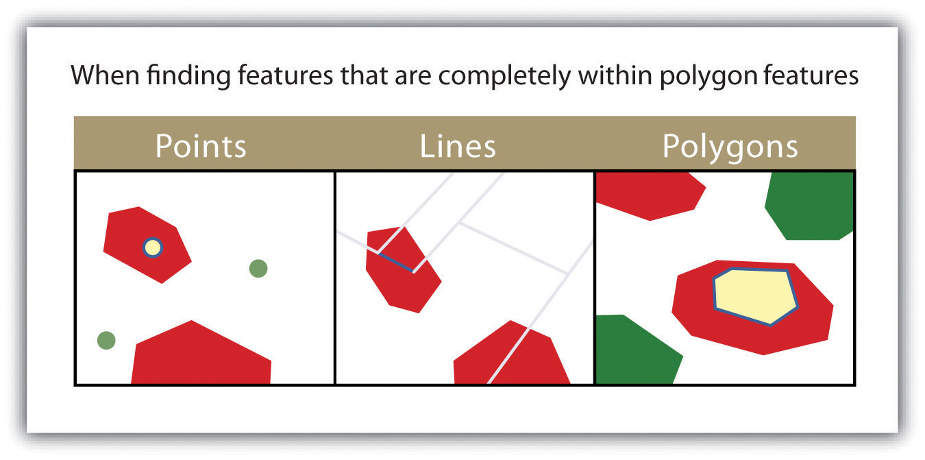
The highlighted blue and yellow features are selected because they are completely within the red features.
- HAVE THEIR CENTER IN. This technique selects target features whose center, or centroid, is located within the boundary of the source feature dataset. The “have their center in” query allows points, lines, or polygon layers to be used as both the source and target layers (Figure 6.12).
Figure 6.12
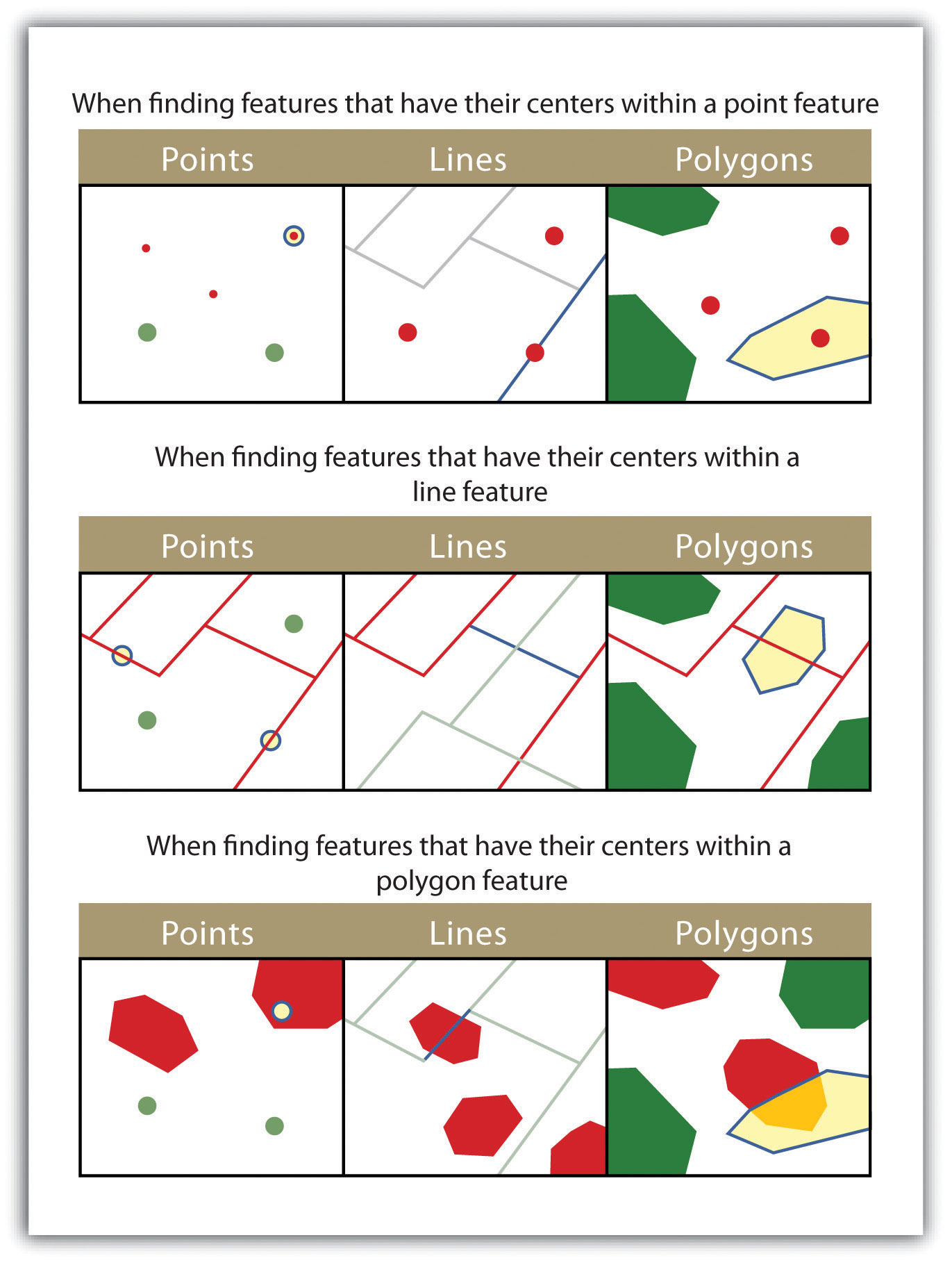
The highlighted blue and yellow features are selected because they have their centers in the red features.
- SHARE A LINE SEGMENT. This spatial query selects target features whose boundary geometries share a minimum of two adjacent vertices with the source layer. The “share a line segment” query allows for line or polygon layers to be used for either of the source and target layers (Figure 6.13).
Figure 6.13
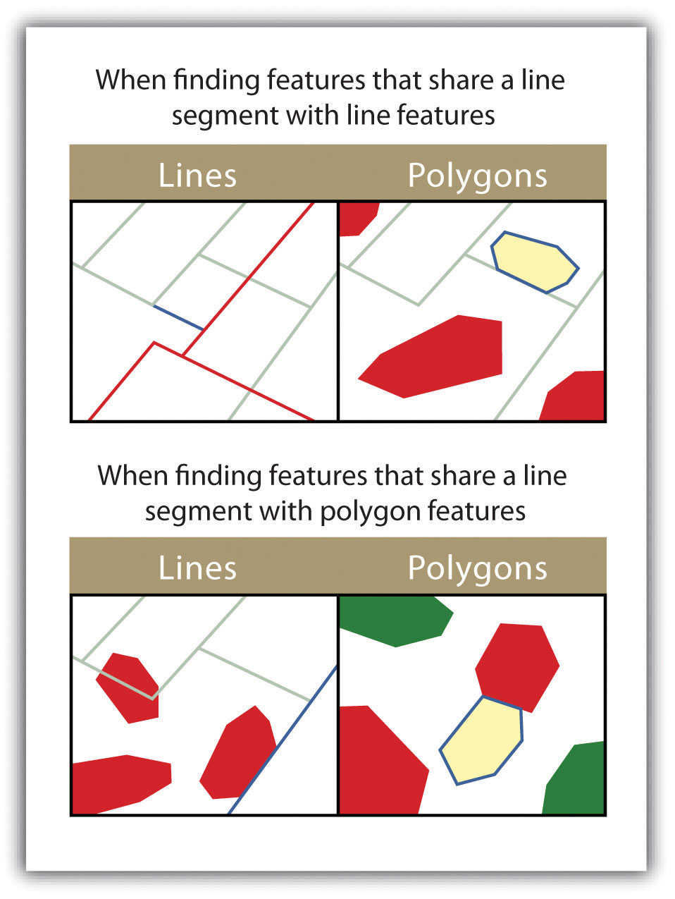
The highlighted blue and yellow features are selected because they share a line segment with the red features.
- TOUCH THE BOUNDARY OF. This methodology is similar to the INTERSECT spatial query; however, it selects line and polygon features that share a common boundary with target layer. The “touch the boundary of” query allows for line or polygon layers to be used as both the source and target layers (Figure 6.14).
Figure 6.14
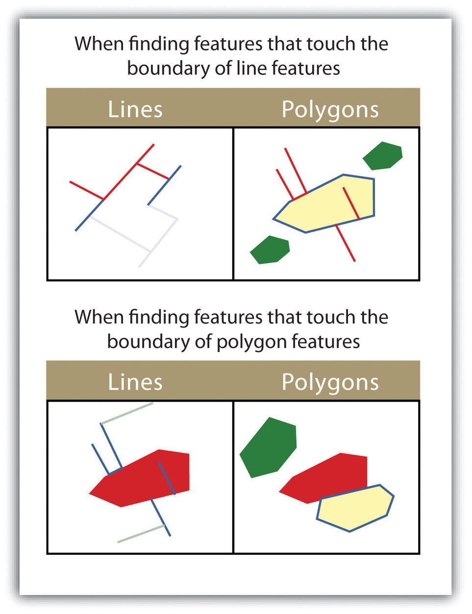
The highlighted blue and yellow features are selected because they touch the boundary of the red features.
- ARE IDENTICAL TO. This spatial query returns features that have the exact same geographic location. The “are identical to” query can be used on points, lines, or polygons, but the target layer type must be the same as the source layer type (Figure 6.15).
Figure 6.15
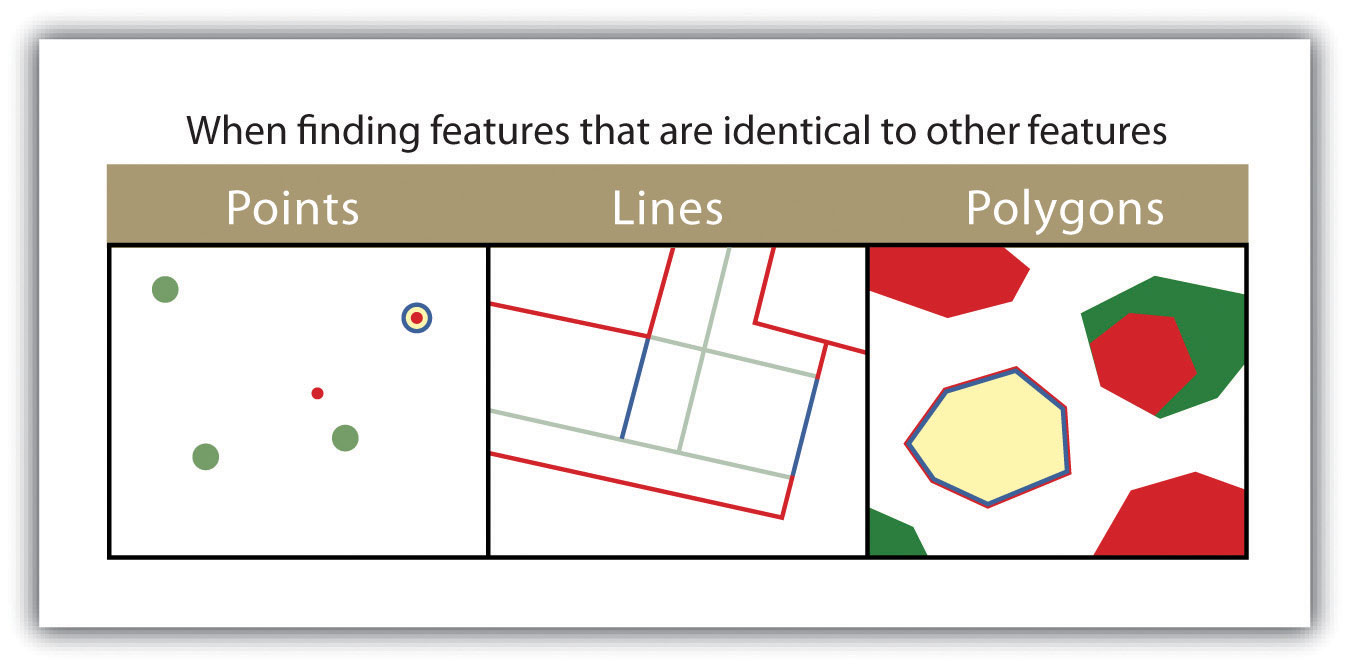
The highlighted blue and yellow features are selected because they are identical to the red features.
- ARE CROSSED BY THE OUTLINE OF. This selection criteria returns features that share a single vertex but not an entire line segment. The “are crossed by the outline of” query allows for line or polygon layers to be used as both source and target layers (Figure 6.16).
Figure 6.16
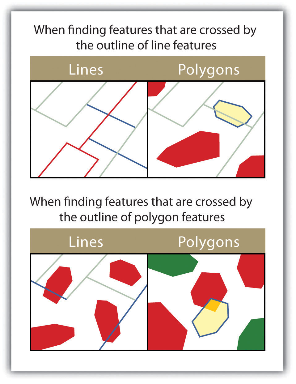
The highlighted blue and yellow features are selected because they are crossed by the outline of the red features.
- CONTAIN. This method is similar to the COMPLETELY CONTAIN spatial query; however, features in the target layer will be selected even if the boundaries overlap. The “contain” query allows for point, line, or polygon features in the target layer when points are used as a source; when line and polygon target layers with a line source; and when only polygon target layers with a polygon source (Figure 6.17).
Figure 6.17
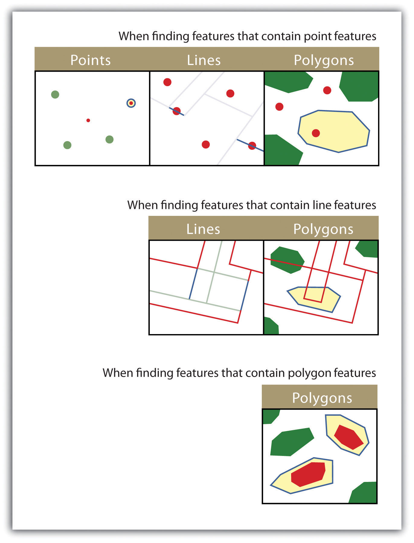
The highlighted blue and yellow features are selected because they contain the red features.
- ARE CONTAINED BY. This method is similar to the ARE COMPLETELY WITHIN spatial query; however, features in the target layer will be selected even if the boundaries overlap. The “are contained by” query allows for point, line, or polygon features in the target layer when polygons are used as a source; when point and line target layers with a line source; and when only point target layers with a point source (Figure 6.18).
Figure 6.18
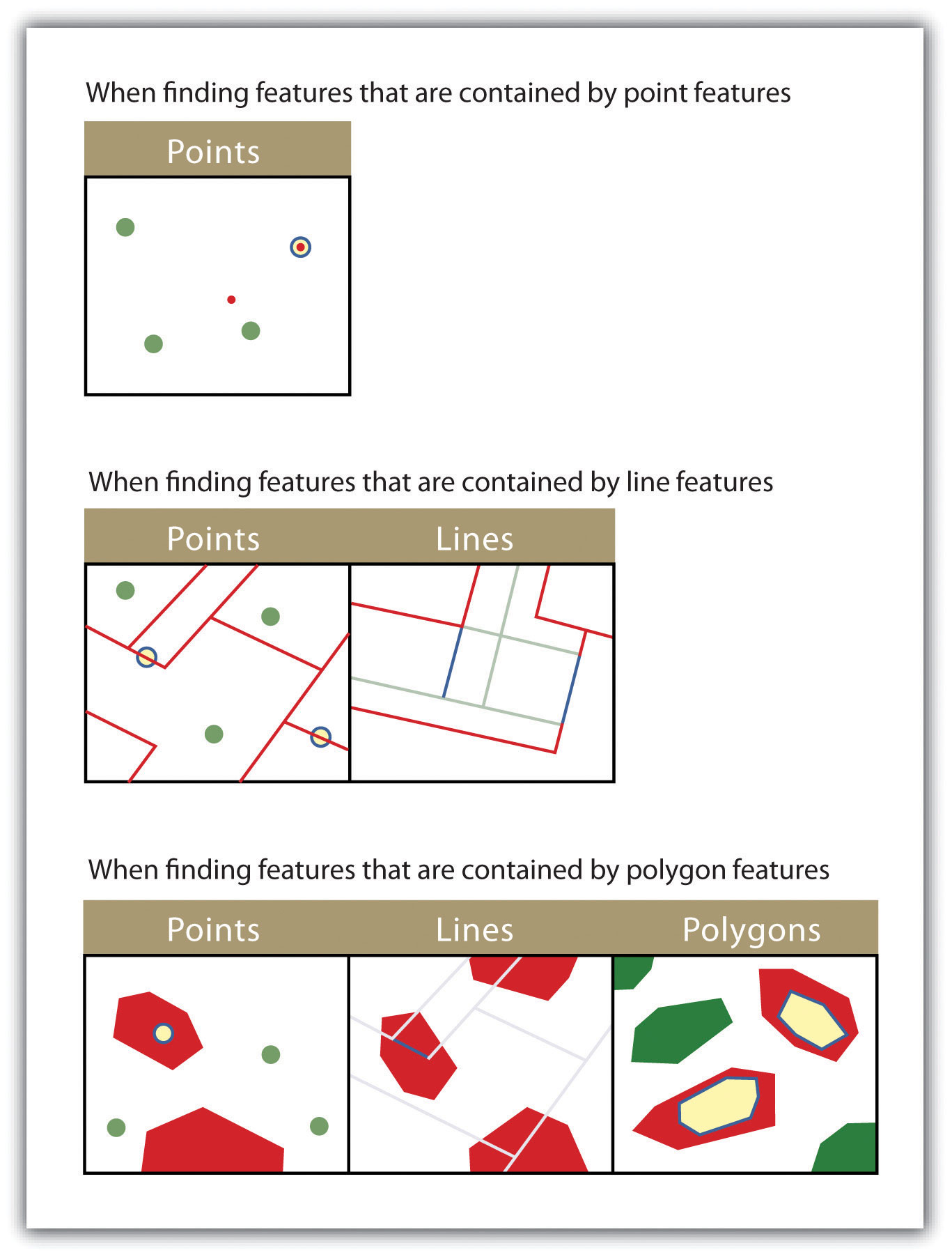
The highlighted blue and yellow features are selected because they are contained by the red features.
KEY TAKEAWAYS
- The three basic methods for searching and querying attribute data are selection, query by attribute, and query by geography.
- SQL is a commonly used computer language developed to query by attribute data within a relational database management system.
- Queries by geography allow a user to highlight desired features by examining their position relative to other features. The eleven different query-by-geography options listed here are available in most GIS software packages.
EXERCISES
- Using Figure 6.1 “Histogram Showing the Frequency Distribution of Exam Scores”, develop the SQL statement that results in the output of all the street names of people living in Los Angeles, sorted by street number.
- When querying by geography, what is the difference between a source layer and a target layer?
- What is the difference between the CONTAIN, COMPLETELY CONTAIN, and ARE CONTAINED BY queries?
6.3 Data Classification
LEARNING OBJECTIVE
- The objective of this section is to describe the methodologies available to parse data into various classes for visual representation in a map.
The process of data classification combines raw data into predefined classes, or bins. These classes may be represented in a map by some unique symbols or, in the case of choropleth maps, by a unique color or hue (for more on color and hue, see Chapter 8 “Geospatial Analysis II: Raster Data”, Section 8.1 “Basic Geoprocessing with Rasters”). Choropleth maps are thematic maps shaded with graduated colors to represent some statistical variable of interest. Although seemingly straightforward, there are several different classification methodologies available to a cartographer. These methodologies break the attribute values down along various interval patterns. Monmonier (1991)Monmonier, M. 1991. How to Lie with Maps. Chicago: University of Chicago Press. noted that different classification methodologies can have a major impact on the interpretability of a given map as the visual pattern presented is easily distorted by manipulating the specific interval breaks of the classification. In addition to the methodology employed, the number of classes chosen to represent the feature of interest will also significantly affect the ability of the viewer to interpret the mapped information. Including too many classes can make a map look overly complex and confusing. Too few classes can oversimplify the map and hide important data trends. Most effective classification attempts utilize approximately four to six distinct classes.
While problems potentially exist with any classification technique, a well-constructed choropleth increases the interpretability of any given map. The following discussion outlines the classification methods commonly available in geographic information system (GIS) software packages. In these examples, we will use the US Census Bureau’s population statistic for US counties in 1997. These data are freely available at the US Census website (http://www.census.gov).
The equal interval (or equal step) classification method divides the range of attribute values into equally sized classes. The number of classes is determined by the user. The equal interval classification method is best used for continuous datasets such as precipitation or temperature. In the case of the 1997 Census Bureau data, county population values across the United States range from 40 (Yellowstone National Park County, MO) to 9,184,770 (Los Angeles County, CA) for a total range of 9,184,770 − 40 = 9,184,730. If we decide to classify this data into 5 equal interval classes, the range of each class would cover a population spread of 9,184,730 / 5 = 1,836,946 (Figure 6.19 “Equal Interval Classification for 1997 US County Population Data”). The advantage of the equal interval classification method is that it creates a legend that is easy to interpret and present to a nontechnical audience. The primary disadvantage is that certain datasets will end up with most of the data values falling into only one or two classes, while few to no values will occupy the other classes. As you can see in Figure 6.19 “Equal Interval Classification for 1997 US County Population Data”, almost all the counties are assigned to the first (yellow) bin.
Figure 6.19 Equal Interval Classification for 1997 US County Population Data
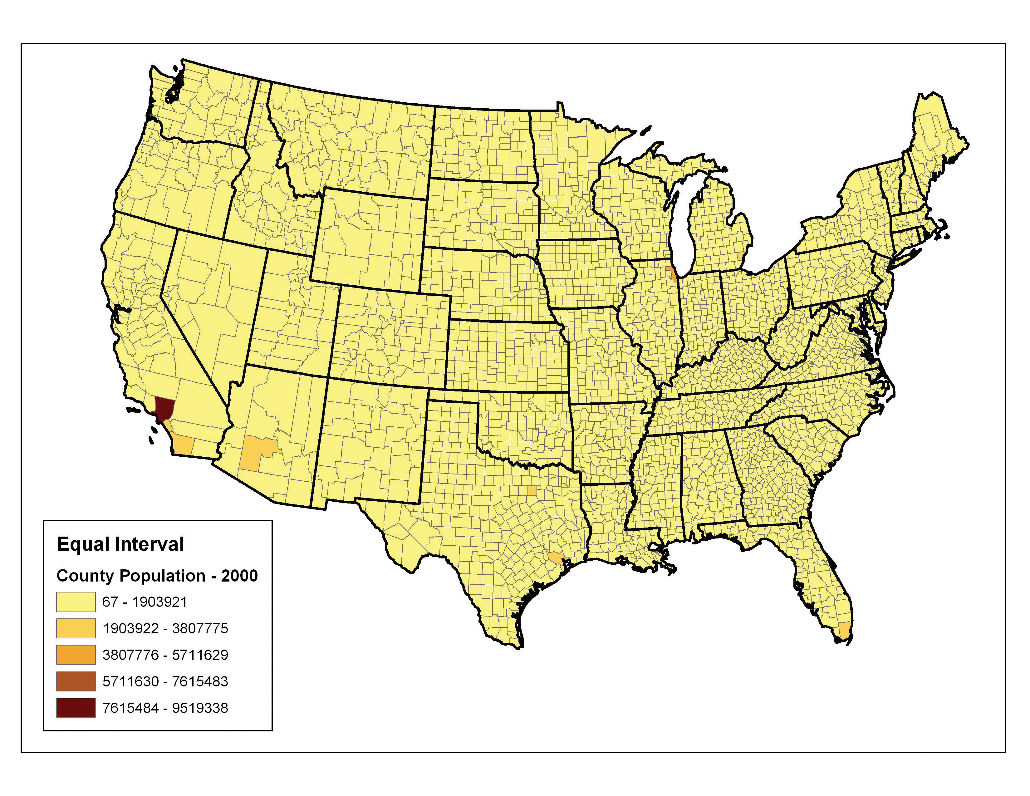
The quantile classification method places equal numbers of observations into each class. This method is best for data that is evenly distributed across its range. Figure 6.20 “Quantiles” shows the quantile classification method with five total classes. As there are 3,140 counties in the United States, each class in the quantile classification methodology will contain 3,140 / 5 = 628 different counties. The advantage to this method is that it often excels at emphasizing the relative position of the data values (i.e., which counties contain the top 20 percent of the US population). The primary disadvantage of the quantile classification methodology is that features placed within the same class can have wildly differing values, particularly if the data are not evenly distributed across its range. In addition, the opposite can also happen whereby values with small range differences can be placed into different classes, suggesting a wider difference in the dataset than actually exists.
Figure 6.20 Quantiles
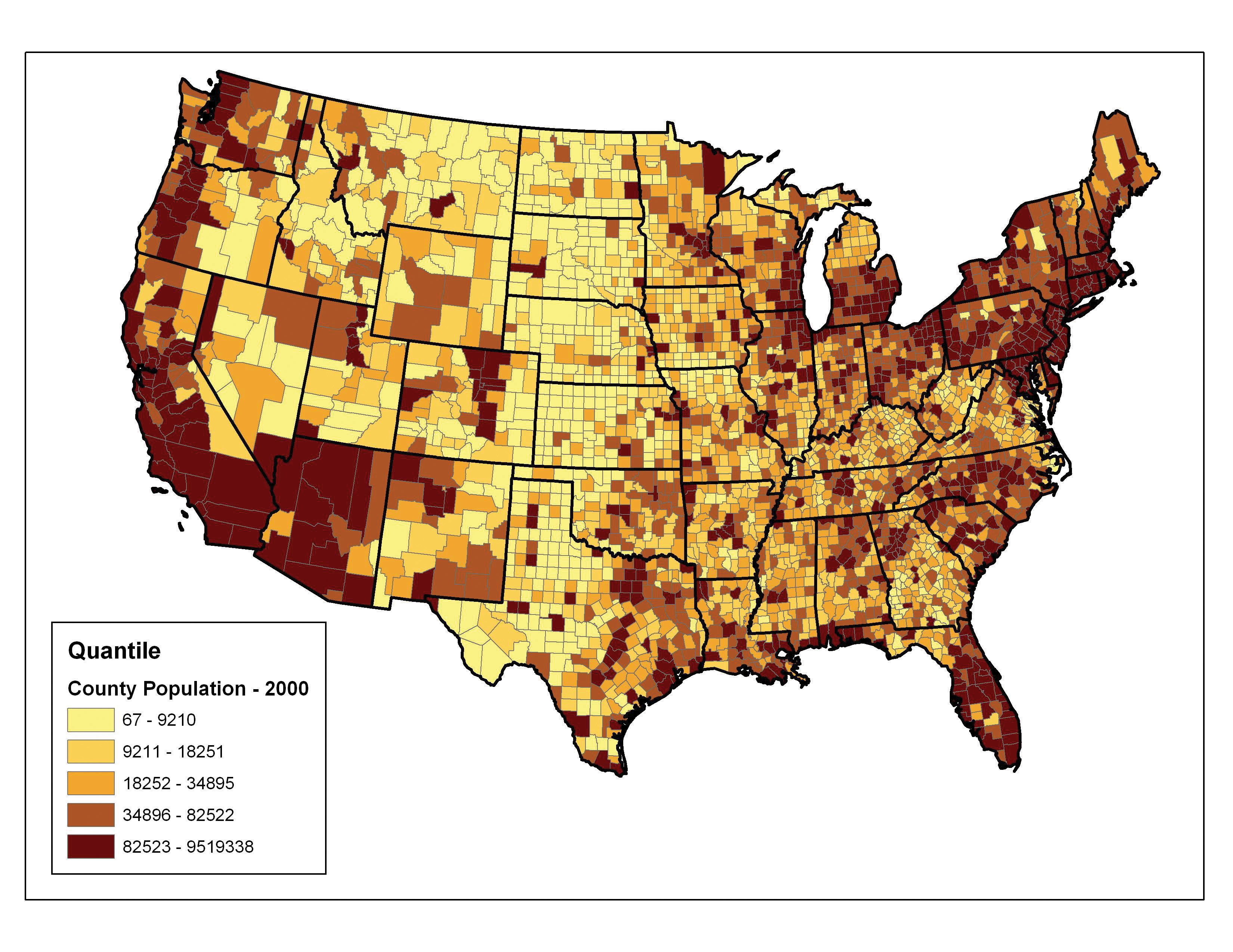
The natural breaks (or Jenks) classification method utilizes an algorithm to group values in classes that are separated by distinct break points. This method is best used with data that is unevenly distributed but not skewed toward either end of the distribution. Figure 6.21 “Natural Breaks” shows the natural breaks classification for the 1997 US county population density data. One potential disadvantage is that this method can create classes that contain widely varying number ranges. Accordingly, class 1 is characterized by a range of just over 150,000, while class 5 is characterized by a range of over 6,000,000. In cases like this, it is often useful to either “tweak” the classes following the classification effort or to change the labels to some ordinal scale such as “small, medium, or large.” The latter example, in particular, can result in a map that is more comprehensible to the viewer. A second disadvantage is the fact that it can be difficult to compare two or more maps created with the natural breaks classification method because the class ranges are so very specific to each dataset. In these cases, datasets that may not be overly disparate may appear so in the output graphic.
Figure 6.21 Natural Breaks
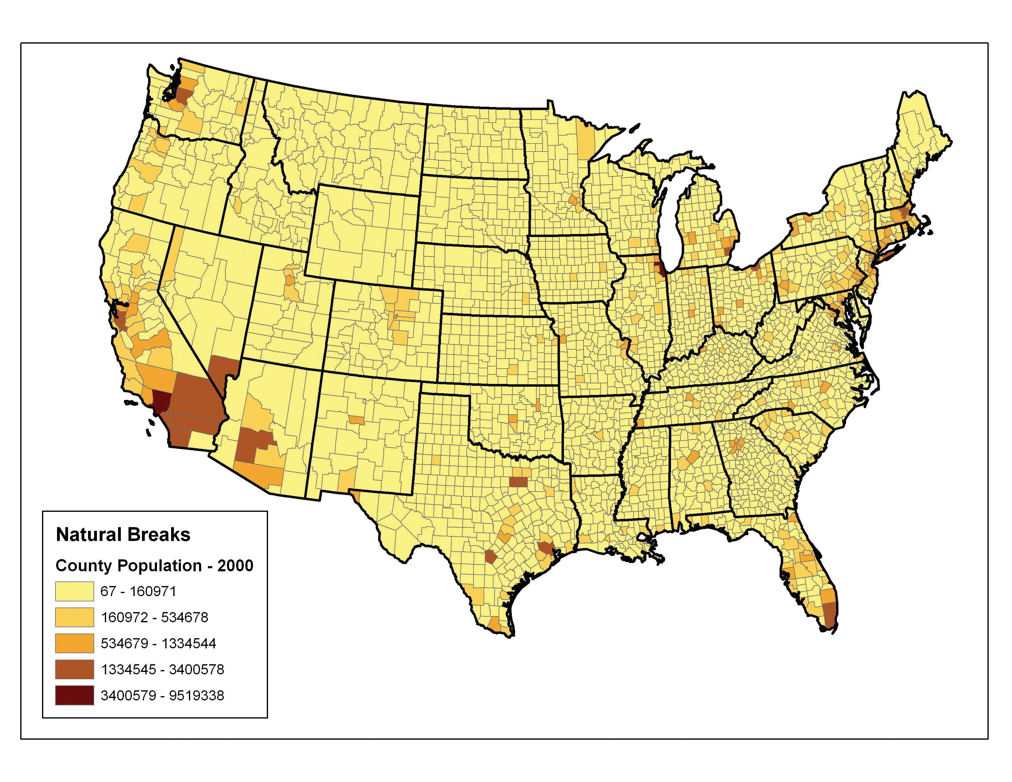
Finally, the standard deviation classification method forms each class by adding and subtracting the standard deviation from the mean of the dataset. The method is best suited to be used with data that conforms to a normal distribution. In the county population example, the mean is 85,108, and the standard deviation is 277,080. Therefore, as can be seen in the legend of Figure 6.22 “Standard Deviation”, the central class contains values within a 0.5 standard deviation of the mean, while the upper and lower classes contain values that are 0.5 or more standard deviations above or below the mean, respectively.
Figure 6.22 Standard Deviation
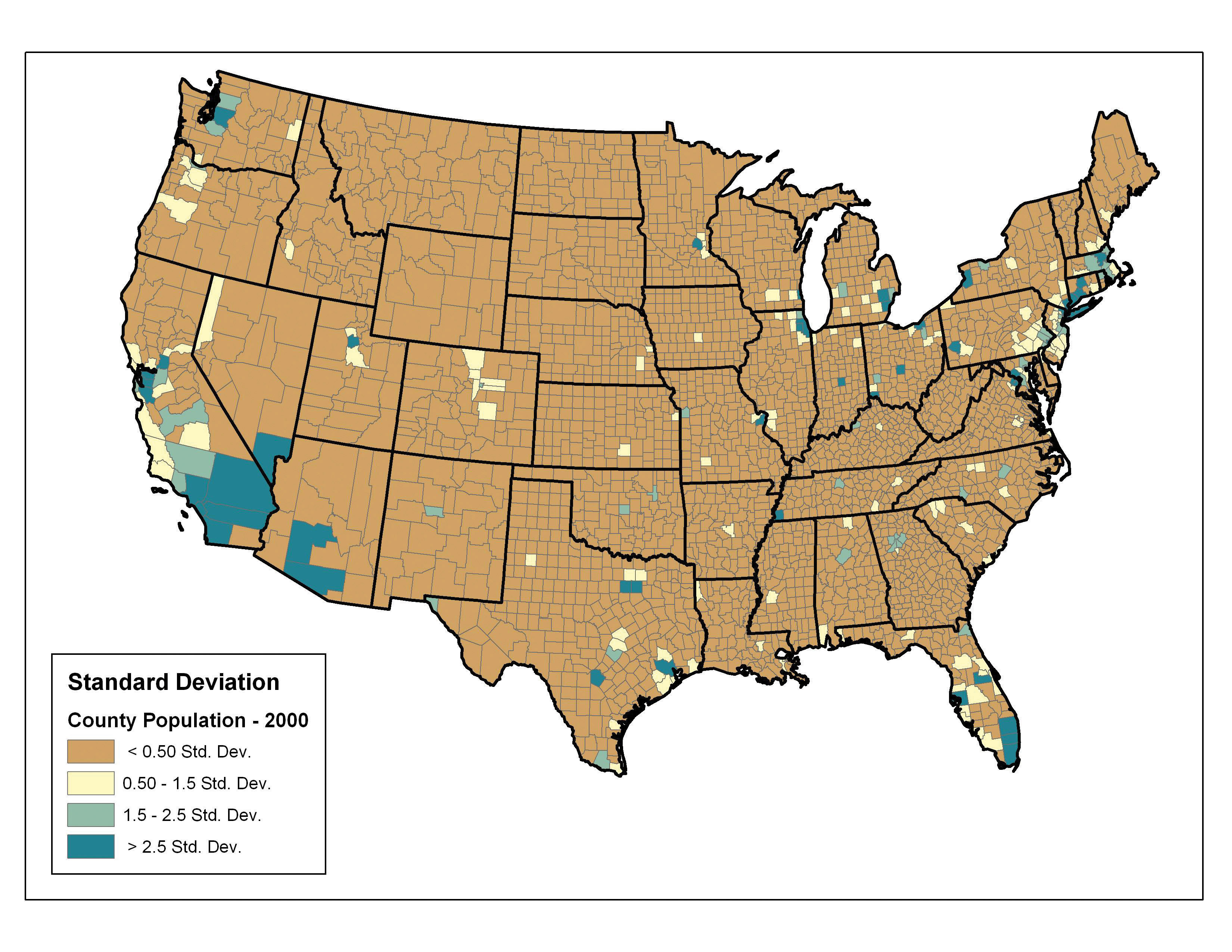
In conclusion, there are several viable data classification methodologies that can be applied to choropleth maps. Although other methods are available (e.g., equal area, optimal), those outlined here represent the most commonly used and widely available. Each of these methods presents the data in a different fashion and highlights different aspects of the trends in the dataset. Indeed, the classification methodology, as well as the number of classes utilized, can result in very widely varying interpretations of the dataset. It is incumbent upon you, the cartographer, to select the method that best suits the needs of the study and presents the data in as meaningful and transparent a way as possible.
KEY TAKEAWAYS
- Choropleth maps are thematic maps shaded with graduated colors to represent some statistical variable of interest.
- Four methods for classifying data presented here include equal intervals, quartile, natural breaks, and standard deviation. These methods convey certain advantages and disadvantages when visualizing a variable of interest.
EXERCISES
- Given the choropleth maps presented in this chapter, which do you feel best represents the dataset? Why?
- Go online and describe two other data classification methods available to GIS users.
- For the table of thirty data values created in Section 6.1 “Descriptions and Summaries”, Exercise 1, determine the data ranges for each class as if you were creating both equal interval and quantile classification schemes.
Chapter 7Geospatial Analysis I: Vector Operations
In Chapter 6 “Data Characteristics and Visualization”, we discussed different ways to query, classify, and summarize information in attribute tables. These methods are indispensable for understanding the basic quantitative and qualitative trends of a dataset. However, they don’t take particular advantage of the greatest strength of a geographic information system (GIS), notably the explicit spatial relationships. Spatial analysis is a fundamental component of a GIS that allows for an in-depth study of the topological and geometric properties of a dataset or datasets. In this chapter, we discuss the basic spatial analysis techniques for vector datasets.
7.1 Single Layer Analysis
LEARNING OBJECTIVE
- The objective of this section is to become familiar with concepts and terms related to the variety of single overlay analysis techniques available to analyze and manipulate the spatial attributes of a vector feature dataset.
As the name suggests, single layer analyses are those that are undertaken on an individual feature dataset. Buffering is the process of creating an output polygon layer containing a zone (or zones) of a specified width around an input point, line, or polygon feature. Buffers are particularly suited for determining the area of influence around features of interest. Geoprocessing is a suite of tools provided by many geographic information system (GIS) software packages that allow the user to automate many of the mundane tasks associated with manipulating GIS data. Geoprocessing usually involves the input of one or more feature datasets, followed by a spatially explicit analysis, and resulting in an output feature dataset.
Buffering
Buffers are common vector analysis tools used to address questions of proximity in a GIS and can be used on points, lines, or polygons (Figure 7.1 “Buffers around Red Point, Line, and Polygon Features”). For instance, suppose that a natural resource manager wants to ensure that no areas are disturbed within 1,000 feet of breeding habitat for the federally endangered Delhi Sands flower-loving fly (Rhaphiomidas terminatus abdominalis). This species is found only in the few remaining Delhi Sands soil formations of the western United States. To accomplish this task, a 1,000-foot protection zone (buffer) could be created around all the observed point locations of the species. Alternatively, the manager may decide that there is not enough point-specific location information related to this rare species and decide to protect all Delhi Sands soil formations. In this case, he or she could create a 1,000-foot buffer around all polygons labeled as “Delhi Sands” on a soil formations dataset. In either case, the use of buffers provides a quick-and-easy tool for determining which areas are to be maintained as preserved habitat for the endangered fly.
Figure 7.1 Buffers around Red Point, Line, and Polygon Features
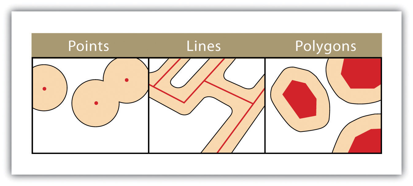
Several buffering options are available to refine the output. For example, the buffer tool will typically buffer only selected features. If no features are selected, all features will be buffered. Two primary types of buffers are available to the GIS users: constant width and variable width. Constant width buffers require users to input a value by which features are buffered (Figure 7.1 “Buffers around Red Point, Line, and Polygon Features”), such as is seen in the examples in the preceding paragraph. Variable width buffers, on the other hand, call on a premade buffer field within the attribute table to determine the buffer width for each specific feature in the dataset (Figure 7.2 “Additional Buffer Options around Red Features: (a) Variable Width Buffers, (b) Multiple Ring Buffers, (c) Doughnut Buffer, (d) Setback Buffer, (e) Nondissolved Buffer, (f) Dissolved Buffer”).
In addition, users can choose to dissolve or not dissolve the boundaries between overlapping, coincident buffer areas. Multiple ring buffers can be made such that a series of concentric buffer zones (much like an archery target) are created around the originating feature at user-specified distances (Figure 7.2 “Additional Buffer Options around Red Features: (a) Variable Width Buffers, (b) Multiple Ring Buffers, (c) Doughnut Buffer, (d) Setback Buffer, (e) Nondissolved Buffer, (f) Dissolved Buffer”). In the case of polygon layers, buffers can be created that include the originating polygon feature as part of the buffer or they be created as a doughnut buffer that excludes the input polygon area. Setback buffers are similar to doughnut buffers; however, they only buffer the area inside of the polygon boundary. Linear features can be buffered on both sides of the line, only on the left, or only on the right. Linear features can also be buffered so that the end points of the line are rounded (ending in a half-circle) or flat (ending in a rectangle).
Figure 7.2 Additional Buffer Options around Red Features: (a) Variable Width Buffers, (b) Multiple Ring Buffers, (c) Doughnut Buffer, (d) Setback Buffer, (e) Nondissolved Buffer, (f) Dissolved Buffer
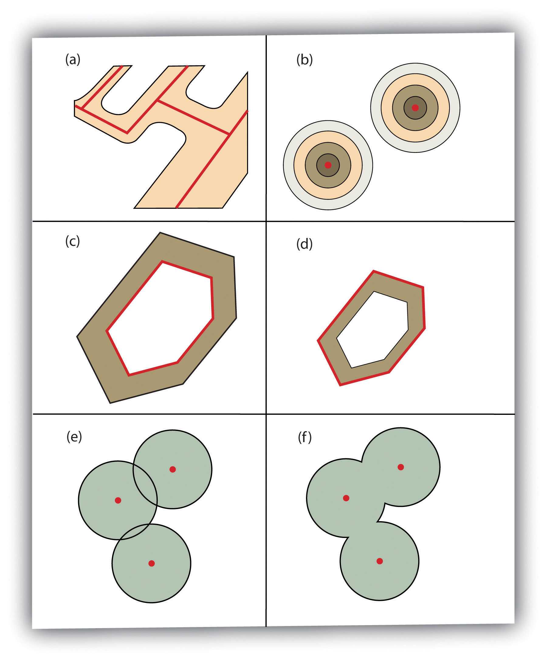
Geoprocessing Operations
“Geoprocessing” is a loaded term in the field of GIS. The term can (and should) be widely applied to any attempt to manipulate GIS data. However, the term came into common usage due to its application to a somewhat arbitrary suite of single layer and multiple layer analytical techniques in the Geoprocessing Wizard of ESRI’s ArcView software package in the mid-1990s. Regardless, the suite of geoprocessing tools available in a GIS greatly expand and simplify many of the management and manipulation processes associated with vector feature datasets. The primary use of these tools is to automate the repetitive preprocessing needs of typical spatial analyses and to assemble exact graphical representations for subsequent analysis and/or inclusion in presentations and final mapping products. The union, intersect, symmetrical difference, and identity overlay methods discussed in Section 7.2.2 “Other Multilayer Geoprocessing Options” are often used in conjunction with these geoprocessing tools. The following represents the most common geoprocessing tools.
The dissolve operation combines adjacent polygon features in a single feature dataset based on a single predetermined attribute. For example, part (a) of Figure 7.3 “Single Layer Geoprocessing Functions” shows the boundaries of seven different parcels of land, owned by four different families (labeled 1 through 4). The dissolve tool automatically combines all adjacent features with the same attribute values. The result is an output layer with the same extent as the original but without all of the unnecessary, intervening line segments. The dissolved output layer is much easier to visually interpret when the map is classified according to the dissolved field.
The append operation creates an output polygon layer by combining the spatial extent of two or more layers (part (d) of Figure 7.3 “Single Layer Geoprocessing Functions”). For use with point, line, and polygon datasets, the output layer will be the same feature type as the input layers (which must each be the same feature type as well). Unlike the dissolve tool, append does not remove the boundary lines between appended layers (in the case of lines and polygons). Therefore, it is often useful to perform a dissolve after the use of the append tool to remove these potentially unnecessary dividing lines. Append is frequently used to mosaic data layers, such as digital US Geological Survey (USGS) 7.5-minute topographic maps, to create a single map for analysis and/or display.
The select operation creates an output layer based on a user-defined query that selects particular features from the input layer (part (f) of Figure 7.3 “Single Layer Geoprocessing Functions”). The output layer contains only those features that are selected during the query. For example, a city planner may choose to perform a select on all areas that are zoned “residential” so he or she can quickly assess which areas in town are suitable for a proposed housing development.
Finally, the merge operation combines features within a point, line, or polygon layer into a single feature with identical attribute information. Often, the original features will have different values for a given attribute. In this case, the first attribute encountered is carried over into the attribute table, and the remaining attributes are lost. This operation is particularly useful when polygons are found to be unintentionally overlapping. Merge will conveniently combine these features into a single entity.
Figure 7.3 Single Layer Geoprocessing Functions
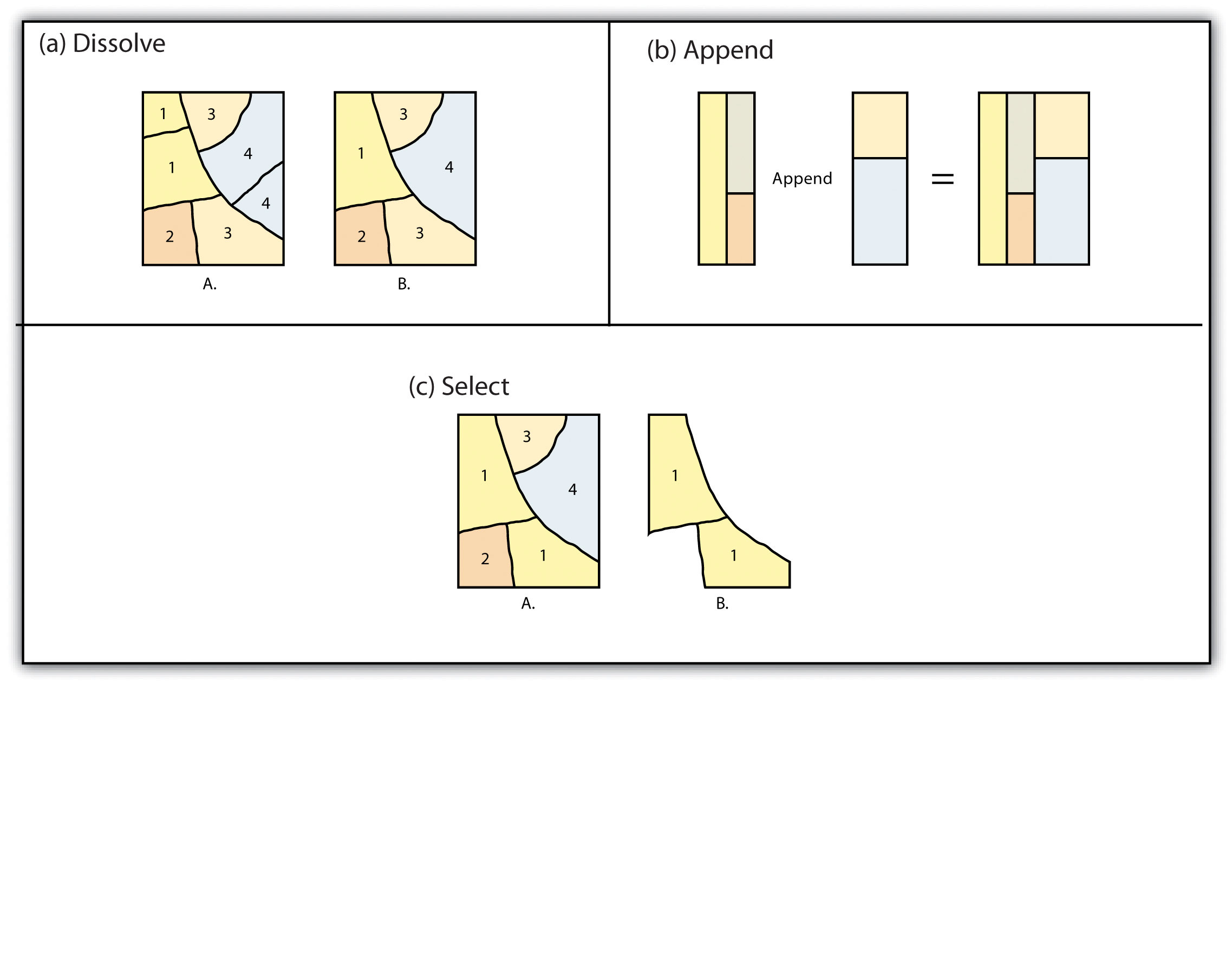
KEY TAKEAWAYS
- Buffers are frequently used to create zones of a specified width around points, lines, and polygons.
- Vector buffering options include constant or variable widths, multiple rings, doughnuts, setbacks, and dissolve.
- Common single layer geoprocessing operations on vector layers include dissolve, merge, append, and select.
EXERCISES
- List and describe the various buffering options available in a GIS.
- Why might you use the various geoprocessing operations to answer spatial questions related to your particular field of study?
7.2 Multiple Layer Analysis
LEARNING OBJECTIVE
- The objective of this section is to become familiar with concepts and terms related to the implementation of basic multiple layer operations and methodologies used on vector feature datasets.
Among the most powerful and commonly used tools in a geographic information system (GIS) is the overlay of cartographic information. In a GIS, an overlay is the process of taking two or more different thematic maps of the same area and placing them on top of one another to form a new map (Figure 7.4 “A Map Overlay Combining Information from Point, Line, and Polygon Vector Layers, as Well as Raster Layers”). Inherent in this process, the overlay function combines not only the spatial features of the dataset but also the attribute information as well.
Figure 7.4 A Map Overlay Combining Information from Point, Line, and Polygon Vector Layers, as Well as Raster Layers
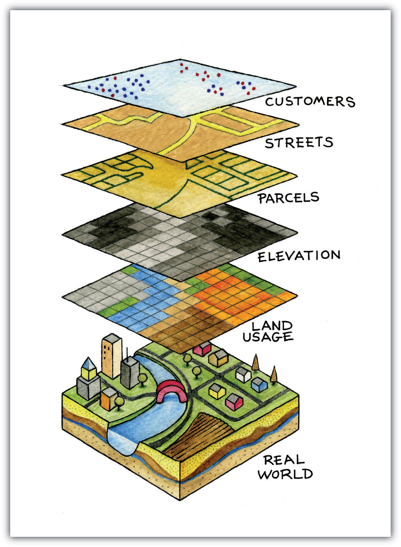
A common example used to illustrate the overlay process is, “Where is the best place to put a mall?” Imagine you are a corporate bigwig and are tasked with determining where your company’s next shopping mall will be placed. How would you attack this problem? With a GIS at your command, answering such spatial questions begins with amassing and overlaying pertinent spatial data layers. For example, you may first want to determine what areas can support the mall by accumulating information on which land parcels are for sale and which are zoned for commercial development. After collecting and overlaying the baseline information on available development zones, you can begin to determine which areas offer the most economic opportunity by collecting regional information on average household income, population density, location of proximal shopping centers, local buying habits, and more. Next, you may want to collect information on restrictions or roadblocks to development such as the cost of land, cost to develop the land, community response to development, adequacy of transportation corridors to and from the proposed mall, tax rates, and so forth. Indeed, simply collecting and overlaying spatial datasets provides a valuable tool for visualizing and selecting the optimal site for such a business endeavor.
Overlay Operations
Several basic overlay processes are available in a GIS for vector datasets: point-in-polygon, polygon-on-point, line-on-line, line-in-polygon, polygon-on-line, and polygon-on-polygon. As you may be able to divine from the names, one of the overlay dataset must always be a line or polygon layer, while the second may be point, line, or polygon. The new layer produced following the overlay operation is termed the “output” layer.
The point-in-polygon overlay operation requires a point input layer and a polygon overlay layer. Upon performing this operation, a new output point layer is returned that includes all the points that occur within the spatial extent of the overlay (Figure 7.4 “A Map Overlay Combining Information from Point, Line, and Polygon Vector Layers, as Well as Raster Layers”). In addition, all the points in the output layer contain their original attribute information as well as the attribute information from the overlay. For example, suppose you were tasked with determining if an endangered species residing in a national park was found primarily in a particular vegetation community. The first step would be to acquire the point occurrence locales for the species in question, plus a polygon overlay layer showing the vegetation communities within the national park boundary. Upon performing the point-in-polygon overlay operation, a new point file is created that contains all the points that occur within the national park. The attribute table of this output point file would also contain information about the vegetation communities being utilized by the species at the time of observation. A quick scan of this output layer and its attribute table would allow you to determine where the species was found in the park and to review the vegetation communities in which it occurred. This process would enable park employees to make informed management decisions regarding which onsite habitats to protect to ensure continued site utilization by the species.
Figure 7.5 Point-in-Polygon Overlay
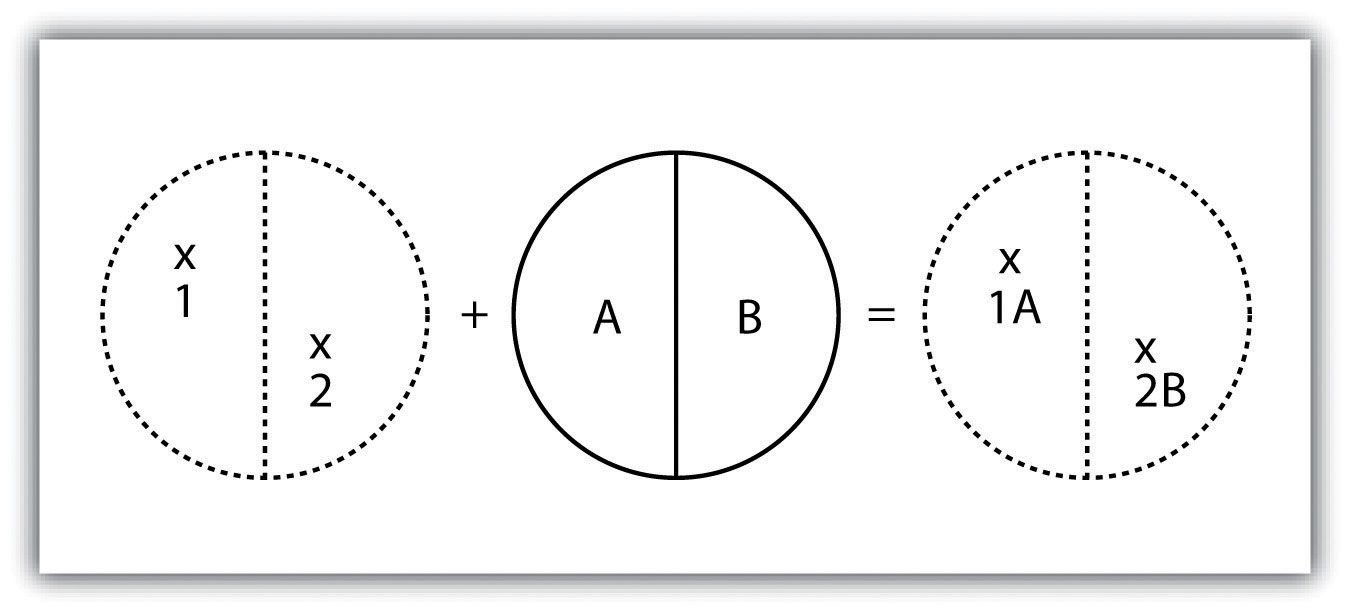
As its name suggests, the polygon-on-point overlay operation is the opposite of the point-in-polygon operation. In this case, the polygon layer is the input, while the point layer is the overlay. The polygon features that overlay these points are selected and subsequently preserved in the output layer. For example, given a point dataset containing the locales of some type of crime and a polygon dataset representing city blocks, a polygon-on-point overlay operation would allow police to select the city blocks in which crimes have been known to occur and hence determine those locations where an increased police presence may be warranted.
Figure 7.6 Polygon-on-Point Overlay
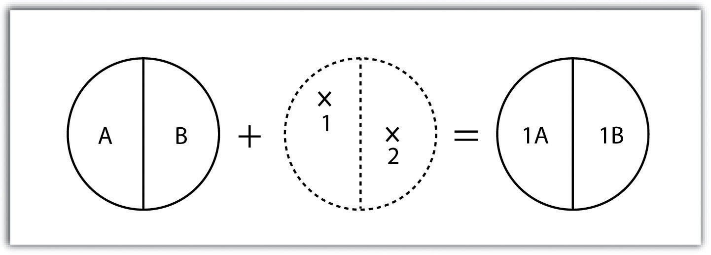
A line-on-line overlay operation requires line features for both the input and overlay layer. The output from this operation is a point or points located precisely at the intersection(s) of the two linear datasets (Figure 7.7 “Line-on-Line Overlay”). For example, a linear feature dataset containing railroad tracks may be overlain on linear road network. The resulting point dataset contains all the locales of the railroad crossings over a town’s road network. The attribute table for this railroad crossing point dataset would contain information on both the railroad and the road over which it passed.
Figure 7.7 Line-on-Line Overlay
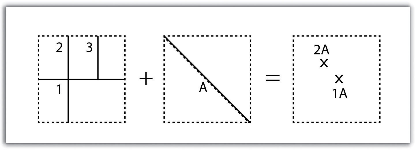
The line-in-polygon overlay operation is similar to the point-in-polygon overlay, with that obvious exception that a line input layer is used instead of a point input layer. In this case, each line that has any part of its extent within the overlay polygon layer will be included in the output line layer, although these lines will be truncated at the boundary of the overlay (Figure 7.9 “Polygon-on-Line Overlay”). For example, a line-in-polygon overlay can take an input layer of interstate line segments and a polygon overlay representing city boundaries and produce a linear output layer of highway segments that fall within the city boundary. The attribute table for the output interstate line segment will contain information on the interstate name as well as the city through which they pass.
Figure 7.8 Line-in-Polygon Overlay
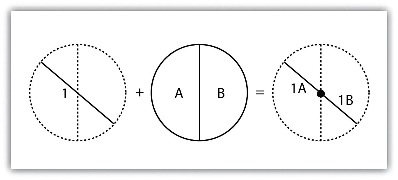
The polygon-on-line overlay operation is the opposite of the line-in-polygon operation. In this case, the polygon layer is the input, while the line layer is the overlay. The polygon features that overlay these lines are selected and subsequently preserved in the output layer. For example, given a layer containing the path of a series of telephone poles/wires and a polygon map contain city parcels, a polygon-on-line overlay operation would allow a land assessor to select those parcels containing overhead telephone wires.
Figure 7.9 Polygon-on-Line Overlay
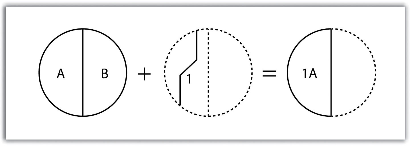
Finally, the polygon-in-polygon overlay operation employs a polygon input and a polygon overlay. This is the most commonly used overlay operation. Using this method, the polygon input and overlay layers are combined to create an output polygon layer with the extent of the overlay. The attribute table will contain spatial data and attribute information from both the input and overlay layers (Figure 7.10 “Polygon-in-Polygon Overlay”). For example, you may choose an input polygon layer of soil types with an overlay of agricultural fields within a given county. The output polygon layer would contain information on both the location of agricultural fields and soil types throughout the county.
Figure 7.10 Polygon-in-Polygon Overlay
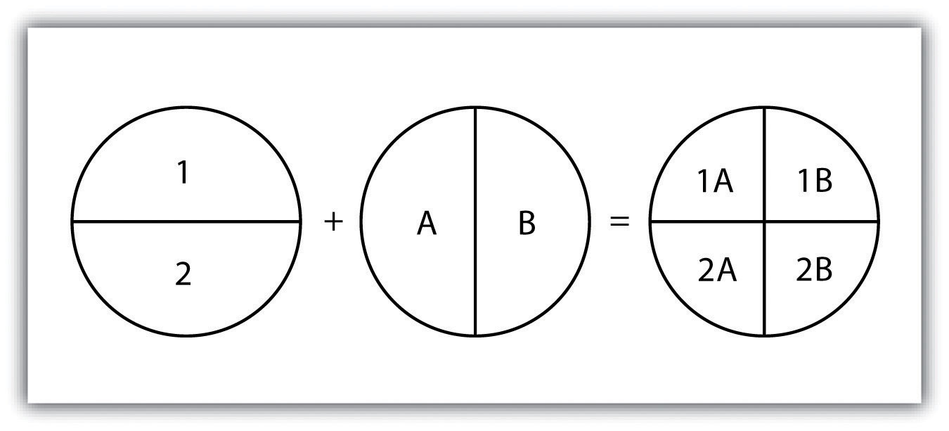
The overlay operations discussed previously assume that the user desires the overlain layers to be combined. This is not always the case. Overlay methods can be more complex than that and therefore employ the basic Boolean operators: AND, OR, and XOR (see Section 6.1.2 “Measures of Central Tendency”). Depending on which operator(s) are utilized, the overlay method employed will result in an intersection, union, symmetrical difference, or identity.
Specifically, the union overlay method employs the OR operator. A union can be used only in the case of two polygon input layers. It preserves all features, attribute information, and spatial extents from both input layers (part (a) of Figure 7.11 “Vector Overlay Methods “). This overlay method is based on the polygon-in-polygon operation described in Section 7.1.1 “Buffering”.
Alternatively, the intersection overlay method employs the AND operator. An intersection requires a polygon overlay, but can accept a point, line, or polygon input. The output layer covers the spatial extent of the overlay and contains features and attributes from both the input and overlay (part (b) of Figure 7.11 “Vector Overlay Methods “).
The symmetrical difference overlay method employs the XOR operator, which results in the opposite output as an intersection. This method requires both input layers to be polygons. The output polygon layer produced by the symmetrical difference method represents those areas common to only one of the feature datasets (part (c) of Figure 7.11 “Vector Overlay Methods “).
In addition to these simple operations, the identity (also referred to as “minus”) overlay method creates an output layer with the spatial extent of the input layer (part (d) of Figure 7.11 “Vector Overlay Methods “) but includes attribute information from the overlay (referred to as the “identity” layer, in this case). The input layer can be points, lines, or polygons. The identity layer must be a polygon dataset.
Figure 7.11 Vector Overlay Methods
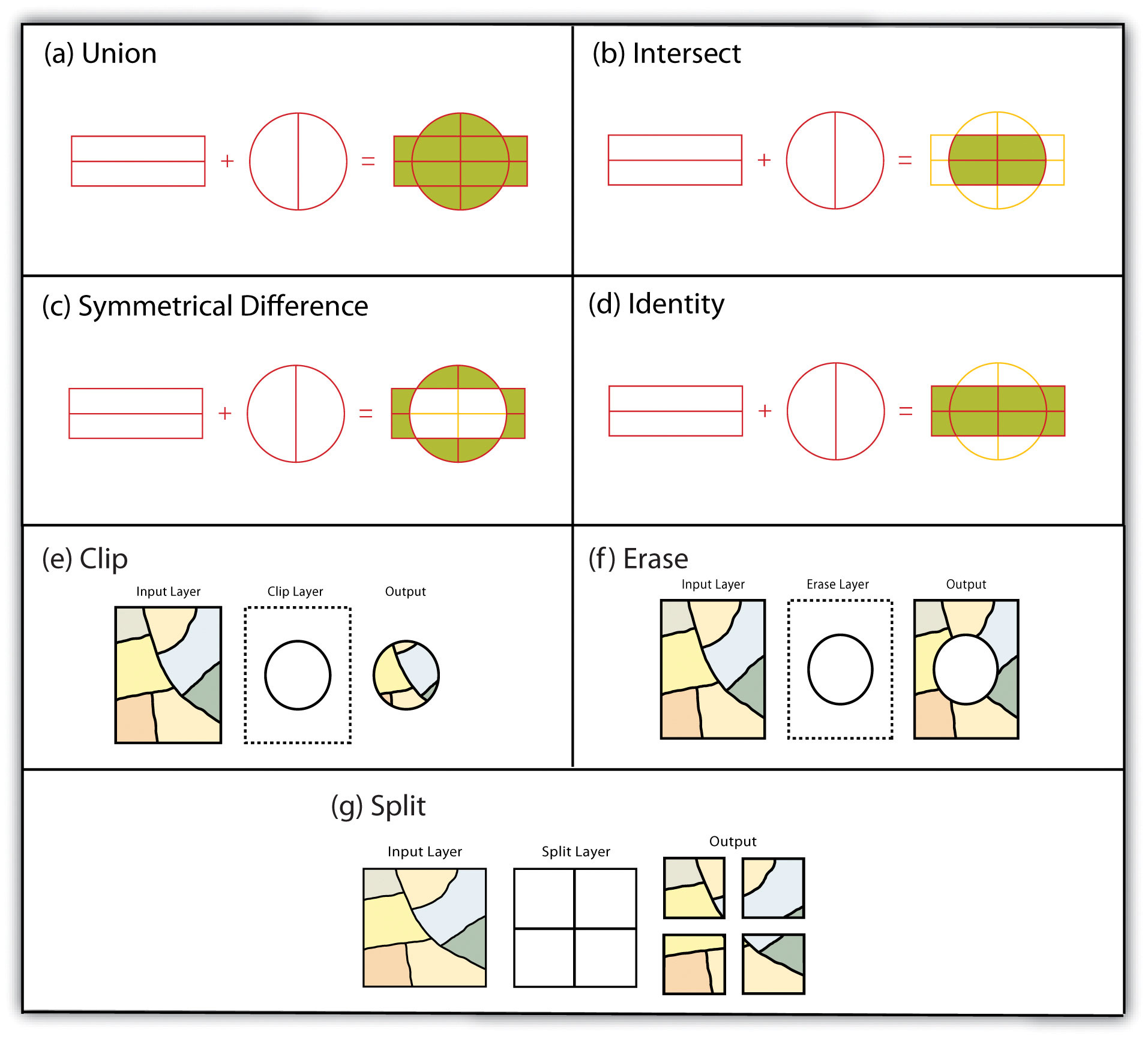
Other Multilayer Geoprocessing Options
In addition to the aforementioned vector overlay methods, other common multiple layer geoprocessing options are available to the user. These included the clip, erase, and split tools. The clip geoprocessing operation is used to extract those features from an input point, line, or polygon layer that falls within the spatial extent of the clip layer (part (e) of Figure 7.11 “Vector Overlay Methods “). Following the clip, all attributes from the preserved portion of the input layer are included in the output. If any features are selected during this process, only those selected features within the clip boundary will be included in the output. For example, the clip tool could be used to clip the extent of a river floodplain by the extent of a county boundary. This would provide county managers with insight into which portions of the floodplain they are responsible to maintain. This is similar to the intersect overlay method; however, the attribute information associated with the clip layer is not carried into the output layer following the overlay.
The erase geoprocessing operation is essentially the opposite of a clip. Whereas the clip tool preserves areas within an input layer, the erase tool preserves only those areas outside the extent of the analogous erase layer (part (f) of Figure 7.11 “Vector Overlay Methods “). While the input layer can be a point, line, or polygon dataset, the erase layer must be a polygon dataset. Continuing with our clip example, county managers could then use the erase tool to erase the areas of private ownership within the county floodplain area. Officials could then focus specifically on public reaches of the countywide floodplain for their upkeep and maintenance responsibilities.
The split geoprocessing operation is used to divide an input layer into two or more layers based on a split layer (part (g) of Figure 7.11 “Vector Overlay Methods “). The split layer must be a polygon, while the input layers can be point, line, or polygon. For example, a homeowner’s association may choose to split up a countywide soil series map by parcel boundaries so each homeowner has a specific soil map for their own parcel.
Spatial Join
A spatial join is a hybrid between an attribute operation and a vector overlay operation. Like the “join” attribute operation described in Section 5.2.2 “Joins and Relates”, a spatial join results in the combination of two feature dataset tables by a common attribute field. Unlike the attribute operation, a spatial join determines which fields from a source layer’s attribute table are appended to the destination layer’s attribute table based on the relative locations of selected features. This relationship is explicitly based on the property of proximity or containment between the source and destination layers, rather than the primary or secondary keys. The proximity option is used when the source layer is a point or line feature dataset, while the containment option is used when the source layer is a polygon feature dataset.
When employing the proximity (or “nearest”) option, a record for each feature in the source layer’s attribute table is appended to the closest given feature in the destination layer’s attribute table. The proximity option will typically add a numerical field to the destination layer attribute table, called “Distance,” within which the measured distance between the source and destination feature is placed. For example, suppose a city agency had a point dataset showing all known polluters in town and a line dataset of all the river segments within the municipal boundary. This agency could then perform a proximity-based spatial join to determine the nearest river segment that would most likely be affected by each polluter.
When using the containment (or “inside”) option, a record for each feature in the polygon source layer’s attribute table is appended to the record in the destination layer’s attribute table that it contains. If a destination layer feature (point, line, or polygon) is not completely contained within a source polygon, no value will be appended. For example, suppose a pool cleaning business wanted to hone its marketing services by providing flyers only to homes that owned a pool. They could obtain a point dataset containing the location of every pool in the county and a polygon parcel map for that same area. That business could then conduct a spatial join to append the parcel information to the pool locales. This would provide them with information on the each land parcel that contained a pool and they could subsequently send their mailers only to those homes.
Overlay Errors
Although overlays are one of the most important tools in a GIS analyst’s toolbox, there are some problems that can arise when using this methodology. In particular, slivers are a common error produced when two slightly misaligned vector layers are overlain (Figure 7.12 “Slivers”). This misalignment can come from several sources including digitization errors, interpretation errors, or source map errors (Chang 2008).Chang, K. 2008. Introduction to Geographic Information Systems. New York: McGraw-Hill. For example, most vegetation and soil maps are created from field survey data, satellite images, and aerial photography. While you can imagine that the boundaries of soils and vegetation frequently coincide, the fact that they were most likely created by different researchers at different times suggests that their boundaries will not perfectly overlap. To ameliorate this problem, GIS software incorporates a cluster tolerance option that forces nearby lines to be snapped together if they fall within a user-specified distance. Care must be taken when assigning cluster tolerance. Too strict a setting will not snap shared boundaries, while too lenient a setting will snap unintended, neighboring boundaries together (Wang and Donaghy 1995).Wang, F., and P. Donaghy. 1995. “A Study of the Impact of Automated Editing on Polygon Overlay Analysis Accuracy.” Computers and Geosciences 21: 1177–85.
Figure 7.12 Slivers
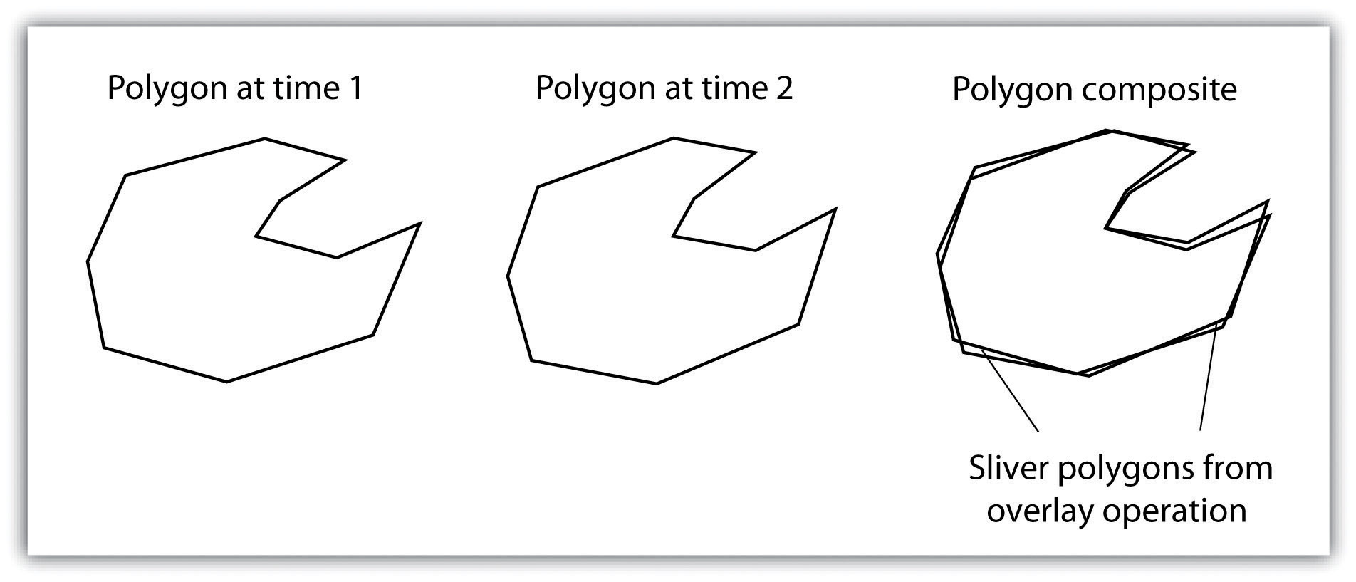
A second potential source of error associated with the overlay process is error propagation. Error propagation arises when inaccuracies are present in the original input and overlay layers and are propagated through to the output layer (MacDougall 1975).MacDougall, E. 1975. “The Accuracy of Map Overlays.” Landscape Planning 2: 23–30. These errors can be related to positional inaccuracies of the points, lines, or polygons. Alternatively, they can arise from attribute errors in the original data table(s). Regardless of the source, error propagation represents a common problem in overlay analysis, the impact of which depends largely on the accuracy and precision requirements of the project at hand.
KEY TAKEAWAYS
- Overlay processes place two or more thematic maps on top of one another to form a new map.
- Overlay operations available for use with vector data include the point-in-polygon, polygon-on-point, line-on-line, line-in-polygon, polygon-on-line, and polygon-in-polygon models.
- Union, intersection, symmetrical difference, and identity are common operations used to combine information from various overlain datasets.
EXERCISES
- From your own field of study, describe three theoretical data layers that could be overlain to create a new, output map that answers a complex spatial question such as, “Where is the best place to put a mall?”
- Go online and find the vector datasets related to the question you just proposed.
Chapter 8Geospatial Analysis II: Raster Data
Following our discussion of attribute and vector data analysis, raster data analysis presents the final powerful data mining tool available to geographers. Raster data are particularly suited to certain types of analyses, such as basic geoprocessing (Section 8.1 “Basic Geoprocessing with Rasters”), surface analysis (Section 8.2 “Scale of Analysis”), and terrain mapping (Section 8.3 “Surface Analysis: Spatial Interpolation”). While not always true, raster data can simplify many types of spatial analyses that would otherwise be overly cumbersome to perform on vector datasets. Some of the most common of these techniques are presented in this chapter.
8.1 Basic Geoprocessing with Rasters
LEARNING OBJECTIVE
- The objective of this section is to become familiar with basic single and multiple raster geoprocessing techniques.
Like the geoprocessing tools available for use on vector datasets (Section 8.1 “Basic Geoprocessing with Rasters”), raster data can undergo similar spatial operations. Although the actual computation of these operations is significantly different from their vector counterparts, their conceptual underpinning is similar. The geoprocessing techniques covered here include both single layer (Section 8.1.1 “Single Layer Analysis”) and multiple layer (Section 8.1.2 “Multiple Layer Analysis”) operations.
Single Layer Analysis
Reclassifying, or recoding, a dataset is commonly one of the first steps undertaken during raster analysis. Reclassification is basically the single layer process of assigning a new class or range value to all pixels in the dataset based on their original values (Figure 8.1 “Raster Reclassification”. For example, an elevation grid commonly contains a different value for nearly every cell within its extent. These values could be simplified by aggregating each pixel value in a few discrete classes (i.e., 0–100 = “1,” 101–200 = “2,” 201–300 = “3,” etc.). This simplification allows for fewer unique values and cheaper storage requirements. In addition, these reclassified layers are often used as inputs in secondary analyses, such as those discussed later in this section.
Figure 8.1 Raster Reclassification
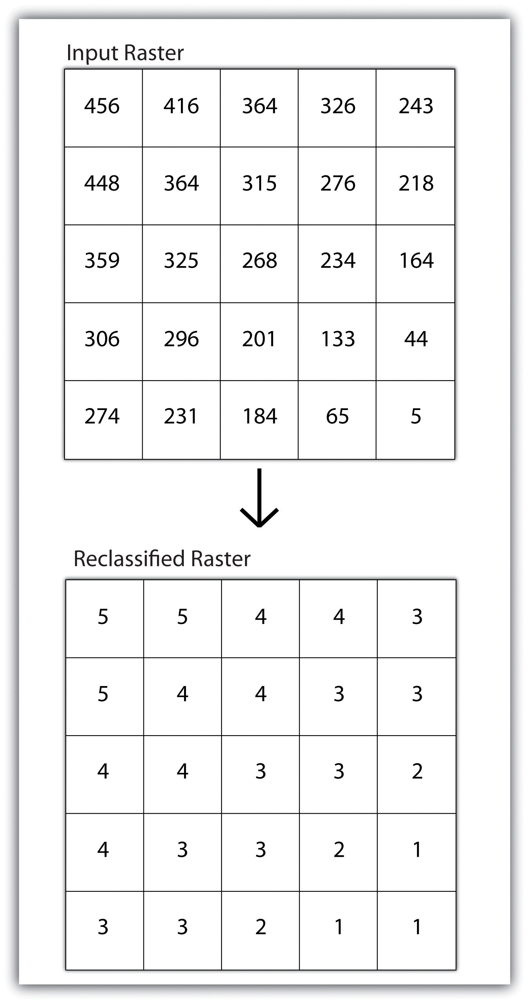
As described in Chapter 7 “Geospatial Analysis I: Vector Operations”, buffering is the process of creating an output dataset that contains a zone (or zones) of a specified width around an input feature. In the case of raster datasets, these input features are given as a grid cell or a group of grid cells containing a uniform value (e.g., buffer all cells whose value = 1). Buffers are particularly suited for determining the area of influence around features of interest. Whereas buffering vector data results in a precise area of influence at a specified distance from the target feature, raster buffers tend to be approximations representing those cells that are within the specified distance range of the target (Figure 8.2 “Raster Buffer around a Target Cell(s)”). Most geographic information system (GIS) programs calculate raster buffers by creating a grid of distance values from the center of the target cell(s) to the center of the neighboring cells and then reclassifying those distances such that a “1” represents those cells composing the original target, a “2” represents those cells within the user-defined buffer area, and a “0” represents those cells outside of the target and buffer areas. These cells could also be further classified to represent multiple ring buffers by including values of “3,” “4,” “5,” and so forth, to represent concentric distances around the target cell(s).
Figure 8.2 Raster Buffer around a Target Cell(s)
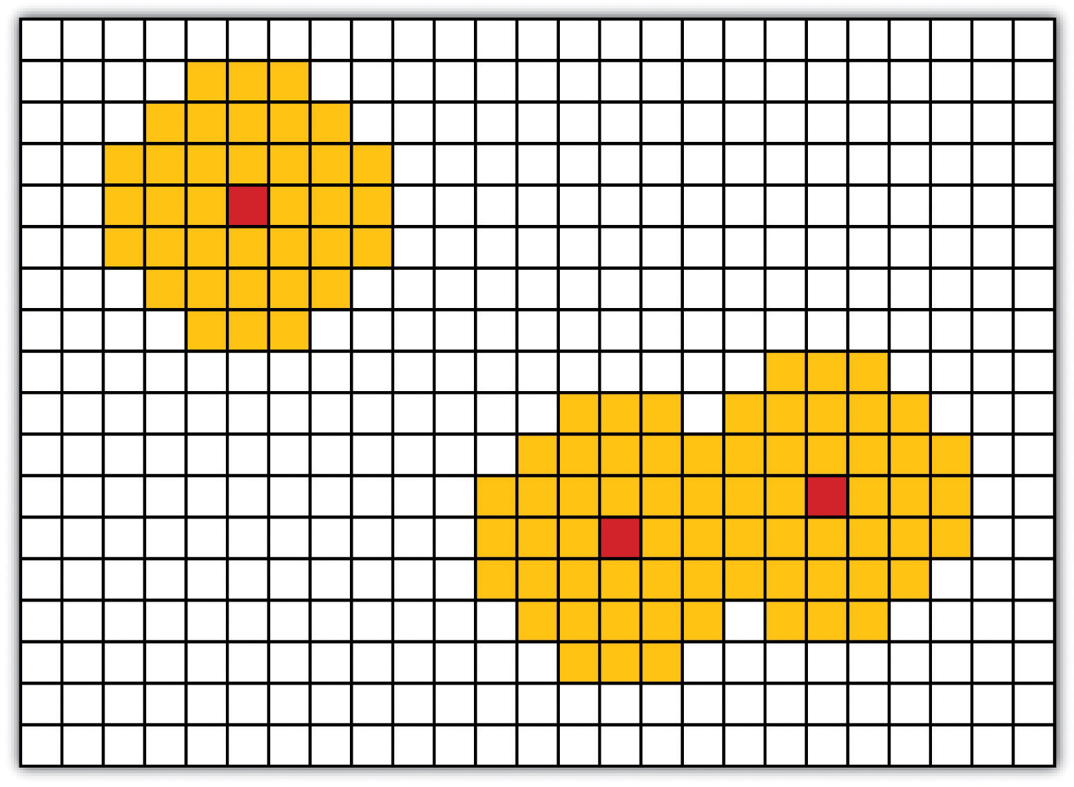
Multiple Layer Analysis
A raster dataset can also be clipped similar to a vector dataset (Figure 8.3 “Clipping a Raster to a Vector Polygon Layer”). Here, the input raster is overlain by a vector polygon clip layer. The raster clip process results in a single raster that is identical to the input raster but shares the extent of the polygon clip layer.
Figure 8.3 Clipping a Raster to a Vector Polygon Layer
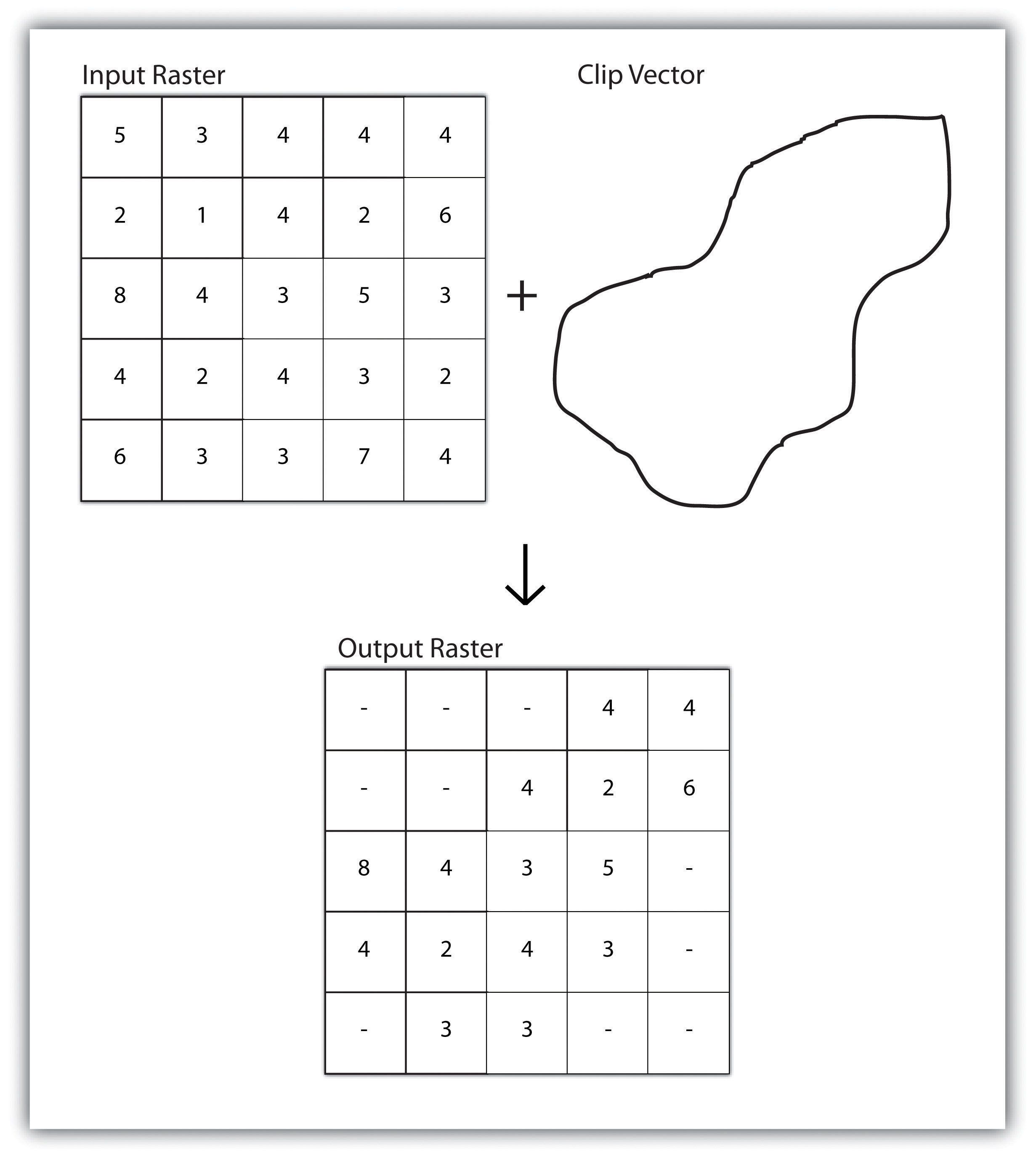
Raster overlays are relatively simple compared to their vector counterparts and require much less computational power (Burroughs 1983).Burroughs, P. 1983. Geographical Information Systems for Natural Resources Assessment. New York: Oxford University Press. Despite their simplicity, it is important to ensure that all overlain rasters are coregistered (i.e., spatially aligned), cover identical areas, and maintain equal resolution (i.e., cell size). If these assumptions are violated, the analysis will either fail or the resulting output layer will be flawed. With this in mind, there are several different methodologies for performing a raster overlay (Chrisman 2002).Chrisman, N. 2002. Exploring Geographic Information Systems. 2nd ed. New York: John Wiley and Sons.
The mathematical raster overlay is the most common overlay method. The numbers within the aligned cells of the input grids can undergo any user-specified mathematical transformation. Following the calculation, an output raster is produced that contains a new value for each cell (Figure 8.4 “Mathematical Raster Overlay”). As you can imagine, there are many uses for such functionality. In particular, raster overlay is often used in risk assessment studies where various layers are combined to produce an outcome map showing areas of high risk/reward.
Figure 8.4 Mathematical Raster Overlay
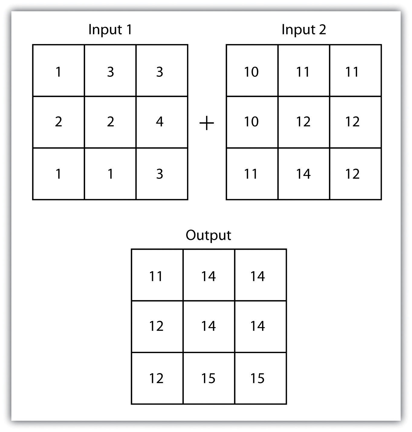
Two input raster layers are overlain to produce an output raster with summed cell values.
The Boolean raster overlay method represents a second powerful technique. As discussed in Chapter 6 “Data Characteristics and Visualization”, the Boolean connectors AND, OR, and XOR can be employed to combine the information of two overlying input raster datasets into a single output raster. Similarly, the relational raster overlay method utilizes relational operators (<, <=, =, <>, >, and =>) to evaluate conditions of the input raster datasets. In both the Boolean and relational overlay methods, cells that meet the evaluation criteria are typically coded in the output raster layer with a 1, while those evaluated as false receive a value of 0.
The simplicity of this methodology, however, can also lead to easily overlooked errors in interpretation if the overlay is not designed properly. Assume that a natural resource manager has two input raster datasets she plans to overlay; one showing the location of trees (“0” = no tree; “1” = tree) and one showing the location of urban areas (“0” = not urban; “1” = urban). If she hopes to find the location of trees in urban areas, a simple mathematical sum of these datasets will yield a “2” in all pixels containing a tree in an urban area. Similarly, if she hopes to find the location of all treeless (or “non-tree,” nonurban areas, she can examine the summed output raster for all “0” entries. Finally, if she hopes to locate urban, treeless areas, she will look for all cells containing a “1.” Unfortunately, the cell value “1” also is coded into each pixel for nonurban, tree cells. Indeed, the choice of input pixel values and overlay equation in this example will yield confounding results due to the poorly devised overlay scheme.
KEY TAKEAWAYS
- Overlay processes place two or more thematic maps on top of one another to form a new map.
- Overlay operations available for use with vector data include the point-in-polygon, line-in-polygon, or polygon-in-polygon models.
- Union, intersection, symmetrical difference, and identity are common operations used to combine information from various overlain datasets.
- Raster overlay operations can employ powerful mathematical, Boolean, or relational operators to create new output datasets.
EXERCISES
- From your own field of study, describe three theoretical data layers that could be overlain to create a new output map that answers a complex spatial question such as, “Where is the best place to put a mall?”
- Go online and find vector or raster datasets related to the question you just posed.
8.2 Scale of Analysis
LEARNING OBJECTIVE
- The objective of this section is to understand how local, neighborhood, zonal, and global analyses can be applied to raster datasets.
Raster analyses can be undertaken on four different scales of operation: local, neighborhood, zonal, and global. Each of these presents unique options to the GIS analyst and are presented here in this section.
Local Operations
Local operations can be performed on single or multiple rasters. When used on a single raster, a local operation usually takes the form of applying some mathematical transformation to each individual cell in the grid. For example, a researcher may obtain a digital elevation model (DEM) with each cell value representing elevation in feet. If it is preferred to represent those elevations in meters, a simple, arithmetic transformation (original elevation in feet * 0.3048 = new elevation in meters) of each cell value can be performed locally to accomplish this task.
When applied to multiple rasters, it becomes possible to perform such analyses as changes over time. Given two rasters containing information on groundwater depth on a parcel of land at Year 2000 and Year 2010, it is simple to subtract these values and place the difference in an output raster that will note the change in groundwater between those two times (Figure 8.5 “Local Operation on a Raster Dataset”). These local analyses can become somewhat more complicated however, as the number of input rasters increase. For example, the Universal Soil Loss Equation (USLE) applies a local mathematical formula to several overlying rasters including rainfall intensity, erodibility of the soil, slope, cultivation type, and vegetation type to determine the average soil loss (in tons) in a grid cell.
Figure 8.5 Local Operation on a Raster Dataset
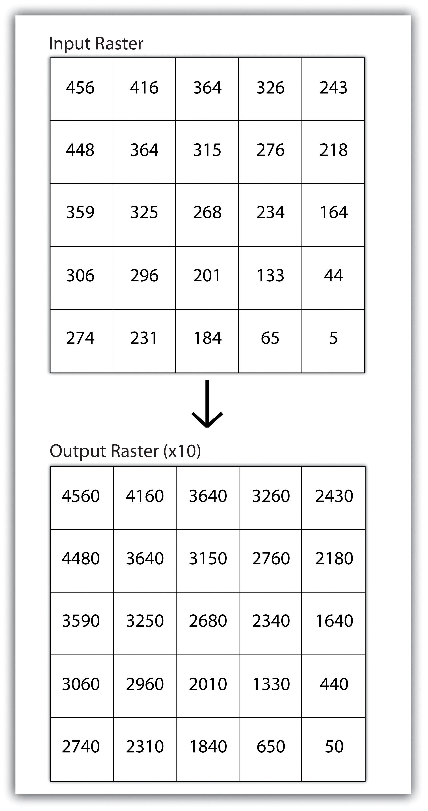
Neighborhood Operations
Tobler’s first law of geography states that “everything is related to everything else, but near things are more related than distant things.” Neighborhood operations represent a group of frequently used spatial analysis techniques that rely heavily on this concept. Neighborhood functions examine the relationship of an object with similar surrounding objects. They can be performed on point, line, or polygon vector datasets as well as on raster datasets. In the case of vector datasets, neighborhood analysis is most frequently used to perform basic searches. For example, given a point dataset containing the location of convenience stores, a GIS could be employed to determine the number of stores within 5 miles of a linear feature (i.e., Interstate 10 in California).
Neighborhood analyses are often more sophisticated when used with raster datasets. Raster analyses employ moving windows, also called filters or kernels, to calculate new cell values for every location throughout the raster layer’s extent. These moving windows can take many different forms depending on the type of output desired and the phenomena being examined. For example, a rectangular, 3-by-3 moving window is commonly used to calculate the mean, standard deviation, sum, minimum, maximum, or range of values immediately surrounding a given “target” cell (Figure 8.6 “Common Neighborhood Types around Target Cell “x”: (a) 3 by 3, (b) Circle, (c) Annulus, (d) Wedge”). The target cell is that cell found in the center of the 3-by-3 moving window. The moving window passes over every cell in the raster. As it passes each central target cell, the nine values in the 3-by-3 window are used to calculate a new value for that target cell. This new value is placed in the identical location in the output raster. If one wanted to examine a larger sphere of influence around the target cells, the moving window could be expanded to 5 by 5, 7 by 7, and so forth. Additionally, the moving window need not be a simple rectangle. Other shapes used to calculate neighborhood statistics include the annulus, wedge, and circle (Figure 8.6 “Common Neighborhood Types around Target Cell “x”: (a) 3 by 3, (b) Circle, (c) Annulus, (d) Wedge”).
Figure 8.6 Common Neighborhood Types around Target Cell “x”: (a) 3 by 3, (b) Circle, (c) Annulus, (d) Wedge
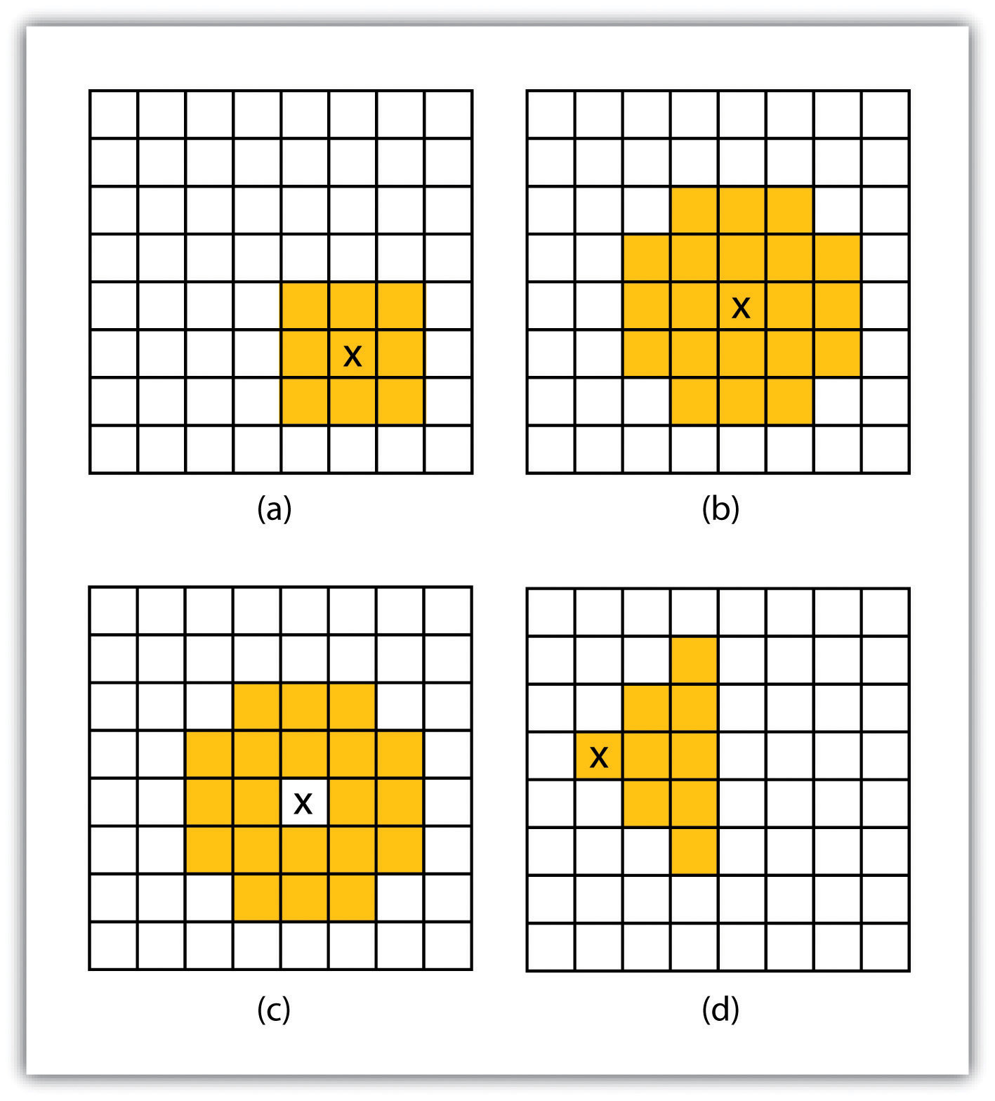
Neighborhood operations are commonly used for data simplification on raster datasets. An analysis that averages neighborhood values would result in a smoothed output raster with dampened highs and lows as the influence of the outlying data values are reduced by the averaging process. Alternatively, neighborhood analyses can be used to exaggerate differences in a dataset. Edge enhancement is a type of neighborhood analysis that examines the range of values in the moving window. A large range value would indicate that an edge occurs within the extent of the window, while a small range indicates the lack of an edge.
Zonal Operations
A zonal operation is employed on groups of cells of similar value or like features, not surprisingly called zones (e.g., land parcels, political/municipal units, waterbodies, soil/vegetation types). These zones could be conceptualized as raster versions of polygons. Zonal rasters are often created by reclassifying an input raster into just a few categories (see Section 8.2.2 “Neighborhood Operations”). Zonal operations may be applied to a single raster or two overlaying rasters. Given a single input raster, zonal operations measure the geometry of each zone in the raster, such as area, perimeter, thickness, and centroid. Given two rasters in a zonal operation, one input raster and one zonal raster, a zonal operation produces an output raster, which summarizes the cell values in the input raster for each zone in the zonal raster (Figure 8.7 “Zonal Operation on a Raster Dataset”).
Figure 8.7 Zonal Operation on a Raster Dataset
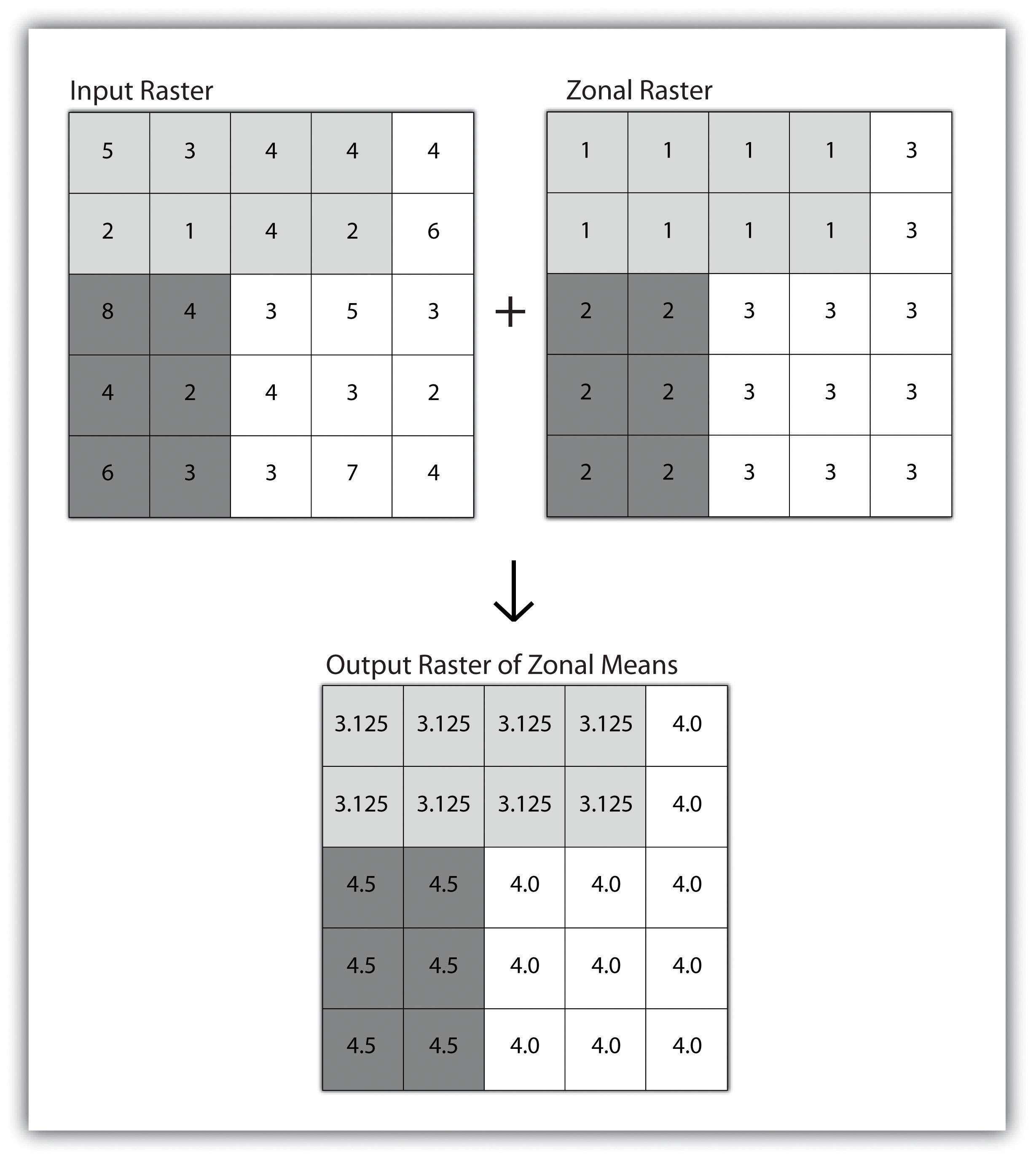
Zonal operations and analyses are valuable in fields of study such as landscape ecology where the geometry and spatial arrangement of habitat patches can significantly affect the type and number of species that can reside in them. Similarly, zonal analyses can effectively quantify the narrow habitat corridors that are important for regional movement of flightless, migratory animal species moving through otherwise densely urbanized areas.
Global Operations
Global operations are similar to zonal operations whereby the entire raster dataset’s extent represents a single zone. Typical global operations include determining basic statistical values for the raster as a whole. For example, the minimum, maximum, average, range, and so forth can be quickly calculated over the entire extent of the input raster and subsequently be output to a raster in which every cell contains that calculated value (Figure 8.8 “Global Operation on a Raster Dataset”).
Figure 8.8 Global Operation on a Raster Dataset
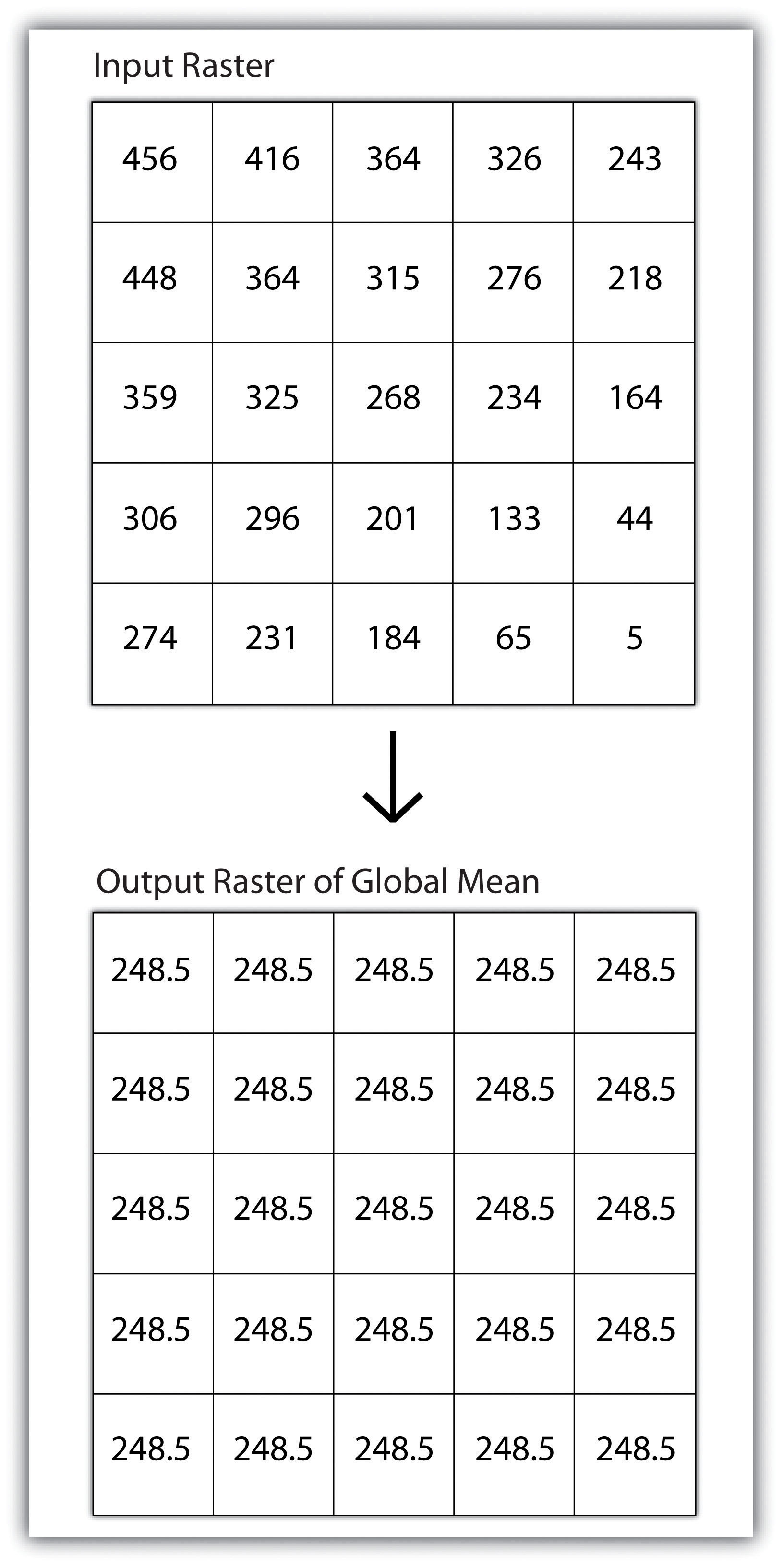
KEY TAKEAWAYS
- Local raster operations examine only a single target cell during analysis.
- Neighborhood raster operations examine the relationship of a target cell proximal surrounding cells.
- Zonal raster operations examine groups of cells that occur within a uniform feature type.
- Global raster operations examine the entire areal extent of the dataset.
EXERCISE
- What are the four neighborhood shapes described in this chapter? Although not discussed here, can you think of specific situations for which each of these shapes could be used?
8.3 Surface Analysis: Spatial Interpolation
LEARNING OBJECTIVE
- The objective of this section is to become familiar with concepts and terms related to GIS surfaces, how to create them, and how they are used to answer specific spatial questions.
A surface is a vector or raster dataset that contains an attribute value for every locale throughout its extent. In a sense, all raster datasets are surfaces, but not all vector datasets are surfaces. Surfaces are commonly used in a geographic information system (GIS) to visualize phenomena such as elevation, temperature, slope, aspect, rainfall, and more. In a GIS, surface analyses are usually carried out on either raster datasets or TINs (Triangular Irregular Network; Chapter 5 “Geospatial Data Management”, Section 5.3.1 “Vector File Formats”), but isolines or point arrays can also be used. Interpolation is used to estimate the value of a variable at an unsampled location from measurements made at nearby or neighboring locales. Spatial interpolation methods draw on the theoretical creed of Tobler’s first law of geography, which states that “everything is related to everything else, but near things are more related than distant things.” Indeed, this basic tenet of positive spatial autocorrelation forms the backbone of many spatial analyses (Figure 8.9 “Positive and Negative Spatial Autocorrelation”).
Figure 8.9 Positive and Negative Spatial Autocorrelation
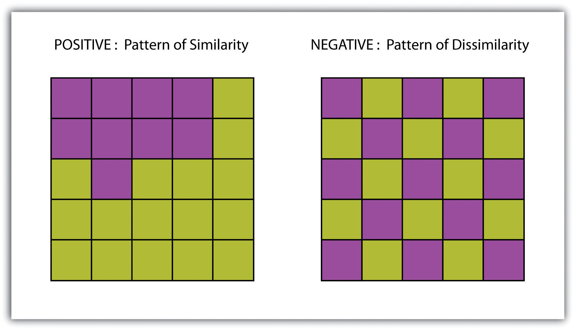
Creating Surfaces
The ability to create a surface is a valuable tool in a GIS. The creation of raster surfaces, however, often starts with the creation of a vector surface. One common method to create such a vector surface from point data is via the generation of Thiessen (or Voronoi) polygons. Thiessen polygons are mathematically generated areas that define the sphere of influence around each point in the dataset relative to all other points (Figure 8.10 “A Vector Surface Created Using Thiessen Polygons”). Specifically, polygon boundaries are calculated as the perpendicular bisectors of the lines between each pair of neighboring points. The derived Thiessen polygons can then be used as crude vector surfaces that provide attribute information across the entire area of interest. A common example of Thiessen polygons is the creation of a rainfall surface from an array of rain gauge point locations. Employing some basic reclassification techniques, these Thiessen polygons can be easily converted to equivalent raster representations.
Figure 8.10 A Vector Surface Created Using Thiessen Polygons
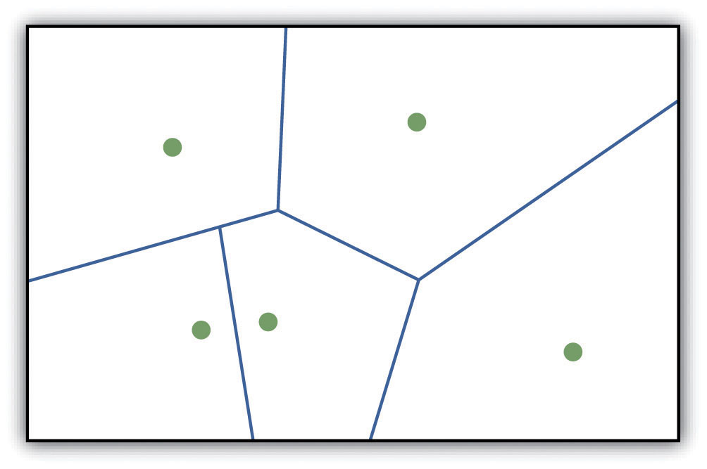
While the creation of Thiessen polygons results in a polygon layer whereby each polygon, or raster zone, maintains a single value, interpolation is a potentially complex statistical technique that estimates the value of all unknown points between the known points. The three basic methods used to create interpolated surfaces are spline, inverse distance weighting (IDW), and trend surface. The spline interpolation method forces a smoothed curve through the set of known input points to estimate the unknown, intervening values. IDW interpolation estimates the values of unknown locations using the distance to proximal, known values. The weight placed on the value of each proximal value is in inverse proportion to its spatial distance from the target locale. Therefore, the farther the proximal point, the less weight it carries in defining the target point’s value. Finally, trend surface interpolation is the most complex method as it fits a multivariate statistical regression model to the known points, assigning a value to each unknown location based on that model.
Other highly complex interpolation methods exist such as kriging. Kriging is a complex geostatistical technique, similar to IDW, that employs semivariograms to interpolate the values of an input point layer and is more akin to a regression analysis (Krige 1951).Krige, D. 1951. A Statistical Approach to Some Mine Valuations and Allied Problems at the Witwatersrand. Master’s thesis. University of Witwatersrand. The specifics of the kriging methodology will not be covered here as this is beyond the scope of this text. For more information on kriging, consult review texts such as Stein (1999).Stein, M. 1999. Statistical Interpolation of Spatial Data: Some Theories for Kriging. New York: Springer.
Inversely, raster data can also be used to create vector surfaces. For instance, isoline maps are made up of continuous, nonoverlapping lines that connect points of equal value. Isolines have specific monikers depending on the type of information they model (e.g., elevation = contour lines, temperature = isotherms, barometric pressure = isobars, wind speed = isotachs) Figure 8.11 “Contour Lines Derived from a DEM” shows an isoline elevation map. As the elevation values of this digital elevation model (DEM) range from 450 to 950 feet, the contour lines are placed at 500, 600, 700, 800, and 900 feet elevations throughout the extent of the image. In this example, the contour interval, defined as the vertical distance between each contour line, is 100 feet. The contour interval is determined by the user during the creating of the surface.
Figure 8.11 Contour Lines Derived from a DEM
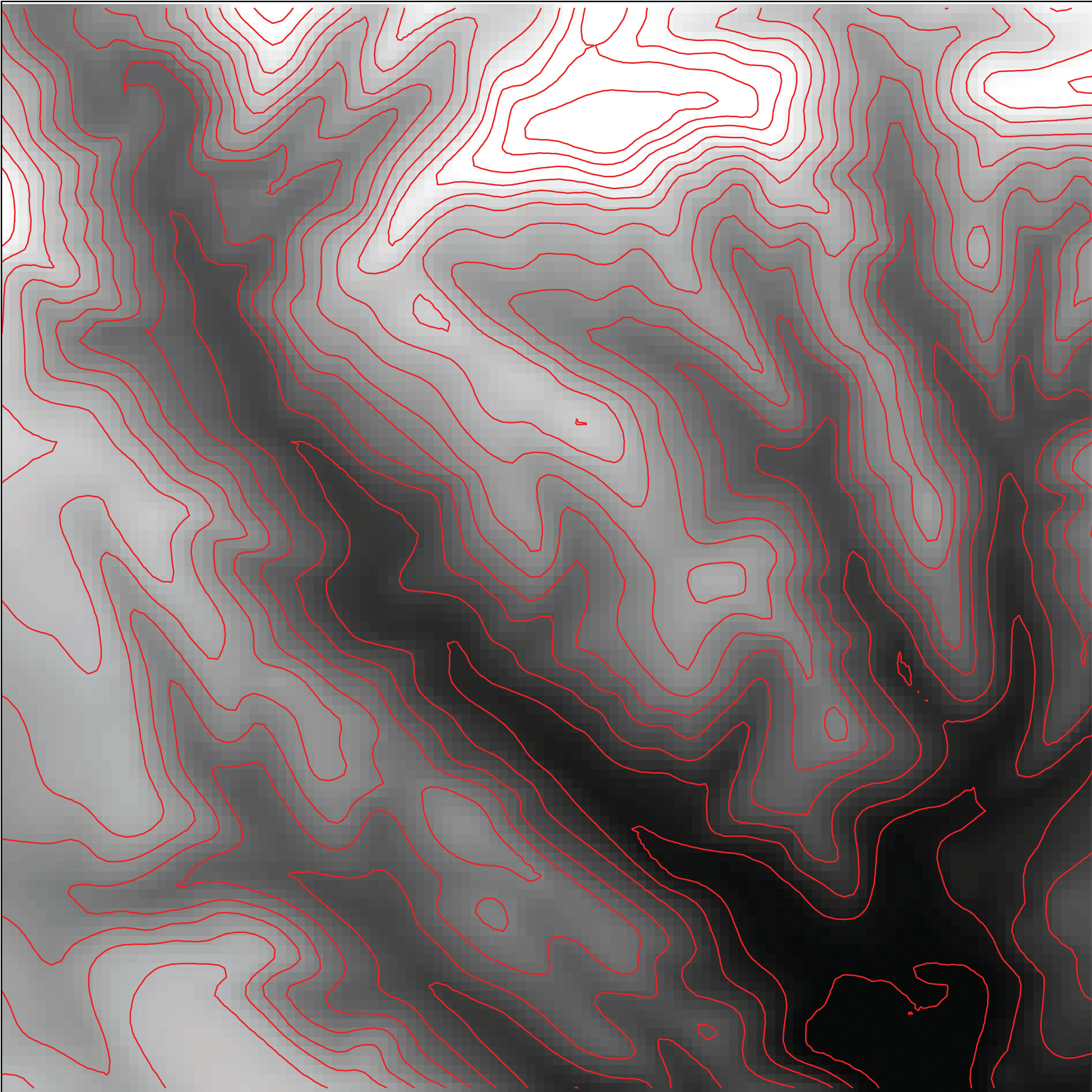
KEY TAKEAWAYS
- Spatial interpolation is used to estimate those unknown values found between known data points.
- Spatial autocorrelation is positive when mapped features are clustered and is negative when mapped features are uniformly distributed.
- Thiessen polygons are a valuable tool for converting point arrays into polygon surfaces.
EXERCISES
- Give an example of five phenomena in the real world that exhibit positive spatial autocorrelation.
- Give an example of five phenomena in the real world that exhibit negative spatial autocorrelation.
8.4 Surface Analysis: Terrain Mapping
LEARNING OBJECTIVE
- The objective of this section is to learn to apply basic raster surface analyses to terrain mapping applications.
Surface analysis is often referred to as terrain (elevation) analysis when information related to slope, aspect, viewshed, hydrology, volume, and so forth are calculated on raster surfaces such as DEMs (digital elevation models; Chapter 5 “Geospatial Data Management”, Section 5.3.1 “Vector File Formats”). In addition, surface analysis techniques can also be applied to more esoteric mapping efforts such as probability of tornados or concentration of infant mortalities in a given region. In this section we discuss a few methods for creating surfaces and common surface analysis techniques related to terrain datasets.
Several common raster-based neighborhood analyses provide valuable insights into the surface properties of terrain. Slope maps (part (a) of Figure 8.12 “(a) Slope, (b) Aspect, and (c and d) Hillshade Maps”) are excellent for analyzing and visualizing landform characteristics and are frequently used in conjunction with aspect maps (defined later) to assess watershed units, inventory forest resources, determine habitat suitability, estimate slope erosion potential, and so forth. They are typically created by fitting a planar surface to a 3-by-3 moving window around each target cell. When dividing the horizontal distance across the moving window (which is determined via the spatial resolution of the raster image) by the vertical distance within the window (measure as the difference between the largest cell value and the central cell value), the slope is relatively easily obtained. The output raster of slope values can be calculated as either percent slope or degree of slope.
Any cell that exhibits a slope must, by definition, be oriented in a known direction. This orientation is referred to as aspect. Aspect maps (part (b) of Figure 8.12 “(a) Slope, (b) Aspect, and (c and d) Hillshade Maps”) use slope information to produce output raster images whereby the value of each cell denotes the direction it faces. This is usually coded as either one of the eight ordinal directions (north, south, east, west, northwest, northeast, southwest, southeast) or in degrees from 1° (nearly due north) to 360° (back to due north). Flat surfaces have no aspect and are given a value of −1. To calculate aspect, a 3-by-3 moving window is used to find the highest and lowest elevations around the target cell. If the highest cell value is located at the top-left of the window (“top” being due north) and the lowest value is at the bottom-right, it can be assumed that the aspect is southeast. The combination of slope and aspect information is of great value to researchers such as botanists and soil scientists because sunlight availability varies widely between north-facing and south-facing slopes. Indeed, the various light and moisture regimes resulting from aspect changes encourage vegetative and edaphic differences.
A hillshade map (part (c) of Figure 8.12 “(a) Slope, (b) Aspect, and (c and d) Hillshade Maps”) represents the illumination of a surface from some hypothetical, user-defined light source (presumably, the sun). Indeed, the slope of a hill is relatively brightly lit when facing the sun and dark when facing away. Using the surface slope, aspect, angle of incoming light, and solar altitude as inputs, the hillshade process codes each cell in the output raster with an 8-bit value (0–255) increasing from black to white. As you can see in part (c) of Figure 8.12 “(a) Slope, (b) Aspect, and (c and d) Hillshade Maps”, hillshade representations are an effective way to visualize the three-dimensional nature of land elevations on a two-dimensional monitor or paper map. Hillshade maps can also be used effectively as a baseline map when overlain with a semitransparent layer, such as a false-color digital elevation model (DEM; part (d) of Figure 8.12 “(a) Slope, (b) Aspect, and (c and d) Hillshade Maps”).
Figure 8.12 (a) Slope, (b) Aspect, and (c and d) Hillshade Maps
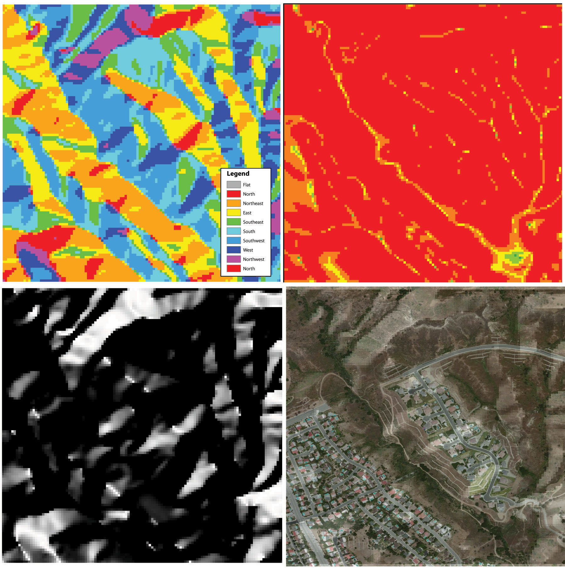
Source: Data available from U.S. Geological Survey, Earth Resources Observation and Science (EROS) Center, Sioux Falls, SD.
Viewshed analysis is a valuable visualization technique that uses the elevation value of cells in a DEM or TIN (Triangulated Irregular Network) to determine those areas that can be seen from one or more specific location(s) (part (a) of Figure 8.13 “(a) Viewshed and (b) Watershed Maps”). The viewing location can be either a point or line layer and can be placed at any desired elevation. The output of the viewshed analysis is a binary raster that classifies cells as either 1 (visible) or 0 (not visible). In the case of two viewing locations, the output raster values would be 2 (visible from both points), 1 (visible from one point), or 0 (not visible from either point).
Additional parameters influencing the resultant viewshed map are the viewing azimuth (horizontal and/or vertical) and viewing radius. The horizontal viewing azimuth is the horizontal angle of the view area and is set to a default value of 360°. The user may want to change this value to 90° if, for example, the desired viewshed included only the area that could be seen from an office window. Similarly, vertical viewing angle can be set from 0° to 180°. Finally, the viewing radius determines the distance from the viewing location that is to be included in the output. This parameter is normally set to infinity (functionally, this includes all areas within the DEM or TIN under examination). It may be decreased if, for instance, you only wanted to include the area within the 100 km broadcast range of a radio station.
Similarly, watershed analyses are a series of surface analysis techniques that define the topographic divides that drain surface water for stream networks (part (b) of Figure 8.13 “(a) Viewshed and (b) Watershed Maps”). In geographic information systems (GISs), a watershed analysis is based on input of a “filled” DEM. A filled DEM is one that contains no internal depressions (such as would be seen in a pothole, sink wetland, or quarry). From these inputs, a flow direction raster is created to model the direction of water movement across the surface. From the flow direction information, a flow accumulation raster calculates the number of cells that contribute flow to each cell. Generally speaking, cells with a high value of flow accumulation represent stream channels, while cells with low flow accumulation represent uplands. With this in mind, a network of rasterized stream segments is created. These stream networks are based on some user-defined minimum threshold of flow accumulation. For example, it may be decided that a cell needs at least one thousand contributing cells to be considered a stream segment. Altering this threshold value will change the density of the stream network. Following the creation of the stream network, a stream link raster is calculated whereby each stream segment (line) is topologically connected to stream intersections (nodes). Finally, the flow direction and stream link raster datasets are combined to determine the output watershed raster as seen in part (b) of Figure 8.13 “(a) Viewshed and (b) Watershed Maps”(Chang 2008).Chang, K. 2008. Introduction to Geographic Information Systems. New York: McGraw-Hill. Such analyses are invaluable for watershed management and hydrologic modeling.
Figure 8.13 (a) Viewshed and (b) Watershed Maps
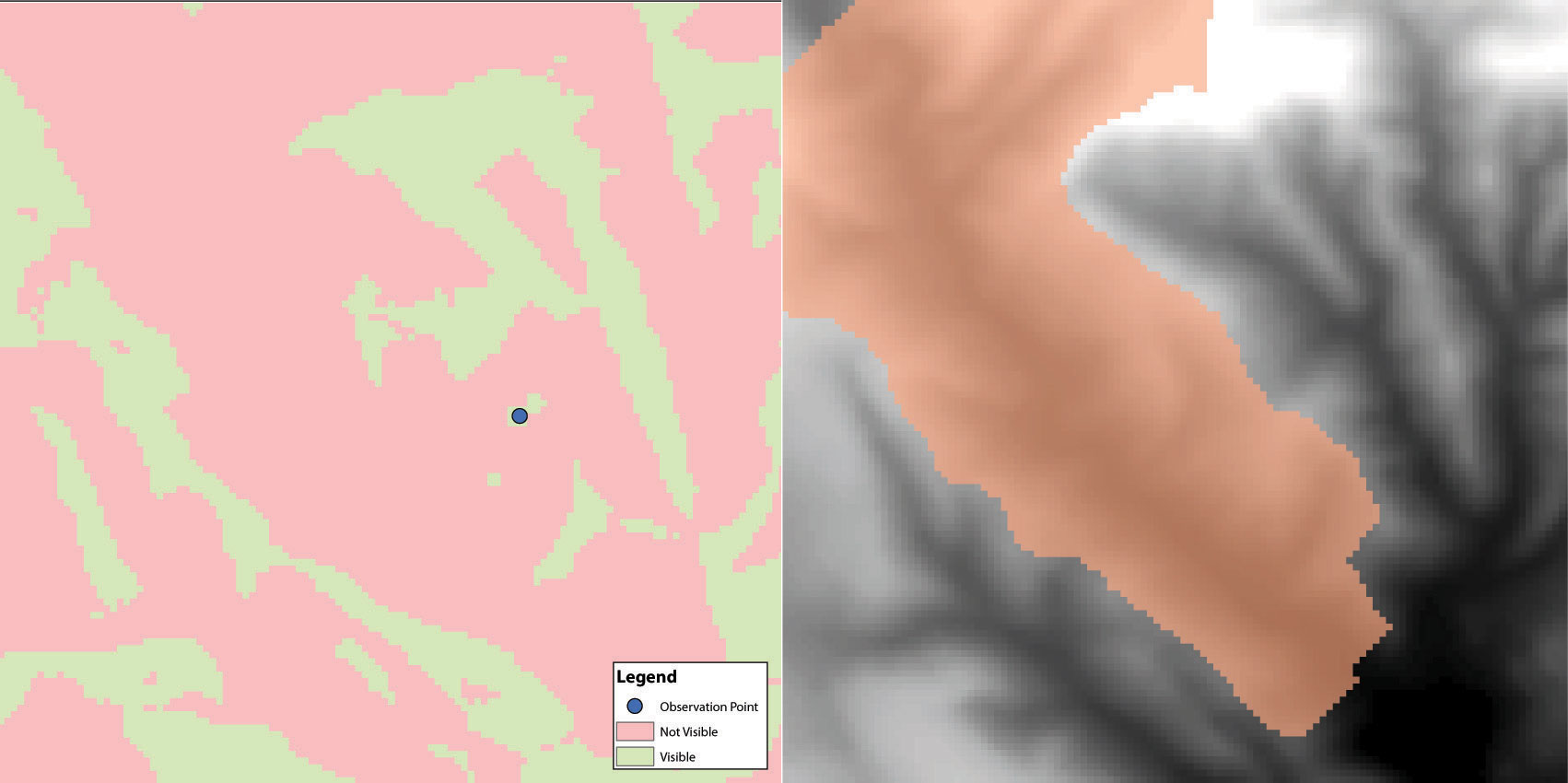
Source: Data available from U.S. Geological Survey, Earth Resources Observation and Science (EROS) Center, Sioux Falls, SD.
KEY TAKEAWAY
- Nearest neighborhood functions are frequently used to on raster surfaces to create slope, aspect, hillshade, viewshed, and watershed maps.
EXERCISES
- How are slope and aspect maps utilized in the creation of a hillshade map?
- If you were going to build a new home, how might you use a viewshed map to assist your effort?
Chapter 9Cartographic Principles
From projections to data management to spatial analysis, we have up to now focused on the more technical points of a geographic information system (GIS). This chapter is concerned less with the computational options available to the GIS user and more with the artistic options. In essence, this chapter shifts the focus away from GIS tools and toward cartographic tools, although the two are becoming more and more inextricably bound. Unfortunately, many GIS users are never exposed to the field of cartography. In these cases, the hard work of creating, maintaining, aligning, and analyzing complex spatial datasets are not truly appreciated as the final mapping product may not adequately communicate this information to the consumer. In addition, maps, like statistics, can be used to distort information, as illustrated by Mark Monmonier’s (1996)Monmonier, M. 1996. How to Lie with Maps. 2nd ed. Chicago: University of Chicago Press. book titled How to Lie with Maps. Indeed, a strong working knowledge of cartographic rules will not only assist in the avoidance of potential misrepresentation of spatial information but also enhance one’s ability to identify these indiscretions in other cartographers’ creations. The cartographic principles discussed herein are laid out to guide GIS users through the process of transforming accumulated bits of GIS data into attractive, usefulmaps for print and display. This discussion specifically addresses the intricacies of effective color usage (Section 9.1 “Color”), symbol selection (Section 9.2 “Symbology”), and map layout and design (Section 9.3 “Cartographic Design”).
9.1 Color
LEARNING OBJECTIVE
- The objective of this section is to gain an understanding the properties of color and how best to utilize them in your cartographic products.
Although a high-quality map is composed of many different elements, color is one of the first components noticed by end-users. This is partially due to the fact that we each have an intuitive understanding of how colors are, and should be, used to create an effective and pleasing visual experience. Nevertheless, it is not always clear to the map-maker which colors should be used to best convey the purpose of the product. This intuition is much like listening to our favorite music. We know when a note is in tune or out of tune, but we wouldn’t necessarily have any idea of how to fix a bad note. Color is indeed a tricky piece of the cartographic puzzle and is not surprisingly the most frequently criticized variable on computer-generated maps (Monmonier 1996).Monmonier, M. 1996. How to Lie with Maps. 2nd ed. Chicago: University of Chicago Press. This section attempts to outline the basic components of color and the guidelines to most effectively employ this important map attribute.
Color Basics
As electromagnetic radiation (ER) travels via waves from the sun (or a lightbulb) to objects on the earth, portions of the ER spectrum are absorbed, scattered, or reflected by various objects. The resulting property of the absorbed, scattered, and reflected ER is termed “color.” White is the color resulting from the full range of the visual spectrum and is therefore considered the benchmark color by which all others are measured. Black is the absence of ER. All other colors result from a partial interaction with the ER spectrum.
The three primary aspects of color that must be addressed in map making are hue, value, and saturation. Hue is the dominant wavelength or color associated with a reflecting object. Hue is the most basic component of color and includes red, blue, yellow, purple, and so forth. Value is the amount of white or black in the color. Value is often synonymous with contrast. Variations in the amount of value for a given hue result in varying degrees of lightness or darkness for that color. Lighter colors are said to possess high value, while dark colors possess low value. Monochrome colors are groups of colors with the same hue but with incremental variations in value. As seen in Figure 9.1 “Value”, variations in value will typically lead the viewer’s eye from dark areas to light areas.
Figure 9.1 Value
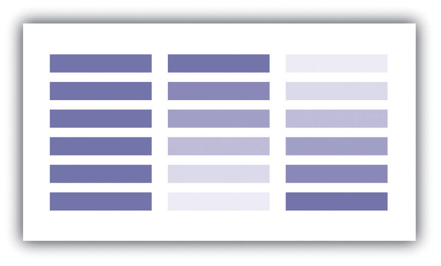
Saturation describes the intensity of color. Full saturation results in pure colors, while low saturation colors approach gray. Variations in saturation yield different shades and tints. Shades are produced by blocking light, such as by an umbrella, tree, curtain, and so forth. Increasing the amount of shading results in grays and blacks. Tint is the opposite of shade and is produced by adding white to a color. Tints and shades are particularly germane when using additive color models (see Section 9.1.2 “Color Models” for more on additive color models). To maximize the interpretability of a map, use saturated colors to represent hierarchically prominent features and washed-out colors to represent background features.
If used properly, color can greatly enhance and support map design. Likewise, color can detract from a mapping product if abused. To use color properly, one must first consider the purpose of the map. In some cases, the use of color is not warranted. Grayscale maps can be just as effective as color maps if the subject matter merits it. Regardless, there are many reasons to use color. The five primary reasons are outlined here.
Color is particularly suited to convey meaning (Figure 9.2 “Use of Color to Provide Meaning”). For example, red is a strong color that evokes a passionate response in humans. Red has been shown to evoke physiological responses such as increasing the rate of respiration and raising blood pressure. Red is frequently associated with blood, war, violence, even love. On the other hand, blue is a color associated with calming effects. Associated with the sky or ocean, blue colors can actually assist in sleep and is therefore a recommended color for bedrooms. Too much blue, however, can result in a lapse from calming effects into feelings of depression (i.e., having the “blues”). Green is most commonly associated with life or nature (plants). The color green is certainly one of the most topical colors in today’s society with commonplace references to green construction, the Green party, going green, and so forth. Green, however, can also represent envy and inexperience (e.g., the green-eyed monster, greenhorn). Brown is also a nature color but more as a representation of earth and stone. Brown can also imply dullness. Yellow is most commonly associated with sunshine and warmth, somewhat similar to red. Yellow can also represent cowardice (e.g., yellow-bellied). Black, the absence of color, is possibly the most meaning-laden color in modern parlance. Even more than the others, the color black purports surprisingly strong positive and negative connotations. Black conveys mystery, elegance, and sophistication (e.g., a black-tie affair, in the black), while also conveying loss, evil, and negativity (e.g., blackout, black-hearted, black cloud, blacklist).
Figure 9.2 Use of Color to Provide Meaning
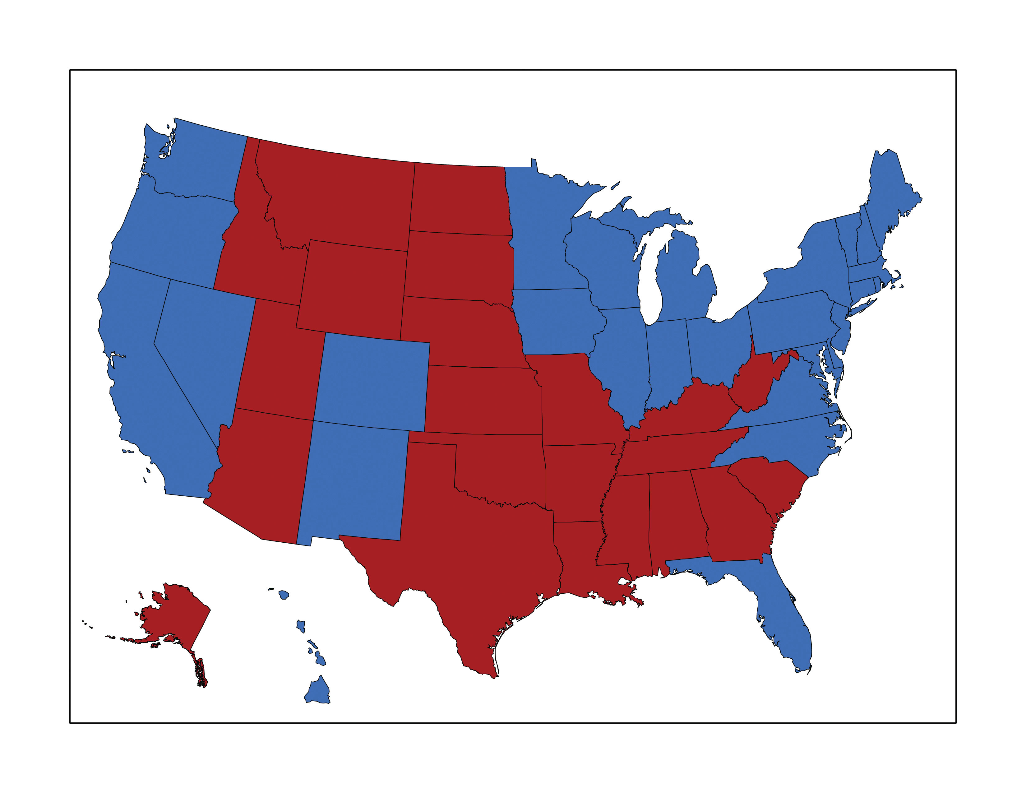
In this map, red counties are those that voted for the Republican Party in the 2004 presidential election, while blue counties voted Democrat. These colors are typically used to designate the Democratic and Republican Parties.
The second reason to use color is for clarification and emphasis (Figure 9.3 “Use of Color to Provide Emphasis”). Warm colors, such as reds and yellows, are notable for emphasizing spatial features. These colors will often jump off the page and are usually the first to attract the reader’s eye, particularly if they are counterbalanced with cool colors, such as blues and greens (see Section 9.1.3 “Color Choices” for more on warm and cool colors). In addition, the use of a hue with high saturation will stand out starkly against similar hues of low saturation.
Figure 9.3 Use of Color to Provide Emphasis
Red marks the spot!
Color use is also important for creating a map with pleasing aesthetics (Figure 9.4 “Use of Color to Provide Aesthetics”). Certainly, one of the most challenging aspects of map creation is developing an effective color palette. When looking at maps through an aesthetic lens, we are truly starting to think of our creations as artwork. Although somewhat particular to individual viewers, we all have an innate understanding of when colors in a graphic/art are aesthetically pleasing and when they are not. For example, color use is considered harmonious when colors from opposite sides of the color wheel are used (Section 9.1.3 “Color Choices”), whereas equitable use of several major hues can create an unbalanced image.
Figure 9.4 Use of Color to Provide Aesthetics

The fourth use of color is abstraction (Figure 9.5 “Use of Color to Provide Abstraction”). Color abstraction is an effective way to illustrate quantitative and qualitative data, particularly for thematic products such as choropleth maps. Here, colors are used solely to denote different values for a variable and may not have any particular rhyme or reason. Figure 9.5 “Use of Color to Provide Abstraction” shows a typical thematic map with abstract colors representing different countries.
Figure 9.5 Use of Color to Provide Abstraction
Opposite abstraction, color can also be used to represent reality (Figure 9.6). Maps showing elevation (e.g., digital elevation models or DEMs) are often given false colors that approximate reality. Low areas are colored in variations of green to show areas of lush vegetation growth. Mid-elevations (or low-lying desert areas) are colored brown to show sparse vegetation growth. Mountain ridges and peaks are colored white to show accumulated snowfall. Watercourses and water bodies are colored blue. Unless there is a specific reason not to, natural phenomena represented on maps should always be colored to approximate their actual color to increase interpretability and to decrease confusion.
Figure 9.6
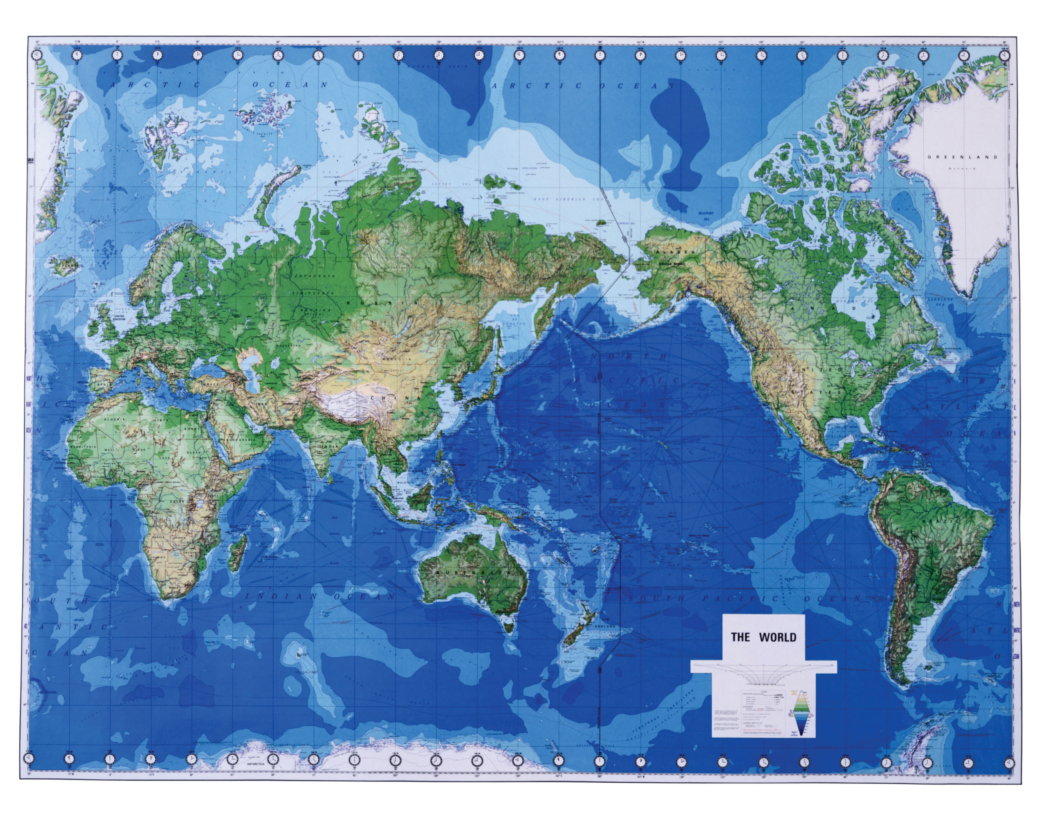
Greens, blues, and browns are used to imitate real-world phenomena.
Color Models
Color models are systems that allow for the creation of a range of colors from a short list of primary colors. Color models can be additive or subtractive. Additive color models combine emitted light to display color variations and are commonly used with computer monitors, televisions, scanners, digital cameras, and video projectors. The RGB (red-green-blue) color model is the most common additive model (part (a) of Figure 9.7 “Additive Color Models: (a) RGB, (b) HSL, and (c) HSV”). The RGB model combines light beams of the primary hues of red, green, and blue to yield additive secondary hues of magenta, cyan, and yellow. Although there is a substantive difference between pure yellow light (~580 nm) and a mixture of green and red light, the human eye perceives these signals as the same. The RGB model typically employs three 8-bit numeric values (called an RGB triplet) ranging from 0 to 255 to model colors. For instance, the RGB triplets for the pure primary and secondary colors are as follows:
- Red = (255, 0, 0)
- Green = (0, 255, 0)
- Blue = (0, 0, 255)
- Magenta = (255, 0, 255)
- Cyan = (0, 255, 255)
- Yellow = (255, 255, 0)
- Black, the absence of additive color = (0, 0, 0)
- White, the sum of all additive color = (255, 255, 255)
Two other common additive color models, based on the RGB model, are the HSL (hue, saturation, lightness) and HSV (hue, saturation, value) models (Figure 9.7 “Additive Color Models: (a) RGB, (b) HSL, and (c) HSV”, b and c). These models are based on cylindrical coordinate systems whereby the angle around the central vertical axis corresponds to the hue; the distance from the central axis corresponds to saturation; and the distance along the central axis corresponds to either saturation or lightness. Because of their basis in the RGB model, both the HSL and HSV color models can be directly transformed between the three additive models. While these relatively simple additive models provide minimal computer-processing time, they do possess the disadvantage of glossing over some of the complexities of color. For example, the RGB color model does not define “absolute” color spaces, which connotes that these hues may look differently when viewed on different displays. Also, the RGB hues are not evenly spaced along the color spectrum, meaning combinations of the hues is less than exact.
Figure 9.7 Additive Color Models: (a) RGB, (b) HSL, and (c) HSV
In contrast to an additive model, subtractive color models involve the mixing of paints, dyes, or inks to create full color ranges. These subtractive models display color on the assumption that white, ambient light is being scattered, absorbed, and reflected from the page by the printing inks. Subtractive models therefore create white by restricting ink from the print surface. As such, these models assume the use of white paper as other paper colors will result in skewed hues. CMYK (cyan, magenta, yellow, black) is the most common subtractive color model and is occasionally referred to as a “four-color process” (Figure 9.8 “Subtractive Color Model: CMYK”). Although the CMY inks are sufficient to create all of the colors of the subtractive rainbow, a black ink is included in this model as it is much cheaper than using a CMY mix for all blacks (black being the most commonly printed color) and because combining CMY often results in more of a dark brown hue. The CMYK model creates color values by entering percentages for each of the four colors ranging from 0 percent to 100 percent. For example, pure red is composed of 14 percent cyan, 100 percent magenta, 99 percent yellow, and 3 percent black.
As you may guess, additive models are the preferred choice when maps are to be displayed on a computer monitor, while subtractive models are preferred when printing. If in doubt, it is usually best to use the RGB model as this supports a larger percentage of the visible spectrum in comparison with the CMYK model. Once an image is converted from RGB to CMYK, the additional RGB information is irretrievably lost. If possible, collecting both RGB and CMYK versions of an image is ideal, particularly if your graphic is to be both printed and placed online. One last note, you will also want to be selective in your use of file formats for these color models. The JPEG and GIF graphic file formats are the best choice for RGB images, while the EPS and TIFF graphic file formats are preferred with printed CMYK images.
Figure 9.8 Subtractive Color Model: CMYK

Color Choices
Effective color usage requires a modicum of knowledge about the color wheel. Invented by Sir Isaac Newton in 1706, the color wheel is a visual representation of colors arranged according to their chromatic relationships. Primary hues are equidistant from each other with secondary and tertiary colors intervening. The red-yellow-blue color wheel is the most frequently used (Figure 9.9 “Color Wheel”); however, the magenta-yellow-cyan wheel is the preferred choice of print makers (for reasons described in the previous section). Primary colors are those that cannot be created by mixing other colors; secondary colors are defined as those colors created by mixing two primary hues; tertiary colors are those created by mixing primary and secondary hues. Furthermore, complementary colors are those placed opposite each on the wheel, while analogous colors are located proximal to each other. Complementary colors emphasize differences. Analogues suggest harmony.
Figure 9.9 Color Wheel
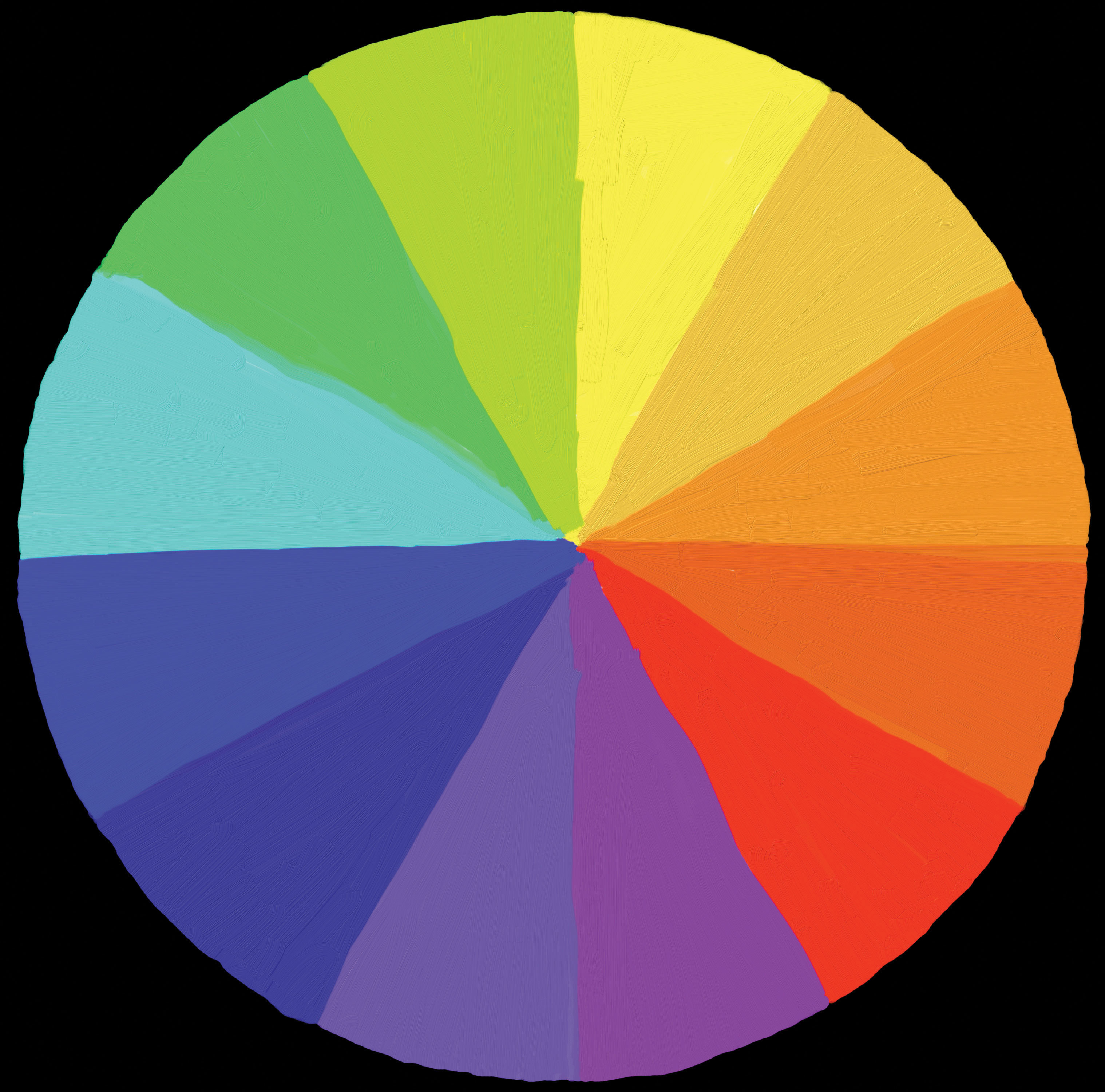
Colors can be further referred to as warm or cool (Figure 9.10 “Warm (Orange) and Cool (Blue) Colors”). Warm colors are those that might be seen during a bright, sunny day. Cool colors are those associated with overcast days. Warm colors are typified by hues ranging from red to yellow, including browns and tans. Cool color hues range from blue-green through blue-violet and include the majority of gray variants. When used in mapping, it is wise to use warm and cool colors with care. Indeed, warm colors stand out, appear active, and stimulate the viewer. Cool colors appear small, recede, and calm the viewer. As you might guess, it is important that you apply warm colors to the map features of primary interest, while using cool colors on the secondary, background, and/or contextual features.
Figure 9.10 Warm (Orange) and Cool (Blue) Colors
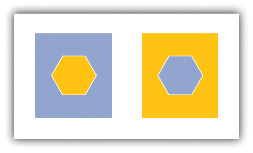
Note that the warm color stands out, while the cool color recedes.
In light of the plethora of color schemes and options available, it is wise to follow some basic color usage guidelines. For example, changes in hue are best suited to visualizing qualitative data, while changes in value and saturation are effective at visualizing quantitative data. Likewise, variations in lightness and saturation are best suited to representing ordered data since these establish hierarchy among features. In particular, a monochromatic color scale is an effective way to represent the order of data whereby light colors represent smaller data values and dark colors represent larger values. Keep in mind that it is best to use more light shades than dark ones as the human eye can better discern lighter shades. Also, the number of coincident colors that can be distinguished by humans is around seven, so be careful not to abuse the color palette in your maps. If the data being mapped has a zero point, a dichromatic scale (Figure 9.11) provides a natural breaking point with increasing color values on each end of the scale representing increasing data values.
Figure 9.11

A dichromatic scale is essentially two monochromatic scales joined by a low color value in the center.
In addition, darker colors result in more important or pronounced graphic features (assuming the background is not overly dark). Use dark colors on features whose visual impact you wish to magnify. Finally, do not use all the colors of the spectrum in a single map. It is best to leave such messy, rainbow-spectacular effects to the late Jackson Pollock and his abstract expressionist ilk.
KEY TAKEAWAYS
- Colors are defined by their hue, value, saturation, shade, and tint.
- Colors are used to convey meaning, clarification and emphasis, aesthetics, abstraction, and reality.
- Color models can be additive (e.g., RGB) or subtractive (e.g., CMYK).
- The color wheel is a powerful tool that assists in the selection of colors for your cartographic products.
EXERCISES
- Go online and find a map that uses color effectively. Explain.
- Go online and find a map that uses color ineffectively. Explain.
9.2 Symbology
LEARNING OBJECTIVE
- The objective of this section is to understand how to best utilize point, line, and polygon symbols to assist in the interpretation of your map and its features.
While color is an integral variable when choosing how to best represent spatial data, making informed decisions on the size, shape, and type of symbols is equally important. Although raster data are restricted to symbolizing features as a single cell or as cell groupings, vector data allows for a vast array of options to symbolize points, lines, and polygons in a map. Like color, cartographers must take care to use symbols judiciously in order to most effectively communicate the meaning and purpose of the map to the viewer.
Basic Symbol Guidelines
Vector points, lines, and polygons can be symbolized in a myriad of ways. The guidelines laid out in this section will help you to make informed decisions on how best to represent the features in your map. The primary visual variables associated with symbolization include size, texture, pattern, and shape (Figure 9.12 “Visual Variables”). Changes to symbol size and texture are most effectively used in conjunction with ordinal, interval, and ratio data. Changes to symbol pattern and shape are preferred in conjunction with nominal data.
Figure 9.12 Visual Variables
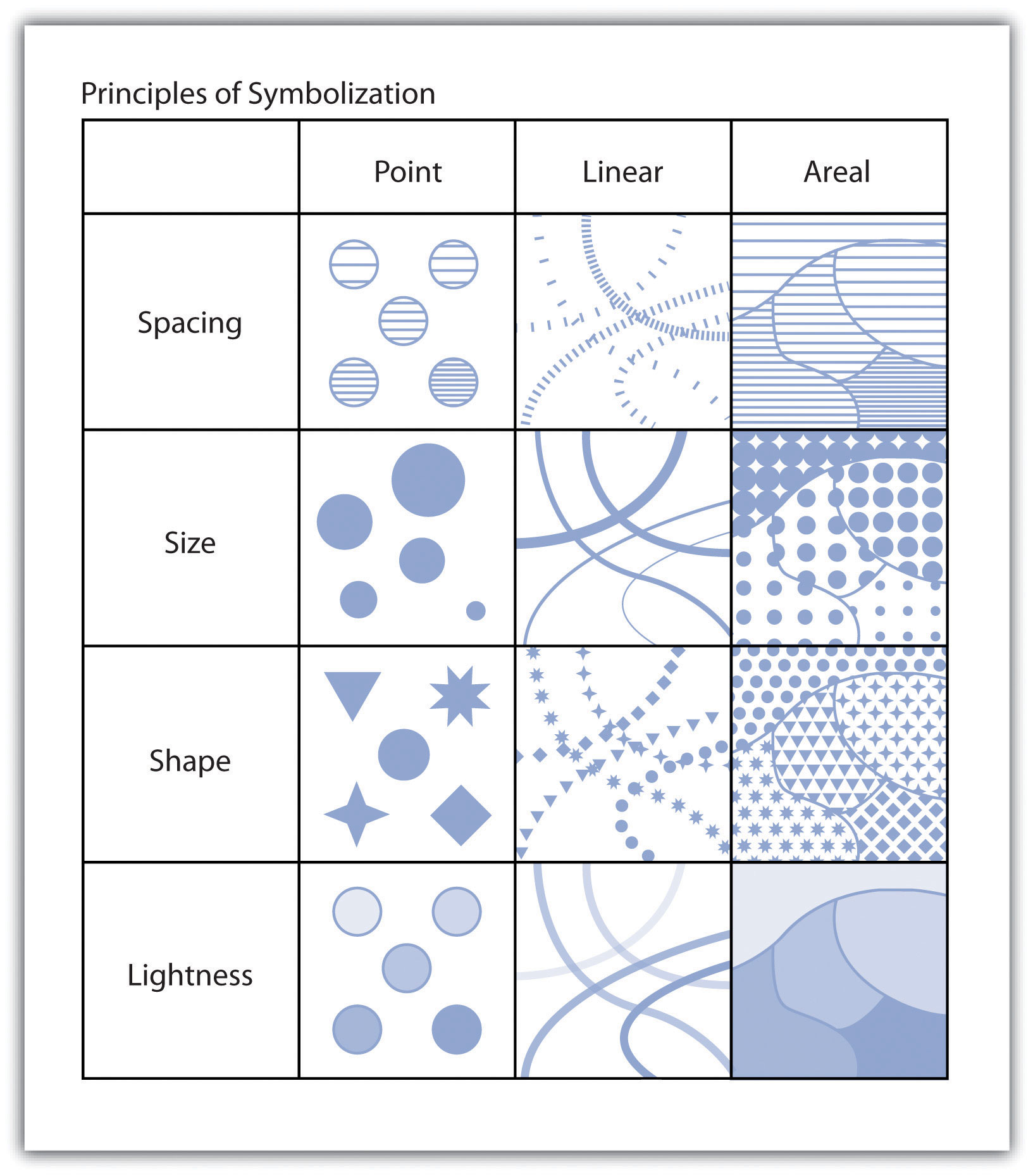
Variations in the size of symbols are powerful indicators of feature importance. Intuitively, larger symbols are assumed to be more important than smaller symbols. Although symbol size is most commonly associated with point features, linear symbols can effectively be altered in size by adjusting line width. Polygon features can also benefit from resizing. Despite the fact that the area of the polygon can’t be changed, a point representing the centroid of the polygon can be included in the map. These polygon centroids can be resized and symbolized as desired, just like any other point feature. Varying symbol size is moderately effective when applied to ordinal or numerical data but is ineffective with nominal data.
Symbol texture, also referred to as spacing, refers to the compactness of the marks that make up the symbol. Points, lines, and polygons can be filled with horizontal hash marks, for instance. The closer these hash marks are spaced within the feature symbol, the more hierarchically important the feature will appear. Varying symbol texture is most effective when applied to ordinal or numerical data but is ineffective with nominal data.
Much like texture, symbols can be filled with different patterns. These patterns are typically some artistic abstraction that may or may not attempt to visualize real-world phenomena. For example, a land-use map may change the observed fill patterns of various land types to try to depict the dominant plants associated with each vegetation community. Changes to symbol patterns are most often associated with polygon features, although there is some limited utility in changing the fill patterns of points and lines. Varying symbol size is moderately effective when applied to ordinal or numerical data and is ineffective when applied to nominal data.
Altering symbol shape can have dramatic effects on the appearance of map features. Point symbols are most commonly symbolized with circles. Circles tend to be the default point symbol due to their unchanging orientation, compact shape, and viewer preference. Other geometric shapes can also constitute effective symbols due to their visual stability and conservation of map space. Unless specific conditions allow, volumetric symbols (spheres, cubes, etc.) should be used sparingly as they rarely contribute more than simple, two-dimensional symbols. In addition to geometric symbols, pictograms are useful representations of point features and can help to add artistic flair to a map. Pictograms should clearly denote features of interest and should not require interpretation by the viewer (Figure 9.13 “Pictograms”). Locales that frequently employ pictograms include picnic areas, camping sites, road signs, bathrooms, airports, and so forth. Varying symbol shape is most effective when applied to nominal data and is moderately effective with ordinal and nominal data.
Finally, applying variations in lightness/darkness will affect the hierarchical value of a symbol. The darker the symbol, the more it stands out among lighter features. Variations in the lightness/darkness of a symbol are most effective when applied to ordinal data, are moderately effective when applied to numerical data, and are ineffective when applied to nominal data.
Figure 9.13 Pictograms
Keep in mind that there are many other visual variables that can be employed in a map, depending on the cartographic software used. Regardless of the chosen symbology, it is important to maintain a logical relationship between the symbol and the data. Also, visual contrast between different mapped variables must be preserved. Indeed, the efficacy of your map will be greatly diminished if you do not ensure that its symbols are readily identifiable and look markedly different from each other.
Proportional Symbolization
In addition to the uniform symbols presented in the previous section, symbols for a single, quantitative variable can be sized proportionally to match the data values. These proportional symbols are useful for presenting a fairly exact understanding of the differences in magnitude within a dataset. As the numeric values for each class increases, so too does the size of the symbol representing that class. This allows the symbol size of features to be directly related to the attribute values they represent whereby small points denote small data values and large points denote large data values.
Similar to proportional symbols, range graded symbols group raw data into classes with each class represented by a differently sized symbol. Both proportional and range graded symbols are most frequently used with point data, but lines and polygons can benefit from proportional symbolization as well. In the case of linear datasets, line width is most frequently used as the proportional visual variable. Polygon datasets typically summarize a quantitative variable within each polygon, place a centroid within that polygon, and proportion that centroid point symbol. Range grading should not be used if the data range for a given variable is small. In these cases, range grading will suggest larger differences in the data values than is merited.
The advantage of proportional symbolization is the ease with which the viewer can discriminate symbol size and thus understand variations in the data values over a given map extent. On the other hand, viewers may misjudge the magnitude of the proportional symbols if they do not pay close attention to the legend. In addition, the human eye does not see and interpret symbol size in absolute terms. When proportional circles are used in maps, it is typical that the viewer will underestimate the larger circles relative to the smaller circles. To address this potential pitfall, graduated symbols can be based on either mathematical or perceptual scaling. Mathematical scaling directly relates symbol size with the data value for that locale. If one value is twice as large as another, it will be represented with a symbol twice as large as the other. Perceptual scaling overcomes the underestimation of large symbols by making these symbols much larger than their actual value would indicate (Figure 9.14 “Mathematical versus Perceptual Scaling”).
Figure 9.14 Mathematical versus Perceptual Scaling
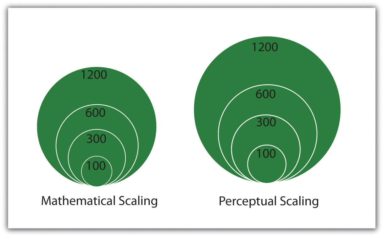
A disadvantage of proportional symbolization is that the symbol size can appear variable depending on the surrounding symbols. This is best shown via the Ebbinghaus illusion (also known as Titchener circles). As you can see in Figure 9.15 “Ebbinghaus Illusion”, the central circles are both the same size but appear different due to the visual influence of the surrounding circles. If you are creating a graphic with many different symbols, this illusion can wreak havoc on the interpretability of your map.
Figure 9.15 Ebbinghaus Illusion

KEY TAKEAWAYS
- Vector points, lines, and polygons can be symbolized in a variety of ways. Symbol variables include size, texture, pattern, and shape.
- Proportional symbols, which can be mathematically or perceptually scaled, are useful for representing quantitative differences within a dataset.
EXERCISES
- Locate a map or maps that utilize differences in symbol size, texture, pattern, and shape to convey meaning.
- List ten map features that are commonly depicted with a pictogram.
9.3 Cartographic Design
LEARNING OBJECTIVE
- The objective of this section is to familiarize cartographers with the basic cartographic principles that contribute to effective map design.
In addition to effective use of colors and symbols, a map that is well designed will greatly enhance its ability to relate pertinent spatial information to the viewer. Judicious use of map elements, typography/labels, and design principles will result in maps that minimize confusion and maximize interpretability. Furthermore, the use of these components must be guided by a keen understanding of the map’s purpose, intended audience, topic, scale, and production/reproduction method.
Map Elements
Chapter 9 “Cartographic Principles”, Section 9.1 “Color” and Section 9.2 “Symbology” discussed visual variables specific to the spatial features of a map. However, a map is composed of many more elements than just the spatial features, each of which contributes immensely to the interpretability and flow of the overall map. This section outlines the basic map elements that should be incorporated into a “complete” map. Following Slocum et al. (2005),Slocum, T., R. McMaster, F. Kessler, and H. Howard. 2005. Thematic Cartography and Geographic Visualization. 2nd ed. Upper Saddle River, NJ: Pearson Prentice Hall. these elements are listed in the logical order in which they should be placed into the map (Figure 9.16 “A US Map Showing Various Map Elements”).
The first feature that should be placed into the map layout is the frame line. This line is essentially a bordering box that surrounds all the map elements described hereafter. All of these map elements should be balanced within the frame line. To balance a map, ensure that neither large blank spaces nor jumbled masses of information are present within the map. Similar to frame lines are neat lines. Neat lines are border boxes that are placed around individual map elements. By definition, neat lines must occur within the frame line. Both frame lines and neat lines are typically thin, black-lined boxes, but they can be altered to match the specific aesthetics of an individual map.
The mapped area is the primary geographic component of the overall map. The mapped area contains all of the features and symbols used to represent the spatial phenomena being displayed. The mapped area is typically bordered with a neat line.
Insets can be thought of as secondary map areas, each encased within their own neat line. These neat lines should be of different thickness or type than other line features on the map to adequately demarcate them from other map features. Insets often display the primary mapped area in relation to a larger area. For example, if the primary map shows the locales of national parks with a county, an inset displaying the location of that county within the larger state boundary may be included. Conversely, insets are also used to display areas related to the primary map but that occur at some far off locale. This type of inset is often used with maps of the United States whereby Alaska and Hawaii are placed as insets to a map of the contiguous United States. Finally, insets can be used to clarify areas where features would otherwise be overcrowded if restricted to the primary mapping area. If the county map of national parks contained four small, adjacent parks, an inset could be used to expand that jumbled portion of the map to show the exact spatial extent of each of the four parks. This type of inset is frequently seen when showing the small northeastern states on a map of the entire United States.
All maps should have a title. The title is one of the first map elements to catch the viewer’s eye, so care should be taken to most effectively represent the intent of the map with this leading text. The title should clearly and concisely explain the purpose of the map and should specifically target the intended viewing audience. When overly verbose or cryptically abbreviated, a poor title will detract immensely from the interpretability of the cartographic end-product. The title should contain the largest type on the map and be limited to one line, if possible. It should be placed at the top-center of the map unless there is a specific reason otherwise. An alternate locale for the title is directly above the legend.
The legend provides a self-explanatory definition for all symbols used within the mapped area. Care must be taken when developing this map element, as a multitude of features within a dataset can lead to an overly complex legend. Although placement of the legend is variable, it should be placed within the white space of the map and not in such a way that it masks any other map elements. Atop the legend box is the optional legend header. The legend header should not simply repeat the information from the title, nor should it include extraneous, non-legend-specific information. The symbols representing mapped features should be to the left of the explanatory text. Placing a neat line around the legend will help to bring attention to the element and is recommended but not required. Be careful not to take up too much of the map with the legend, while also not making the legend so small that it becomes difficult to read or that symbols become cluttered. Removing information related to base map features (e.g., state boundaries on a US map) or readily identifiable features (e.g., highway or interstate symbols) is one effective way to minimize legend size. If a large legend is unavoidable, it is acceptable to place this feature outside of the map’s frame line.
Attribution of the data source within the map allows users to assess from where the data are derived. Stylistically, the data source attribution should be hierarchically minimized by using a relatively small, simple font. It is also helpful to preface this map element with “Source:” to avoid confusion with other typographic elements.
An indicator of scale is invaluable to provide viewers with the means to properly adjudicate the dimensions of the map. While not as important when mapping large or widely familiar locales such as a country or continent, the scale element allows viewers to measure distances on the map. The three primary representations of scale are the representational fraction, verbal scale, and bar scale (for more, see Chapter 2 “Map Anatomy”, Section 2.1 “Maps and Map Types”). The scale indicator should not be prominently displayed within the map as this element is of secondary importance.
Finally, map orientation notifies the viewer of the direction of the map. To assist in clarifying orientation, a graticule can also be included in the mapped area. Most maps are made such that the top of the page points to the north (i.e., a north-up map). If your map is not north-up, there should be a good reason for it. Orientation is most often indicated with a north arrow, of which there are many stylistic options available in current geographic information system (GIS) software packages. One of the most commonly encountered map errors is the use of an overly large or overly ornate north arrow. North arrows should be fairly inconspicuous as they only need to be viewed once by the reader. Ornate north arrows can be used on small scale maps, but simple north arrows are preferred on medium to large-scale maps so as to not detract from the presumably more important information appearing elsewhere.
Taken together, these map elements should work together to achieve the goal of a clear, ordered, balanced, and unified map product. Since modern GIS packages allow users to add and remove these graphic elements with little effort, care must be taken to avoid the inclination to employ these components with as little forethought as it takes to create them. The following sections provide further guidance on composing these elements on the page to honor and balance the mapped area.
Figure 9.16 A US Map Showing Various Map Elements
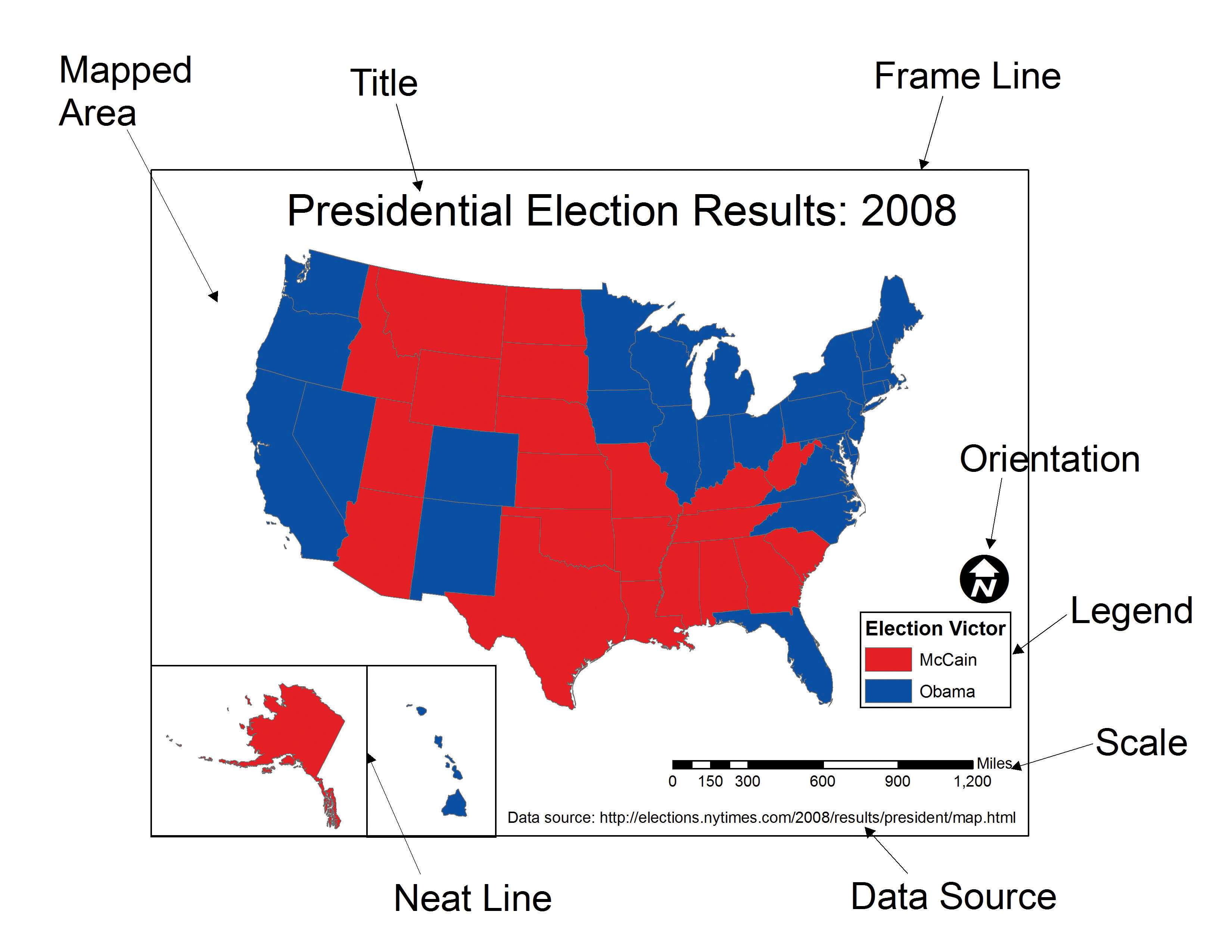
Typography and Label Placement
Type is found throughout all the elements of a map. Type is similar to map symbols in many senses. Coloring effects alter typographic hierarchy as lighter type fades into the background and dark type jumps to the fore. Using all uppercase letters and/or bolded letters will result in more pronounced textual effects. Larger font sizes increase the hierarchical weight of the type, so ensure that the size of the type corresponds with the importance of the map feature. Use decorative fonts, bold, and italics sparingly. These fonts, as well as overly small fonts, can be difficult to read if overused. Most importantly, always spell check your final cartographic product. After spell checking, spell check again. Yu wont reegrett teh ecstra efort.
Other typographic options for altering text include the use of serif, sans serif, and display fonts. While the use of serif fonts are preferred in written documents to provide horizontal guidelines, either is acceptable in a mapping application (Slocum 2005).Slocum, T., R. McMaster, F. Kessler, and H. Howard. 2005. Thematic Cartography and Geographic Visualization. 2nd ed. Upper Saddle River, NJ: Pearson Prentice Hall. Sans serif fonts, on the other hand, are preferred for maps that are viewed over the Internet.
Kerning is an effective typographic effect that alters the space between adjacent letters in a word. Decreasing the kerning of a typeset is useful if the text is too large for the space given. Alternatively, increasing the kerning is an effective way to label large map areas, particularly in conjunction with all-uppercase lettering. Like kerning, changes in leading (pronounced “led-ing”) alter the vertical distance between lines of text. Leading should not be so cramped that lines of text begin to overwrite each other, nor should it be so wide that lines of text appear unrelated. Other common typographic effects include masks, callouts, shadows, and halos (Figure 9.17 “Typographic Effects”). All of these effects serve to increase the visibility and importance of the text to which they are applied.
Figure 9.17 Typographic Effects
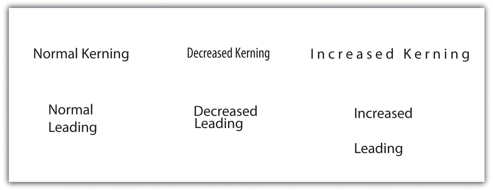
In addition to the general typographic guidelines discussed earlier, there are specific typographic suggestions for feature labels. Obviously, labels must be placed proximal to their symbols so they are directly and readily associated with the features they describe. Labels should maintain a consistent orientation throughout so the reader does not have to rubberneck about to read various entries. Also, avoid overprinting labels on top of other graphics or typographic features. If that is not possible, consider using a halo, mask, callout, or shadow to help the text stand out from the background. In the case of maps with many symbols, be sure that no features intervene between a symbol and its label.
Some typographic guidelines are specific to labels for point, line, and polygon features. Point labels, for example, should not employ exaggerated kerning or leading. If leader lines are used, they should not touch the point symbol nor should they include arrow heads. Leader lines should always be represented with consistent color and line thickness throughout the map extent. Lastly, point labels should be placed within the larger polygon in which they reside. For example, if the cities of Illinois were being mapped as points atop a state polygon layer, the label for the Chicago point symbol should occur entirely over land, and not reach into Lake Michigan. As this feature is located entirely on land, so should its label.
Line labels should be placed above their associated features but should not touch them. If the linear feature is complex and meandering, the label should follow the general trend of the feature and not attempt to match the alignment of each twist and turn. If the linear feature is particularly long, the feature can be labeled multiple times across its length. Line labels should always read from left to right.
Polygon labels should be placed within the center of the feature whenever possible. If increased emphasis is desired, all-uppercase letters can be effective. If all-uppercase letters are used, exaggerated kerning and leading is also appropriate to increase the hierarchical importance of the feature. If the polygon feature is too small to include text, label the feature as if it were a point symbol. Unlike point labels, however, leader lines should just enter into the feature.
Map Design
Map design is a complex process that provides many variables and choices to the cartographer. The British Cartographic Society Design Group presented five “Principles of Cartographic Design” on their listserv on November 26, 1999. These principles, and a brief summary of each, are as follows:
- Concept before compilation. A basic understanding of the concept and purpose of the map must be secured before the actual mapping exercise begins. Furthermore, there is no way to determine what information to include in a map without having first determined who the end-user is and in what manner the map will be used. A map without a purpose is of no use to anyone.
- Hierarchy with harmony. Important map features must appear prominent on the map. The less important features should fade into the background. Creating harmony between the primary and secondary representations on the map will lead to a quality product that will best suit the needs for which it was developed.
- Simplicity from sacrifice. Upon creating a map, it is tempting to add as much information into the graphic view as can possibly fit. In reality, it is best to leave some stones unturned. Just as the key to good communication is brevity, it can be said that the key to good mapping is simplicity. A map can be considered complete when no other features can be removed. Less, in this instance, is more.
- Maximum information at minimum cost. The purpose of a map is to convey the greatest amount of information with the least amount of interpretive effort by the user. Map design should allow complex spatial relationships to be understood at a glance.
- Engage the emotion to engage the understanding. Well-constructed maps are basically works of art. All of the artistic and aesthetic rules outlined in this chapter serve to engage the emotive center of the viewer. If the viewer does not formulate some basic, emotional response to the map, the message will be lost.
It should become increasingly clear that the cartographic choices made during the mapping process have as much influence on the interpretation of a map as does the data being mapped. Borrowing liberally from the popularized Mark Twain quote, it could be said that, “There are three kinds of lies: lies, damned lies, and maps.” Mapmakers, indeed, have the ability to use (or misuse) cartographic principles to represent (or misrepresent) the spatial data at their disposal. It is now up to you, the cartographer, to master the tools presented in this book to harness the power of maps to elucidate and address the spatial issues with which you are confronted.
KEY TAKEAWAYS
- Commonly used map elements include the neat line, frame line, mapped area, inset, title, legend, data source, scale, and orientation.
- Like symbology, typography and labeling choices have a major impact on the interpretability of your map.
- Map design is essentially an artistic endeavor based around a handful of cartographic principles. Knowledge of these principles will allow you create maps worth viewing.
EXERCISES
- Go online and find a map that employs all the map elements described in this chapter.
- Go online and find two maps that violate at least two different “Principles of Cartographic Design.” Explain how you would improve these maps.
Chapter 10GIS Project Management
As Chapter 9 “Cartographic Principles” moved past the technical aspects of a geographic information system (GIS) and into the artistic skills needed by mapmakers, this chapter continues in that vein by introducing effective GIS project management solutions that commonly arise in the modern workplace. GIS users typically start their careers performing low-end tasks such as digitizing vast analogue datasets or error checking voluminous metadata files. However, adept cartographers will soon find themselves promoted through the ranks and possibly into management positions. Here, they will be tasked with an assortment of business-related activities such as overseeing work groups, interfacing with clients, creating budgets, and managing workflows. As GISs become increasingly common in today’s business world, so too must cartographers become adept at managing GIS projects to maximize effective work strategies and minimize waste. Similarly, as GIS projects begin to take on more complex and ambitious goals, GIS project managers will only become more important and integral to address the upcoming challenges of the job at hand.
10.1 Project Management Basics
LEARNING OBJECTIVE
- The objective of this section is to achieve a basic understanding of the role of a project manager in the lifecycle of a GIS project.
Project management is a fairly recent professional endeavor that is growing rapidly to keep pace with the increasingly complex job market. Some readers may equate management with the posting of clichéd artwork that lines the walls of corporate headquarters across the nation (Figure 10.1). These posters often depict a multitude of parachuters falling arm-in-arm while forming some odd geometric shape, under which the poster is titled “Teamwork.” Another is a beautiful photo of a landscape titled, “Motivation.” Clearly, any job that is easy enough that its workers can be motivated by a pretty picture is a job that will either soon be done by computers or shipped overseas. In reality, proper project management is a complex task that requires a broad knowledge base and a variety of skills.
Figure 10.1

Management is more than posting vapid, buzzword-laden artwork such as this in the office place.
The Project Management Institute (PMI) Standards Committee describes project management as “the application of knowledge, skills, tools, and techniques to project activities in order to meet or exceed stakeholder needs and expectations.” To assist in the understanding and implementation of project management, PMI has written a book devoted to this subject titled, “A Guide to the Project Management Body of Knowledge,” also known as the PMBOK Guide (PMI 2008). This section guides the reader through the basic tenets of this text.
The primary stakeholders in a given project include the project manager, project team, sponsor/client, and customer/end-user. As project manager, you will be required to identify and solve potential problems, issues, and questions as they arise. Although much of this section is applicable to the majority of information technology (IT) projects, GIS projects are particularly challenging due to the large storage, integration, and performance requirements associated with this particular field. GIS projects, therefore, tend to have elevated levels of risk compared to standard IT projects.
Project management is an integrative effort whereby all of the project’s pieces must be aligned properly for timely completion of the work. Failure anywhere along the project timeline will result in delay, or outright failure, of the project goals. To accomplish this daunting task, five process groupsand nine project management knowledge areas have been developed to meet project objectives. These process groups and knowledge areas are described in this section.
PMBOK Process Groups
The five project management process groups presented here are described separately, but realize that there is typically a large degree of overlap among each of them.
Initiation, the first process group, defines and authorizes a particular project or project phase. This is the point at which the scope, available resources, deliverables, schedule, and goals are decided. Initiation is typically out of the hands of the project management team and, as such, requires a high-level sponsor/client to approve a given course of action. This approval comes to the project manager in the form of a project charter that provides the authority to utilize organizational resources to address the issues at hand.
The planning process group determines how a newly initiated project phase will be carried out. It focuses on defining the project scope, gathering information, reviewing available resources, identifying and analyzing potential risks, developing a management plan, and estimating timetables and costs. As such, all stakeholders should be involved in the planning process group to ensure comprehensive feedback. The planning process is also iterative, meaning that each planning step may positively or negatively affect previous decisions. If changes need to be made during these iterations, the project manager must revisit the plan components and update those now-obsolete activities. This iterative methodology is referred to as “rolling wave planning.”
The executing process group describes those processes employed to complete the work outlined in the planning process group. Common activities performed during this process group include directing project execution, acquiring and developing the project team, performing quality assurance, and distributing information to the stakeholders. The executing process group, like the planning process group, is often iterative due to fluctuations in project specifics (e.g., timelines, productivity, unanticipated risk) and therefore may require reevaluation throughout the lifecycle of the project.
The monitoring and controlling process group is used to observe the project, identify potential problems, and correct those problems. These processes run concurrently with all of the other process groups and therefore span the entire project lifecycle. This process group examines all proposed changes to the project and approves only those that do not alter the overall, stated goals of the project. Some of the specific activities and actions monitored and controlled by this process group include the project scope, schedule, cost, output quality, reports, risk, and stakeholder interactions.
Finally, the closing process group essentially terminates all of the actions and activities undertaken during the four previous process groups. This process group includes handing off all pertinent deliverables to the proper recipients and the formal completion of all contracts with the sponsor/client. This process group is also important to signal the sponsor/client that no more charges will be made, and they can now reassign the project staff and organizational resources as needed.
PMBOK Project Management Knowledge Areas
Each of the five aforementioned process groups is available for use with nine different knowledge areas. These knowledge areas comprise those subjects that project managers must be familiar with to successfully complete a given project. A brief description of each of these nine knowledge areas is provided here.
- Project integration management describes the ability of the project manager to “identify, define, combine, unify, and coordinate” the various project activities into a coherent whole (PMBOK 2008). It is understood by senior project managers that there is no single way to successfully complete this task. In reality, each manager must apply their specific skills, techniques, and knowledge to the job at hand. This knowledge area incorporates all five of the PMBOK process groups.
- Project scope management entails an understanding of not only what work is required to complete the project but also what extraneous work should be excluded from project. Defining the scope of a project is usually done via the creation of a scope plan document that is distributed among team members. This knowledge area incorporates the planning, as well as the monitoring and controlling process groups.
- Project time management takes into account the fact that all projects are subject to certain time constraints. These time constraints must be analyzed and an overall project schedule must be developed based on inputs from all project stakeholders (see Section 10.2.1 “Scheduling” for more on scheduling). This knowledge area incorporates the planning, as well as the monitoring and controlling process groups.
- Project cost management is focused not only with determining a reasonable budget for each project task but also with staying within the defined budget. Project cost management is often either very simple or very complex. Particular care needs to be taken to work with the sponsor/client as they will be funding this effort. Therefore, any changes or augments to the project costs must be vetted through the sponsor/client prior to initiating those changes. This knowledge area incorporates the planning, as well as the monitoring and controlling process groups.
- Project quality management identifies the quality standards of the project and determines how best to satisfy those standards. It incorporates responsibilities such as quality planning, quality assurance, and quality control. To ensure adequate quality management, the project manager must evaluate the expectations of the other stakeholders and continually monitor the output of the various project tasks. This knowledge area incorporates the planning, executing, and monitoring and controlling process groups.
- Project human resource management involves the acquisition, development, organization, and oversight of all team members. Managers should attempt to include team members in as many aspects of the task as possible so they feel loyal to the work and invested in creating the best output possible. This knowledge area incorporates the planning, executing, and monitoring and controlling process groups.
- Project communication management describes those processes required to maintain open lines of communication with the project stakeholders. Included in this knowledge area is the determination of who needs to communicate with whom, how communication will be maintained (e-mail, letter reports, phone, etc.), how frequently contacts will be made, what barriers will limit communication, and how past communications will be tracked and archived. This knowledge area incorporates the planning, executing, and monitoring and controlling process groups.
- Project risk management identifies and mitigates risk to the project. It is concerned with analyzing the severity of risk, planning responses, and monitoring those identified risks. Risk analysis has become a complex undertaking as experienced project managers understand that “an ounce of prevention is worth a pound of cure.” Risk management involves working with all team members to evaluate each individual task and to minimize the potential for that risk to manifest itself in the project or deliverable. This knowledge area incorporates the planning, as well as the monitoring and controlling process groups.
- Project procurement management, the final knowledge area, outlines the process by which products, services, and/or results are acquired from outside the project team. This includes selecting business partners, managing contracts, and closing contracts. These contracts are legal documents supported by the force of law. Therefore, the fine print must be read and understood to ensure that no confusion arises between the two parties entering into the agreement. This knowledge area incorporates the planning, executing, monitoring and controlling, and closing process groups.
Project Failure
Murphy’s Law of Project Management states that no major project is completed on time, within budget, and with the same staff that started it—do not expect yours to be the first. It has been estimated that only 16 percent of fully implemented information technology projects are completed on time and within budget (The Standish Group International 2000).The Standish Group International. 2000. “Our Blog.” http://www.pm2go.com. These failed projects result in an estimated loss of over $81 billion every year! David Hamil discusses the reasons for these failures in his web feature titled, “Your Mission, Should You Choose to Accept It: Project Management Excellence” (http://spatialnews.geocomm.com/features/mesa1).
The first noted cause for project failure is poor planning. Every project must undergo some type of planning-level feasibility study to determine the purpose of the project and the methodologies employed to complete it. A feasibility study is basically used to determine whether or not a project should be given the “green light.” It outlines the project mission, goals, objectives, scope, and constraints. A project may be deemed unfeasible for a variety of reasons including an unacceptable level of risk, unclear project requirements, disagreement among clients regarding project objectives, missing key stakeholders, and unresolved political issues.
A second cause for project failure is lack of corporate management support. Inadequate staffing and funding, as well as weak executive sponsorship on the part of the client, will typically result in a project with little chance of success. One of the most important steps in managing a project will be to determine which member of the client’s team is championing your project. This individual, or group of individuals, must be kept abreast of all major decisions related to the project. If the client’s project champion loses interest in or contact with the effort, failure is not far afield.
A third common cause of project failure is poor project management. A high-level project manager should have ample experience, education, and leadership abilities, in addition to being a skilled negotiator, communicator, problem solver, planner, and organizer. Despite the fact that managers with this wide-ranging expertise are both uncommon and expensive to maintain, it only takes a failed project or two for a client to learn the importance of securing the proper person for the job at hand.
The final cause of project failure is a lack of client focus and the lack of the end-user participation. The client must be involved in all stages of the lifecycle of the project. More than one GIS project has been completed and delivered to the client, only to discover that the final product was neither what the client envisioned nor what the client wanted. Likewise, the end-user, which may or may not be the client, is the most important participant in the long-term survival of the project. The end-user must participate in all stages of project development. The creation of a wonderful GIS tool will most likely go unused if the end-user can find a better and/or more cost-efficient solution to their needs elsewhere.
KEY TAKEAWAYS
- Project managers must employ a wide range of activities and actions to achieve the overall goals of the project. These actions are broken down into five process groups: initiation, planning, executing, monitoring and controlling, and closing.
- The activities and actions described in this section are applied to nine management knowledge areas that managers must be cognizant of to ensure that all the goals of the project will be met: integration management, scope management, time management, cost management, quality management, human resource management, communication management, risk management, and procurement management.
- Projects can fail for a variety of reasons. Successful managers will be aware of these potential pitfalls and will work to overcome them.
EXERCISE
- As a student, you are constantly tasked with completing assignments for your classes. Think of one of your recent assignments as a project that you, as a project (assignment) manager, completed. Describe how you utilized a sampling of the project management process groups and knowledge areas to complete that assigned task.
10.2 GIS Project Management Tools and Techniques
LEARNING OBJECTIVE
- The objective of this section is to review a sampling of the common tools and techniques available to complete GIS project management tasks.
As a project manager, you will find that there are many tools and techniques that will assist your efforts. While some of these are packaged in a geographic information system (GIS), many are not. Others are mere concepts that managers must be mindful of when overseeing large projects with a multitude of tasks, team members, clients, and end-users. This section outlines a sampling of these tools and techniques, although their implementation is dependent on the individual project, scope, and requirements that arise therein. Although these topics could be sprinkled throughout the preceding chapters, they are not concepts whose mastery is typically required of entry-level GIS analysts or technicians. Rather, they constitute a suite of skills and techniques that are often applied to a project after the basic GIS work has been completed. In this sense, this section is used as a platform on which to present novice GIS users with a sense of future pathways they may be led down, as well as providing hints to other potential areas of study that will complement their nascent GIS knowledge base.
Scheduling
One of the most difficult and dread-inducing components of project management for many is the need to oversee a large and diverse group of team members. While this text does not cover tips for getting along with others (for this, you may want to peruse Unnamed Publisher’s selection of psychology/sociology texts), ensuring that each project member is on task and up to date is an excellent way to reduce potential problems associated with a complex project. To achieve this, there are several tools available to track project schedules and goal completions.
The Gantt chart (named after its creator, Henry Gantt) is a bar chart that is used specifically for tracking tasks throughout the project lifecycle. Additionally, Gantt charts show the dependencies of interrelated tasks and focus on the start and completion dates for each specific task. Gantt charts will typically represent the estimated task completion time in one color and the actual time to completion in a second color (Figure 10.2 “Gantt Chart”). This color coding allows project members to rapidly assess the project progress and identify areas of concern in a timely fashion.
Figure 10.2 Gantt Chart
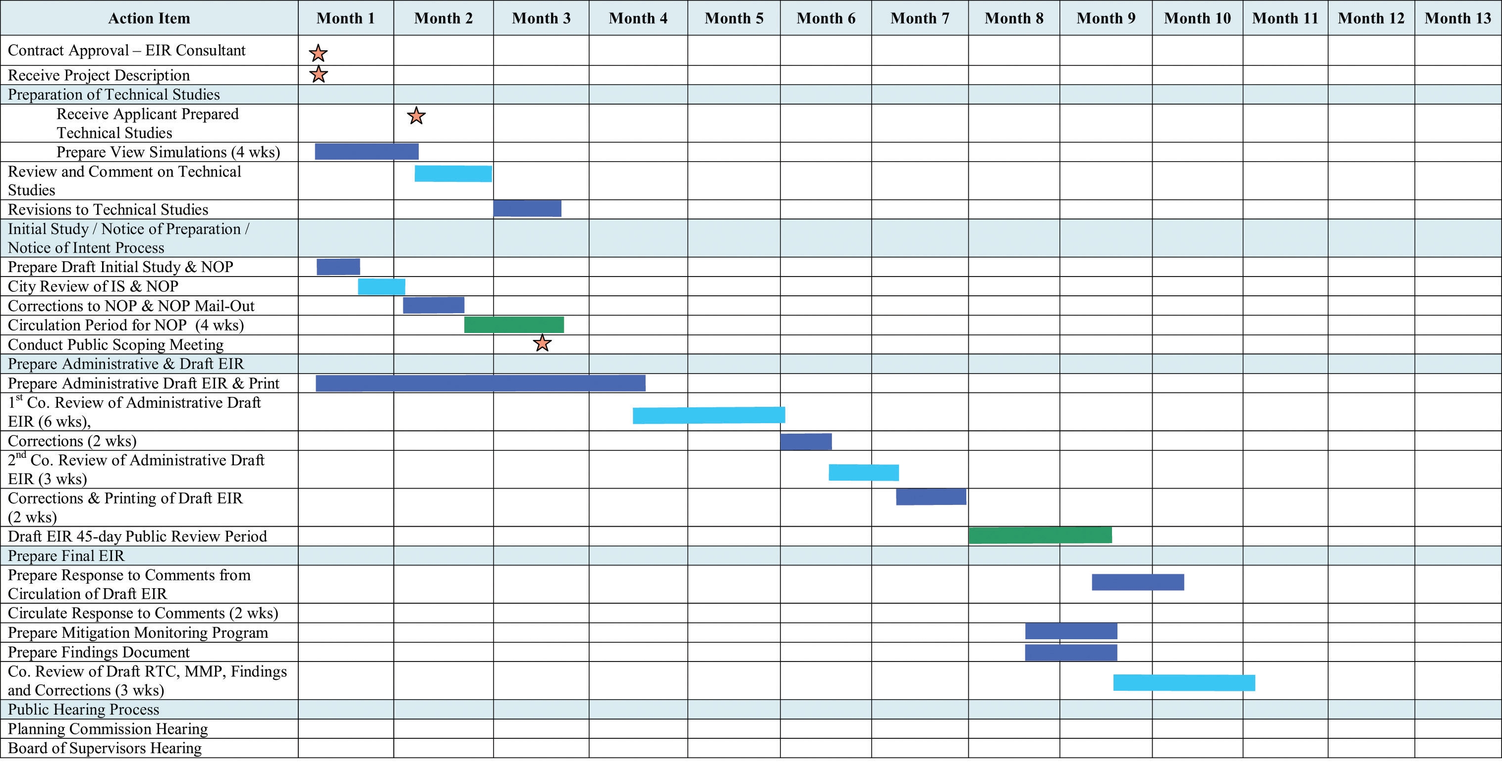
PERT (Program Evaluation and Review Technique) charts are similar to Gantt charts in that they are both used to coordinate task completion for a given project (Figure 10.3 “PERT Chart”). PERT charts focus more on the events of a project than on the start and completion dates as seen with the Gantt charts. This methodology is more often used with very large projects where adherence to strict time guidelines is more important than monetary considerations. PERT charts include the identification of the project’s critical path. After estimating the best- and worst-case scenario regarding the time to finish all tasks, the critical path outlines the sequence of events that results in the longest potential duration for the project. Delays to any of the critical path tasks will result in a net delay to project completion and therefore must be closely monitored by the project manager.
Figure 10.3 PERT Chart
There are some advantages and disadvantages to both the Gantt and PERT chart types. Gantt charts are preferred when working with small, linear projects (with less than thirty or so tasks, each of which occurs sequentially). Larger projects (1) will not fit onto a single Gantt display, making them more difficult to visualize, and (2) quickly become too complex for the information therein to be related effectively. Gantt charts can also be problematic because they require a strong sense of the entire project’s timing before the first task has even been committed to the page. Also, Gantt charts don’t take correlations between separate tasks into account. Finally, any change to the scheduling of the tasks in a Gantt chart results in having to recreate the entire schedule, which can be a time-consuming and mind-numbing experience.
PERT charts also suffer from some drawbacks. For example, the time to completion for each individual task is not as clear as it is with the Gantt chart. Also, large project can become very complex and span multiple pages. Because neither method is perfect, project managers will often use Gantt and PERT charts simultaneously to incorporate the benefits of each methodology into their project.
Working with CAD Data
While a GIS commands a large swath of the computer-generated mapping market share, it is not the only cartographic player in town. GIS, as you now hopefully understand, is primarily a database-driven mapping solution. Computer-aided design (CAD), on the other hand, is a graphics-based mapping solution adopted by many cartographers; engineers in particular. Historically speaking, points, lines, and polygons in a CAD system do not link to attributes but are mere drawings representing some reality. CAD software, however, has recently begun to incorporate “smart” features whereby attribute information is explicitly linked to the spatial representations.
CAD is typically used on many projects related to surveying and civil engineering work. For example, creating a cadastral map for a housing development is a complex matter with a fine scale of exactitude required to ensure, for example, that all electrical, sewer, transportation, and gas lines meet at precise locales (Figure 10.4 “CAD Drawing of a Conceptual Land Development Project”). An error of inches, in either the vertical or horizontal dimension, could result in a need for a major plan redesign that may cost the client an inordinate amount of time and money. Too many of these types of errors, and you and your engineer may soon be looking for a new job.
Figure 10.4 CAD Drawing of a Conceptual Land Development Project
Regardless, the CAD drawing used to create these development plans is usually only concerned with the local information in and around the project site that directly affects the construction of the housing units, such as local elevation, soil/substrates, land-use/land-cover types, surface water flows, and groundwater resources. Therefore, local coordinate systems are typically employed by the civil engineer whereby the origin coordinate (the 0, 0 point) is based off of some nearby landmark such as a manhole, fire hydrant, stake, or some other survey control point. While this is acceptable for engineers, the GIS user typically is concerned not only with local phenomena but also with tying the project into a larger world.
For example, if a development project impacts a natural watercourse in the state of California, agencies such as the US Army Corps of Engineers (a nationwide government agency), California Department of Fish and Game (a statewide government agency), and the Regional Water Quality Control Board (a local government agency) will each exert some regulatory requirements over the developer. These agencies will want to know where the watercourse originates, where it flows to, where within the length of the watercourse the development project occurs, and what percentage of the watercourse will be impacted. These concerns can only be addressed by looking at the project in the larger context of the surrounding watershed(s) within which the project occurs. To accomplish this, external, standardized GIS datasets must be brought to bear on the project (e.g., national river reaches, stream flow and rain gauges, habitat maps, national soil surveys, and regional land-use/land-cover maps). These datasets will normally be georeferenced to some global standard and therefore will not automatically overlay with the engineer’s local CAD data.
As project manager, it will be your team’s duty to import the CAD data (typically DWG, DGN, or DXF file format) and align it exactly with the other, georeferenced GIS data layers. While this has not been an easy task historically, sophisticated tools are being developed by both CAD and GIS software packages to ensure that they “play nicely” with each other. For example, ESRI’s ArcGIS software package contains a “Georeferencing” toolbar that allows users to shift, pan, resize, rotate, and add control points to assist in the realignment of CAD data.
Application Development
As project manager, you may discover that the GIS software package employed by your workgroup is missing some basic functionality that would greatly enhance the productivity of your team. In these cases, it may be worthwhile to create your own GIS application(s). GIS applications are either stand-alone GIS software packages or customizations of a preexisting GIS software package that are made to meet some specific project need. These applications can range from simple (e.g., apply a standard symbol/color set and text guidelines to mapped features) to complex (e.g., sort layers, select features based on a predefined set of rules, perform a spatial analysis, and output a hard-copy map).
Some of the more simple applications can be created by using the canned tool sets and functionality provided in the GIS software. For example, ESRI’s ArcGIS software package includes a macro language called Model Builder that allows users with no knowledge of programming languages create a series of automated tasks, also called workflows, which can be chained together and executed multiple times to reduce the redundancy associated with many types of GIS analyses. The more complex applications will most likely require the use of the GIS software’s native macro language or to write original code using some compatible programming language. To return to the example of ESRI products, ArcGIS provides the ability to develop and incorporate user-written programs, called scripts, into to standard platform. These scripts can be written in the Python, VBScript, JScript, and Perl programming languages.
While you may want to create a GIS application from the ground up to meet your project needs, there are many that have already been developed. These pre-written applications, many of which are open source, may be employed by your project team to reduce the time, money, and headache associated with such an effort. A sampling of the open-source GIS applications written for the C-family of programming languages are as follows (Ramsey 2007):Ramsey, P. 2007. “The State of Open Source GIS.” Refractions Research. http://www.refractions.net/expertise/whitepapers/opensourcesurvey/survey-open-source-2007-12.pdf.
- MapGuide Open Source (http://mapguide.osgeo.org)—A web-based application developed to provide a full suite of analysis and viewing tools across platforms
- OSSIM (http://www.ossim.org)—“Open Source Software Image Map” is an application developed to efficiently process very large raster images
- GRASS (http://grass.itc.it)—The oldest open-source GIS product, GRASS was developed by the US Army for complex data analysis and modeling
- MapServer (http://mapserver.gis.umn.edu)—A popular Internet map server that renders GIS data into cartographic map products
- QGIS (http://www.qgis.org)—A GIS viewing environment for the Linux operating system
- PostGIS (http://postgis.refractions.net)—An application that adds spatial data analysis and manipulation functionality to the PostgreSQL database program
- GMT (http://gmt.soest.hawaii.edu)—“Generic Mapping Tools” provides a suite of data manipulation and graphic generation tools that can be chained together to create complex data analysis flows
GIS applications, however, are not always created from scratch. Many of them incorporate open-source shared libraries that perform functions such as format support, geoprocessing, and reprojection of coordinate systems. A sampling of these libraries is as follows:
- GDAL/OGR (http://www.gdal.org)—“Geospatial Data Abstraction Library/OpenGIS Simple Features Reference Implementation” is a compilation of translators for raster and vector geospatial data formats
- Proj4 (http://proj.maptools.org)—A compilation of projection tools capable of transforming different cartographic projection systems, spheroids, and data points.
- GEOS (http://geos.refractions.net)—“Geometry Engine, Open Source” is a compilation of functions for processing 2-D linear geometry
- Mapnik (http://www.mapnik.org)—A tool kit for developing visually appealing maps from preexisting file types (e.g., shapefiles, TIFF, OGR/GDAL)
- FDO (http://fdo.osgeo.org)—“Feature Data Objects” is similar to, although more complex than, GDAL/OGR in that it provides tools for manipulating, defining, translating, and analyzing geospatial datasets
While the C-based applications and libraries noted earlier are common due to their extensive time in development, newer language families are supported as well. For example, Java has been used to develop unique applications (e.g., gvSIG, OpenMap, uDig, Geoserver, JUMP, and DeeGree) from its libraries (GeoAPI, WKB4J, GeoTools, and JTS Topology Suite), while .Net applications (e.g., MapWindow, WorldWind, SharpMap) are a new but powerful application option that support their own libraries (Proj.Net, NTS) as well as the C-based libraries.
Map Series
A project manager will often be required to produce paper and/or digital maps of the project site. These maps will typically include standard information such as a title, north arrow, scale bar, corporate contact information, data source, and so forth. This is simple if the site is small enough that the pertinent mapped features can be resolved on a single map. However, problems arise if the site is exceedingly large, follows a linear pathway (e.g., highway improvement projects), or is composed of distant, noncontiguous site locales. In these cases, the manager will need to create a series of easily referenced and reproduced maps that are at the exact same scale, have minimal overlap, and maintain consistent collar material throughout.
To accomplish this task, a map series can be employed to create standardized maps from the GIS (e.g., “DS Map Book” for ArcGIS 9; “Data Driven Pages” for ArcGIS 10). A map series is essentially a multipage document created by dividing the overall data frame into unique tiles based on a user-defined index grid. Figure 10.5 “Project Site Tiled into an Output Series” shows an example of a map series that divides a project site into a grid of similar tiles. Figure 10.6 “Output from a Map Series”shows the standardized maps produced when that series is printed. While these maps can certainly be created without the use of a map series generator, this functionality greatly assists in the organization and display of project’s whose extents cannot be represented within a single map.
Figure 10.5 Project Site Tiled into an Output Series
Source: Data available from U.S. Geological Survey, Earth Resources Observation and Science (EROS) Center, Sioux Falls, SD.
Figure 10.6 Output from a Map Series
Source: Data available from U.S. Geological Survey, Earth Resources Observation and Science (EROS) Center, Sioux Falls, SD.
Grid-to-Ground Transformations
Project managers must be mindful of the transition from in-program mapped units to real-world locations. As discussed in Chapter 3 “Data, Information, and Where to Find Them”, Section 3.2 “Data about Data”, transforming the three-dimensional earth to two dimensions necessarily results in both accuracy and precision errors. While projects that cover a small areal extent may not noticeably suffer from this error, projects that cover a large areal extent could run into substantial problems.
When surveyors measure the angles and distances of features on the earth for input into a GIS, they are taking “ground” measurements. However, spatial datasets in a GIS are based on a predefined coordinate system, referred to as “grid” measurements. In the case of angles, ground measurements are taken relative to some north standard such as true north, grid north, or magnetic north. Grid measurements are always relative to the coordinate system’s grid north. Therefore, grid north and ground north may well need to be rotated in order to align correctly.
In the case of distances, two sources of error may be present: (1) scale error and (2) elevation error. Scale error refers to the phenomenon whereby points measured on the three-dimensional earth (i.e., ground measurement) must first be translated onto the coordinate system’s ellipsoid (i.e., mean sea level), and then must be translated to the two-dimensional grid plane (Figure 10.7 “Grid-to-Ground Transformation”). Basically, scale error is associated with the move from three to two dimensions and is remedied by applying a scale factor (SF) to any measurements made to the dataset.
Figure 10.7 Grid-to-Ground Transformation
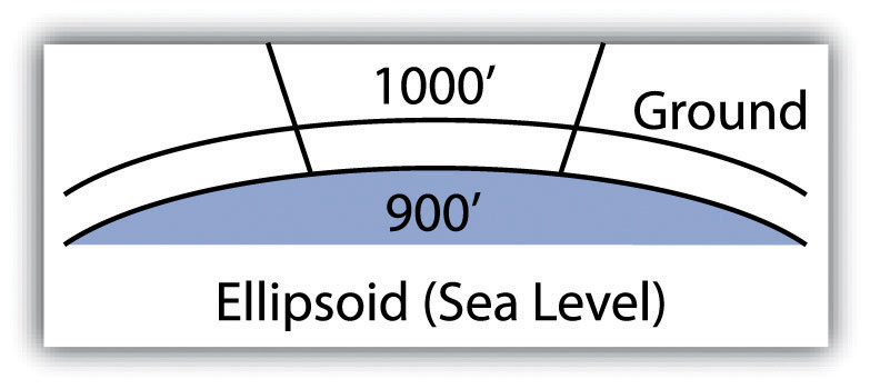
In addition to scale error, elevation error becomes increasingly pronounced as the project site’s elevation begins to rise. Consider Figure 10.8 “Grid versus Ground Measurements”, where a line measured as 1,000 feet at altitude must first be scaled down to fit the earth’s ellipsoid measurement, then scaled again to fit the coordinate system’s grid plane. Each such transition requires compensation, referred to as the elevation factor (EF). The SF and EF are often combined into a single combination factor (CF) that is automatically applied to any measurements taken from the GIS.
Figure 10.8 Grid versus Ground Measurements
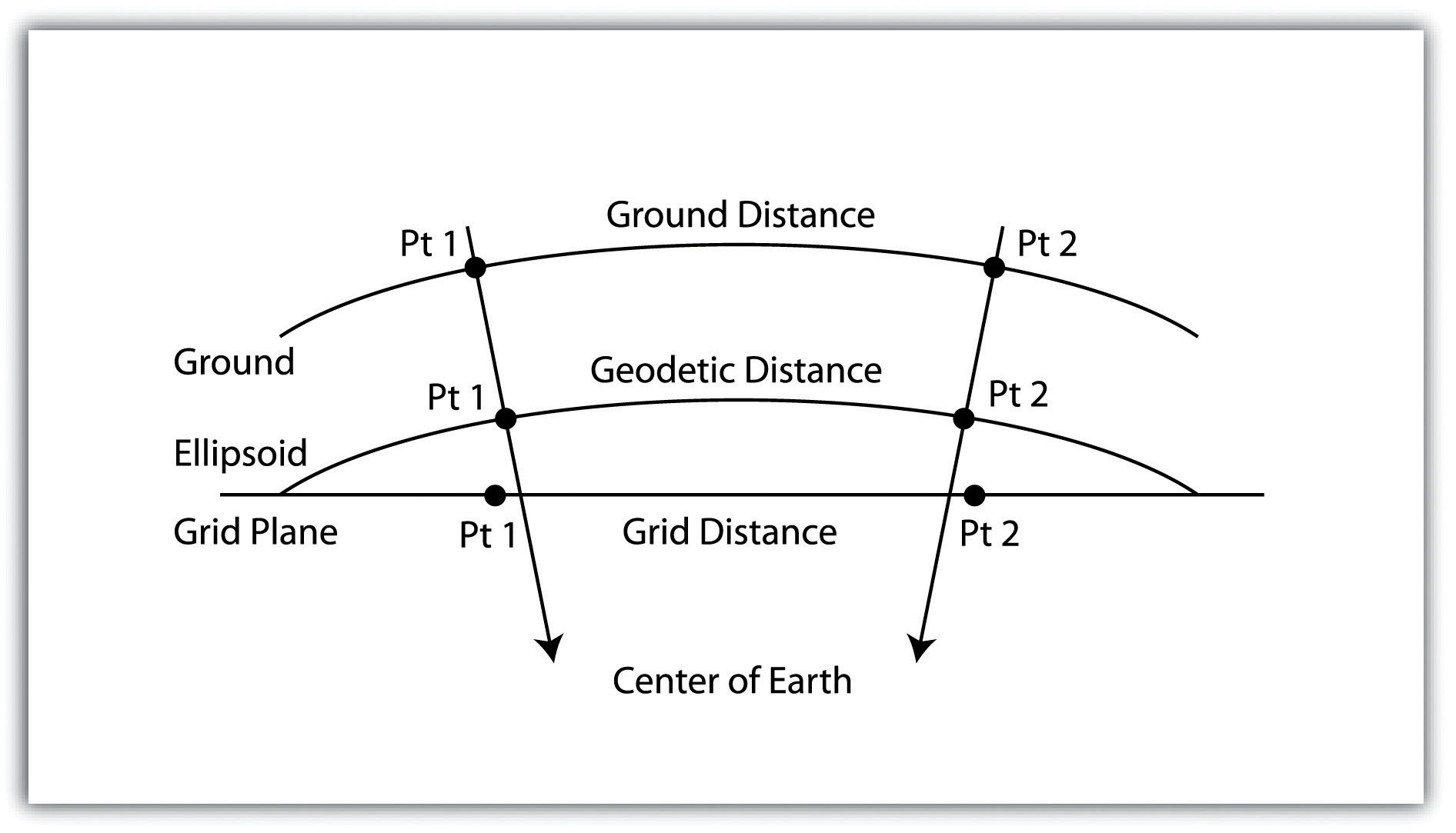
In addition to EF and SF errors, care must be taken when surveying areas greater than 5 miles in length. At these distances, slight errors will begin to compound and may create noticeable discrepancies. In particular, projects whose length crosses over coordinate systems zones (e.g., Universal Transverse Mercator [UTM] zones or State Plane zones) are likely to suffer from unacceptable grid-to-ground errors.
While the tools and techniques outlined in this section may be considered beyond the scope of an introductory text on GISs, these pages represent some of the concerns that will arise during your tenure as a GIS project manager. Although you will not need a comprehensive understanding of these issues for your first GIS-related jobs, it is important that you understand that becoming a competent GIS user will require a wide-ranging skill set, both technically and interpersonally.
KEY TAKEAWAYS
- As project manager, you will need to utilize a wide variety of tools and techniques to complete your GIS project.
- The tools and techniques you employ will not necessarily be included as a part of your native GIS software package. In these cases, you will need to apply all project management resources at your disposal.
EXERCISE
- Consider the following GIS project: You are contacted by the City of Miami to determine the effect of inundation due to sea-level rise on municipal properties over the next hundred years. Assuming that the sea level will rise one meter during that time span, describe in detail the process you would take to respond to this inquiry. Assuming you have two months to complete this task, develop a timeline that shows the steps you would take to respond to the city’s request. In your discussion, include information pertaining to the data layers (both raster and vector), data sources, and data attributes needed to address the problem. Outline some of the geoprocessing steps that would be required to convert your baseline GIS data into project-specific layers that would address this particular problem. Upon completion of the geospatial analysis, how might you employ cartographic principals to most effectively present the data to city officials? Talk about potential problems that may arise during the analysis and discuss how you might go about addressing these issues.
Candela Citations
- Essentials of Geographic Information Systems. Provided by: Saylor Academy. Located at: https://www.saylor.org/. License: CC BY-NC-SA: Attribution-NonCommercial-ShareAlike
