Use a scatterplot to display the relationship between two quantitative variables. Describe the overall pattern (form, direction, and strength) and striking deviations from the pattern.
Learning Objectives
- Use a scatterplot to display the relationship between two quantitative variables. Describe the overall pattern (form, direction, and strength) and striking deviations from the pattern.
Example
Highway Signs
A research firm conducts a study to explore the relationship between a driver’s age and the driver’s ability to read highway signs. The subjects are a random sample of 30 drivers between the ages of 18 and 82. (Source: Jessica M. Utts and Robert F. Heckard, Mind on Statistics [Brooks/Cole, 2002]. Original source: Data collected by The Last Resource, Inc., Bellfonte, PA.)
Because the purpose of this study is to explore the effect of age on the driver’s ability to read highway signs,
- the explanatory variable is age, and
- the response variable is the maximum distance at which the driver can read a highway sign, or maximum reading distance.
Both variables are quantitative.
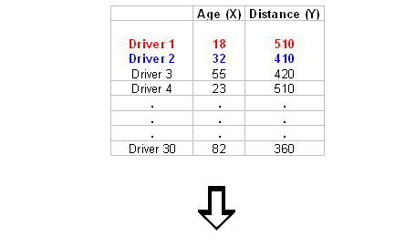
Here is what the raw data look like:

In this data set, the individuals are the 30 drivers. For each driver, we have two values: age and maximum reading distance.
To explore the relationship between age and distance, we create a graph called a scatterplot. To create a scatterplot, we use an ordered pair (x, y) to represent the data for each driver. The x-coordinate is the explanatory variable: driver’s age. The y-coordinate is the response variable: maximum reading distance.
For this example, the ordered pair (18, 510) represents an 18-year-old driver who can read a highway sign at a maximum distance of 510 feet. We plot a point for each ordered pair. In the scatterplot, each driver appears as a single point.
Generally, each point in a scatterplot represents one individual. The x-coordinate is the value of the explanatory variable for that individual. The y-coordinate is the value of the response variable for that individual.
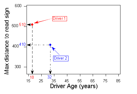
Here is the completed scatterplot:

Learn By Doing
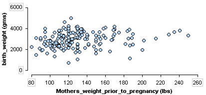
Recall this dataset from a medical study. In this study researchers collected data on new mothers to identify variables connected to low birth weights. This scatterplot investigates the relationship between two quantitative variables in the study: mother’s weight prior to pregnancy and baby’s birth weight.
 https://assessments.lumenlearning.com/assessments/3856
Comment
Remember: The explanatory variable is on the horizontal x-axis. The response variable is on the vertical y-axis. Sometimes the variables do not have a clear explanatory–response relationship. In this case, there is no rule to follow. Plot the variables on either axis.
Candela Citations
- Concepts in Statistics. Provided by: Open Learning Initiative. Located at: http://oli.cmu.edu. License: CC BY: Attribution