Learning Objectives
- Use a scatterplot to display the relationship between two quantitative variables. Describe the overall pattern (form, direction, and strength) and striking deviations from the pattern.
We now look at two more examples:
Example
Average Length of Pregnancy
What is the relationship between an animal’s lifespan and the length of its pregnancy? To investigate this question, we have data from 40 different species of animals living in captivity. We use average lifespan as the explanatory variable, x. The average length of pregnancy is the response variable, y. (Source: Allen J. Rossman and Beth L. Chance, Workshop Statistics: Discovery with Data and Minitab [Key College Publishing, 2001]. Original source: World Almanac and Book of Facts, 1993 [World Almanac, 1993].)
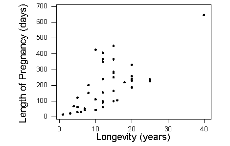
What can we learn about the relationship from the scatterplot?
The direction of the relationship is positive. An increase in lifespan is associated with an increase in pregnancy length. In other words, animals that live longer tend to have longer pregnancies. The form of the relationship is linear. The relationship is moderately strong.
Is there an outlier? There is a data point that deviates from the rest of the data because it has large x– and y-values. This is the elephant. Elephants live a long time (large x-value) and have a long pregnancy (large y-value). So the elephant is an outlier in the distribution of both the lifespan and the pregnancy variables. But this data point follows the positive direction of the data and fits the linear pattern. With respect to the form and direction of the relationship between the variables, this point is not an outlier.
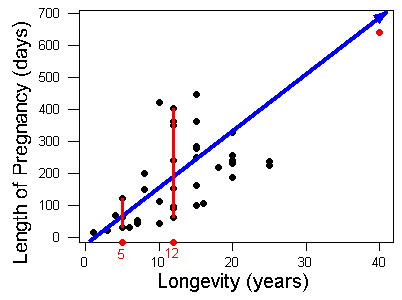
Notice that the variation in pregnancy length is larger for animals that live longer. For example, animals that live 5 years have pregnancies that range from about 30 days to 120 days. The short, red vertical line on the left illustrates this range. Animals that live 12 years have pregnancies that vary more, ranging from about 60 days to over 400 days. The longer red vertical line on the right illustrates this range. So the relationship is stronger for animals with shorter lifespans.
Example
Fuel Usage
When you drive a car, what is the relationship between the speed you drive and the amount of gas the car uses? In this study, engineers measured the amount of fuel (in liters) used to drive 100 kilometers. They made these fuel measurements for a car driving at a fixed speed (in kilometers per hour). They then made fuel measurements for different fixed speeds.

What can we learn about the relationship from the scatterplot?
The data describe a relationship that decreases, then increases, so the direction of the relationship is negative and then becomes positive. In other words, at slow speeds, the car uses a lot of fuel. The amount of fuel decreases rapidly to a low point when the speed is 60 kilometers per hour, so the car uses the least amount of fuel at a speed of 60 km/h. The amount of fuel increases gradually for speeds above 60 km/h. This forms a curvilinear relationship that is very strong. All of the data fit a smooth curve.
Is there an outlier? The point (10, 21) lies above the rest of the data. With respect to speed (x), this point is not an outlier. The x-value does not deviate from the pattern for the other x-values in the data. In this study, it appears that the engineers varied the speeds by increments of 10 km/h. However, the y-value is much higher than the other y-values. With respect to fuel usage, this point is an outlier. But the point fits the overall curvilinear pattern in the data, so with respect to direction and form, this point is not an outlier.
Learn By Doing
Comment
In Summarizing Data Graphically and Numerically, we developed a method for identifying outliers in a distribution of one quantitative variable. The method was the 1.5 * IQR rule. In a scatterplot, you can use this rule to determine if the x-value of a point is an outlier with respect to the x-values in data. Similarly, you can use this rule to determine if a y-value of a point is an outlier with respect to the y-values in the data. However, this rule does not help us identify a point that deviates from the overall pattern in the data.
Is there a method to identify outliers that deviate from the overall pattern in a scatterplot? The answer is yes, but we do not discuss these techniques in this course. For now, just look at the scatterplot and see if a point deviates from the overall pattern. In other words, see if the point deviates from the direction and form of the data. We will see later that this type of outlier can influence measures of center and spread for two quantitative variables.
Candela Citations
- Concepts in Statistics. Provided by: Open Learning Initiative. Located at: http://oli.cmu.edu. License: CC BY: Attribution