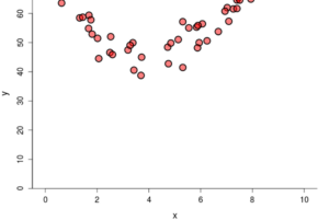
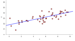
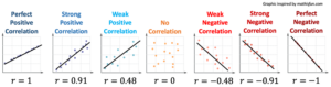
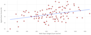
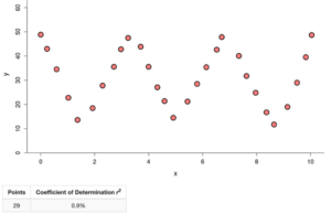
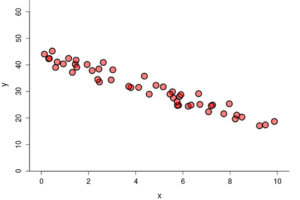
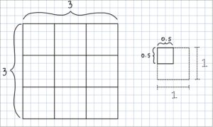
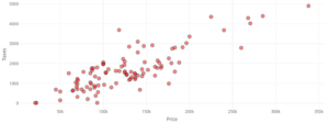
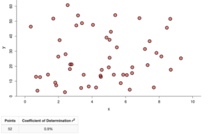
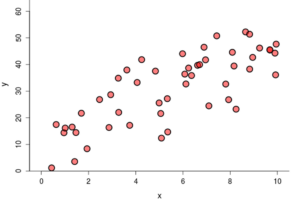
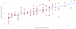
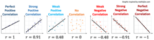
6C

A scatterplot showing points that are fairly close together arranged in a semicircular pattern.

Graph A

A scatterplot showing points that are close together in a roughly linear shape.

Graph B

A scatterplot showing points that are not grouped closely together and follow a somewhat linear pattern.

Graph C

A scatterplot with a line of best fit that begins around (0, 35) and ends around (10, 28). Most points are within approximately 5 units of the line.A scatterplot with a line of best fit that begins around (0, 18) and ends around (10, 41). Points are within approximately 10 units.A selection menu. At the top, "Explore Linear Regression" is selected and "Scatterplot" and "Residual" are unselected. Beneath that menu is a heading that reads "Initial Relationship." Beneath it is a dropdown menu where "Draw Your Own (Click in Graph)" is selected and "Random Scatter," "Linear Relationship," and "Quadratic Relationship" are selected.A checklist with the heading "Options." "Linear Regression Line" is selected, "Smooth Trend" is unselected, and "Show Correlation Coefficient r" and "Squared Correlation Coefficient r squared" are both selected.A selection menu. At the top, "Explore Linear Regression" is selected and "Scatterplot" and "Residualplot" are unselected. Beneath this is a dropdown menu where "Draw Your Own (Click in Graph)" and "Random Scatter" are unselected, "Linear Relationship" is selected, and "Quadratic Relationship" is unselected. Beneath that is another heading that says "Initial Number of Points." Under it, 50 is selected and 20, 100, and 500 are all unselected.Several scatterplots labeled by the correlation of their line of best fit. The first graph is labeled "Perfect Positive Correlation" and shows points exactly on the line of best fit. The line has a positive slope and the r value is 1. The second graph is labeled "Strong Positive Correlation" and shows points close to the line of best fit. The slope of the line is positive and the r value is 0.91. The next graph is labeled "Weak Positive Correlation" and shows points that are not close to the line of best fit, but still show a correlation to the line. The slope of the line is positive and the r value is 0.48. The next graph is labeled "No Correlation" and show points randomly scattered across the graph. There is no line of best fit and the r value is 0. The next graph is labeled "Weak Negative Distribution" and shows points that are not close to the line of best fit, but still show a correlation to the line. The slope of the line is negative and the r-value is -0.48. The next graph is labeled "Strong Negative Correlation" and shows points that are close to the line of best fit. The slope of the line is negative and the r-value is -0.91. The last graph is labeled "Perfect Negative Correlation" and shows points that are exactly on the line of best fit. It has a negative slope and the r-value is -1.A grid with two squares drawn on it. One of them is labeled as a 3x3. The other is a 1x1 and a quarter of it is labeled as a 0.5 x 0.5.Children with backpacks on smiling and running out of a buildingA scatterplot labeled "Teacher Experience (Years)" on the horizontal axis and "Algebra Exam Scores (%)" on the vertical axis. There is a line of best fit that is seen going from (1, 64) to (22, 90). One of the points is located at approximately (17, 63).A scatterplot labeled "Number of School Days Attended" on the horizontal axis and "Algebra Exam Scores (%)" on the vertical axis. There is a line of best fit that is shown reaches from approximately (50, 53) to (100, 95).A scatterplot labeled "Math Department Budget ($ per teacher)" on the horizontal axis and "Algebra Exam Scores (%)" on the vertical axis. The line of best fit is shown extending from approximately (223, 66) to approximately (1900, 82).A graph with Time on its x-axis and Attendance on its y-axis. There is a line on the graph with a positive slope.A graph with Time on its x-axis and Test Scores on its y-axis. There is a horizontal line on the graph.A scatterplot labeled Price on the x-axis and Taxes on the y-axis.Several graphs and charts. The first two both show House prices in Florida, graphing size in square feet on the x-axis and price in dollars on the y-axis. The first chart has a horizontal line across the center. For each point, a square is drawn based on its distance from the horizontal line. On the second graph, the points are in the same locations, but instead of a horizontal line, there is a diagonal line of best fit. For each point, a square is drawn based on its vertical distance from this line. Beneath this is two illustrations, each one corresponding to one of the graphs. The first one is titled "Total variation in price" and shows each of the squares from the graph with the horizontal line. The second one is labeled "Variation in price not explained by its linear relationship with size" and shows the squares from the graph with the line of best fit. Beneath both of these is another heading that says "Proportion of variation in price not explained by its linear relationship with size." Beneath it, the squares from each graph are shown again, but this time, overlain, showing that the squares from the graph with the line of best fit have approximately one fifth of the area of those from the graph with the horizontal line.A selection menu with the heading "Spread." Beneath it, "medium" has been selected and "small" and "large" are both unselected. Beneath those is a button that reads "Refresh."A scatterplot showing points arranged in a horizontal zig-zag pattern.A scatterplot showing points arranged randomly.              

Skill or Concept: I can . . . Questions to check your understanding Rating
from 1 to 5
Develop intuition about how  is related to the shape of a scatterplot. 1, 2, 4, 8
Identify variable types (explanatory and response) and plot data in a scatterplot. 3
Use technology to calculate . 5
Interpret the meaning of  in context. 6
Identify possible values of . 7

Glossary

sign
the indicator of whether a number is positive or negative.
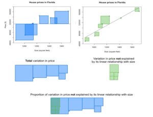
coefficient of determination
the proportion of the variation in the response variable that can be explained by its linear relationship with the explanatory variable; denoted 𝑅^2 and pronounced “R squared.”
counterexample
an example that contradicts or disproves a general statement.