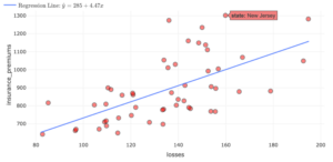
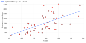
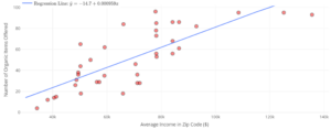
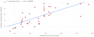
| State | Losses ($) | Observed Insurance Premiums ($) | Predicted Insurance Premiums ($) | Residual ($) |
| Louisiana | $194.78 | $1,281.50 | ||
| Idaho | $82.75 | $642.00 | ||
| Montana | $85.15 | $816.20 | ||
| Oklahoma | $178.86 | $881.50 |


| Skill or Concept: I can . . . | Questions to check your understanding | Rating from 1 to 5 |
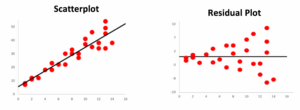
| Calculate and interpret residual errors. | 1, 2, 3, 4 | |
| Identify violations of assumptions needed to perform linear regression. | 5, 8 | |
| Discuss the effect of influential points on . | 6, 7 |
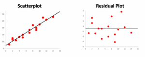
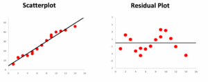
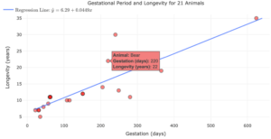
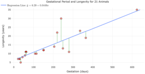
- influential point
- an observation that does not fit the trend of the data.
