What you’ll need to know
In this support activity you’ll become familiar with the following:
- Read and interpret bar charts that represent percentages.
- Read and interpret stacked bar charts.
- Express absolute change in percentages.
- Express relative change in percentages.
You will also have an opportunity to refresh the following skills:
In the next section of the course material and in the following activity, you will need to be able to interpret data presented in side-by-side and stacked bar charts. Prepare for that in this support activity by practicing working with data presented as percentages. At the end of the activity you’ll also compute absolute and relative changes in percentages. That part can be tricky. Follow the Recall box and question hints for help along the way. You may also wish to refer to Fractions, Decimals, Percentages.
Bar Charts
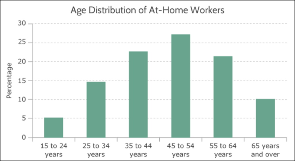
You worked with bar graphs (also called bar charts) recently in What to Know About Displaying Categorical Data: 3A. The graphs in that page displayed several bars, each representing a different categorical variable. The height of the bar represented that category’s associated frequency (count). The graphs we’ll look at in this activity are similar to the ones you saw there, but instead of the bar heights representing counts, these will represent percentages. Let’s take a close look at the first graph below, Age Distribution of At-Home Workers, as an example.
The graph below shows data from the U.S. Census Bureau on at-home workers in the United States in 2010. [1] Note that age ranges are listed along the horizontal axis and percentages are marked along the vertical axis. The graph displays the percentages of all workers, separated by age ranges, who worked at home at least one full day during a typical work week in 2010 (at-home workers). For example, we can see from the graph that workers who were 15 to 24 years old represented 5% of all at-home workers. Workers aged 25 to 34 years old represented nearly 15% of at-home workers, and so on. Use this graph to answer the questions below.
question 1
How many bars are in the chart?
question 2
What does the height of each bar represent?
question 3
How many bars represent at-home workers 44 years of age or younger?
question 4
Does this graph show the total number of people between the ages of 15 to 24 who work at home? Why or why not? If not, what additional data would be needed to compute this number?
Stacked Bar Charts
Stacked bar charts also display values for different categories but rather than showing a different bar for each category, they display sub-categories as segments within each bar. Sometimes the bars represent counts, while others, such as the one we see in the image below, display percentages. Each segment represents a percentage of the whole so it’s easy to see relative differences within a bar. But as segment percentages grow smaller, it becomes difficult to estimate them. Let’s take a look at the graph below to gain a better understanding of how to read stacked bar charts.
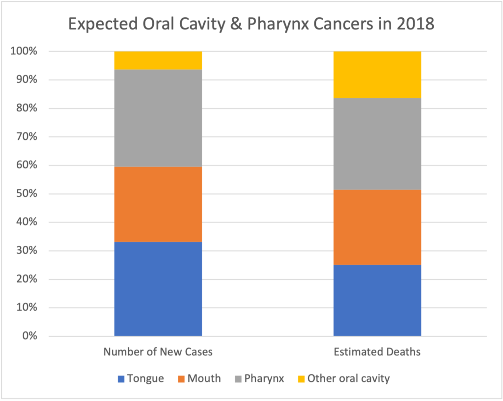
The graph above shows the expected number of new cases of oral cavity and pharynx cancer for 2018 and the expected number of deaths from oral cavity and pharynx cancer for 2018, separated by the specific location of the cancer. [2] The bar on the left shows the number of new cases of a cancer by location in the body as a percent of all new oral cavity and pharynx cancers that year. The bar on the right shows the number of deaths by location of cancer as a percent of total deaths from these cancers. The percentages represented by the segments within each bar will total to 100%. For example, we can see that in the bar on the left, the yellow segment covers about 7% of the bar from 93% to 100%. This means that locations other than tongue, mouth, or pharynx accounted for about 7% of new cancers. In the bar on the right, we see that deaths from cancers in other locations accounted for about 17% of new cancers (the yellow segment covers from about 83% to 100%).
Interactive example
What percent of estimated deaths from these cancer were located in the tongue? In the mouth? In the pharynx? Estimate them by looking at the range of percentages covered by each segment. Check your answers, then complete the question below the graph.
Now it’s your turn to practice reading the stacked bar chart by answering the following questions. The graph is linked again here for convenience.
question 5
What does the first column in the previous graph illustrate?
question 6
What does the second column illustrate?
question 7
What does each color represent?
question 8
Which type of oral cavity and pharynx cancer was expected to have the greatest number of new cases in 2018? Explain.
question 9
Which type of oral cavity and pharynx cancer was expected to lead to the most deaths in 2018? Explain.
Changes in Percentages
When examining data, it can sometimes be helpful to compare two values by taking their absolute change or their relative change. It can be challenging, though, to compare relative change when data are presented at percentages. Before we try to understand how to apply these comparisons to percentages, please refresh your understanding of absolute and relative difference in the Recall box below.
Recall
When computing absolute change and relative change between two values, we need one value that we think of as the starting point and the other that represents the value after some change. We’ll call the starting point value the reference value and the second one will be the new value. We’ll use these terms in the skill explanations below.
Core skill:
Core skill:
It can be tricky to handle the units when they are in percentage points. Use this rule of thumb when the original units are percentage points:
- The absolute difference will be in percentage points, indicating the change occurred in a number of percentage points.
- The relative difference will be expressed with the [latex]\%[/latex] symbol, indicating that the amount of something has changed by some percent relative to its original amount.
Interactive example
Consider a small town that suffered the downsizing of a large manufacturing plant. In 2010, 60% of the town’s workers were employed in the plant. But in 2011, only 27% of the town’s workers remained.
What was the absolute change in the percentage of workers employed at the plant?
What was the relative change?
Now you try this scenario about graduation rates.
In 2013, 80% of the original class of 2013 (who started in 2009) graduated from Valley High School, and in 2014, 73% of the original class of 2014 graduated.
question 10
What was the absolute change in the graduation rate from 2013 to 2014 in percentage points?
question 11
What was the relative change between the 2013 and 2014 graduation rates?
question 12
Do you have enough data to determine the size of the graduating class of 2013? If so, state the answer. If not, explain what additional information is necessary.
- Mateyka, P. J., Rapino, M. A., & Landivar, L. C. (2012, October). Home-based workers in the United States: 2010. United States Census Bureau. https://www.census.gov/prod/2012pubs/p70-132.pdf ↵
- American Cancer Society. (2018). Table 1. Estimated number of new cancer cases and deaths by sex, US, 2018. https://www.cancer.org/content/dam/cancer-org/research/cancer-facts-and-statistics/annual-cancer-facts-and-figures/2018/estimated-number-of-new-cancer-cases-and-deaths-by-sex-us-2018.pdf. ↵
