| Sample | Sample Proportion |
| 1 | |
| 2 | |
| 3 | |
| 4 | |
| 5 |
| Skill or Concept: I can . . . | Questions to check your understanding | Rating from 1 to 5 |
| Identify whether a summary measure is a parameter or a statistic. | 1 | |
| Determine the appropriate type of plot for a given dataset. | 3, Part A | |
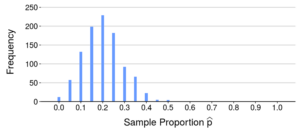
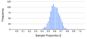
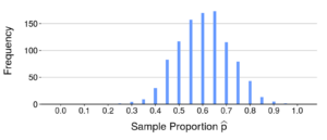
| Simulate sample proportions of random samples of a given size from a population with known . | 4, 5 | |
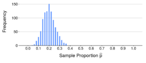
| Describe and interpret features of a sampling distribution of sample proportions. | 2
3, Part B 3, Part C 4–6 |
|
| Calculate the standard deviation of a sample proportion. | 7 |
 A dis
A dis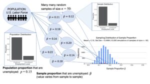

| Skill or Concept: I can . . . | Questions to check your understanding | Rating from 1 to 5 |
| Describe how the center, spread, and shape of a sampling distribution of a sample proportion varies with the sample size, , and the population proportion, . | 1–4 | |
| Use a normal distribution to approximate probabilities involving a sample proportion. | 5, Parts A and B | |
| Use a normal distribution to approximate percentiles of a sample proportion. | 5, Part C |
- sampling distribution
- the distribution showing how sample proportions vary from sample to sample.
- population distribution
- the distribution showing how individuals vary in a population.
Glossary 9C
- percentile
- the value at which a certain percentage falls below that value.
- Central Limit Theorem
- as the sample size gets larger, the distribution of the sample proportion will become closer to a normal distribution.
