16A

Skill or Concept: I can . . . Questions to check your understanding Rating
from 1 to 5
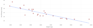
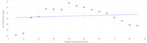
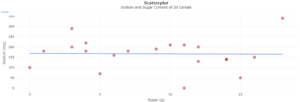
Identify the difference between the sample slope of the line of best fit and the population slope. 4
Understand the relationship between the correlation coefficient and the slope of a regression line. 1–3
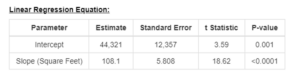
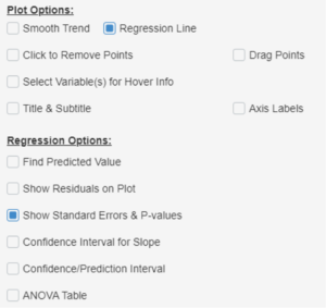
Write the hypotheses and obtain a test statistic and P-value for a test for significance of slope. 5 and 6

A scatterplot labeled “Temperature” on the x-axis and “Park Attendance” on the y-axis. There is a line of best fit that extends from approximately (70, 12500) to approximately (105, 13000). The points near the middle of the x-axis are generally higher in value than those near either end. An illustration of a city. A residual plot labeled “Size” on the x-axis and “Residual” on the y-axis. There is a horizontal line at y = 0. The points with lower x-values are generally closer to the line than those with higher x-values. A scatterplot labeled “Square Feet” on the x-axis and “Price” on the y-axis. There is a line of best fit that extends approximately from (1300, 175000) to (3200, 390000). The points are clustered near the line. A residual plot labeled “Square Feet” on the x-axis and “Residual” on the y-axis. There is a horizontal line at y = 0. There is no pattern to the points. A table labeled "Linear Regression Equation," with headings "Parameter," "Estimate," "Standard Error," "t Statistic," and "P-value." The first row has values "intercept," 44,321, 12,357, 3.59, and 0.001. The second row has values "Slope (Square Feet)," 108.1, 5.808, 18.62, and <0.0001. A scatterplot labeled “Age (years)” on the x-axis and “Hours of Sleep in a Typical Night” on the y-axis. The points near the middle of the x-axis are generally lower in value than those near either end. A residual plot labeled “Residual” on the y-axis. There is a horizontal line at y = 0. The points near the middle of the x-axis are generally lower in value than those near either end. A scatterplot labeled “Milk” on the x-axis and “Eggs” on the y-axis. There is a line whose equation is given at the top, where it reads “Regression Line y = -0.79 + 0.76.” Beneath the graph is a table titled “Linear Regression Equation,” with columns “Parameter,” “Estimate,” “Standard Error,” “t Statistic,” and “P-value.” The first row has values “Intercept,” -0.7895, 0.659, -1.2, 0.2456. The second row has values “Slope (Milk),” 0.7595, 0.2049, 3.71, 0.0015. A residual plot labeled “Milk” on the x-axis and “Residual” on the y-axis. There is a horizontal line at y = 0. The points have no pattern. A scatterplot labeled “Weight (kg)” on the x-axis and “Gas Mileage (mpg)” on the y-axis. There is a line that extends approximately from (2500, 33) to (6400, 13). The points are close to the line. A scatterplot labeled “Steady Driving Speed (mph)” on the x-axis and “Fuel Efficiency (mpg)” on the y-axis. There is a line that extends approximately from (5, 31) to (85, 34). The points near the middle of the x-axis are generally higher in value than those near either end. A scatterplot titled “Sodium and Sugar Content of 20 Cereals.” The x-axis is labeled “Sugar (g)” and the y-axis is titled “Sodium (mg).” There is a pin that appears horizontal at approximately y = 170. Most points are relatively close to the line. A selection menu. The first heading reads “Plot Options” and has checkboxes for “Smooth Trend,” “Regression Line,” “Click to Remove Points,” “Select Variable(s) for Hover Info,” “Title & Subtitle,” “Drag Points,” and “Axis Labels.” Only “Regression Line” is selected. The next heading reads “Regression Options” and has checkboxes for “Find Predicted Value,” “Show Residuals on Plot,” “Show Standard Errors & P-values,” “Confidence Interval for Slope,” “Confidence/Prediction Interval,” and “ANOVA Table.” Only “Show Standard Errors & P-values” is selected.