What you’ll need to know
In this support activity you’ll become familiar with the following:
- Recognize the types of variables appropriate for heat maps.
You will also have an opportunity to refresh the following skills:
- Calculate a change in percentage
- Calculate relative frequency
In the next preview assignment and in the next class, you will need to identify and interpret the color scale of a heat map and recognize an accurate interpretation of the statistics used in a heat map. We’ll use this support activity to preview the terminology and components of heat maps and to make sure you are feeling comfortable with relative frequencies and percentages.
Heat Maps
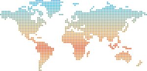
A heat map is a specific type of complex graphical display where data values or summary statistics calculated from values in the dataset are grouped into different colors along a scale. The visual representation of the heat map is often displayed as a map either of a specific country or the entire world.
Variables
In this Corequisite Support Activity, you’ll learn about the types of variables usually presented in a heat map and how those variables are categorized for use in this visual display. Earlier in the course you learned that some graphical displays are well-suited for categorical variables and others for quantitative variables. A heatmap is similarly better suited for one of these, too.
example
Consider the heatmap that appears in the text above. What variable do you think the colors might represent? Do you think that variable would be quantitative or categorical?
To help you answer those questions, imagine that the heatmap includes a key letting you know value ranges for the shades of blue, orange, and red shown in the map.
Work in pairs to answer Question 1 – 4 to understand how variables (and what type of variables) are presented in a heat map.
Question 1
If we take a quantitative variable and group that variable into different categories to create a new variable in our dataset, what type of variable is the new variable (e.g., if the temperature is >71˚, then “Hot”)?
Question 2
In the table below, we have average temperatures (in degrees Celsius) for four U.S. cities during the four seasons of the year (Winter, Spring, Summer, and Autumn).[1]
| Winter | Spring | Summer | Autumn | |
| New York | 39˚ | 64˚ | 84˚ | 55˚ |
| Los Angeles | 68˚ | 73˚ | 83˚ | 79˚ |
| Chicago | 25˚ | 56 ˚ | 75˚ | 50˚ |
| Houston | 60˚ | 76˚ | 91˚ | 75˚ |
One way we can compare these average temperatures is to create groups with a certain range of temperatures for each group. Let us use the following groups for the average temperatures: Cold (less than 40˚), Warm (40˚ to 70˚), and Hot (71˚ and above). Choose diverging colors to depict “Cold,” “Warm,” and “Hot.” Then, color in each cell of the previous table with the corresponding color for that group of average temperatures. Do not forget to add a legend next to the table to indicate what each color means.
Question 3
What did you notice about the average temperatures for the four cities after you colored in the cells of the table?
Question 4
Determine whether the statement is true or false: If we were to change the range of temperatures for the categories of Cold, Warm, and Hot, the colors of the cells in the table would change.
Percentages
Sometimes the heat map is not based on averages but rather on other statistics, such as a change in percentages. A change in percentages is the difference between two percentages. Usually, a change in percentages is calculated for a heat map when we want to show the difference between two time points (e.g., Year 1 and Year 2).
The percentage of people in the United States who experienced flu-like symptoms as reported by the Center for Disease Control (CDC) on February 16, 2019 was 5.04%; on February 15, 2020, it was 6.11%.
Question 5
Calculate the change in percentages of people who experienced flu-like symptoms between 2019 and 2020 in the month of February.
Question 6
What is the correct interpretation of the change in percentages?
a) The percentage of people in the United States who had flu-like symptoms increased between 2019 and 2020.
b) The percentage of people in the United States who had flu-like symptoms decreased between 2019 and 2020.
c) The percentage of people in the United States who had flu-like symptoms stayed the same between 2019 and 2020.
Relative Frequency
Another variable that can be displayed on a heat map is called a relative frequency. A relative frequency is defined as the number of times an event of interest occurred divided by the total number of trials. See the Recall box for a refresher as needed before answering Questions 7 and 8.
recall
You used relative frequencies in [Displaying Categorical Data: Corequisite Support Activity]. Feel free to return to that page for a refresher of how you used the skill to explore the number of shark attacks in one region as part of shark attacks occurring in all regions. A brief review appears here.
Core skill:
Question 7
Suppose that you have a birdfeeder outside your window, and you notice many different birds visiting the birdfeeder each week. You notice that out of the 75 birds you counted at your birdfeeder for one week, 21 of those birds were cardinals. What is the relative frequency of seeing a cardinal at your birdfeeder?
Question 8
What would be an estimate of the relative frequency that one of your friends/followers on any social media platform (i.e., Facebook, Instagram, Twitter, TickTock, etc.) is from your hometown?
Now that you’ve learned what goes into creating a heat map and gained some practice with the associated math skills, you are ready to move into the course section!
- National Oceanic and Atmospheric Administration, National Centers for Environmental Information. (2021). Climate at a Glance. https://www.ncdc.noaa.gov/cag/city/time- series/USH00305801/tavg/12/1/1895-2021?base_prd=true&begbaseyear=1901&endbaseyear=2000 ↵
