learning goals
At the end of this page, you should feel comfortable performing these skills:
- Define the criteria for effective visualization.
- Identify misleading components in a graphical display.
In the next Forming Connections, you will need to understand how to use a rating scale and best practices criteria to think critically about graphical displays and evaluate whether the criteria have been met. Let’s prepare for that by carefully defining the criteria and learning to use them to identify whether a graphical display has a misleading or missing component.
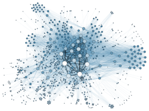
Social Network Analysis Visualization
Criteria for Effective Visualization
When evaluating graphical displays, it is important to identify evidence of the following criteria: design, precision, efficiency, use of time, use of ink, use of space, and multivariate. The criteria are based on the Principles of Graphical Excellence[1] by Edward Tufte, a statistician and pioneer in the field of information design. These principles are important aspects of a graphical display that are needed for an effective visualization.
Design
The first criterion is the use of design attributes such as color, symbols, or lines/curves to encourage comparisons that create a clear purpose for the graphical display.
Examples
When a graphical display includes a key, compare the key to the graph to see that all the information is explained clearly. The key may include explanations of the colors, symbols, or the style of lines (a combination of lines and symbols) used to convey information.
With which attributes of a graphical display is the design criteria is concerned?
- a) Spacing, media, color
- b) Color, symbols, lines/curves
- c) All of the above
Try identifying the design attributes in the graph in Question 1.
question 1
Which types of design attributes were used in the following graphical display[2] to compare birth, death, and infant mortality rates during the Chinese Famine of 1959–61? There may be more than one correct answer.
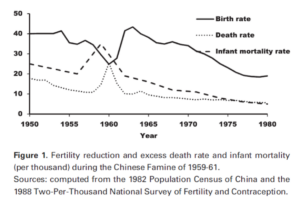
Figure 1. Fertility reduction and excess death rate and infant mortality (per thousand) during the Chinese Famine of 1959-61. Sources: computed from the 1982 Population Census of China and the 1988 Two-Per-Thousand National Survey of Fertility and Contraception.
- a) Color
- b) Symbols
- c) Lines/curves
Precision
The second criterion is the use of precision, which means that the statistical transformation is appropriate for the type of visualization. For example, a graphical display that uses precision would start the y-axis of a bar graph at 0 rather than another number. The use of precision is not evident in a graphical display if we see any transformation of the data that shows an exaggeration of differences and distorts the data.
Video Placement
[Worked example: a 3-instructor video showing examples of graphs that exhibit precision and those that do not. One of the examples should preview the type of inconsistency displayed in Question 2, in which the “weight” of a symbol as a percentage is not consistent across the display]
Try determining whether a graph’s design exhibits precision in Question 2.
question 2
Which statement is a correct interpretation of the following graphical display?[3]

- a) This graph is precise and does not exaggerate the differences in percentages between the years.
- b) This graph is not precise because the use of a book as a percentage point is not consistent across the bars of the graph.
Efficiency
The third criterion is efficiency, which means that the effort required for the reader to understand the purpose of the graphical display is minimal. In order for a graph to be efficient, the graphical display should be clear in communicating patterns or trends.
example
Under the efficiency criterion, a graph shouldn’t be more complicated than is necessary to convey the desired information. For example, displays should not try to include trends for unrelated data or data of different magnitudes on the same graph.
Which of the following statements would fall under the efficiency criterion of graphical displays? Choose all that apply.
- a) The reader should understand the graphical display with minimal effort.
- b) A graph should demand the concentration of the reader to correctly interpret it.
- c) The graphical display should be clear in communicating patterns or trends.
Analyze the efficiency of the graph displayed in Question 3.
question 3
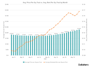
Is this graph[4] efficient in showing the relationship between the average price per square foot compared to the average rent per square foot?
- a) Yes
- b) No
Time, Ink, and Space
The fourth, fifth, and sixth criteria are closely related and are use of time, use of ink, and use of space. A graphical display is most effective when it allows the viewer to gain the largest number of ideas in the shortest time with the least amount of ink in the smallest space. With criteria four, five, and six, it is important to not overload the viewer of the graph with too much information. Graphical displays that do not show evidence of these criteria are graphs that have extra colors or symbols that are not needed, or 3-D plots where the third dimension is not relevant to understanding the graph.
Video Placement
[Perspective Video: a 3-instructor video that uses one good example of use of time/ink/space to show students how to think about a well-designed graph (see the link in Question 4 for an excellent example) along with classic examples of bad design using 3D graphs.]
Now it’s your turn to identify examples of good or bad examples of use of time, use of ink, and use of space as you answer Questions 4 and 5.
question 4
Go to www.gapminder.org/world and use the graph to answer Parts A and B.
The graph is called a bubbleplot, with life expectancy on the y-axis and income per capita on the x-axis. Colors represents different geographic regions, and the size of the bubble represents the population size of the country.
Part A: Does this graph make good use of time?
- a) Yes
- b) No
Part B: Does the graph make good use of small space?
- a) Yes
- b) No
question 5
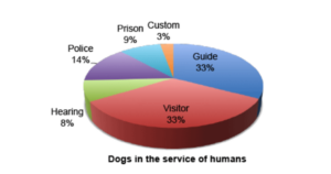
Is there a good use of ink in the following pie chart[5] that was used to summarize data on where dogs are used in the service of humans?
- a) Yes
- b) No
Multivariate
[Note: this section appears to have been largely derived from https://allpsych.com/psychology101/sensation_perception/perception/ , which is referenced in a footnote on the DC page. I added the paragraph relating it to the Gestalt Laws of design (a well-known UX principle) — it seems unusual that this page just uses these four principles without referencing the very well known source. I am not aware myself of the design criteria used this way statistically. This may be an attempt to summarize some key design principals into a neat set that DC has called The Criteria (emphasis mine). Someone else may have more information about it.]
The seventh criterion is multivariate, which means displaying more than one variable on a graphical display to encourage the reader to make comparisons. The way that the multivariate criterion can be shown on a graph is through the design principles of similarity, proximity, continuity, or closure.[6]
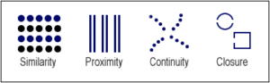
- Similarity can be shown in a graphical display through the use of similar colors or shapes.
- Proximity is defined as the spacing between visual objects.
- Connection or continuity focuses on creating visual focus for the eye using lines.
- Closure is the practice of using boxes or circles to highlight groups.
This criterion stems from the Gestalt Principles, which are a set of psychological laws that describe the tendency in the human mind to items based on similar presentation. Graphical displays of multivariate data (more than two variables present, as opposed to univariate or bivariate data) leverage these principles to aid reader comprehension.
Answer Questions 6 – 10 to see examples of how the multivariate principles apply to visual perception. Keep these in mind during the upcoming activities in this module.
question 6
Similarity through colors: When you look at the following image, do you see rows or columns?
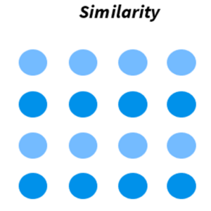
- a) Rows
- b) Columns
question 7
Similarity through shapes: When you look at the following image, do you see rows or columns?
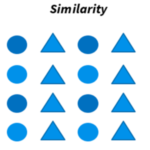
- a) Rows
- b) Columns
question 8
Example of proximity: When you look at the following image, do you see rows or columns?
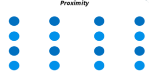
- a) Rows
- b) Columns
question 9
Example of connection: When you look at the following image, do you see rows or columns?
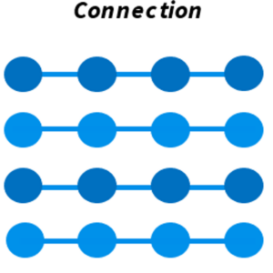
- a) Rows
- b) Columns
question 10
Example of closure: When you look at the following image, do you see rows or columns?
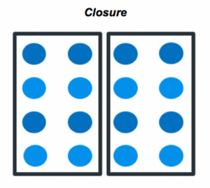
- a) Rows
- b) Columns
Summary
In this What to Know page, you learned to define the criteria for best practices in graphical displays and to use the criteria to look critically at graphs for misleading or missing representation. Let’s summarize these here by looking at the questions in which each criterion appeared.
- In Question 1, you identified evidence of the design criterion.
- In Question 2, you identified evidence of the precision criterion.
- In Question 3, you identified evidence of the efficiency criterion.
- In Questions 4 – 5, you identified evidence of the use of time, use of space, and use of ink criteria.
- In Questions 6 – 10, you identified evidence of the multivariate criterion.
You may wish to make notes of these criteria to take into the activity with you. If you feel comfortable with these ideas, move on to the activity in Forming Connections.
- Tufte, E. R. (2001). The visual display of quantitative information (2nd edition). Graphics Press. ↵
- Huang, C., Guo, C., Nichols, C., Chen, S., & Martorell, R. (2014). Elevated levels of protein in urine in adulthood after exposure to the Chinese famine of 1959-61 during gestation and the early postnatal period. International Journal of Epidemiology, 43(6), 1806–1814. ↵
- 3 U.S. Department of Education, National Center for Education Statistics. (n.d.). Under President Obama, more students are earning their high school diplomas than ever before. https://twitter.com/ObamaWhiteHouse/status/677189256834609152 ↵
- The do’s and don’ts of dual axis charts. (2015, April 23). DataHero. Retrieved from https://datahero.com/blog/2015/04/23/the-dos-and-donts-of-dual-axis-charts/ ↵
- Sleuthing pie graphs. (n.d.). AAMT, Top Drawer Teachers. Retrieved from https://topdrawer.aamt.edu.au/Statistics/Good-teaching/Data-representation/Creating-pie- graphs/Sleuthing-pie-graphs ↵
- Chapter 5.2: Perception. (n.d.). AllPsych. Retrieved from https://allpsych.com/psychology101/perception/ ↵
