Objectives for the Mini-project
During this activity, you will:
- Create an appropriate display to visualize the distribution of a single variable (univariate graphs) or the relationship between two or more variables (multivariable graphs).
- Write statements to communicate statistical results to a general audience.
- Apply principles of making effective graphical displays to improve an existing graph.
We conclude this module surrounding the interpretation of complex graphical displays with a mini-project designed for you to showcase the skills you’ve learned exploring these visualizations. You’ll be working with a a large dataset of health statistics to explore associations between three variables by creating your own effective graphical displays. You’ll see that graphical displays can be used to communicate information either about a single variable or the relationship between two variables and that creating effective displays is typically an iterative process.
Guidance
[Intro: The goal of this mini-project is to give you hands-on experience in an open-ended activity in which you get to use what you know to create a new graphical display — one unique to your understanding. You’ll have guidance along the way to help you frame the work, though. The first 3 questions in this activity page are designed to help you prepare by helping you to recall important skills and information. In Question 1, you’ll access the database, recall how to use the data dictionary, and refresh your memory regarding categorical vs. quantitative variables. In Question 2, you’ll identify the appropriate technology for the project. Question 3 introduces the rubric for the project so that you’ll have clear guidelines to use to meet the expectations for the project. The remainder of the activity will guide you through the project, which you will complete individually outside of class. ]
Mini-Project: Do Fitness Habits and Perceptions of Health Change With Age?
In this mini-project, you will use data collected by the U.S. National Center for Health Statistics through the 2011-2012 National Health and Nutrition Examination Survey (NHANES). The NHANES has been conducted every two years since the early 1960s. The data collected from the survey include demographics, various body and health measurements, and information about various lifestyle choices. The NHANES is unique in that the health measurements are collected through physical examinations (data on all other variables are self-reported).

Before you begin the analysis, we will discuss the data and expectations for this project. Questions 1 – 3 below will familiarize you with the dataset, which is located in the spreadsheet linked here.
DCMP_STAT_5D_nhanes_alldata <– link to the spreadsheet
question 1
Locate the NHANES dataset (DCMP_STAT_5D_nhanes_alldata) containing the following variables:
Age: Age in years at screening of the study participant (Note: Subjects 80 years or older were recorded as 80)
HealthGen: Self-reported rating of the study participant’s health in general (Excellent, Vgood, Good, Fair, Poor)
PhysActive: Whether the study participant reported performing moderate or vigorous sports, fitness, or recreational activities (Yes, No)
AttendCollege: Whether the study participant attended or completed college at the time of the study (Yes, No)
BadPhysHlthDay: Whether the study participant self-reported having at least one bad physical health day in the past 30 days (Yes = at least 1 day; No = 0 days)
BadMentlHlthDay: Whether the study participant self-reported having at least one bad mental health day in the past 30 days (Yes = at least 1 day; No = 0 days)
BMI: Body mass index (weight/height2 in kg/m2)
SleepTrouble: Participant told a doctor or other health professional that they had trouble sleeping (Yes, No)
SleepHrsNight: Self-reported number of sleep hours the study participant usually got on weekdays or workdays
TotChol: Total HDL cholesterol in mmol/L
BPSysAve: Average of three systolic blood pressure readings in mm/Hg
Part A: Identify two quantitative variables in the data. What possible values do these variables take in the dataset?
Part B: Identify two categorical variables in the data. List the possible categories these variables can take.
question 2
In this project, you will create univariate, bivariate, and multivariate graphical displays for quantitative and categorical variables. Identify one or two DCMP Data Analysis Tools at https://utdanacenter.org/data-analysis-tools (or other tools) you can use to create these graphs. Include the name of the tool and the type of graph you can create in your answer.
question 3
One goal of this project is to continue developing your statistical writing skills. This includes writing your interpretations in a way that can be clearly understood by a general audience and presenting your results in a report suitable for an academic or professional setting.
Part A: Describe what is meant by “writing in a way that could be clearly understood by a general audience.”
Part B: Refer to the project rubric. Based on the rubric, what are qualities of a report that are suitable for an academic or professional setting?
Now you should be prepared to complete the mini-project in Questions 4 – 7.
Project Completion and Presentation
The remainder of this activity forms the mini-project itself and should be completed outside of class. With that in mind, note that the remaining questions are more open-ended than usual. This gives you leeway to demonstrate your understanding of the data analysis tools, statistical techniques, data entry, and labeling. You’ll wrap up each question by writing requested statements about the graphs you create.
The primary objective of this analysis is to explore associations between age, health perception, and regular physical activity. The data you’ll use to investigate these associations include responses from 6,033 adults, aged 20 years and older.
This analysis focuses on the following variables:
- Age: Age in years at screening of the study participant (Note: Subjects 80 years or older were recorded as 80)
- HealthGen: Self-reported rating of the study participant’s health in general (Excellent, Vgood, Good, Fair, Poor)
- PhysActive: Whether the study participant reported performing moderate or vigorous sports, fitness, or recreational activities (Yes, No)
Questions 4 – 6 ask you to create a specific graph using data from the dataset. You may copy and paste the data into a data analysis tool or you may enter it by hand. See the hints located in these questions for guidance.
Question 7 asks you to improve upon an existing graph. Be sure to note all the concerns you have about the original graph along with the improvements you made to address them. Your instructor will assess whether your interpretations are correct. See the rubric for details.
Create a Graphical Display
To answer the questions below, you’ll need to copy and paste data from the spreadsheet into the analysis tool (It would take too long to type it in by hand). If you are using the course embedded data analysis tools, remember to choose “your own” data under the Enter Data tab. Then select the data in the spreadsheet and copy it into the Enter observations box in the tool. You’ll need to choose the correct tool to create each display.
Take a screenshot of each of your graphs to include in your project. You may wish to include a screenshot of the entire page as well as a high resolution image of the graph using the data analysis tool image feature. Be sure to use appropriately descriptive title and axis labels.
question 4
Let’s begin by looking at the ages of the survey respondents.
Part A: Use technology to create a histogram of Age.
Part B: Describe the distribution. Include the shape, center, spread, and the presence of outliers in your description, using appropriate summary statistics as needed.
Part C: The distribution shows a small peak around 80 years old. (Note: Changing the binwidth of the histogram makes the peak more or less noticeable.) Briefly explain why there may be a peak around this value.
question 5
Next let’s examine how the respondents generally perceived their health.
Create an appropriate graphical display of HealthGen. Then use the graph to describe two different observations about the respondents’ general perceptions of their health.
question 6
Now let’s examine whether there is an association between health perception and whether a person performs regular physical activity.
Create a graphical display to visualize the distribution of HealthGen for each category of PhysActive.
To create the display, you may wish to copy and paste the data into the tool. If you do, there may not be an opportunity to order it in the way you would prefer. One option for entering data to create a well-ordered graph is to enter it from the following contingency table.
| Perceived Health / Physical Activity | No | Yes |
| Excellent | 206 | 504 |
| Vgood | 700 | 1274 |
| Good | 1197 | 1161 |
| Fair | 564 | 275 |
| Poor | 128 | 24 |
Does there appear to be a difference in general health perception between people who perform regular physical activity and those who do not? Write two observations from the graphical display to support your response.
Improve a Graphical Display
question 7
A popular health and wellness website is writing an article that explores the following questions:
(1) Does having a habit of regular physical activity change with age?
(2) Does the association between age and health perception differ based on performing regular physical activity?
They would like to include a graphical display in the article to help readers visualize conclusions in the article about the associations between the variables. The authors propose the following graph, but the website editor is concerned it may be confusing to readers. She has asked for your help to improve the graph and write an interpretation of the graph that will be included in the article.
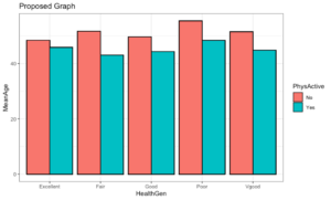
Part A: Describe two ways this graphical display may be confusing and/or makes it difficult to explore the questions of interest for the article.
Part B: Use technology to make an improved graphical display that can be effectively used to answer the two questions of interest. You may use multiple graphs, if needed.
In statistics, we often need to manipulate the structure of the dataset in order to create the visualizations. See the reorganized dataset (DCMP_STAT_5D_nhanesYesNo) in the spreadsheet linked below that includes only the variables for this question that aide in the creation of your visual display.
[link a pdf of the spreadsheet DCMP_STAT_5D_nhanesYesNo here]
Part C: Use the graph(s) to answer the two questions of interest for the article. Write a short paragraph (three to six sentences) that includes your answers to the questions and observations from the graph(s) that support your response. The response should be written in a way that is clearly understood by a general audience.
Presentation
Follow your instructor’s rubric to prepare your graphs and summary statements for presentation. Remember to use informative titles and axis labels and to prepare a neatly written paper that follows conventions of academic writing. Your instructor will advise how to submit the completed mini-project.
