Learning Goals
At the end of this page, you should feel comfortable performing these skills:
- Identify the estimated y-intercept and estimated slope from the equation of the line.
- Interpret the estimated slope in context.
In this next in-class activity, you will need to be able to identify and interpret the slope and y-intercept of a line. You’ve probably seen linear equations before. If so, after refreshing the concept, focus on the interpretation of slope in the context of statistics. Understanding that the slope of a line of best fit in a statistical model will be a key idea as you complete the upcoming Forming Connections activity.
Mathematical Models
In a previous math class, you may have learned about the general form of a linear equation: [latex]y=mx+b[/latex], where m is the slope of the line and b is the [latex]y[/latex]-intercept. You may have also learned that [latex]m[/latex] is the ratio that measures how much [latex]y[/latex] changes compared to an increase in [latex]x[/latex] and that [latex]b[/latex] is the place on the graph where the line crosses the [latex]y[/latex]-axis.
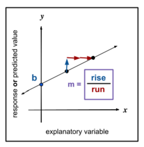
See the video below to learn how to read the slope of a line from a graph and from a data table. Then, answer Question 1.
Video Placement
[A short video (no more than 1 minute) illustrating using rise over run to “count out” the next point on a line then a worked example showing how to obtain the slope of a line from a data table of linear data. Finally, show how to express the slope in context in a sentence (e.g. for each change in x by n units, there is a change in y by m units.]
Now, answer Question 1 to identify and interpret the slope of a line from a data table.
question 1
Consider the linear equation[latex]y=3x+100[/latex]. The following is a table showing four ordered pairs in this linear equation.
| x | y |
| 0 | 100 |
| 1 | 103 |
| 2 | 106 |
| 3 | 109 |
Part A: What is the slope of the line? Express your answer as a ratio.
Part B: Use any two points in the table to verify the slope using the formula [latex]m= \frac{rise}{run}[/latex]. Show your work.
Part C: Complete the sentence:
For this equation, the slope tells us that for every _____ unit increase in x, there is a _____ unit increase in y.
Part D: What is the y-intercept?
Part E: What is the y-intercept of the line represented by the following table?
| x | y |
| -2 | 1 |
| 0 | 3 |
| 2 | 5 |
| 4 | 7 |
Statistical Models
Video Placement
[Perspective Video: A short video showing the “rebranding” of the slope-intercept form of the linear equation to statistics style as shown below. Include a discussion of the estimated nature of the intercept and predicted response values.]
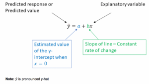
In statistics, we rearrange the general form of the equation and rebrand the letters. The following diagrams illustrate how we do this.
Answer Question 2 to summarize the changes made to the linear model in the context of statistics.
question 2
Use the diagrams to answer the following questions:
Part A: What letter represents the predicted value of the response variable?
Part B: What letter represents an observed explanatory value?
Part C: What letter represents the estimated [latex]y[/latex]-intercept (the estimated value of [latex]\hat{y}[/latex] when [latex]x[/latex] is 0)?
Part D: What letter represents the estimated slope of the line?
Estimated Y-intercept and Slope
An important distinction between mathematical models and statistical models is that in statistics, we estimate the equation of the line from data. That is, a mathematical model may be a equation that describes an existing line, upon which every point may be predicted with complete accuracy. But a statistical model may not accurately predict a response in the data. The statistical model provides an estimation of the best line that fits as much of the data as possible while minimizing vertical errors in the observed values of the response variable.
Mathematical model: [latex]y=mx+b[/latex], in which [latex]b[/latex] is the exact point of intersection between the line and the y-axis and [latex]m[/latex] permits any point on the line to be predicted from any other point on the line.
Statistical model: [latex]\hat{y}=a+bx[/latex], in which [latex]a[/latex] is the estimation from the data of the y-intercept of a line of best fit and [latex]b[/latex] is an estimation from the data of the slope of the line of best fit. The “hat” symbol ([latex]^[/latex]) signifies that the predicted value of the response variable is estimated by the model rather than being a known quantity. The following are the formulas for calculating [latex]a[/latex] and [latex]b[/latex] from the data, but keep in mind that we’ll use technology to calculate these for us.
- The estimated slope is [latex]b=r \frac{S_y}{S_x}[/latex]; where [latex]S_y[/latex] and [latex]S_x[/latex] are the sample standard deviations for the response and explanatory variables and [latex]r[/latex] is the correlation coefficient for the data set..
- The estimated y-intercept is [latex]a= \bar{y} -b \bar{x}[/latex], where [latex]\bar{y}[/latex] and [latex]\bar{x}[/latex] are the sample means for the response and explanatory variables.
These formulas demonstrate that both the estimated slope and intercept are calculated directly from the data. If you change the data, you will almost certainly get a different line of best fit, slope, and intercept.
Please keep this distinction in mind as we progress through the upcoming activity, during which we’ll interpret the estimated or predicted slopes and estimated or predicted intercepts generated from given datasets.
The good news is that we will rely solely on the data analysis tool for all the calculations involved in the line of best fit. However, you will need to use some common sense and appropriate units when providing interpretations.
Let’s go to the data analysis tool to see how the line of best fit is calculated to answer Question 3.
question 3
Go to the DCMP Linear Regression tool at https://dcmathpathways.shinyapps.io/LinearRegression/ and select the “Beer Alcohol and Calories” dataset. Under “Plot Options,” select “Regression Line.”
The following diagram explains the output that is generated:
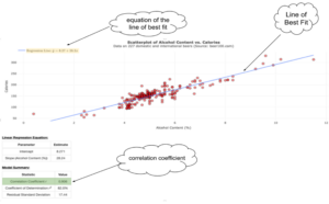
Part A: What is the equation of the line of best fit? Use proper notation.
Part B: Identify the estimated y-intercept and the estimated slope of the line of best fit.
Interpreting the Estimated Slope
The information gathered from the tool is not meaningful if it does not have an interpretation in the context of the problem. The following are guidelines for interpreting the estimated slope ([latex]b[/latex]). We will interpret the estimated y-intercept during the upcoming activity.
The value [latex]b[/latex] tells us the predicted change in [latex]\hat{y}[/latex]given a one unit increase in the value of the explanatory variable [latex]x[/latex]. You will be asked to identify this value in the context of the problem. This means you must be specific, and you must use the units described in the problem.
A suggested template for the interpretation of the estimated slope is as follows:
For every one (unit) increase in (explanatory variable units), we predict an average increase/decrease of ___ (response variable units) in (response variable).
Example
[These scenarios are pulled from the DC Linear Regression tool: “Organic Foods” and “Animal Gestation.” This could be an opportunity to present scenarios supporting inclusivity in the materials, as desired.]
For each of the following scenarios, interpret the estimated slope using the template given above.
- A linear regression was performed using the following variables to explore a possible linear relationship. Avg_Income: average income per household in tens of thousands of U.S. dollars per zip code.
Num_Organic: the number of organic food items offered for sale in stores within the zip code. The correlation coefficient showed a moderately strong linear association at [latex]0.785[/latex]. The estimated slope of the line of best fit was [latex]9.591[/latex]. Interpret the estimated slope in context. - Researchers wanted to determine if the length of gestation for an animal (in days) is linearly related to its longevity (in years). A linear regression analysis yielded [latex]r=0.856[/latex] and a regression line of [latex]\hat{y}=6.29+0.449x[/latex]. Interpret the estimated slope in context.
You try interpreting estimated slopes using data sets located in the data analysis tool https://dcmathpathways.shinyapps.io/LinearRegression/ to answer Questions 4 and 5.
question 4
Interpret the estimated slope of the line of best fit [latex]b=28.2[/latex] in the context of the “Beer Alcohol and Calories” dataset. Fill in the blanks.
For every one percent increase in ____________________, we predict an average _______________ of _____________ for a bottle of beer.
question 5
Consider the dataset “Fuel Efficiency and Speed (non-linear)” in the DCMP Linear Regression tool.
Define the x-variable to be “Steady Driving Speed” and the y-variable to be “Fuel Efficiency,” and then use the software to generate a scatterplot and the equation for the line of best fit.
Which of the following is the best answer for the interpretation of the slope of the line of best fit? Choose the best answer.
- a) For every one mile per hour (mph) increase in the steady driving speed of the car, we know that the miles per gallon (mpg) fuel efficiency increases by 0.0348 mpg.
- b) For every one mph increase in the steady driving speed of the car, we predict that the average mpg fuel efficiency increases by 0.0348 mpg.
- c) For every one mpg increase in fuel efficiency, we know that the driving speed increases by 30.8 mph.
- d) For every one mpg increase in fuel efficiency, we predict that the driving speed increases by 30.8 mph.
- e) None of the above; it is not appropriate to use linear regression for this dataset.
Summary
In this What to Know page, you gained an in-depth understanding of slope and the estimated line of best fit as it pertains to statistics. You saw the slope as a constant predicted, estimated rate of change in bivariate data and interpreted it for a given scenario. Let’s summarize these ideas as you saw them.
- In Questions 1 – 3, you identified the estimated y-intercept and estimated slope from the equation of the line of best fit.
- In Questions 4 and 5, you interpreted the estimated slope in context.
If you feel comfortable with these ideas, move on to the Forming Connections activity to apply them.
