Objectives for this activity
During this activity you will:
- Construct and interpret a residual plot.
- Informally assess the appropriateness of a linear regression model.
In the previous What to Know assignment for this activity, you spent quite a lot of time calculating and interpreting residuals, identifying common scenarios of datasets for which linear analysis would not be appropriate, and exploring the effect of outliers on [latex]R^2[/latex]. You did this work to prepare for this activity in which you’ll construct a plot of the residuals for a dataset and use it to assess the appropriateness of a linear regression model. As you do so, you’ll see that residual plots can magnify potential issues with a linear model and that linear regression models may not be appropriate when we observe non-linear data trends or non-constant variance of residuals. You’ll also see that outliers should be investigated, as they affect the strength of a model.
This activity will investigate the whether the average income in an area is correlated with access to high quality, nutritious foods. Let’s begin.
Model Adequacy and Residuals

As an introduction to this activity, read and answer Question 1 independently before sharing and discussing your answer with a partner.
question 1
What factors might make it more difficult for people with modest incomes to access healthy foods (relative to individuals with higher incomes)?
Guidance
[Intro: In the following Question, you’ll perform some familiar tasks such as loading a dataset in the data analysis tool and creating a scatterplot with a line of best fit. Remember to closely examine the explanatory and response variables in order to fully understand the scenario before you begin your analysis. in Question 2 Part A, you’ll draw in the residuals for each data point. You can perform this in the tool by clicking the Regression Option to “Show Residuals on Plot.” Analyzing the first 10 stores on the graph will help you transition to being able to read the Fitted Values & Residual Analysis tab in the tool in order to answer the remainder of the question. Work together in pairs or groups to support one another as you learn this new skill.]
question 2
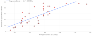
The following data were collected on the number of organic foods offered at 37 grocery stores in San Antonio, Texas in 2019. The number of organic foods offered at each store is plotted against the average income of the zip code in which each store is located. All stores are from the same grocery chain (same company).
Find the dataset “Organic Foods” in the DCMP Linear Regression tool at https://dcmathpathways.shinyapps.io/LinearRegression/ and reproduce the following plot.

Part A: For the first 10 stores (going from left to right on the graph), draw the residuals on the plot. Among the first four stores, how many have positive residuals? How many have negative residuals? Which store (among the first four) has the highest magnitude residual?
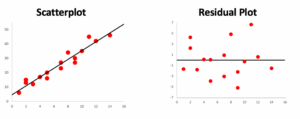
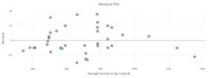
Part B: Go to the Fitted Values & Residual Analysis tab in the DCMP Linear Regression tool. You’ll see a “Residual Plot” that looks like the following plot. Compare the x-axis and y-axis labels of the residual plot with those from the previous regular scatterplot. What is the same? What is different?

Part C: Compare the first four store values (again, reading the graphs from left to right) in the regular scatterplot and the residual plot. Are the y-values in the regular scatterplot positive or negative? Are the y-values in the residual plot positive or negative? Explain.
Part D: Based on what you saw in the previous plot, why might statisticians find residual plots to be useful?
Residual plots emphasize the residual values in our model. The following scatterplot and corresponding residual plot show that our linear regression model is appropriate: the residual values appear to be randomly scattered across the x-values, with no clear patterns or changes in variability. Recall that this was one of the conditions assumed for a linear regression to be appropriate for a dataset.
Check in with your group to make sure your understanding of how to read a residual plot compared to a scatterplot is clear at this point, then move on to Question 3.
question 3
Now, let’s explore how residual plots can help us assess the reasonableness of our linear model.
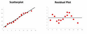
Part A: For the following scatterplot, is a linear model appropriate? Does the residual plot help make assessing this clearer? Explain.
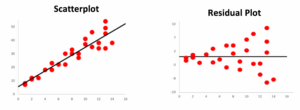
Part B: For the following scatterplot, is a linear model appropriate? Does the residual plot help make assessing this clearer? Explain.
For Questions 4 and 5, there is no single correct answer. Statistics involves making a choice and justifying it through proper reasoning. As you work in groups to answer these questions by finding support for your choices, you may ask yourself what would be clearly misleading to do in this situation. This can help you discover alternative reasonable choices.
question 4
Let’s return to the organic grocery items dataset. Real datasets rarely have “perfect” residual plots. Looking at the following residual plot, is there any reason to question if a linear model is appropriate? Explain.
question 5
[Please note that the images below are incorrect. They are the same as the previous images but shouldn’t be. There are slightly different plots given in DC Question 5 that include an outlier point at about (123, 58) on the scatterplot and about (123, -40) on the residual plot. The equation is also different in the plots that should be showing up here. Please snip them over from the DC in-class to this page.]
The organic items dataset contained in the course web app is actually a slightly altered version of the original dataset. The original dataset is visualized in the following scatterplot, along with an accompanying residual plot:
Part A: This original dataset is identical to the dataset we saw earlier, except it contains one additional data point—an outlier. Locate the outlier in both the scatterplot and the residual plot. How can you tell that this data point is an outlier?
Part B: A statistician would like to remove this value from the dataset. They justify the choice by saying that removing the data value would increase the R2 value. Is this proper justification? Explain.
Part C: The real reason this store was removed from the dataset was because it is a specialty boutique store, and, therefore, is much smaller in size compared to the supermarkets that make up the rest of the data points. Is this a valid justification for removing the store? Explain.
Answer Question 6 independently before discussing your answers with your partner or group. Make sure you include specific reasoning in your answer. When discussing your answers, you may wish to consult with nearby groups to obtain the largest variety of viewpoints.
question 6
Imagine that an investigative journalist finds that this supermarket actually uses a model to estimate how many organic items it should put on shelves purely based on neighborhood income. The model calls for fewer organic items in low-income areas.
Part A: How is this story supported by our previous data?
Part B: Are the company’s practices unethical? Explain.
Guidance
[Wrap-up: Hopefully you have a better idea of the subjective nature of interpreting statistical results after completing this (and the previous) activity. Understanding the mathematical implications of measures such as [latex]R^2[/latex] and residuals ensure a statistically sound analysis, but when adopting policy changes, there is still further room for interpretation. The most important practice you can adopt when performing analysis to implement change is to support your conclusions clearly and thoroughly and to permit a variety of viewpoints to enter into the discussion.
Take a moment to look back on the introductory paragraph to this activity to find which parts of the activity addressed which objectives and desired understanding.]
