Question 1
1) A researcher is interested in comparing the average weight loss over a 12-week period between individuals randomly assigned to one of four groups:
- Diet only
- Diet and assorted cardio routines four days a week
- Diet and cycling activities four days a week
- Diet and combination of strength training and cardio activities four days a week Explain why a one-way ANOVA should be considered for this situation.
Question 2
2) Write the null hypothesis for the weight loss situation. Be sure to define each parameter.
Question 3
3) Write the alternative hypothesis for this situation.
Question 4
4) Before conducting a formal hypothesis test, the researcher would like to visually assess the data. The following boxplots and dotplots compare the distributions of each group. The sample means for each group, as well as the grand mean (e.g., 17.1 pounds (lb) is the mean of all the data values), are provided.
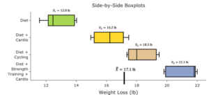
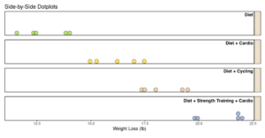
Based on these graphs alone, does it appear there is visual evidence that the diets differ in average weight loss? That is, is there visual evidence to reject the null hypothesis in favor of the alternative hypothesis? Explain.
Question 5
5) Suppose the results are different than those presented in Question 4. An alternative result is reflected in the following boxplot and dotplot.
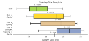
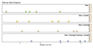
Based on these graphs alone, does it appear there is visual evidence that the diets differ in average weight loss? That is, is there visual evidence to reject the null hypothesis in favor of the alternative hypothesis? Explain.
Question 6
6) Compare and contrast the graphical displays in Questions 4 and 5.
Part A: How are they similar and how are they different?
Part B: Which one appeared to provide more convincing evidence? What might the differences suggest about making a conclusion about the null hypothesis in a one-way ANOVA?
The test statistic and P-value are calculated by considering the ratio of variation within each of the groups to the variation between each of the groups. That is, when the variation between each of the groups is significantly greater than the variation within each of the groups, we will reject the null hypothesis and conclude that at least two of the means are different (similar to what we saw in Question 4).
However, when there is a significant amount of variation within groups, relative to the variation between groups (like in Question 5), we will have less evidence of a difference and may fail to reject the null hypothesis.
The statistic measuring the variation within the groups is the error sum of squares. This is calculated by summing the variation within each of the groups. The variation within each of the groups is visualized in the boxplot by the size of the box and in the dotplot as the spread of the dots within each group.
A statistic measuring the variation between the groups is the group sum of squares. This is calculated by summing the variation between each of the group means and the grand mean (i.e., the mean of all the data values).
Question 7
7) Given the information about the error sum of squares, which data (Question 4 or 5) do you think would have the greater error sum of squares value? Explain.
Question 8
8) Given the information about the group sum of squares, which data (Question 4 or 5) do you think would have the greater group sum of squares value? Explain.
