In the next preview assignment and in the next class, you will need to determine whether different groups of data have similar variation. In this corequisite support activity, we’ll explore the use of different tools to explore data before conducting formal analyses.
What Should You Pack?
Suppose you’re taking a trip across the country to visit several different friends. You’ll be traveling through Miami, Florida, Phoenix, Arizona, and Honolulu, Hawaii, but you’re not sure what kinds of clothes to pack. What’s the weather like in those cities? A quick Internet search tells you that the mean high temperature in each city is as follows:
| City | Mean High Temperature[1] |
| Miami | 84 °F |
| Phoenix | 87 °F |
| Honolulu | 84 °F |
Question 1
1) What are your first impressions of the weather in each city? What other information would you like to have before deciding what to pack?
Question 2
2) Obviously, a single data point is not enough information to help you pack. The following are boxplots representing the daily high temperatures in each city over the course of a year.2
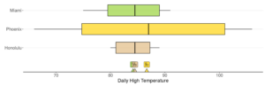
Part A: Which city has the greatest variability in the data? Explain what this means about the weather in this city.
Part B: Which city has the least variability in the data? Explain what this means about the weather in this city.
2 U.S. climate data. (2021). https://www.usclimatedata.com/climate/united-states/us
Question 3
3) For all three cities, the lowest temperatures are seen in December, January, and February. If your trip is in January, how will this affect what clothes you pack?
Question 4
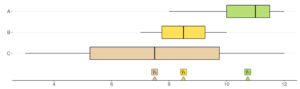
4) Practice evaluating variability one more time. Which of the following boxplots represents the data with the greatest variability?
Variance From Summary Statistics
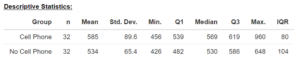
Question 5
5) When statistical software provides summary statistics of data, it usually provides standard deviation instead of variance. We can use that to compare the variability between groups.
Look at the following summary statistics for two groups of data. Which group has more variability? Explain.
Question 6
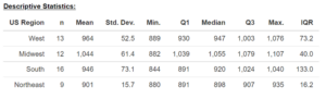
6) This example uses four groups instead of two and compares SAT scores in different regions of the United States.
Part A: Look at the following summary statistics. Which region has the most variability? Explain.
Part B: Which region has the least variability? Explain.
Part C: In order for an ANOVA to be appropriate, it is recommended that the largest standard deviation be no more than two times the smallest standard deviation when the sample sizes are equal.
Would these groups meet that recommendation for using an ANOVA to compare means?
Interpreting ANOVA Hypotheses
When conducting an ANOVA, the null and alternative hypotheses can be written as:
- Null – [latex]H_{0}:\;\mu_{1}=\mu_{2}\ldots=\mu_{k}[/latex]
- Alternative – [latex]H_{a}[/latex]: At least two means are different.
But what does it mean when we reject the null hypothesis? Remember that an ANOVA only tells us that there is a difference, not which group(s) are different. Let’s use colors to understand it better.
Question 7
7) Suppose there is a version of ANOVA that compares colors instead of means. We have five circles, and we can’t decide if the colors are significantly different without the help of this analysis.
 |
 |
 |
 |
 |
Part A: Write the null and alternative hypotheses for this scenario.
Part B: After the analysis, we fail to reject the null hypothesis. A friend says, “That means all the colors are the same!” How would you respond?
Question 8
8) Now we’ll repeat the analysis on a new set of circles.
 |
 |
 |
 |
 |
Part A: Write the null and alternative hypotheses for this scenario.
Part B: After the analysis, we reject the null hypothesis. Your friend asks you which circles are different colors. How would you respond?
Question 9
9) Let’s do one more example.
 |
 |
 |
 |
 |
Part A: Write the null and alternative hypotheses for this scenario.
Part B: After the analysis, we reject the null hypothesis. Using this analysis, can we determine which circles have different colors? Explain.
- U.S. climate data. (2021). https://www.usclimatedata.com/climate/united-states/us ↵
