
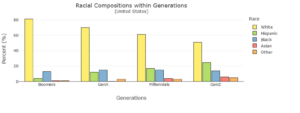
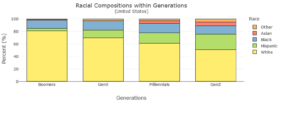
| Generation | White | Hispanic | Black | Asian | Other |
| Boomers | 81.20% | 4.00% | 12.90% | 1.00% | 1.00% |
| Gen X | 70.00% | 12.00% | 15.00% | 0.00% | 3.00% |
| Millennials | 61.00% | 17.00% | 15.00% | 4.00% | 3.00% |
| Gen Z | 51.00% | 24.50% | 13.70% | 5.90% | 4.90% |
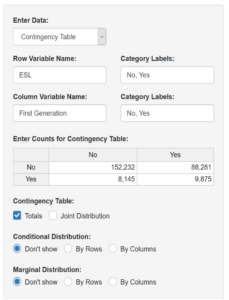
| Not First Generation | First Generation | |
| Not ESL | 152,232 | 88,281 |
| ESL | 8,145 | 9,875 |
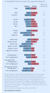
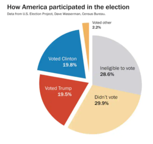
| Survey Results of the 2016 Presidential Election | |||
| Clinton | Trump | Other | |
| White | 39 | 54 | 7 [calculated from 100(39+54)] |
| Black | 6 | ||
| Hispanic | 66 |
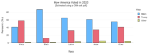
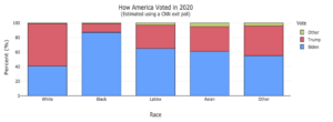
| Biden | Trump | Other | |
| White | 41 | 58 | 1 |
| Black | 87 | 12 | 1 |
| Latinx | 65 | 32 | 3 |
| Asian | 61 | 34 | 5 |
| Other | 55 | 41 | 4 |
| Skill or Concept: I can . . . | Questions to check your understanding | Rating from 1 to 5 |
| Read and interpret a basic pie chart. | 1–3 | |
| Understand the differences between side-by-side and stacked bar charts. | 4–9 | |
| Make comparisons of different groups using side-by-side and stacked bar charts. | 4–9 |
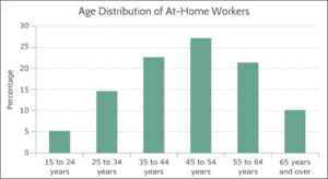
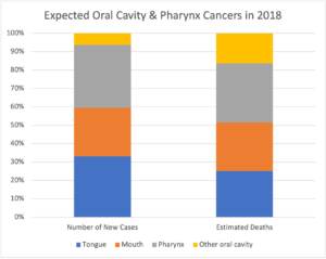
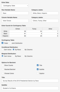
The images below here are from the instructor coreq and in-class activity
Glossary
- reference value
- the starting point value for computing absolute change and relative change between two values.
- new value
- the second value for computing absolute change and relative change between two values.
- absolute change
- the actual increase or decrease from one value to the next.
- relative change
- a ratio that expresses the absolute change between two values relative to the reference value.
- stacked bar chart
- a chart in which two different categorical variables are compared in bars that are stacked on top of one another.
- side-by-side bar chart
- a chart in which two different categorical variables are compared in bars that are placed beside one another.
- contingency table (two-way table)
- a table that displays the results of two categorical variables simultaneously.
