In the next in-class activity, you will need to visually assess and make comparisons between groups using graphical displays. This corequisite support activity will provide a review of interpreting graphical displays and making connections between graphs, measures of variation, and measures of center.
Interpreting Graphical Displays
This support activity revisits data from a sleep study[1] that we’ve explored throughout the course. Recall that the researchers in this study were interested in a number of variables related to college students’ sleeping habits, health, academic success, and alcohol consumption.
Question 1
1) The following boxplots summarize the number of morning classes missed by students based on whether they consumed a large number of alcoholic drinks per week (Heavy), a moderate number of alcoholic drinks per week (Moderate), a few alcoholic drinks per week (Light), or no alcoholic drinks per week (Abstain).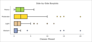
Part A: Compare and contrast the classes missed between the groups. Is there anything in particular that you notice from the boxplot?
Part B: Compare the medians from each group. Which group(s) appear(s) to have the greatest median number of classes missed?
Part C: Based on the boxplots, which group appears to have less variation in the number of classes missed—the Heavy group or the Moderate group? How do you know?
Question 2
2) The following boxplots and histograms (continued on the next page) illustrate the number of morning classes missed by students based on whether they identified as Morning Larks, Night Owls, or Neither.
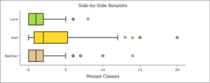
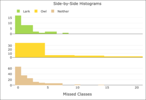
Part A: Compare and contrast the classes missed between the various groups. Is there anything in particular that you notice from the boxplot and histogram?
Part B: Based on the previous graphical displays, if we were to calculate the standard deviation for each of these groups, which group do you think would have the greatest value? Explain.
Part C: Based on the previous graphical displays, if we were to calculate the median for each of these groups, which group would have the greatest value? Explain.
Part D: Based on the previous graphical displays, if we were to calculate the mean for each of these groups, which group do you think would have the greatest value? Explain.
Question 3
3) Using the DCMP Describing and Exploring Quantitative Variables tool at https://dcmathpathways.shinyapps.io/EDA_quantitative/, select the appropriate dataset and calculate descriptive statistics for the classes missed based on whether individuals identified as Morning Larks, Night Owls, or Neither. Complete the following table.
| Sleep Type | n | Mean | Median | Std. Dev. |
| Morning Lark | ||||
| Night Owl | ||||
| Neither |
Question 4
4) Do your calculations align with your answers in Question 2? Explain.
- Onyper, S. V., Thacher, P. V., Gilbert, J. W., & Gradess, S. G. (2012). Class start times, sleep, and academic performance in college: A path analysis. Chronobiology International, 29(3), 318–335. ↵
