Question 1
1) Choose one of the following options and explain how you made your choice. Data on incomes areusually…
a) Skewed right
b) Skewed left
c) Symmetric

The data for this in-class activity are from the Gapminder site on global development, which shows 2018 data on countries’ income per person[1] (in standardized dollar amounts) and life expectancy.[2] Each data point represents a different nation.
Question 2
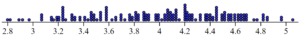
2) The following is a dotplot showing the income per person among all the nations in the dataset.
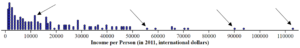
Part A: Do any of the labeled countries have higher or lower income values than you expected? Explain.
Part B: Describe the shape of the distribution.
Question 3
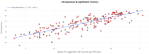
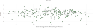
3) The following is a scatterplot (created using theDCMP Linear Regression tool) that visualizes each nation’s life expectancy as predicted by its income per person. A linear model is fit to the data, with the least square regression equation shown. The fit has an 𝑅2value of 46.6%. The following scatterplot is a residual plot from this fit.
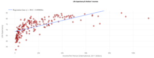
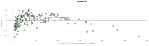
Part A: Is the linear model a good fit for these data? Would you trust predictions or inferences made from a linearmodel? Justify your answer using the 𝑅2value, residual plot, and scatterplot.
Part B: Why do you think the data take this shape in the scatterplot? Explain while referencing the dotplot in Question 2. Life Expectancy & Nations’ Incomes Residual Plot
Question 4
4) To handle the right skew in the income data, let’s try different transformations.
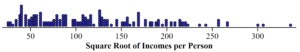
Part A: The following is a dotplot of incomes per person after taking the square root of all the values. Is the right skew reduced in severity? Is it still present? Explain.
Part B: The following is a dotplot of incomes per person after taking the base 10 logarithms of all the values. Is the right skew reducedin severity? Is it still present? Explain.
Part C: Which transformation makes the data more symmetric? Explain.
Question 5
5) The following is a scatterplot after taking the base 10 log transformations of the income values. A linear model is fit to the data (using log income in place of income on the x-axis), with the least square regression equation shown. The fit has an 𝑅2 value of 71.1%. The following scatterplot is a residual plot from this fit: Dotplot created at stapplet.com Dotplot created at stapplet.com Log10(Nations’ Incomes)
Part A: Did the transformation result in data for which a linear model provides abetter fit for the data? Explain your answer using the 𝑅2 value, residual plot, and scatterplot.
Part B: Using the previous scatterplot and the linear regression model, a statistician claims that, “A nation with an income of about $4 per person has a predicted national life expectancy of about 73 years.” Explain what’s wrong with their statement and correct it.
Part C: Imagine that we instead looked at the national budget balance per person in every nation. In some nations, the budget balance is negative (more debts than revenue). In such a case, we can no longer use the log transformation. Explain. Life Expectancy & Log (Nations’ Incomes)Residual Plot
Question 6
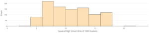
6) In addition to transformations that make right-skew distributions more symmetric, there are transformations that can make left-skew distributions more symmetric.High school GPAs tend to be distributed in a left-skew shape; most students get A’s, B’s, and C’s in their classes, while fewerstudents consistently get lower grades (left tail). The followingis a dataset[3] of 1,000 high school student GPAsvisualized as a histogram:
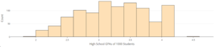
Part A: To try to make this distribution more symmetric, let’s first try to square all the values.The following graph shows the squared GPAs.Is the left skew reduced in severity? Is it still present? Explain.
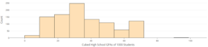
Part B: The following graph shows the GPAs cubed. Is the left skew reduced in severity? Is it still present? Explain.
Part C: If your goal is to make the distribution symmetric, would you use the square or cube transformation of GPA values? Explain.
Part D: In some countries, GPA values can be negative. In such cases, a transformation that squares every data value wouldn’t be appropriate. Explain.
- Gapminder. (n.d.). GDP per capita in constant PPP dollars. http://gapm.io/dgdppc ↵
- Gapminder. (n.d.). Life expectancy at birth. http://gapm.io/ilexDotplot created atstapplet.comQatarUSASingaporeAlbaniaCredit: iStock/hyejin kang ↵
- OpenIntro. (n.d.). SAT and GPA data. https://www.openintro.org/data/index.php?data=satgpa ↵
