| U.S. State | Count |
| California | 33 |
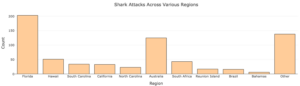
| Florida | 203 |
| Hawaii | 51 |
| North Carolina | 23 |
| Other | 27 |
| South Carolina | 34 |
| Texas | 16 |
| U.S. State | Count | Proportion | Percent (%) |
| California | 33 | 0.0853 | 8.53 |
| Florida | 203 | 0.5245 | 52.45 |
| Hawaii | 51 | 0.1318 | 13.18 |
| North Carolina | 23 | 0.0594 | 5.94 |
| Other | 27 | ||
| South Carolina | 34 | ||
| Texas | 16 |

| AnxietyScore | StressScore | AnxietyStatus | Stress | Happiness | AllNighter | AverageSleep |
| 3 | 8 | normal | normal | 28 | 0 | 7.18 |
| 0 | 3 | normal | normal | 25 | 0 | 6.93 |
| 18 | 9 | severe | normal | 17 | 0 | 5.02 |
| 4 | 6 | normal | normal | 32 | 0 | 6.9 |
| 25 | 14 | severe | normal | 15 | 0 | 6.35 |
| 8 | 28 | moderate | high | 22 | 0 | 9.04 |
| 0 | 1 | normal | normal | 25 | 1 | 7.52 |
| 2 | 3 | normal | normal | 29 | 0 | 9.01 |
| 16 | 20 | severe | high | 29 | 0 | 8.54 |
| 11 | 31 | moderate | high | 30 | 0 | 6.68 |
| All Nighter?
0 = no, 1 = yes |
Frequency |
| 0 | 219 |
| 1 | 34 |
| Frequency Table: | |||
| Anxiety Level | Frequency | Relative Frequency | Percent (%) |
| normal | 181 | 0.715 | 71.5 |
| severe | 16 | 0.063 | 6.3 |
| moderate | 56 | 0.221 | 22.1 |
| Total: | 253 | 1.000 | 100.0 |
| Frequency Table: | |||
| Stress Level | Frequency | Relative Frequency | Percent (%) |
| normal | 197 | 0.779 | 78 |
| high | 56 | 0.221 | 22 |
| Total: | 253 | 1.000 | 100 |
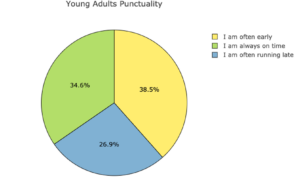
| Alcohol | Age | Height | Punctuality | Number of siblings | Enjoy Music 1=strongly disagree, 5=strongly agree | Internet usage | Left – right handed |
| drink a lot | 20 | 163 | I am always on time | 1 | 5 | few hours a day | right handed |
| drink a lot | 19 | 163 | I am often early | 2 | 4 | few hours a day | right handed |
| drink a lot | 20 | 176 | I am often running late | 2 | 5 | few hours a day | right handed |
| drink a lot | 22 | 172 | I am often early | 1 | 5 | most of the day | right handed |
| social drinker | 20 | 170 | I am always on time | 1 | 5 | few hours a day | right handed |
| never | 20 | 186 | I am often early | 1 | 5 | few hours a day | right handed |
| social drinker | 20 | 177 | I am often early | 1 | 5 | less than an hour a day | right handed |
| drink a lot | 19 | 184 | I am always on time | 1 | 5 | few hours a day | right handed |
| social drinker | 18 | 166 | I am often early | 1 | 5 | few hours a day | right handed |
| drink a lot | 19 | 174 | I am often running late | 3 | 5 | few hours a day | right handed |
| social drinker | 19 | 175 | I am often early | 2 | 5 | less than an hour a day | left handed |
| never | 17 | 176 | I am often running late | 1 | 5 | few hours a day | right handed |
| social drinker | 24 | 168 | I am often running late | 10 | 5 | few hours a day | right handed |
| social drinker | 19 | 165 | I am often early | 1 | 5 | few hours a day | right handed |
| social drinker | 22 | 175 | I am often early | 1 | 5 | most of the day | right handed |
| Alcohol | Frequency | Relative Frequency | Percent
(%) |
| Never | 2 | 2/15 = 0.1333 | 13.33 |
| Social drinker | |||
| Drink a lot |

| Skill or Concept: I can . . . | Questions to check your understanding | Rating from 1 to 5 |
| Determine which variables are categorical from raw data. | 1 | |
| Understand how frequency tables are formed from raw data. | 2 | |
| Understand how graphs for categorical data are formed from frequency tables. | 4 | |
| Use data analysis tools to create a frequency table from an embedded dataset. | 3 | |
| Read frequency tables, bar graphs, and pie charts. | 3–5 |
Glossary
- frequency
- the number of times an event or a value occurs. It is commonly referred to as the count.
- frequency table
- a table that lists the number of observations (the frequency or count) of each unique value of a categorical variable.
- relative frequency
- the proportion of observations that are in a particular category and can be expressed as a decimal or a percentage.
- bar graph
- a graph in which the categories are represented by bars that are separated from each other.
- pie chart
- a chart in which categories are represented by wedges in a circle and are proportional in size to the percentage of individuals/items in each category.
- categorical variable
- a variable that places an individual into one of several groups.
- quantitative variable
- a variable that takes numerical values that can be used in arithmetic.
- dataset
- a collection of data.
