What you’ll need to know
In this support activity you’ll become familiar with the following:
- Read and interpret a frequency table.
- Read and interpret a bar graph.
- Read and interpret a pie chart.
You will also have an opportunity to refresh the following skills:
In the next section of the course material and in the following activity, you will need to read and interpret frequency tables, bar graphs, and pie charts. These kinds of tables, graphs, and charts help us to visualize data collected about a situation in order to understand it clearly. To help you gain familiarity and practice with these ideas before the course section begins, let’s work with a small data set to see what methods are available to us for visualizing the data. You’ll also need an understanding of percentages and relative frequencies. Look for the recall boxes in the text and/or refer to the Student Resource pages indicated there if you need a refresher.
Shark Attacks
In this corequisite support activity, we will look at shark attacks in the United States and internationally. We will see how visual displays like tables and graphs can help to analyze the number of attacks that occur in each country or U. S. state.
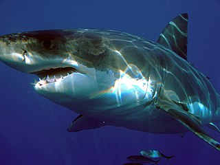
Carcharodon carcharias
To frame the landscape for this activity, think about shark attacks for a moment. What areas of the country or the world seem to be associated with a lot of interaction between sharks and humans? What sort of data do you think is collected about location and number of shark attacks? We will examine some data soon; first consider the two questions below.
In the United States, which state do you think has the most shark attacks?
Which country in the world do you think has the most?
It’s interesting to speculate about the answers to these questions, but can use data to answer them definitively. It will help to organize and visualize the data.
Frequency tables
Frequency tables include information about a number of times something occurs, also known as the frequency of occurrences. One column in the table lists different categories or groups. Another column lists the frequency of occurrences associated with each category or group.
Below is a frequency table of shark attacks in the United States.[1] A frequency table organizes categorical data by listing the different possible categories and the number of times each category occurs in the dataset. For example, in the table below, we see that California had [latex]33[/latex] shark attacks, Florida had [latex]203[/latex], and so on.
| Shark Attacks in the United States |
|
| U.S. State | Count |
| California | [latex]33[/latex] |
| Florida | [latex]203[/latex] |
| Hawaii | [latex]51[/latex] |
| North Carolina | [latex]23[/latex] |
| Other | [latex]27[/latex] |
| South Carolina | [latex]34[/latex] |
| Texas | [latex]16[/latex] |
question 1
question 2
question 3
Relative frequency
The relative frequency is a proportion or percent of a total frequency. It tells us how frequently a particular value has occurred out of the total number of occurrences. For example, in the table Shark Attacks in the United States, we can see that there were 23 shark attacks in North Carolina out of the 387 shark attacks in all the states combined. If we want to know what proportion of the total attacks occurred in North Carolina, we can express them as a ratio (fraction), then convert the ratio to a proportion (decimal) or a percent.
[latex]\dfrac{\text{# attacks in N.C.}}{\text{# total attacks}}=\dfrac{23}{387} \approx 0.0594[/latex] or about [latex]5.94%[/latex]
We can express the relative frequency by saying either of the following.
The proportion of U.S. shark attacks in North Carolina is 0.0594
About 5.94% of U.S. shark attacks occurred in North Carolina.
Frequency tables commonly include a column for relative frequency, expressed as a proportion (decimal) or a percent. See the Recall box below for a refresher on how to convert fractions to proportions and percentages then complete the missing information in the table below.
recall
To write the relative frequency of an item in a frequency table, divide the frequency (count) of an item by the total frequency of the table.
Ex. Calculate the relative frequency of shark attacks in North Carolina as a proportion rounded to 4 decimal places.
Core Skill:
Core Skill:
[Also see Corequisite Support Activities 1E and 2D for more practice.]
Recall that a relative frequency represents the proportion or percentage of a particular frequency out of the total frequency. The table below contains the same information as the one you examined above, but adds columns for Proportion and Percent (%). We can see in the table that the proportion of shark attacks that occurred in California out of the total number of shark attacks is 0.0853, which is equivalent to 8.53% of all the shark attacks listed. In the following question, you’ll need to compute the missing proportion and percent for the rows Other, South Carolina, and Texas.
| Shark Attacks in the United States |
|||
| U.S. State | Count | Proportion | Percent (%) |
| California | 33 | 0.0853 | 8.53 |
| Florida | 203 | 0.5245 | 52.45 |
| Hawaii | 51 | 0.1318 | 13.18 |
| North Carolina | 23 | 0.0594 | 5.94 |
| Other | 27 | ||
| South Carolina | 34 | ||
| Texas | 16 | ||
question 4
Complete the proportion and percent columns of the shark attack table above. Round your answers to four decimal places.
| U.S. State | Count | Proportion | Percent(%) |
| Other | 27 | ||
| South Carolina | 34 | ||
| Texas | 16 |
Bar graphs
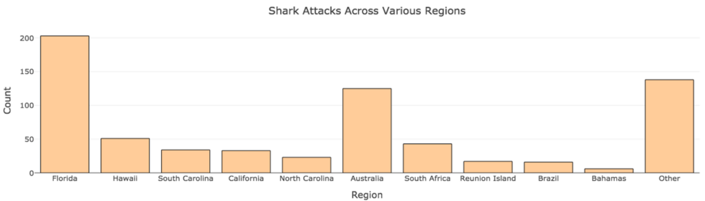
Bar graphs are visual displays of data in which the frequency of each category is indicated by the height of a rectangular bar (or the length if the graph is displayed horizontally). The image below displays a a bar graph (also known as a bar chart) of 689 shark attacks across the globe.[2] Note that each country or state is listed along the horizontal axis. The height of each bar provides a visual representation of the number (count) of shark attacks that occurred in each country. We cannot read the exact frequency of each bar from a bar graph. Rather, the display helps us to visualize the frequencies relative to one another. We can see in the graph below, for example, that South Carolina and California had similar numbers of attacks, about 35 each, while Hawaii had about 50.
Use the chart to answer the questions below.
question 5
Which regions had the highest number of shark attacks? I have an issue with this question based on the bar chart and answer provided by DC. Question embedded below is based on what I think would be better.-jw
question 6
question 7
Pie Charts
Pie charts display data in a round graph, split into “pie pieces,” each representing a relative frequency. A key is provided to identify the categories associated with each relative frequency. Pie charts are useful for visually comparing relative frequencies. For example, let’s say we were interested in comparing the percentage of shark attacks occurring in the United States and Australia versus the rest of the globe. We could create pie chart like the one below. This chart takes 689 international shark attacks and divides them into three categories: attacks occurring in the United States, in Australia, and all other locations.
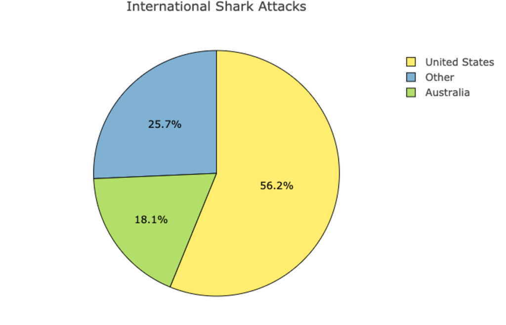
Knowing that the total frequency of attacks is 689 and the relative frequency of attacks in Australia is 18.1%, how could we determine the count of the attacks in Australia? This is same as asking the question what is 18.1% of 689? If you need to, use the recall box below to refresh the process for determining what number a certain percent represents in a given total, then find the frequency (the count) of attacks that occurred in Australia.
recall
When working with percentages, it is often helpful to convert them to counts.
Core skill:
Did you find that about 125 attacks happened in Australia? [latex]0.181\times689=124.709[/latex], which rounds up to 125. Relative frequencies written as percentages are often approximations due to having rounded them to smaller decimal places. For this reason, the percentages don’t always add up to exactly 100%, but they will be close.
Now it’s your turn. Use the pie chart above to answer the following two questions.
question 8
question 9
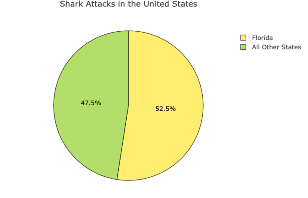
Let’s try one more. The following is a pie chart of 387 shark attacks in the United States. Use the information from the table to determine how many shark attacks in each of the two categories shown.
question 10
question 11
You’ve seen how to read information presented in frequency tables, bar charts, and pie charts and you’ve learned to calculate relative frequencies. You’ve also seen how to interpret the information displayed, and that sometimes it is helpful to convert numbers between ratios, proportions, and percentages in doing so. If you feel comfortable with these skills, then it’s time to move on to the next section.
Candela Citations
- Great White Shark. Authored by: Sharkdiver68. Provided by: Wikimedia Commons. Located at: https://commons.wikimedia.org/wiki/File:Carcharodon_carcharias.jpg. License: Public Domain: No Known Copyright
- Sharks US only (csv). (n.d.). The Art & Science of Learning from Data. Retrieved from https://img1.wsimg.com/blobby/go/bbca5dba-4947-4587-b40a- db346c01b1b3/downloads/sharksUS.csv?ver=1622756678385 ↵
- Sharks (csv). (n.d.). The Art & Science of Learning from Data. Retrieved from https://img1.wsimg.com/blobby/go/bbca5dba-4947-4587-b40a-db346c01b1b3/downloads/sharks.csv?ver=1622756678385 ↵
