| Season | Num_clouds |
| 1 | 4 |
| 2 | 7 |
| 3 | 5 |
| 4 | 5 |
| 5 | 6 |
| 6 | 9 |
| 7 | 10 |
| 8 | 7 |
| 9 | 9 |
| 10 | 9 |
| 11 | 10 |
| 12 | 8 |
| 13 | 8 |
| Number of Clouds | Frequency |
| 4 | |
| 5 | |
| 6 | |
| 7 | |
| 8 | |
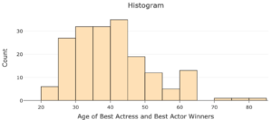
| oscar_no | oscar_yr | award | name | movie | age | birth_pl | birth_mo | birth_d | birth_y |
| 1 | 1929 | Best actress | Janet Gaynor | 7th Heaven | 22 | Pennsylvania | 10 | 6 | 1906 |
| 2 | 1930 | Best actress | Mary Pickford | Coquette | 37 | Canada | 4 | 8 | 1892 |
| 3 | 1931 | Best actress | Norma Shearer | The Divorcee | 28 | Canada | 8 | 10 | 1902 |
| 4 | 1932 | Best actress | Marie Dressler | Min and Bill | 63 | Canada | 11 | 9 | 1868 |
| 5 | 1933 | Best actress | Helen Hayes | The Sin of Madelon Claudet | 32 | Washington DC | 10 | 10 | 1900 |

| Skill or Concept: I can . . . | Questions to check your understanding | Rating from 1 to 5 |
| Identify quantitative variables and the plots used to visualize their distributions. | 1, 2 | |
| Use technology to make a plot of the distribution of a quantitative variable. | 4, 6, 7 | |
| Use a histogram to describe a distribution. | 5 | |
| Identify how bin width affects a histogram. | 6 | |
| Use a dotplot to describe a distribution. | 8 | |
| Identify the population and sample and explain limitations on the scope of the analysis based on sample data. | 9 |
Glossary
- dotplot
- a graphical display for quantitative data where each dot represents an observation.
- histogram
- a graphical display that groups observations into bins rather than having a single dot for each observation.
- bin
- a range of values that the quantitative variable can take.
- endpoints
- the smallest and largest values of the quantitative variable represented in the bin.
- width
- a numerical value that is calculated by the difference in the values of the end points.
- population
- the group of individuals or entities that our research or survey questions pertain to.
- sample
- a group of individuals or entities on which we collect data.
- representative
- when the characteristics of a sample tend to match the characteristics of the population.
- generalize
- when the sample is representative of the population, this transfers our analysis of the sample to the population.
