What you’ll need to know
In this support activity you’ll become familiar with the following:
.jpg)
In the next section of the course material and in the following activity, you will need to be able to use technology to make plots to visualize the distribution of quantitative variables and then use the plots to identify features of the distribution.
Let’s practice creating, reading, and interpreting quantitative distributions using a dataset of information about a beloved painter and art instructor whose work aired on public television in the late 20th century.
Analyzing Bob Ross Paintings
Bob Ross was a famous painter and star of the TV show The Joy of Painting, during which viewers followed along as he painted. He (and occasionally a guest host) created a single painting in each of the 403 episodes of his show. He was particularly known for painting trees and clouds, which he famously called “happy little trees” and “happy little clouds,” respectively.
The objective of this analysis is to explore how many paintings included clouds in a given season. To answer this question, you’ll use technology to make plots to visualize the number of paintings that included clouds in a given season. You may use the Describing and Exploring Quantitative Variables tool or comparable technology for this assignment.
The dataset “Clouds” [1] contains the following variables for each season of The Joy of Painting:
- season: Season number (1–13)
- num_clouds: Number of paintings that included clouds in the season
The following data table includes the number of paintings that included clouds, represented by the variable num_clouds, for each of the first 13 seasons.
| Clouds in Bob Ross’ Paintings | |
| season | num_clouds |
| 1 | 4 |
| 2 | 7 |
| 3 | 5 |
| 4 | 5 |
| 5 | 6 |
| 6 | 9 |
| 7 | 10 |
| 8 | 7 |
| 9 | 9 |
| 10 | 9 |
| 11 | 10 |
| 12 | 8 |
| 13 | 8 |
We will use this data to write a frequency table. Then we’ll use the frequency table to create a dotplot and a histogram.
Create a frequency table from a dataset
Below, you’ll see a partially created frequency table for the dataset. Your goal is to complete the frequency table using information from the above data table.
Characteristics of the frequency table:
- The column on the left should contain, in numerical order, each number that appears in the dataset num_clouds column. You’ll need to complete this column with the missing numbers. Each number is listed only once.
- The column on the right in the frequency table should contain the number of seasons in which that many paintings with clouds were created. We can see that there was only one season in which 4 paintings with clouds were created, so we say the frequency of 4 clouds in a painting is 1.
| Frequency Table | |
| Number of Paintings with Clouds in a Season | Frequency |
| 4 | 1 |
| 5 | |
| 6 | |
| 7 | |
| 8 | |
Use the interactive example below to get started then finish the table on your own in Question 1.
Interactive Example
Looking back on the data table at the start of this page, we see that there were no seasons in which fewer than 4 paintings with clouds were created. And we can see that only one season included exactly that many.
The frequency of 4 paintings with clouds is 1.
- How many seasons included 5 paintings of clouds? That is, what is the frequency of 5 paintings in the dataset?
Show Answer
- What is the frequency of 6 paintings with clouds in a season?
Show Answer
- What is the frequency of 7 paintings with clouds in a season?
Show Answer
Use the answers from the interactive example above to begin filling in the frequency table in Question 1, then complete the missing information on your own. Don’t forget to look for seasons in which more than 8 paintings with clouds were created.
question 1
Create a frequency table that summarizes the number of paintings that include clouds by filling in the missing values.
| Frequency Table |
|
| Number of Paintings with Clouds in a Season | Frequency |
| 4 | |
| 5 | |
| 6 | |
| 7 | |
| 8 | |
Create a dotplot from a frequency table.
In a previous activity you learned about dotplots, graphical displays for quantitative data where each dot represents an observation. Dotplots are useful for visualizing distributions when the dataset is small.
Create a dotplot for the number of paintings with clouds using the data analysis tool. Follow these steps to create a dotplot with raw observations or a frequency table:
Go to the Describing and Exploring Quantitative Variables tool at https://dcmathpathways.shinyapps.io/EDA_quantitative/.
Step 1) Select the Single Group tab.
Step 2) Locate the dropdown under Enter Data and select Your Own.
Step 3) Locate the options under Do you have, and select Individual Observations.
Step 4): For Name of Variable, enter “Number of Paintings with Clouds.”
Step 5) Locate the box under the variable name and enter the observations num_clouds from the data set.
Step 6) For Choose Type of Plot Select Dotplot. Unselect any other choices that were already selected.
Step 7) Under Dotplot Options, Select Dotsize for Dotplot: 0.5 and Select Binwidth for Dotplot: 0.5.
question 2
Create a histogram from a frequency table
Typically, a histogram is more useful for large datasets. If there are a large number of observations, a histogram is easier to read, since it groups observations into bins (see this defined below) rather than having a single dot for each observation.
Use the same data analysis tool to make a histogram to visualize the distribution of the number of paintings that included clouds in a season.
With the same tool still open, (or after following Steps 1 – 5 above),
question 3
Understand the difference between a bar graph and a histogram
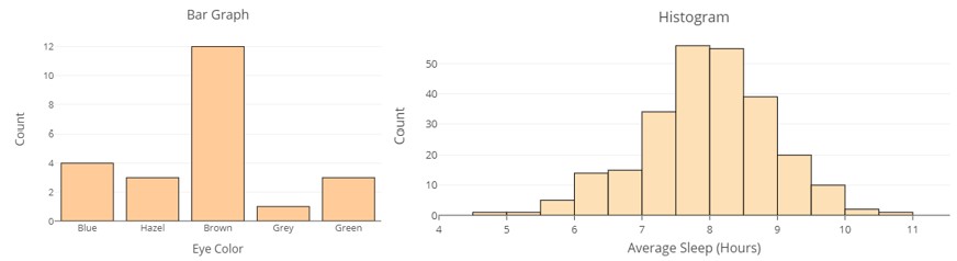
A histogram looks somewhat like a bar graph. But, while a bar graph displays categorical data, showing counts of observations within categories, a histogram displays quantitative data by showing frequencies of a quantitative variable. You’ll be able to tell a bar graph from a histogram by observing whether the horizontal axis appears to be a list of categories (e.g. eye color, zip code, etc…) or a number line.
The bars of a histogram are each of the same width and meet smoothly together over the horizontal axis. In a histogram, we call the bars bins.
- A bin is a range of values that the quantitative variable can take.
- A bin can be defined by its end points, the smallest and largest values of the quantitative variable represented in the bin. For the first bin [latex]\left[4 , 5\right)[/latex], the end points are 4 and 5. The notation [latex]\left[4 , 5\right)[/latex] means this bin includes observations of the numbers of paintings with clouds that include 4 but not 5. We knew from the frequency table that the frequency of 4 paintings in a season is 1, and there is a single dot above the 4 on the horizontal axis to indicate this.
- The width of the bin, called binwidth, is calculated by taking the difference of the values of the end points. For the first bin, the width is [latex]5 - 4 = 1[/latex]. The width of the bins should remain the same for each graph. You can verify visually that each bin is exactly 1 wide.
Use the histogram you created to answer the following questions.
question 4
Which value of the variable (number of paintings with clouds) occurs most frequently in the dataset?
question 5
How many seasons have 10 paintings with clouds?
question 6
How many seasons have at least 8 paintings with clouds?
question 7
How many seasons have 5 or fewer paintings with clouds?
question 8
There are 13 seasons with 13 new paintings in each season. In how many seasons do at least half the paintings include clouds?
question 9
Make a new histogram of the number of paintings with clouds using a bin width of 2 (bin width = 2) and then compare the new histogram to the one from Question 1. How are they similar? How are they different?
Create a histogram from a dataset using technology.
Hopefully, you are feeling comfortable using histograms to answer questions about the dataset. Try creating a histogram from a new dataset, then use it to answer questions. This time, you won’t need to enter the data by hand. We’ll use an existing dataset in the tool.
If you don’t still have the Describing and Exploring Quantitative Variables tool open, open it at https://dcmathpathways.shinyapps.io/EDA_quantitative/ and follow these steps:
Step 1) Select the Single Group tab.
Step 2) Locate the dropdown under Enter Data and select From Textbook.
Step 3) Choose the Dataset “Hours Watching TV (2018) to create a histogram.
Step 4) Under Type of Plot, make sure the Histogram box is checked. You can uncheck any other boxes that are selected.
Step 5) Select Binwidth = 2.
The dataset “Hours Watching TV (2018)” in the Describing and Exploring Quantitative Variables tool has the weekly number of hours spent watching TV for 1,555 individuals. Create a histogram with binwidth = 2 to display the distribution of the variable. Use it to answer the questions below.
question 10
question 11
Look at the histogram with bin widths of 2, 5, and 10. Which bin width is most useful for visualizing the distribution of weekly number of TV hours? Explain.
question 12
Use the histogram to write 2 or 3 observations about the distribution of weekly number of hours watching TV.
Candela Citations
- Used paint brushes and opened yellow, blue, red, and black paint tubes on a wooden floor with paint splattered on it.. Authored by: Andrian Valeanu. Provided by: Wikimedia Commons. Located at: https://commons.wikimedia.org/wiki/File:Andrian_Valeanu_2016-04-11_(Unsplash).jpg. License: CC0: No Rights Reserved
- Hickey, W. (2014, April 14). A statistical analysis of the work of Bob Ross. FiveThirtyEight. https://fivethirtyeight.com/features/a-statistical-analysis-of-the-work-of-bob-ross/ ↵
