| Hurricane Damage (in millions of dollars)
() |
Deviation from the Mean (in millions of dollars) |
| 105,840 | |
| 45,561 | |
| 27,790 | |
| 20,587 | |
| 19,832 | |
| 15,820 | |
| 12,775 | |
| 11,797 | |
| 11,760 | |
| 11,227 |

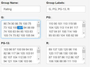
| Rating | Mean | Median | Standard Deviation | Variance |
| G | ||||
| R |
| Rating | Mean | Median | Standard Deviation | Variance |
| G rating with the outlier | ||||
| G rating without the outlier |
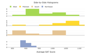
| Region | Mean | Median | Standard Deviation | Variance |
| West | ||||
| Midwest | ||||
| South | ||||
| Northeast |
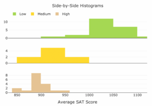
| Skill or Concept: I can . . . | Questions to check your understanding | Rating from 1 to 5 |
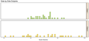
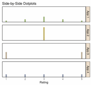
| Visually assess the differences in variability, given comparative histograms or dotplots. | 1, 2 | |
| Understand the summary statistics feature of the Describing and Exploring Quantitative Variables tool. | 3, 4 | |
| Use technology to calculate measures of variability: standard deviation, variance, and range. | 5–7 |
Glossary
- deviation from the mean
- the distance between an observation () in a dataset and the mean of the dataset.
- variability
- a measure of how dispersed (spread out) the data are. It is often referred to as the spread, or dispersion, of a dataset.
- standard deviation
- a measure of how spread out observations are from the mean.
- the standard deviation of a population of observations.
- the standard deviation of a sample of observations.
- variance
- the standard deviation squared.
- the variance of a population of observations.
- the variation of a sample of observations.
- range
- the maximum (or largest) value – the minimum (or smallest) value.
